

लेआउट, उपयोगकर्ता के लिए आपके ऐप्लिकेशन के साथ इंटरफ़ेस करने की विज़ुअल संरचना तय करता है. जैसे, कंपोज़ेबल में. Android, कॉन्टेंट को दिखाने और उसकी पोज़िशन तय करने के लिए, कई लाइब्रेरी, कैननिकल शुरुआती पॉइंट, और तकनीकें उपलब्ध कराता है.
शुरू करें
Android लेआउट डिज़ाइन करना शुरू करने के लिए, सबसे पहले ऐप्लिकेशन के स्ट्रक्चर के बारे में जानें. इसके बाद, अपने ऐप्लिकेशन के कॉन्टेंट को व्यवस्थित करने का तरीका जानें.
सीखने वाली अहम बातें
अलग-अलग आसपेक्ट रेशियो, साइज़ क्लास, और रिज़ॉल्यूशन के बारे में सोचें जो उपयोगकर्ताओं को दिख सकते हैं. पुष्टि करें कि आपका ऐप्लिकेशन, लैंडस्केप और पोर्ट्रेट ओरिएंटेशन के साथ-साथ अलग-अलग स्क्रीन साइज़ और फ़ॉर्म फ़ैक्टर पर उपयोगकर्ताओं को अच्छा अनुभव देता हो.
ज़्यादा जानकारी के लिए, लेआउट को अडैप्ट करने और कैननिकल लेआउट के बारे में दिशा-निर्देश देखें.
Honor डिवाइस के सेफ़ एरिया का पालन करें. इनमें यूज़र इंटरफ़ेस (यूआई) के ये हिस्से शामिल हैं: डिसप्ले कटआउट, एज-टू-एज इनसेट, एज डिसप्ले, सॉफ़्टवेयर कीबोर्ड, और सिस्टम बार. उपयोगकर्ताओं को कीबोर्ड के साथ इंटरैक्ट करने के लिए, फ़्लेक्सिबल लेआउट उपलब्ध कराएं.
यह करें
ऐसा न करें
अहम इंटरैक्शन, जैसे कि प्राइमरी नेविगेशन को स्क्रीन के ऐसे हिस्से में रखें जहां उपयोगकर्ता आसानी से पहुंच सकें. फ़्लोटिंग ऐक्शन बटन (एफ़एबी) से, इंटरैक्शन का एक ऐसा पॉइंट मिलता है जो आसानी से दिखता है और जिस तक आसानी से पहुंचा जा सकता है

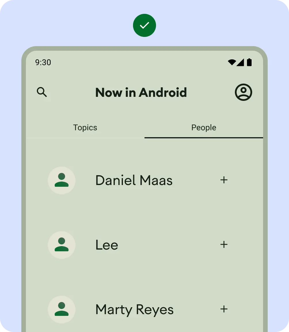
मिलते-जुलते कॉन्टेंट को ग्रुप करने के लिए, कंटेनमेंट का इस्तेमाल करें. इससे उपयोगकर्ता को कॉन्टेंट और कार्रवाइयों के बारे में जानकारी मिलती है. कॉन्टेंट को एक साथ रखने के लिए, साफ़ तौर पर कंटेनमेंट का इस्तेमाल करने वाले कार्ड.

अलाइनमेंट
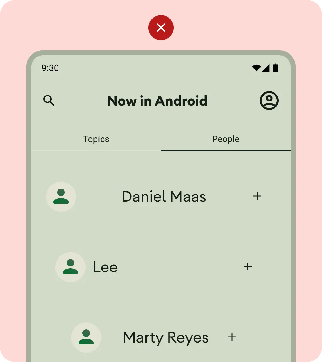
एक जैसे कॉन्टेंट और यूज़र इंटरफ़ेस (यूआई) एलिमेंट के बीच एक जैसा अलाइनमेंट उपलब्ध कराएं.
यह करें
ऐसा न करें
उपयोगकर्ता को एक व्यू में बहुत ज़्यादा कार्रवाइयां न दिखाएं.

पसंद के मुताबिक लेआउट बनाते समय, यह बताएं कि लेआउट में कॉन्टेंट कैसे दिखेगा. इसके लिए, अलाइनमेंट, कंस्ट्रेंट या ग्रैविटी टर्म का इस्तेमाल करें. यह जानकारी शामिल करें कि इमेज को सही तरीके से दिखाने के लिए, कंटेनर के हिसाब से इमेज का साइज़ कैसे बदला जाना चाहिए.
