
Desktop users rely on pointer devices, such as a mouse or touchpad, to interact with your app. For an optimal desktop experience, support key pointer events such as hover, scroll, primary click, and secondary click.
Takeaways when adapting to desktop inputs
- Add hover states and interactions to your existing system.
- Account for right-click interaction for added efficiency.
- Targets should have more precise sizing.
Primary click
Primary click, or in most cases left-click, is the main cursor interaction a desktop user relies on. The rule of thumb is that a user should be able to accomplish all the primary user journeys with primary clicks alone. Not hiding functionality from primary clicks is not only good for discoverability but also critical to assistive technologies like Switch Access.
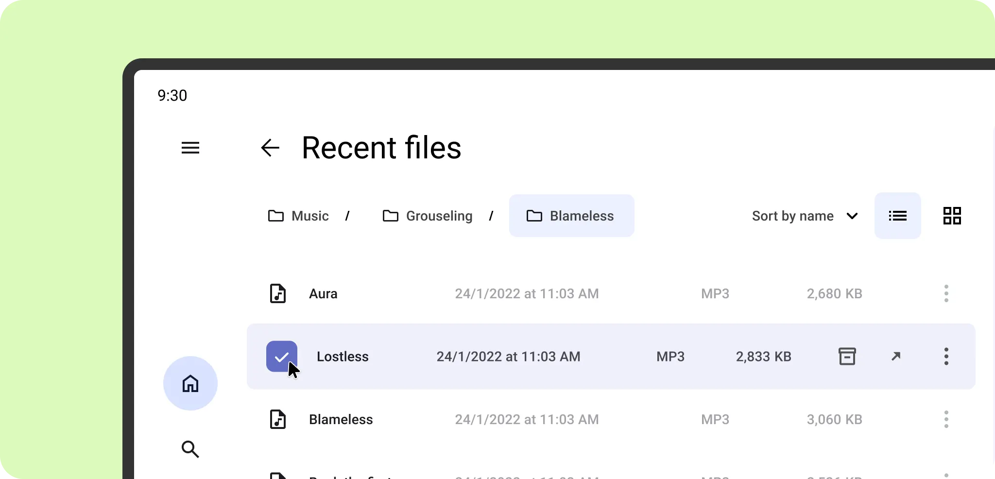
Secondary click
While touch interactions rely on a long-press, desktop users expect context menus to appear on a secondary click, such as a right-click on a mouse or a two-finger tap on a touchpad. For an optimal desktop experience, configure your app to trigger context menus on a secondary click, rather than requiring a long click.

Hover
In addition to cursor icon change, interactivity can also be indicated by changing an element's visual state on hover. For design guidance, learn more at states.
Hover can also reveal supplementary information or actions, such as tooltips or list actions nested in context menus or overflow menus.

Drag-and-drop
On touchscreens, dragging requires a long-press because a one-finger swipe is reserved for scrolling. Click-and-drag should be instantaneous with pointer devices with dedicated scroll methods, such as a scroll wheel or two-finger swipe on a touchpad.

Selection
Streamline selection interactions for the desktop experience by providing a dedicated click target.
Target size
When sizing UI elements for cursor interactions, avoid buttons that are overly large or have intrinsic touch targets beyond the element's visual boundaries.


Do

Don't
Pointer targets can be smaller than the standard 48 x 48 dp touch target, for alternative cursor interactions, such as an archive on hover that appears primarily after the item is selected.

For more on designing for inputs, learn more on Material Design inputs. Learn how to implement with Mouse and touchpad support.