
사용자가 잘 알고 있으며 텍스트 라벨이 필요하지 않은 작업에는 버튼 구성요소를 사용하세요. 버튼은 원형 모양으로 칩과 구별됩니다.
분석
A. 콘텐츠
버튼에는 아이콘이나 텍스트용으로 예약된 단일 슬롯이 있습니다. 버튼이 실행하는 작업과 관련된 아이콘을 선택합니다. 아이콘이 관련 작업을 설명할 수 없는 경우 최대 3자(영문 기준)의 텍스트를 사용할 수 있습니다. 아이콘이 작업을 명확하게 설명할 수 없다면 칩 구성요소를 사용하는 것이 좋습니다.
B. 컨테이너
버튼 컨테이너는 단일 단색 채우기로 제한됩니다.
버튼 유형
계층 구조
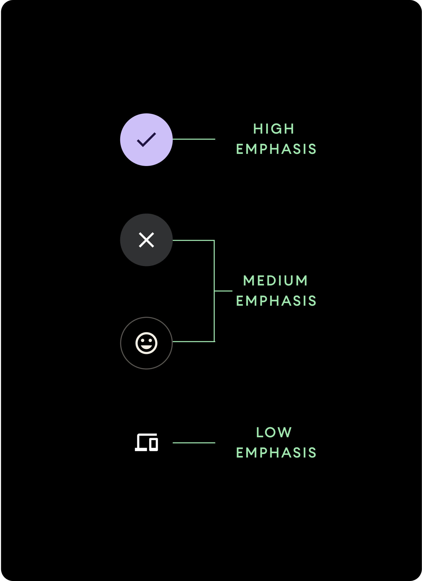
다양한 색상 채우기를 사용하여 버튼 계층 구조를 표시합니다.
높은 강조
높은 강조 버튼에는 앱의 주요 작업이 포함됩니다. 높은 강조 버튼의 경우 컨테이너에 기본 색상이나 보조 색상을 사용하고 콘텐츠에는 기본(대비) 색상과 보조(대비) 색상을 사용하세요. 자세한 내용은 Wear Material Theming을 참고하세요.
중간 강조
중간 강조 버튼은 대비가 낮은 색상 채우기로 구별됩니다. 여기에는 기본 작업보다 덜 중요한 작업이 포함됩니다. 컨테이너에 표면 색상을 사용하고 콘텐츠에 표면(대비) 색상을 사용합니다.
또는 중간 강조 버튼에 맞춤 OutlinedButton 구성요소를 사용합니다. 여기에는 투명한 배경, 불투명도 60% 의 기본 변형 색상 스트로크, 기본 색상 콘텐츠가 포함됩니다.
낮은 강조(아이콘에만 적용)낮은 강조 버튼은 채우기가 없는 것으로 구별됩니다. 압축 정렬이 필요한 시계 화면의 작은 영역에 가장 적합합니다. 콘텐츠에는 표면(대비) 색상을 사용합니다.
크기
크기가 다양한 버튼을 사용하여 작업을 강조하거나 강조하지 않습니다.
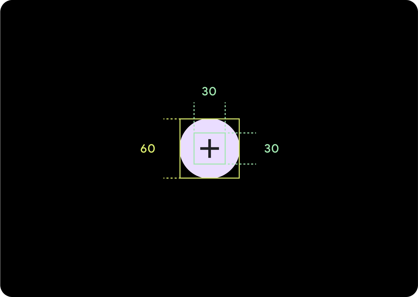
대형
아이콘 (30 x 30 dp)
컨테이너 (60 x 60 dp)
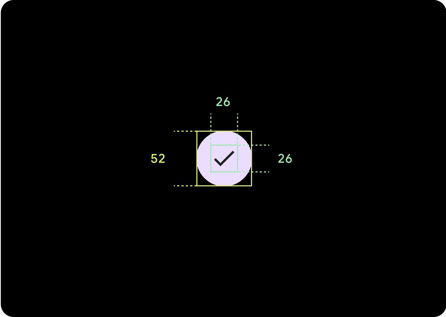
Default
아이콘 (26 x 26 dp)
컨테이너 (52 x 52 dp)
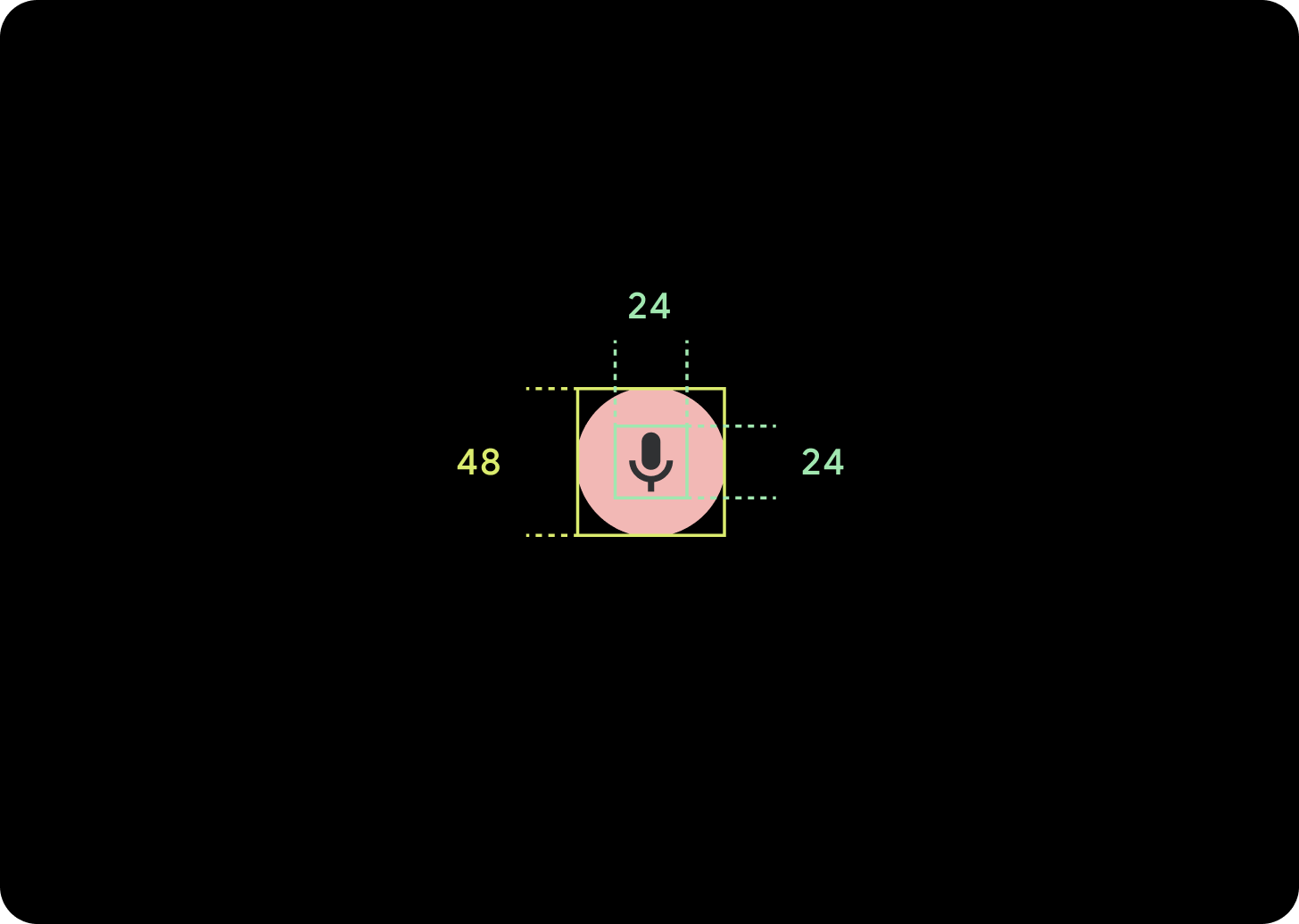
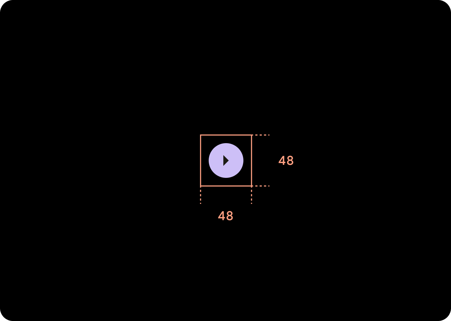
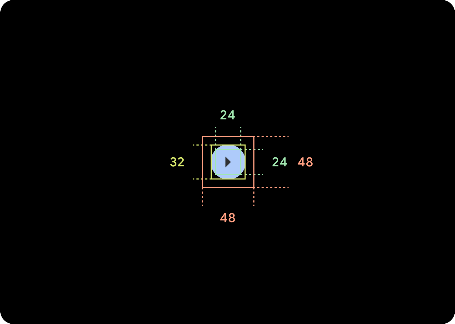
소규모
아이콘 (24 x 24 dp)
컨테이너 (48 x 48 dp)
Extra Small(XS)
아이콘 (24 x 24 dp)
컨테이너 (32 x 32 dp)
48dp 이상의 탭 타겟을 만들려면 이 버튼 주위에 패딩을 추가하는 것이 좋습니다. 이는 접근성을 위한 최소 탭 타겟 크기입니다.
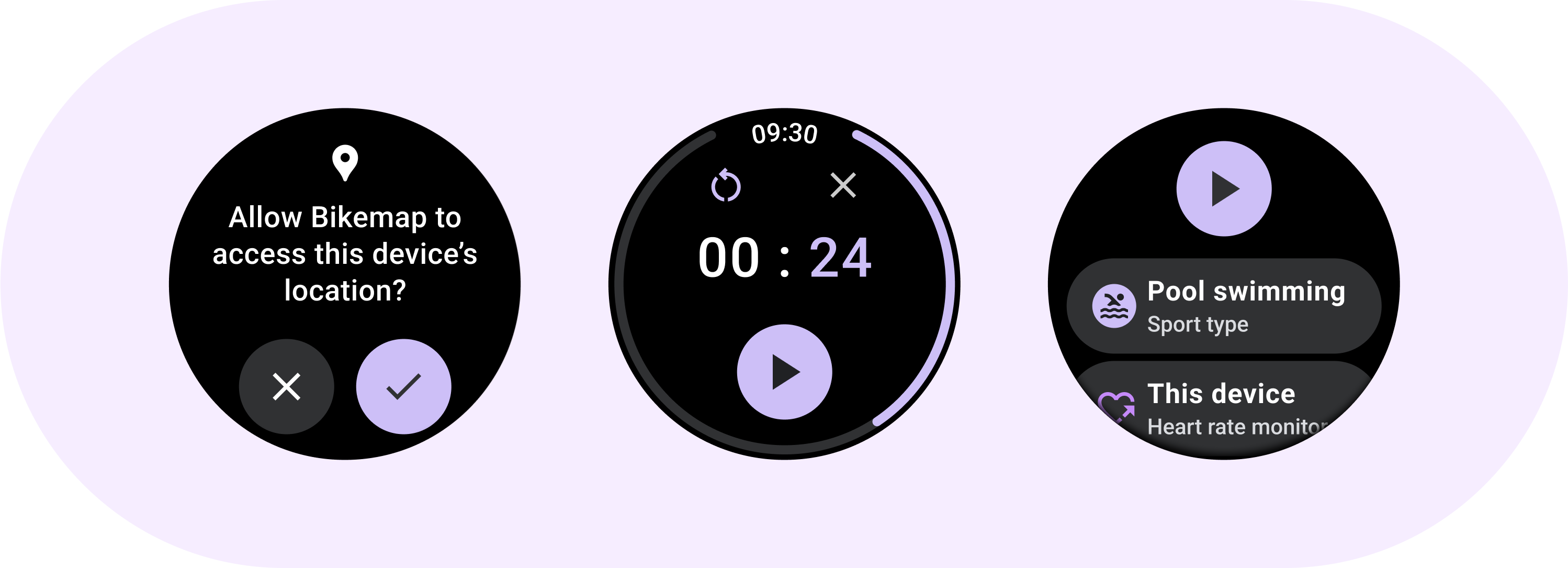
사용
표준 버튼을 사용하면 사용자가 통화 수락 또는 거부, 타이머 시작 등의 단일 작업을 할 수 있습니다.
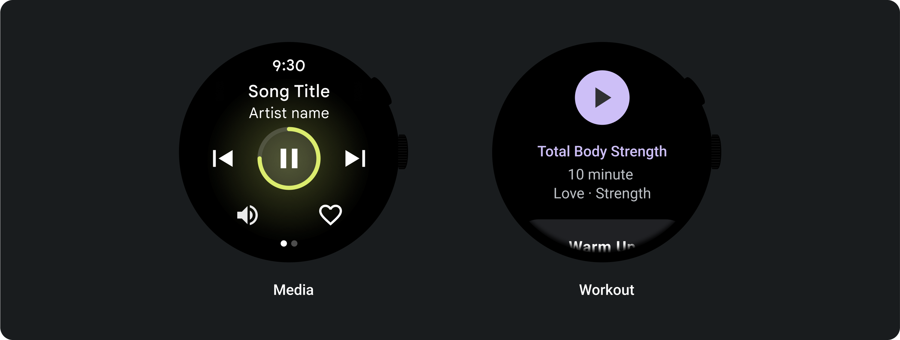
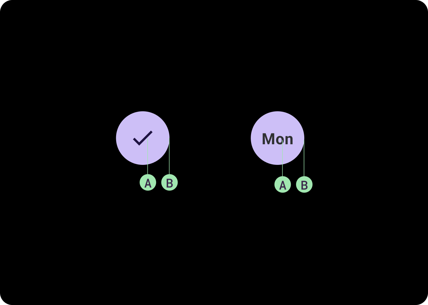
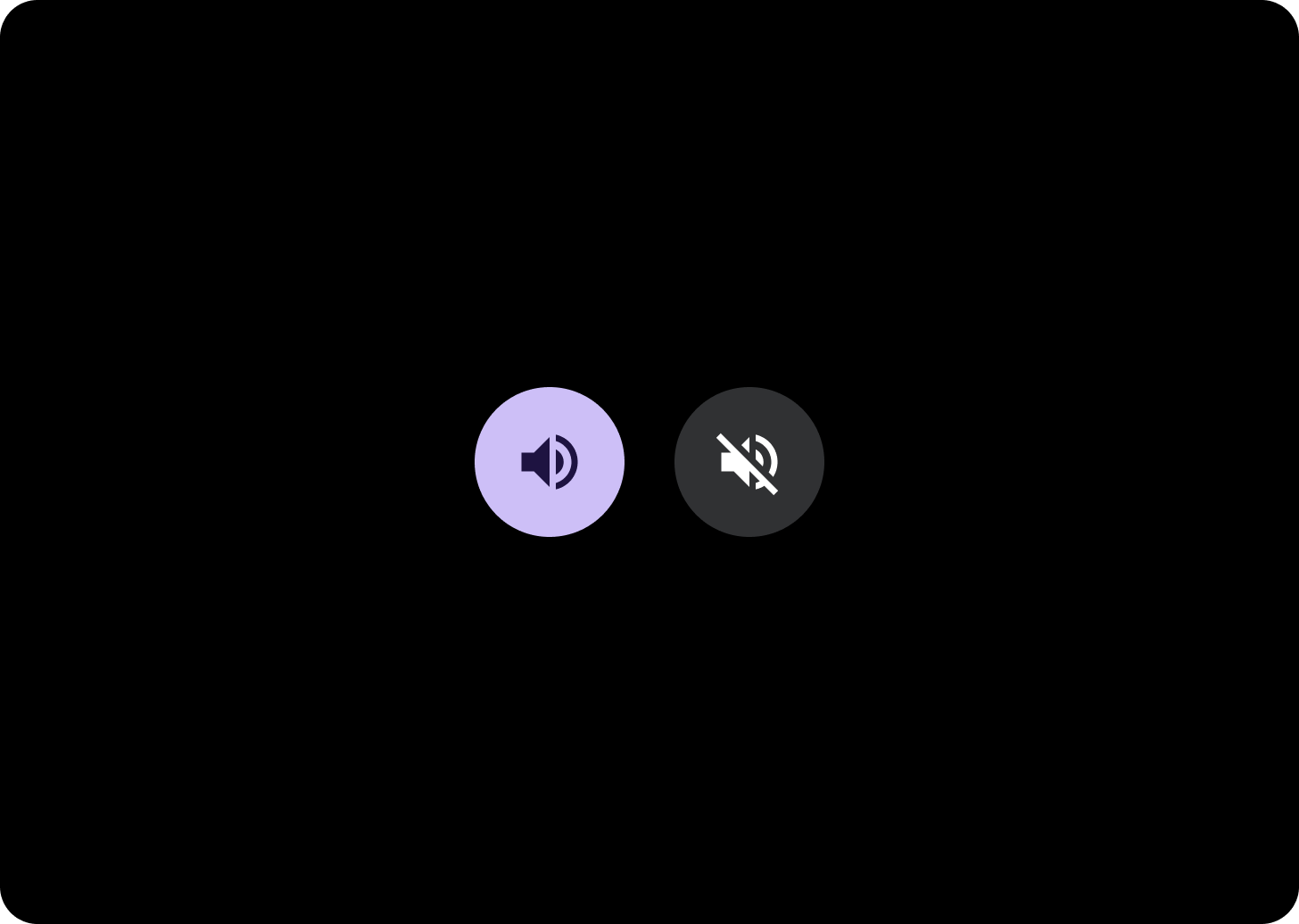
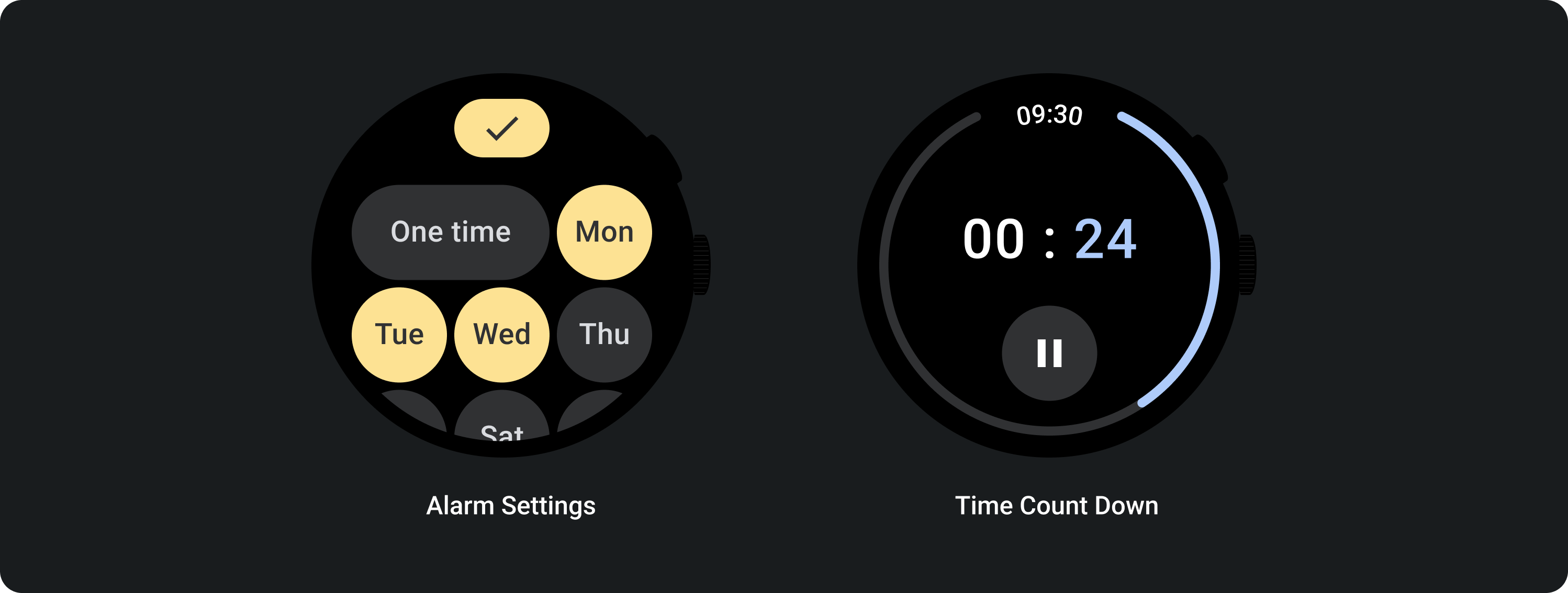
전환 버튼을 통해 사용자는 요일을 선택 및 선택 해제하거나 타이머를 일시중지 및 재개하는 등의 옵션을 사용 설정하거나 사용 중지할 수 있습니다.
적응형 레이아웃
대응하는 동작
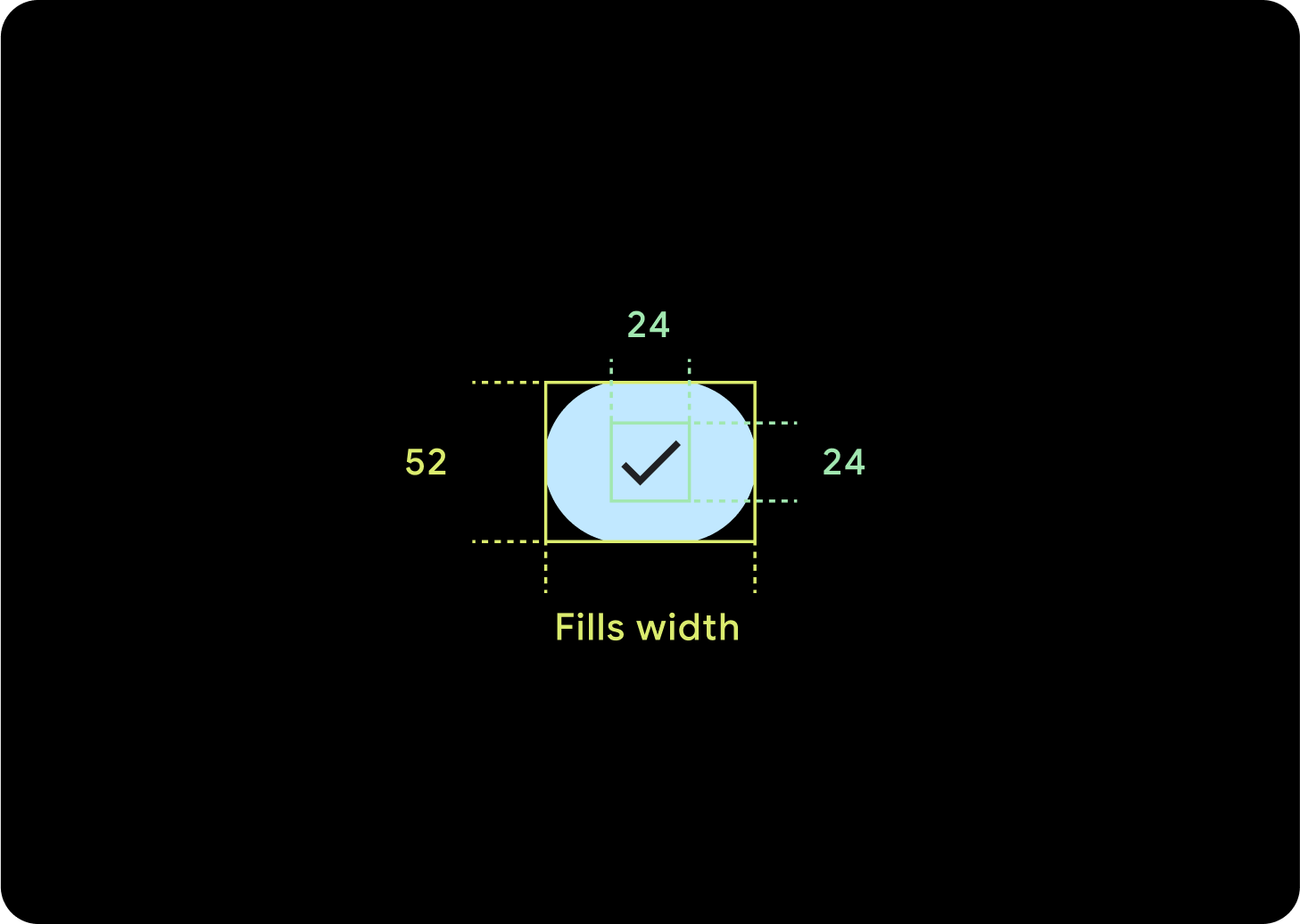
버튼 1개
내부 패딩은 동일하게 유지되며, 버튼이 너무 늘어나지 않고 상대 크기를 유지할 수 있도록 여백은 백분율로 지정해야 합니다.
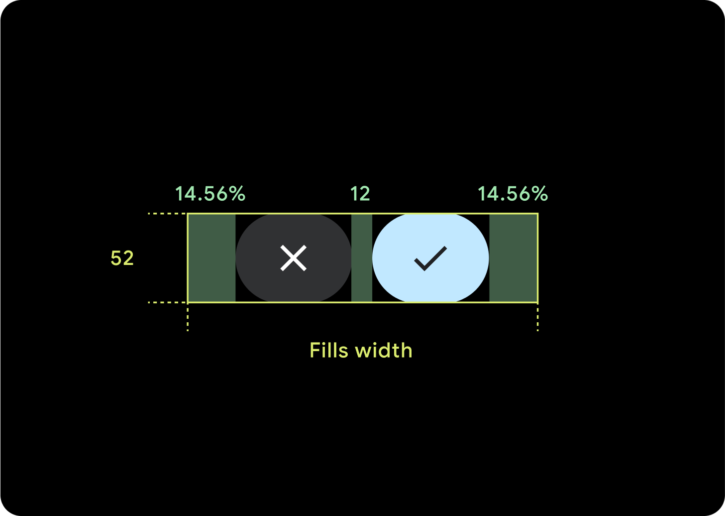
버튼 2개
버튼이 2개 있는 경우 버튼이 너무 늘어나지 않도록 하고 상대 크기를 유지하기 위해 내부 여백의 비율이 추가됩니다.
IME
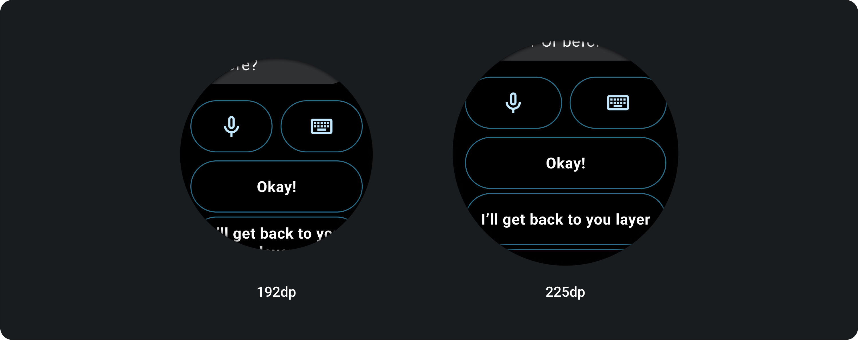
버튼 1개 또는 2개
버튼 2개 또는 1개로 잠긴 IME는 화면 크기와 관계없이 항상 측면 여백까지 완전히 늘어납니다.
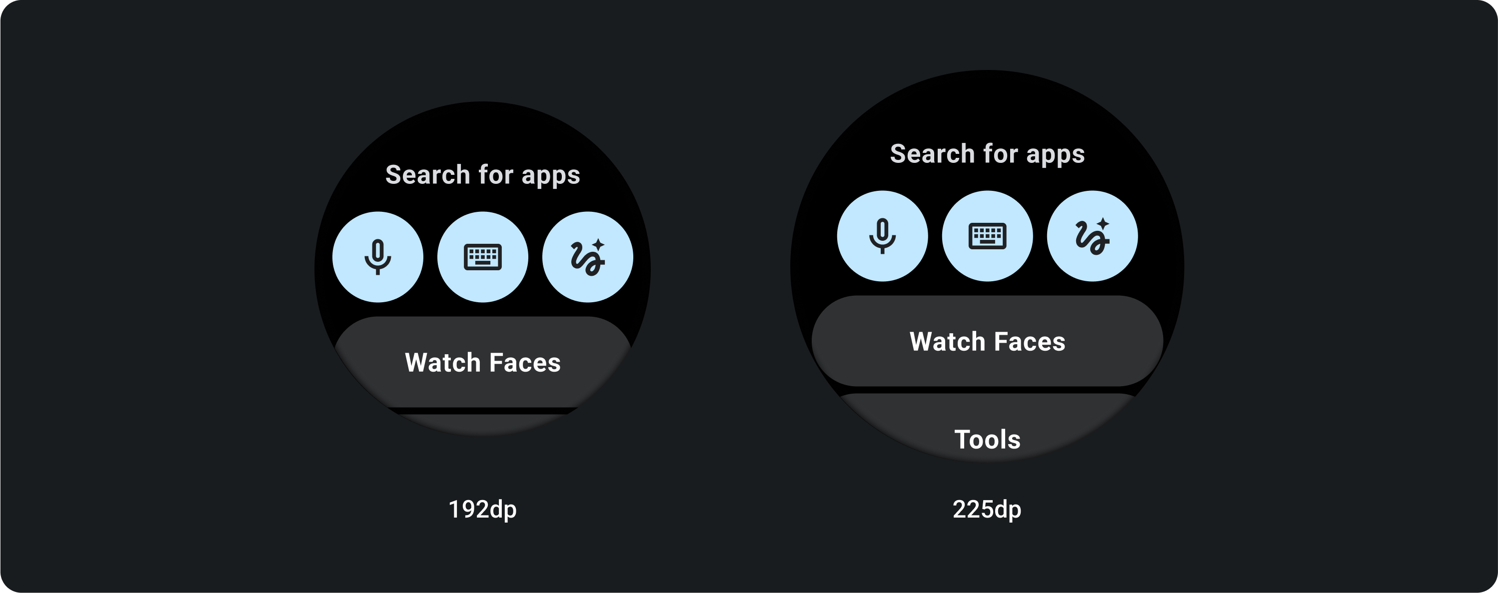
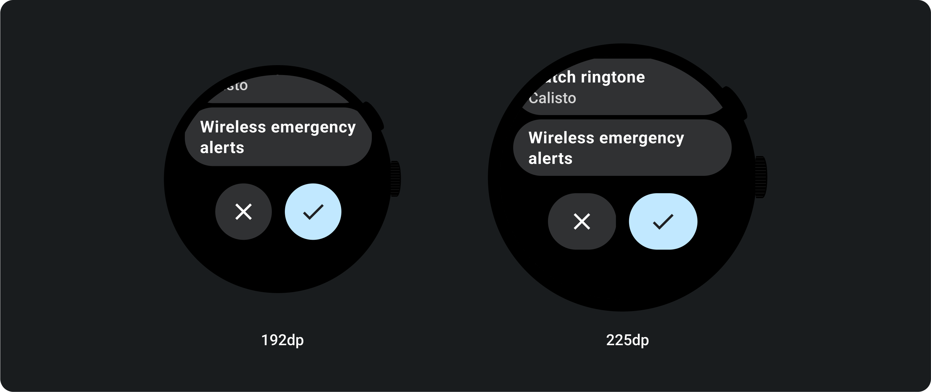
버튼 3개
225dp 미만의 화면에서는 버튼이 원형으로 유지되고 늘어나지 않습니다. 225dp 이상인 대형 화면에서는 버튼이 측면 여백까지 늘어납니다.