
在圆形屏幕上设计自适应布局时,滚动视图和非滚动视图在缩放界面元素和保持平衡的布局和组合方面各有独特的要求。以下图片仅供大致参考;示例仅作说明之用。查看每个组件或界面页面,获取详细、贴合情境且富有回应性的指南。
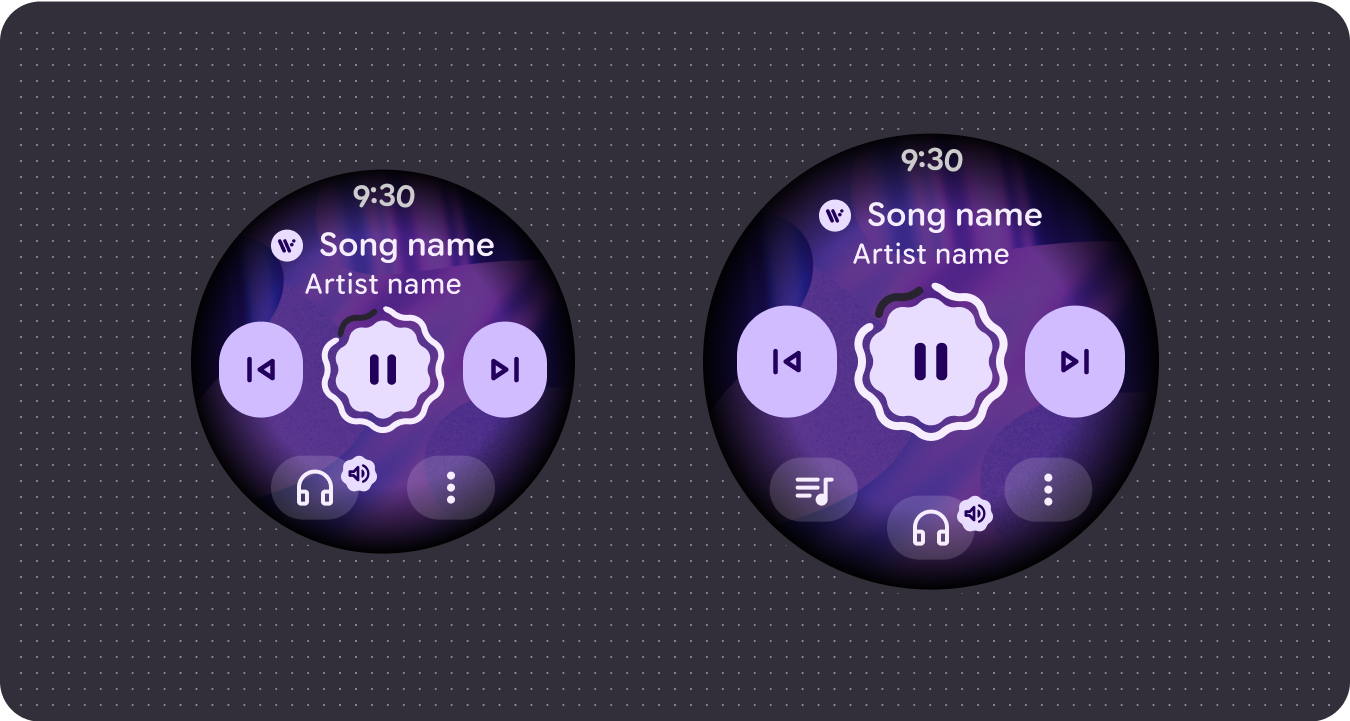
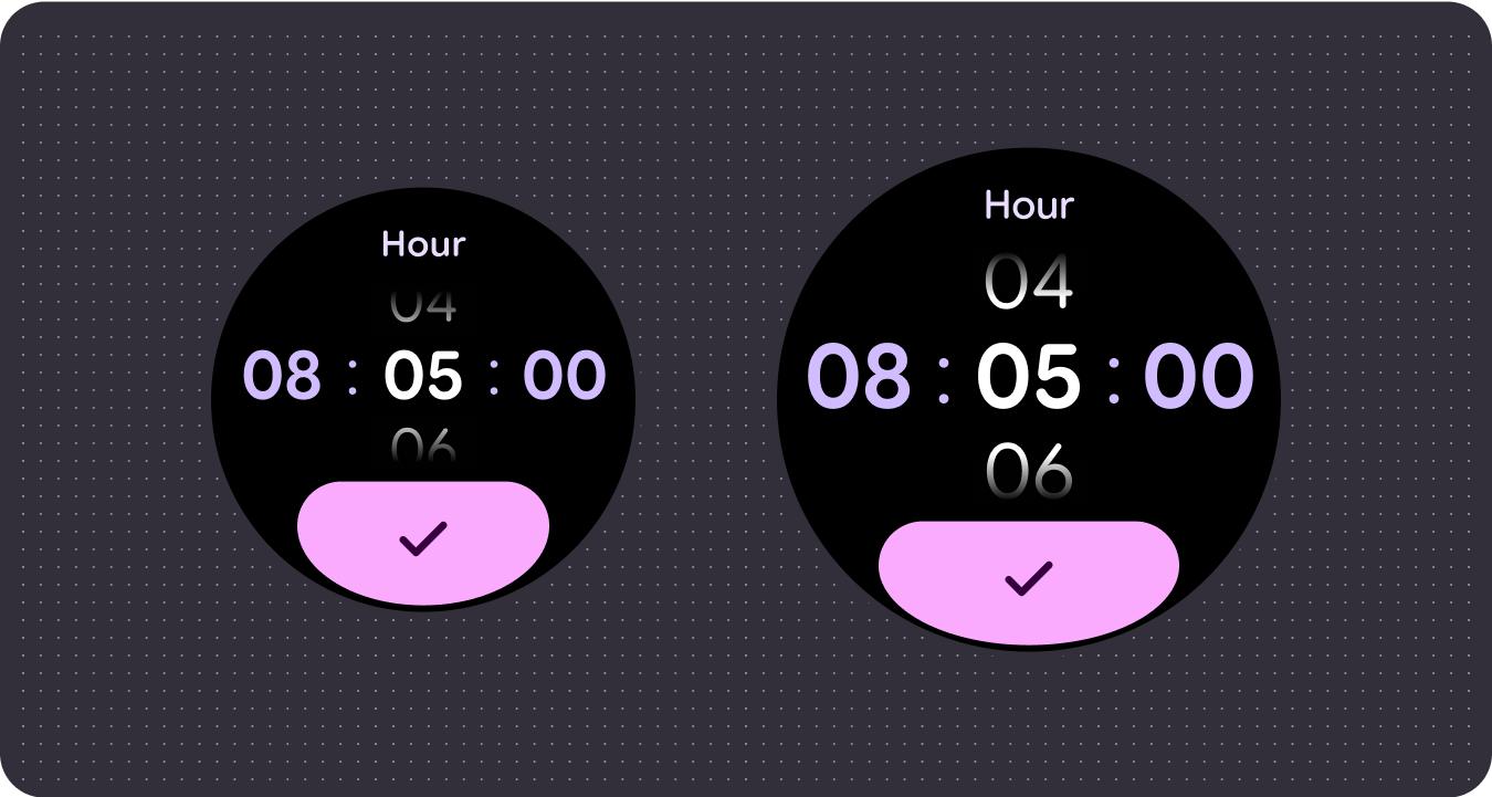
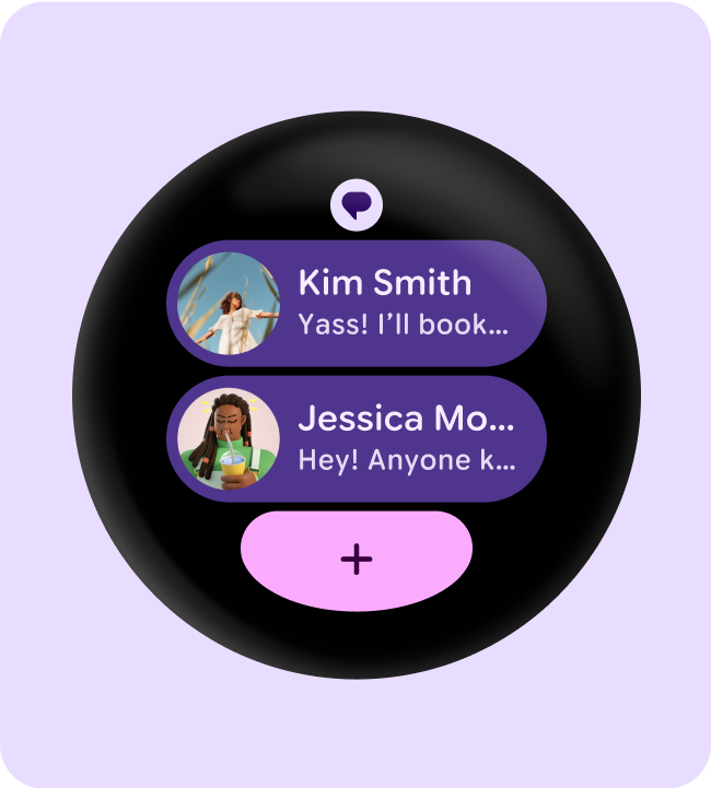
一目了然地查看更多内容
借助响应式布局,您可以在单个屏幕上显示更多条状标签、卡片、文本行和按钮。
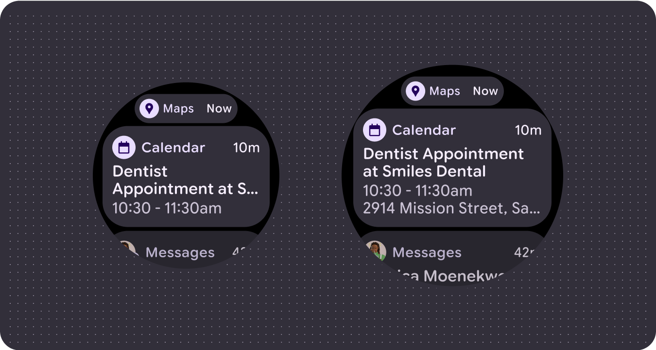
可见更多内容元素
使用在指定屏幕尺寸断点处应用的新布局,以便尽可能引入内容,从而在屏幕尺寸较大的设备上为用户提供额外价值。
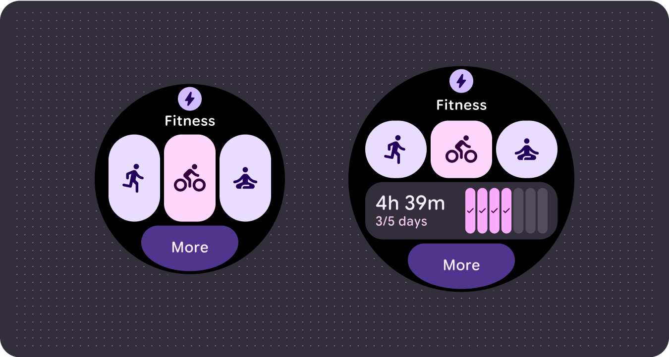
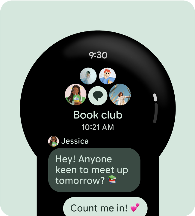
改进了一目了然
利用额外的屏幕空间提供更大的容器、更大的文本、更粗的圆环和更精细的数据可视化,以便用户一目了然。

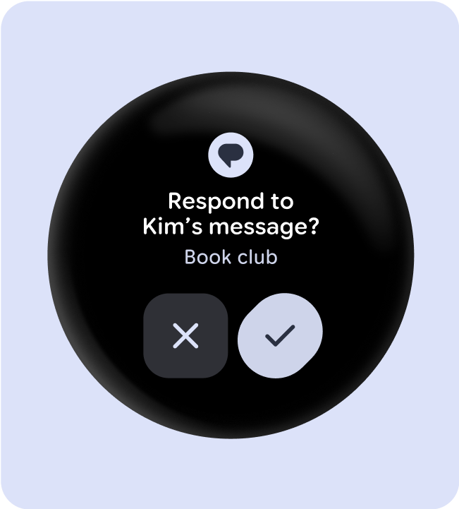
改进了易用性
利用额外的屏幕空间提供更大的点按目标、更清晰的视觉层次结构,并在内容项之间留出内边距,以便界面易于访问且富有吸引力。
优化后的组合
利用更新后的组件和模板,为所有屏幕尺寸的界面提供更好的外观和风格。
使用已建立的规范布局
利用已建立的规范布局,帮助界面在各种设备尺寸上顺畅自适应。我们的规范布局经过精心设计,可在所有屏幕尺寸上提供优质体验。
功能块(非滚动布局)
应用滚动布局
应用的非滚动布局