
功能块有助于用户快速访问完成各种任务所需的信息和操作。用户只需在表盘上滑动一下手指,便能了解自己的健身目标进展、查看天气信息等等。功能块还非常便于快速启动应用或完成基本任务。
制作自适应且经过优化的设计
为了帮助您将设计布局调整为适应更大的屏幕尺寸,我们更新了布局和组件的行为,使其具有内置的自适应行为,包括基于百分比的内边距和内边距。
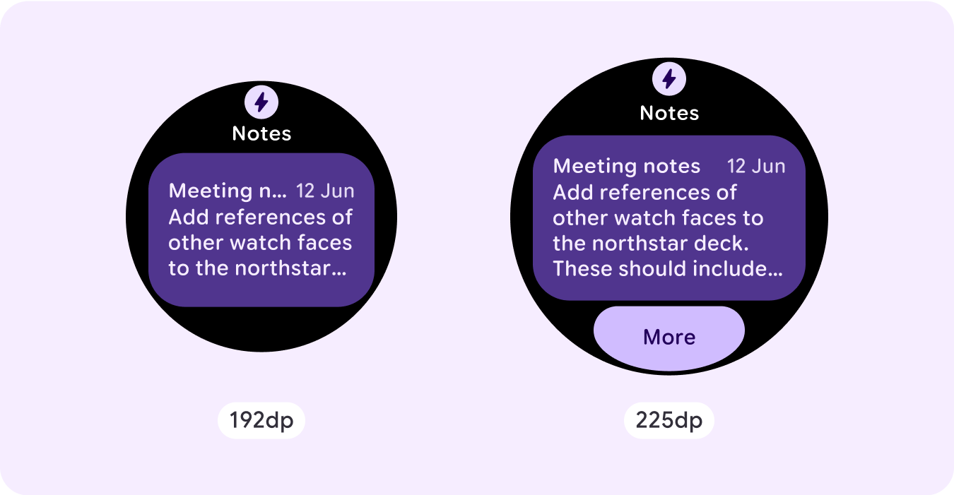
如果您使用的是我们的 ProtoLayout 模板,则可以通过 Wear ProtoLayout Jetpack 库的最新 Beta 版自动继承这些更新。此外,您只需提供在屏幕尺寸断点后添加了其他内容或组件的布局。如需有关如何充分利用更大屏幕尺寸的完整指南和建议,请参阅我们的 [功能块指南][2]。功能块的屏幕高度是固定的,因此我们调整了内边距,以最大限度地利用有限的屏幕空间,同时避免了不必要的剪裁。
检查组件是否填满了可用宽度
所有组件都应采用响应式设计。将高度和宽度设置为“expand”后,它们会填充可用空间。添加必要的外边距,以防止内容被圆角屏幕剪裁。
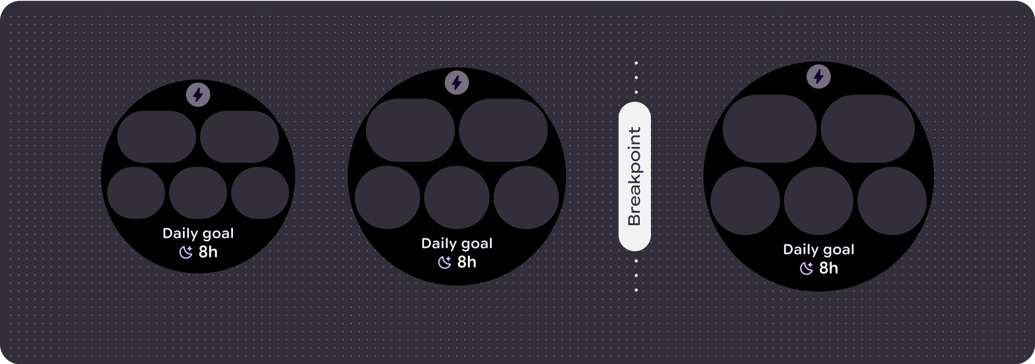
构建自适应且差异化的设计
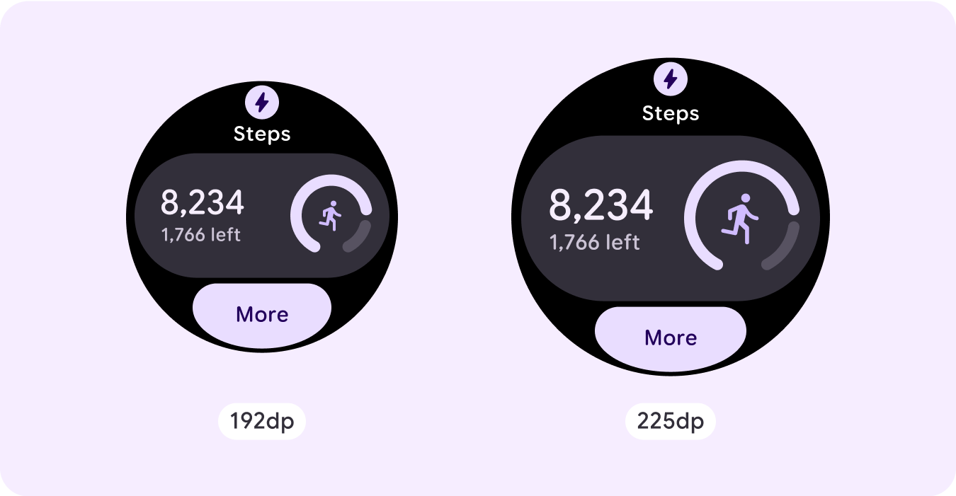
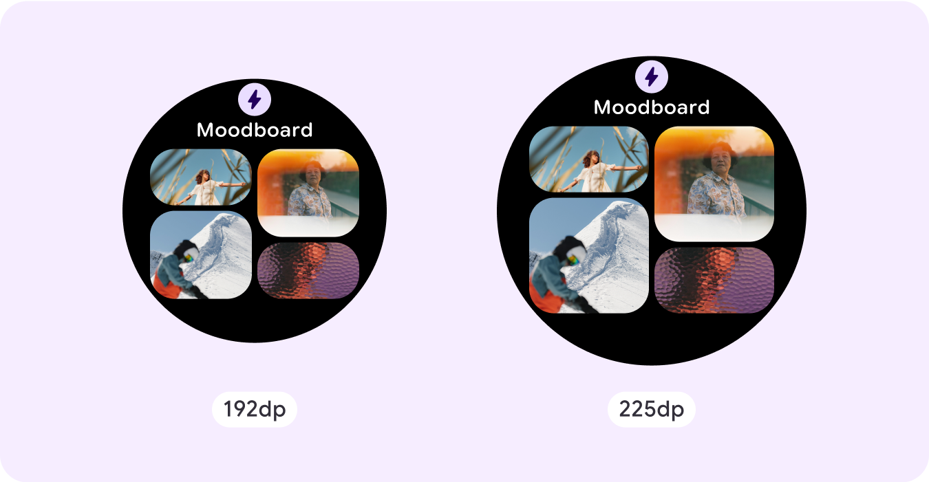
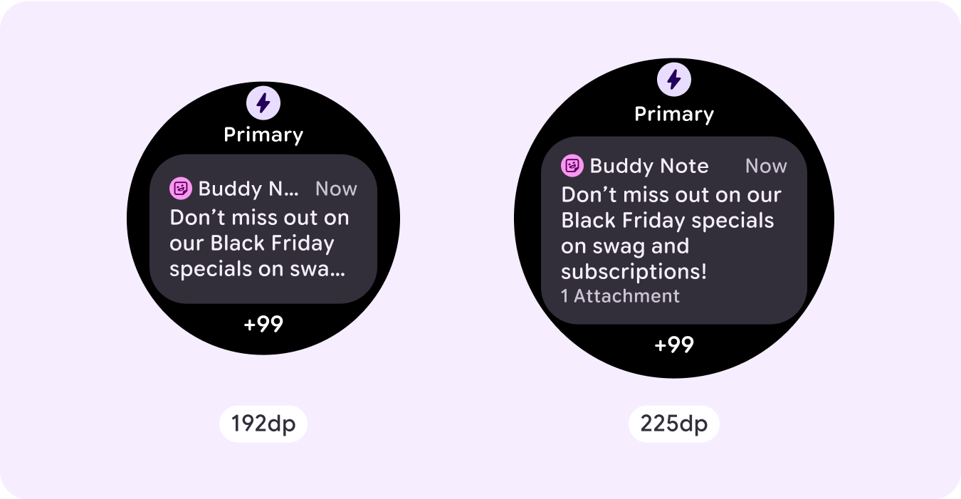
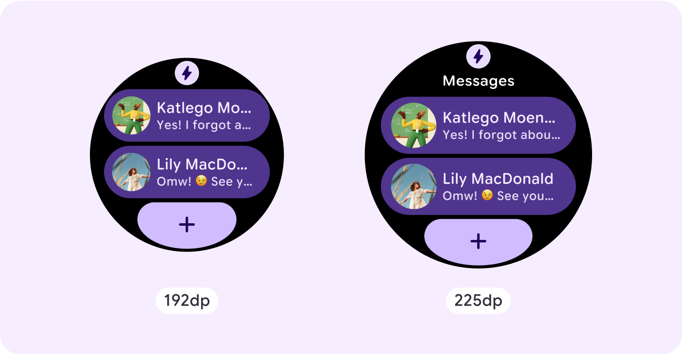
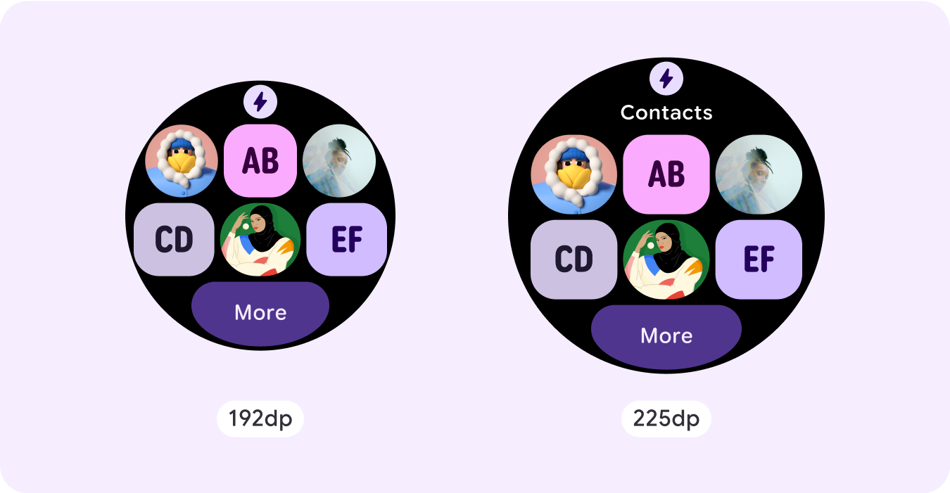
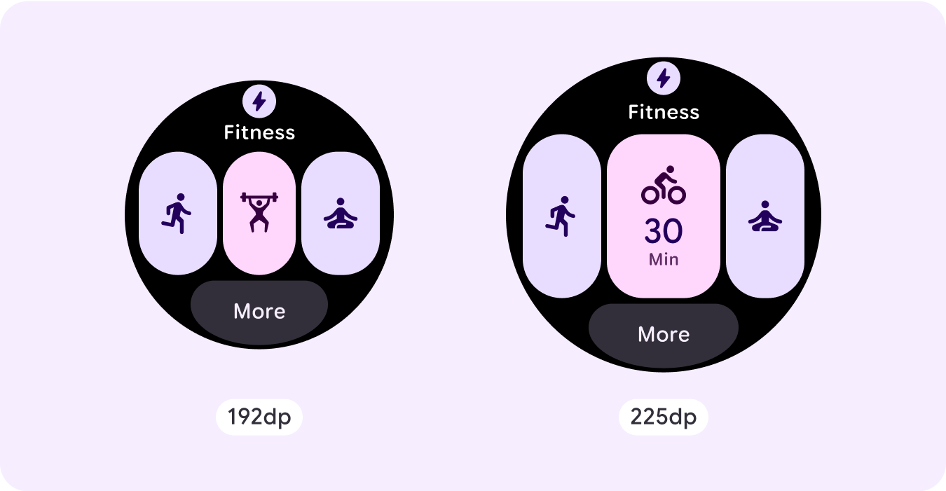
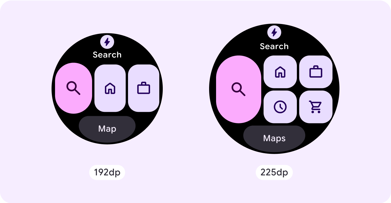
如需充分利用较大屏幕尺寸的额外空间,请在 225dp 处添加尺寸断点。借助此断点,您可以显示更多内容、添加更多按钮或数据,或更改布局以更好地适应更大的屏幕。
这需要为每个断点采用不同的设计。较大的屏幕设计(225 dp 以上)可以包含以下额外元素:
显示之前隐藏的标题槽
对于在断点前有两行的布局,建议采用此方法,其中需要移除标题槽,以确保最小点按目标为 48dp。
增加现有组件的大小或更改其状态
这样做是为了显示更多详细信息或让内容更易于浏览。
在当前布局中添加组件槽
通过添加组件,布局可以提供更多选项或其他详细信息。不过,请确保内容一目了然。
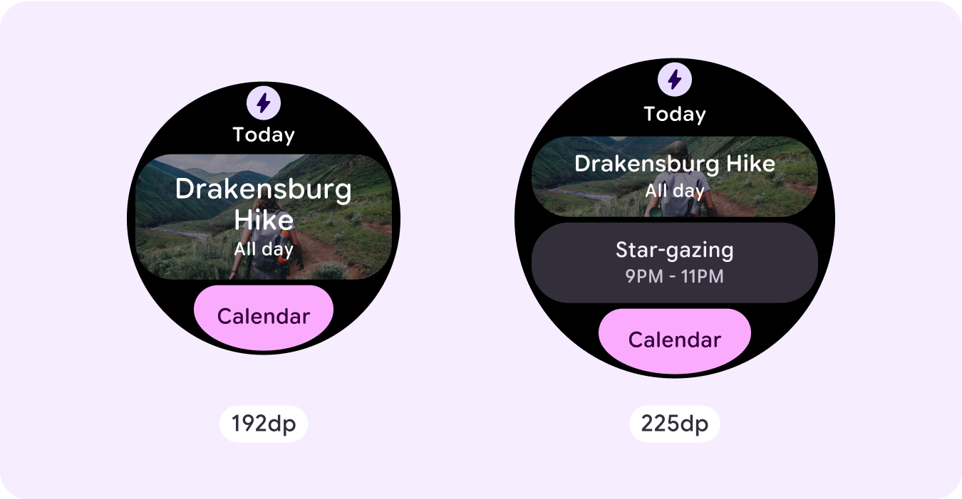

在底部添加更多内容
在某些情况下,在底部部分添加操作按钮或内容,而不是在主槽中添加组件,更为合理。
注意: 显示屏尺寸较大时,显示的信息不应比尺寸较小时少。 这对于在断点处添加的自定义行为尤为重要。
一个常见的例子是,组件或文本大小超过断点,最终在较大的屏幕上显示的内容较少。屏幕尺寸越大,显示的价值始终越高。
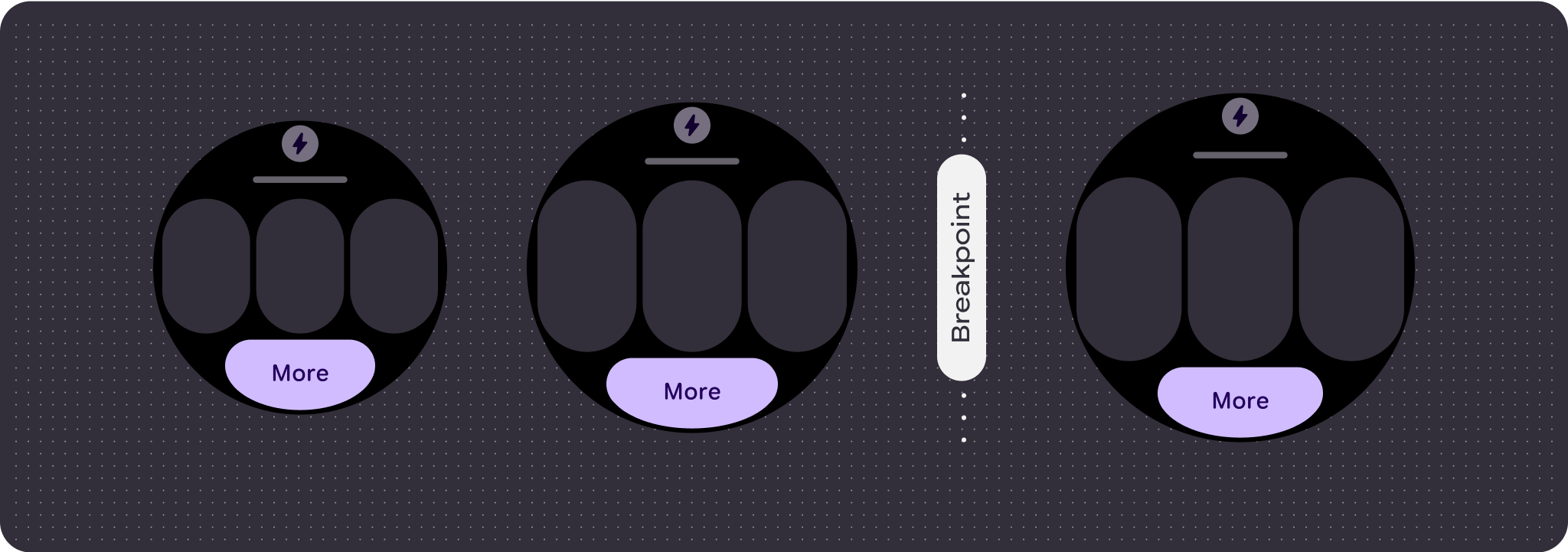
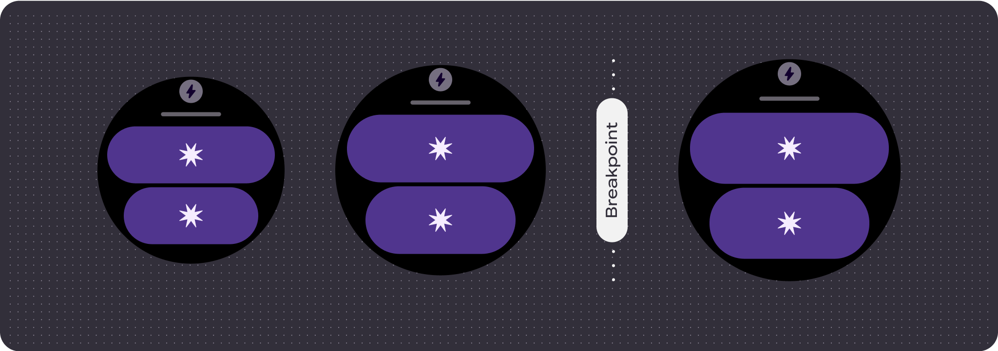
响应式和自适应行为
响应式和自适应行为取决于布局的三个槽(部分)。
应用图标和标题槽
系统提供的应用图标的行为没有任何变化。标题槽会自动适应更大的屏幕尺寸,显示更多字符。顶部部分采用按比例(百分比)的内部边距,以免在屏幕尺寸增大时出现任何剪裁。
主槽(组件)
主槽中的所有组件都应将其宽度和高度设置为“expand”,以便自动适应更大的屏幕尺寸。主槽部分(在某些情况下,此槽中的每一行)具有比例(百分比)内边距,以避免在屏幕尺寸增大时发生任何剪裁。如果您同时使用角半径和布局,则主槽可能需要更大的边距。
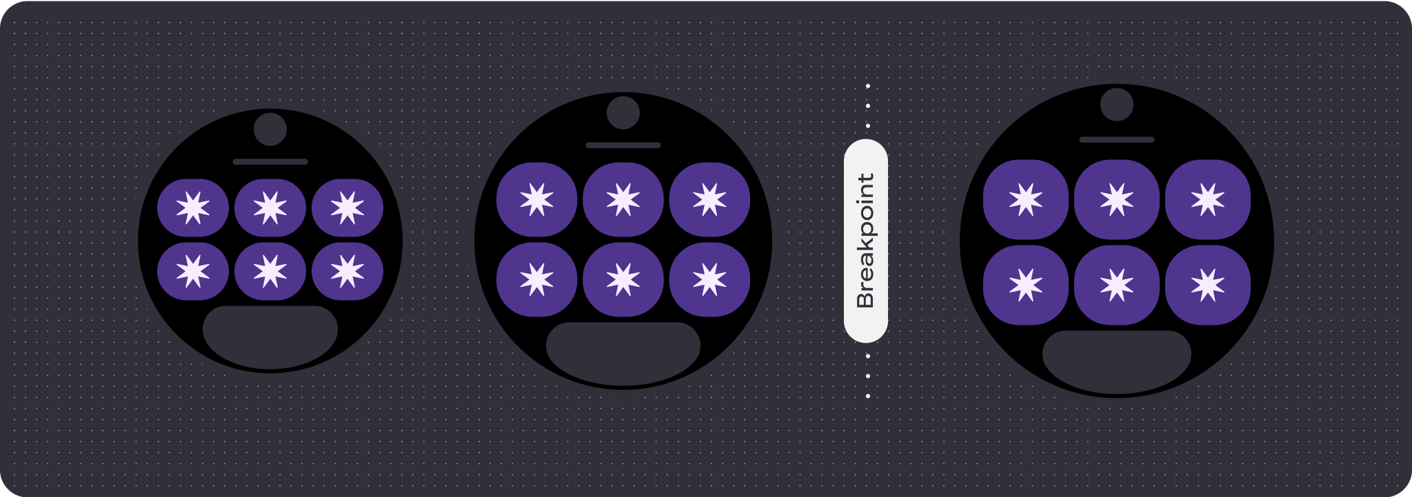
底部槽
底部按钮或文本的行为不会发生变化,但按钮和文本框的宽度会自动适应更大的屏幕尺寸,并增加字符。底部槽上有比例(百分比)内部边距,以避免在屏幕尺寸增大时发生任何剪裁。如果没有底部槽,系统会自动添加默认边距。
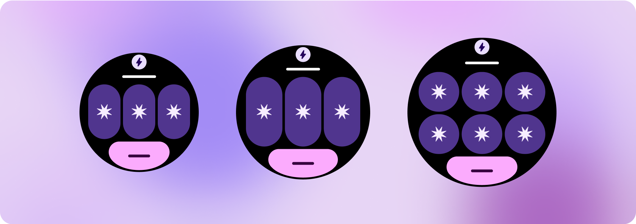
打造差异化体验
一个完全可自定义的布局,内置 60 种或更多排列组合,可实现几乎无限的自定义。功能块基于基于槽的系统构建,因此您可以将规范布局中的某个槽替换为任何内容或组件,并将该组件设置为众多变体和颜色组合之一。在这种情况下,请保持响应式行为并遵循我们的设计建议。
这些自定义内容应有所限制,并且不得偏离功能块模板。这样可以确保用户在 Wear OS 设备上滚动浏览功能块轮播界面时保持一致性。