Kartu
Tetap teratur dengan koleksi
Simpan dan kategorikan konten berdasarkan preferensi Anda.

Komponen Kartu berisi konten dan tindakan tentang satu subjek.
Anatomi
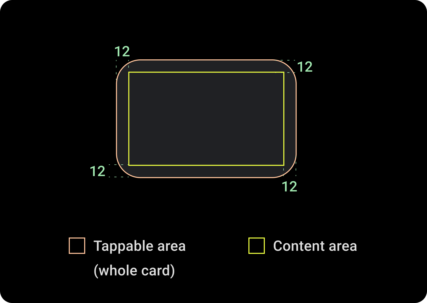
Komponen kartu hanya memiliki satu slot. Kartu dapat berisi ikon, gambar, atau label, yang dapat disesuaikan.
Secara default, kartu berbentuk persegi panjang dengan sudut membulat dan latar belakang gradien. Setel tinggi maksimum kartu ke 60% untuk memastikan kartu ditampilkan sepenuhnya di layar karena layar melingkar dapat memotong hingga 20% bagian atas dan bawah layar.
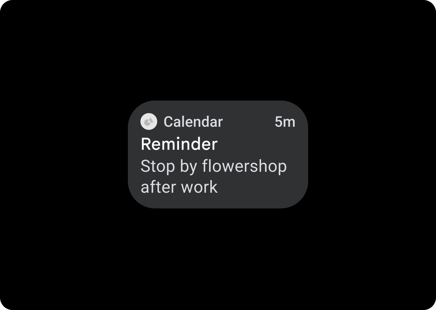
Kartu Judul
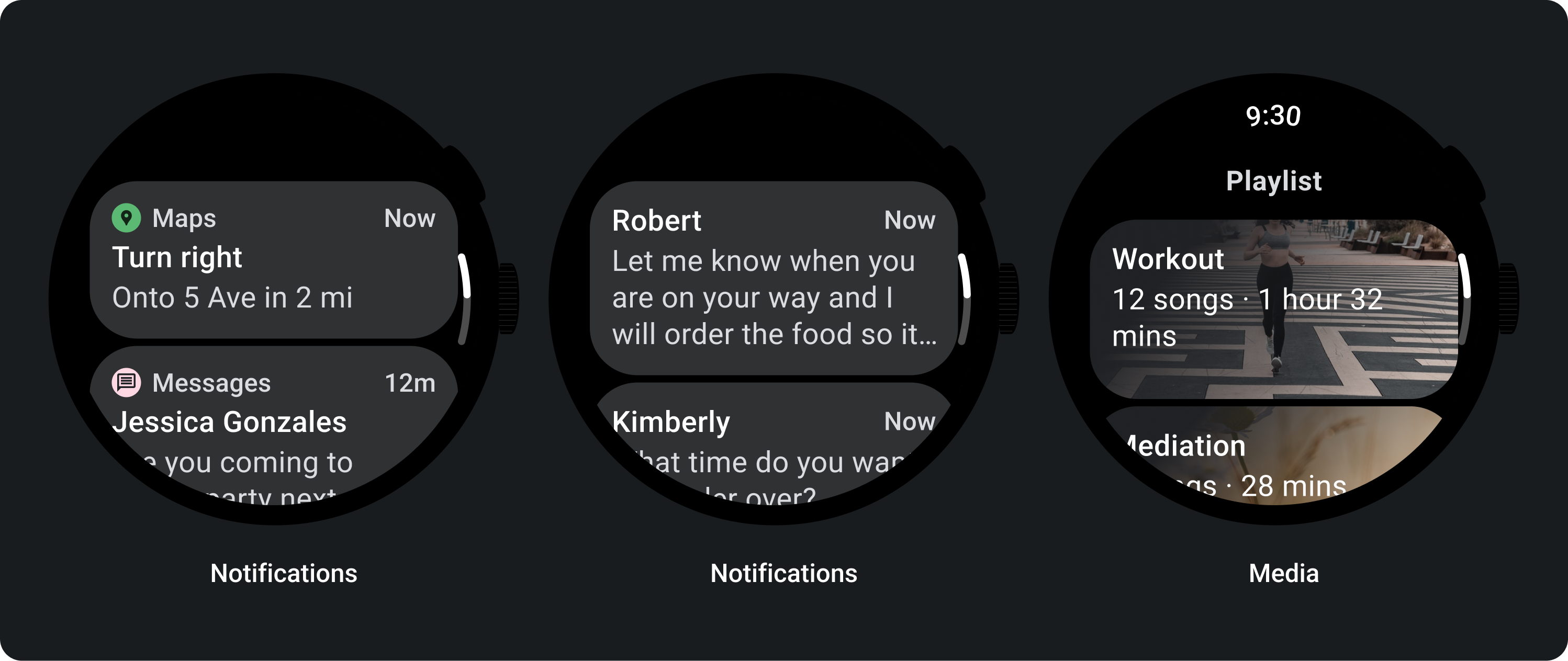
Gunakan Kartu judul untuk menampilkan informasi dalam aplikasi, seperti pesan. Kartu judul memiliki tata letak tiga slot yang mencakup judul, kolom waktu opsional, dan konten yang relevan, yang berupa gambar atau teks.
Kartu Aplikasi
Gunakan Kartu aplikasi untuk menampilkan elemen interaktif dari beberapa aplikasi. Kartu aplikasi memiliki tata letak lima slot yang mencakup ikon aplikasi, nama aplikasi, waktu terjadinya aktivitas, judul semacam dan konten yang relevan, yang dapat berupa gambar atau teks.
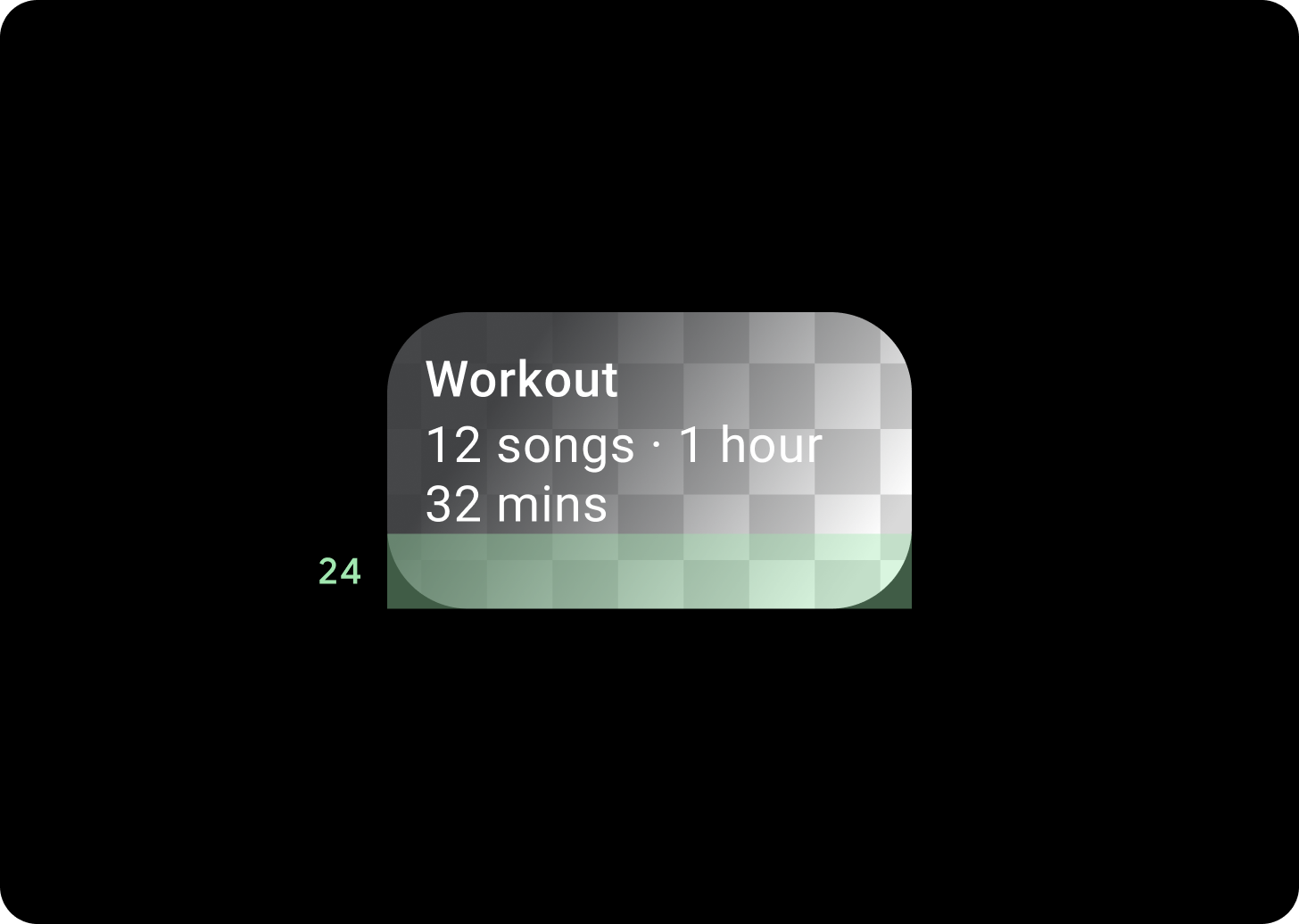
Gradien kartu
Gradien Kartu
Atas/Kiri + Padding atas 68dp dari Kiri = 100% Permukaan
Bawah/Kanan = 0% Permukaan
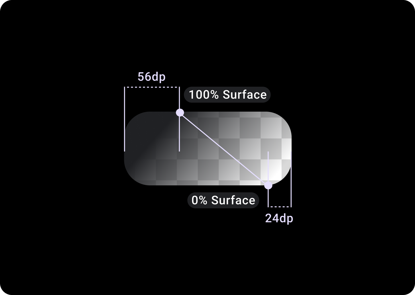
Overlay Kartu Gambar
Padding Atas/Kiri + 56 dp dari T/L = 100% Permukaan
Bawah/Kanan + Padding 24 dp dari B/R = 0% Permukaan
(Overlay gradien di latar belakang gambar)
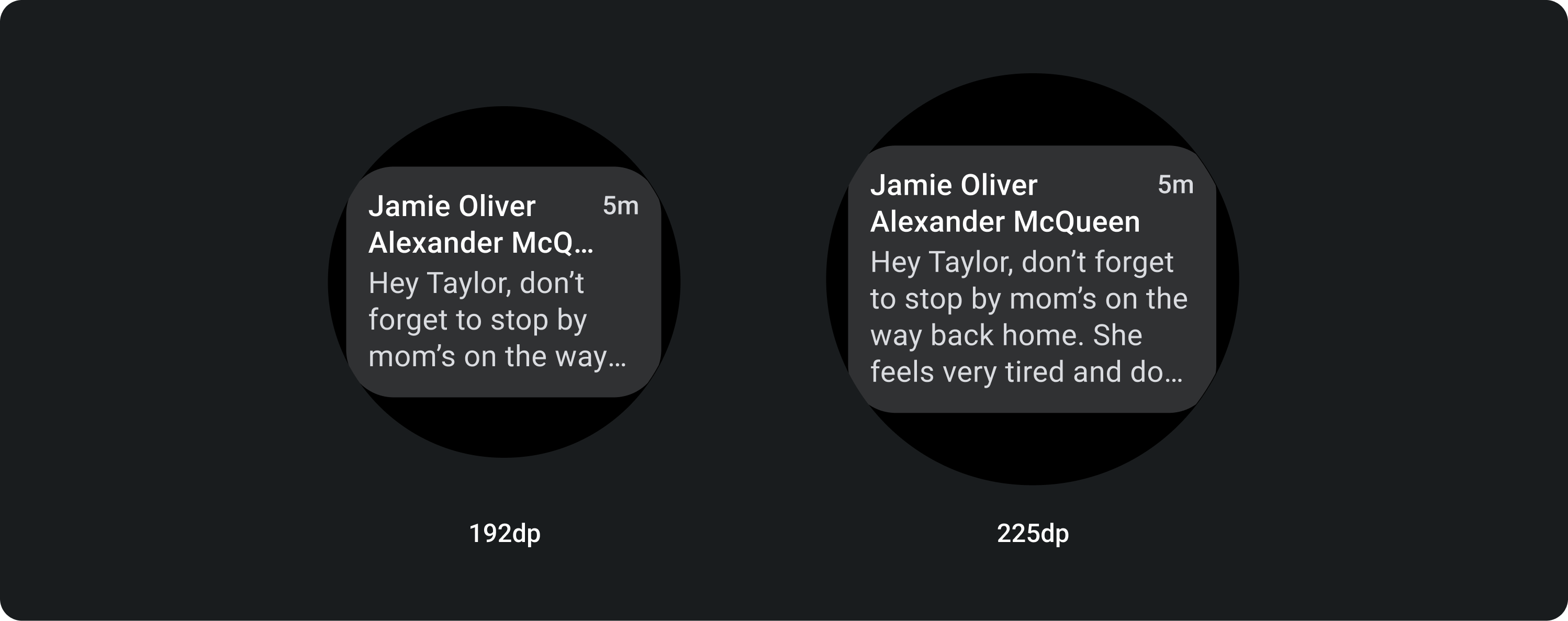
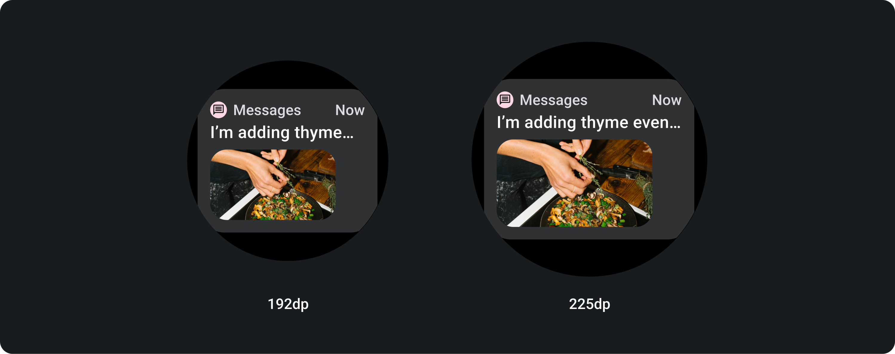
Ukuran
Lebar kartu
Kartu ditetapkan secara default ke lebar maksimum penampung.
Tinggi kartu
Tinggi kartu fleksibel. Hal ini ditentukan oleh konten komponen.
Pada tampilan jam bulat, kartu yang tingginya lebih dari 60% dari tinggi layar akan terpotong.
Penggunaan

Tata letak adaptif

KartuJudul
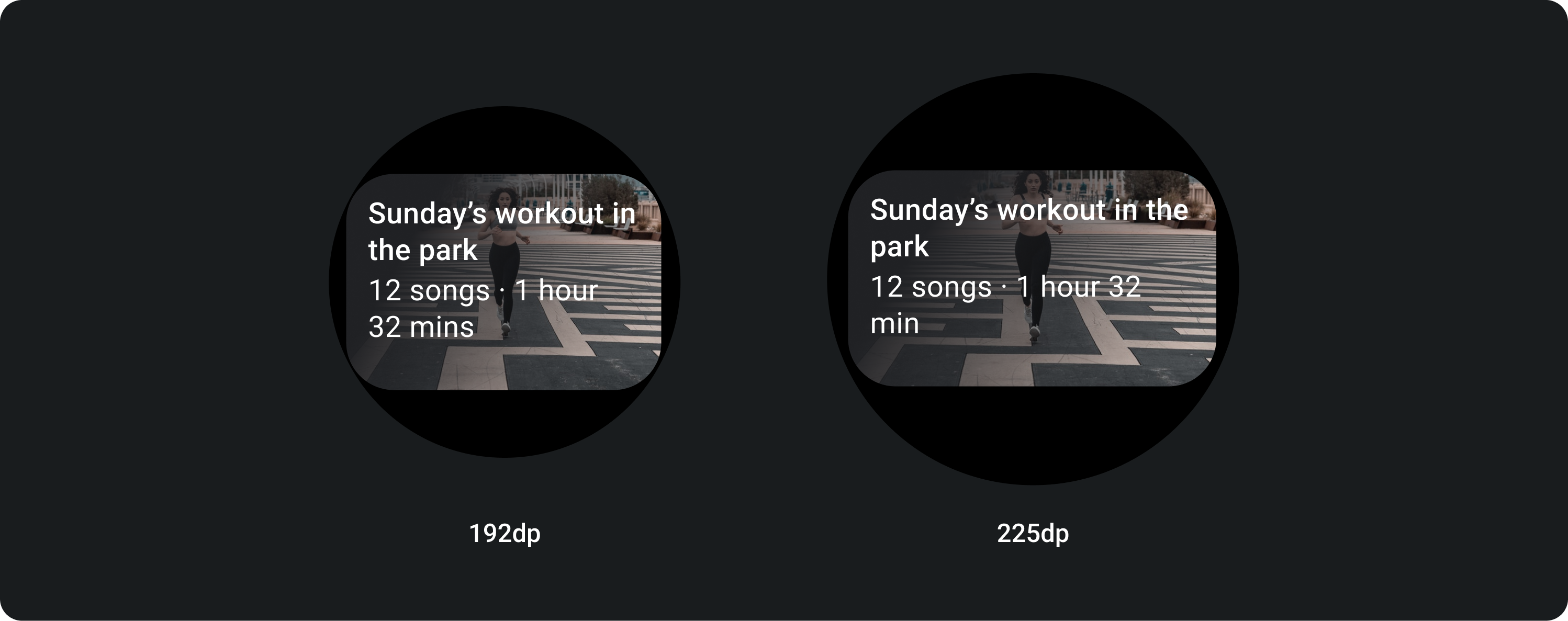
Pada layar yang lebih besar, kami mengizinkan baris teks tambahan untuk teks isi. Untuk menampilkan lebih banyak gambar, tambahkan padding 24 dp yang diperbesar di bagian bawah.

TitleCard dengan gambar sebaris (menggantikan slot teks isi)
Pada layar yang lebih besar, gambar tidak mengubah rasio aspeknya dan memiliki padding di sebelah kanan untuk tidak membuat tinggi kartu terlalu besar.

Kartu dengan penyesuaian tambahan
Kartu dengan latar belakang gambar
Untuk mencapai tata letak ini, Anda perlu penyesuaian.
Kartu gambar menampilkan konten yang terkait dengan satu topik dengan gambar latar. Kartu gambar juga dapat menampilkan gambar mandiri.
Sebaiknya padding bawah ditingkatkan hingga 24 dp untuk menampilkan lebih banyak gambar latar tanpa teks di atasnya.

Konten dan contoh kode di halaman ini tunduk kepada lisensi yang dijelaskan dalam Lisensi Konten. Java dan OpenJDK adalah merek dagang atau merek dagang terdaftar dari Oracle dan/atau afiliasinya.
Terakhir diperbarui pada 2025-07-27 UTC.
[null,null,["Terakhir diperbarui pada 2025-07-27 UTC."],[],[],null,["# Cards\n\nThe [Card](/reference/kotlin/androidx/wear/compose/material/package-summary#Card(kotlin.Function0,androidx.compose.ui.Modifier,androidx.compose.ui.graphics.painter.Painter,androidx.compose.ui.graphics.Color,kotlin.Boolean,androidx.compose.foundation.layout.PaddingValues,androidx.compose.ui.graphics.Shape,androidx.compose.foundation.interaction.MutableInteractionSource,androidx.compose.ui.semantics.Role,kotlin.Function1)) component contains content and actions about a single subject.\n\nAnatomy\n-------\n\nA card component only has a single slot. Cards can contain icons, images or labels, are customizable.\n\nBy default, cards are rectangular with rounded corners and a gradient background. Set the maximum height of your card to 60% to ensure that it's fully displayed on the screen because circular displays can clip up to 20% of the top and bottom of the screen.\n\n\u003cbr /\u003e\n\n\u003cbr /\u003e\n\n**Title Card**\n\nUse [Title cards](/reference/kotlin/androidx/wear/compose/material/package-summary#TitleCard(kotlin.Function0,kotlin.Function1,androidx.compose.ui.Modifier,kotlin.Boolean,kotlin.Function1,androidx.compose.ui.graphics.painter.Painter,androidx.compose.ui.graphics.Color,androidx.compose.ui.graphics.Color,androidx.compose.ui.graphics.Color,kotlin.Function1)) to show information within an application, such as a message. Title cards have a three-slot layout which includes a title, an optional time field, and the relevant content, which is either an image or text. \n**App Card**\n\nUse [App cards](/reference/kotlin/androidx/wear/compose/material/package-summary#AppCard(kotlin.Function0,kotlin.Function1,kotlin.Function1,kotlin.Function1,androidx.compose.ui.Modifier,kotlin.Boolean,kotlin.Function1,androidx.compose.ui.graphics.painter.Painter,androidx.compose.ui.graphics.Color,androidx.compose.ui.graphics.Color,androidx.compose.ui.graphics.Color,androidx.compose.ui.graphics.Color,kotlin.Function1)) to show interactive elements from multiple applications. App cards have a five-slot layout that includes an application icon, the application name, the time that the activity occurred, a title of some sort and the relevant content, which is either an image or text.\n\n\u003cbr /\u003e\n\n\u003cbr /\u003e\n\nCards gradient\n--------------\n\n**Card Gradient**\n\nTop/Left + 68dp padding from Left = 100% Surface \n\nBottom/Right = 0% Surface\n\n\u003cbr /\u003e\n\n\u003cbr /\u003e\n\n**Image Card Overlay**\n\nTop/Left + 56 dp padding from T/L = 100% Surface \n\nBottom/Right + 24 dp padding from B/R = 0% Surface \n\n(Gradient overlays on a image background)\n\n\u003cbr /\u003e\n\n\u003cbr /\u003e\n\nSizes\n-----\n\n**Card width**\n\nCards default to the maximum width of the container.\n\n\u003cbr /\u003e\n\n**Card height**\n\n\u003cbr /\u003e\n\nCard height is flexible. It is determined by the components' content.\n\nOn round watch faces, cards that are taller than 60% of the height of the screens are clipped.\n\n\u003cbr /\u003e\n\n\u003cbr /\u003e\n\nUsage\n-----\n\nAdaptive layouts\n----------------\n\n**TitleCard**\n\nOn larger screens we allow an extra line of text for body copy. And in order to display more of the image, add an enlarged 24 dp padding at the bottom.\n\n**TitleCard with in-line image (replacing the body copy slot)**\n\nOn larger screens, the image doesn't change its aspect ratio and has the padding on the right in order to not make the height of the card too big.\n\n### Cards with additional customization\n\n**Card with an image background** \nIn order to achieve this layout you will need customization. \n\n\nImage cards display content relating to a single topic with a background image. Image cards can also display standalone images. \n\n\nIt is recommended that the bottom padding is increased to 24 dp in order to display more of the background image without text over it.\n\n\u003cbr /\u003e\n\n\u003cbr /\u003e"]]