对话框
使用集合让一切井井有条
根据您的偏好保存内容并对其进行分类。
使用 Dialog 及时将用户的注意力集中在一项操作或一条信息上。
剖析
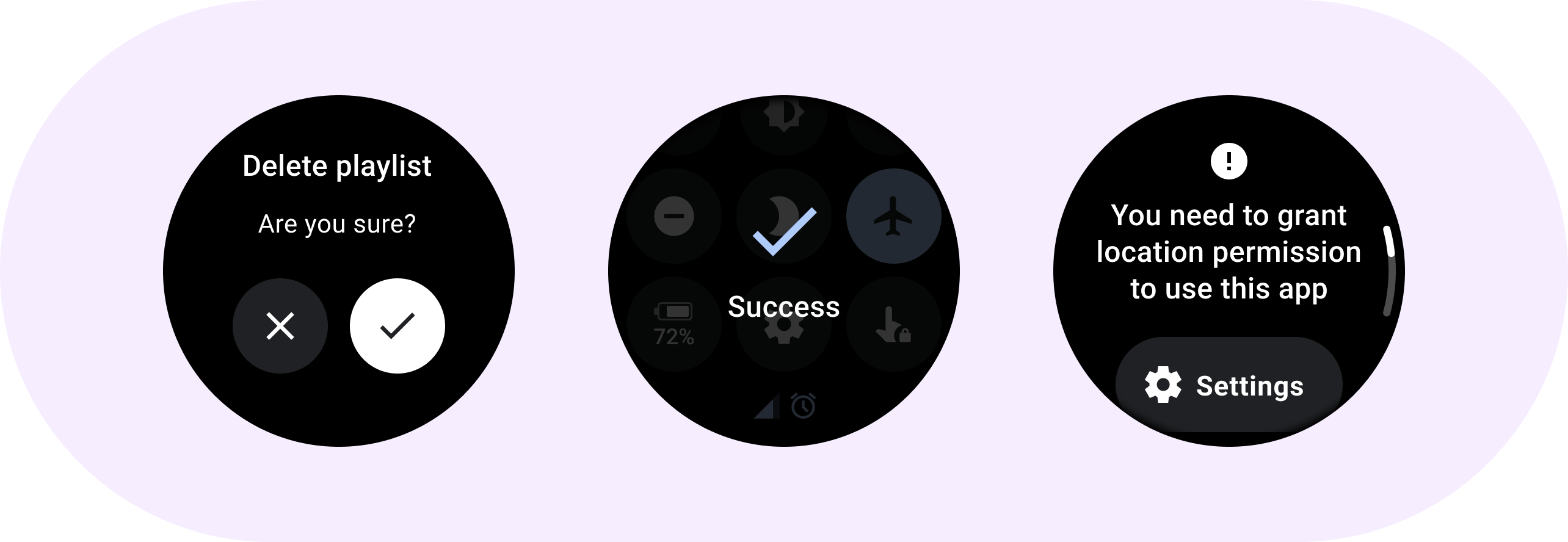
对话框应通过响应提供相关信息或上下文信息来响应用户任务或操作。与移动版应用不同,Wear OS 中的对话框会占据整个屏幕,并且与其他内容重叠。
对话框支持滑动关闭手势。当用户执行此滑动手势时,系统会在后台显示父级内容。
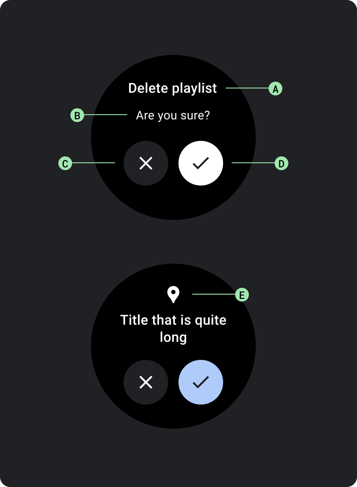
对话框包含一个槽位,用于包含主观对话框内容,例如提醒或确认。
提醒
使用提醒组件获取用户对重要任务的响应。
提醒会停用所有应用功能,并在应用执行操作前一直显示在屏幕上。提醒会强制显示,因此请谨慎使用。
如果提醒的内容超过三行文本,请考虑左对齐内容以提高可读性。否则,文本默认将居中对齐。
A. 标题
B. 内容(可选)
C. 否定按钮
D. 肯定按钮
E. 图标(可选)
确认
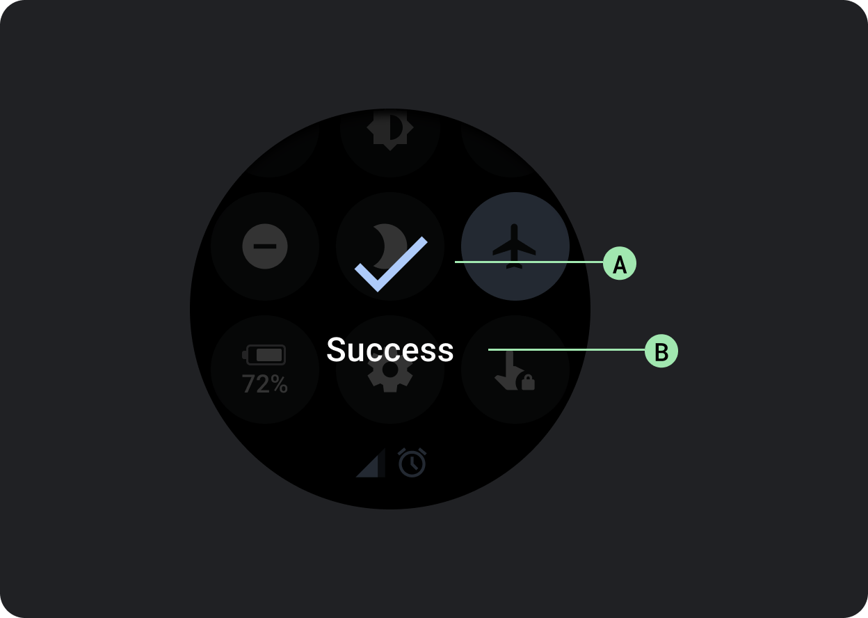
确认组件会在短时间内向用户显示确认消息。与 Material 中的对应组件不同,Wear OS 中的确认组件不允许用户提供最终的确认选择。
该组件用于在执行操作后吸引用户的注意力。
A. 图标
B. 标签
本页面上的内容和代码示例受内容许可部分所述许可的限制。Java 和 OpenJDK 是 Oracle 和/或其关联公司的注册商标。
最后更新时间 (UTC):2025-07-27。
[null,null,["最后更新时间 (UTC):2025-07-27。"],[],[],null,["# Dialogs\n\nUse a [`Dialog`](/reference/kotlin/androidx/wear/compose/material/dialog/package-summary) to focus users' attention on a timely action or piece of\ninformation.\n\nAnatomy\n-------\n\n\nDialogs should appear in response to a user task or an action, with\nrelevant or contextual information. Unlike their mobile counterparts,\nDialogs in Wear OS occupy the whole screen and are layered over other\ncontent.\n\n\nDialogs support a swipe-to-dismiss gesture. When the user performs\nthis swipe gesture, the system reveals the parent content in the\nbackground.\n\nDialogs have a single slot for opinionated dialog content, such as an\n[Alert](/reference/kotlin/androidx/wear/compose/material/dialog/package-summary#Alert(kotlin.Function1,kotlin.Function0,kotlin.Function0,androidx.compose.ui.Modifier,kotlin.Function1,androidx.wear.compose.material.ScalingLazyListState,androidx.compose.ui.graphics.Color,androidx.compose.ui.graphics.Color,androidx.compose.ui.graphics.Color,androidx.compose.ui.graphics.Color,androidx.compose.foundation.layout.Arrangement.Vertical,androidx.compose.foundation.layout.PaddingValues,kotlin.Function1)) or\n[Confirmation](/reference/kotlin/androidx/wear/compose/material/dialog/package-summary#Confirmation(kotlin.Function0,androidx.compose.ui.Modifier,kotlin.Function1,androidx.wear.compose.material.ScalingLazyListState,kotlin.Long,androidx.compose.ui.graphics.Color,androidx.compose.ui.graphics.Color,androidx.compose.ui.graphics.Color,androidx.compose.foundation.layout.Arrangement.Vertical,androidx.compose.foundation.layout.PaddingValues,kotlin.Function1)).\n\n\u003cbr /\u003e\n\n\n**Alert**\n\nUse an alert component to get the user's response for important\ntasks.\n\nAlerts disable all app functionality when they appear, and remain on\nscreen until an action has been taken. Alerts are purposefully interruptive,\nso use them sparingly.\n\nIf the content of the alert is longer than three lines of text, consider\nleft aligning the content to improve its readability. Otherwise the text\nis center aligned by default.\n\n\n**A. Title\nB. Content (optional)\nC. Negative button\nD. Positive button\nE. Icon (optional)**\n\n\u003cbr /\u003e\n\n**Confirmation**\n\nThe confirmation component displays a confirmation message to the user\nfor a short period of time. Unlike its Material counterpart, the\nconfirmation component in Wear OS doesn't allow users to provide final\nconfirmation of a choice.\n\nUse this component to capture a user's attention after an action has been\nexecuted.\n\n\n**A. Icon\nB. Label**"]]
