
Picker membantu pengguna memilih dan menetapkan data tertentu.
Alat pilih
Alat pilih harus digunakan untuk memungkinkan pengguna memilih di antara sejumlah item yang terbatas.
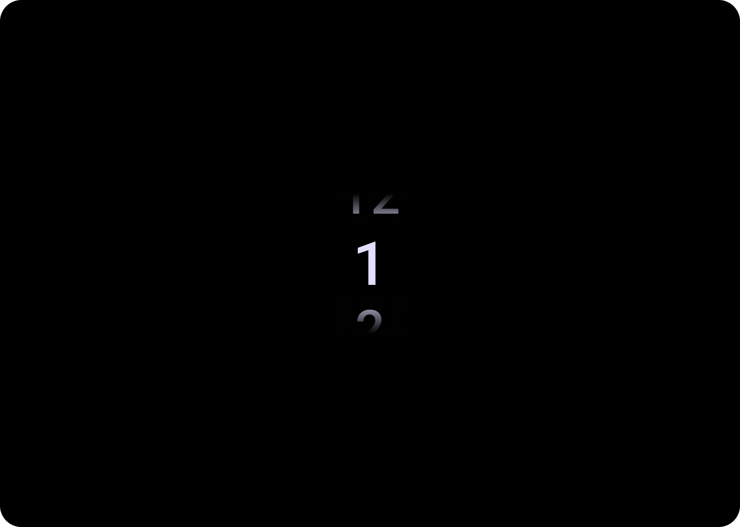
Secara default, item akan diulang tanpa batas di kedua arah. Pertimbangkan untuk menonaktifkan perilaku ini jika urutan dalam daftar penting, atau untuk memungkinkan pengguna mencapai elemen pertama dan terakhir dengan geser cepat.
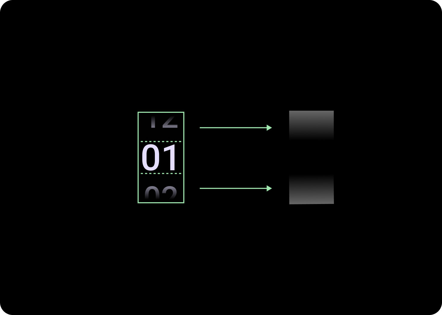
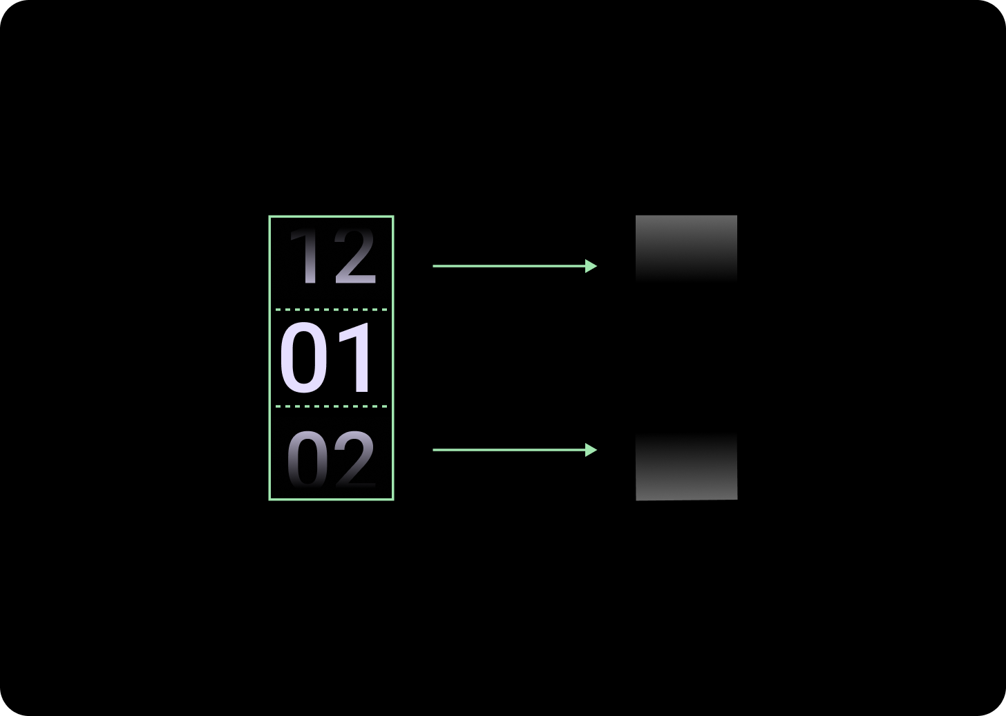
Anatomi
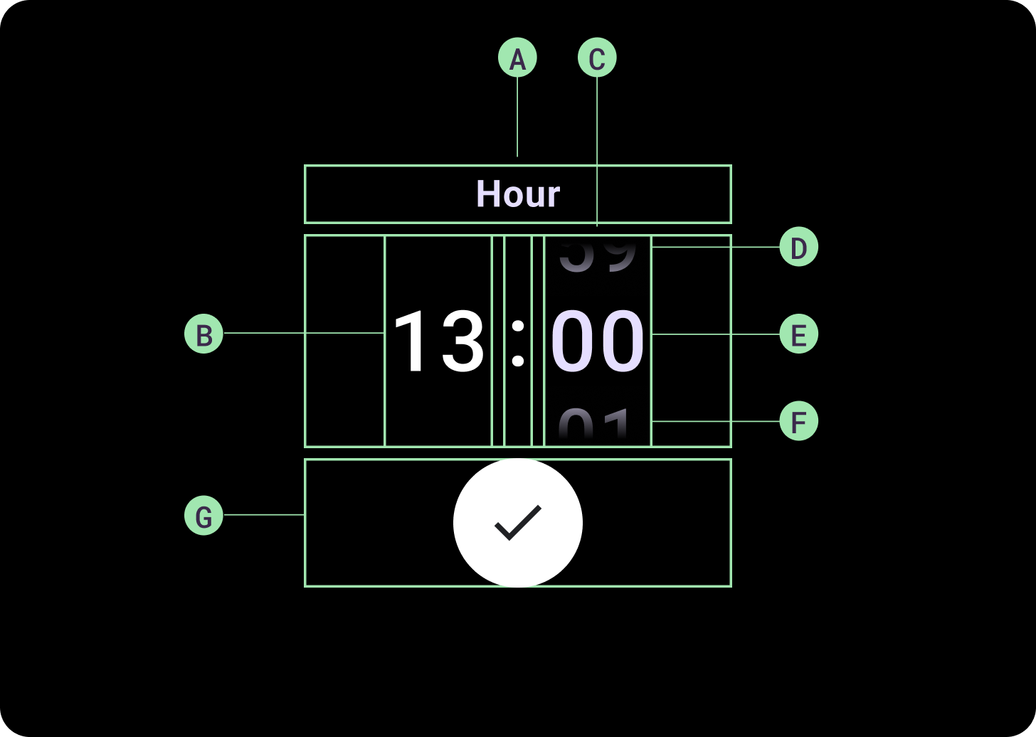
Anatomi
A. Kolom Tidak Aktif
B. Pemisah Titik Dua
C. Kolom Pemilih
D. Konten Populer
E. Konten Tengah
F. Konten Bawah
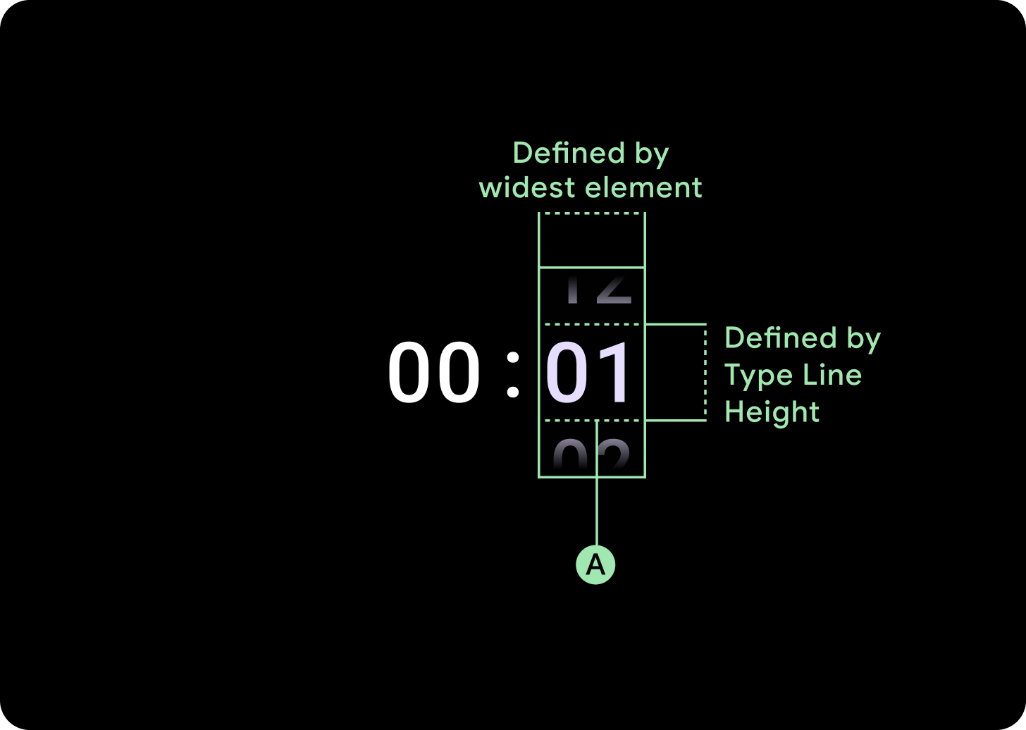
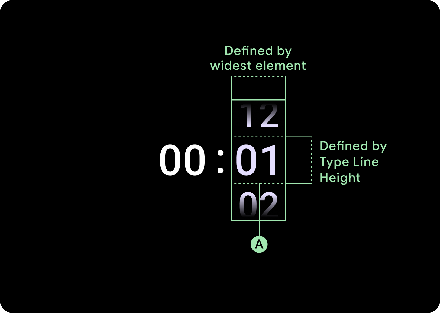
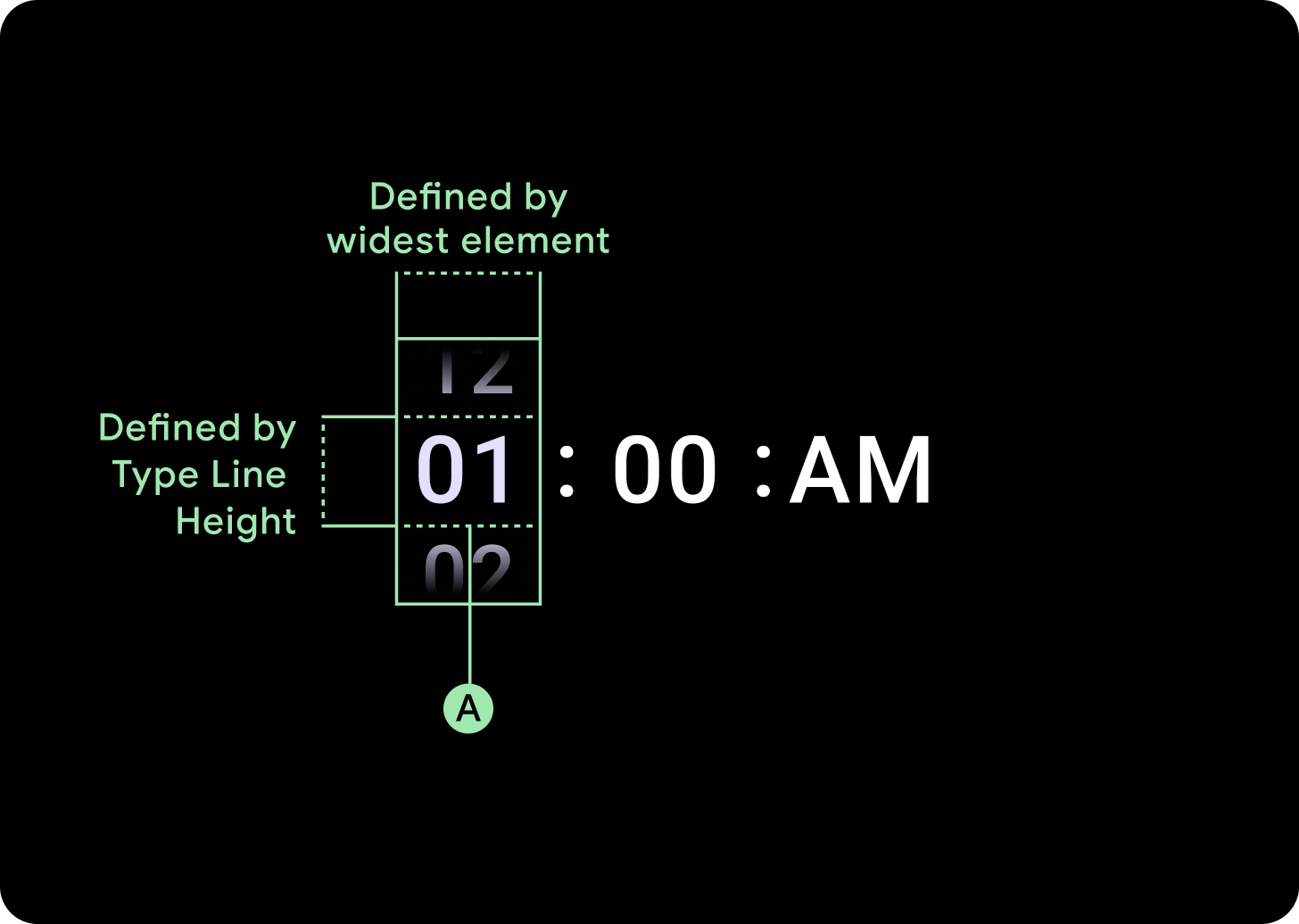
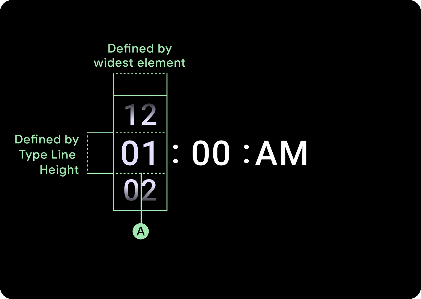
Lebar dan tinggi
Grup Pemilih mengisi tinggi dan lebar yang tersedia. Ada empat opsi tata letak untuk kolom pemilih. Setiap tata letak dipusatkan dan mengisi tinggi yang tersedia. Lebar kolom ditentukan oleh lebar yang diperlukan untuk mengakomodasi jumlah digit yang diperlukan dalam font. Pemilih tanggal adalah pengecualian, secara horizontal mengisi layar dan melampaui tepi.
Misalnya, angka akan menghitung lebar '00', lalu menetapkan lebar. Untuk kolom teks, misalnya kolom bulan, akan dihitung sebagai lebar 'MMM' (yang merupakan huruf terluas dalam alfabet latin). Oleh karena itu, lebar dan tinggi (yaitu tinggi baris gaya huruf yang digunakan) akan terpengaruh oleh font yang digunakan.
Ukuran item pemilih bervariasi di seluruh titik henti sementara.
Penggunaan
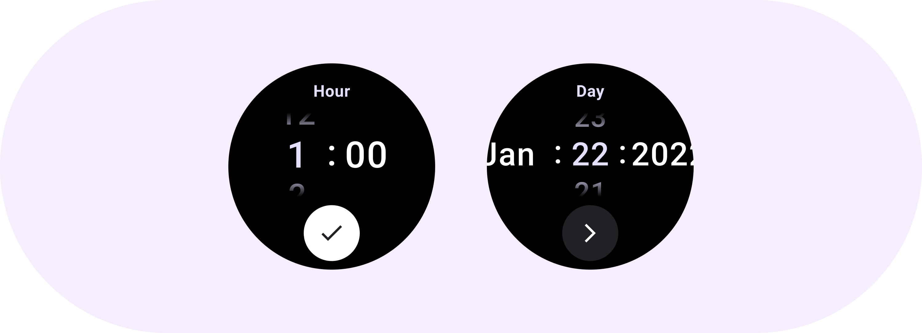
Lihat contoh Pemilih Tanggal dan Waktu berikut
Untuk implementasi alat pilih tanggal dan waktu bawaan, lihat Library Horologis di GitHub.
Jika Anda ingin membuat pengalaman serupa, dengan pengguna memilih nilai multi-bagian di beberapa pemilih, gunakan komponen PickerGroup bawaan. Objek ini menggunakan objek koordinator fokus untuk menetapkan fokus ke elemen Pemilih yang benar.
Tata letak adaptif
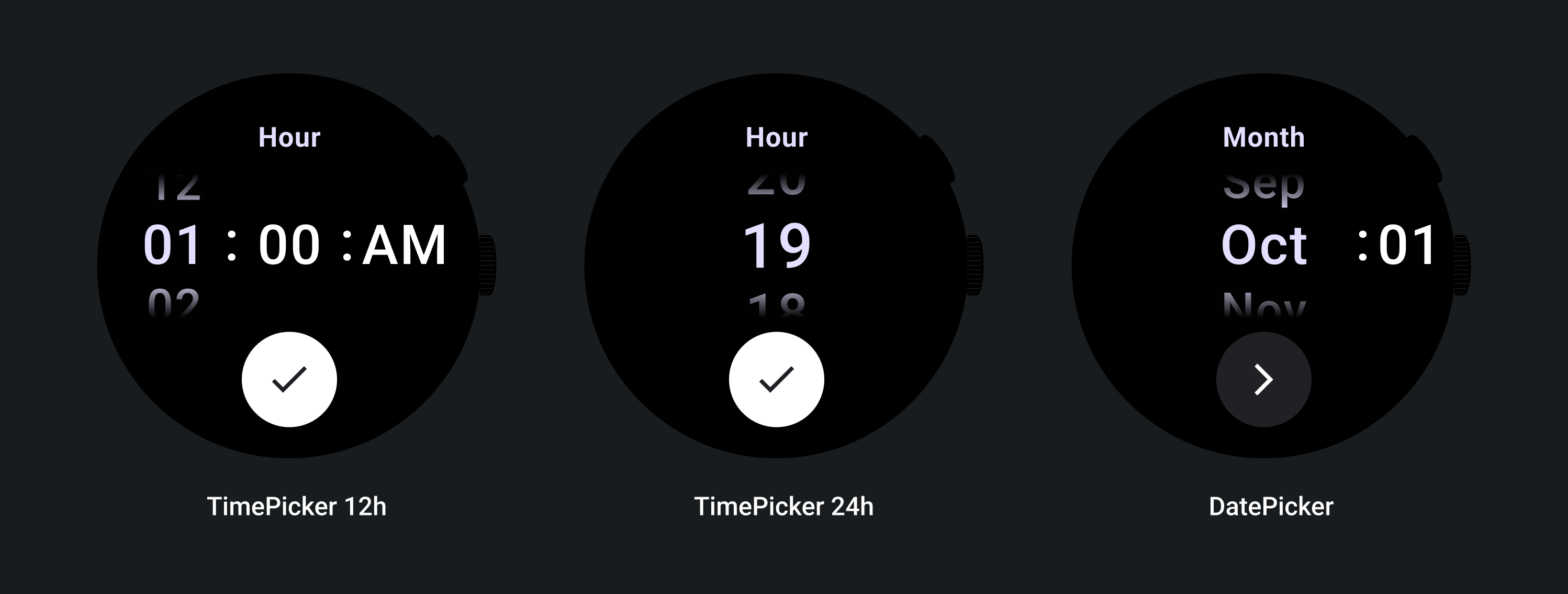
TimePicker 24H
TimePicker 12H
Date Picker
Perilaku responsif
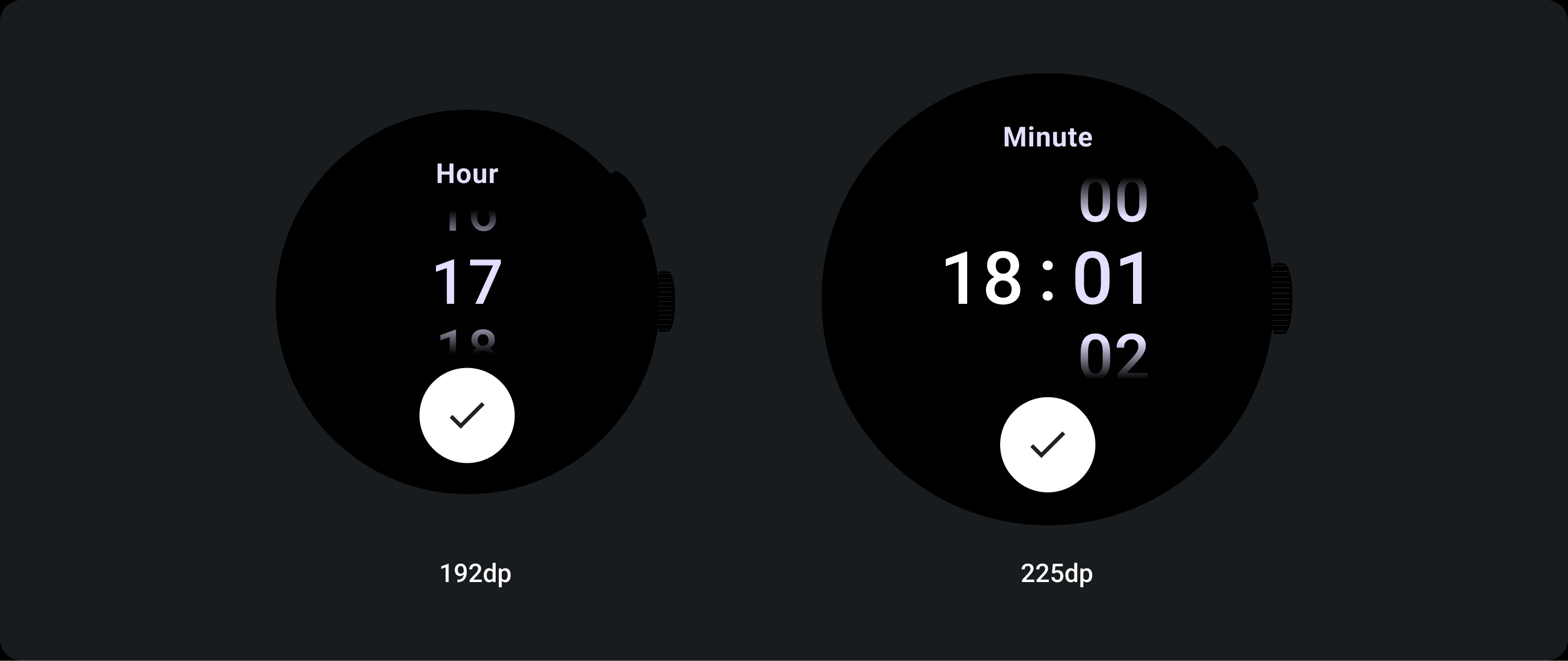
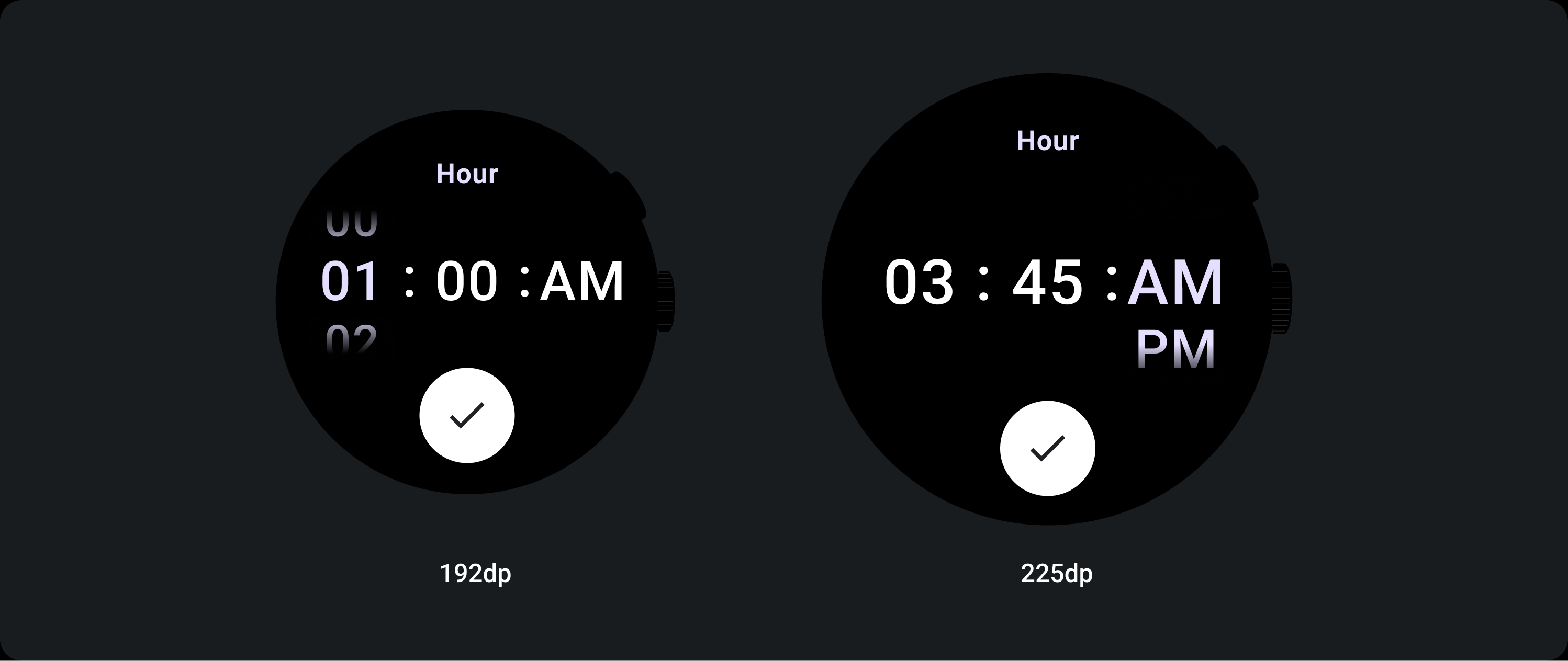
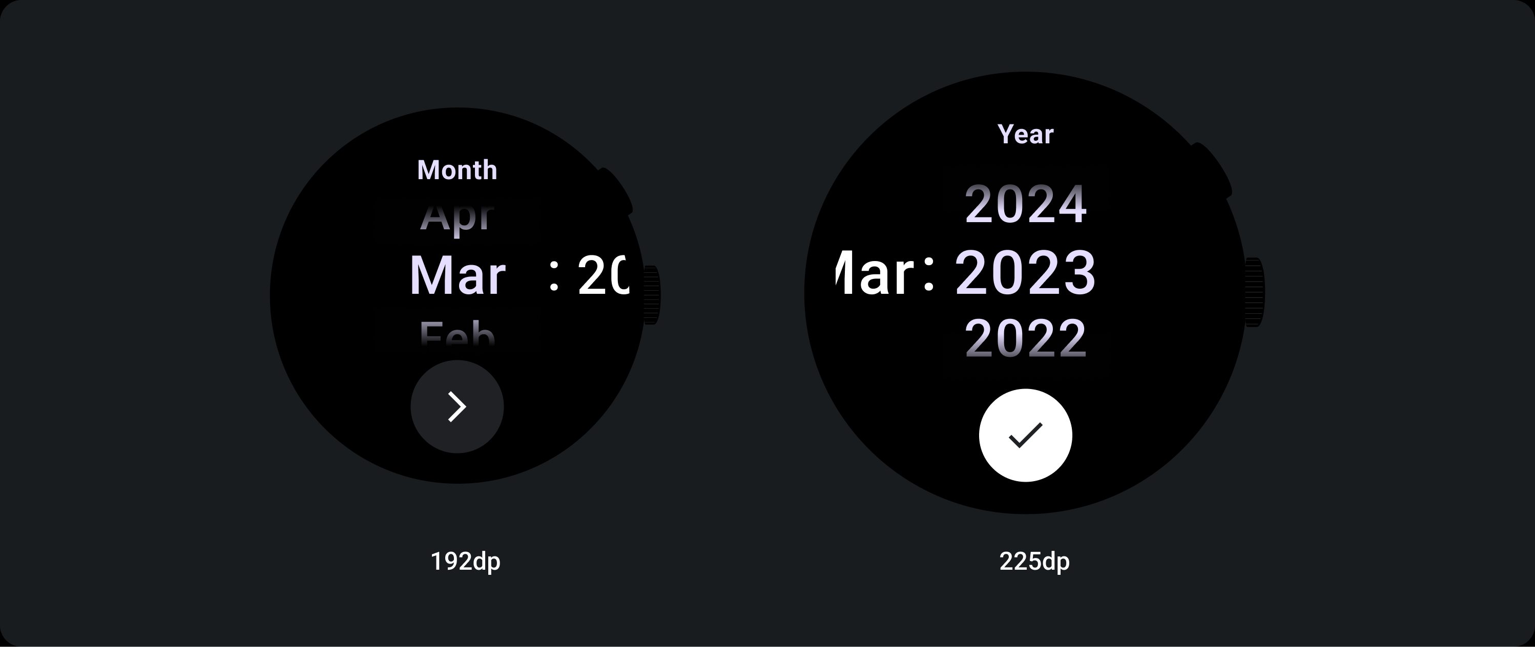
Peningkatan ukuran teks
Setelah Titik Pembatas 225+, ukuran font elemen Pemilih akan berubah. Salinan Atas dan Bawah dalam kolom scroll lambat disesuaikan (A), begitu juga dengan Salinan Tengah. Berikut beberapa contohnya:
Tata letak dua kolom
Di bawah titik henti sementara 225 dp
Font: Display 2
Titik henti sementara di atas 225 dp
Font: Display 1
Tata letak tiga kolom
Di bawah titik henti sementara 225 dp
Font: Tampilan 3
Di atas titik henti sementara 225 dp
Font: Display 2
Peningkatan ukuran gradien
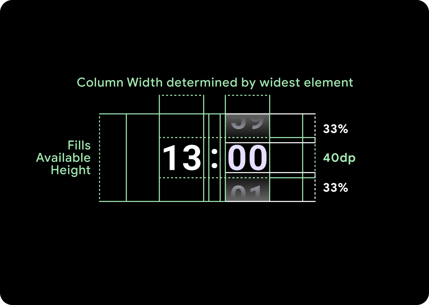
Gradien pada kolom Pemilih ditentukan tingginya berdasarkan ruang yang tersedia. Gradien Atas dan Bawah ditetapkan pada sepertiga (33%) dari tinggi yang tersedia. Artinya, pada setiap ukuran layar yang tersedia, gradien akan diskalakan secara proporsional. Berada di luar tata letak kolom.
Di bawah titik henti sementara 225 dp
Ukuran: 33% dari tinggi kolom
Di atas titik henti sementara 225 dp
Ukuran: 33% dari tinggi kolom
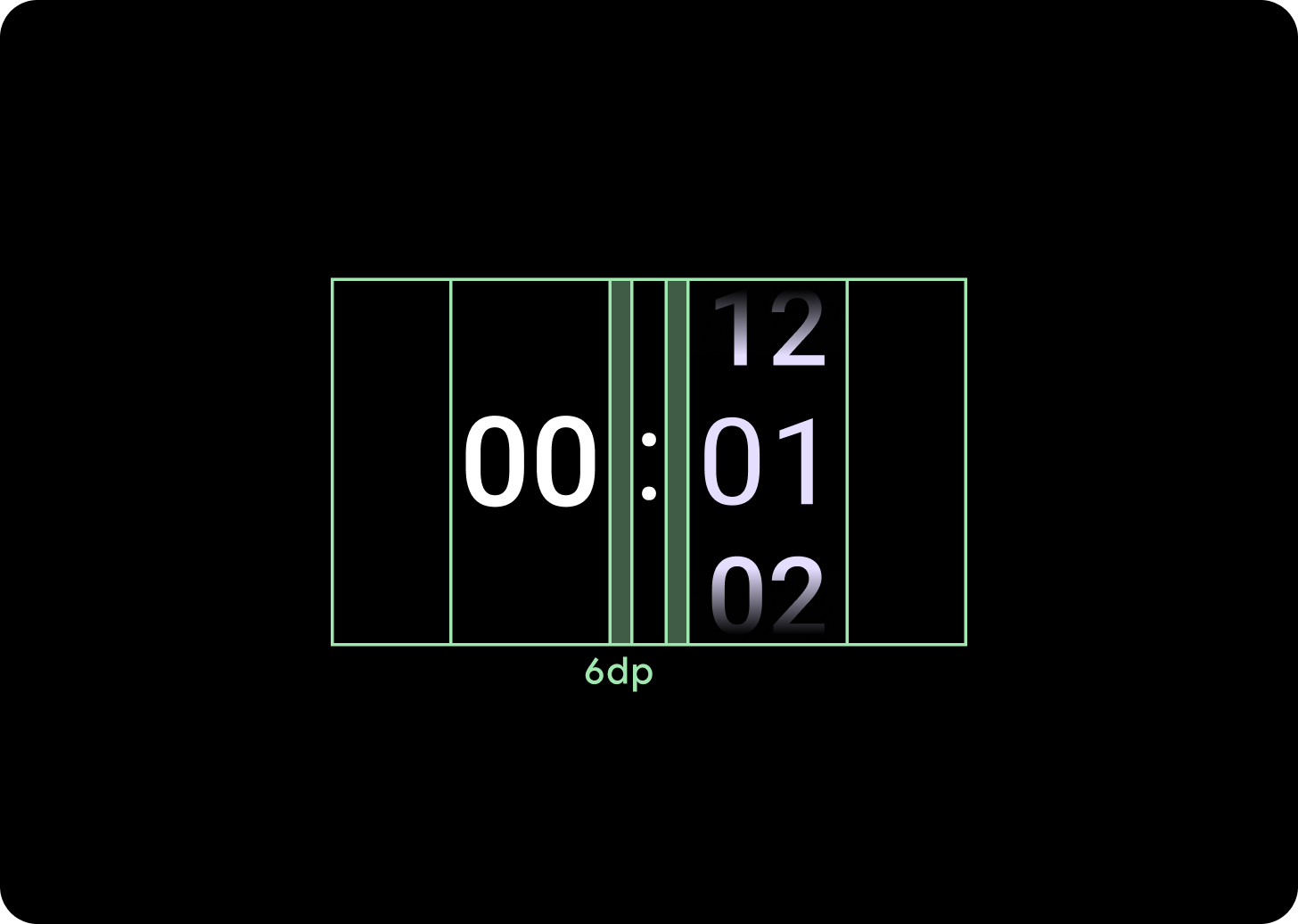
Penambahan jarak kolom
Spasi kolom diskalakan setelah 225+ Titik Henti Sementara, baik dimulai dari 2 dp atau 4 dp dan bertambah menjadi 6 dp. Hal ini bergantung pada tata letak yang Anda pilih; tata letak 2 atau 3 kolom
Tata letak dua kolom
Di bawah titik henti sementara 225 dp
Jarak kolom 4 dp
Di atas titik henti sementara 225 dp
Jarak kolom 6 dp
Tata letak tiga kolom
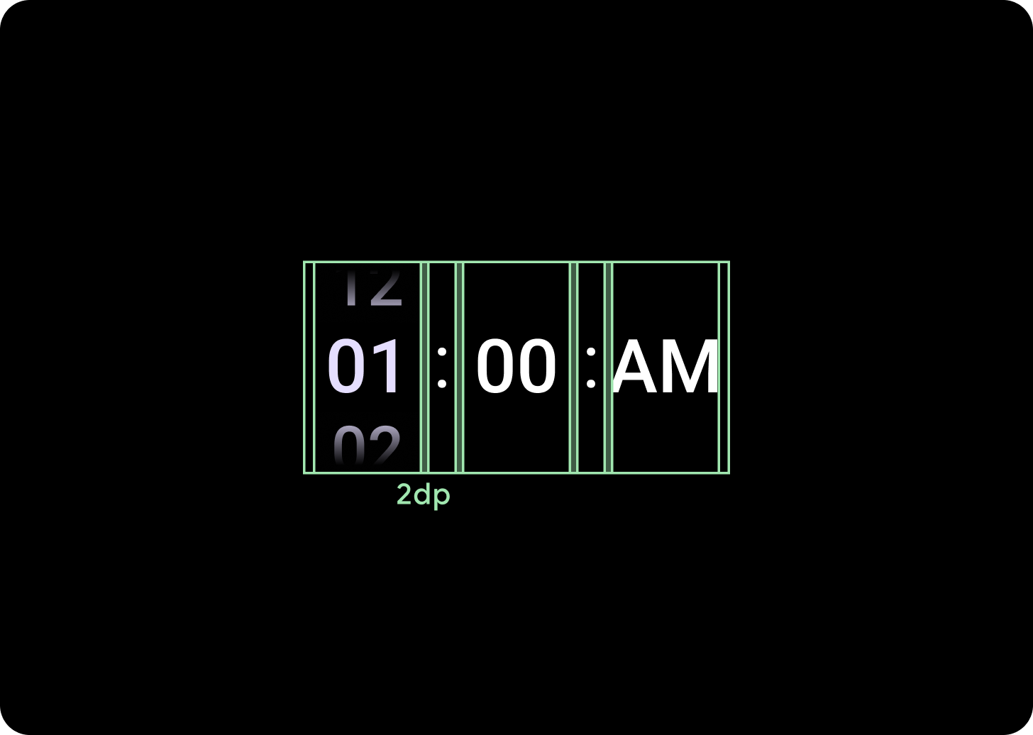
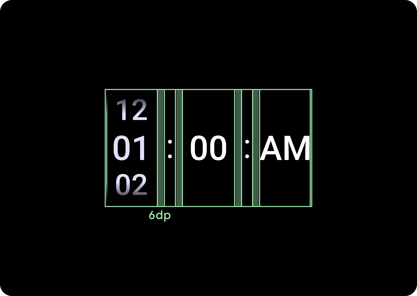
Di bawah titik henti sementara 225 dp
Jarak kolom 2 dp
Di atas titik henti sementara 225 dp
Jarak kolom 6 dp