
选择器可帮助用户选择和设置特定数据。
选择器
选择器应用于让用户从有限数量的项中进行选择。
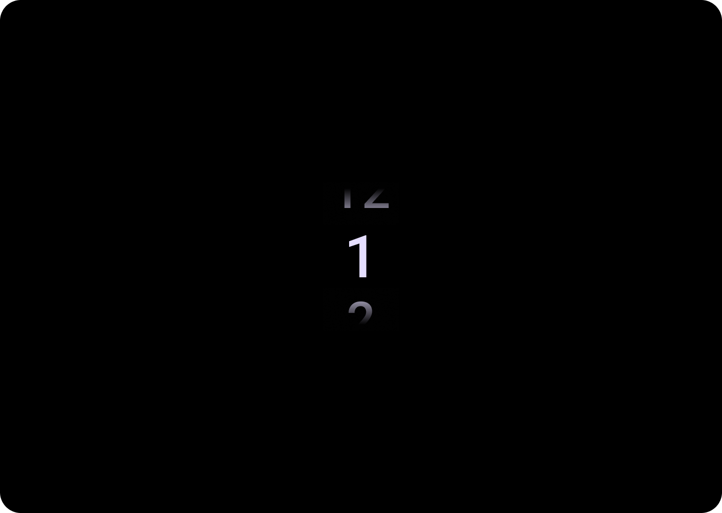
默认情况下,项会在两个方向上无限循环。如果列表顺序很重要,请考虑停用此行为;或者,允许用户通过快速滑动访问第一个和最后一个元素。
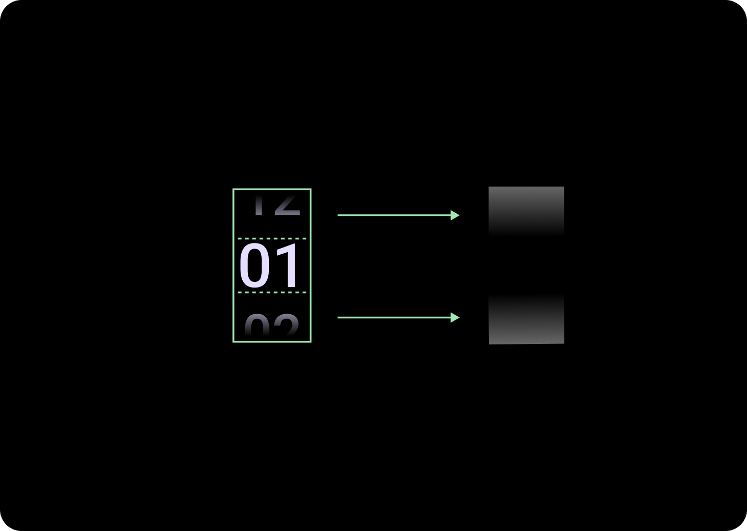
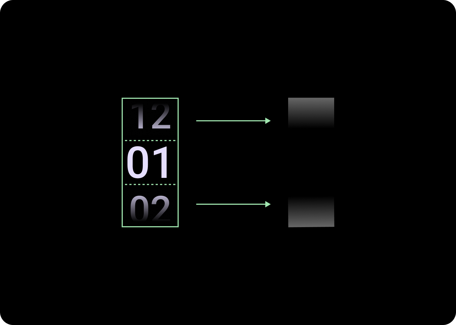
解剖学
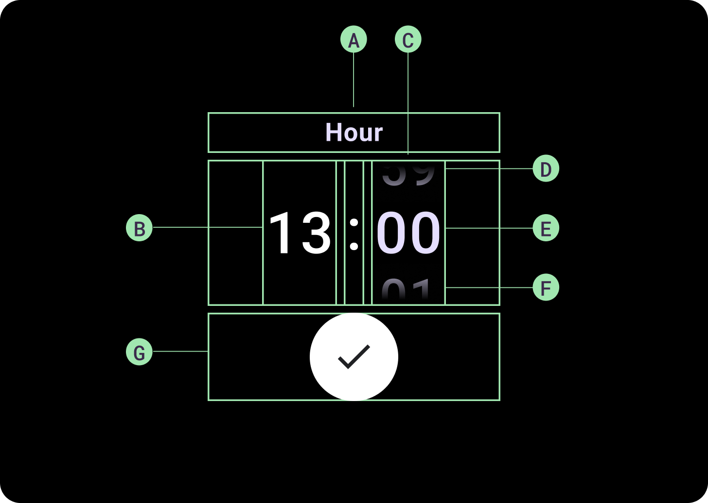
解剖
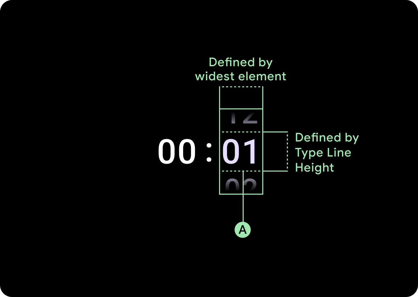
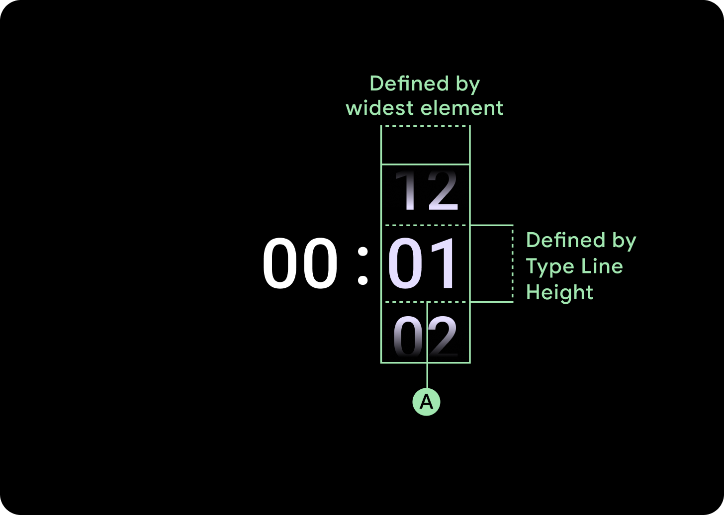
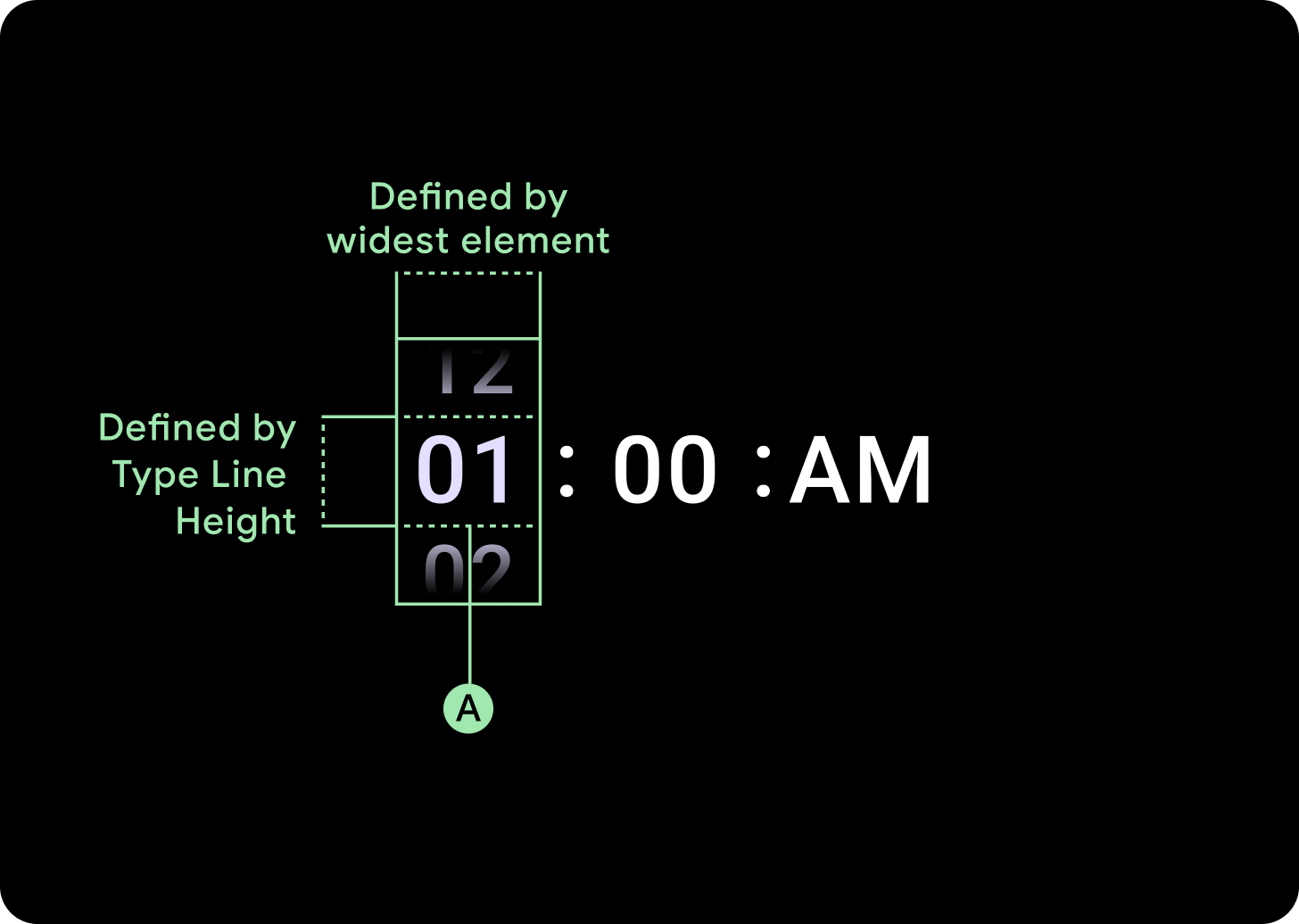
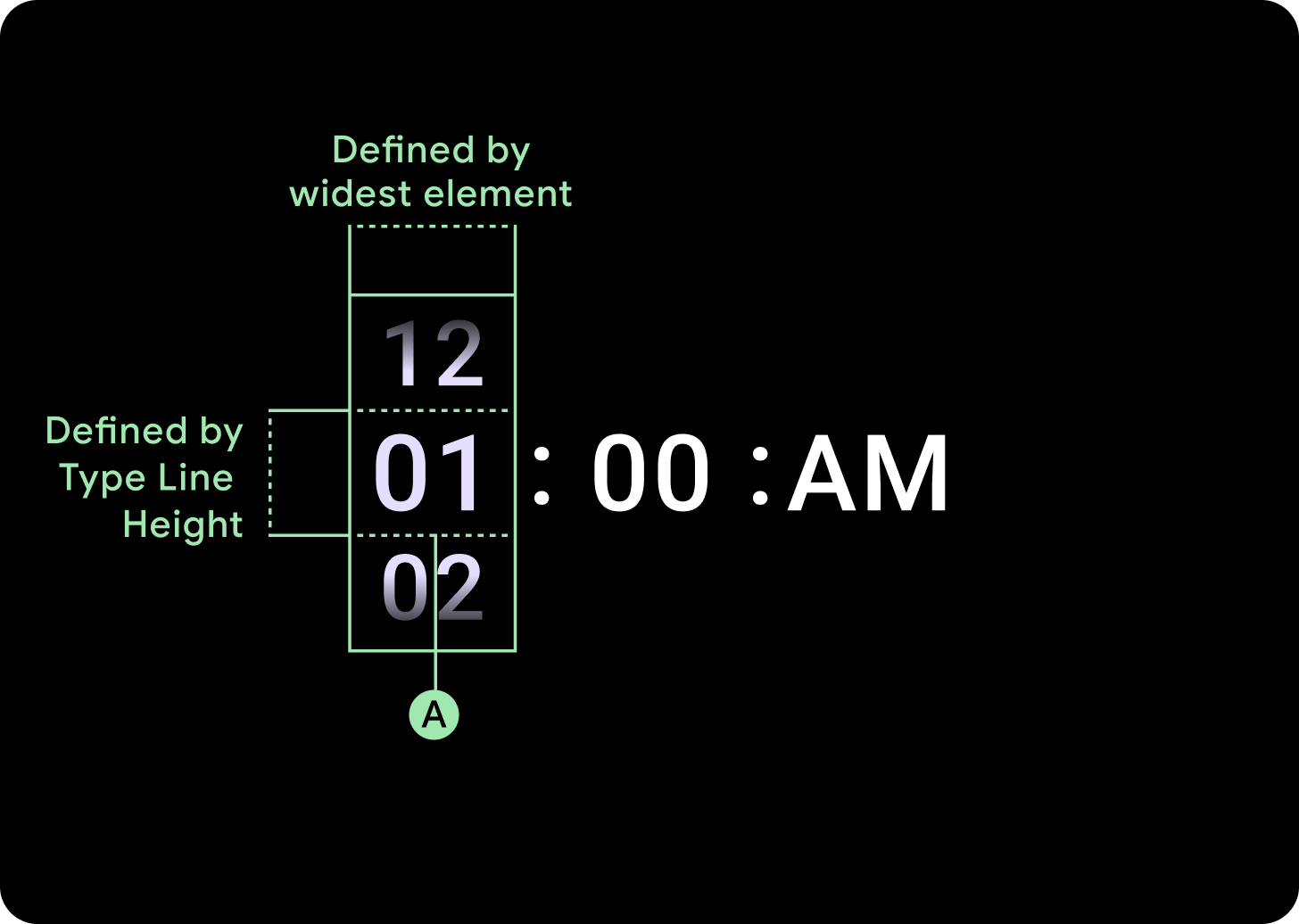
A. 非活动列
B. 冒号分隔符
C. 选择器列
D. 热门内容
E. 中间内容
F. 底部内容
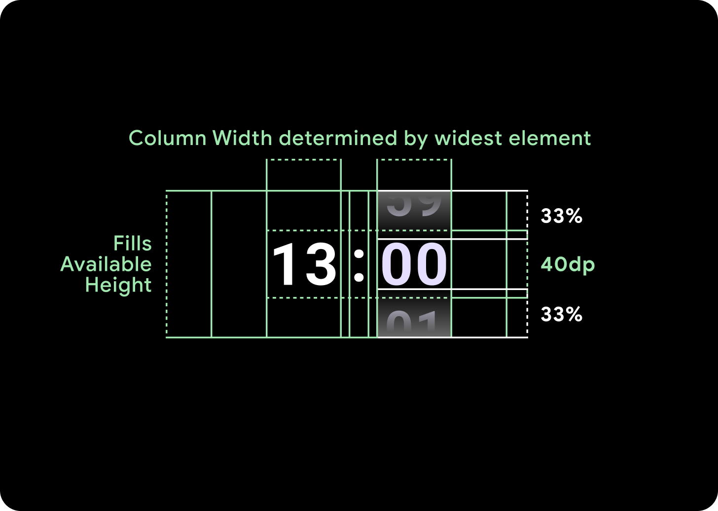
宽度和高度
选择器组会填充可用的高度和宽度。选择器列有四种布局选项。每个布局都居中显示,并填充可用高度。列宽由字体中所需数字数量所需的宽度定义,日期选择器是例外,它会水平填满屏幕并超出边缘。
例如,数字会计算“00”的宽度,然后设置宽度。对于文本字段(例如月份字段),宽度将计算为“MMM”(拉丁字母中最宽的字母)的宽度。因此,宽度和高度(即所用字体样式的行高)将受到所用字体的制约。
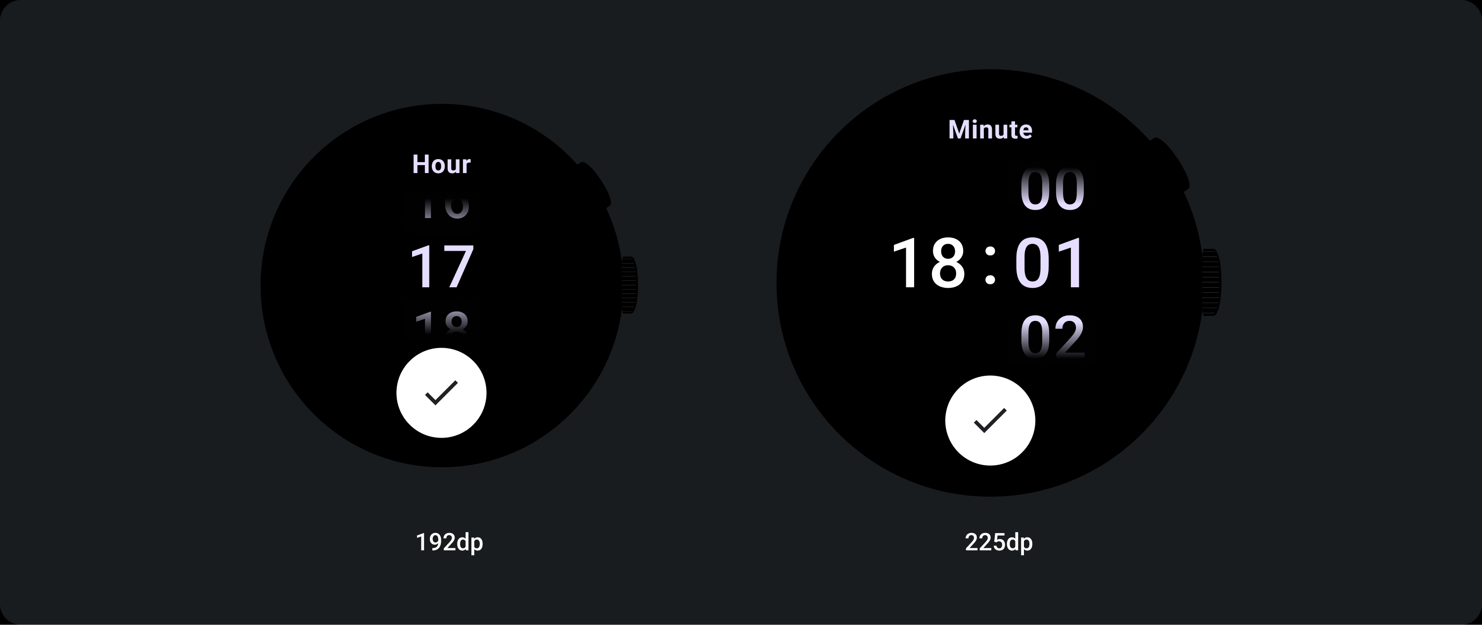
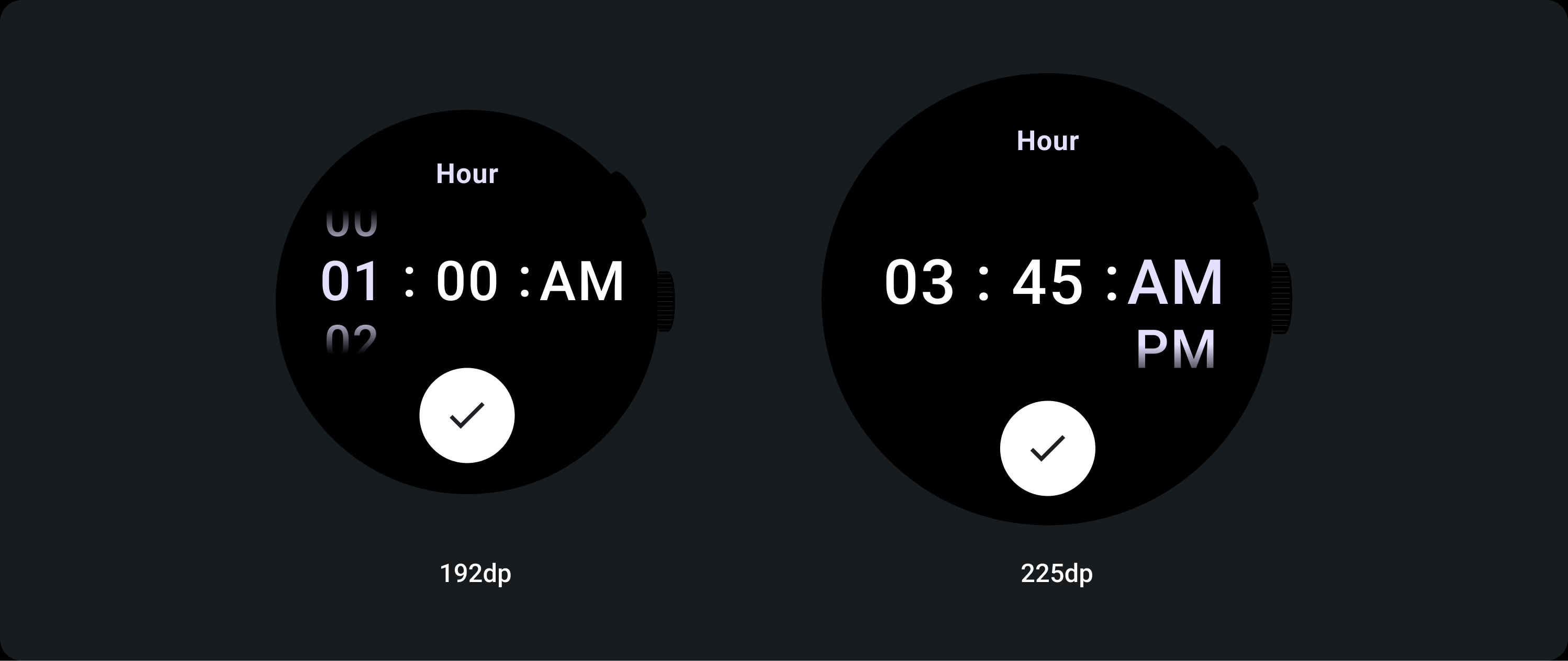
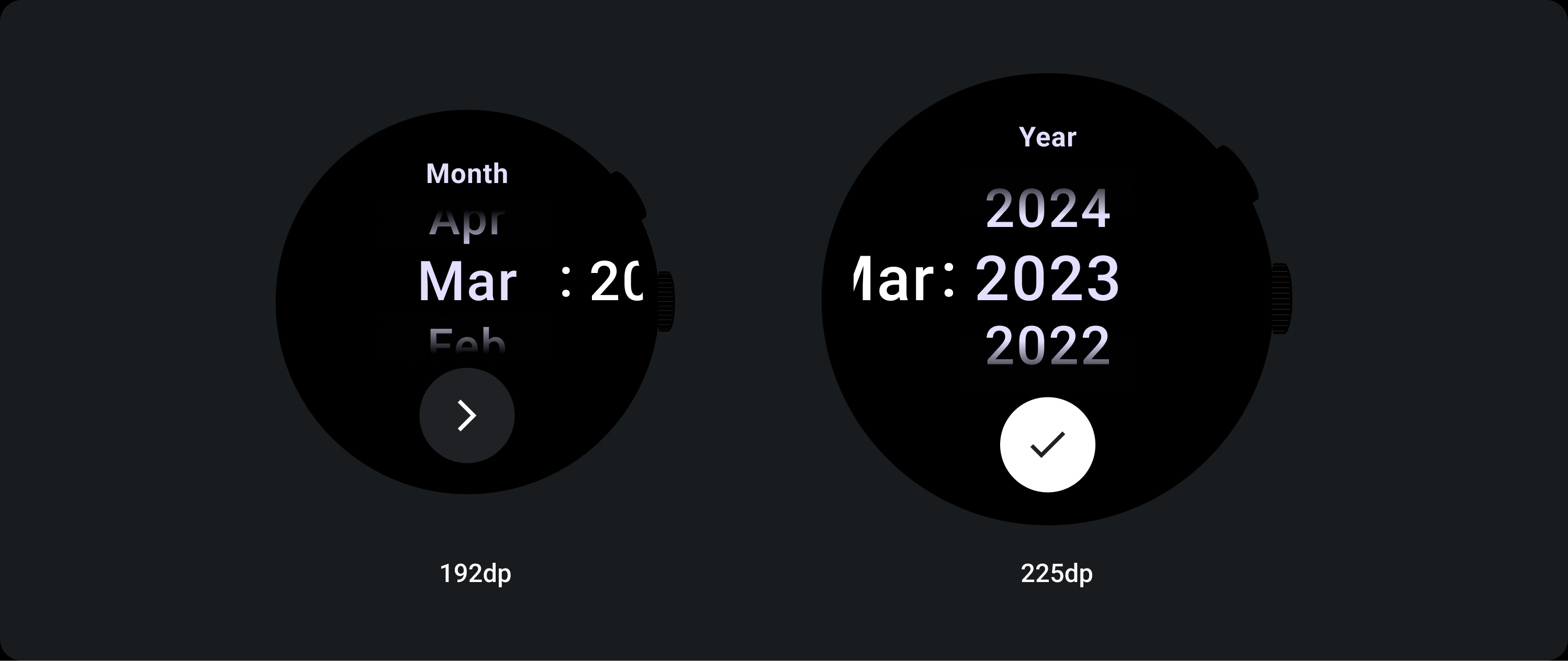
选择器项在不同断点上的大小不同。
用法
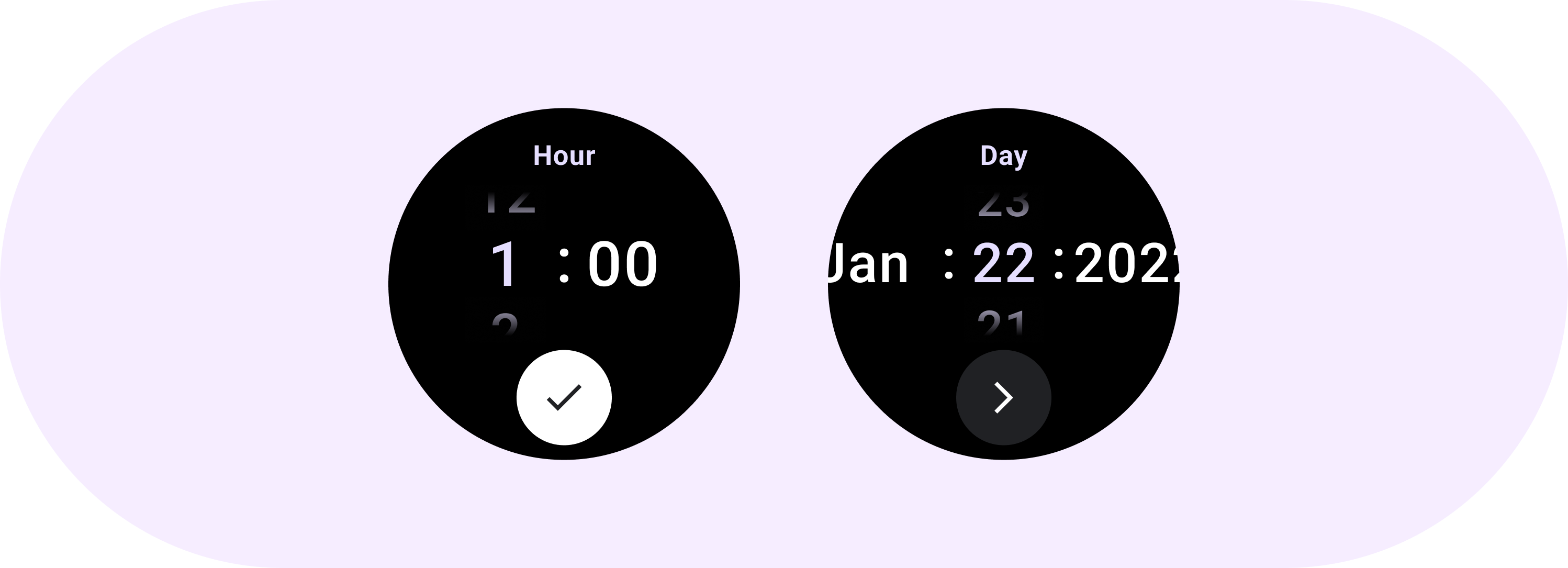
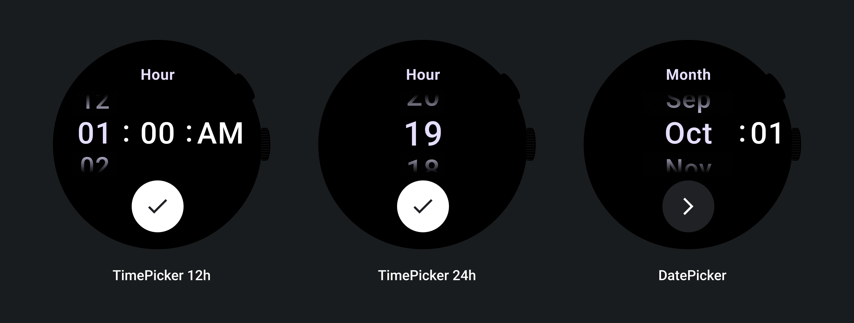
请参阅以下日期和时间选择器示例
如需了解预构建的日期和时间选择器实现,请查看 GitHub 上的 Horologist 库。
如果您想创建类似的体验,让用户从多个选择器中选择一个多部分值,请使用内置的 PickerGroup 组件。此对象使用焦点协调器对象将焦点分配给正确的 Picker 元素。
自适应布局
TimePicker 24 小时制
12 小时制 TimePicker
日期选择器
响应式行为
放大文字大小
超过 225 的断点后,Picker 元素的字号会发生变化。延迟滚动列中的顶部和底部副本会调整(A),中间副本也会调整。以下是一些示例:
两列布局
低于 225 dp 断点
字体:Display 2
高于 225 dp 断点
字体:Display 1
三列布局
低于 225 dp 断点
字体:Display 3
高于 225dp 断点
字体:Display 2
渐变大小增加
选择器列上的渐变高度由可用空间定义。顶部和底部渐变均设置为可用高度的三分之一 (33%)。这意味着,在每种可用屏幕尺寸下,渐变色都会按比例缩放。独立于列布局。
低于 225 dp 断点
大小:占列高 33%
高于 225dp 断点
大小:占列高 33%
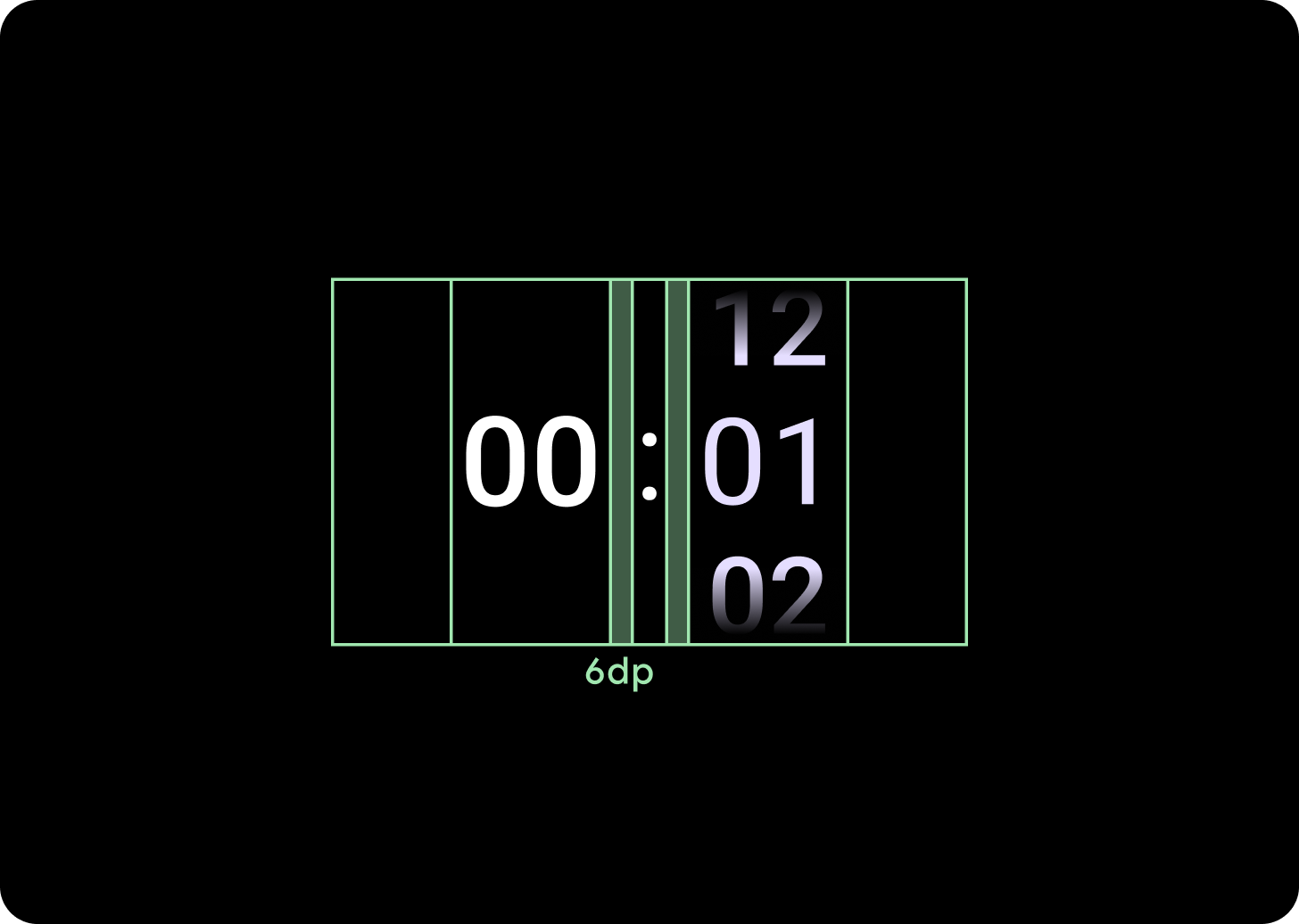
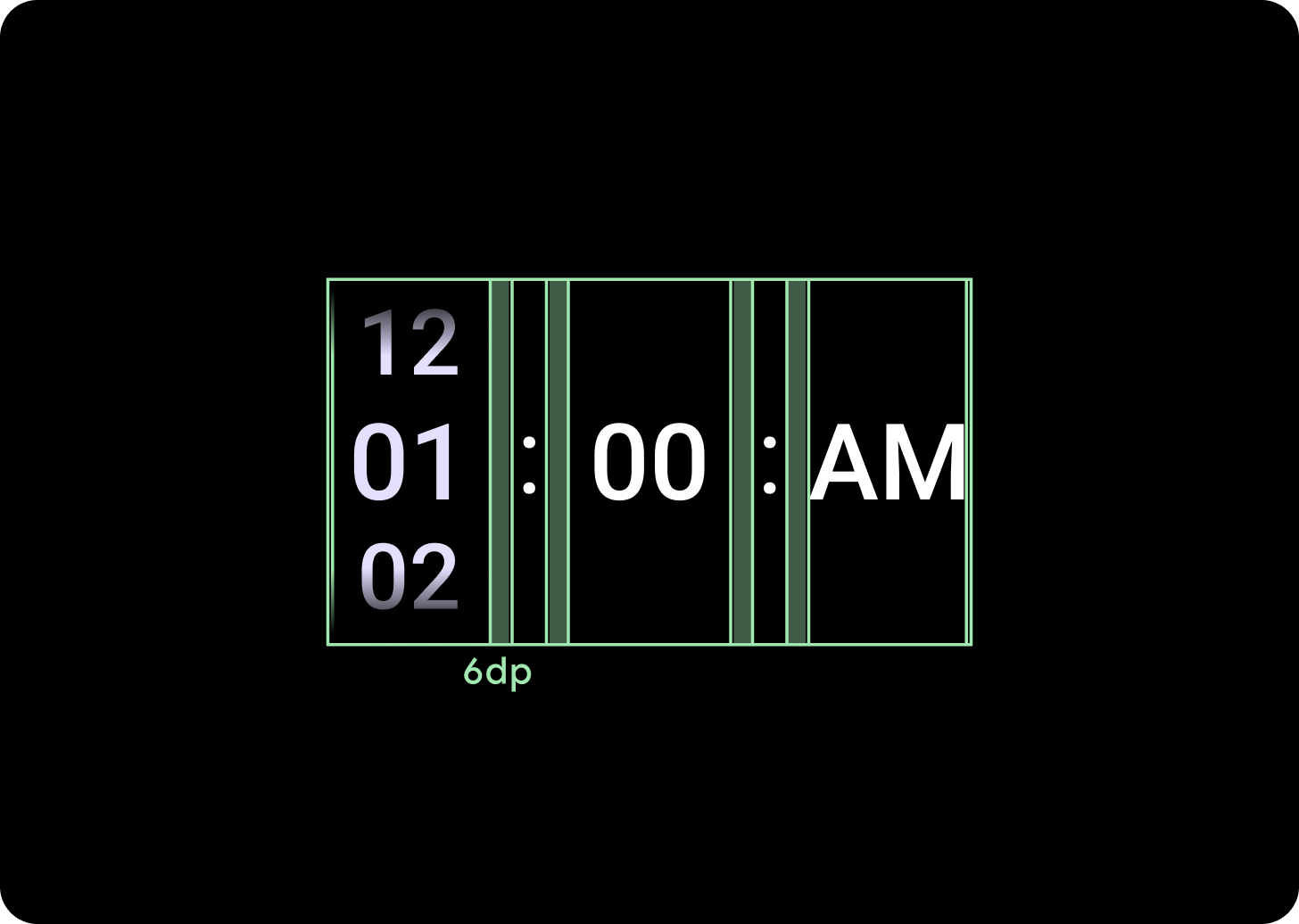
增大列间距
列间距在超过 225+ 断点后会按比例缩放,从 2dp 或 4dp 开始,并增至 6dp。这取决于您选择的布局(2 列或 3 列布局)
两列布局
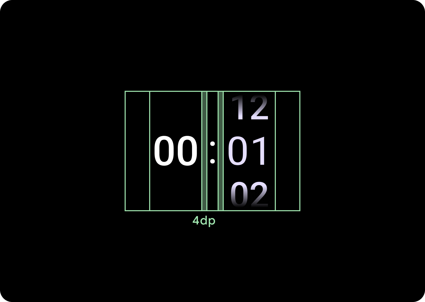
低于 225 dp 断点
4 dp 列间距
高于 225dp 断点
6 dp 列间距
三列布局
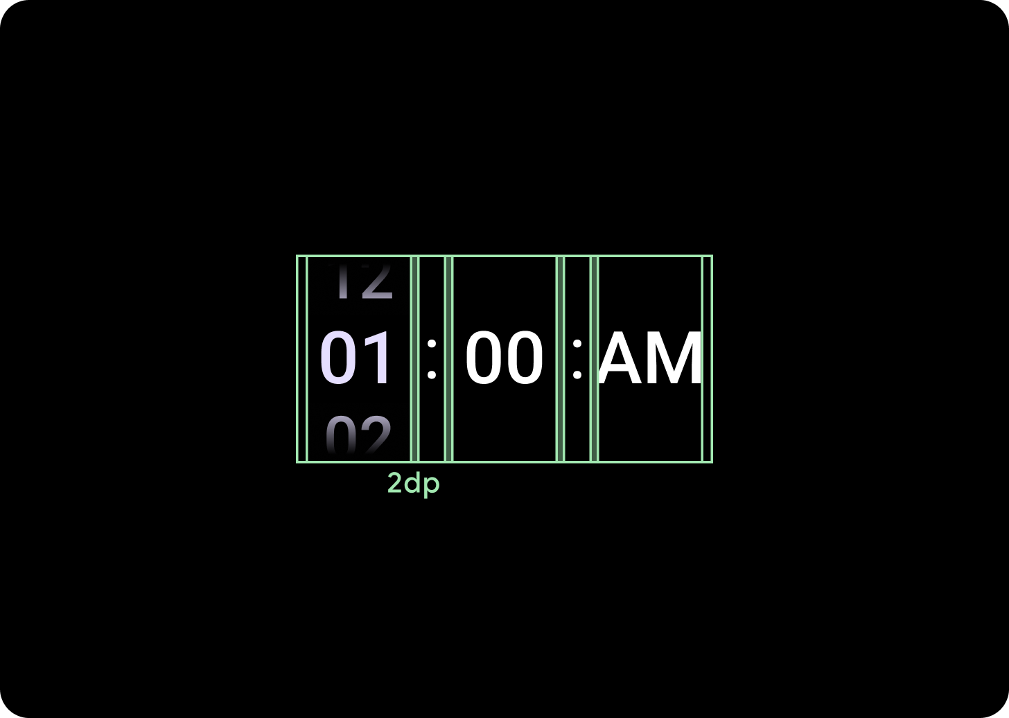
低于 225 dp 断点
2 dp 列间距
高于 225dp 断点
6 dp 列间距