Wear OS 生态系统由屏幕尺寸各异的设备组成。为了为所有用户提供最高品质的体验,利用自适应界面原则至关重要。
什么是自适应界面?
自适应界面会拉伸和更改,以便尽可能充分利用所有可用的屏幕空间,无论它们在何种尺寸的屏幕上呈现。
自适应界面会使用直接内置到布局逻辑中的组件和方法进行响应式更改。这些布局还会利用屏幕尺寸断点(在不同屏幕尺寸上应用不同的设计),为用户打造更丰富的体验。
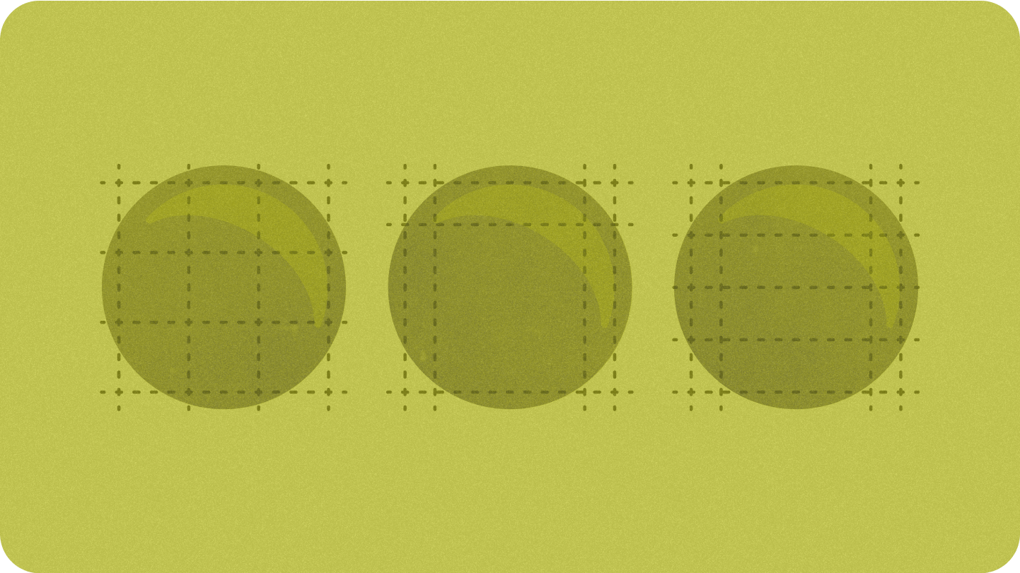
主要屏幕尺寸
了解设计新体验时需要注意的关键参考尺寸

布局类型
在圆形屏幕上设计自适应布局时,滚动视图和非滚动视图在缩放界面元素和保持平衡的布局和组合方面各有独特的要求。
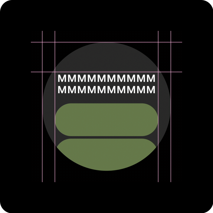
滚动视图
所有上边距、下边距和侧边距都应定义为百分比,以避免剪裁并按比例缩放元素。
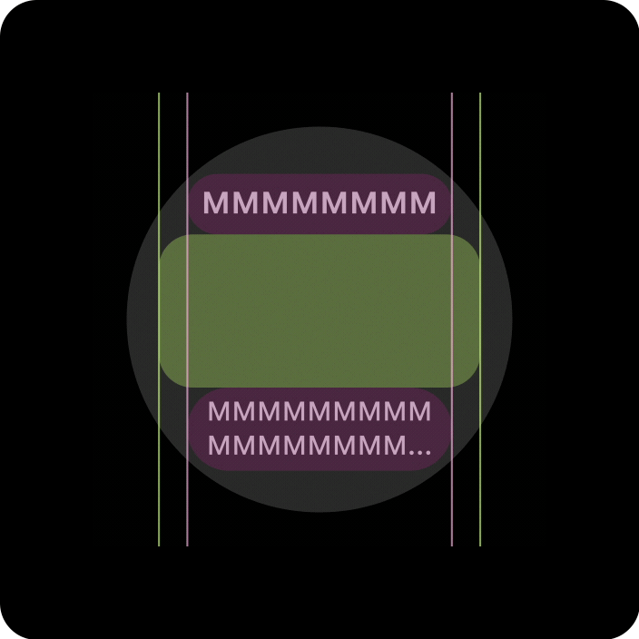
非滚动视图
所有边距都应以百分比定义,并且应定义垂直约束条件,以便中间的主内容可以拉伸以填充可用区域。
通过自适应布局和设计实践提升价值
在圆形屏幕上设计自适应布局时,滚动视图和非滚动视图在缩放界面元素和保持平衡的布局和组合方面各有独特的要求。
以下图片仅供大致参考;示例仅作说明之用。查看每个组件或界面页面,获取详细的上下文响应式指南。
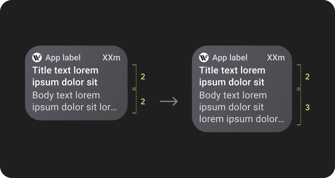
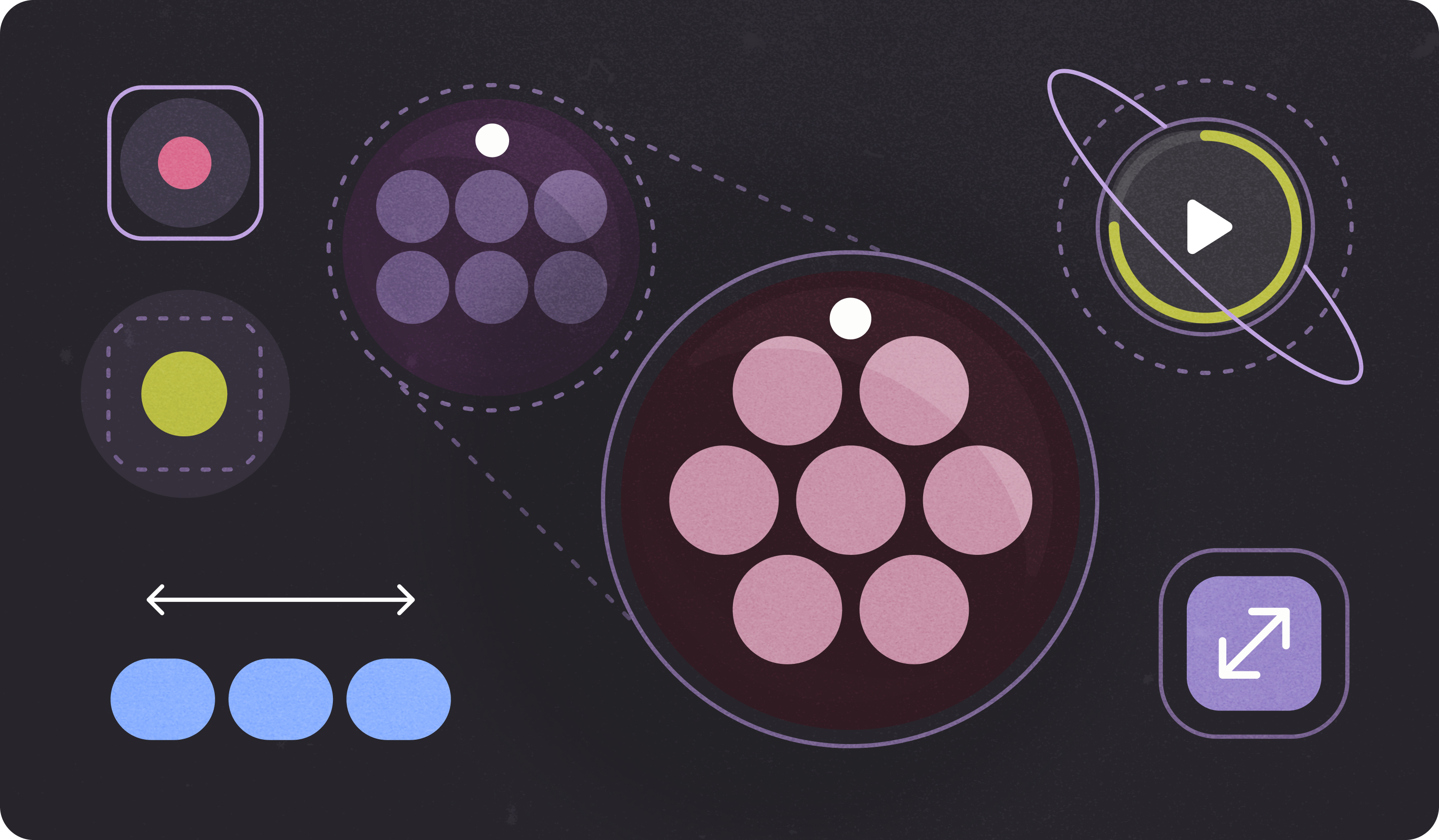
一目了然地浏览更多内容
自适应布局可让更多条状标签、更多卡片、更多行文本和更多按钮在单个屏幕上显示
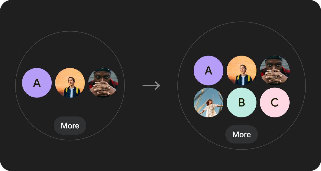
可显示更多内容元素
利用在指定屏幕尺寸断点处应用的新布局,以便尽可能引入新内容,从而在屏幕尺寸较大的设备上为用户提供额外价值。
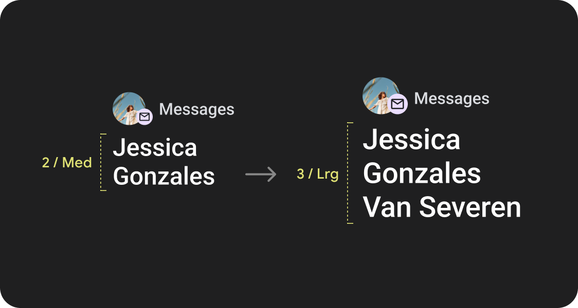
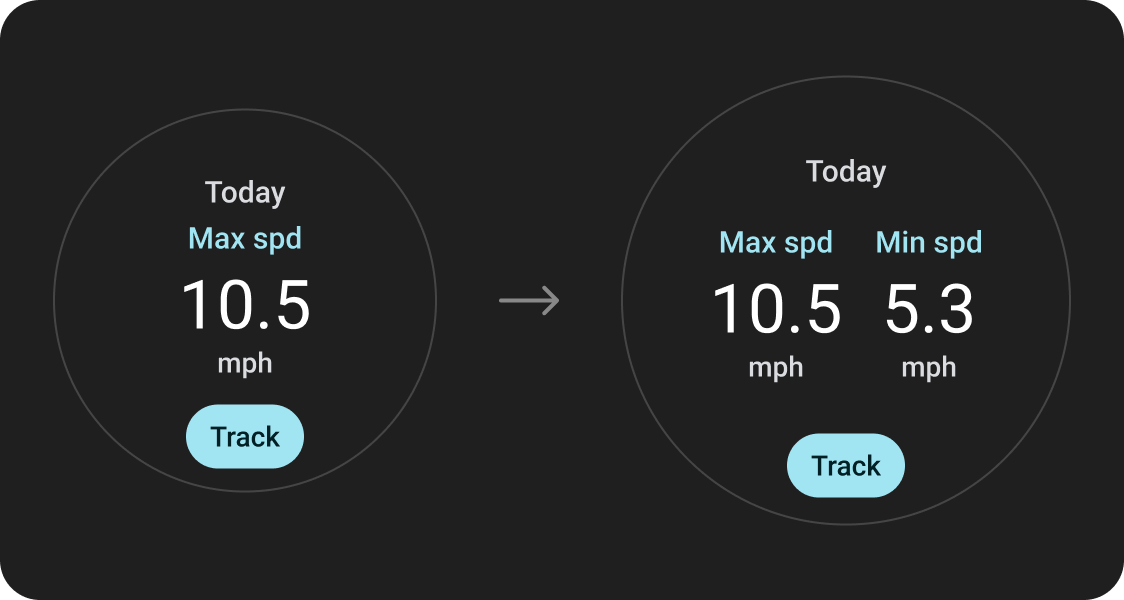
一目了然
利用额外的屏幕空间提供更大的容器、更大的文本、更粗的圆环和更精细的数据可视化,以便用户一目了然。
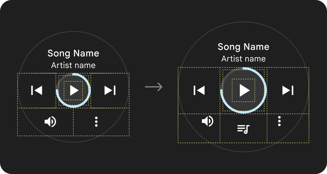
易用性更高
利用额外的屏幕空间提供更大的点按目标、更清晰的视觉层次结构,并在内容项之间留出额外的空间,让界面更易于交互且更舒适。
优化后的组合
利用更新后的组件和模板,为所有屏幕尺寸的界面提供更好的外观和风格。
应用质量
我们的质量指南分为三级。满足所有三个层级的准则,为用户提供尽可能出色的体验。
利用已建立的规范布局