响应迅速且已优化
使用集合让一切井井有条
根据您的偏好保存内容并对其进行分类。

响应式并经过优化的应用采用自适应布局,可自动适应不同的屏幕尺寸,从而为用户提供一些额外的价值,并提供高效且富有吸引力的用户体验。
通过自适应设计增加价值
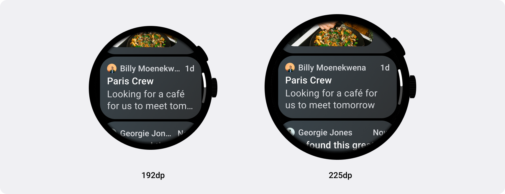
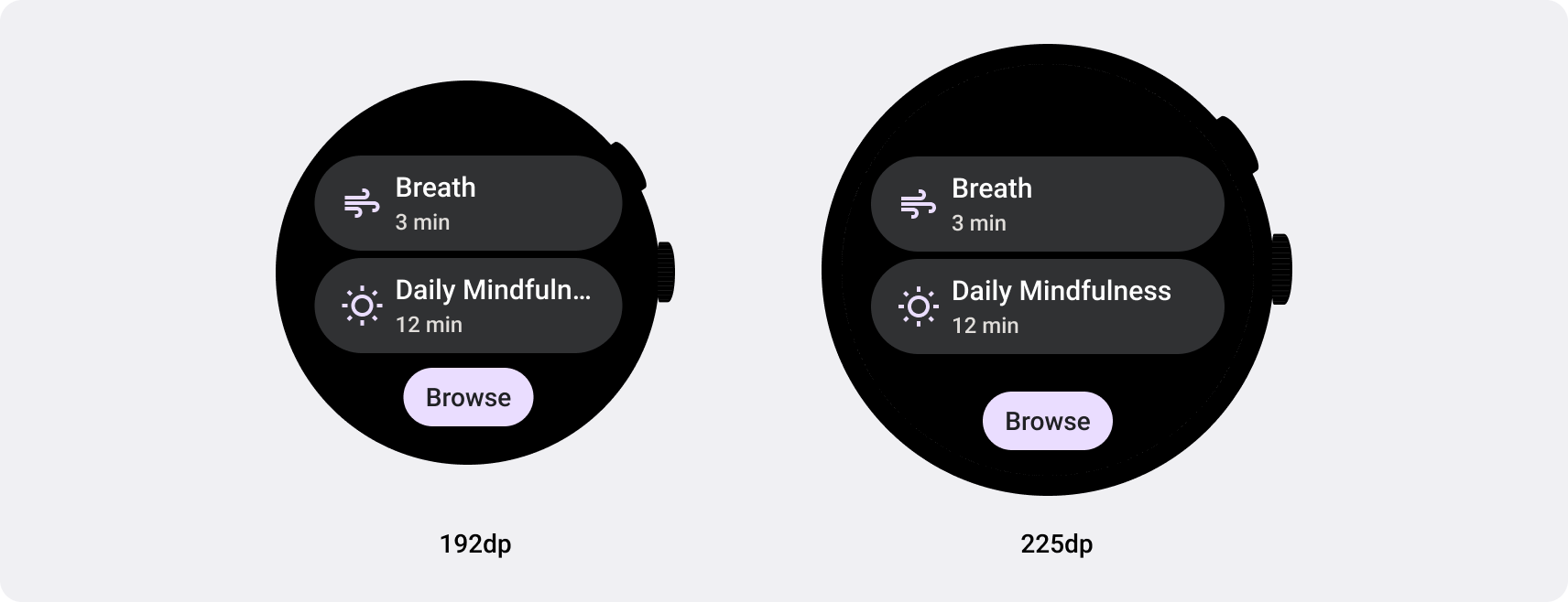
自适应布局可动态设置按钮、文本字段和对话框等元素的格式并调整其位置,从而提供最佳用户体验。利用自适应设计做法,自动为大屏设备上的应用用户提供额外价值。无论是让用户一眼就能看到更多文字、在屏幕上执行更多操作,还是更大、更易访问的点按目标,响应式做法可为使用大屏幕的用户提供更好的体验。

为 Wear OS 构建自适应应用和功能块
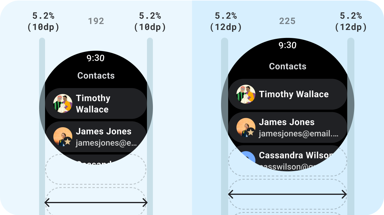
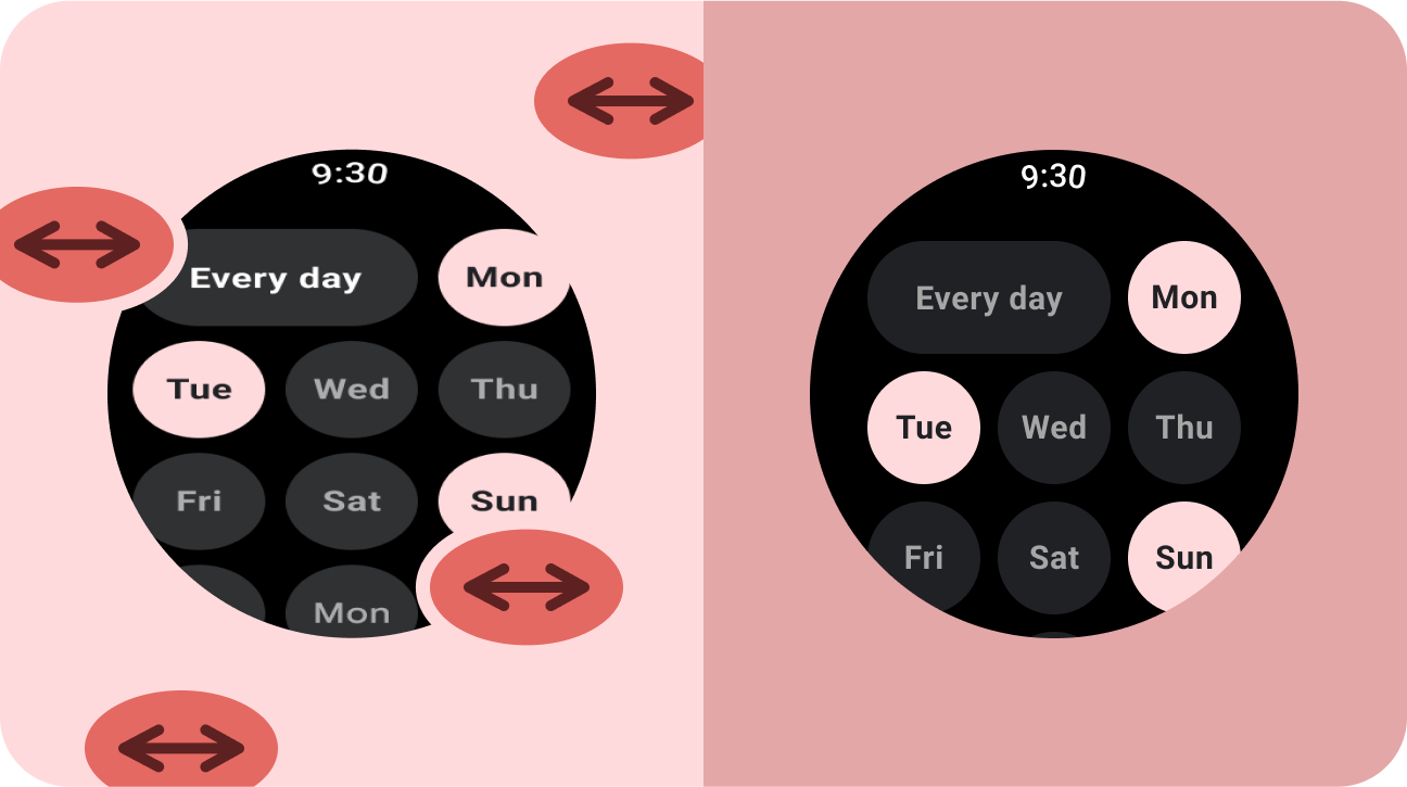
响应式界面会拉伸和变化,以便充分利用所有可用的屏幕空间,无论在何种尺寸的屏幕上呈现。在圆形屏幕上设计自适应布局时,滚动视图和非滚动视图在保持界面元素缩放以及保持平衡的布局和组合方面都有独特的要求。对于滚动视图,请使用百分比来定义所有上外边距、下外边距和侧边外边距,以避免被裁剪并按比例缩放元素。对于非滚动视图,请对所有外边距使用百分比和垂直约束条件。这样,中间的主要内容就可以拉伸以填充可用区域。
如需了解自适应布局,请参阅 Compose 和功能块实现指南。
check_circle
正确做法
- 使用专为自适应而设计的标准组件。
- 充分利用能顺畅自如地适应不同屏幕尺寸的自适应布局。
cancel
错误做法
- 拉伸界面元素(文本字段、按钮、对话框)以填充多余的空间。
- 增大字体(除非字体主要为图形)。
下一步:自适应和差异化
自适应和差异化的应用可以打造在小屏幕设备上无法实现的用户体验。
开始使用
本页面上的内容和代码示例受内容许可部分所述许可的限制。Java 和 OpenJDK 是 Oracle 和/或其关联公司的注册商标。
最后更新时间 (UTC):2025-07-27。
[null,null,["最后更新时间 (UTC):2025-07-27。"],[],[],null,["# Responsive and optimized\n\nApps that are **responsive and optimized** utilize responsive layouts that\nautomatically adapt to different screen sizes, offering some additional value to\nusers and providing a productive, engaging user experience.\n\nAdd value through responsive design\n-----------------------------------\n\nResponsive layouts dynamically format and position elements such as buttons,\ntext fields, and dialogs for an optimal user experience. Automatically offer\nusers of your app additional value on larger screens by utilizing responsive\ndesign practices. Whether it's more text visible at a glance, more actions on\nscreen, or larger, more accessible tap targets, responsive practices provide an\nenhanced experience for users of larger screens.\n\n\nBuild responsive apps and tiles for Wear OS\n-------------------------------------------\n\nResponsive UIs stretch and change to make the best possible use of all available\nscreen space, no matter what size screen they're rendered on. When designing\nresponsive layouts on a round screen, scrolling and non-scrolling views each\nhave unique requirements to maintain UI element scaling, as well as preserve a\nbalanced layout and composition. For [scrolling views](/design/ui/wear/guides/foundations/canonical-adaptive-layouts#scrolling), use percentages to\ndefine all top, bottom, and side margins to avoid clipping and provide\nproportional scaling of elements. For [non-scrolling views](/design/ui/wear/guides/foundations/canonical-adaptive-layouts#non-scrolling), use percentages\nand vertical constraints for all margins. That way, the main content in the\nmiddle can stretch to fill the available area.\n\nSee the [Compose](/training/wearables/compose/screen-size#responsive-layouts) and [Tiles](/training/wearables/tiles/screen-size#responsive-layouts) implementation guidance for responsive\nlayouts. \ncheck_circle\n\n### Do\n\n- Use standard components which are designed for adaptation.\n- Utilize adaptive layouts which adapt smoothly across screen sizes. \ncancel\n\n### Don't\n\n- Stretch UI elements (text fields, buttons, dialogs) to fill extra space.\n- Increase the sizes of fonts (unless they're serving a primarily graphic purpose).\n\nNext step: adaptive and differentiated\n--------------------------------------\n\nApps that are **adaptive and differentiated** create a user experience that\nisn't possible on devices with smaller screens.\n\n[Get started](/design/ui/wear/guides/foundations/larger-screens-differentiated)"]]