黑色背景
在黑色背景上进行设计对 Wear OS 至关重要,原因有两个:
- 电池效率:屏幕上亮起的每个像素都会消耗电量。使用黑色背景可最大限度地减少活动像素的数量,从而延长电池续航时间。
- 无缝美学:黑色背景有助于视觉上最大限度地缩小表圈,营造出延伸到设备边缘的连续表面的错觉。将界面元素包含在此空间中可进一步增强此效果。
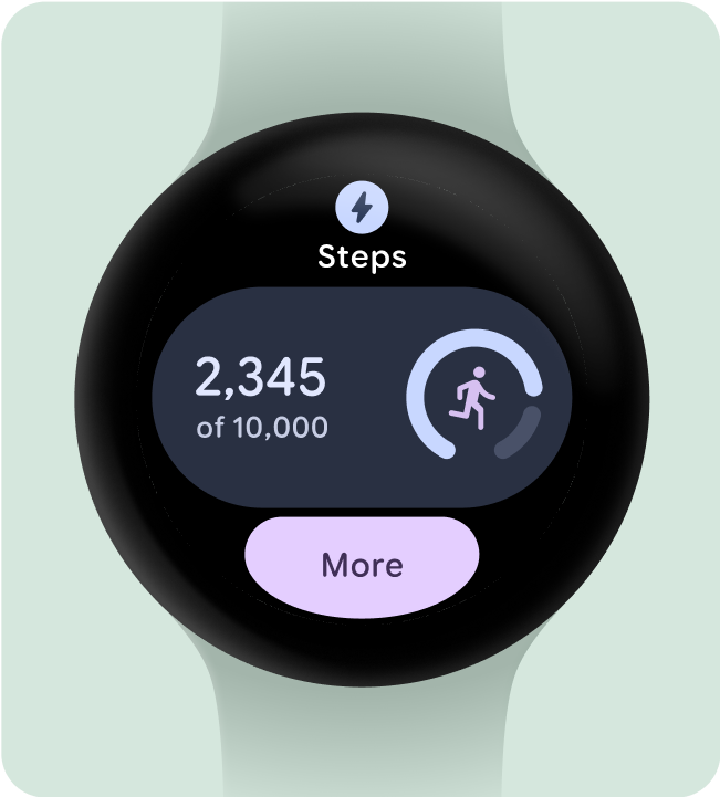
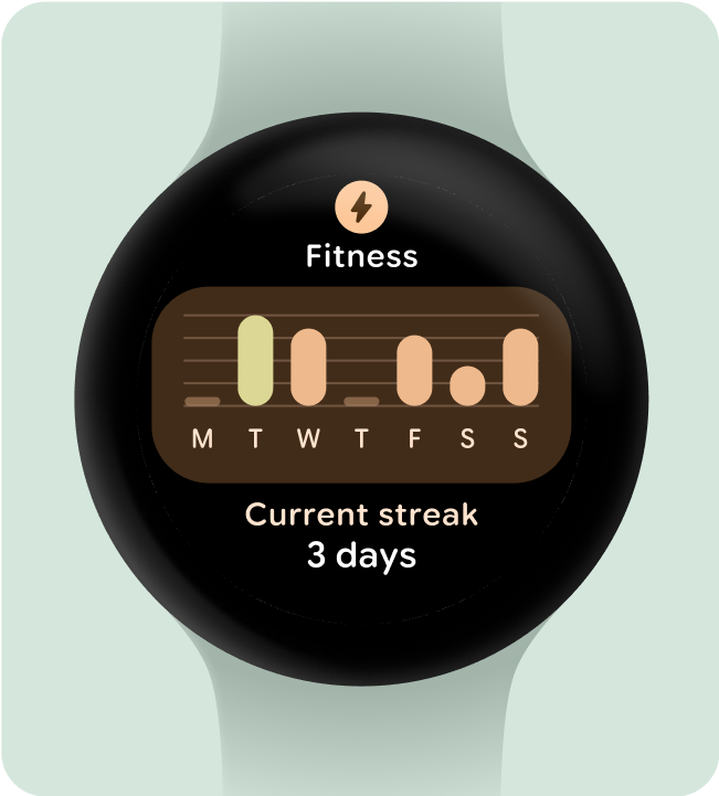
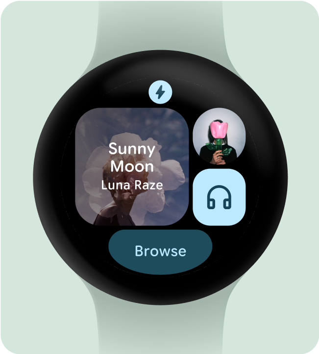
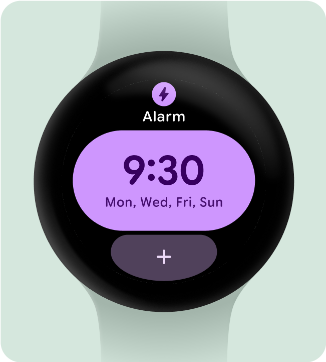
建议做法
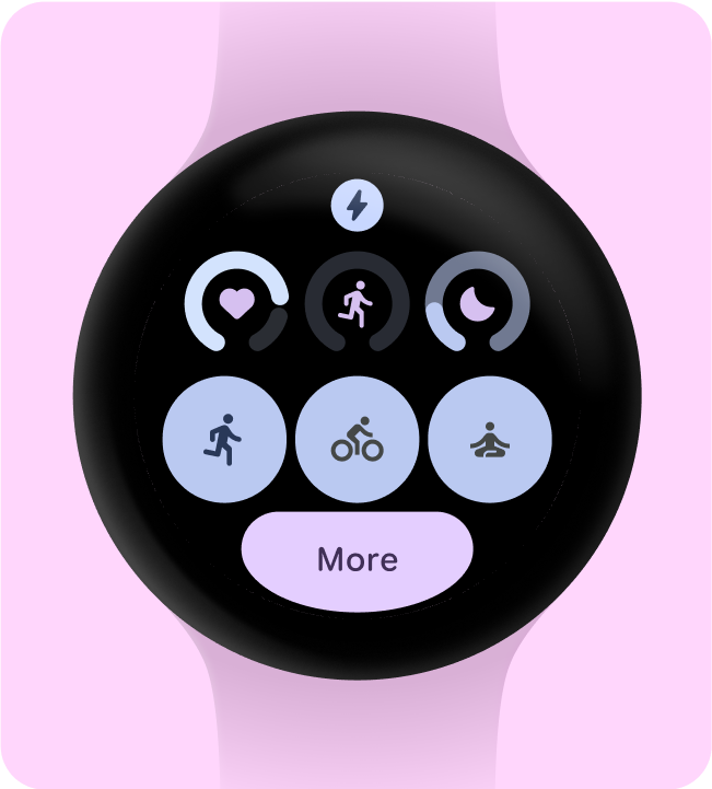
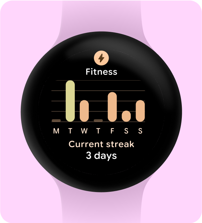
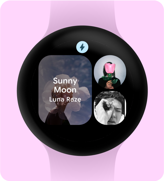
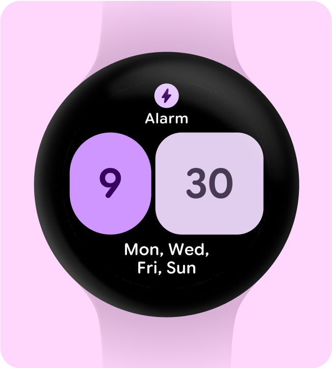
不建议做法
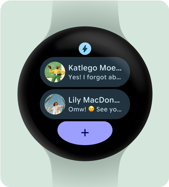
仅包含必要的元素
用户选择启用此功能(例如,使用 ProtoLayout Material3 PrimaryLayout)后,Wear OS 会自动显示永久性应用图标,该图标会在用户滚动浏览功能块轮播界面时自动显示。应用图标不应作为功能块的一部分进行设计和添加。
如果您为功能块使用动态主题设置,请确保提供的应用图标是单色的。请参阅 Android 产品图标指南,了解如何为您的品牌创建应用图标。
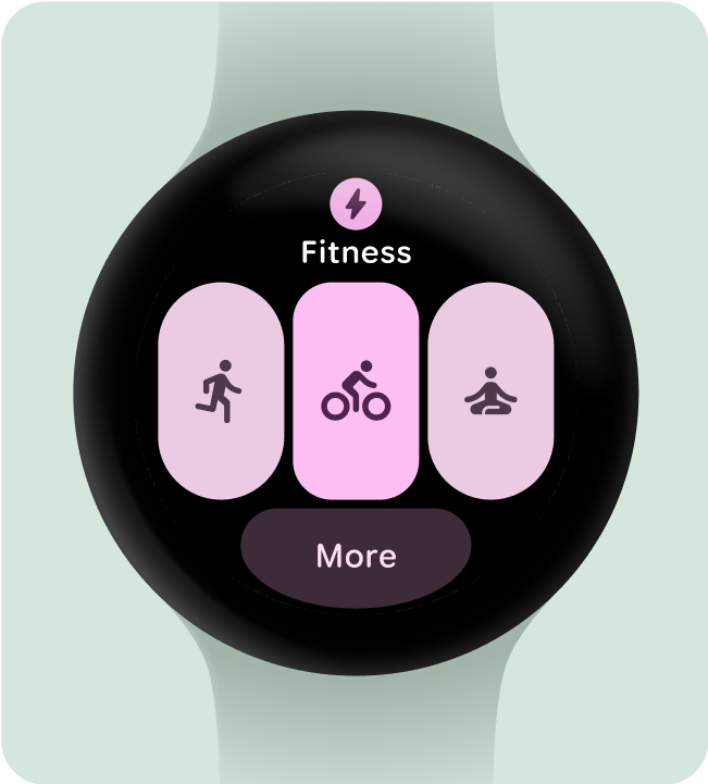
建议做法
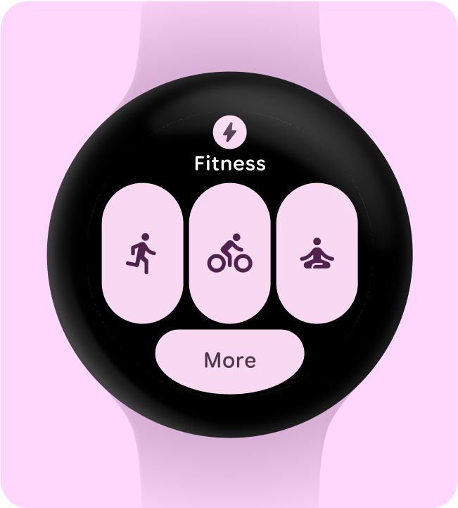
不建议做法
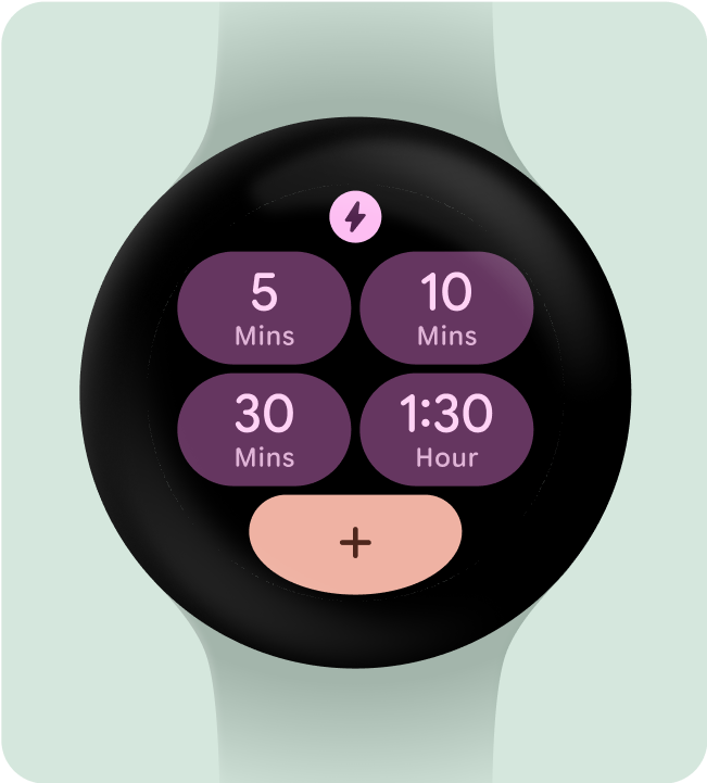
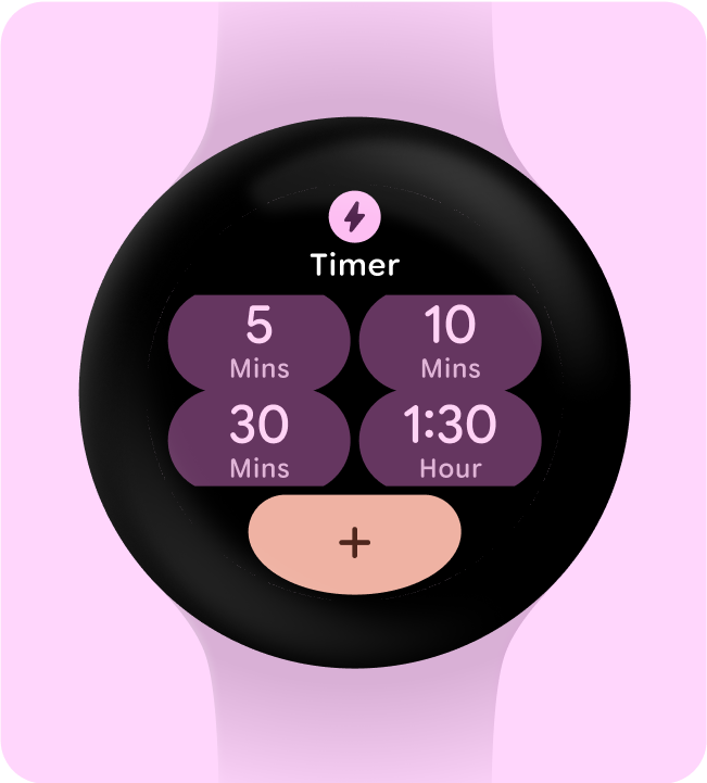
隐藏应用标题以确保最小点按目标
为确保在小屏设备上有足够的空间显示互动元素,当功能块使用两行(和底部部分)时,可以隐藏应用标题。这可确保行足够高(至少 48dp)。标题可以在较大的屏幕(225dp 或更大)上重新显示。
建议做法
不建议做法
选择一个主要用例进行重点介绍
为了确保用户知道如何使用每个功能块(无论是打开应用、启动 activity 还是了解详情),我们需要开发者在布局中添加至少一个互动元素。
建议做法
不建议做法
包含(至少)一个容器
应用中的每个功能块都必须包含至少一个容器元素,并且可完全点按,以链接到应用内的相应屏幕。功能块的信息(无论是包含在容器中还是单独显示)都必须清晰传达关联的内容或可用操作。
如果使用按钮,则应遵循标准设计惯例,并明确指明其功能。
建议做法
不建议做法
让用户立即理解操作
手表上的体验没有足够的空间来传达其含义,因此最有效的功能块具有易于预测的互动组件。
建议做法
不建议做法
直观地确定操作的优先级
为了帮助用户了解功能块上最重要的操作,应在视觉上优先显示互动容器。
- 在主要操作按钮上使用主色。
- 对次要操作使用辅色/第三色
建议做法
不建议做法
简化为更少的容器
功能块应尽量避免使用多个交互组件来触发特定操作,而应尝试将整个布局简化为使用更少的容器。
建议做法
不建议做法
出于功能目的使用容器
为确保用户能够预料功能块中的每个组件将执行的操作,我们不建议出于装饰或结构目的使用容器,以免点按操作无效。
建议做法
不建议做法
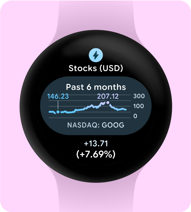
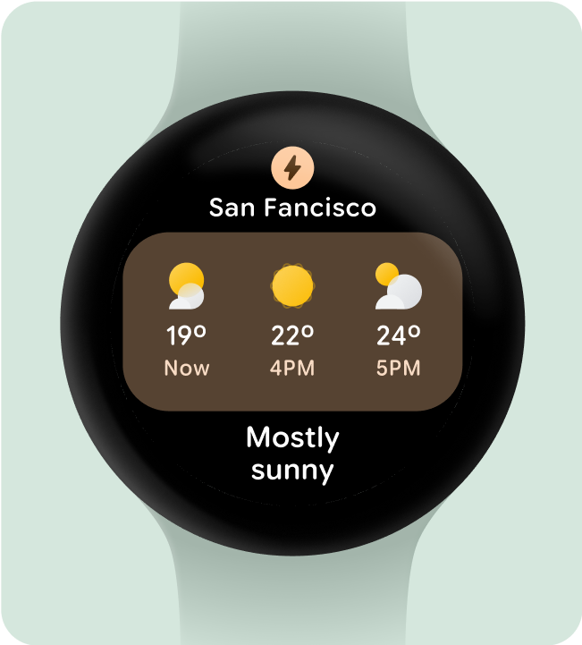
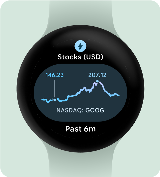
一目了然地显示图表和图形
一目了然是 Wear OS 设计的关键。由于屏幕时间有限(大约 7 秒),请以清晰易懂的格式优先显示重要信息,让用户一目了然。
请注意,手表可与手机相辅相成,让您快速访问关键详细信息。
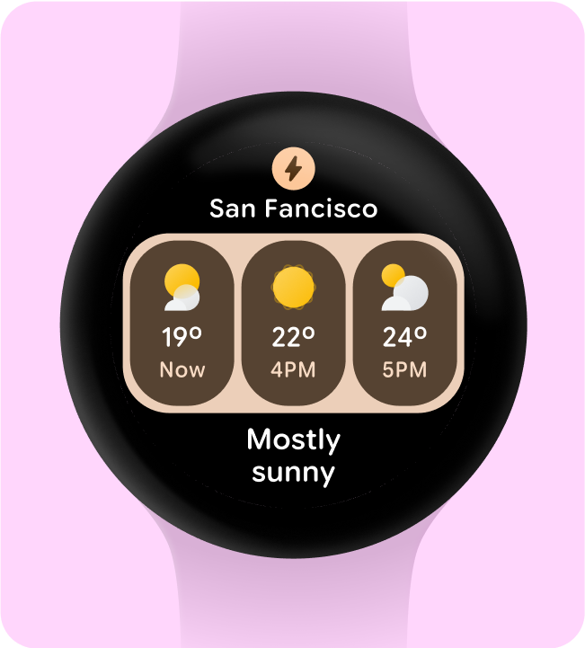
建议做法