黒地にデザイン
Wear OS では、黒い背景でデザインすることが重要です。その理由は次の 2 つです。
- バッテリーの効率: 画面上の各ピクセルが点灯すると電力を消費します。黒い背景を使用すると、アクティブなピクセルの数を最小限に抑え、バッテリーを長持ちさせることができます。
- シームレスな美しさ: 黒い背景により、スマートウォッチのベゼルが視覚的に最小限に抑えられ、デバイスの端まで連続したサーフェスがあるように見えます。このスペース内に UI 要素を配置すると、この効果がさらに高まります。
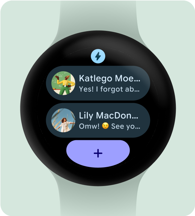
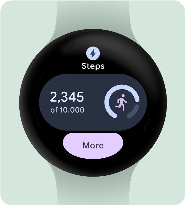
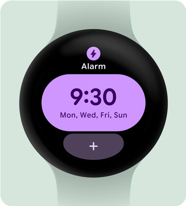
すべきこと
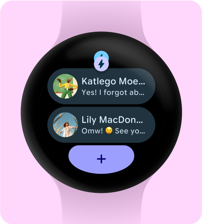
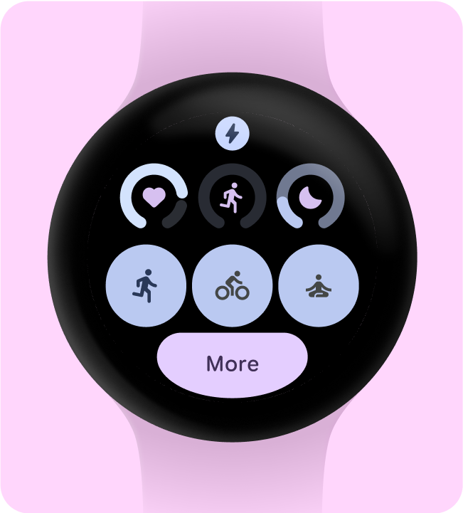
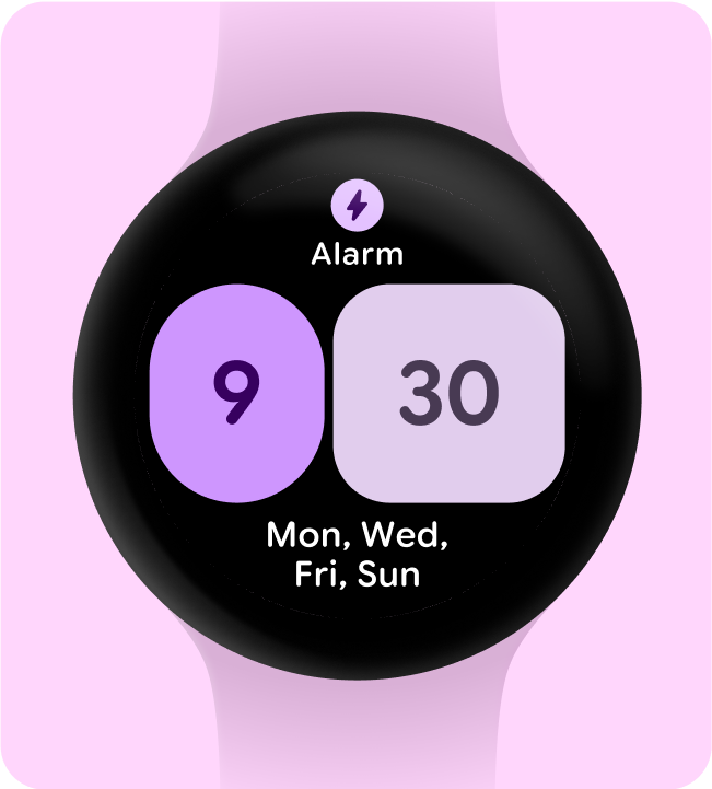
すべきでないこと
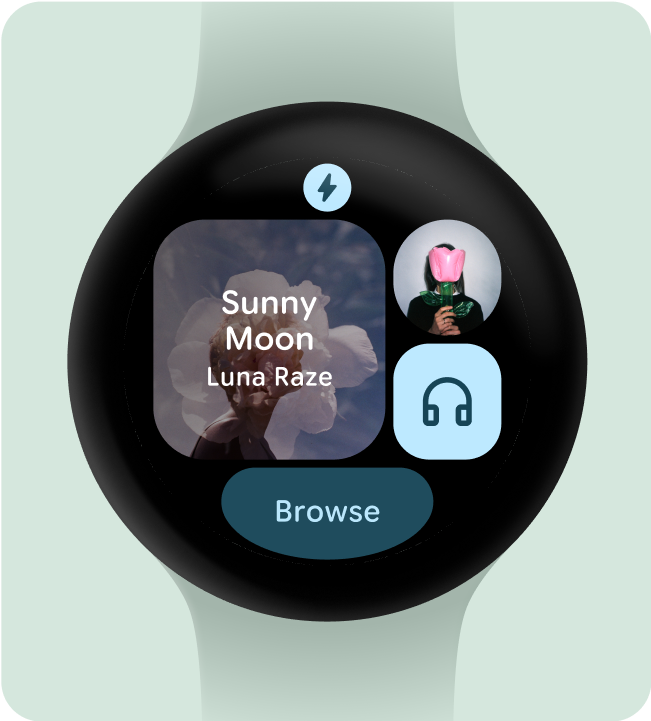
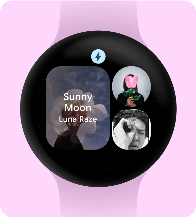
必要な要素のみを追加する
有効にすると(ProtoLayout Material3 PrimaryLayout を使用するなど)、Wear OS では、ユーザーがタイル カルーセルをスクロールすると自動的に表示される、永続的なアプリアイコンが自動的に表示されます。アプリアイコンは、タイルの一部としてデザインして追加しないでください。
タイルに動的テーマ設定を使用する場合は、指定するアプリアイコンがモノクロであることを確認してください。ブランドのアプリアイコンを作成する方法については、Android プロダクト アイコンのガイドラインをご覧ください。
すべきこと
すべきでないこと
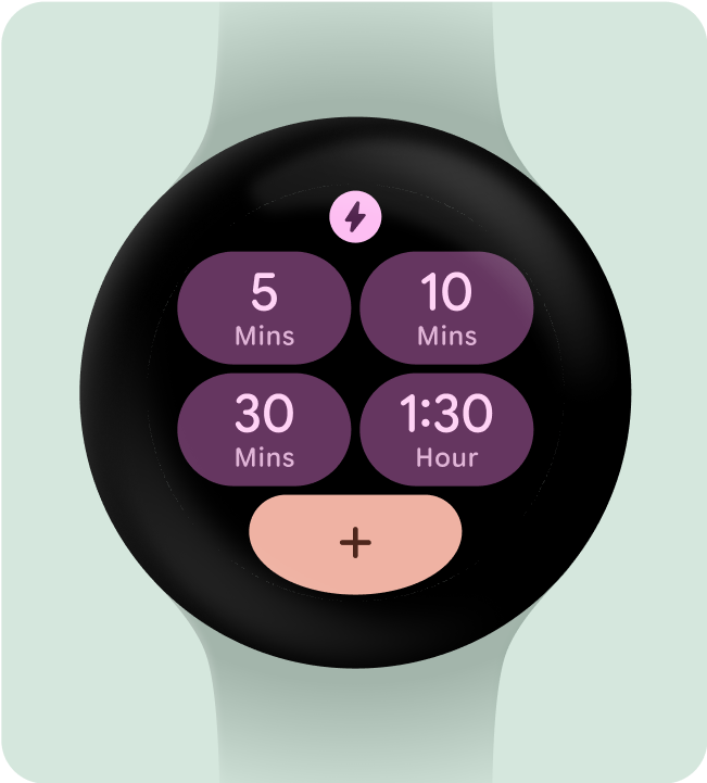
アプリのタイトルを非表示にして最小タップ ターゲットを確保する
小さい画面でインタラクティブな要素に十分なスペースを確保するため、タイルが 2 行(および下部セクション)を使用する場合は、アプリのタイトルを非表示にできます。これにより、行の高さが十分に確保されます(48 dp 以上)。タイトルは、大きな画面(225 dp 以上)で再び表示できます。
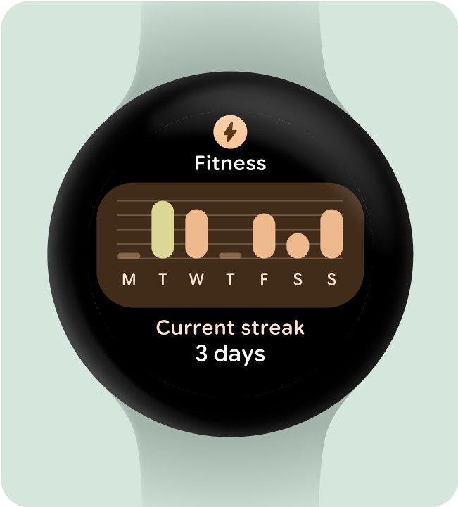
すべきこと
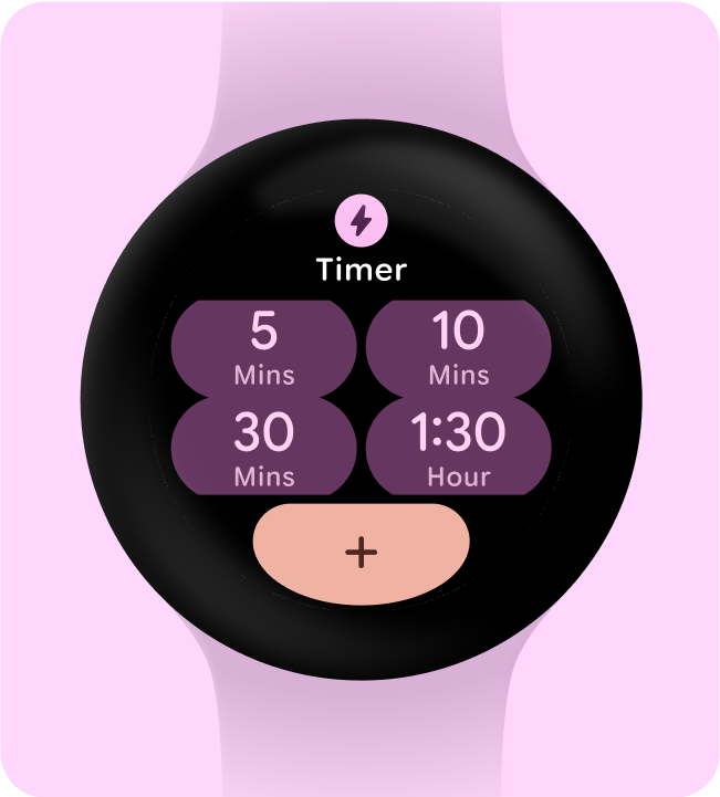
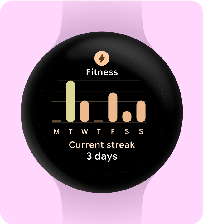
すべきでないこと
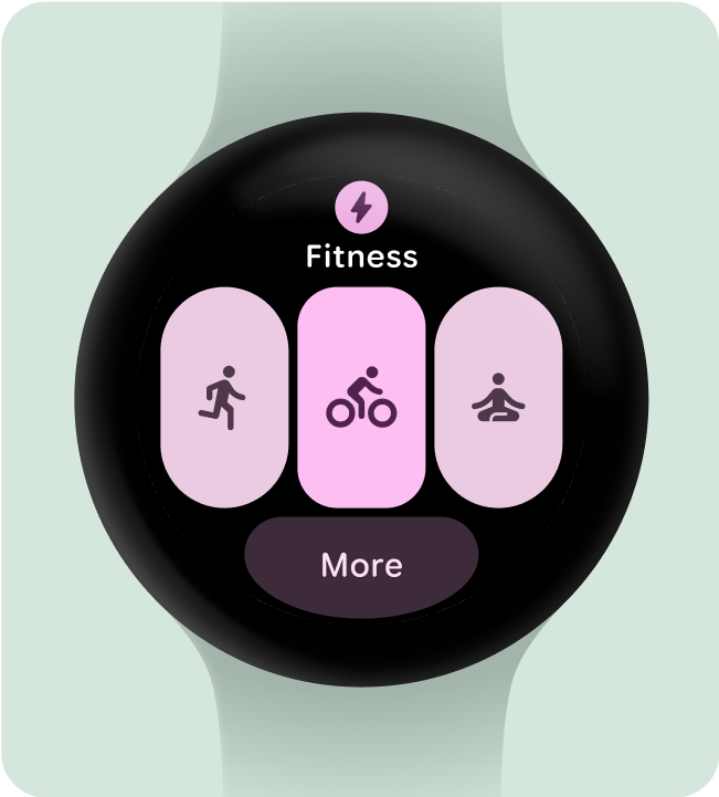
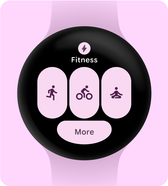
強調する 1 つの主なユースケースを選択する
アプリの起動、アクティビティの開始、詳細情報の確認など、各タイルをどう操作すればよいかをユーザーにわかりやすく伝えるには、レイアウトにインタラクティブな要素を 1 つ以上含める必要があります。
すべきこと
すべきでないこと
コンテナを 1 つ以上含める
アプリ内の各タイルに、少なくとも 1 つのコンテナ要素を含める必要があります。また、タイルは完全にタップ可能で、アプリ内の対応する画面にリンクされている必要があります。タイルの情報がコンテナ内に含まれている場合でも、別途表示されている場合でも、リンクされたコンテンツや利用可能なアクションを明確に伝える必要があります。
ボタンを使用する場合は、標準の設計規則に従い、ボタンの機能を明確に示してください。
すべきこと
すべきでないこと
アクションをすぐに理解できるようにする
スマートウォッチでは、意味を伝えるための十分なスペースがないため、最も効果的なタイルは、簡単に予測できるインタラクティブなコンポーネントを備えています。
すべきこと
すべきでないこと
視覚的にアクションの優先度を設定
タイルの最も重要なアクションをユーザーが理解できるように、インタラクティブ コンテナは視覚的に優先する必要があります。
- メインのアクション ボタンにはプライマリ カラーを使用します。
- セカンダリ アクションにセカンダリ/ターシャリ カラーを使用する
すべきこと
すべきでないこと
コンテナを減らしてシンプルにする
タイルは、特定のアクションをトリガーするために複数のインタラクティブ コンポーネントを使用しないようにし、代わりに全体的なレイアウトをより少ないコンテナに簡素化するようにしてください。
すべきこと
すべきでないこと
機能的な目的でコンテナを使用する
タイル内の各コンポーネントの動作をユーザーが予測できるようにするため、何もしないタップが発生しないように、装飾や構造目的でコンテナを使用しないことをおすすめします。
すべきこと
すべきでないこと
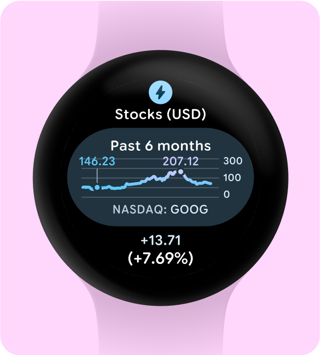
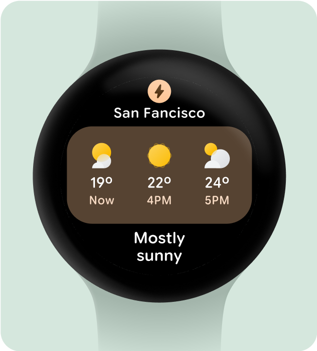
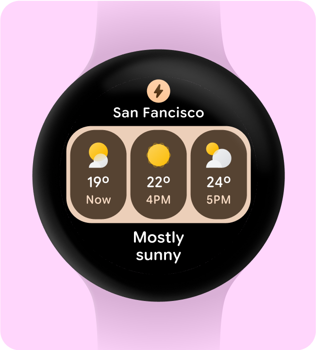
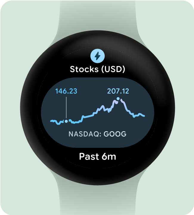
グラフや表を容易に視認できるようにする
一目でわかることは、Wear OS のデザインにおいて重要です。画面表示時間は限られているため(約 7 秒)、重要な情報を優先して、ひと目で理解しやすい明確な形式で表示します。
スマートウォッチはスマートフォンを補完し、重要な詳細情報にすばやくアクセスできるようにします。
すべきこと