Die Komponente Card enthält Inhalte und Aktionen zu einem einzelnen Thema.
Anatomie

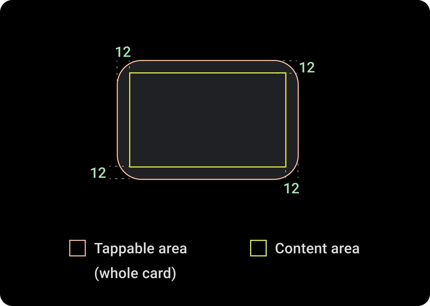
Eine Kartenkomponente hat nur einen einzelnen Slot. Karten können Symbole, Bilder oder Labels enthalten und sind anpassbar.
Standardmäßig sind die Karten rechteckig, haben abgerundete Ecken und einen Hintergrund mit Farbverlauf. Legen Sie die maximale Höhe Ihrer Karte auf 60% fest, damit sie vollständig auf dem Bildschirm angezeigt wird, da runde Displays bis zu 20% des oberen und unteren Rands des Bildschirms beschneiden können.

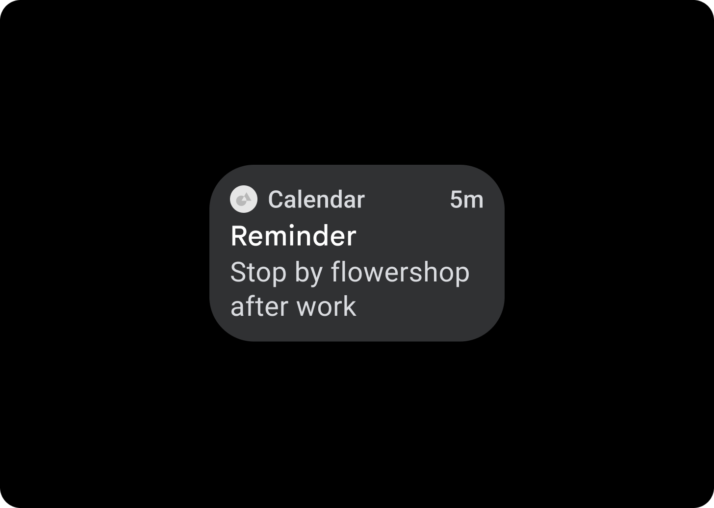
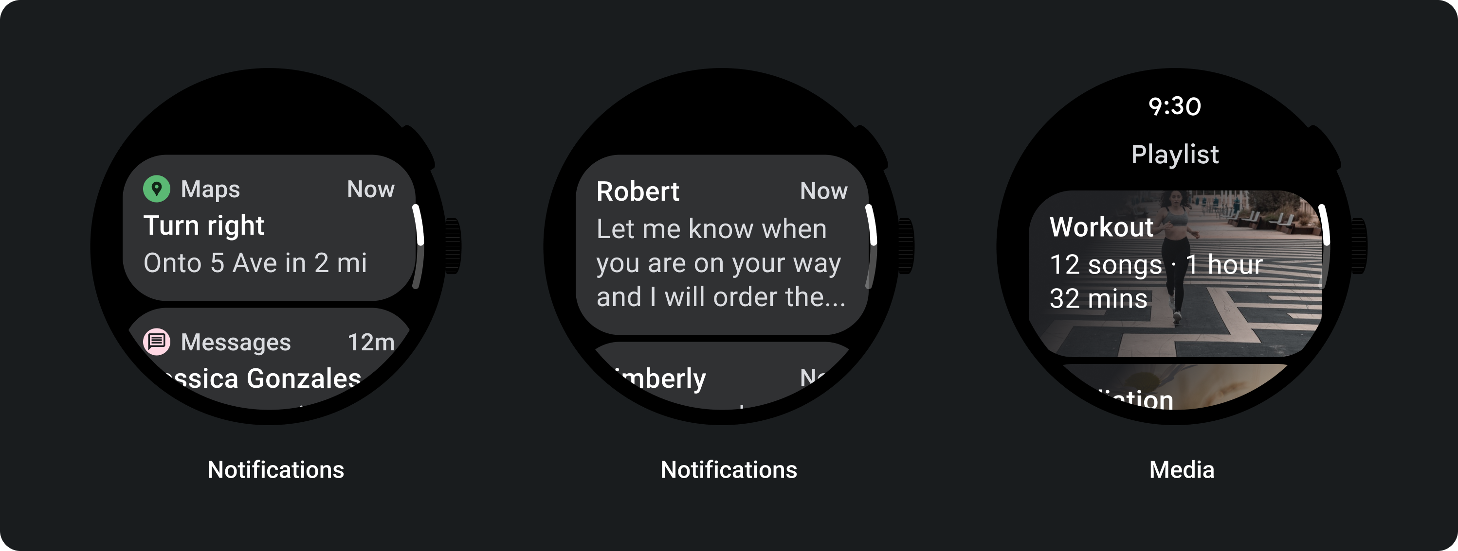
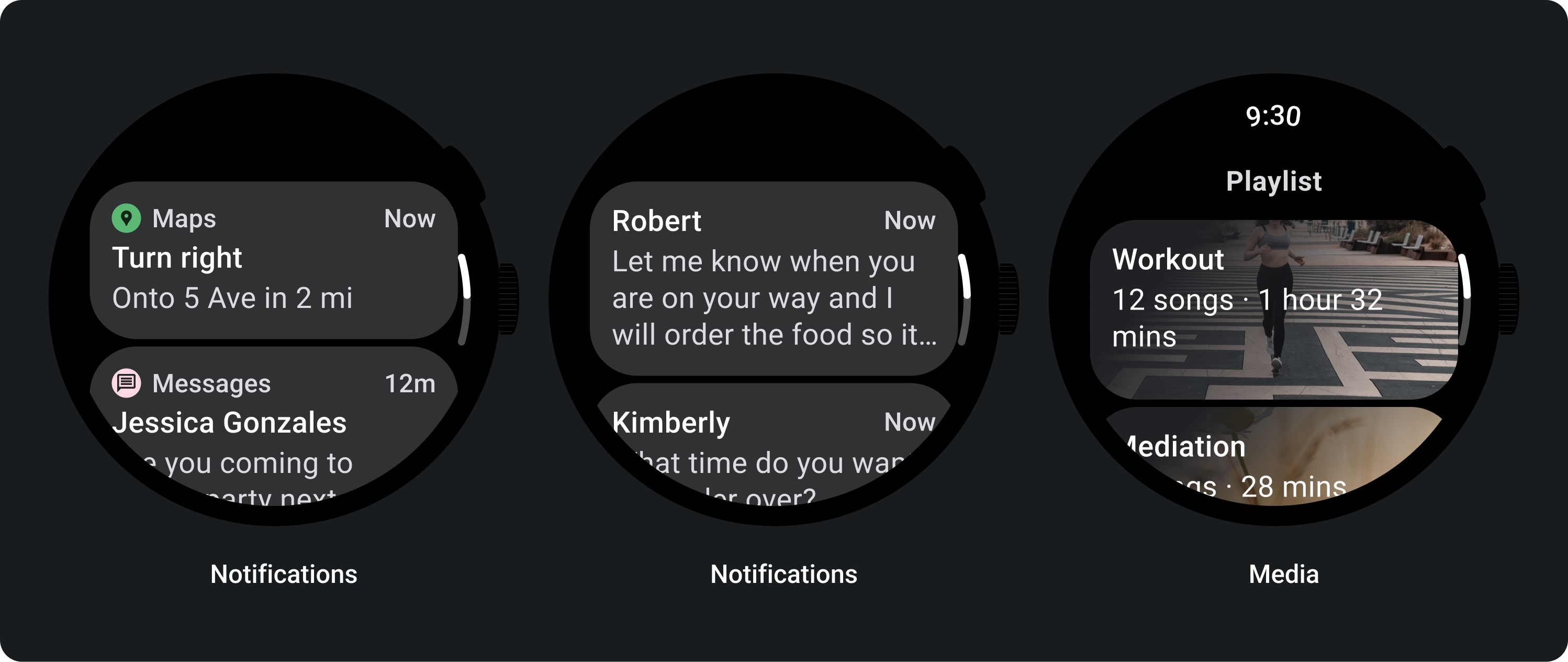
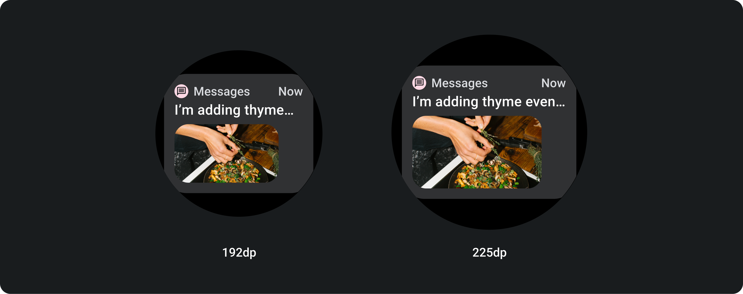
Titelkarte
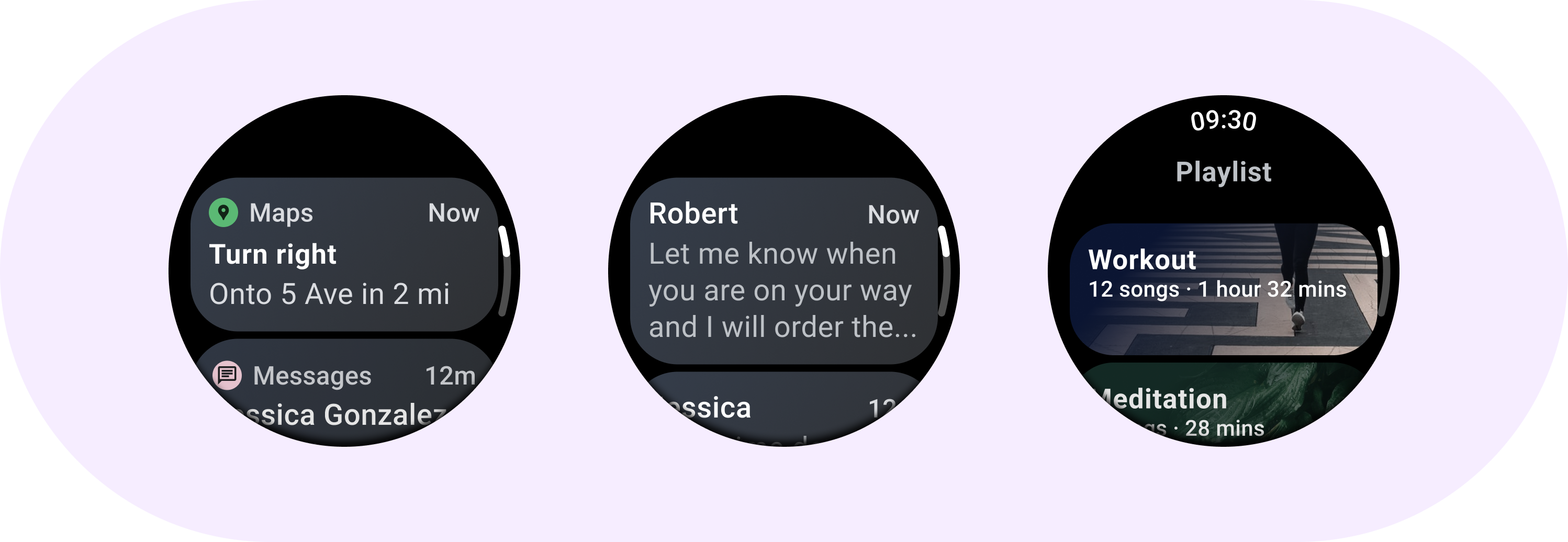
Verwenden Sie Titelkarten, um Informationen in einer App anzuzeigen, z. B. eine Nachricht. Titelkarten haben ein Layout mit drei Slots, das einen Titel, ein optionales Zeitfeld und den relevanten Inhalt enthält – entweder ein Bild oder ein Text.
App-Karte
Mit App-Karten können Sie interaktive Elemente aus mehreren Apps einblenden. App-Karten haben ein Layout mit fünf Bereichen. Es enthält ein App-Symbol, den Namen der App, den Zeitpunkt der Aktivität, einen Titel in irgendeiner Form und den relevanten Inhalt, entweder ein Bild oder Text.
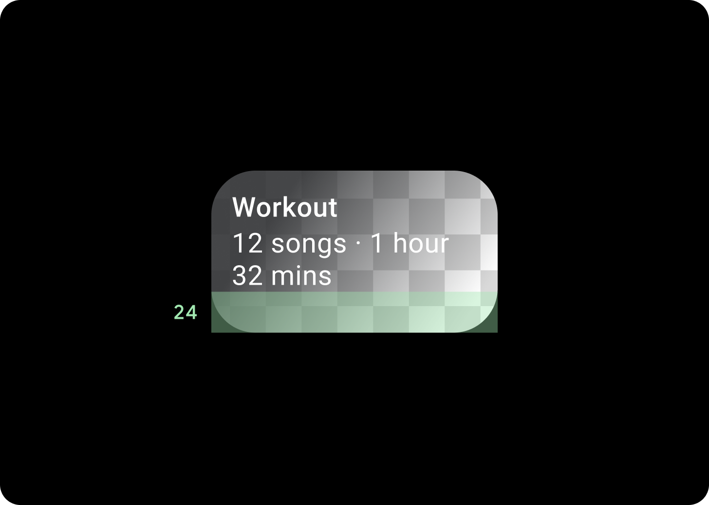
Farbverlauf der Karten
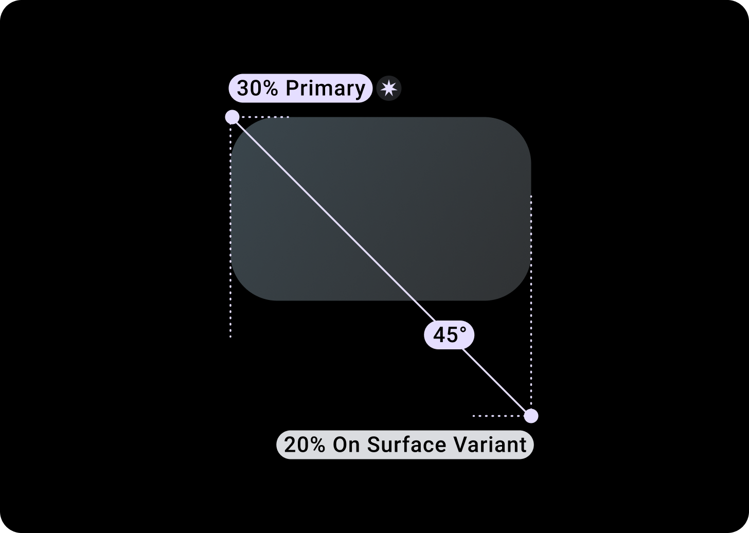
Farbverlauf
Oben/links + 68 dp Abstand von links = 100% Oberfläche
Unten/rechts = 0% Oberfläche
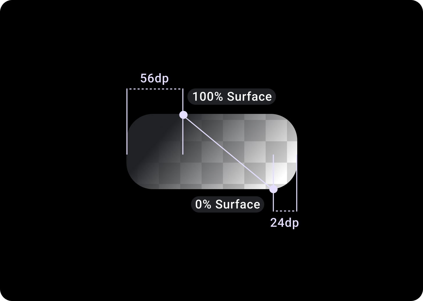
Bildkarten-Overlay
Oben/Links + Abstand von 56 dp von T/L = 100% Oberfläche
Unten/rechts + 24 dp Abstand von rechts/rechts = 0% Oberfläche
(Farbverlauf-Overlays auf einem Bildhintergrund)
Größen
Kartenbreite
Für Karten ist standardmäßig die maximale Breite des Containers festgelegt.
Die Kartenhöhe ist flexibel. Er wird durch den Inhalt der Komponenten bestimmt.
Bei runden Zifferblättern werden Karten, die höher als 60% der Bildschirmhöhe sind, abgeschnitten.
Nutzung
Adaptive Layouts
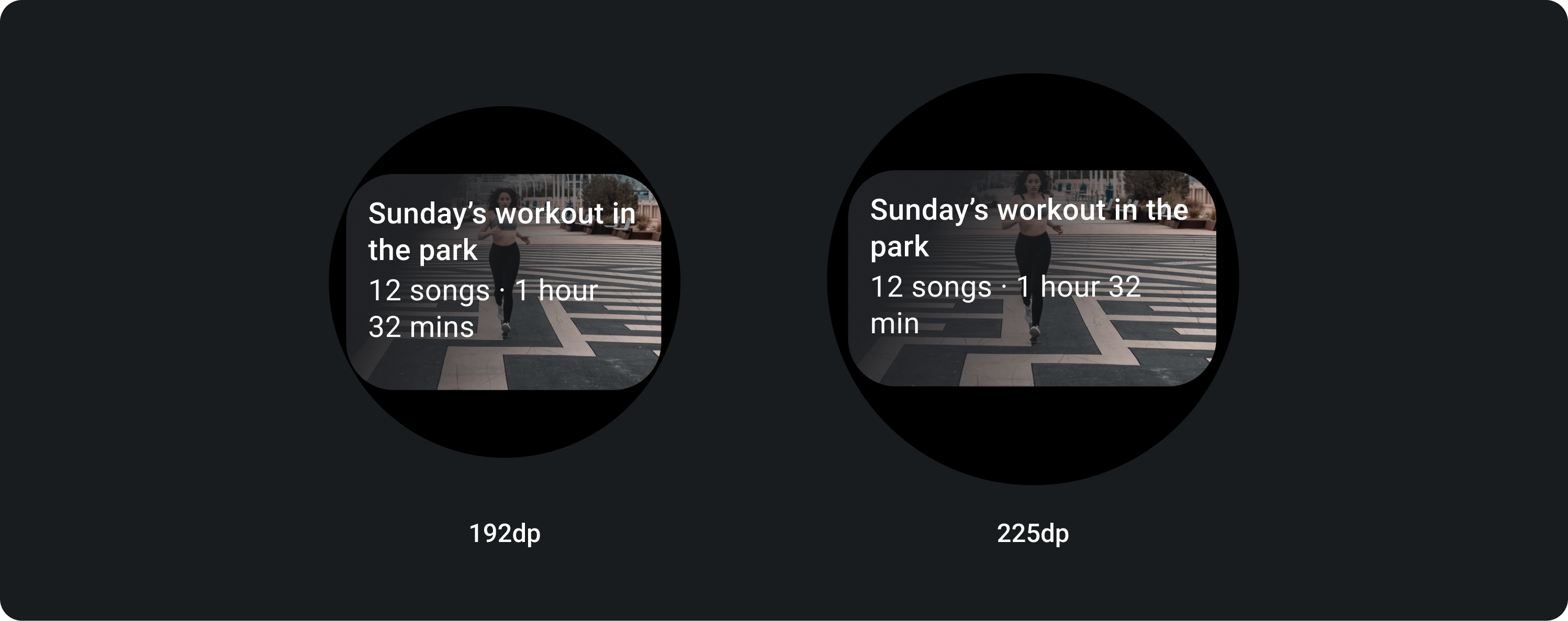
Titelkarte
Auf größeren Bildschirmen ist eine zusätzliche Textzeile für den Fließtext zulässig. Damit mehr vom Bild zu sehen ist, fügen Sie am unteren Rand einen vergrößerten Abstand von 24 dp hinzu.

Titelkarte mit Inline-Bild (ersetzt die Anzeigenfläche für den Haupttext)
Auf größeren Bildschirmen ändert sich das Seitenverhältnis des Bildes nicht und der Innenrand wird auf der rechten Seite angezeigt, damit die Karte nicht zu groß wird.
Karten mit zusätzlicher Anpassung
Karte mit einem Bildhintergrund
Für dieses Layout müssen Sie Anpassungen vornehmen.
Auf Bildkarten werden Inhalte zu einem einzelnen Thema mit einem Hintergrundbild angezeigt. Bildkarten können auch eigenständige Bilder anzeigen.
Der Abstand unten sollte auf 24 dp erhöht werden, damit mehr vom Hintergrundbild ohne Text zu sehen ist.