圖解

資訊卡元件只有一個版位。資訊卡可以包含圖示、圖片或標籤,也能自訂內容。
資訊卡預設為圓角矩形,並有漸層背景。將資訊卡高度上限設為 60%,確保資訊卡能完整顯示在畫面上,因為圓形螢幕最多可覆蓋 20% 的螢幕頂端與底部。

標題資訊卡
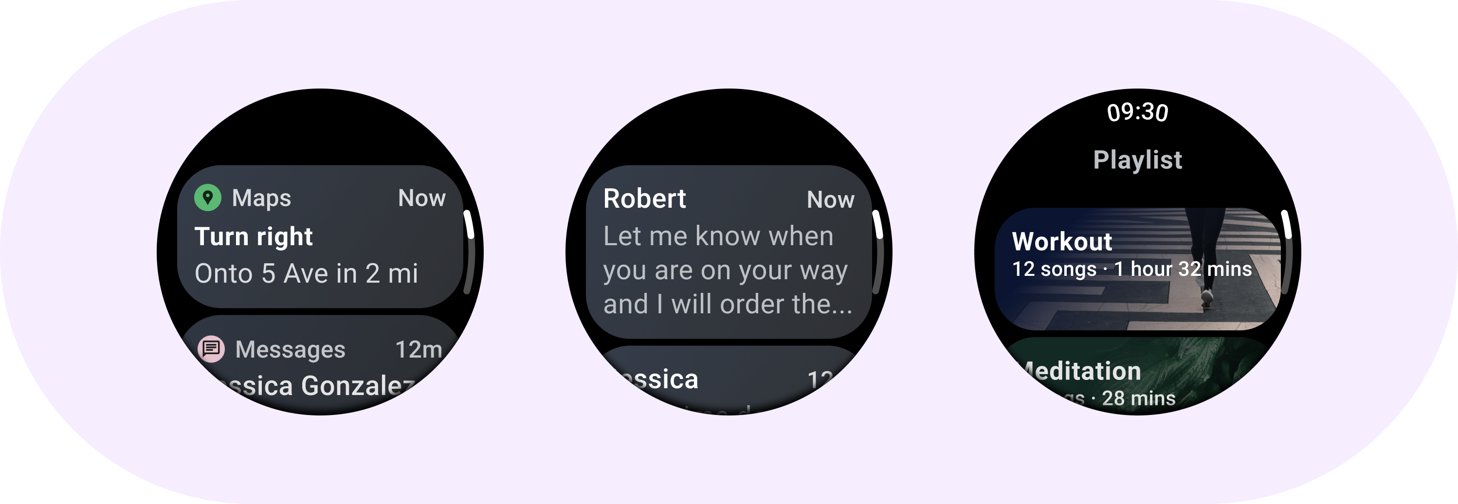
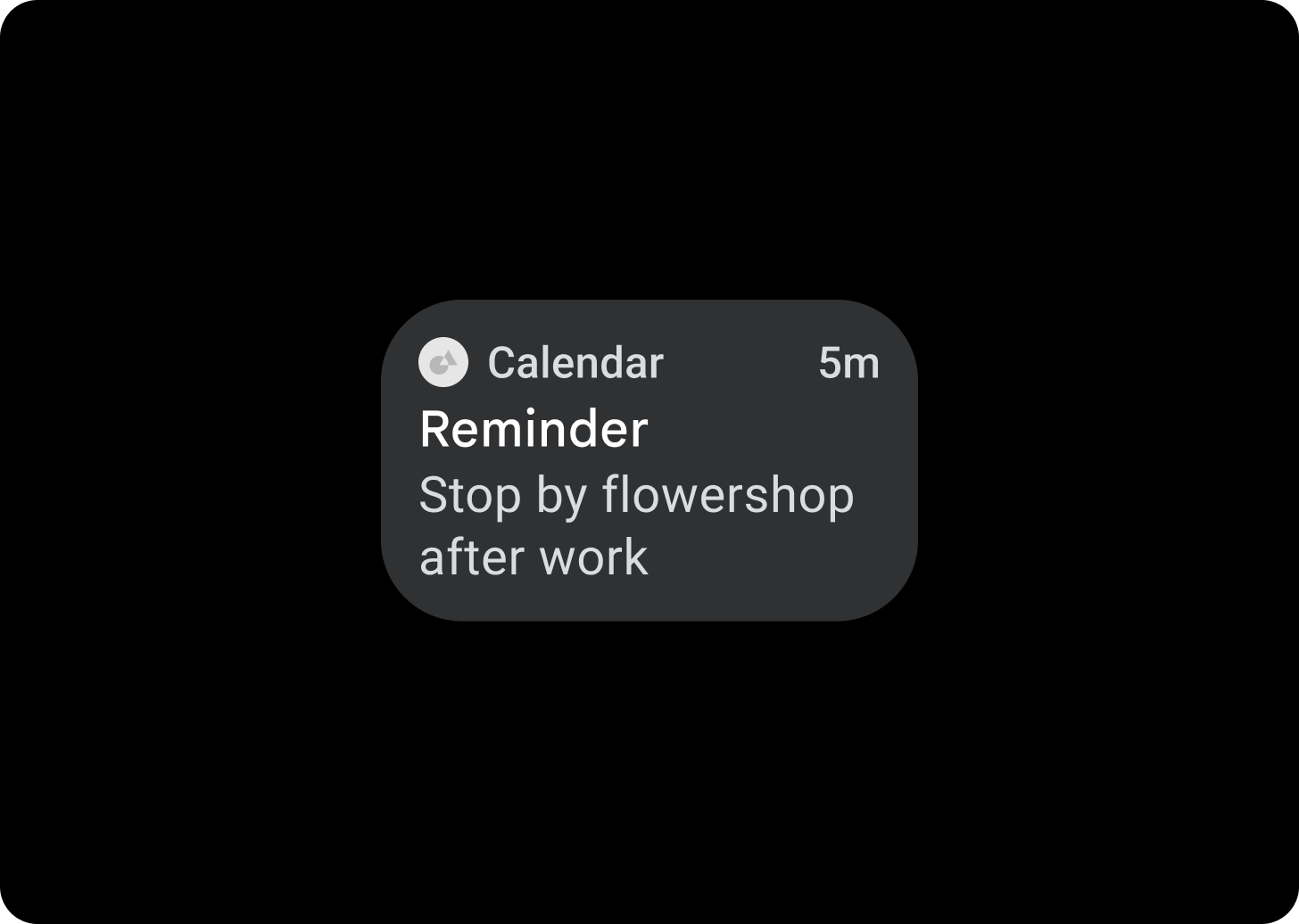
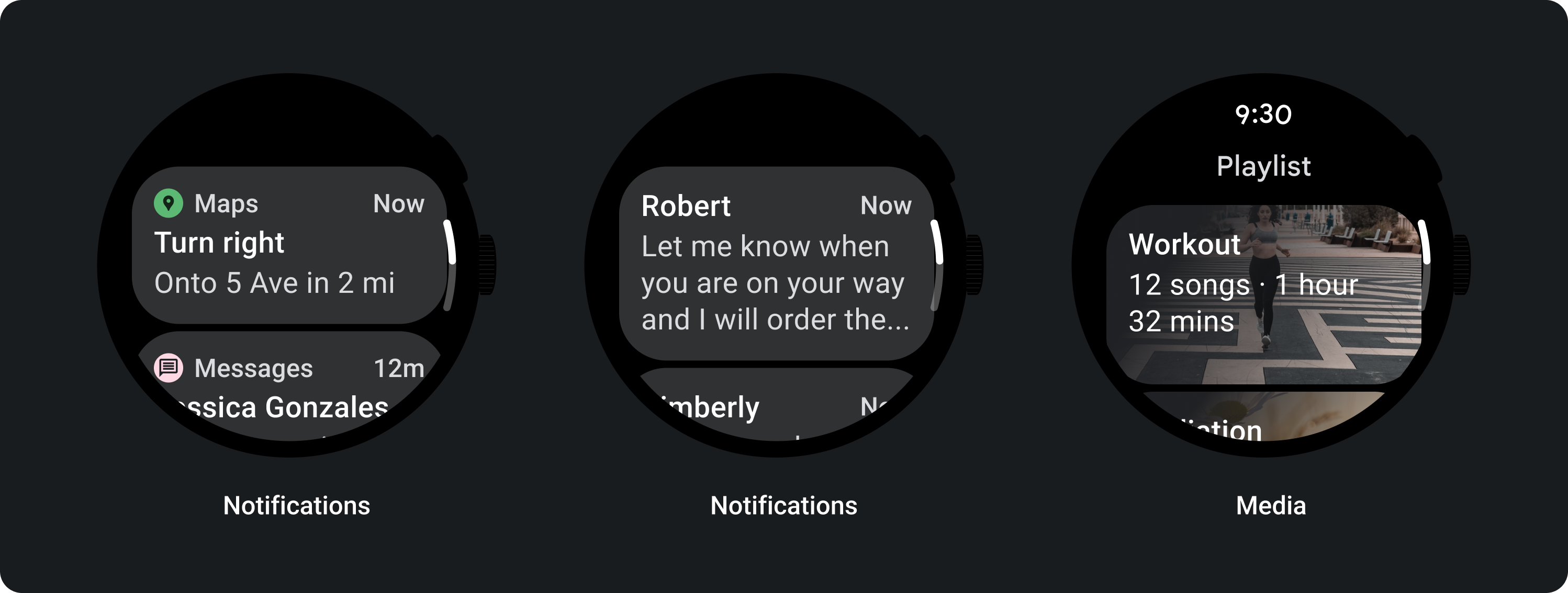
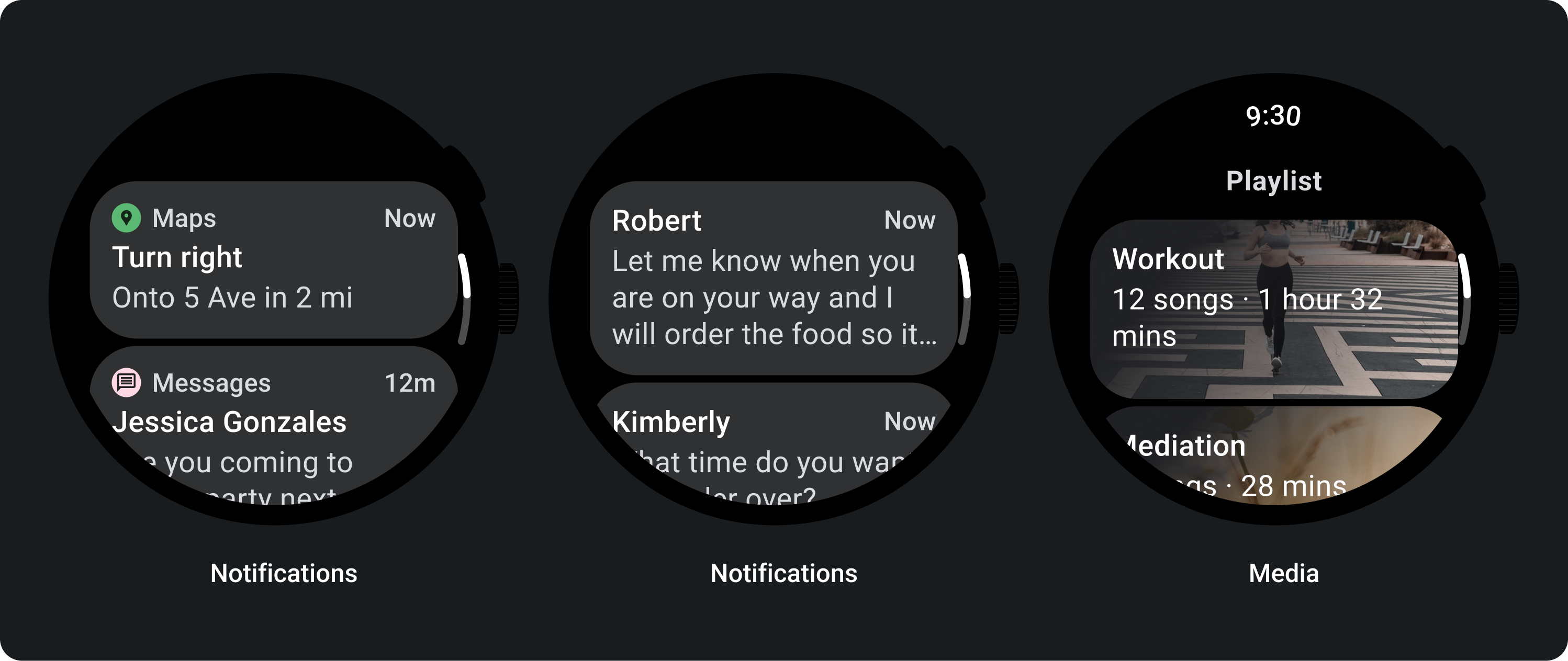
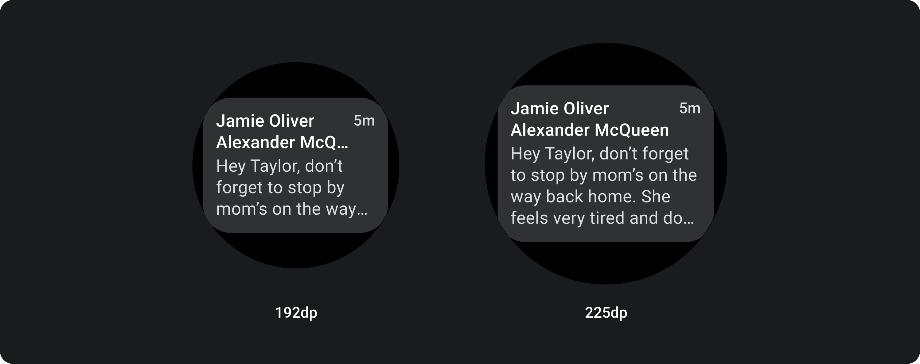
您可以使用片頭字幕在應用程式中顯示資訊,例如訊息。片頭字幕的版面有三個版位版面配置,其中包含標題、選填的時間欄位以及相關內容 (圖片或文字)。
應用程式資訊卡
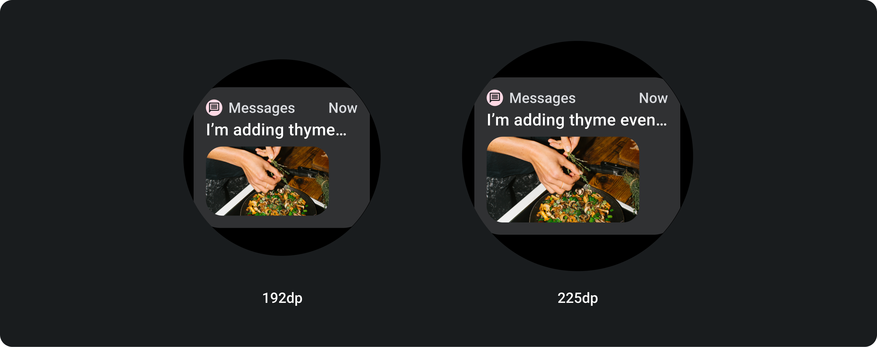
使用應用程式資訊卡顯示來自多個應用程式的互動元素。應用程式資訊卡有五個版位版面配置,其中包含應用程式圖示、應用程式名稱、活動發生時間、某種類型的標題以及相關內容 (圖片或文字)。
資訊卡漸層
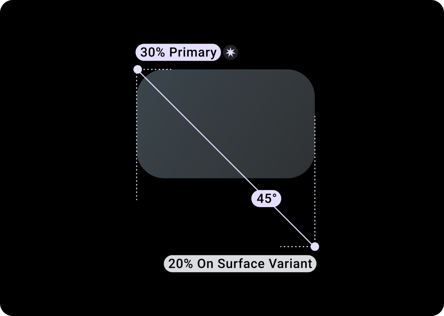
資訊卡漸層
頂端/左側 + 左側 68dp 的邊框間距 = 100% 表面
底部/右側 = 0% 表面
圖片資訊卡重疊廣告
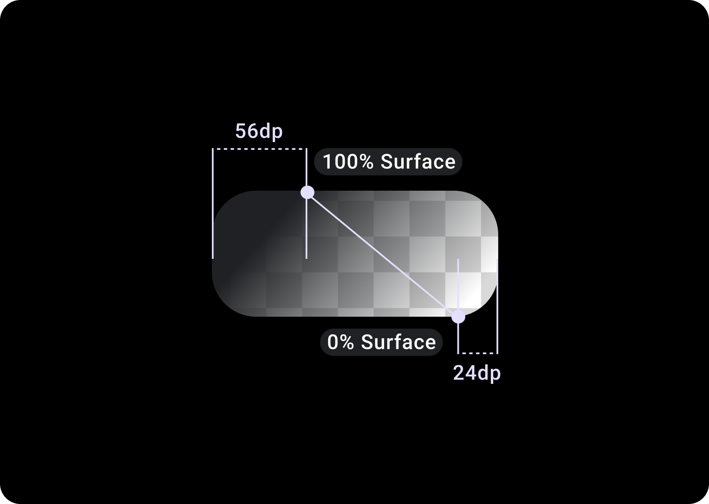
上方/左側 + 56 dp 邊框間距 (從 T/L 算起 = 100% 表面)
下/右 + 24 dp 邊框間距 (B/R 為 0%)
(圖片背景上的漸層疊加層)
大小
資訊卡寬度
資訊卡預設為容器的寬度上限。
您可以調整資訊卡高度。這取決於元件的內容。
在圓形錶面上,系統會裁剪高度高於螢幕高度 60% 的資訊卡。
使用方式
自動調整式版面配置
片頭字幕
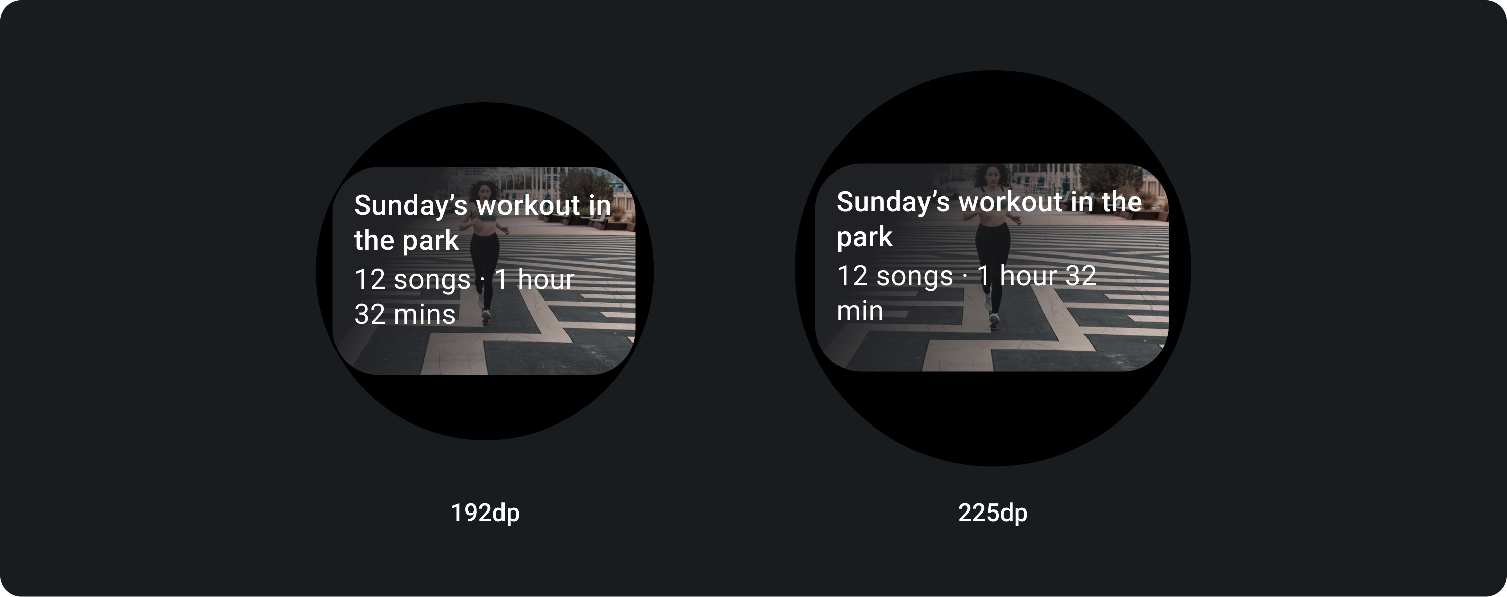
在大螢幕上,我們允許在內文中額外加入一行文字。如要顯示更多圖片,請在底部加入放大的 24 dp 邊框間距。
含有內嵌圖片的 TitleCard (取代內文文案版位)
在大螢幕上,圖片不會變更其顯示比例,且右邊會加上邊框間距,以免資訊卡高度過大。
可自訂的資訊卡
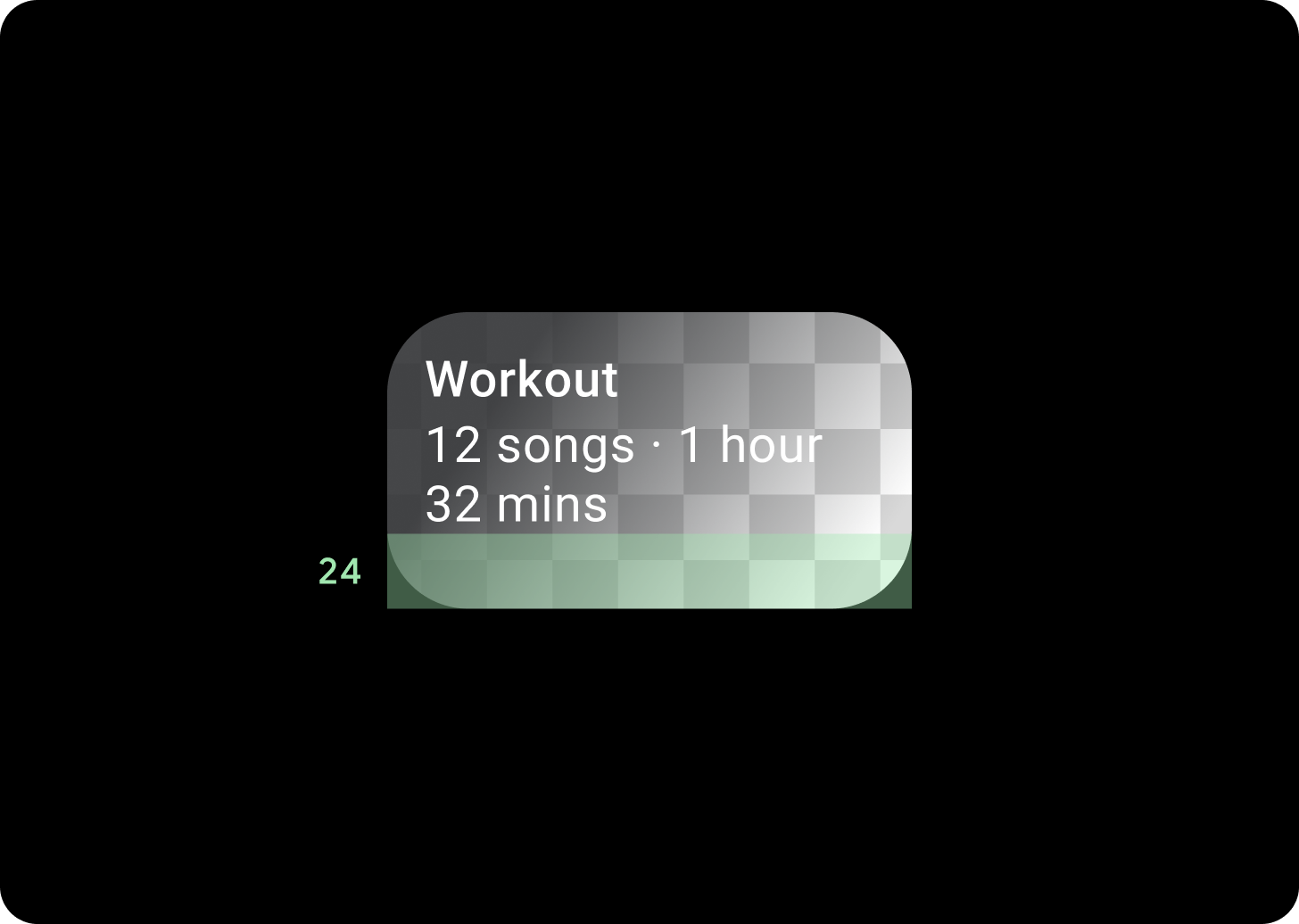
含有圖片背景的資訊卡
您必須自訂項目,才能達到這個版面配置。
圖片資訊卡會顯示與單一主題相關的內容,並有背景圖片。圖片資訊卡也可以顯示獨立圖片。
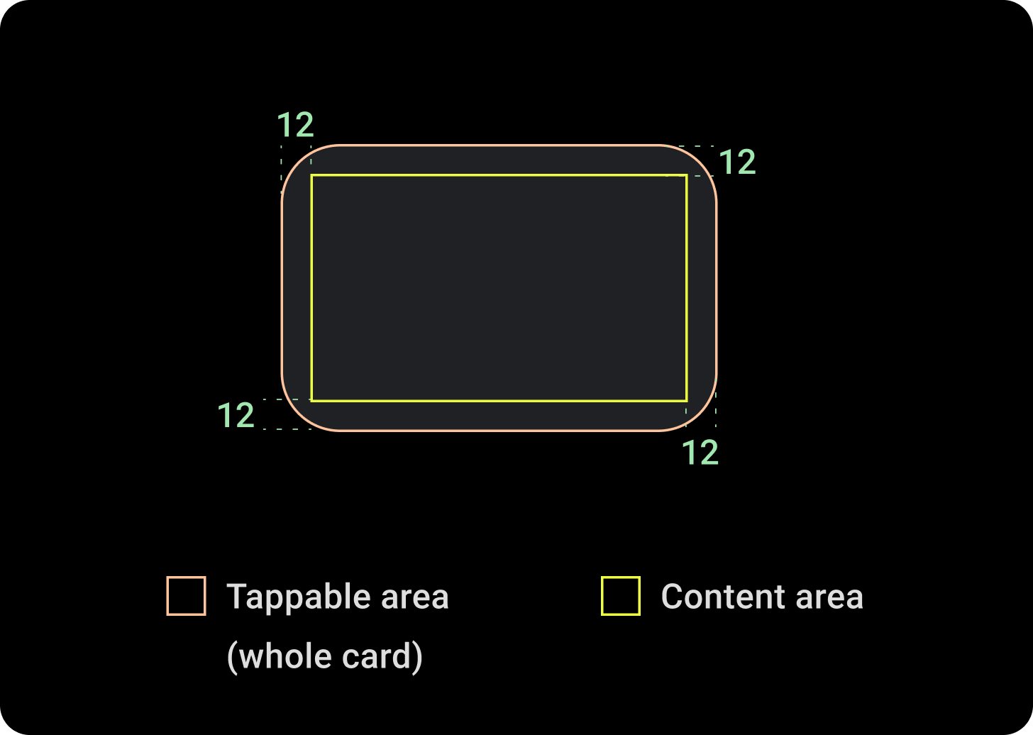
建議您將底部邊框間距調高為 24 dp,這樣在不疊加文字的情況下,顯示更多背景圖片。