卡片组件包含有关单个主题的内容和操作。
解剖学
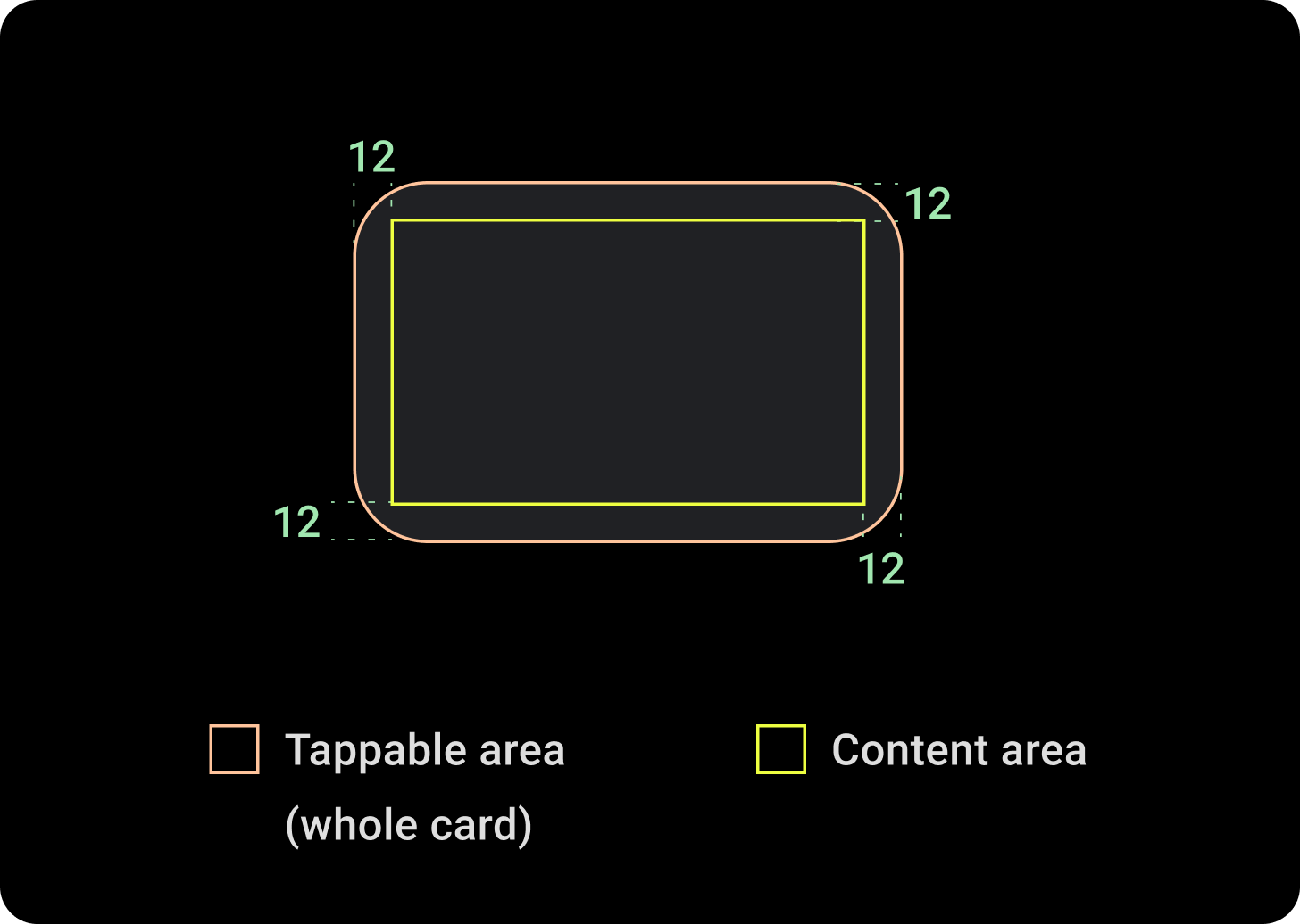
卡片组件只有一个槽位。卡片可以包含图标、图片或标签,并且是可自定义的。
默认情况下,卡片是带有圆角和渐变背景的矩形。将卡片的最大高度设置为 60%,以确保卡片完全显示在屏幕上,因为圆形显示屏最多可裁剪屏幕顶部和底部的 20%。
标题卡片
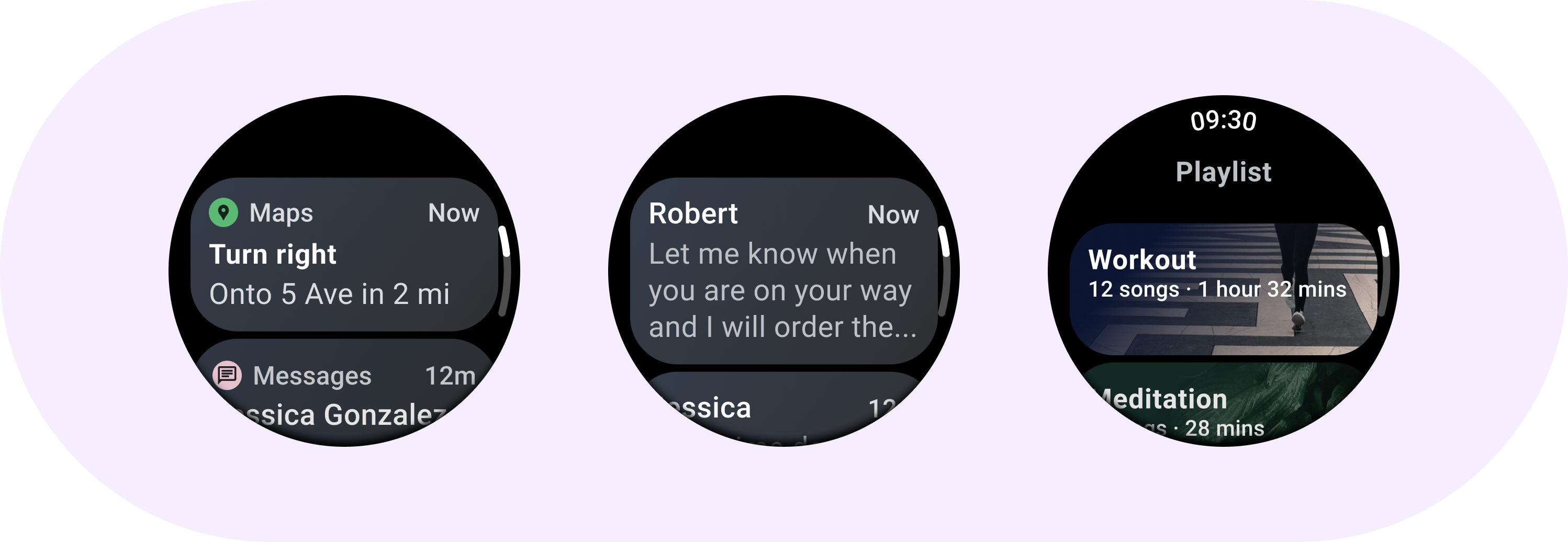
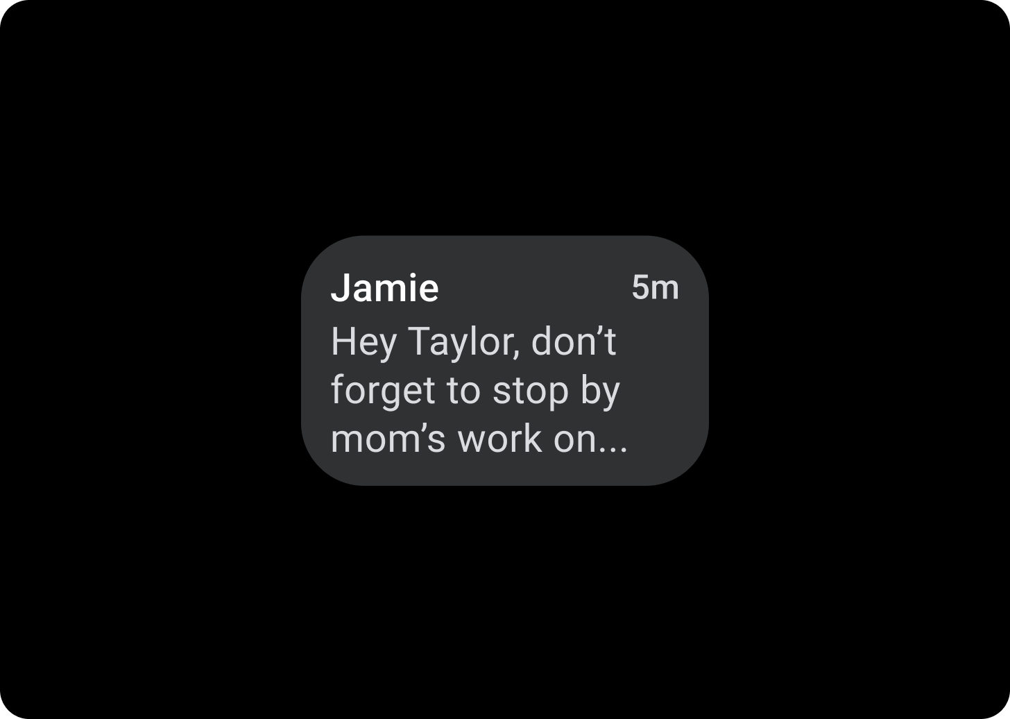
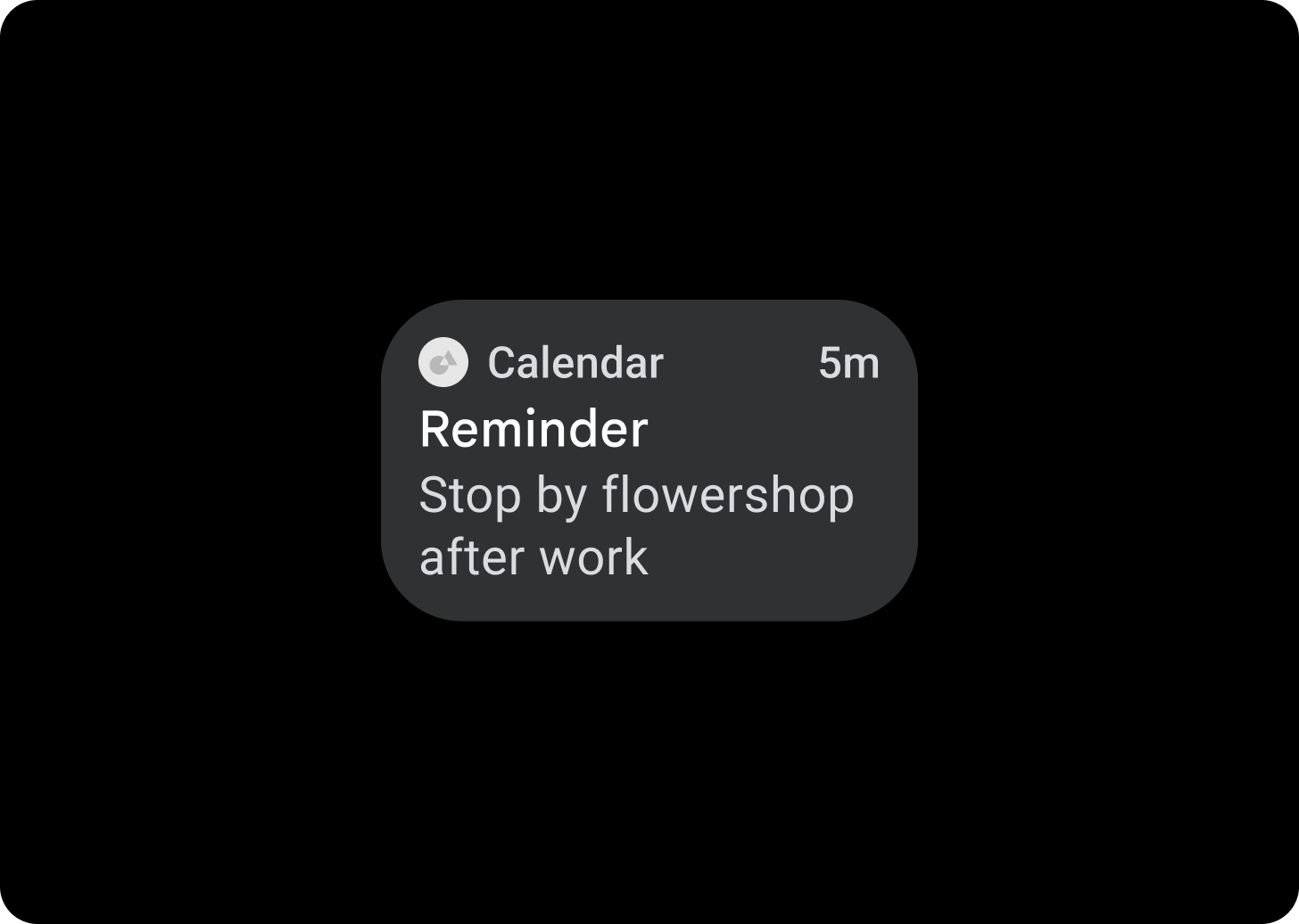
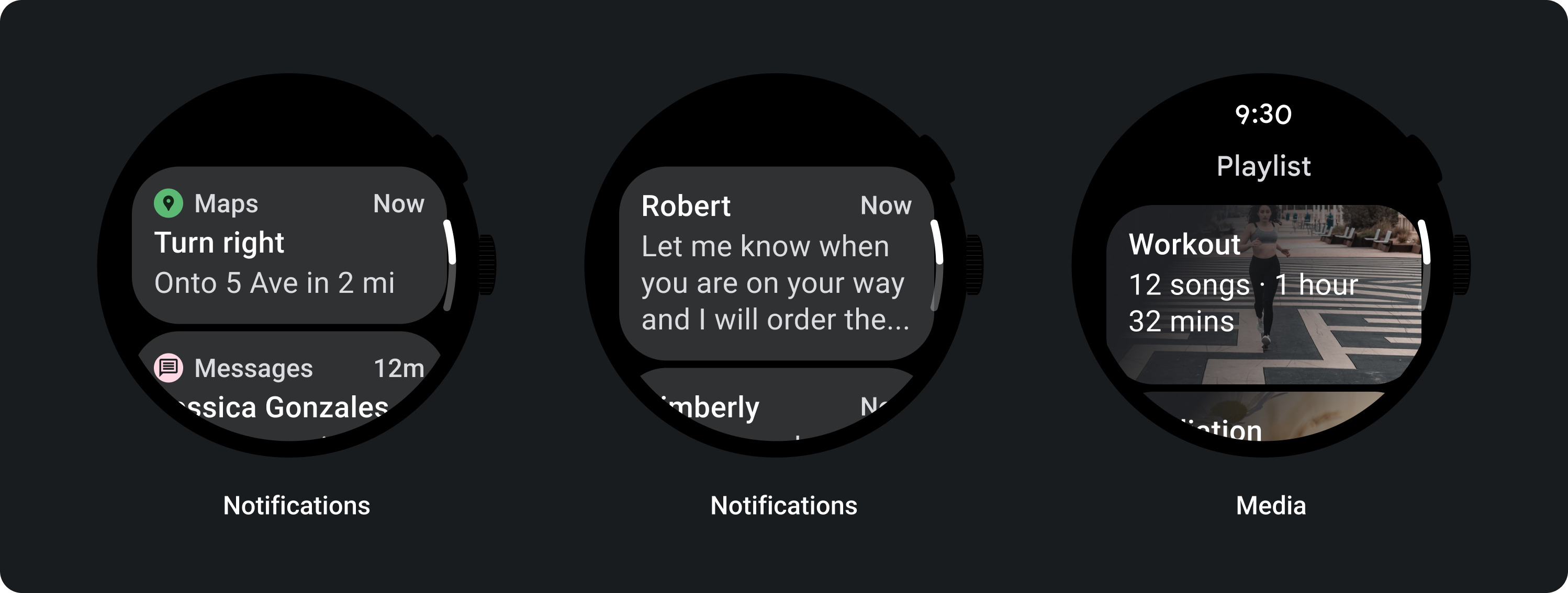
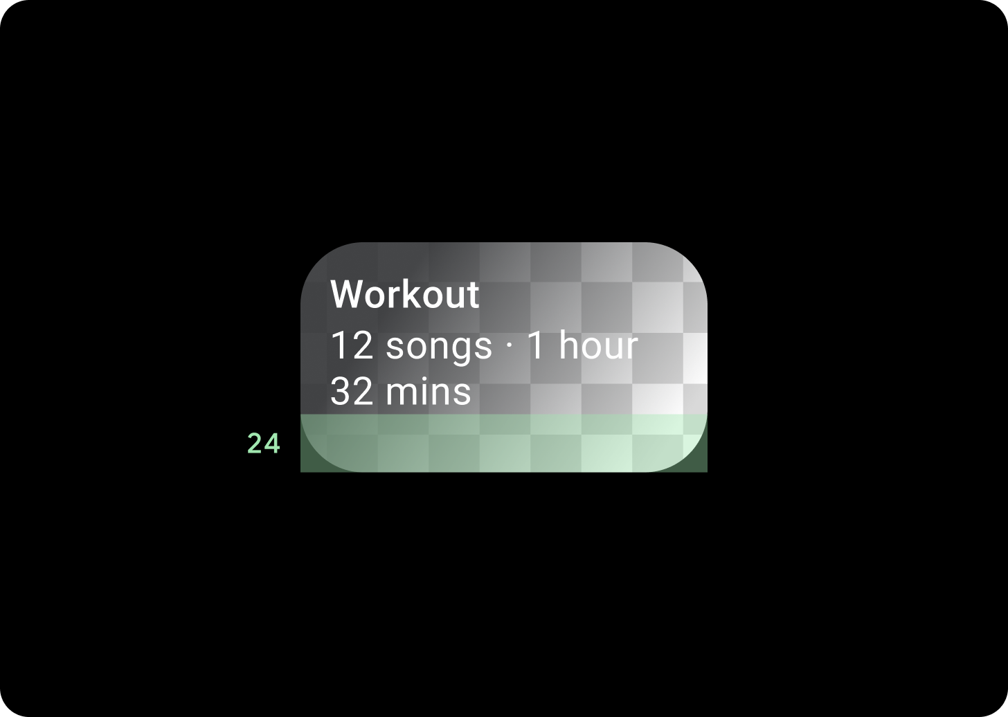
使用标题卡片在应用中显示信息,例如消息。片头字幕采用三格布局,其中包括标题、可选的时间字段以及相关内容(图片或文本)。
应用卡片
使用应用卡片显示多个应用的互动元素。应用卡片采用五格布局,其中包括应用图标、应用名称、activity 发生的时间、某种标题和相关内容(图片或文本)。
卡片渐变
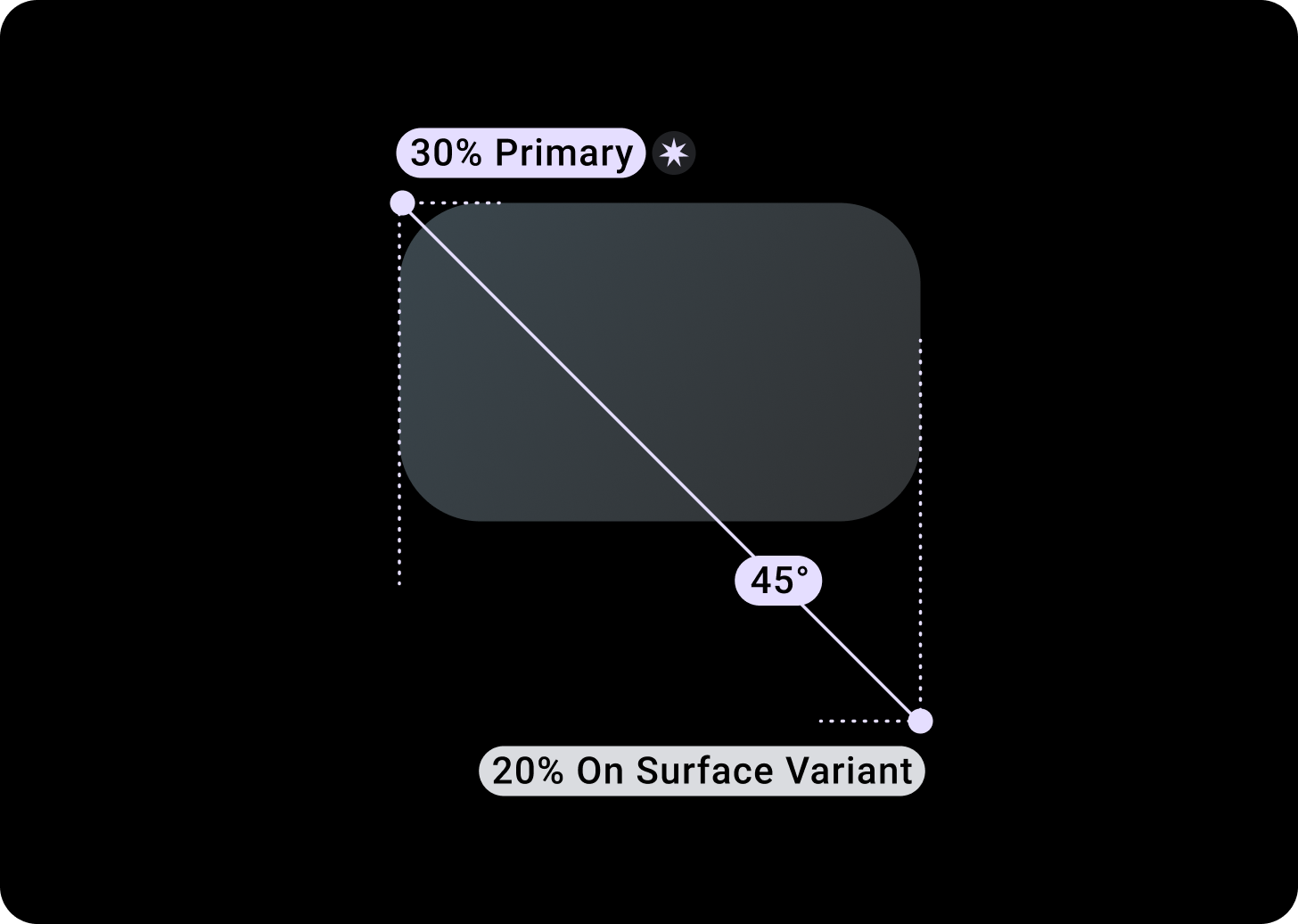
卡片渐变
上/左 + 距左边缘 68dp 的内边距 = 100% Surface
下/右 = 0% Surface
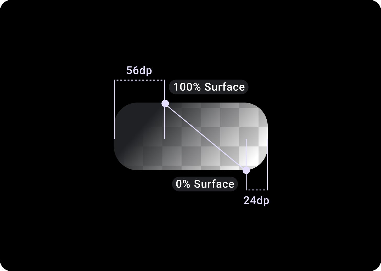
图片卡片叠加层
距 T/L 的上/左 + 56 dp 的内边距 = 100% Surface
下/右 + B/R 的 24 dp 内边距 = 0% Surface
(图片背景上的渐变叠加层)
尺寸
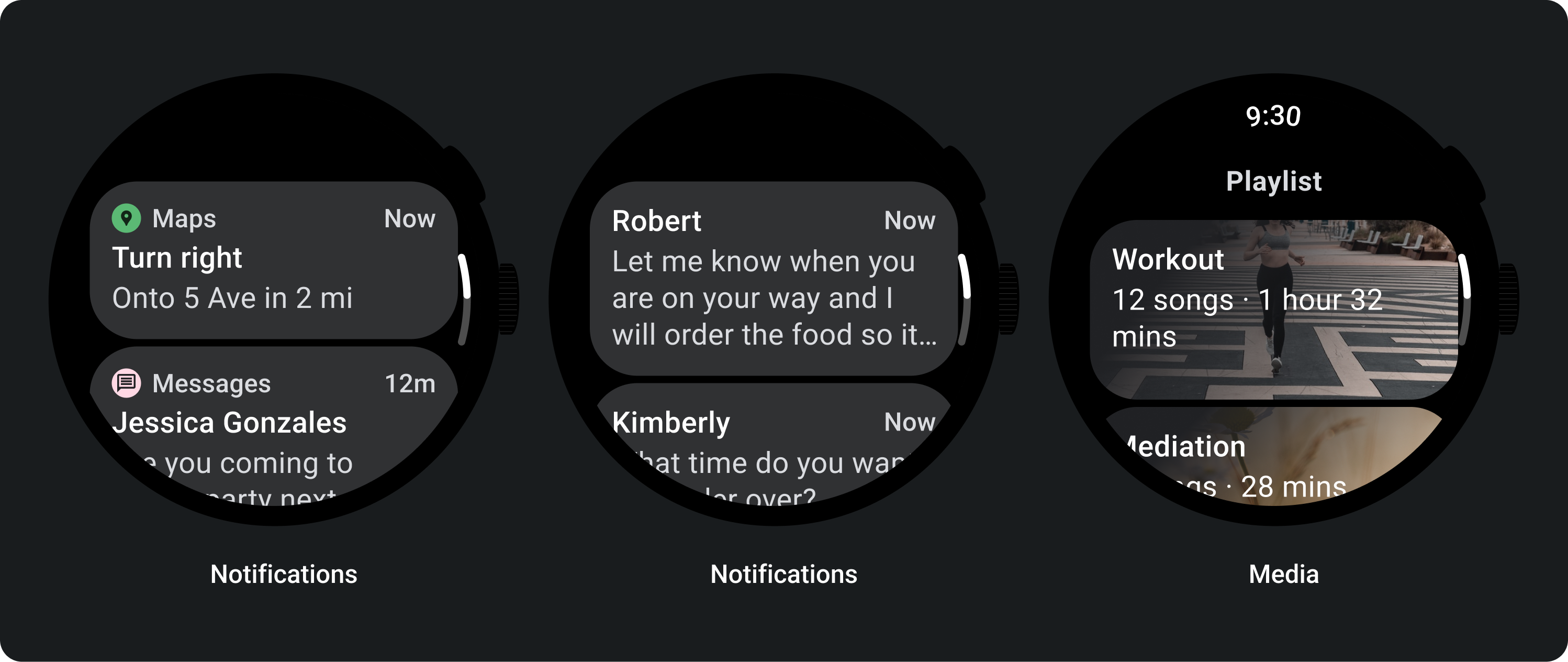
卡片宽度
卡片宽度默认为容器的最大宽度。
卡片高度可灵活设置,具体取决于组件的内容。
在圆形表盘上,卡片高度会超过屏幕高度的 60%,会被裁剪。
使用方法
自适应布局
标题卡片
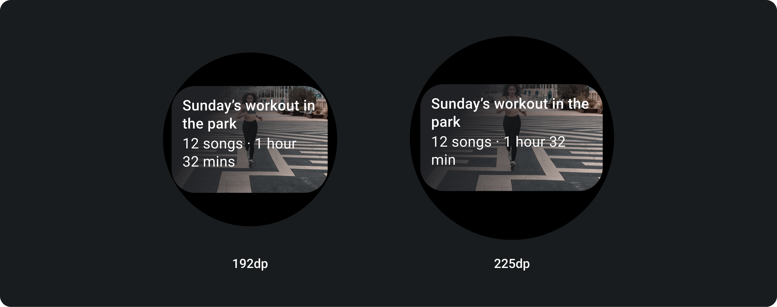
在较大的屏幕上,我们允许在正文中添加额外的一行文字。为了显示图片的更多内容,请在底部添加 24 dp 的放大内边距。
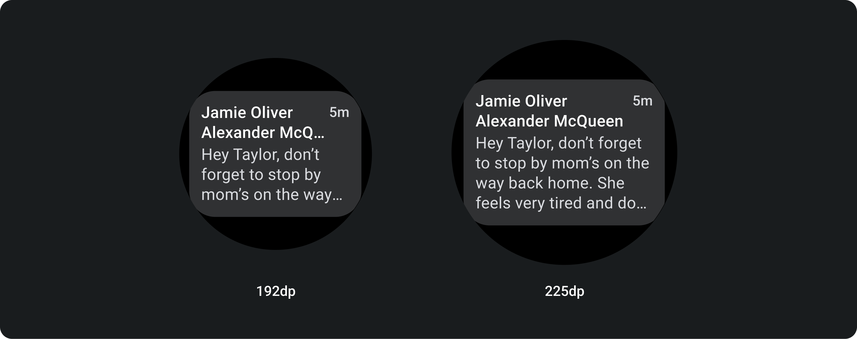
带有内嵌图片的 TitleCard(替换了正文文案槽)
在较大的屏幕上,图片不会改变其宽高比,并且右侧有内边距,以免卡片的高度过大。
可进行其他自定义的卡片
带有图片背景的卡片
为了实现此布局,您需要进行自定义。
图片卡片会显示与单个主题相关的内容,并带有背景图片。图片卡片也可以显示单独的图片。
建议将下内边距增加到 24 dp,以便显示更多没有文字的背景图片。