
使用 Dialog 可讓使用者註意需及時操作的動作或資訊上。
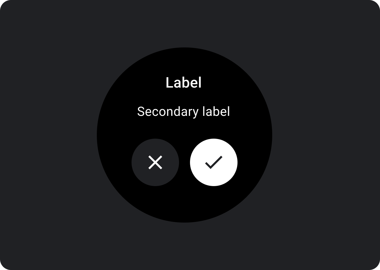
圖解
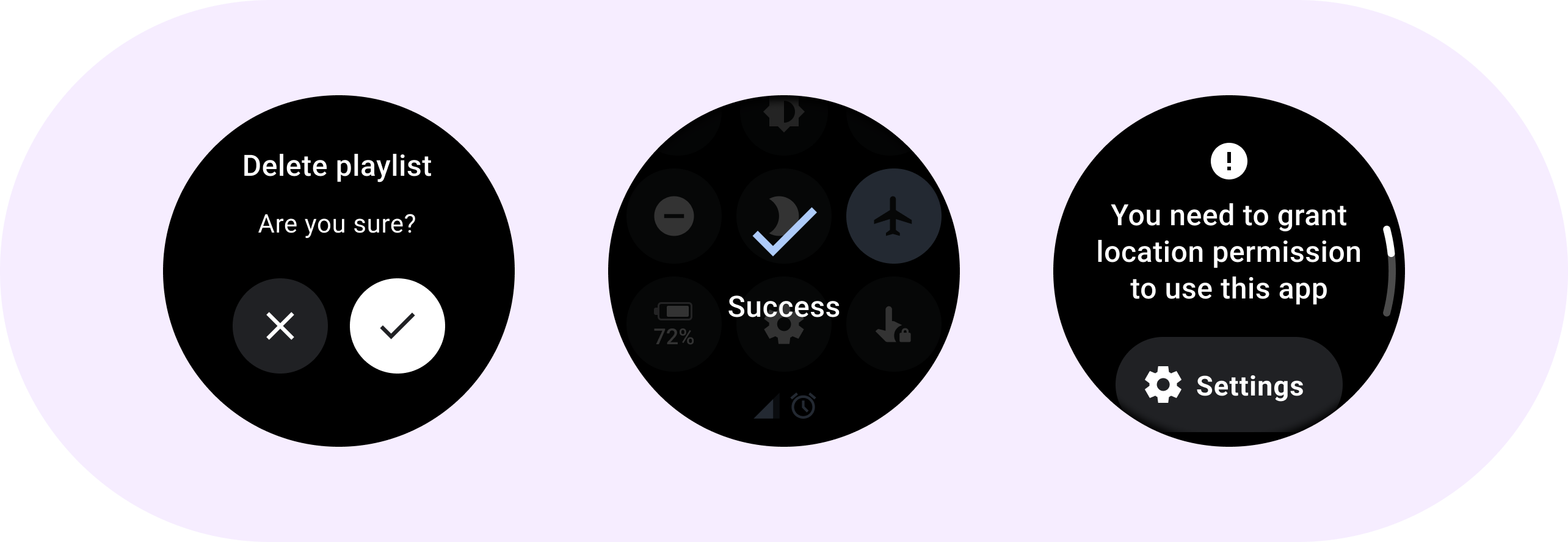
快訊
使用快訊元件取得使用者對重要任務的回應。
快訊到期時,所有應用程式功能都會停用,並會持續顯示於螢幕上,直到您採取行動為止。快訊可能會造成乾擾,因此請謹慎使用。
如果快訊的內容超過三行文字,請考慮將內容靠左對齊,以方便閱讀。否則文字會預設為置中對齊。
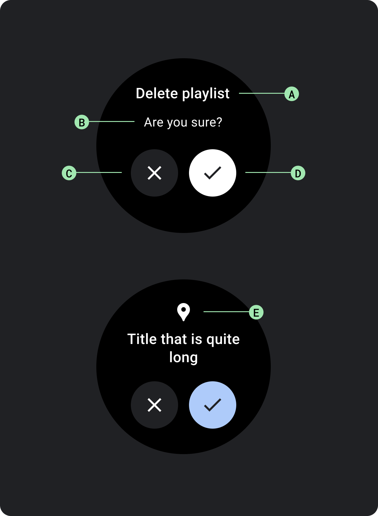
A. 標題
B. 內容 (選用)
C. 否定鈕
D. 確認鈕
E. 圖示 (選擇性)
確認
確認元件會在短時間內向使用者顯示確認訊息。與 Material 對應的應用程式不同,Wear OS 中的確認元件無法讓使用者做出選擇的最終確認。
您可以利用這個元件,在使用者執行動作後吸引他們的注意。
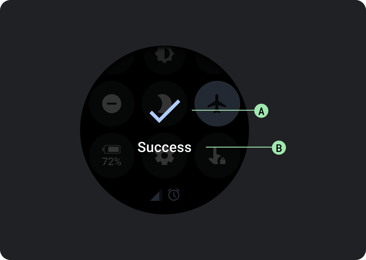
A. 圖示
B. 標籤