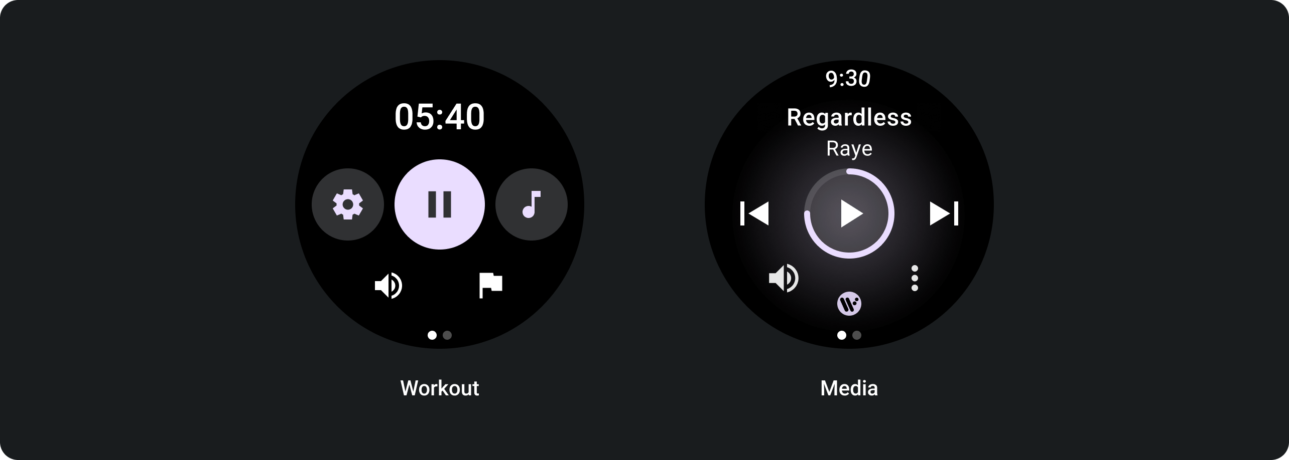
पेज के इंडिकेटर
संग्रह की मदद से व्यवस्थित रहें
अपनी प्राथमिकताओं के आधार पर, कॉन्टेंट को सेव करें और कैटगरी में बांटें.
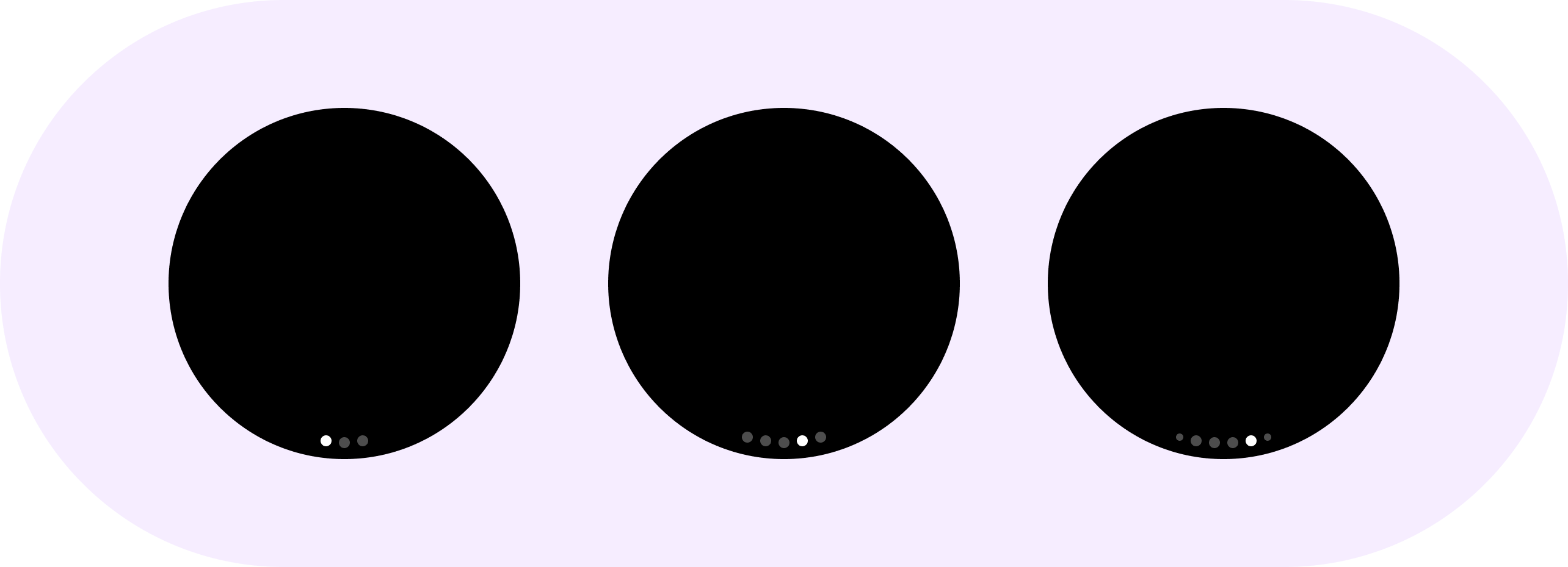
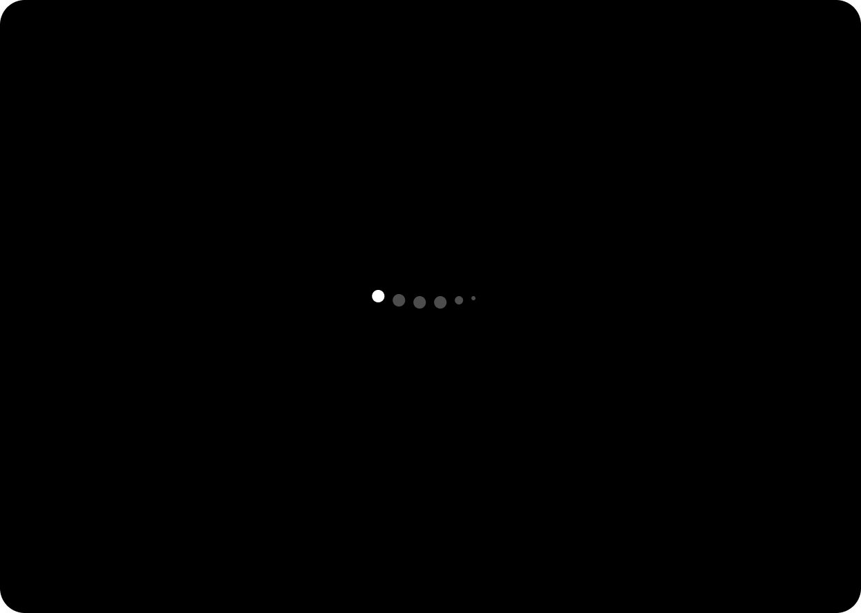
HorizontalPageIndicator कॉम्पोनेंट का इस्तेमाल, किसी ओवरले के मौजूदा ऐक्टिव पेज और कुल पेजों को दिखाने के लिए किया जाता है.
राउंड डिसप्ले पर, पेज इंडिकेटर घुमावदार होता है. यह सुविधा HorizontalPageIndicator क्लास में लागू की गई है. इसमें एक ऐक्टिव इंडिकेटर और कम से कम एक इनऐक्टिव इंडिकेटर होता है.
A. इनऐक्टिव इंडिकेटर
B. चालू होने का इंडिकेटर
इंडिकेटर का इस्तेमाल करके, उपयोगकर्ताओं को यह दिखाएं कि कैरसेल में आप कहां हैं. कॉन्टेंट को बाएं से दाएं ओर कर दें.
इस्तेमाल
अडैप्टिव लेआउट
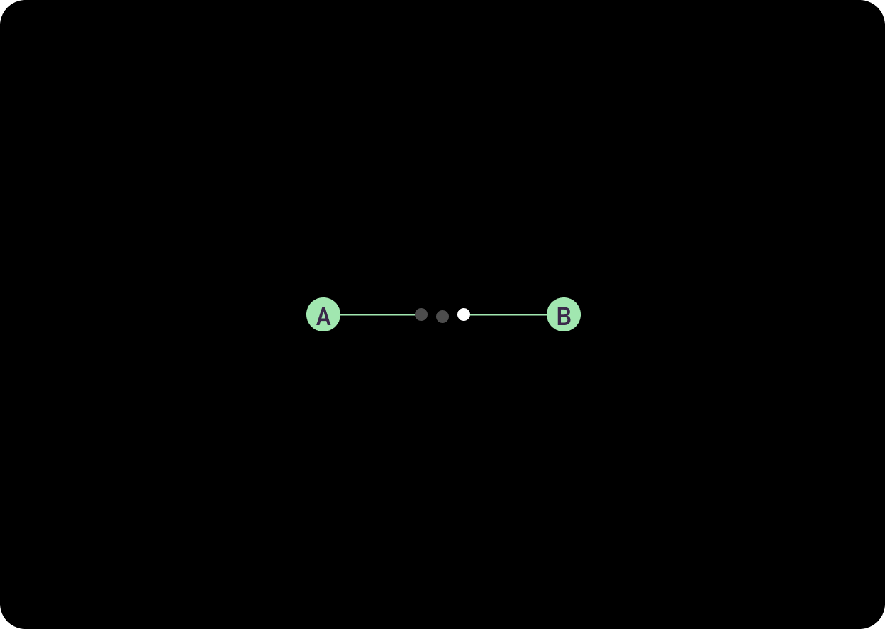
ऑप्टिकल बैलेंस के लिए, बिंदु (इंडिकेटर) के घेरे का केंद्र, सर्कुलर ग्रिड के पास या उस पर अलाइन होता है. इसका मतलब है कि स्क्रीन के साइज़ के बढ़ने पर, कर्व ऐंगल थोड़ा बदल जाता है.
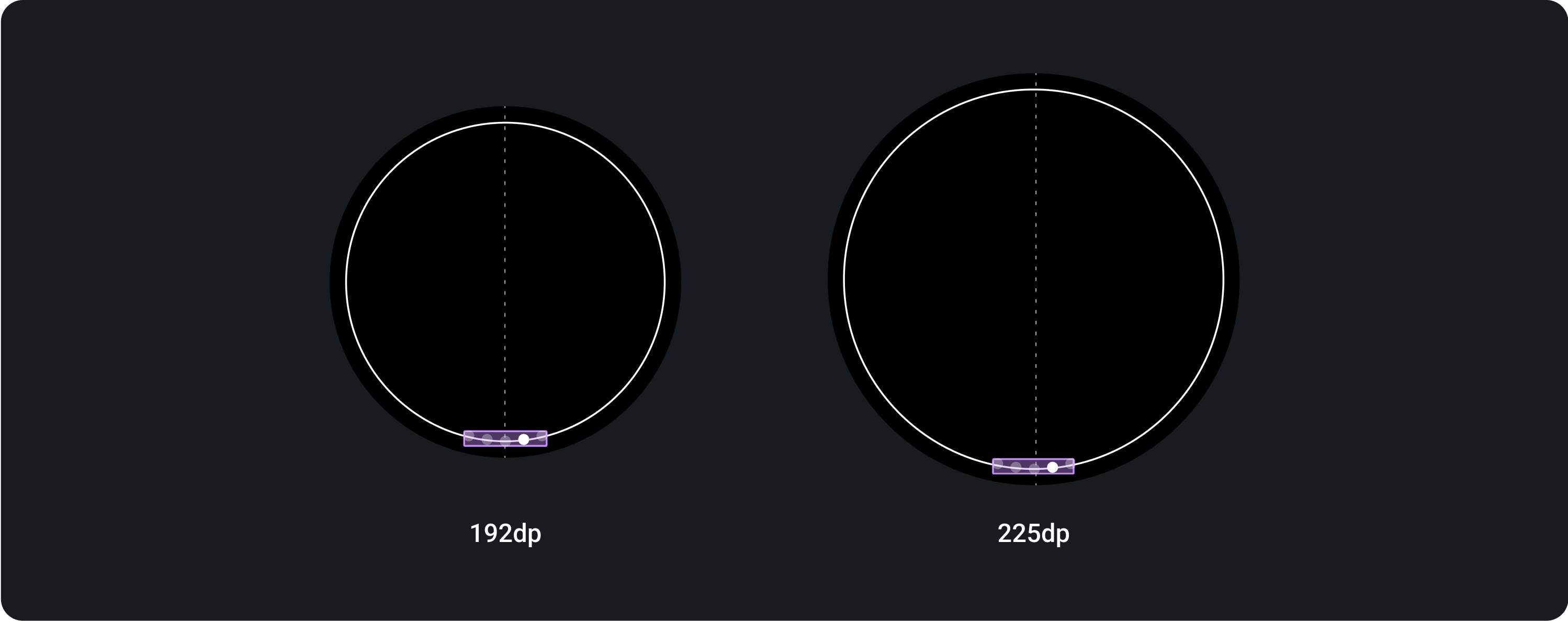
पेजेशन में हमेशा ज़्यादा से ज़्यादा छह बिंदु दिखेंगे. भले ही, स्क्रीन का साइज़ कुछ भी हो.
इस पेज पर मौजूद कॉन्टेंट और कोड सैंपल कॉन्टेंट के लाइसेंस में बताए गए लाइसेंस के हिसाब से हैं. Java और OpenJDK, Oracle और/या इससे जुड़ी हुई कंपनियों के ट्रेडमार्क या रजिस्टर किए हुए ट्रेडमार्क हैं.
आखिरी बार 2025-07-27 (UTC) को अपडेट किया गया.
[null,null,["आखिरी बार 2025-07-27 (UTC) को अपडेट किया गया."],[],[],null,["# Page indicators\n\nThe [HorizontalPageIndicator](/reference/kotlin/androidx/wear/compose/material/package-summary#HorizontalPageIndicator(androidx.wear.compose.material.PageIndicatorState,androidx.compose.ui.Modifier,androidx.wear.compose.material.PageIndicatorStyle,androidx.compose.ui.graphics.Color,androidx.compose.ui.graphics.Color,androidx.compose.ui.unit.Dp,androidx.compose.ui.unit.Dp,androidx.compose.ui.graphics.Shape)) component is used to represent the currently active page and total pages of an overlay. \nOn round displays, a page indicator is curved. This behavior is implemented in the `HorizontalPageIndicator` class. It is made up of one active indicator and at least one inactive indicator. \n\n**A. Inactive Indicator\nB. Active Indicator**\n\n\u003cbr /\u003e\n\n\u003cbr /\u003e\n\nUse indicators to show users where you are in a carousel. Orient content from left to right.\n\n\u003cbr /\u003e\n\n\u003cbr /\u003e\n\n**Usage**\n---------\n\n**Adaptive layouts**\n--------------------\n\nCentre of the dot (indicator) circumference aligns near or on the circular grid for optical balance, this means the curve angle changes slightly as the screen size increases.\n\nThe pagination will always show a maximum of 6 dots, no matter the size of the screen.\n\n\u003cbr /\u003e\n\n\u003cbr /\u003e"]]
