Wear Material 主题能够系统地自定义 Wear Material Design 以反映您的品牌特色。当您开始更改界面的各个方面(例如颜色和排版)时,Wear Material 主题工具会让您的设计构想体现在整个用户体验中。借助这些工具,您可以为所有可自定义的属性提供特定值,从而在设计工作流和代码工作流之间轻松切换。自定义属性值可为您的产品创建一个 Wear Material 主题。
使用 Wear Material 主题
Wear Material 主题包含三项主要操作:自定义主题、在所有设计模拟中应用该主题、在代码中使用该主题。
Wear Material Design 随附可按原样使用的内置主题。您可以对内置主题进行自定义,使 Material 适合您的产品。
主题的实际应用
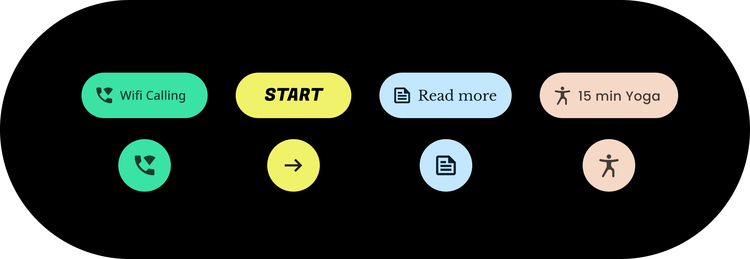
主题能够影响您的整个界面,包括条状标签等单个组件。以下示例展示了如何自定义条状标签组件的默认值。
所含条状标签已被分配了特定颜色、形状和字类的值。请调整默认值,使其适合您的应用的样式。
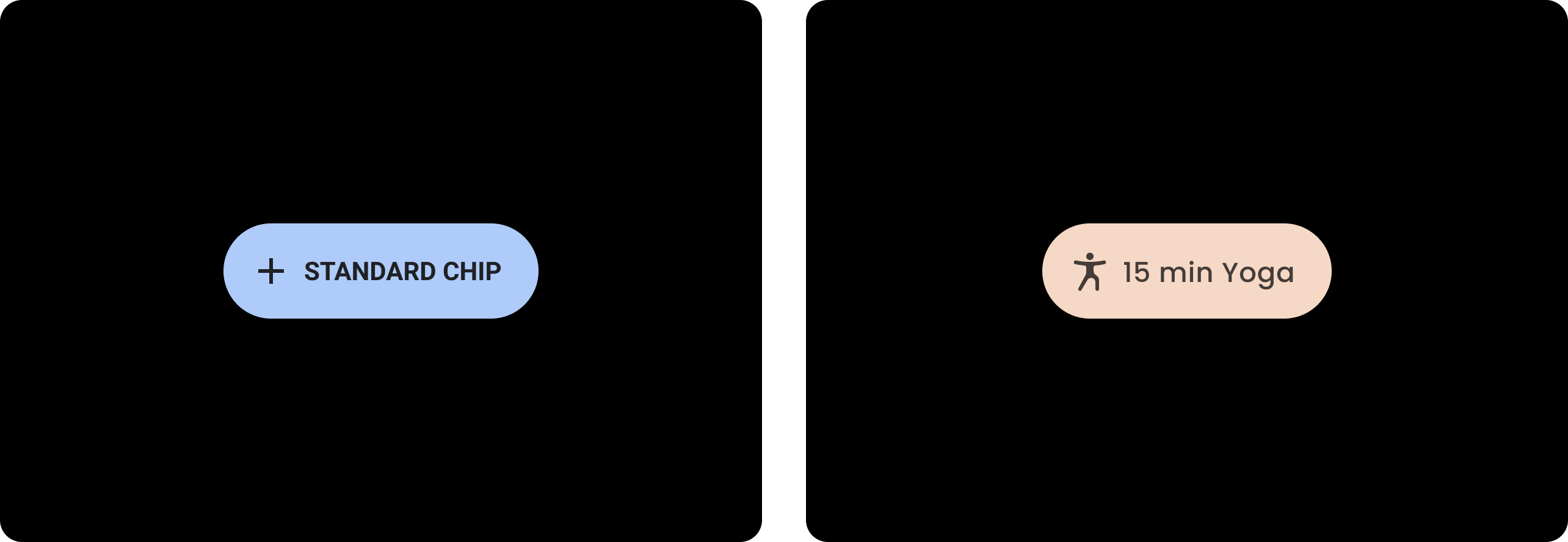
| 之前
采用默认样式的基准 Wear Material 条状标签。 |
之后
自定义的 Wear Material 条状标签。 |
颜色
颜色系统支持为组件、文本、图标和界面设置自定义颜色。您可以为以下 13 个类别设置主题颜色:
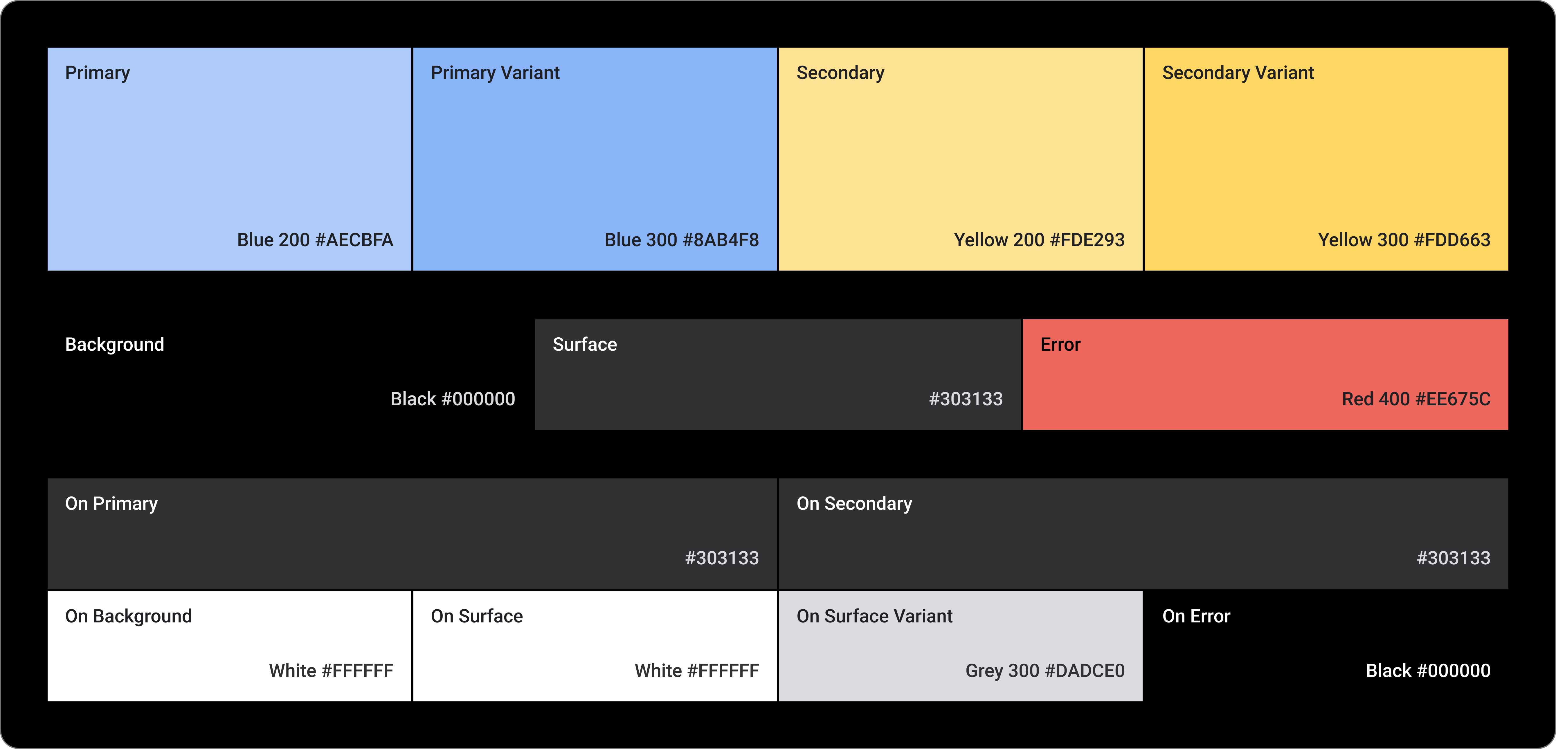
Primary
Primary 变体
Secondary
Secondary 变体
背景
Surface
错误
On Primary
On Secondary
On Background
On Surface
On Surface 变体
On Error
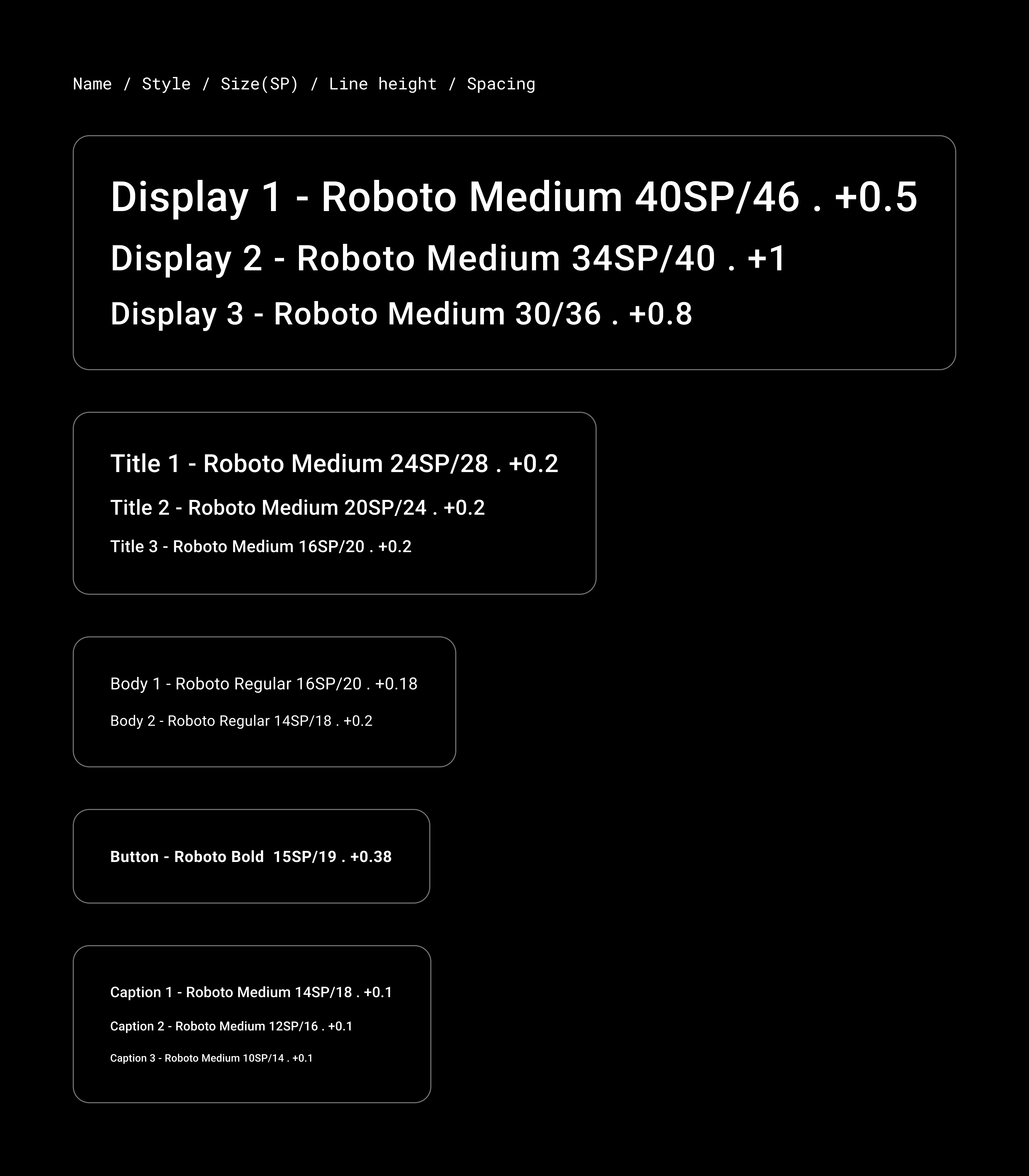
排版
排版系统支持 11 个类别,这些类别共同形成字体比例。这种字体比例决定了屏幕上显示的各种字体样式和字号,从正文到按钮文字都包括在内。
排版属性通过可针对字类、字体、大小写、字号和字间距进行自定义的值来控制。