Wear のマテリアル テーマ設定は、ブランドを反映するように Wear のマテリアル デザインを体系的にカスタマイズする機能です。色やタイポグラフィといった UI の要素を変更し始めると、Wear のマテリアル テーマ設定ツールは、デザイン ビジョンをユーザー エクスペリエンス全体に適用します。このツールを使用すると、カスタマイズ可能なすべての属性に特定の値を指定することで、デザイン ワークフローとコード ワークフローを簡単に切り替えることができます。属性値をカスタマイズすると、プロダクトに合った Wear のマテリアル テーマが作成されます。
Wear のマテリアル テーマ設定を使用する
Wear のマテリアル テーマ設定は、テーマのカスタマイズ、デザインモック全体への適用、コード内での使用という 3 つの主要なアクションで構成されています。
Wear のマテリアル デザインには、そのまま使用できる組み込みのテーマが付属しています。この組み込みのテーマをカスタマイズすることで、マテリアル テーマをプロダクトに合わせます。
テーマ設定の実践
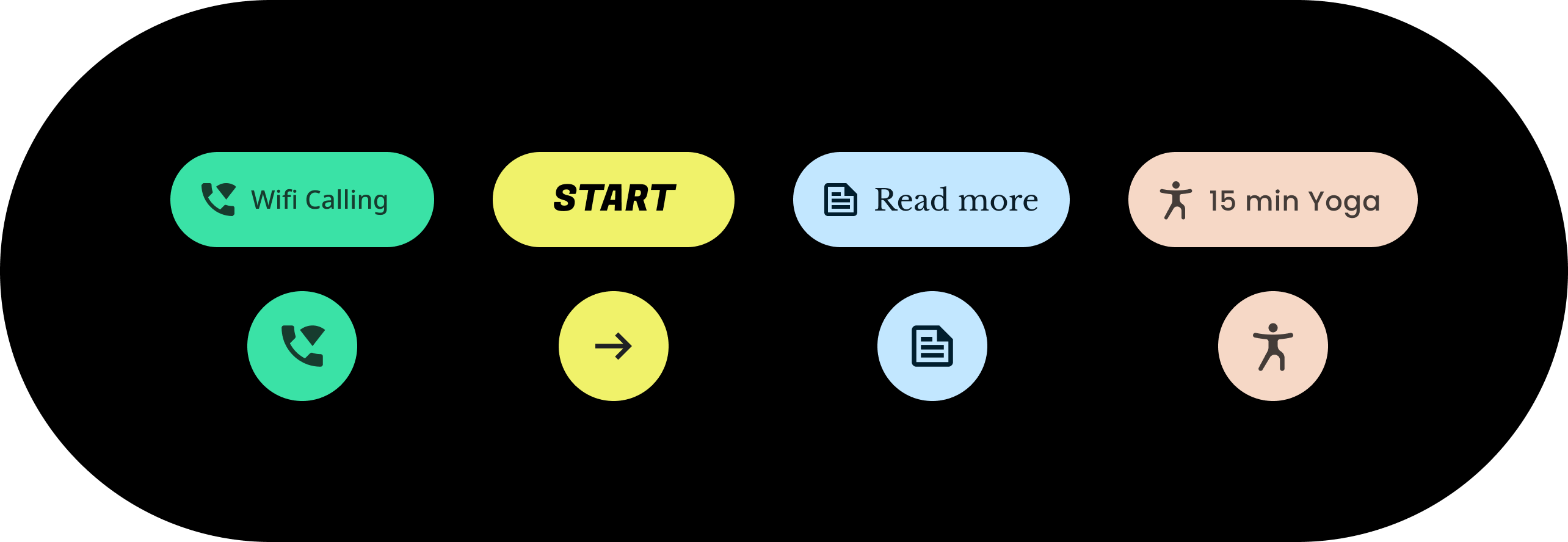
テーマ設定は、チップなどの個々のコンポーネントを含め、UI 全体に影響します。次の例は、チップ コンポーネントのデフォルト値をカスタマイズする方法を示しています。
含まれるチップには、特定の色、形状、タイプ ファミリーの値が割り当てられています。アプリのスタイルに合わせてデフォルト値を調整します。
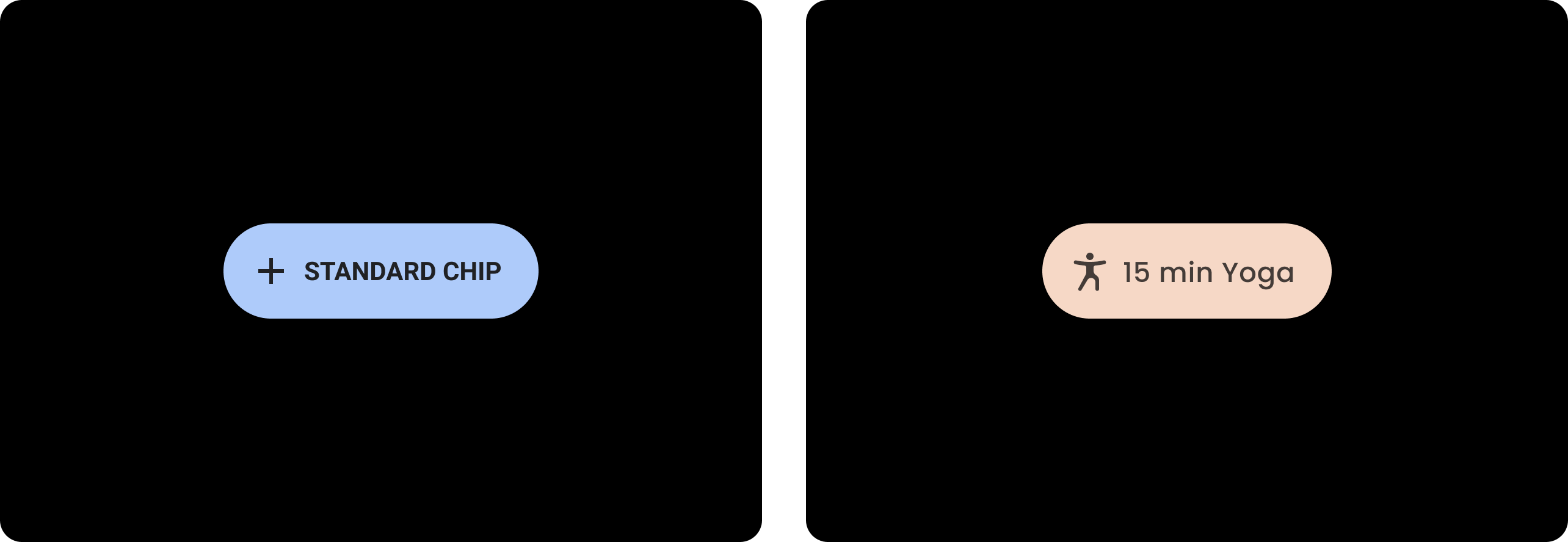
| 変更前
デフォルト スタイルによるベースラインの Wear のマテリアル チップ。 |
変更後
カスタマイズされた Wear のマテリアル チップ。 |
色
カラーシステムは、コンポーネント、テキスト、アイコン、サーフェスのカスタム色設定をサポートしています。以下の 13 のカテゴリについてテーマの色を設定します。
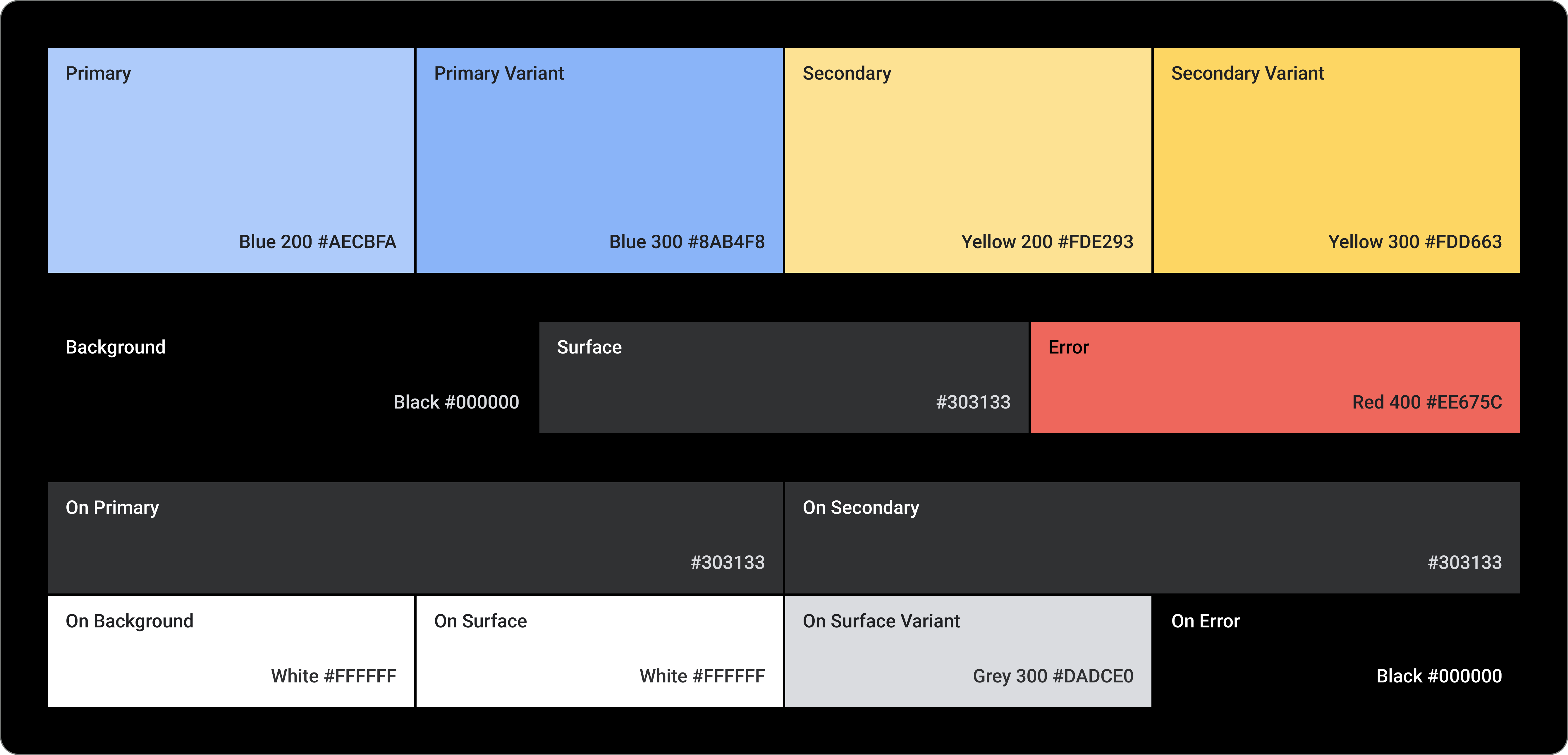
Primary
Primary Variant
Secondary
Secondary Variant
背景
Surface
エラー
On Primary
On Secondary
On Background
On Surface
On Surface Variant
On Error
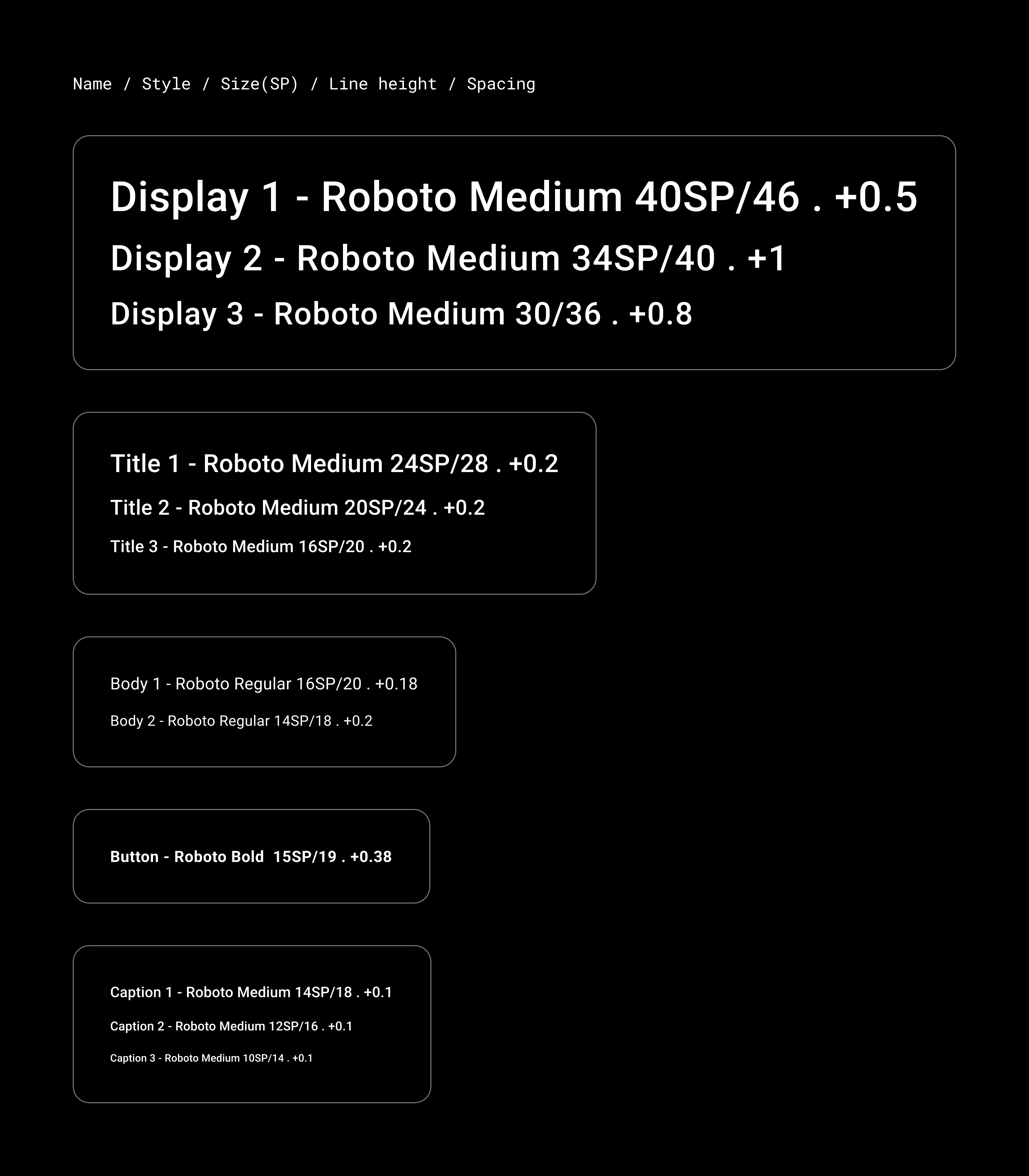
タイポグラフィ
タイポグラフィ システムは 11 のカテゴリをサポートしており、それらが組み合わさってタイプスケールを形成します。タイプスケールにより、本文からボタンテキストまで、画面に表示されるさまざまな文字のスタイルとサイズが決まります。
タイポグラフィ属性は、タイプ ファミリー、フォント、大文字 / 小文字、サイズ、トラッキング用にカスタマイズできる値で制御されます。