

对于用户易于理解且不需要文本标签的操作,请使用 Button 组件。与条状标签不同,按钮为圆形。
解剖学
A. 内容
按钮有一个为图标或文本预留的槽位。请选择与该按钮所执行的操作相关的图标。如果图标无法描述相关操作,您可以使用不超过三个字符的文本。如果图标无法清晰地描述操作,建议使用条状标签组件
B. 容器
按钮容器仅限使用单一纯色填充。
按钮类型


层次结构
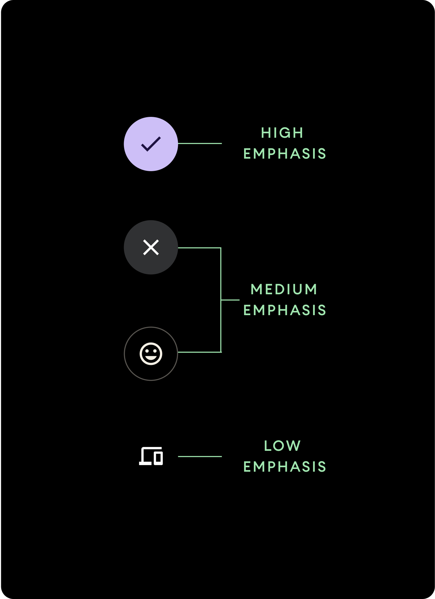
使用不同的填充颜色来表示按钮层次结构。
高强调度
高强调度按钮包含应用的主要操作。对于高强调度按钮,请为容器使用 Primary 或 Secondary 颜色,并为内容使用 On Primary 和 On Secondary 颜色。如需了解详情,请参阅 Wear Material 主题。
中强调度
中强调度按钮使用色彩对比度较低的颜色。其中包含重要性相对主要操作较低的操作。请为容器使用 Surface 颜色,并为内容使用 On Surface 颜色。
或者,也可为中强调度按钮使用自定义 OutlinedButton 组件。该组件具有透明背景、不透明度为 60% 的主要变体彩色描边,以及主要彩色内容。
低强调度(仅限图标)低强调度按钮没有颜色填充。它们最适合需要紧凑排列的表盘上的较小区域。请为内容使用 On Surface 颜色。
尺寸
使用不同大小的按钮来突出显示或弱化显示相关操作。

大
图标 (30 x 30 dp)
容器 (60 x 60 dp)
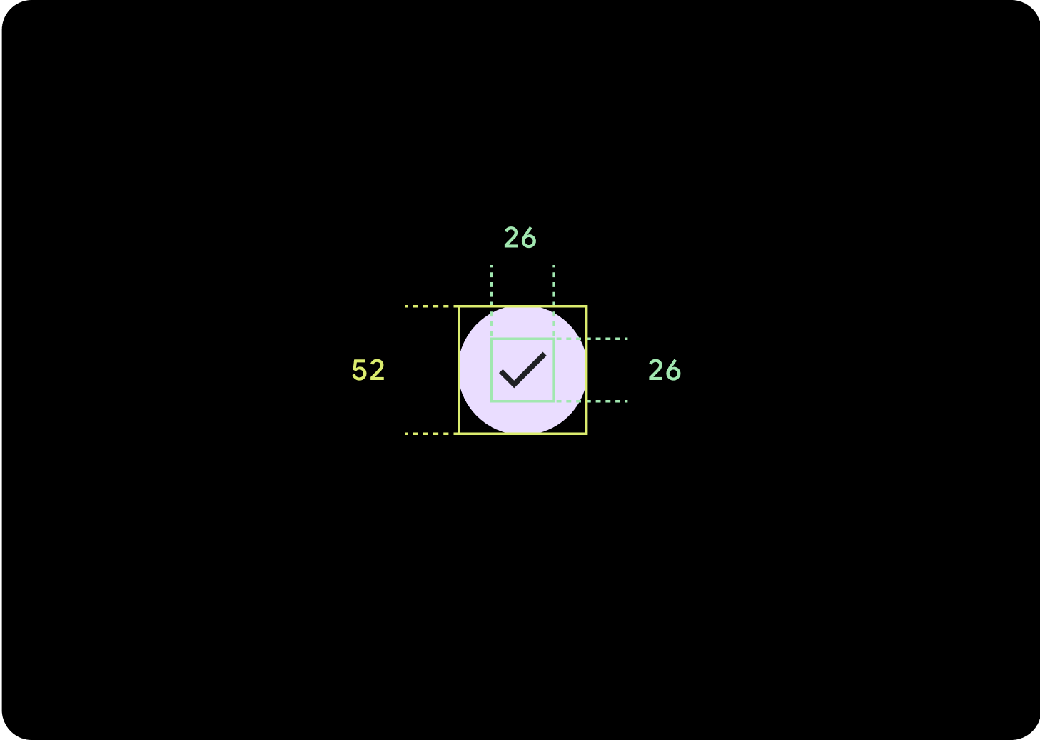
默认
图标 (26 x 26 dp)
容器 (52 x 52 dp)
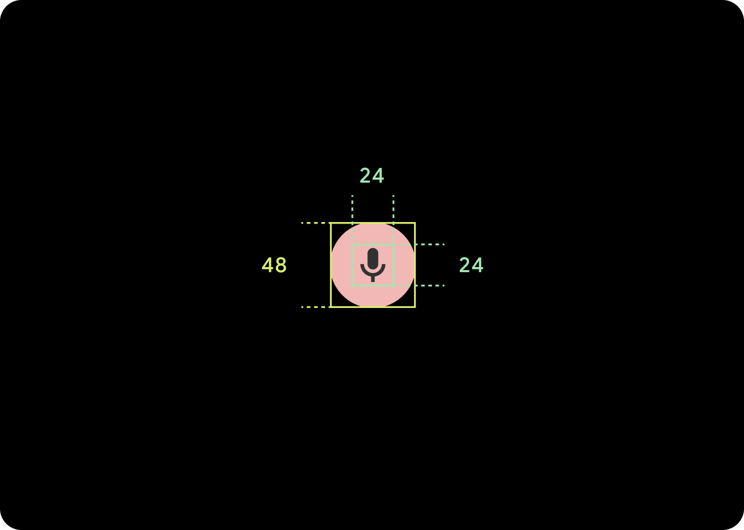
小
图标 (24 x 24 dp)
容器 (48 x 48 dp)

超小号
图标 (24 x 24 dp)
容器 (32 x 32 dp)
建议在该按钮周围添加额外的内边距,以创建至少 48dp 的点按目标。这是我们为无障碍功能设置的最小点按目标尺寸。
用法
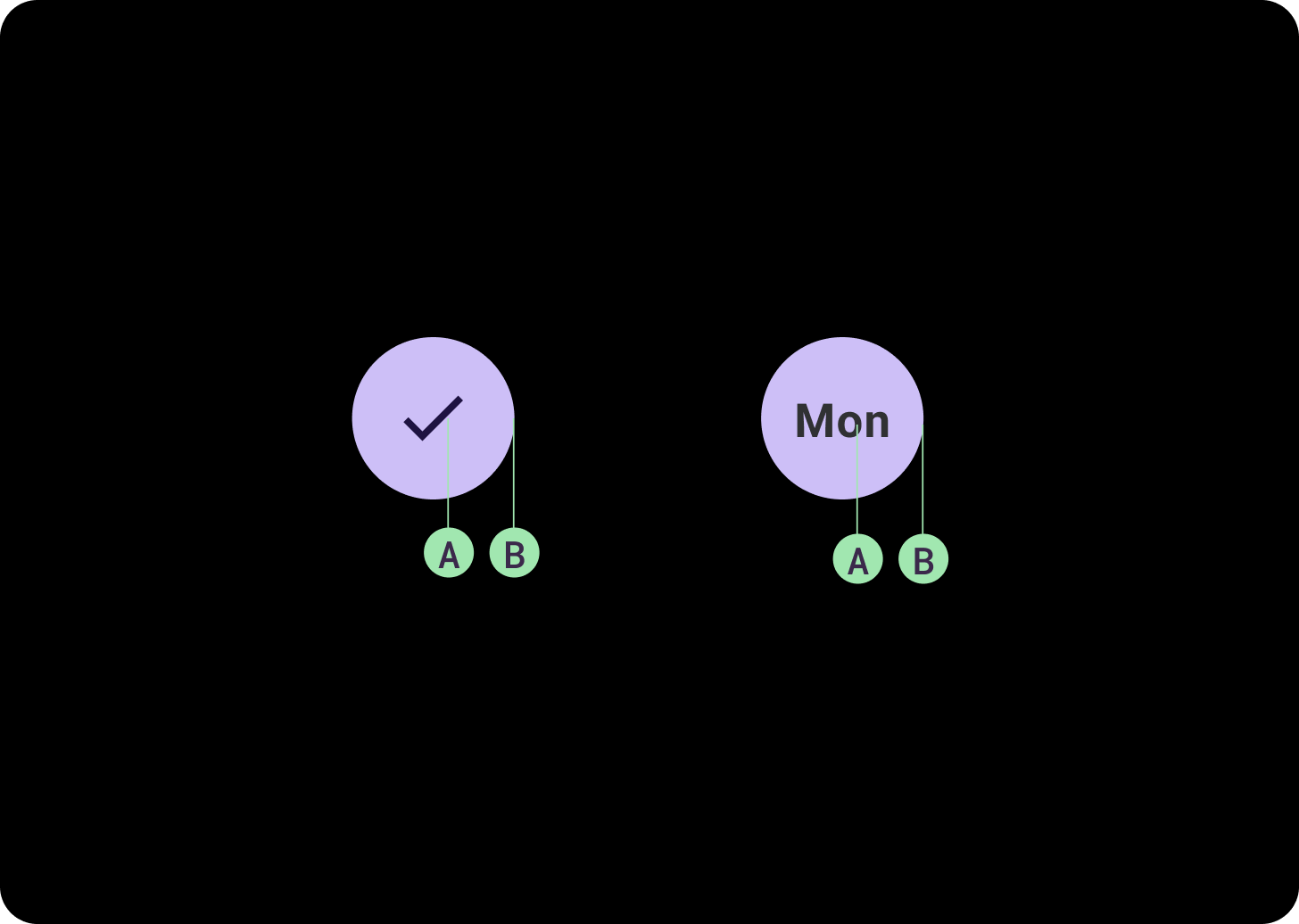
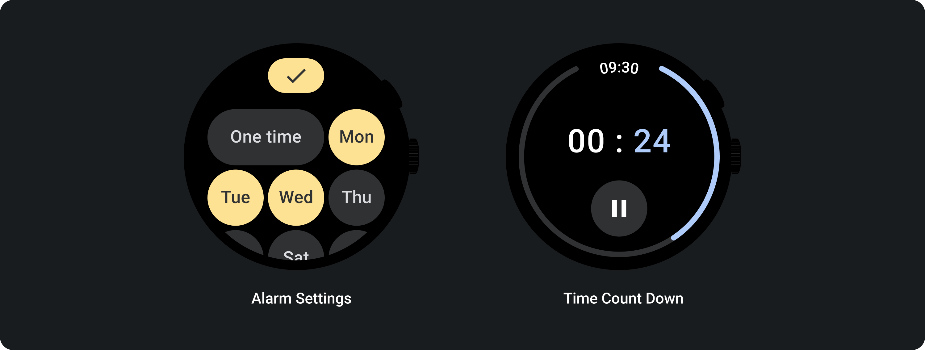
使用标准按钮来允许用户执行单项操作,如接听或拒接来电,或启动计时器。

使用切换按钮来允许用户启用或停用选项,例如选择和取消选择周几,或者暂停和重启计时器。
自适应布局

响应式行为
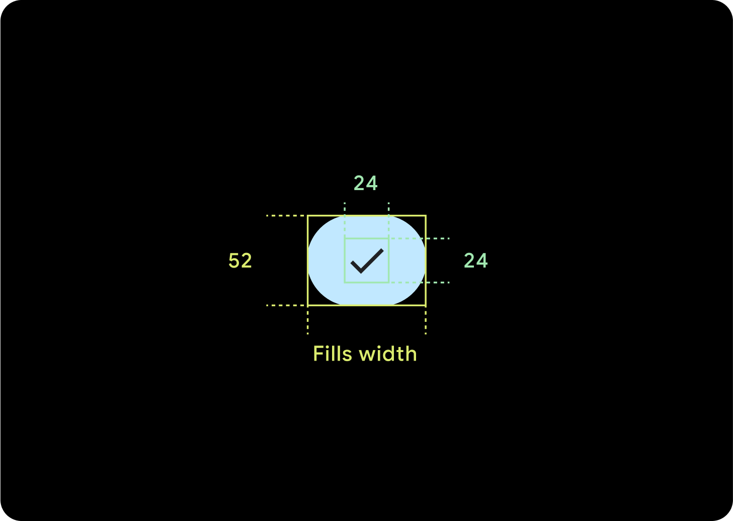
1 个按钮
内部内边距将保持不变,边距应采用百分比形式,以防止按钮过度拉伸并保持相对大小。
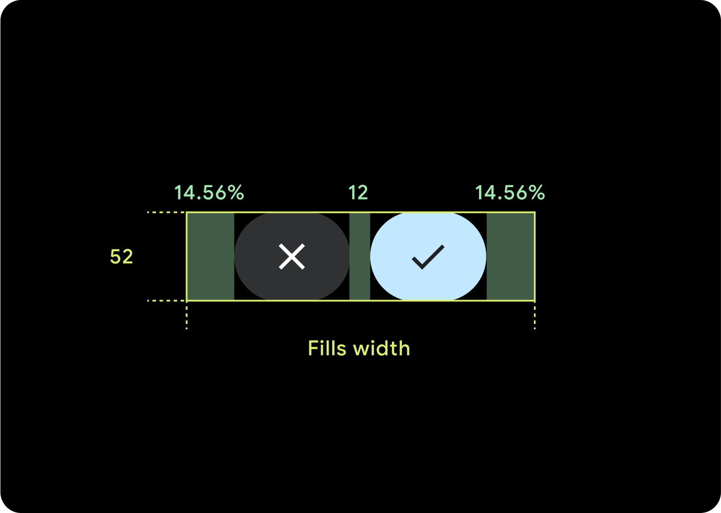
2 个按钮
如果有 2 个按钮,则会添加百分比内部边距,以防止按钮过度拉伸并保持相对大小。
IME
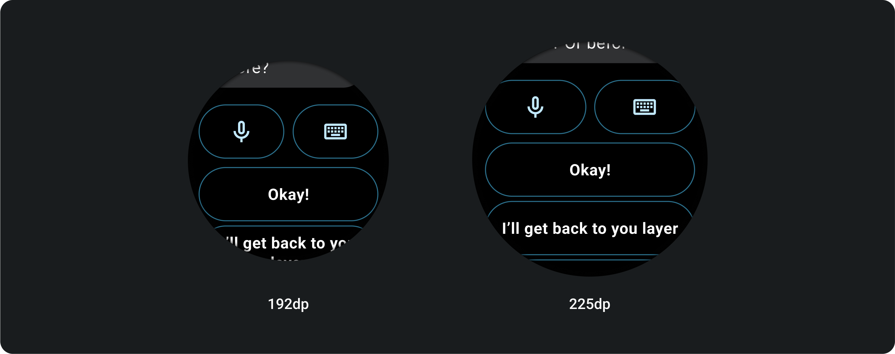
1 个或 2 个按钮
无论屏幕尺寸如何,具有 2 个或 1 个按钮锁定的 IME 始终会一直延伸到侧边边距。
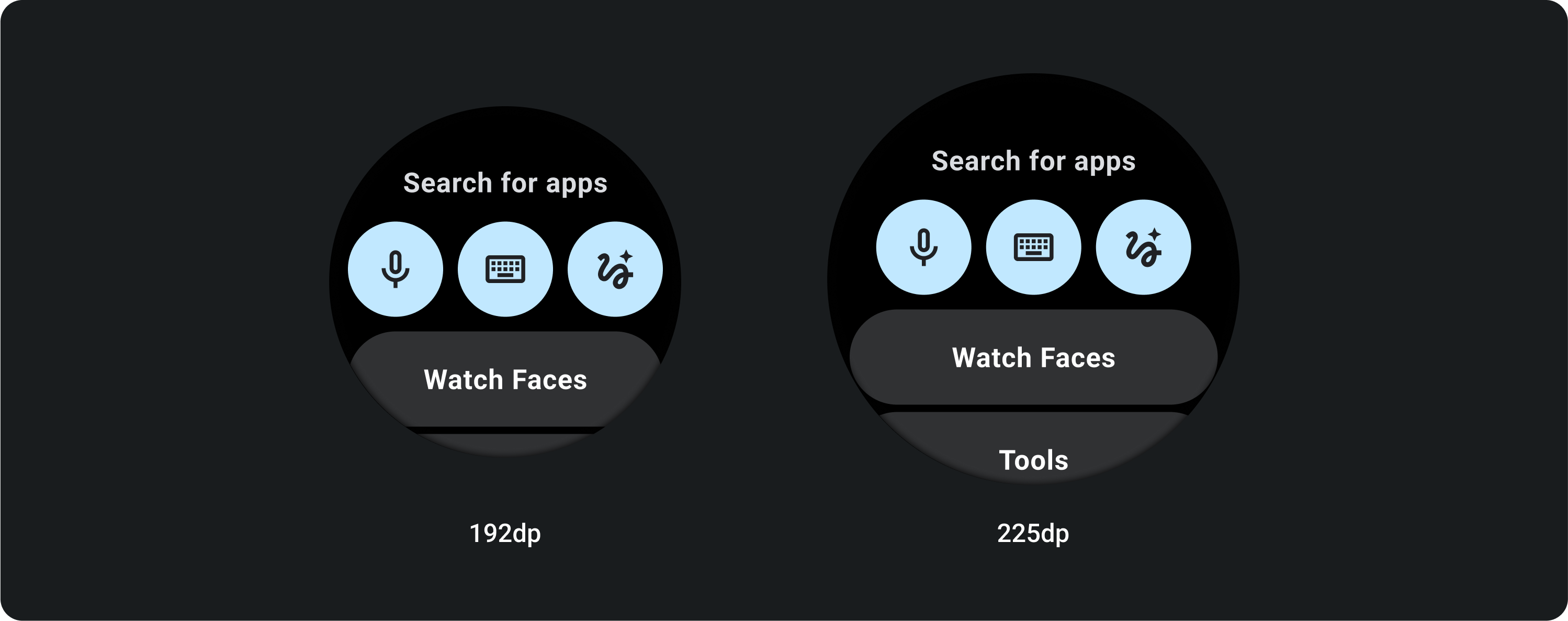
3 个按钮
在小于 225dp 的屏幕上,按钮会保持圆形,不会拉伸。在大屏幕(225 dp 或更大)上,按钮会一直延伸到侧边边距。