
ユーザーによって詳細に理解されており、テキストラベルを必要としないアクションには、Button コンポーネントを使用します。ボタンは、その円形の形状によってチップと区別されます。
解剖学
A. コンテンツ
ボタンには、アイコンまたはテキスト用に 1 つのスロットが用意されています。ボタンで実行するアクションに関連するアイコンを選択します。アイコンで関連するアクションを説明できない場合は、最大 3 文字のテキストを使用できます。アイコンでアクションを明確に説明できない場合は、チップ コンポーネントの使用を検討してください
B. コンテナ
ボタンのコンテナは、単色の塗りつぶしに限定されます。
ボタンの種類
階層
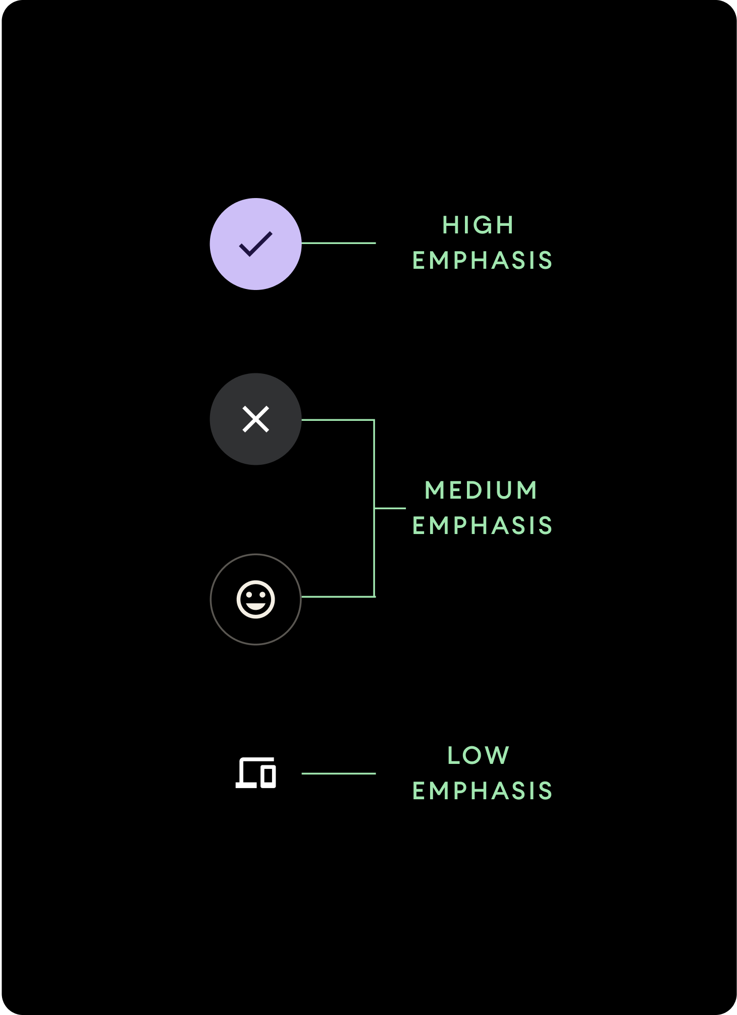
さまざまな色の塗りつぶしを使ってボタンの階層を表します。
高強調
高強調ボタンには、アプリの主要なアクションが含まれます。コンテナに Primary 色または Secondary 色を使用し、コンテンツには On Primary 色と On Secondary 色を使用します。詳細については、Wear のマテリアル テーマ設定をご覧ください。
中強調
中強調ボタンは、コントラストの低い色の塗りつぶしによって区別されます。プライマリ アクションよりも重要度の低いアクションが含まれます。コンテナには Surface 色を、コンテンツには On Surface 色を使用します。
または、中強調ボタンにはカスタムの OutlinedButton コンポーネントを使用します。この場合、背景は透明、ストロークは透明度 60% のプライマリ バリエーションの色、コンテンツはプライマリの色になります。
低強調(アイコンのみ)低強調ボタンは、塗りつぶしがないことで区別されます。コンパクトな配置が必要とされる、ウォッチフェイスの小さな領域に最適です。コンテンツには On Surface 色を使用します。
サイズ
さまざまなサイズのボタンを使用して、アクションを強調したり、目立たなくしたりします。
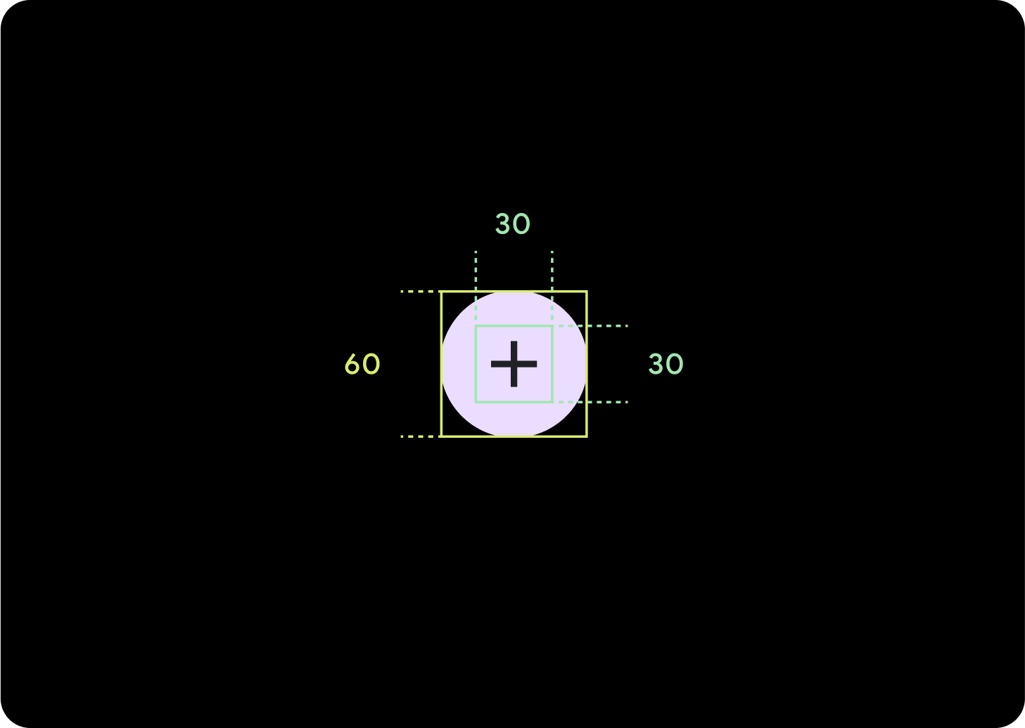
L
アイコン(30 x 30 dp)
コンテナ(60 x 60 dp)
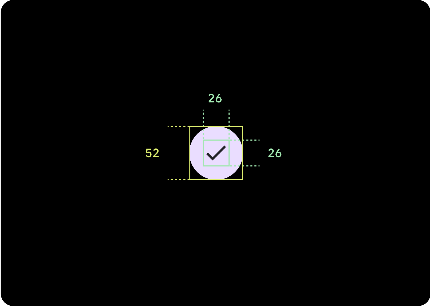
デフォルト
アイコン(26 x 26 dp)
コンテナ(52 x 52 dp)
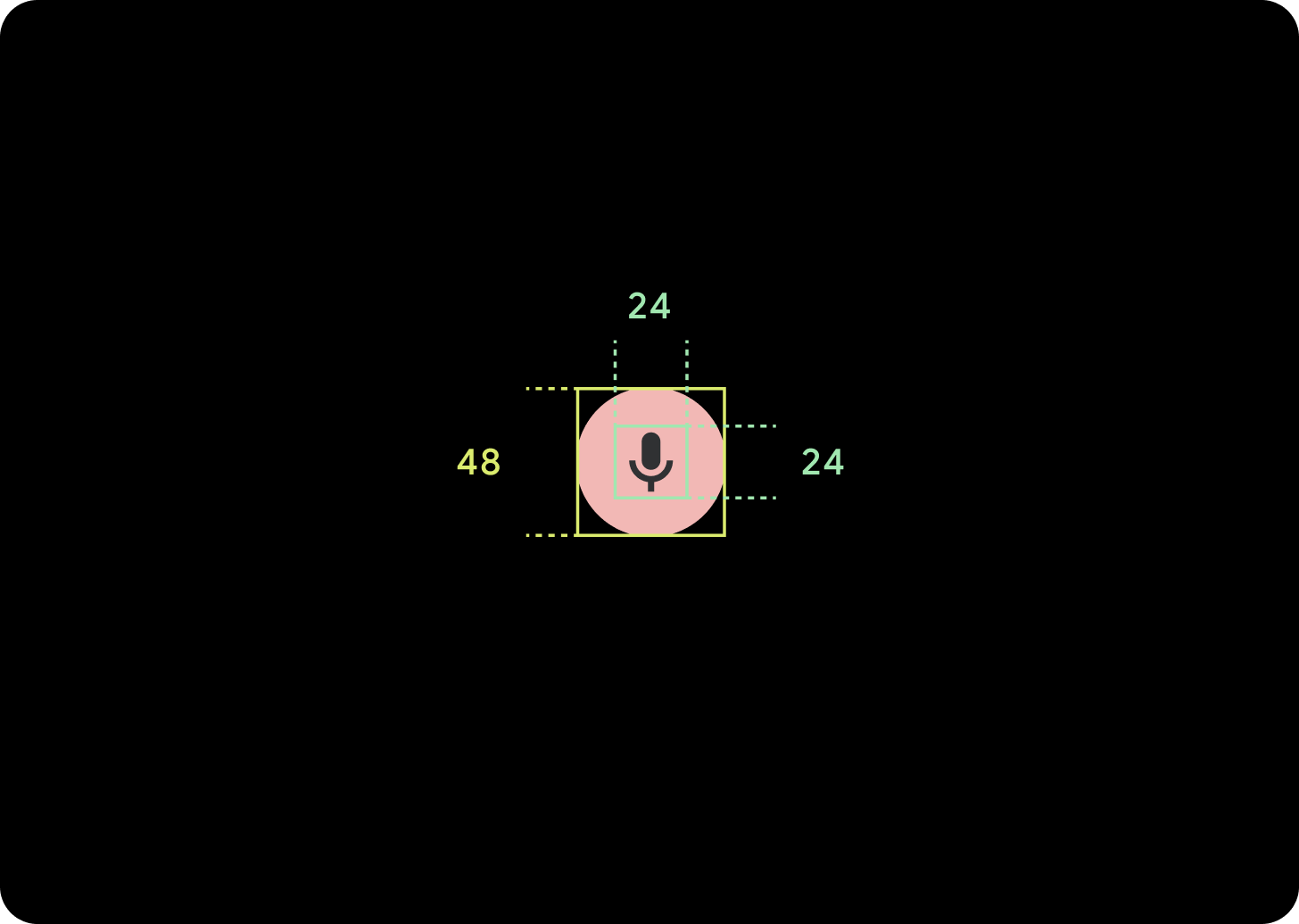
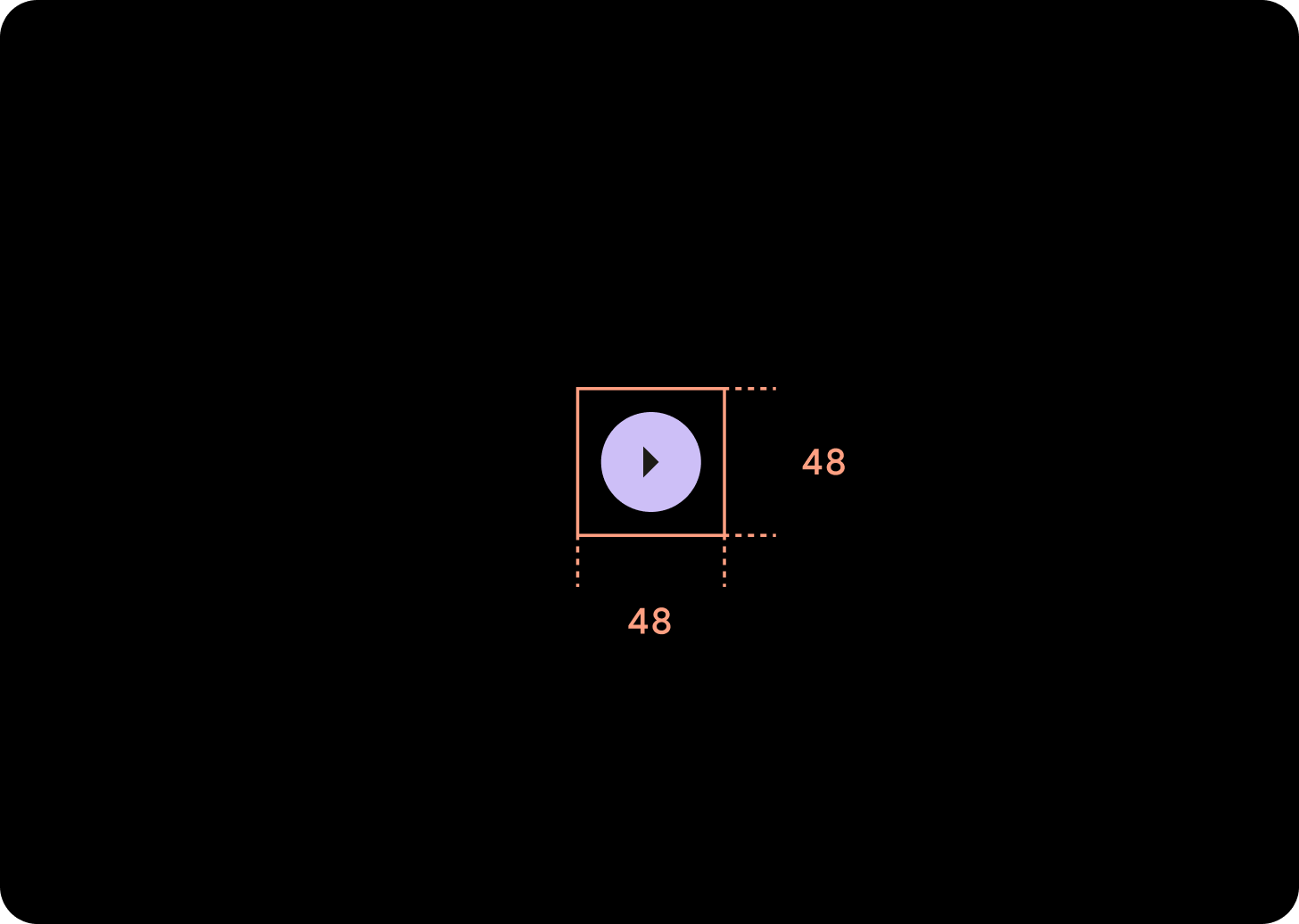
S
アイコン(24 x 24 dp)
コンテナ(48 x 48 dp)
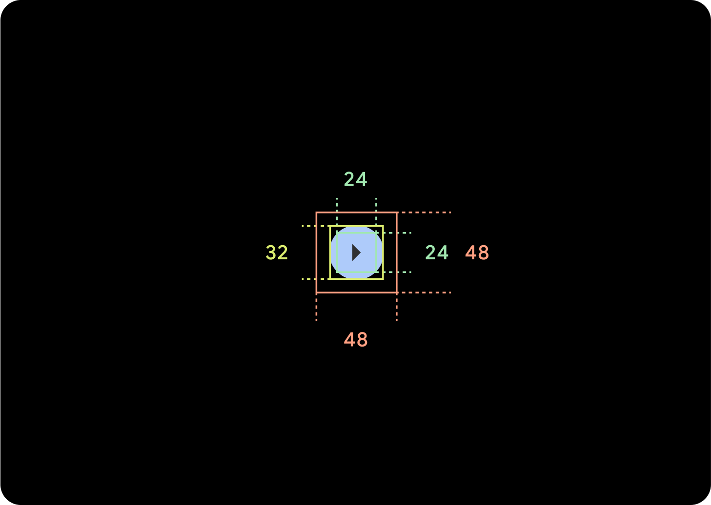
XS
アイコン(24 x 24 dp)
コンテナ(32 x 32 dp)
このボタンの周囲にパディングを追加して、48 dp 以上のタップ ターゲットを作成することをおすすめします。これは、ユーザー補助向けのタップ ターゲットの最小サイズです。
使用方法
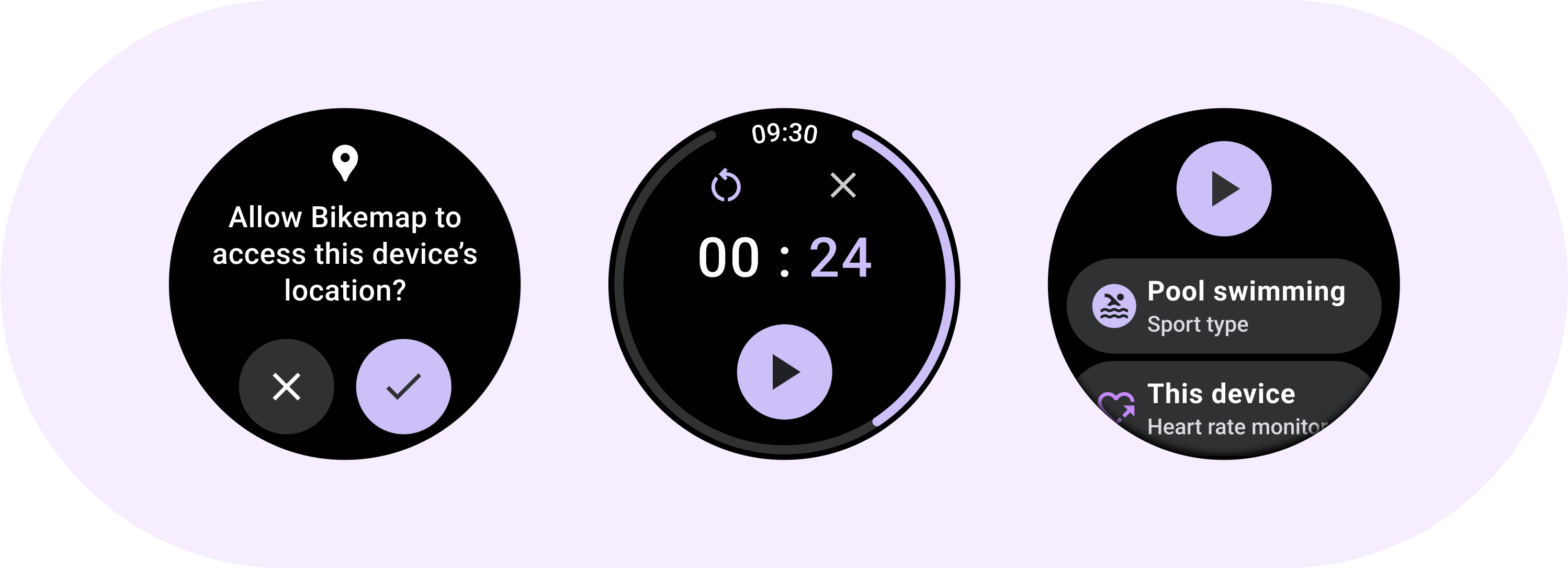
標準ボタンを使用して、呼び出しの承認や拒否、タイマーの開始などの単一のアクションをユーザーが行えるようにします。
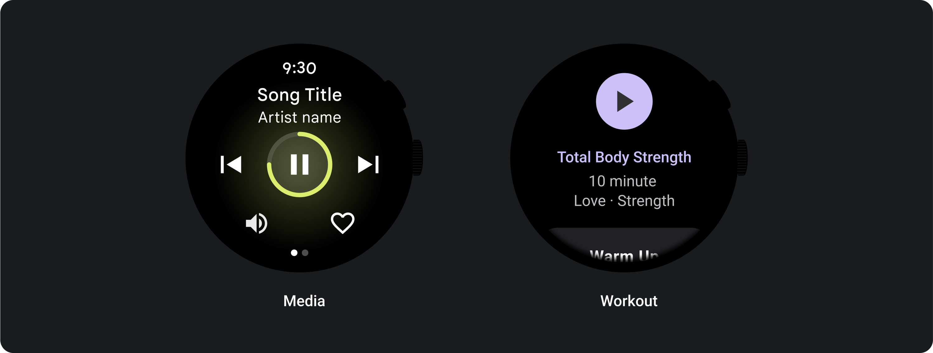
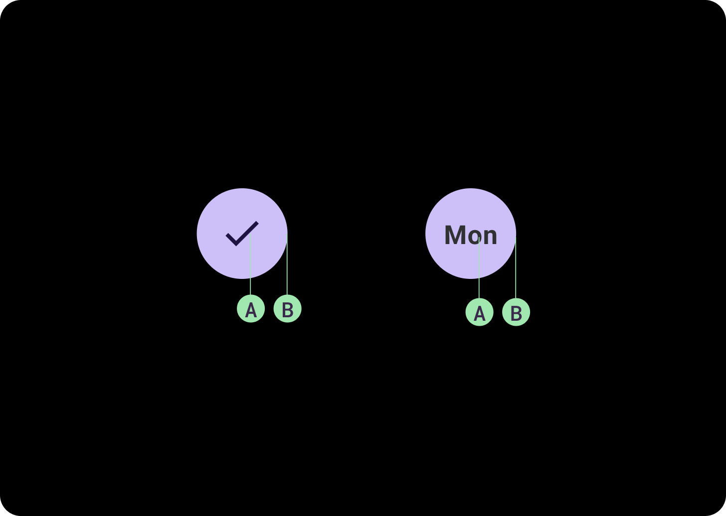
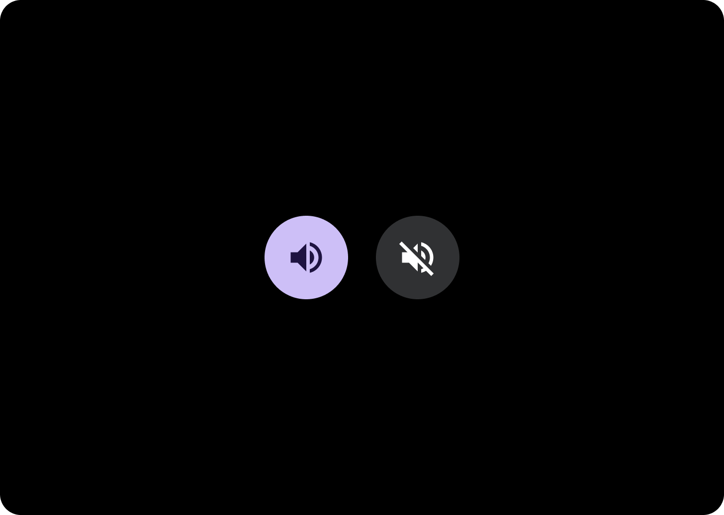
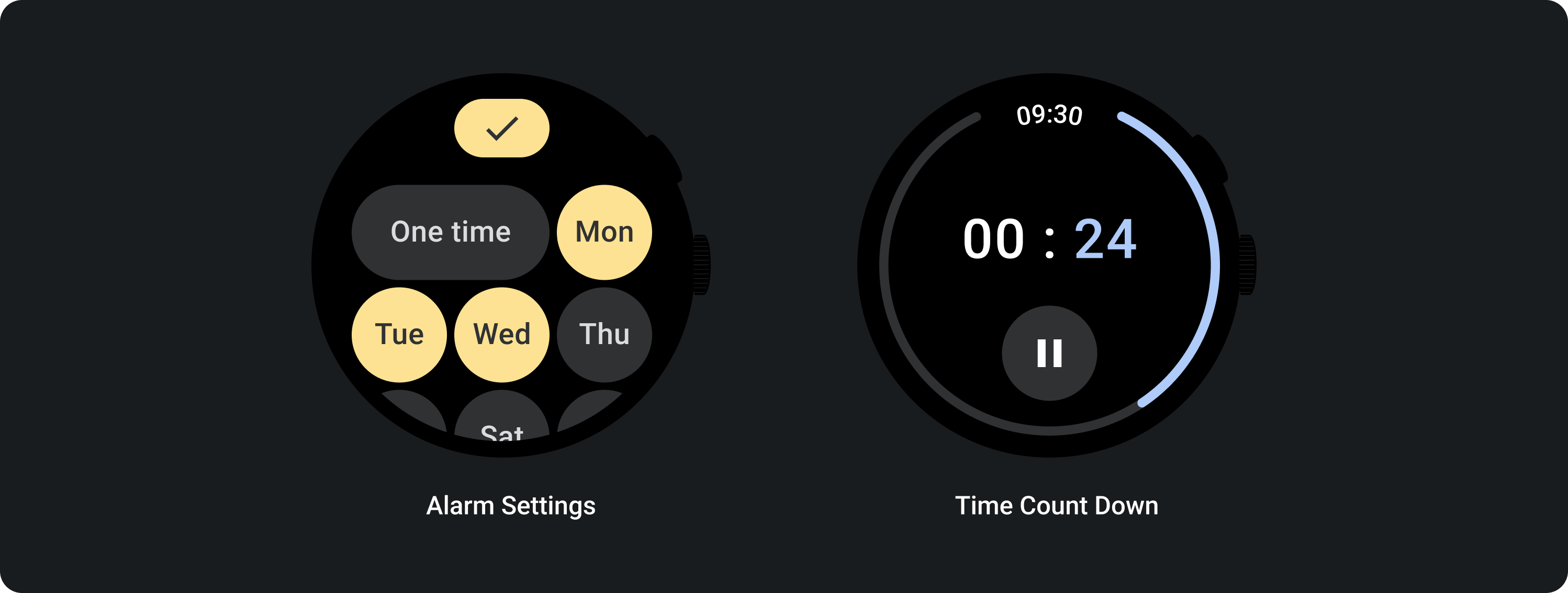
切り替えボタンを使用して、曜日の選択や選択解除、タイマーの一時停止と再開などのオプションをユーザーが有効または無効にできるようにします。
アダプティブ レイアウト
レスポンシブな動作
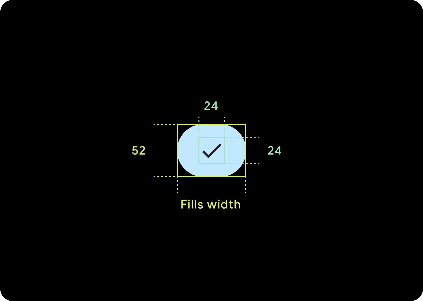
1 つのボタン
内部パディングは同じままで、ボタンが過度に伸びるのを防ぎ、相対サイズを維持するために、余白はパーセンテージにする必要があります。
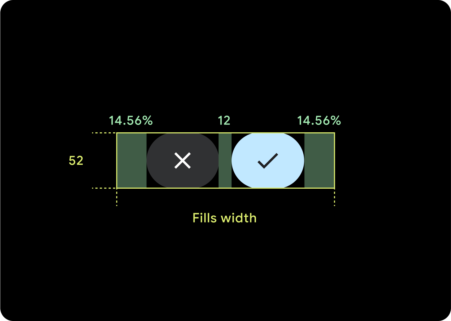
2 つのボタン
ボタンが 2 つある場合は、ボタンが過度に伸びるのを防ぎ、相対サイズを維持するために、内部マージンがパーセンテージで追加されます。
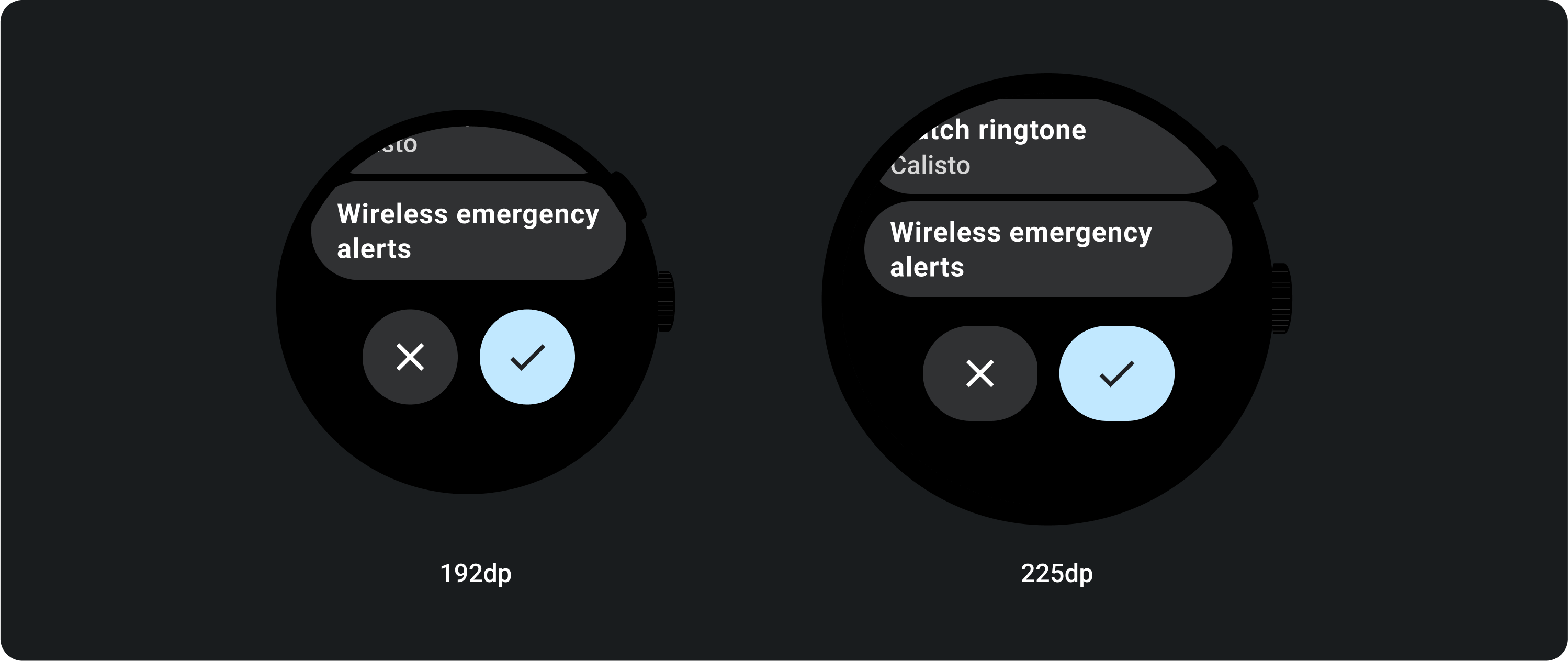
IME
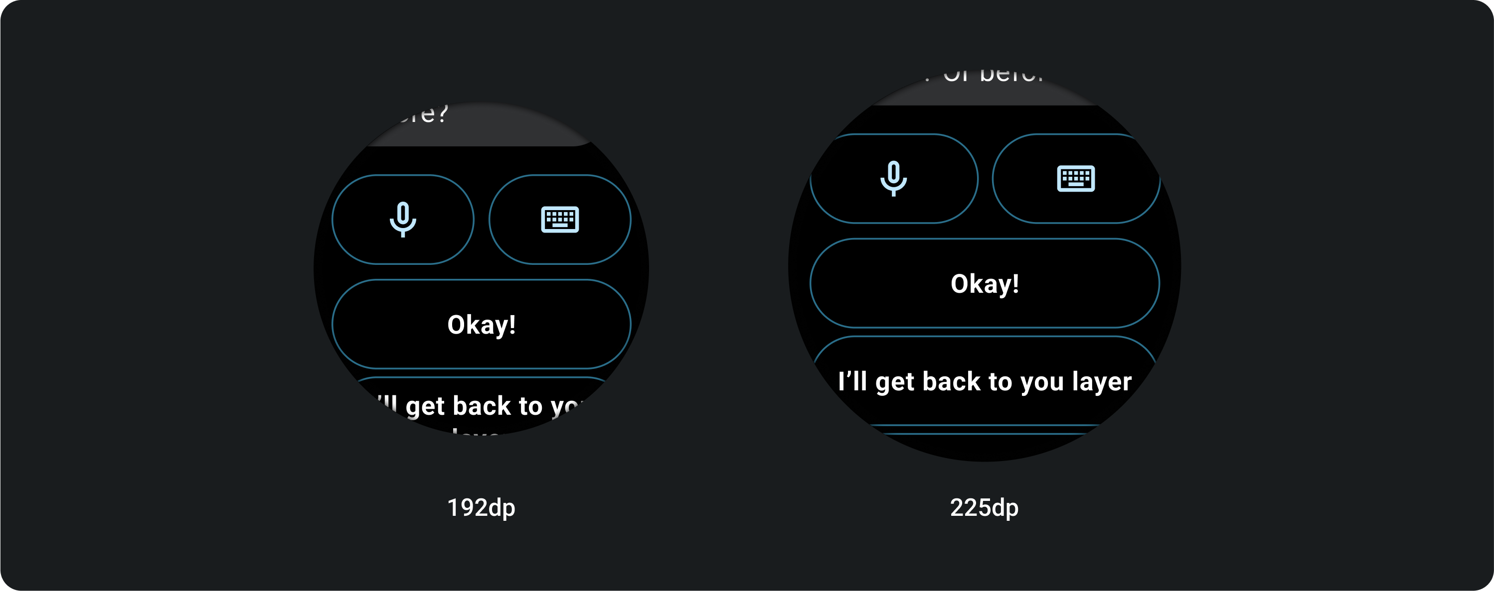
1 つまたは 2 つのボタン
2 つまたは 1 つのボタンロックアップがある IME は、画面サイズに関係なく、常にサイド マージンまで伸びます。
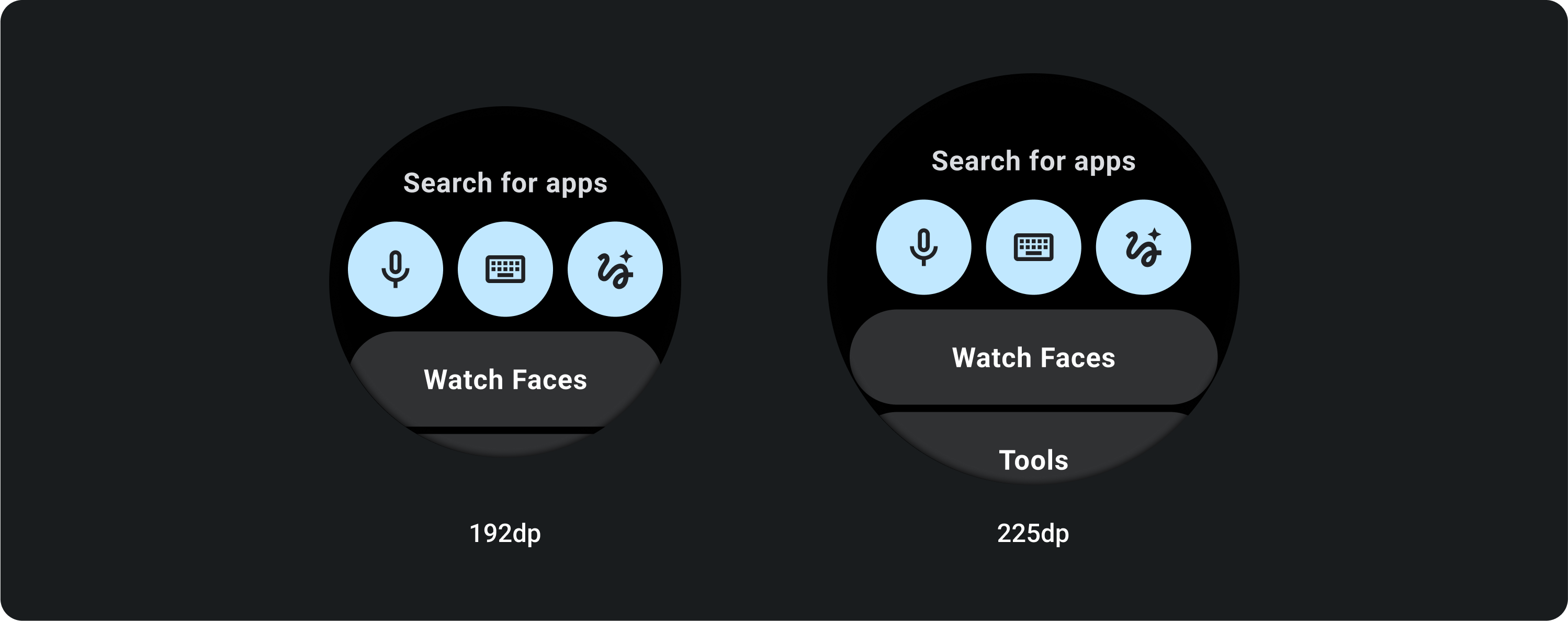
3 ボタン
225 dp 未満の画面では、ボタンは円形のままで伸びません。225 dp 以上の大画面では、ボタンはサイド マージンまで伸びます。