

自動調整與差異化的應用程式能創造出在小螢幕裝置上無法提供的使用者體驗。
這些應用程式會使用新版面配置,實作在主要螢幕大小中斷點,為大螢幕裝置的使用者獲取附加價值,在小螢幕裝置上無法比擬。
套用新的版面配置和範本,創造更多價值
自動調整式版面配置的應用程式遵循自動調整式設計做法,但也會利用中斷點來套用不同的版面配置,並為螢幕較大的裝置使用者創造更豐富的體驗,如以下範例所示:
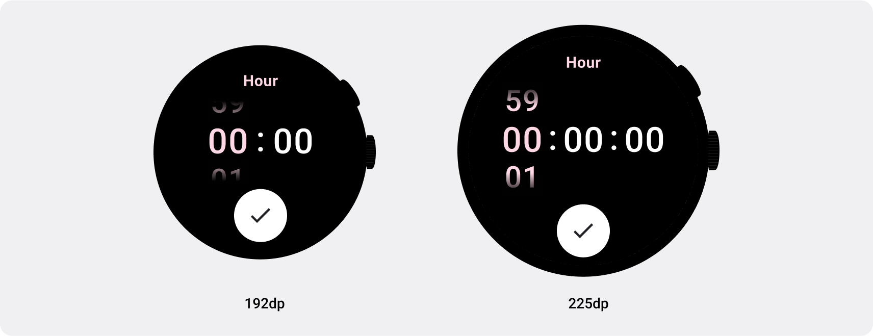
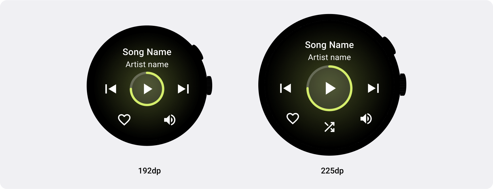
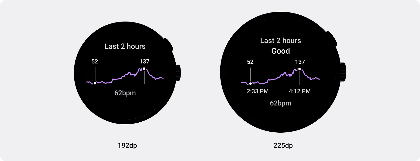
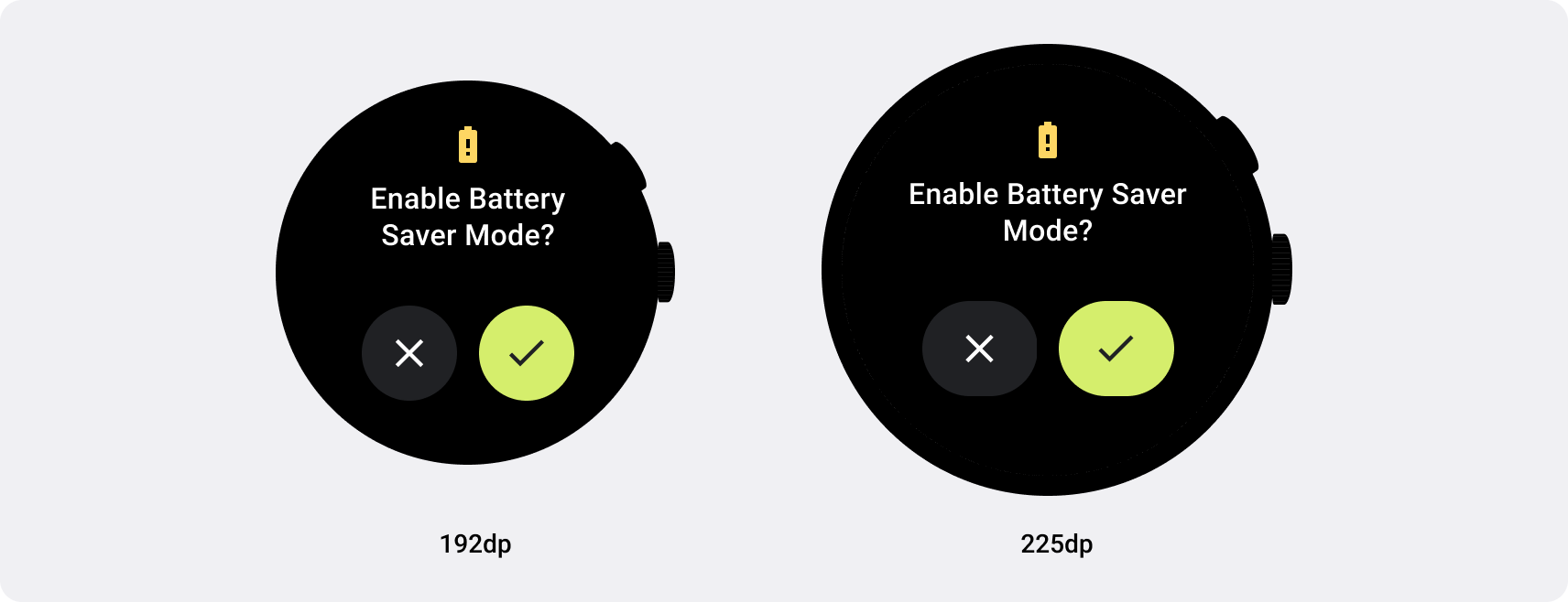
在 Wear OS 上使用中斷點
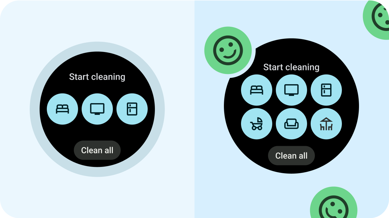
使用 225 dp 的中斷點有助於最佳化各種大小的版面配置。
如要瞭解差異化版面配置,請參閱 Compose 和資訊方塊實作指南。
正確做法
- 大膽創新。
- 將自訂版面配置和行為設計成 225 dp 以上。
錯誤做法
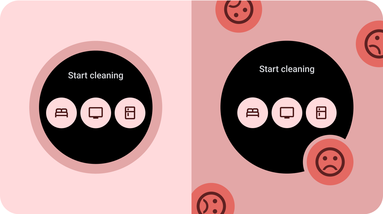
- 甘於平庸。
- 設計時只考量單一裝置尺寸。
- 讓應用程式平平無奇。