開始使用自動調整式版面配置
透過集合功能整理內容
你可以依據偏好儲存及分類內容。

Wear OS 生態系統包含各種螢幕大小的裝置。為了為所有使用者提供最高品質的體驗,請務必採用自適應 UI 設計原則。
什麼是自動調整式 UI?
無論在哪種大小的螢幕上顯示,自動調整式 UI 都會延展及變更,盡可能充分運用所有可用的螢幕空間。
自動調整式 UI 會使用直接建構在版面配置邏輯中的元件和方法,以回應式方式變更。這些版面配置也會使用螢幕大小斷點 (在不同螢幕大小上套用不同的設計),為使用者打造更豐富的體驗。
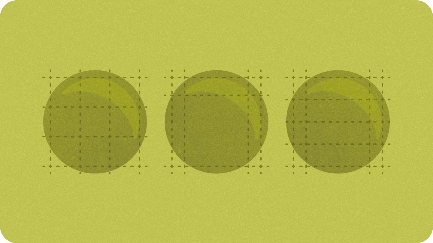
主要螢幕尺寸
版面配置類型
在圓形螢幕上設計自適應版面配置時,捲動和非捲動檢視畫面各自有獨特的縮放 UI 元素和維持平衡的版面配置和組合需求。
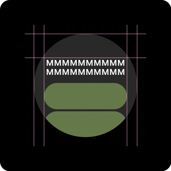
捲動檢視畫面
所有頂部、底部和側邊邊界都應以百分比定義,以免遭到裁剪,並提供元素的比例縮放功能。
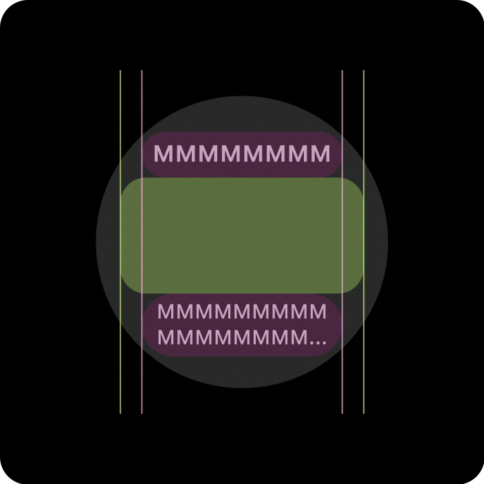
不可捲動檢視畫面
所有邊界都應以百分比定義,且應定義垂直限制,以便中間的主要內容可延展至填滿可用區域。
透過自適應版面配置和設計做法增添價值
在圓形螢幕上設計自適應版面配置時,捲動和非捲動檢視畫面各自有獨特的縮放 UI 元素和維持平衡版面配置和組合的要求。
以下圖片為大致建議,示例僅供參考。查看各個元件或途徑頁面,取得詳細的內容相關回應指南。

一覽更多內容
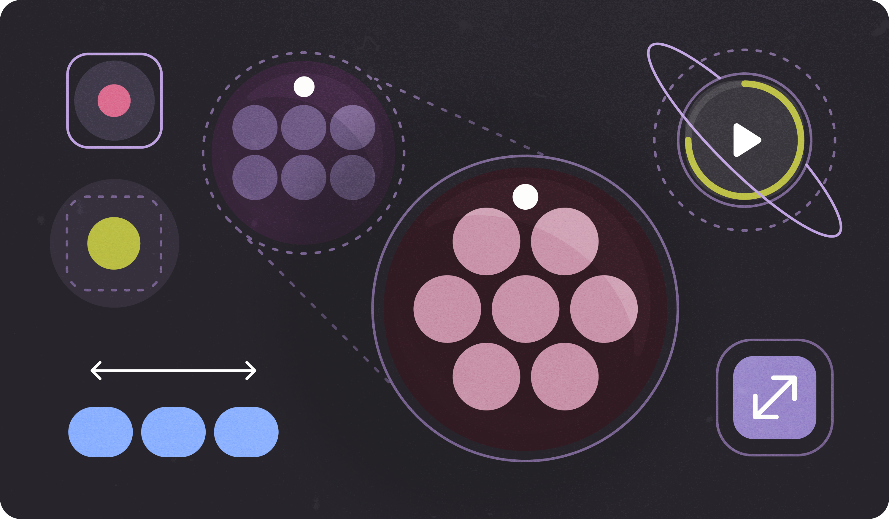
回應式版面配置可讓更多方塊、更多資訊卡、更多行文字和更多按鈕,在單一畫面上顯示
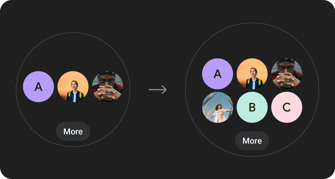
顯示更多內容元素
使用新的版面配置,並套用至已定義的螢幕大小中斷點,以便在可行情況下引入新內容,為使用者提供大螢幕裝置的額外價值。
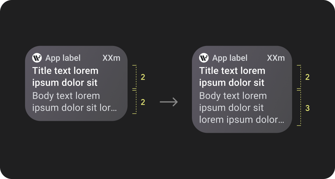
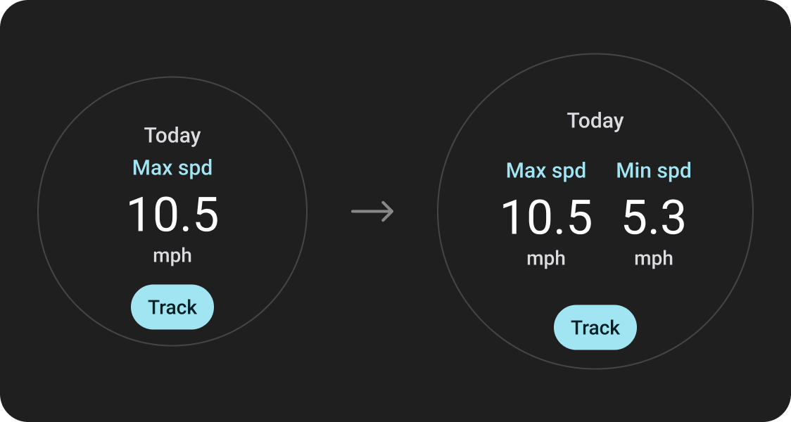
改善一目瞭然的效果
善用額外的螢幕空間,提供更大的容器、更大的文字、更粗的圓環,以及更精細的資料視覺化效果,讓使用者一目瞭然。
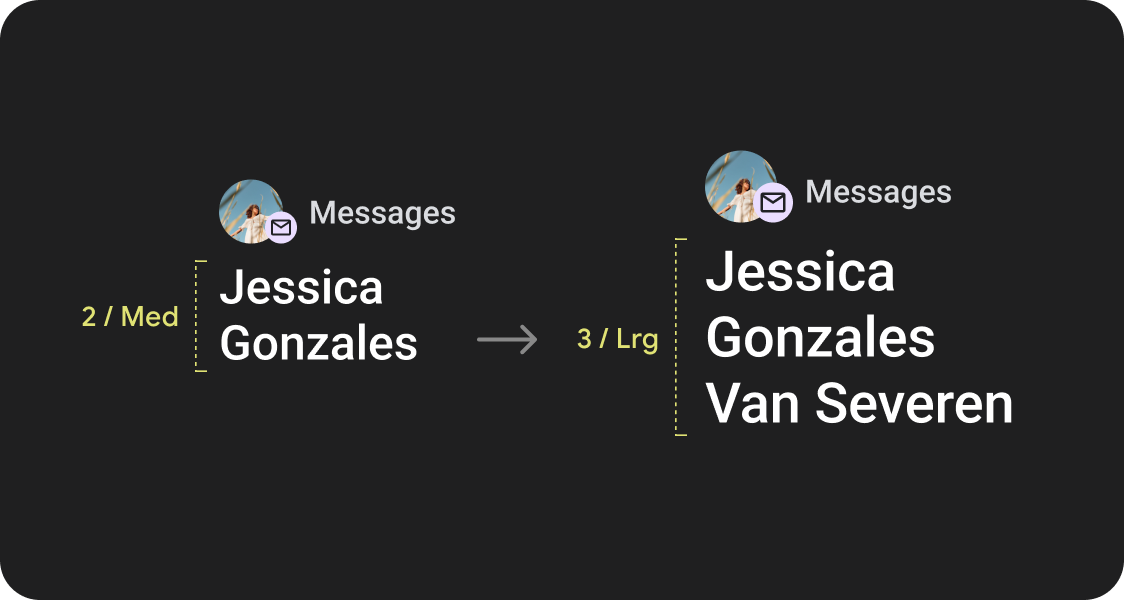
提升可用性
善用額外的螢幕空間,提供更大的輕觸目標、更大的視覺階層,以及內容項目之間的額外空間,讓使用者更輕鬆、更舒適地與介面互動。
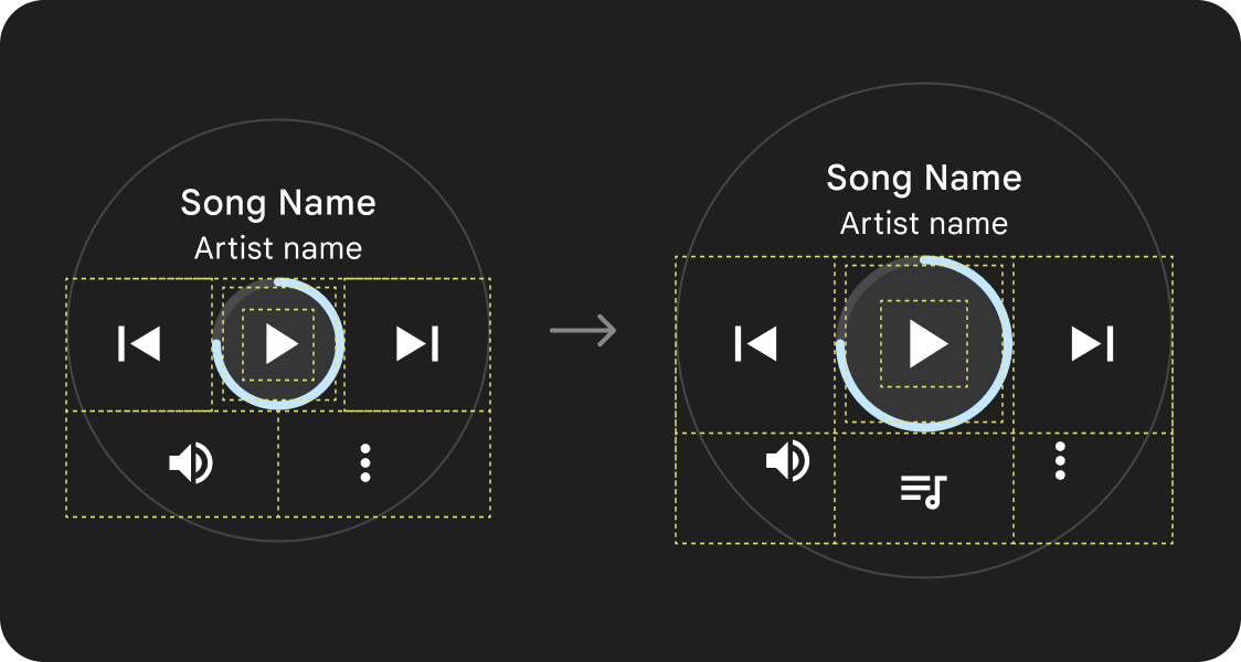
最佳化組合
使用更新版元件和範本,為所有螢幕尺寸提供更優質的使用者介面外觀。
應用程式品質
我們的品質指南分為三個層級,遵守所有三個層級的規範,為使用者提供最佳體驗。
品質指南
可支援所有螢幕大小
請確認您的應用程式可在所有螢幕尺寸上提供優質體驗。建立能充分利用可用應用程式空間的版面配置。
開始使用
響應式且經過最佳化
為允許的裝置提供更多內容,並使用回應式版面配置,自動調整不同螢幕大小。
開始使用
適應性和差異化
善用中斷點,充分利用額外空間,在大螢幕裝置上提供小螢幕裝置無法提供的強大新體驗。
開始使用
使用已建立的標準版面配置
使用已建立的標準版面配置,讓 UI 在各種裝置尺寸下都能順利調整。
我們精心設計標準版面配置,可在所有螢幕尺寸上提供高品質的體驗。
標準版面配置
這個頁面中的內容和程式碼範例均受《內容授權》中的授權所規範。Java 與 OpenJDK 是 Oracle 和/或其關係企業的商標或註冊商標。
上次更新時間:2025-07-27 (世界標準時間)。
[null,null,["上次更新時間:2025-07-27 (世界標準時間)。"],[],[],null,["# Get started with adaptive layouts\n\nThe Wear OS ecosystem is made up of devices that have a wide variety of screen\nsizes. Utilizing adaptive UI principles is critical to delivering the highest\nquality experience for all users.\n\nWhat is adaptive UI?\n--------------------\n\nAdaptive UIs stretch and change to make the best possible use of all available\nscreen space, no matter what size screen they're rendered on.\n\nAdaptive UIs change responsively, using components and methods built directly\ninto the layout logic. These layouts also utilize screen size\nbreakpoints---applying a different design on different screen sizes---to create an\neven richer experience for users.\n\nKey screen sizes\n----------------\n\n\nLearn about key reference sizes to keep in mind as you design new experiences\n\n[Screen sizes](/design/ui/wear/guides/foundations/screen-sizes) \n\n\u003cbr /\u003e\n\n\u003cbr /\u003e\n\nTypes of layouts\n----------------\n\nWhen designing for adaptive layouts on the round screen, scrolling and\nnon-scrolling views each have unique requirements for scaling UI elements and\nmaintaining a balanced layout and composition.\n\n\n**Scrolling views**\n\nAll top, bottom, and side margins\nshould be defined in percentages to avoid clipping and provide\nproportional scaling of elements. \n\n**Non-scrolling views**\n\nAll margins should be defined\nin percentages and vertical constraints should be defined such that the\nmain content in the middle can stretch to fill the available area.\n\n\u003cbr /\u003e\n\nAdd value through adaptive layouts and design practices\n-------------------------------------------------------\n\nWhen designing for adaptive layouts on the round screen, scrolling and\nnon-scrolling views each have unique requirements for scaling UI elements and\nmaintaining a balanced layout and composition.\n\nThe following images are broad suggestions; examples are for illustrative\npurposes only. View each component or surface page for detailed, contextual,\nresponsive guidance.\n\n\n**More content at a glance**\n\nResponsive layouts allow for more chips, more cards, more lines of text, and\nmore buttons to fit on a single screen \n\n**More content elements visible**\n\nUtilize new layouts, applied at defined screen size breakpoints, to allow for\nthe introduction of new content when possible, giving the user additional value\non devices with larger screen sizes.\n\n\u003cbr /\u003e\n\n\n**Improved glanceability**\n\nUse extra screen space to provide larger containers, larger text, thicker rings,\nand more granular data visualization to provide better glanceability for users. \n\n**Improved usability**\n\nUse extra screen space to provide bigger tap targets, greater visual hierarchy,\nand additional space between content items to make interfaces easier and more\ncomfortable to interact with.\n\n\u003cbr /\u003e\n\n\n**Optimized compositions**\n\nUtilize our updated components and templates to offer a better look and feel for\nour UIs across all screen sizes. \n\n\u003cbr /\u003e\n\nApp quality\n-----------\n\n\nOur quality guidelines are organized into three levels. Enable the best possible\nexperience for your users by meeting guidelines in all three tiers.\n\n[Quality guidelines](/docs/quality-guidelines/wear-app-quality) \n\n\u003cbr /\u003e\n\n\u003cbr /\u003e\n\n*** ** * ** ***\n\n\n**Ready for all screen sizes**\n\nMake sure your app is delivering a quality experience across all screen\nsizes. Create layouts that fully use the available app space.\n\n[Get started](/design/ui/wear/guides/foundations/larger-screens-ready) \n**Responsive and optimized**\n\nDeliver more content to users on devices which allow for it, and utilize\nresponsive layouts that automatically adapt to different screen sizes.\n\n[Get started](/design/ui/wear/guides/foundations/larger-screens-optimized) \n**Adaptive and differentiated**\n\nMake the most of additional real estate by utilizing breakpoints to offer\npowerful new experiences on larger screens which are not possible on devices\nwith smaller screens.\n\n[Get started](/design/ui/wear/guides/foundations/larger-screens-differentiated)\n\n\u003cbr /\u003e\n\n*** ** * ** ***\n\nUtilize established canonical layouts\n-------------------------------------\n\n\nUse established canonical layouts to help your UIs adapt smoothly across a range\nof device sizes.\n\nOur canonical layouts have been developed thoughtfully to offer a high quality\nexperience across all screen sizes.\n\n[Canonical layouts](/design/ui/wear/guides/foundations/canonical-adaptive-layouts) \n\n\u003cbr /\u003e"]]