回應式最佳化
透過集合功能整理內容
你可以依據偏好儲存及分類內容。

回應式及最佳化的應用程式會採用能自動配合不同螢幕大小的回應式版面配置,為使用者帶來額外價值,提供高效且引人入勝的使用者體驗。
透過回應式設計創造更多價值
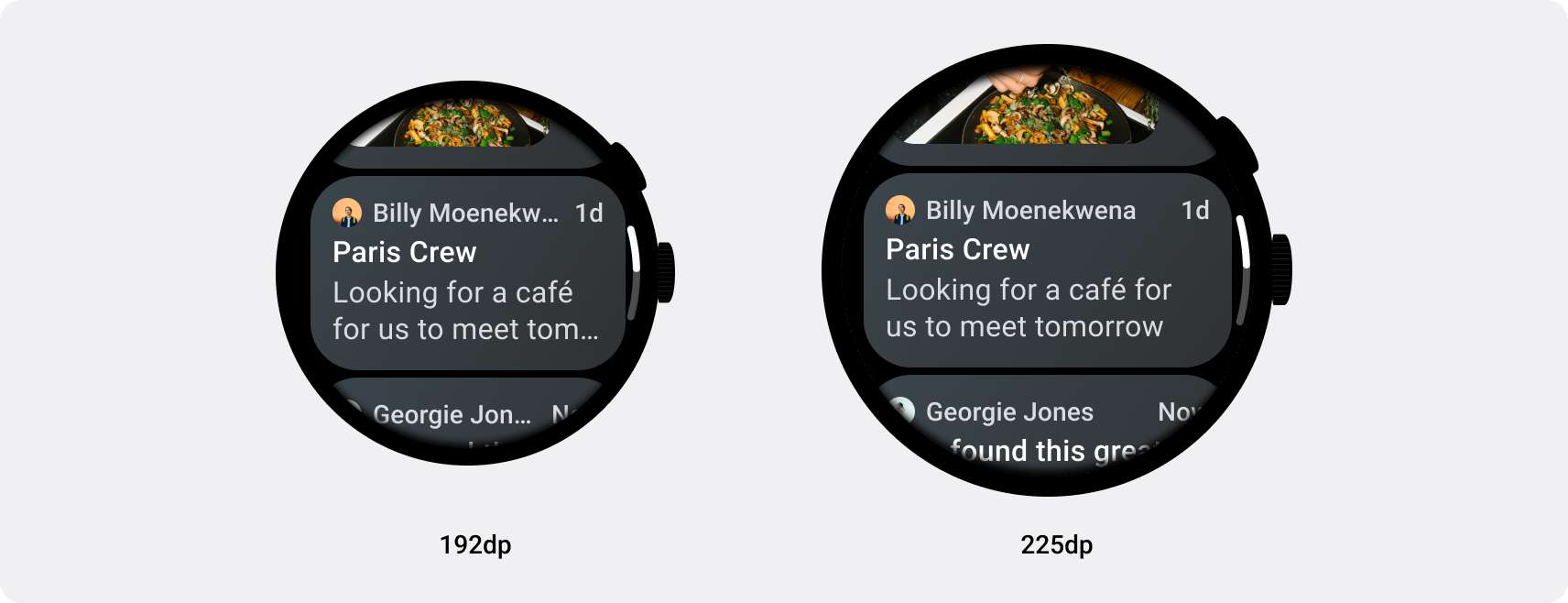
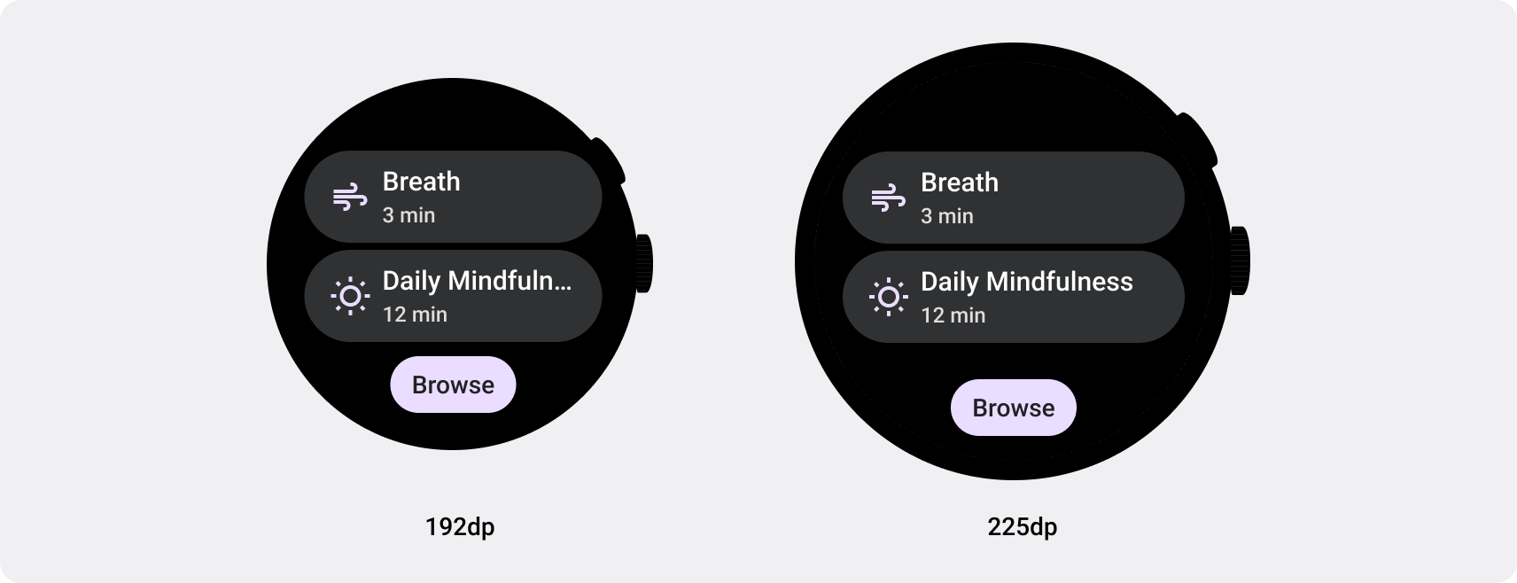
回應式版面配置會動態設定格式和位置元素 (例如按鈕、文字欄位和對話方塊),提供最佳使用者體驗。採用回應式設計做法,自動為應用程式在大螢幕上的使用者提供額外價值。無論是「快速顯示」文字、在畫面上顯示更多動作,還是更大型的觸控目標,回應式做法都能為大螢幕使用者提供更優質的體驗。

建構適用於 Wear OS 的回應式應用程式和資訊方塊
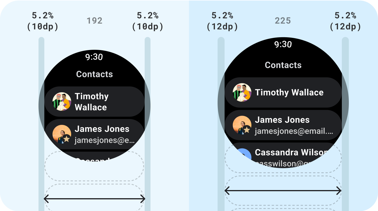
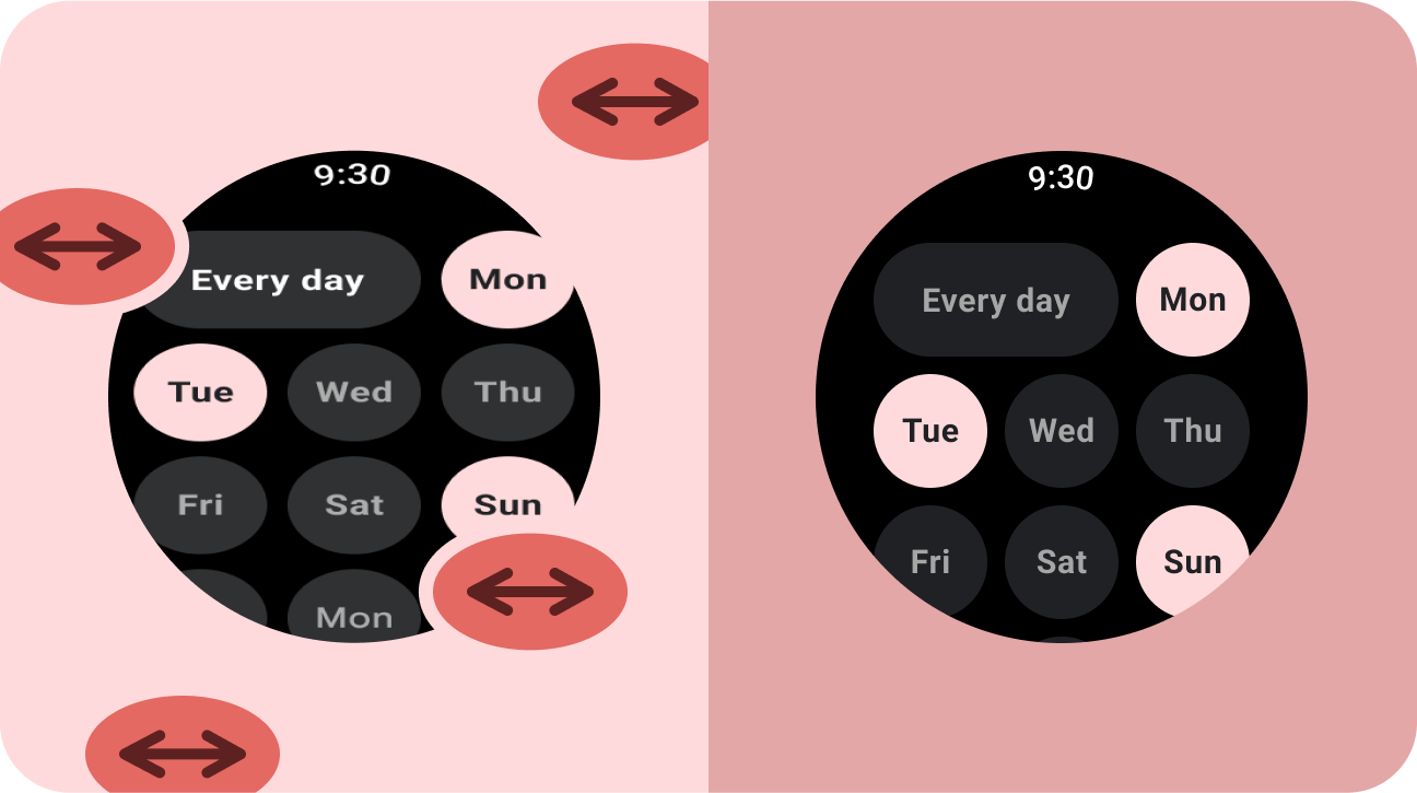
無論顯示畫面的螢幕大小為何,回應式 UI 都會延展並變換,盡可能充分運用所有可用的螢幕空間。在圓形螢幕上設計回應式版面配置時,每個捲動和非捲動的檢視畫面都有各自的獨特要求,以便維持 UI 元素縮放,以及保留平衡的版面配置和組合。對於捲動檢視畫面,請使用百分比定義所有頂部、底部和側邊邊界,避免裁剪,並提供按比例縮放的元素。針對非捲動的檢視畫面,請針對所有邊界使用百分比和垂直限制。這樣一來,中間的主要內容就能延伸來填滿可用區域。
請參閱適用於回應式版面配置的 Compose 和資訊方塊實作指南。
check_circle
正確做法
- 使用專為適應效果設計的標準元件。
- 運用可自動調整的版面配置,因應不同螢幕大小。
cancel
錯誤做法
- 為了填滿額外空間,延展 UI 元素,包括文字欄位、按鈕、對話方塊。
- 增加字型大小 (除非字型主要是圖片用途)。
下一步:自動調整與差異化
自動調整與差異化的應用程式能創造出在小螢幕裝置上無法提供的使用者體驗。
開始使用
這個頁面中的內容和程式碼範例均受《內容授權》中的授權所規範。Java 與 OpenJDK 是 Oracle 和/或其關係企業的商標或註冊商標。
上次更新時間:2025-07-27 (世界標準時間)。
[null,null,["上次更新時間:2025-07-27 (世界標準時間)。"],[],[],null,["# Responsive and optimized\n\nApps that are **responsive and optimized** utilize responsive layouts that\nautomatically adapt to different screen sizes, offering some additional value to\nusers and providing a productive, engaging user experience.\n\nAdd value through responsive design\n-----------------------------------\n\nResponsive layouts dynamically format and position elements such as buttons,\ntext fields, and dialogs for an optimal user experience. Automatically offer\nusers of your app additional value on larger screens by utilizing responsive\ndesign practices. Whether it's more text visible at a glance, more actions on\nscreen, or larger, more accessible tap targets, responsive practices provide an\nenhanced experience for users of larger screens.\n\n\nBuild responsive apps and tiles for Wear OS\n-------------------------------------------\n\nResponsive UIs stretch and change to make the best possible use of all available\nscreen space, no matter what size screen they're rendered on. When designing\nresponsive layouts on a round screen, scrolling and non-scrolling views each\nhave unique requirements to maintain UI element scaling, as well as preserve a\nbalanced layout and composition. For [scrolling views](/design/ui/wear/guides/foundations/canonical-adaptive-layouts#scrolling), use percentages to\ndefine all top, bottom, and side margins to avoid clipping and provide\nproportional scaling of elements. For [non-scrolling views](/design/ui/wear/guides/foundations/canonical-adaptive-layouts#non-scrolling), use percentages\nand vertical constraints for all margins. That way, the main content in the\nmiddle can stretch to fill the available area.\n\nSee the [Compose](/training/wearables/compose/screen-size#responsive-layouts) and [Tiles](/training/wearables/tiles/screen-size#responsive-layouts) implementation guidance for responsive\nlayouts. \ncheck_circle\n\n### Do\n\n- Use standard components which are designed for adaptation.\n- Utilize adaptive layouts which adapt smoothly across screen sizes. \ncancel\n\n### Don't\n\n- Stretch UI elements (text fields, buttons, dialogs) to fill extra space.\n- Increase the sizes of fonts (unless they're serving a primarily graphic purpose).\n\nNext step: adaptive and differentiated\n--------------------------------------\n\nApps that are **adaptive and differentiated** create a user experience that\nisn't possible on devices with smaller screens.\n\n[Get started](/design/ui/wear/guides/foundations/larger-screens-differentiated)"]]