Thành phần Card (Thẻ) chứa nội dung và các thao tác về một chủ đề.
Phân tích
Mỗi thành phần thẻ chỉ chiếm một ô. Thẻ có thể chứa biểu tượng, hình ảnh hoặc nhãn có thể tuỳ chỉnh.
Theo mặc định, thẻ có hình chữ nhật với góc bo tròn và nền chuyển màu. Đặt chiều cao tối đa của thẻ là 60% để đảm bảo thẻ hiển thị đầy đủ trên màn hình vì màn hình tròn có thể cắt tới 20% phần trên cùng và dưới cùng của màn hình.
Thẻ tiêu đề
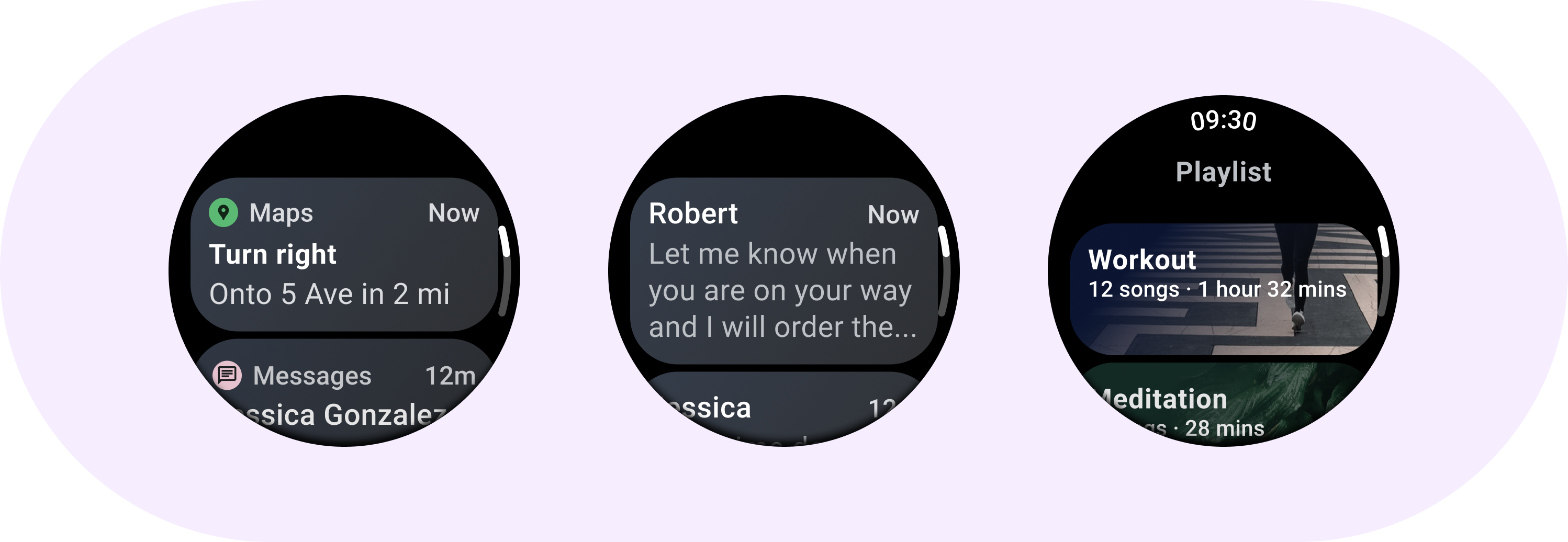
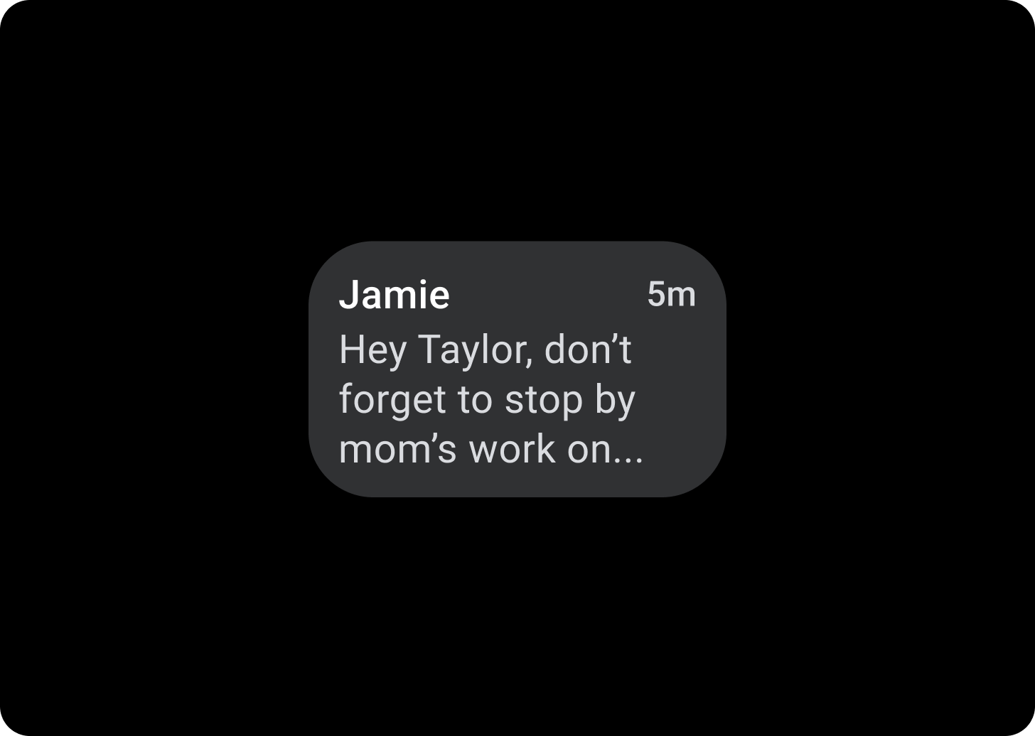
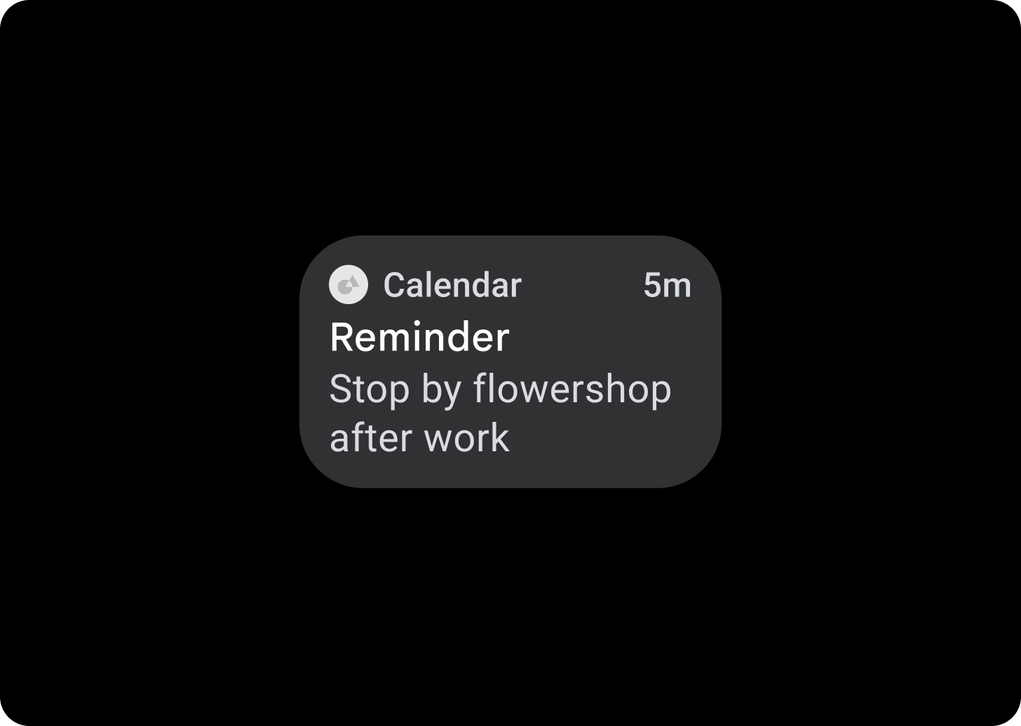
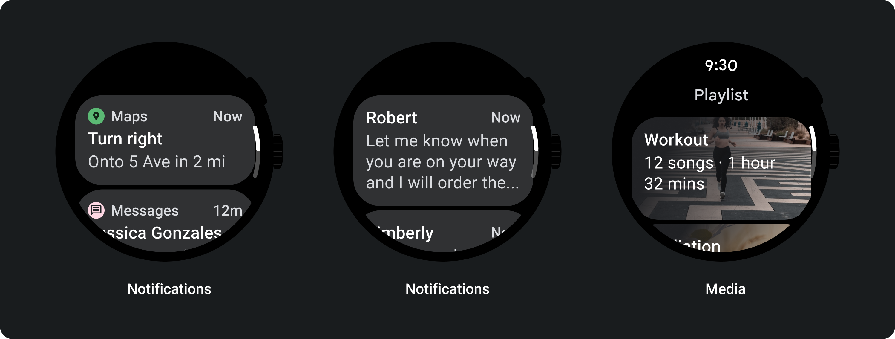
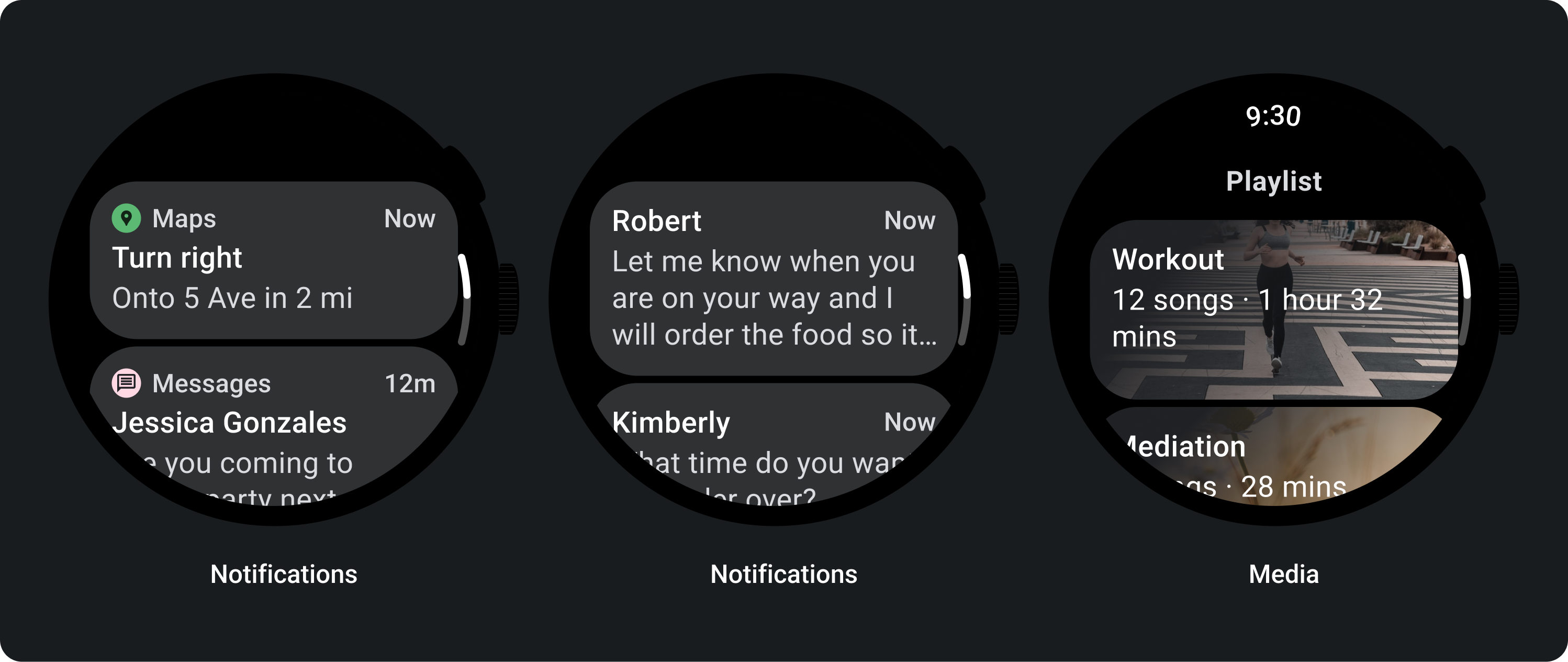
Sử dụng Thẻ tiêu đề để hiển thị thông tin trong ứng dụng, chẳng hạn như một thông báo. Thẻ tiêu đề có bố cục 3 ô bao gồm tiêu đề, trường thời gian (không bắt buộc) và nội dung liên quan (có thể là hình ảnh hoặc văn bản).
Thẻ ứng dụng
Sử dụng Thẻ ứng dụng để hiển thị các thành phần tương tác từ nhiều ứng dụng. Thẻ ứng dụng có bố cục 5 ô bao gồm biểu tượng ứng dụng, tên ứng dụng, thời gian diễn ra hoạt động, tiêu đề của một số loại và nội dung có liên quan (ví dụ: hình ảnh hoặc văn bản).
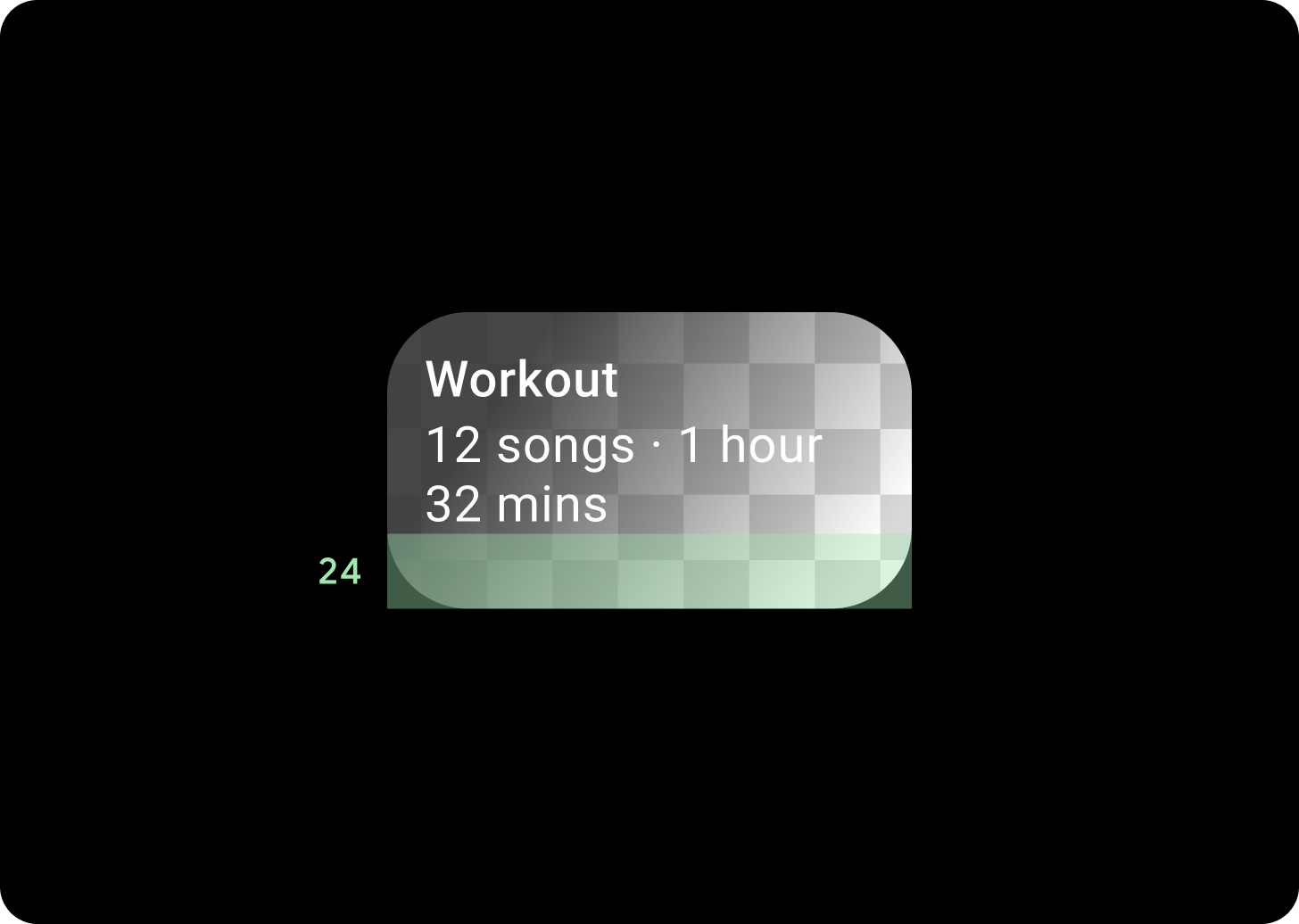
Chuyển màu thẻ
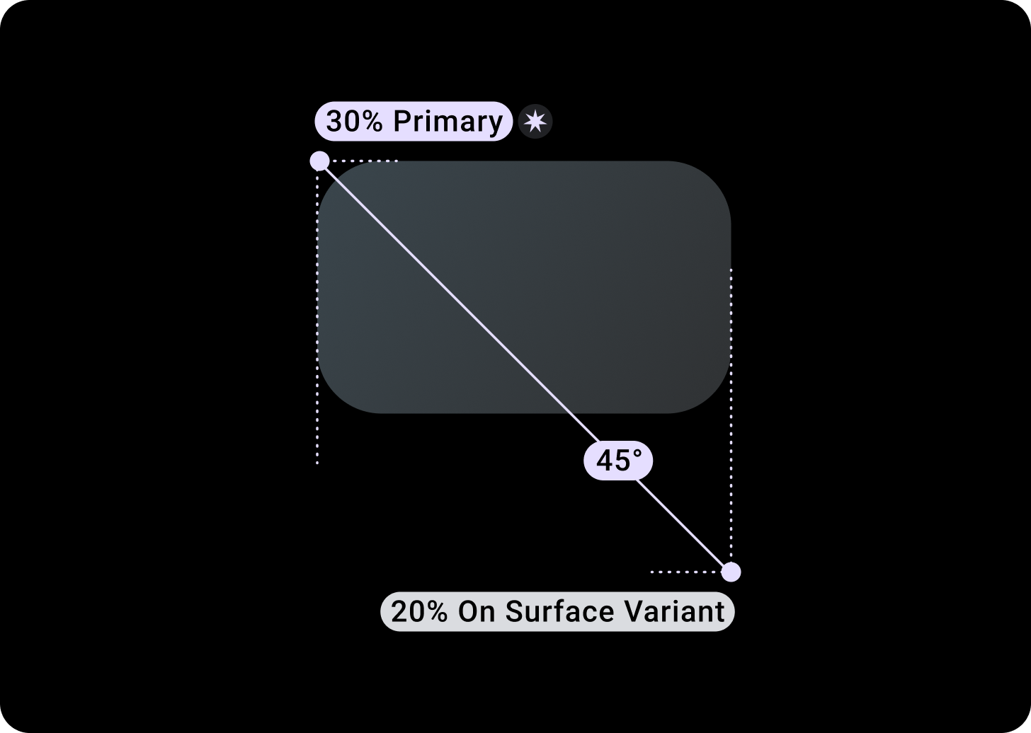
Độ dốc của thẻ
Khoảng đệm trên cùng/Trái + 68 dp từ bên trái = 100% bề mặt
Dưới cùng/Phải = 0% bề mặt
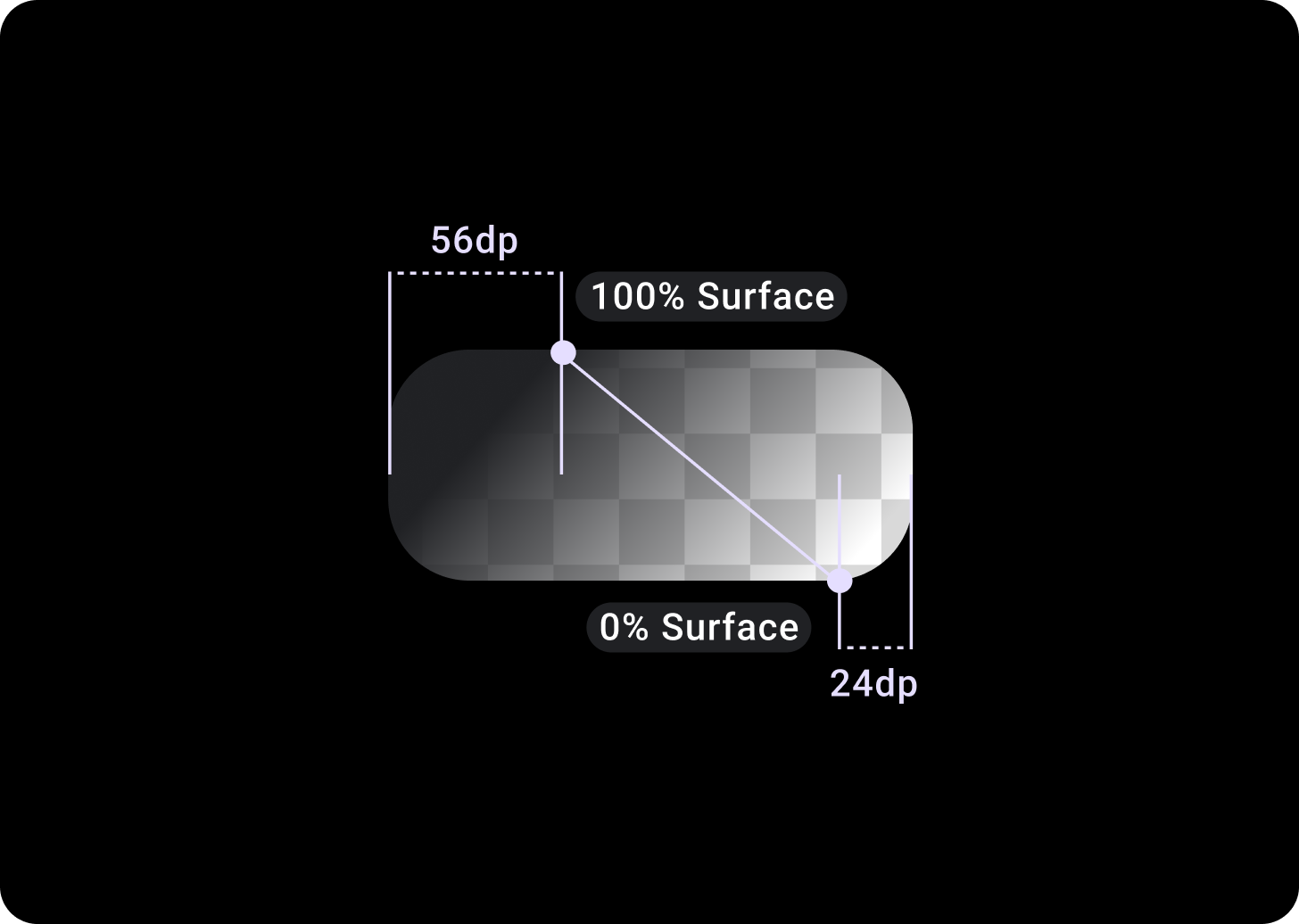
Lớp phủ thẻ hình ảnh
Khoảng đệm Trên cùng/Trái + 56 dp từ T/L = 100% Vùng đệm
Khoảng đệm Dưới cùng/Phải + 24 dp từ B/R = 0% Vùng hiển thị
(Lớp phủ chuyển màu trên nền hình ảnh)
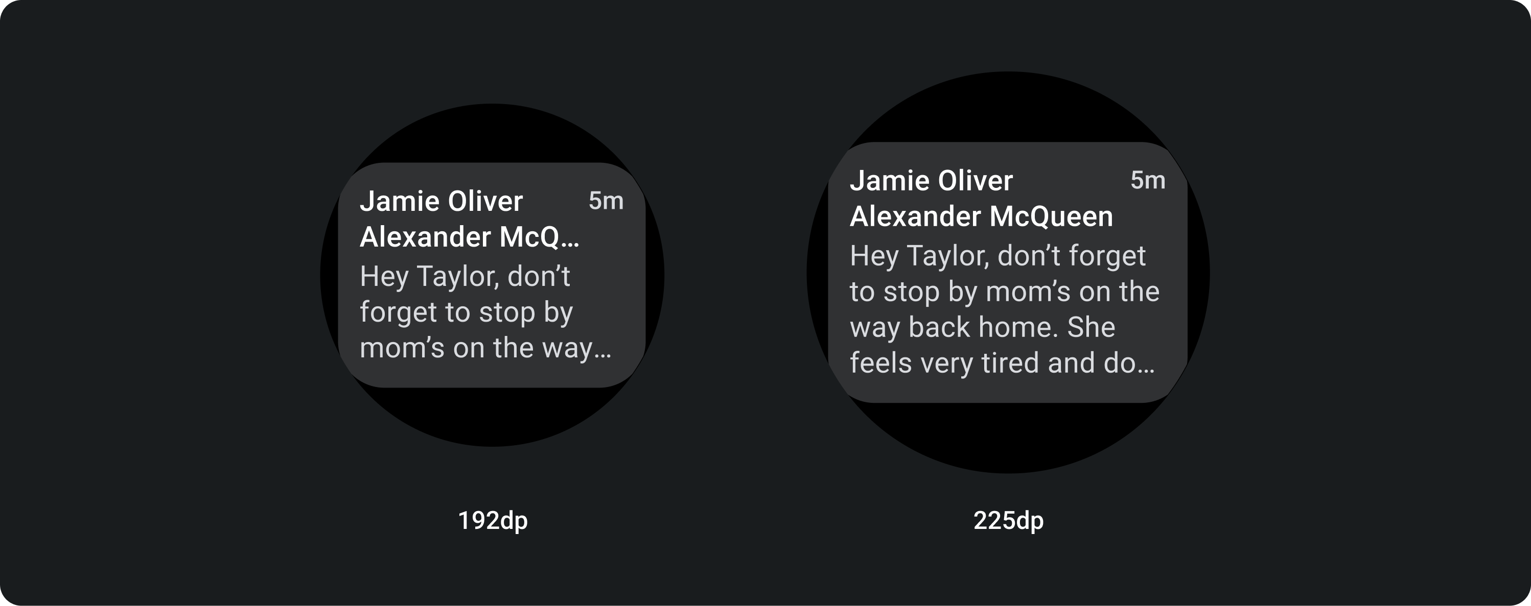
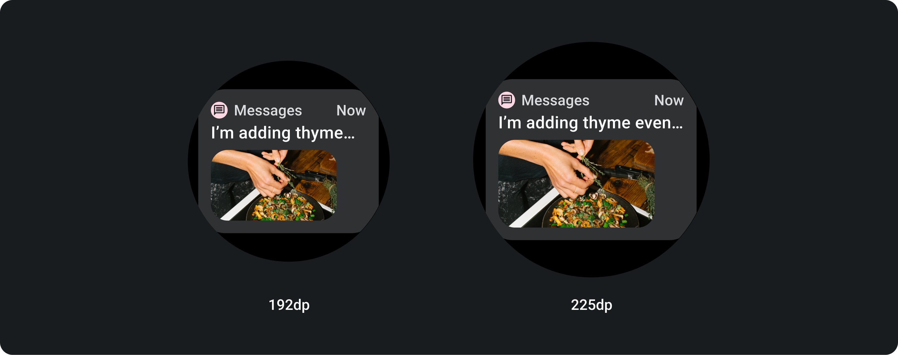
Kích thước
Chiều rộng thẻ
Theo mặc định, các thẻ có chiều rộng tối đa của vùng chứa.
Chiều cao thẻ có kích thước linh hoạt. Yếu tố này là do nội dung của các thành phần quyết định.
Trên mặt đồng hồ hình tròn, các thẻ cao hơn 60% chiều cao màn hình sẽ bị cắt bớt.
Cách sử dụng
Bố cục thích ứng (Adaptive Layouts)
Thẻ tiêu đề
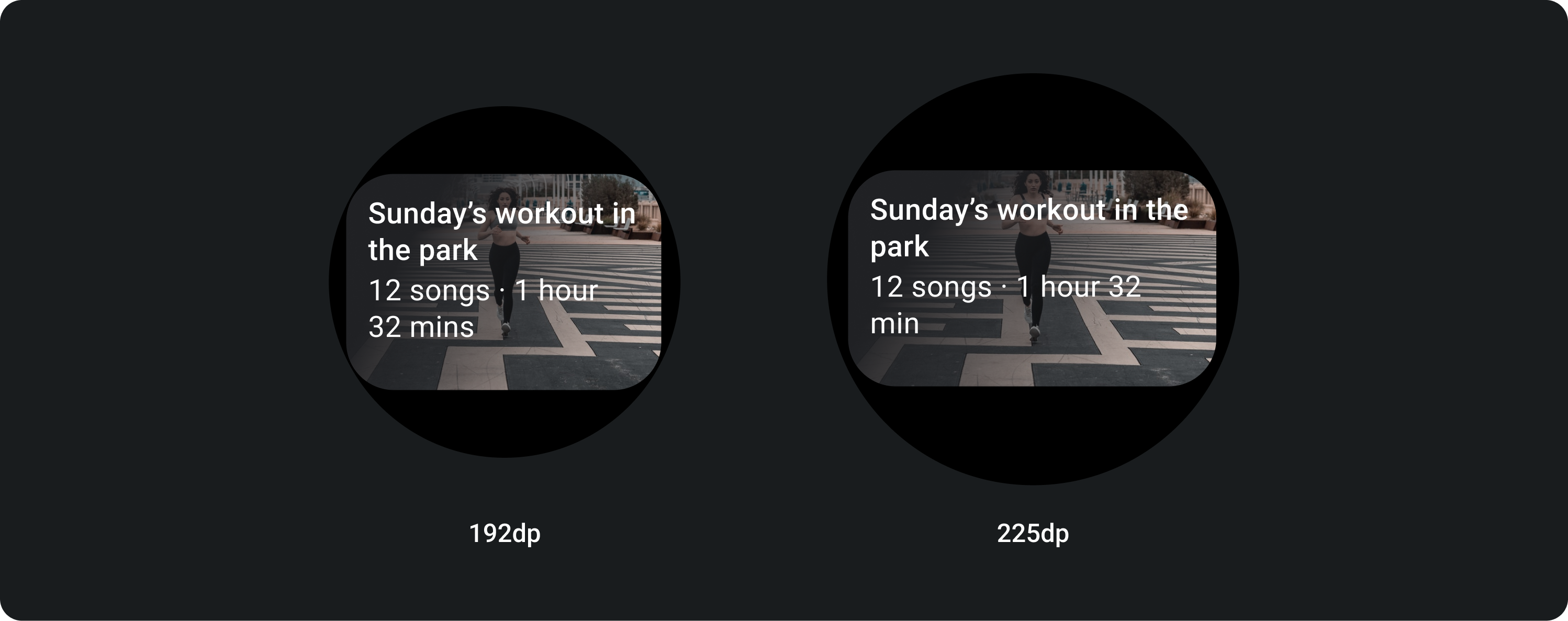
Trên màn hình lớn hơn, chúng tôi cho phép thêm một dòng văn bản cho nội dung. Và để hiển thị thêm hình ảnh, hãy thêm khoảng đệm 24 dp ở dưới cùng.
Thẻ tiêu đề có hình ảnh cùng dòng (thay thế vị trí cho nội dung)
Trên màn hình lớn, hình ảnh không thay đổi tỷ lệ khung hình và có khoảng đệm ở bên phải để chiều cao của thẻ không quá lớn.
Thẻ có khả năng tuỳ chỉnh bổ sung
Thẻ có nền hình ảnh
Để làm được bố cục này, bạn cần tuỳ chỉnh.
Thẻ hình ảnh hiển thị nội dung liên quan đến một chủ đề kèm theo hình nền. Thẻ hình ảnh cũng có thể hiển thị hình ảnh một cách độc lập.
Bạn nên tăng khoảng đệm dưới cùng lên 24 dp để có thể hiển thị nhiều hình nền hơn mà không cần có văn bản.