

在 Wear OS 上,無論螢幕大小為何,都應設有最低品質標準
要打造優質的 Wear OS 應用程式,第一個步驟是讓應用程式支援所有螢幕大小。亦即針對各種目標螢幕大小測試應用程式,並找出並修正任何明顯的錯誤。
在這個階段,應用程式的版面配置可能不太理想,但應用程式沒有明顯的視覺或互動問題,且使用者可以完成所有工作流程。
需留意的常見問題
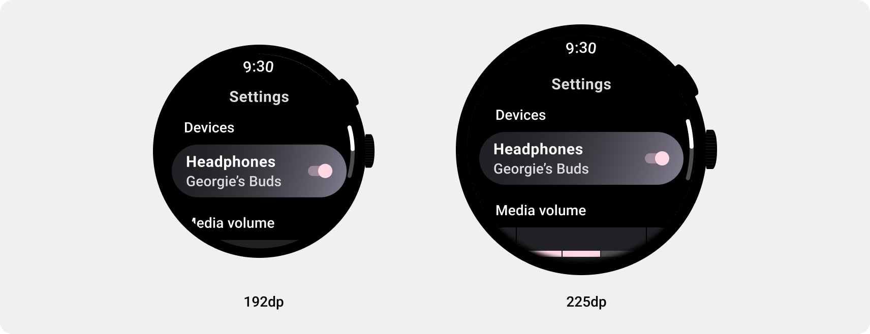
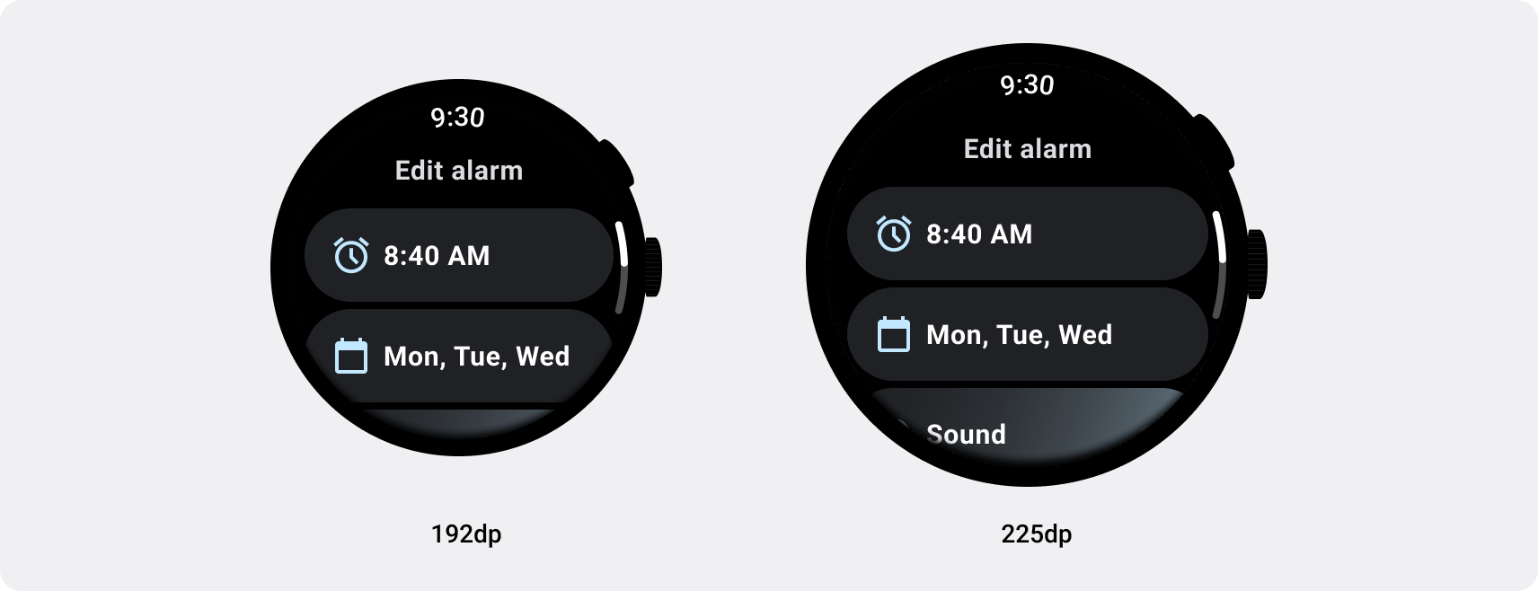
- 上邊界、底部和側邊邊界相關問題
- 裁剪文字、按鈕或其他元件
- 不當的元件調整
- UI 元素的縮放方式不一致
最佳做法
確認應用程式在各種尺寸的裝置上沒有明顯的錯誤。
小心
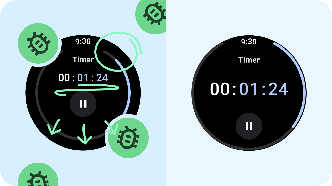
- 浮動對齊或間距。
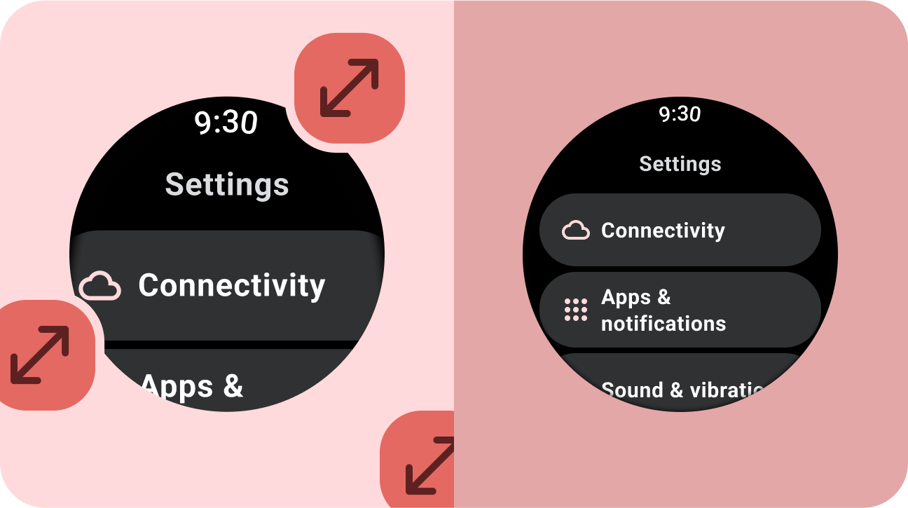
- 按比例擴充 UI 內容。
下一步:回應式及最佳化

採用回應式及最佳化設計的應用程式會採用回應式版面配置,這類版面配置能自動配合不同螢幕大小進行調整,為使用者提供額外價值,並提供效率卓越且互動良好的使用者體驗。