Google Photos เพิ่มจำนวนผู้ใช้ที่ใช้งานอยู่รายวันด้วยการสร้างแอปสำหรับหน้าจอขนาดใหญ่
จัดทุกอย่างให้เป็นระเบียบอยู่เสมอด้วยคอลเล็กชัน
บันทึกและจัดหมวดหมู่เนื้อหาตามค่ากำหนดของคุณ
Google Photos คือพื้นที่รวบรวมความทรงจำของคุณ และทีมพัฒนาเชื่อว่าผู้ใช้ควรเพลิดเพลินกับความทรงจำเหล่านั้นได้ในทุกอุปกรณ์ เพื่อให้มั่นใจว่าฟีเจอร์ของแอปจะทำงานได้ดีในแท็บเล็ต Android, อุปกรณ์แบบพับได้ และอุปกรณ์ ChromeOS ทางบริษัทจึงลงทุนพัฒนาเลย์เอาต์ที่ตอบสนองในทุกหน้าจอ
สิ่งที่พวกเขาทำ
ทีมพัฒนา Google Photos ได้พิจารณาวิธีแก้ไขเลย์เอาต์สำหรับหน้าจอขนาดใหญ่ โดยอาศัยแนวทางปฏิบัติแนะนำด้านความสามารถในการใช้งานและงานวิจัยเพื่อพิจารณาว่าต้องการแก้ไขเลย์เอาต์สำหรับหน้าจอขนาดใหญ่ในลักษณะใด โดยเริ่มจากการปรับปรุงเลย์เอาต์ตารางกริดด้วยการลดความหนาแน่นเมื่อหน้าจอมีขนาดเกิน 600dp สำหรับแท็บเล็ต และ 1008dp สำหรับแล็ปท็อป ซึ่งช่วยให้ผู้ใช้ดูและเลื่อนดูรูปภาพในรูปแบบที่ใหญ่ขึ้นได้ง่ายขึ้น
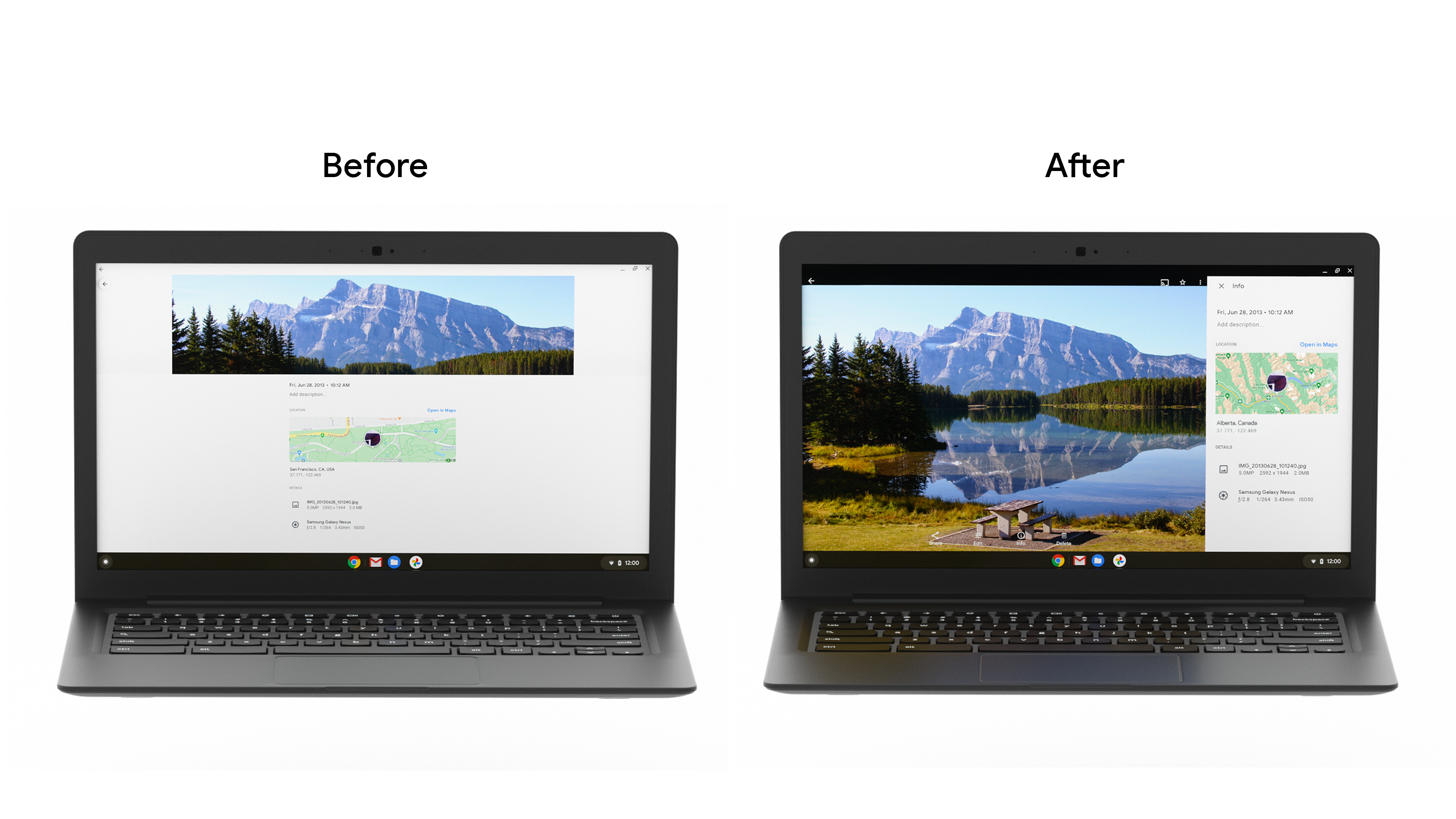
จากนั้นก็แทนที่ลิ้นชักด้านล่างของแผงข้อมูลด้วยแถบด้านข้าง เนื่องจากมักใช้หน้าจอแท็บเล็ตและเดสก์ท็อปในแนวนอน การเปลี่ยนแปลงแนวทางนี้จึงช่วยลดการยืดบนหน้าจอที่กว้างขึ้น และมอบสรีรศาสตร์ที่ดีขึ้นสำหรับวิธีที่ผู้ใช้แท็บเล็ตถืออุปกรณ์ นอกจากนี้ ยังปรับปรุงกล่องโต้ตอบ Bottom Sheet และเพิ่มแถบแสดงข้อความเพื่อให้แสดงข้อความของผู้ใช้บนหน้าจอขนาดใหญ่ได้ง่ายขึ้น
โดยได้เปลี่ยนคอมโพเนนต์การนำทางจากแถบด้านล่างเป็นแถบแนวตั้งเพื่อให้ผู้ใช้ไปยังส่วนต่างๆ และทำงานได้ง่ายขึ้น แม้ว่า Google Photos จะสร้างฟีเจอร์นี้ภายในโค้ดเบสของตนเอง แต่นักพัฒนาแอปก็สามารถสร้างฟีเจอร์นี้ได้โดยใช้คอมโพเนนต์ Material ของแถบนำทางใหม่เพื่อปรับปรุงการยศาสตร์ ลดการยืด และเพิ่มพื้นที่หน้าจอสำหรับแอปที่เลื่อนในแนวตั้ง
นอกจากนี้ ทีมพัฒนาได้ปรับขนาดตารางแบบไดนามิกเพื่อเพิ่มความคล่องตัวในการเปลี่ยนระหว่างท่าทางและขนาดหน้าจอต่างๆ รวมถึงปรับปรุงการรองรับอุปกรณ์เสริม เช่น คีย์บอร์ดและสไตลัส เนื่องจากผู้บริโภคที่ใช้อุปกรณ์ ChromeOS เพื่อเพิ่มประสิทธิภาพการทำงานมีจำนวนเพิ่มขึ้นเรื่อยๆ จึงจำเป็นอย่างยิ่งที่จะต้องตรวจสอบว่าแอปต่างๆ รองรับวิธีการป้อนข้อมูลที่หลากหลาย ซึ่งรวมถึงคีย์บอร์ด เมาส์ และการสัมผัส
ผลลัพธ์
ทีมได้เปิดตัวการเปลี่ยนแปลงเหล่านี้ผ่านการทดสอบ A/B และสังเกตเห็นว่าDAU สำหรับฟีเจอร์ผลิตภัณฑ์หลักบนหน้าจอขนาดใหญ่เพิ่มขึ้นโดยรวม โดยการใช้งานฟีเจอร์เก็บถาวรเพิ่มขึ้นถึง 53% ทีม Google Photos จะลงทุนต่อไปในการปรับปรุงประสบการณ์ของผู้ใช้ในทุกขนาดหน้าจอเพื่อให้มั่นใจว่าผู้ใช้จะได้รับประสบการณ์ที่ยอดเยี่ยมในทุกอุปกรณ์
เริ่มต้นใช้งาน
ดูข้อมูลเพิ่มเติมเกี่ยวกับวิธีเริ่มต้นเพิ่มประสิทธิภาพแอปสำหรับหน้าจอขนาดใหญ่
ตัวอย่างเนื้อหาและโค้ดในหน้าเว็บนี้ขึ้นอยู่กับใบอนุญาตที่อธิบายไว้ในใบอนุญาตการใช้เนื้อหา Java และ OpenJDK เป็นเครื่องหมายการค้าหรือเครื่องหมายการค้าจดทะเบียนของ Oracle และ/หรือบริษัทในเครือ
อัปเดตล่าสุด 2021-09-02 UTC
[null,null,["อัปเดตล่าสุด 2021-09-02 UTC"],[],[],null,["# Google Photos increased daily active users by building for large screens\n\nGoogle Photos is the home for your memories, and their development team believes people should be able to enjoy those memories across all devices. To make sure the app's features worked well across Android tablet, foldable, and ChromeOS devices, they invested in developing responsive layouts across all screens.\n\nWhat they did\n-------------\n\nThe Google Photos development team thought through how to modify their layout for large screens. They leaned on [usability best practices](https://material.io/blog/material-design-for-large-screens) and research to determine how they wanted to modify their layouts for large screens. First they improved the grid layout by reducing the density when screens increase beyond 600dp for tablets, and 1008 dp for laptops. This made it easier for users to view and scroll through their photos on the larger form factor. \n\nThen they replaced the info panel bottom drawer with a sidebar. Since tablets and desktop screens are often used in landscape, this approach change reduces stretching across wider screens and provides better ergonomics for the way tablet users hold devices. They also improved the [bottom sheet dialog](https://developer.android.com/reference/com/google/android/material/bottomsheet/BottomSheetDialog), and added [snackbars](https://developer.android.com/reference/com/google/android/material/snackbar/Snackbar) to display user messages easier on large screens. \n\nThey changed the navigation component from a bottom bar to a vertical rail, to make it easier for users to navigate and complete tasks. While Google Photos built this within their own codebase, developers can build this using the new [Navigation rail material component](https://material.io/components/navigation-rail) to improve ergonomics, reduce stretching, and increase the screen real estate for vertical scrolling apps.\n\nThe development team also made grid resizing dynamic to streamline transitioning between different postures and screen sizes, and improved the support they provide for accessories such as keyboards and stylus pens. Given the growth we've seen amongst consumers using ChromeOS devices for productivity, it is increasingly important to ensure apps support a variety of input methods, including keyboard, mouse, and touch.\n\nResults\n-------\n\nThe team rolled out these changes through an A/B test, and noticed an overall **increase in DAU for key product features on large screens, with Archive seeing as much as a 53% usage increase**. The Google Photos team will continue investing in improving the user experience across all screen sizes to ensure a great experience on all devices.\n\nGet Started\n-----------\n\nLearn more about how you can get started with [optimizing your app for larger screens](https://developer.android.com/large-screens)."]]