Google 相册通过针对大屏设备打造应用,提高了日活跃用户数
使用集合让一切井井有条
根据您的偏好保存内容并对其进行分类。
Google 相册是您美好回忆的存放地,其开发团队认为用户应该能够在所有设备上欣赏这些回忆。为确保该应用的功能可在 Android 平板电脑、可折叠设备和 ChromeOS 设备上正常运行,他们投资开发了适合所有屏幕的响应式布局。
策略
Google 相册开发团队仔细考虑了如何针对大屏设备修改布局。他们依靠易用性最佳做法和研究来确定如何针对大屏设备修改布局。首先,他们改进了网格布局,即当屏幕大小超过 600dp(平板电脑)和 1008dp(笔记本电脑)时,降低密度。这可让用户更轻松地在较大的外形规格上查看和滚动浏览照片。
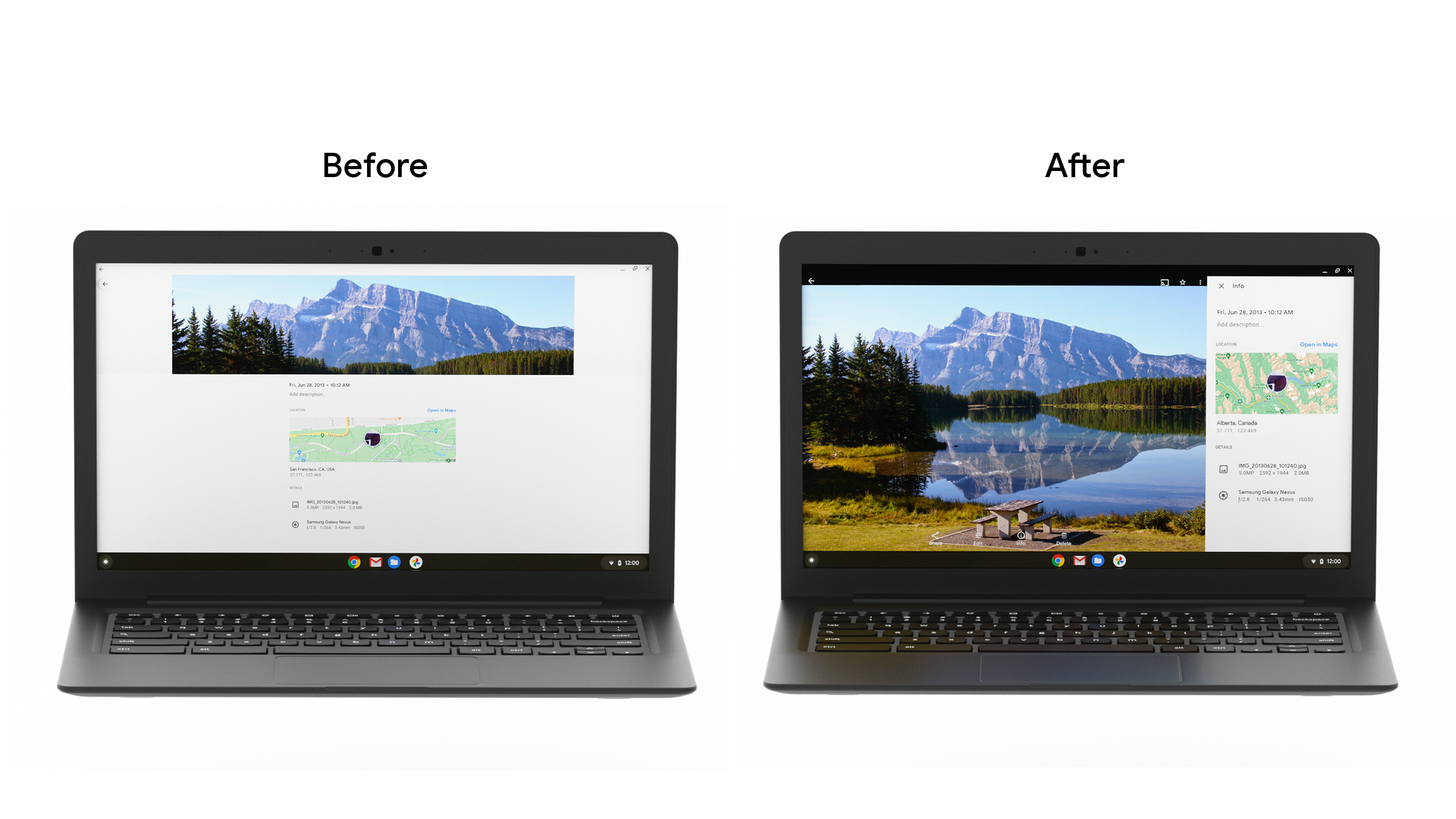
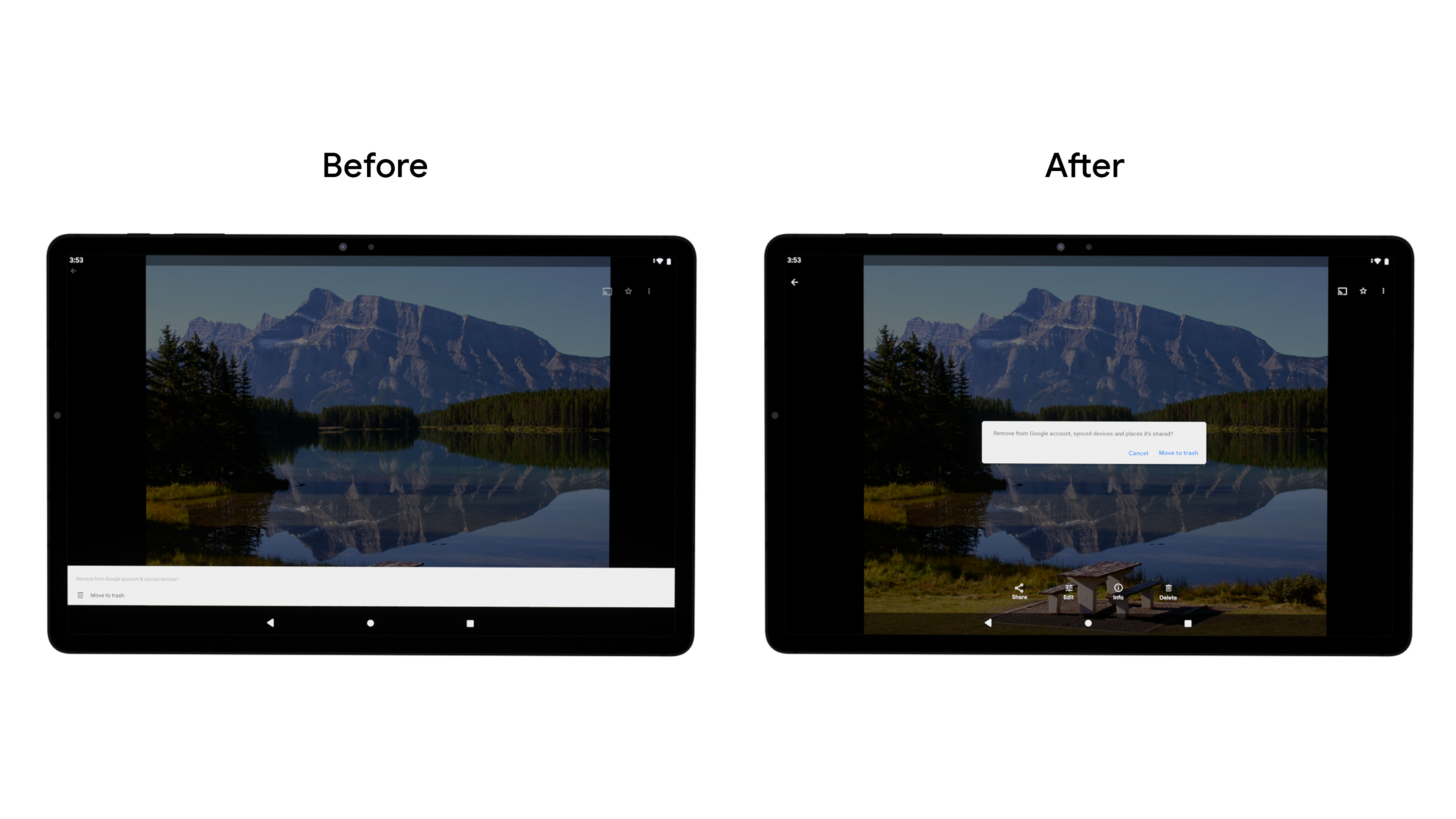
然后将信息面板底部的抽屉式导航栏替换为边栏。由于平板电脑和桌面设备的屏幕通常在横向模式下使用,因此这一变更可减少在较宽屏幕上的拉伸,并针对平板电脑用户手持设备的方式提供更好的人体工学体验。他们还改进了底部动作条对话框,并添加了信息提示控件,以便在大屏设备上更轻松地显示用户消息。
他们将导航组件从底部栏更改为垂直侧边栏,以便用户更轻松地导航和完成任务。虽然 Google 相册是在自己的代码库中构建此组件,但开发者可以使用新的侧边导航栏 Material 组件构建此组件,以便改进人体工程学、减少拉伸,并增加垂直滚动应用的屏幕空间。
此外,开发团队还实现了动态调整网格大小,以简化不同折叠状态和屏幕尺寸之间的转换,并改进了为键盘和触控笔等配件提供的支持。随着使用 ChromeOS 设备提高工作效率的消费者数量不断增长,确保应用支持各种输入法(包括键盘、鼠标和触摸)变得越来越重要。
成果
该团队通过 A/B 测试发布了这些更改,发现大屏设备上关键产品功能的日活跃用户数总体增加了,Archive 的使用量增幅高达 53%。Google 相册团队将继续致力于改进所有屏幕尺寸下的用户体验,确保在所有设备上都能提供出色的体验。
开始使用
详细了解如何开始针对大屏设备优化应用。
本页面上的内容和代码示例受内容许可部分所述许可的限制。Java 和 OpenJDK 是 Oracle 和/或其关联公司的注册商标。
最后更新时间 (UTC):2021-09-02。
[null,null,["最后更新时间 (UTC):2021-09-02。"],[],[],null,["# Google Photos increased daily active users by building for large screens\n\nGoogle Photos is the home for your memories, and their development team believes people should be able to enjoy those memories across all devices. To make sure the app's features worked well across Android tablet, foldable, and ChromeOS devices, they invested in developing responsive layouts across all screens.\n\nWhat they did\n-------------\n\nThe Google Photos development team thought through how to modify their layout for large screens. They leaned on [usability best practices](https://material.io/blog/material-design-for-large-screens) and research to determine how they wanted to modify their layouts for large screens. First they improved the grid layout by reducing the density when screens increase beyond 600dp for tablets, and 1008 dp for laptops. This made it easier for users to view and scroll through their photos on the larger form factor. \n\nThen they replaced the info panel bottom drawer with a sidebar. Since tablets and desktop screens are often used in landscape, this approach change reduces stretching across wider screens and provides better ergonomics for the way tablet users hold devices. They also improved the [bottom sheet dialog](https://developer.android.com/reference/com/google/android/material/bottomsheet/BottomSheetDialog), and added [snackbars](https://developer.android.com/reference/com/google/android/material/snackbar/Snackbar) to display user messages easier on large screens. \n\nThey changed the navigation component from a bottom bar to a vertical rail, to make it easier for users to navigate and complete tasks. While Google Photos built this within their own codebase, developers can build this using the new [Navigation rail material component](https://material.io/components/navigation-rail) to improve ergonomics, reduce stretching, and increase the screen real estate for vertical scrolling apps.\n\nThe development team also made grid resizing dynamic to streamline transitioning between different postures and screen sizes, and improved the support they provide for accessories such as keyboards and stylus pens. Given the growth we've seen amongst consumers using ChromeOS devices for productivity, it is increasingly important to ensure apps support a variety of input methods, including keyboard, mouse, and touch.\n\nResults\n-------\n\nThe team rolled out these changes through an A/B test, and noticed an overall **increase in DAU for key product features on large screens, with Archive seeing as much as a 53% usage increase**. The Google Photos team will continue investing in improving the user experience across all screen sizes to ensure a great experience on all devices.\n\nGet Started\n-----------\n\nLearn more about how you can get started with [optimizing your app for larger screens](https://developer.android.com/large-screens)."]]