Google 相簿為大螢幕裝置打造,因此每日活躍使用者人數增加
透過集合功能整理內容
你可以依據偏好儲存及分類內容。
Google 相簿可讓你集中存放美好回憶,而 Google 相簿的開發團隊相信,使用者應能在各種裝置上欣賞這些珍貴的回憶。為確保應用程式功能在 Android 平板電腦、折疊式裝置和 ChromeOS 裝置上都能正常運作,該公司投入心力開發適合各種螢幕的回應式版面配置。
具體措施
Google 相簿開發團隊仔細思考如何修改大螢幕的版面配置。他們依靠可用性最佳做法和研究結果,來決定如何修改適合大螢幕的版面配置。首先,他們改善了螢幕密度,使其螢幕密度超過 600 dp (平板電腦) 及 1008 dp (筆電)。這可讓使用者在尺寸較大的板型規格上,更輕鬆地瀏覽及捲動瀏覽相片。
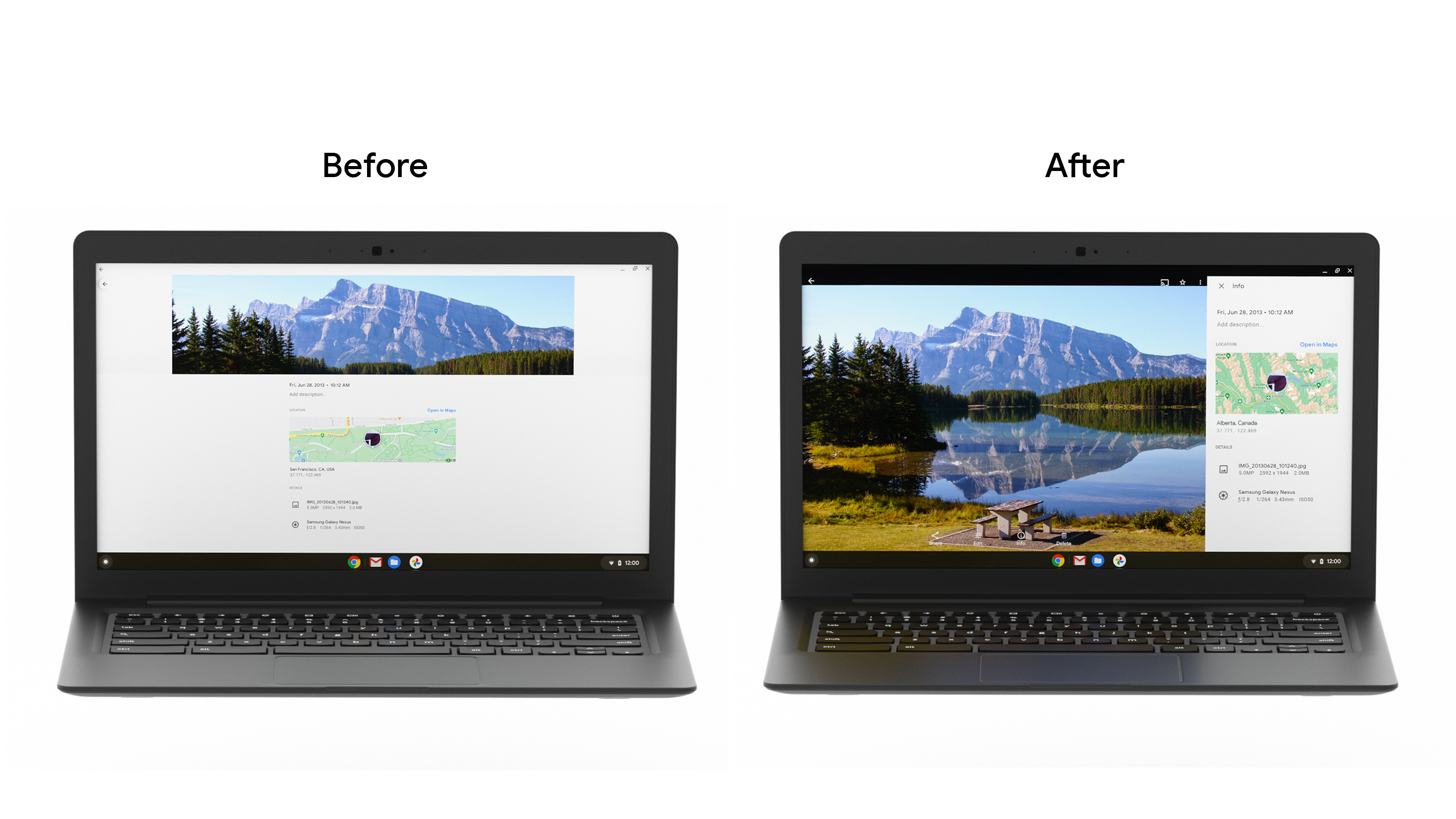
接著,他們以側欄取代資訊面板底部導覽匣。由於平板電腦和電腦螢幕通常採用橫向模式,因此這項做法可減少畫面延伸至較寬的螢幕,並配合平板電腦使用者手持裝置的方式,提供更符合人體工學的體驗。此外,他們也改善了底部功能表對話方塊,並新增了 Snackbar,以便在大螢幕上更輕易顯示使用者訊息。
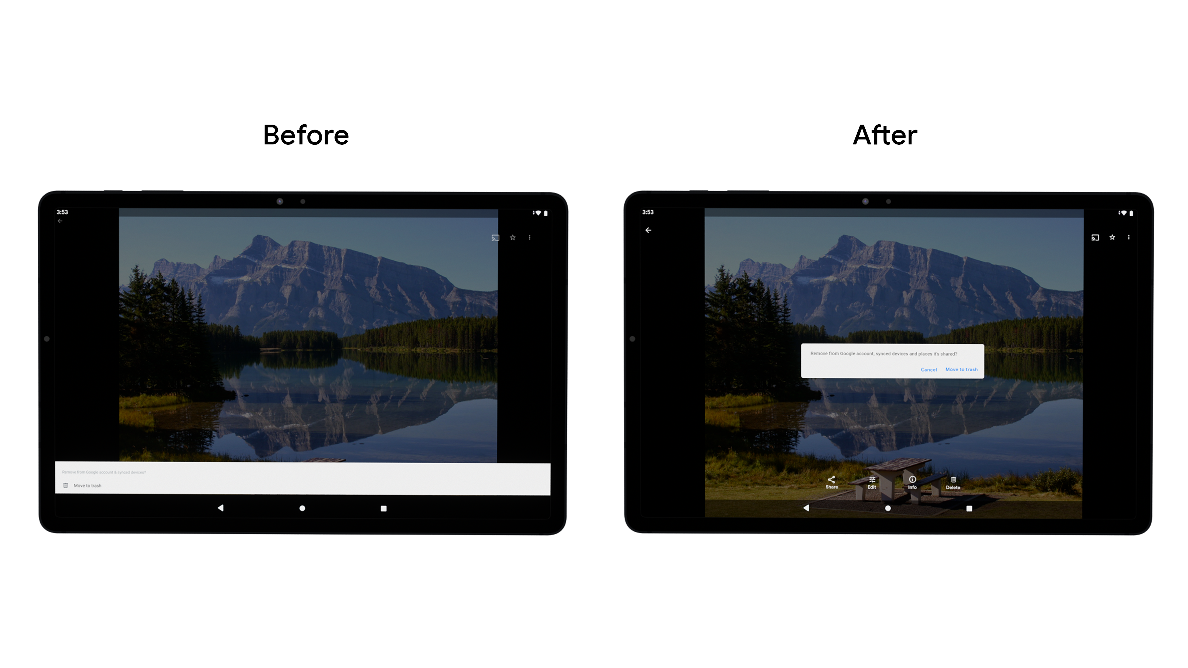
將導覽元件從底部列變更為垂直邊欄,讓使用者更容易瀏覽並完成工作。雖然 Google 相簿在自己的程式碼集內建構了這項功能,但開發人員可以利用新的導覽邊欄元件進行建構,進而提升人體工學、減少拉長及增加垂直捲動應用程式的螢幕空間。
開發團隊也動態調整格線大小,簡化不同型態和螢幕尺寸之間的轉換,並改善了他們為鍵盤和觸控筆等配件提供的支援。越來越多消費者使用 ChromeOS 裝置提升工作效率,因此越來越多消費者使用 ChromeOS 裝置提升工作效率,因此確保應用程式支援鍵盤、滑鼠和觸控等多種輸入法。
成果
該團隊透過 A/B 版本測試推出了這些變更,並發現大型螢幕上重要產品功能的每日活躍使用人數增幅,其中使用 Archive 的使用率高達 53%。Google 相簿團隊將持續投入心力,改善各種螢幕大小的使用者體驗,確保所有裝置的使用者都能享有優質體驗。
立即開始
進一步瞭解如何開始針對大螢幕最佳化應用程式。
這個頁面中的內容和程式碼範例均受《內容授權》中的授權所規範。Java 與 OpenJDK 是 Oracle 和/或其關係企業的商標或註冊商標。
上次更新時間:2021-09-02 (世界標準時間)。
[null,null,["上次更新時間:2021-09-02 (世界標準時間)。"],[],[],null,["# Google Photos increased daily active users by building for large screens\n\nGoogle Photos is the home for your memories, and their development team believes people should be able to enjoy those memories across all devices. To make sure the app's features worked well across Android tablet, foldable, and ChromeOS devices, they invested in developing responsive layouts across all screens.\n\nWhat they did\n-------------\n\nThe Google Photos development team thought through how to modify their layout for large screens. They leaned on [usability best practices](https://material.io/blog/material-design-for-large-screens) and research to determine how they wanted to modify their layouts for large screens. First they improved the grid layout by reducing the density when screens increase beyond 600dp for tablets, and 1008 dp for laptops. This made it easier for users to view and scroll through their photos on the larger form factor. \n\nThen they replaced the info panel bottom drawer with a sidebar. Since tablets and desktop screens are often used in landscape, this approach change reduces stretching across wider screens and provides better ergonomics for the way tablet users hold devices. They also improved the [bottom sheet dialog](https://developer.android.com/reference/com/google/android/material/bottomsheet/BottomSheetDialog), and added [snackbars](https://developer.android.com/reference/com/google/android/material/snackbar/Snackbar) to display user messages easier on large screens. \n\nThey changed the navigation component from a bottom bar to a vertical rail, to make it easier for users to navigate and complete tasks. While Google Photos built this within their own codebase, developers can build this using the new [Navigation rail material component](https://material.io/components/navigation-rail) to improve ergonomics, reduce stretching, and increase the screen real estate for vertical scrolling apps.\n\nThe development team also made grid resizing dynamic to streamline transitioning between different postures and screen sizes, and improved the support they provide for accessories such as keyboards and stylus pens. Given the growth we've seen amongst consumers using ChromeOS devices for productivity, it is increasingly important to ensure apps support a variety of input methods, including keyboard, mouse, and touch.\n\nResults\n-------\n\nThe team rolled out these changes through an A/B test, and noticed an overall **increase in DAU for key product features on large screens, with Archive seeing as much as a 53% usage increase**. The Google Photos team will continue investing in improving the user experience across all screen sizes to ensure a great experience on all devices.\n\nGet Started\n-----------\n\nLearn more about how you can get started with [optimizing your app for larger screens](https://developer.android.com/large-screens)."]]