
Wear OS エコシステムは、さまざまな画面サイズのデバイスで構成されています。すべてのユーザーに最高品質のエクスペリエンスを提供するには、適応型 UI の原則を活用することが重要です。
アダプティブ UI とは何ですか?
アダプティブ UI は、レンダリングされる画面のサイズに関係なく、使用可能な画面スペースを最大限に活用するように伸縮および変更されます。
適応型 UI は、レイアウト ロジックに直接組み込まれたコンポーネントとメソッドを使用して、レスポンシブに変化します。また、これらのレイアウトでは、画面サイズのブレークポイント(異なる画面サイズに異なるデザインを適用)を利用して、ユーザーにより豊かなエクスペリエンスを提供します。
主な画面サイズ
新しいエクスペリエンスを設計する際に考慮すべき主な参照サイズについて学びます。
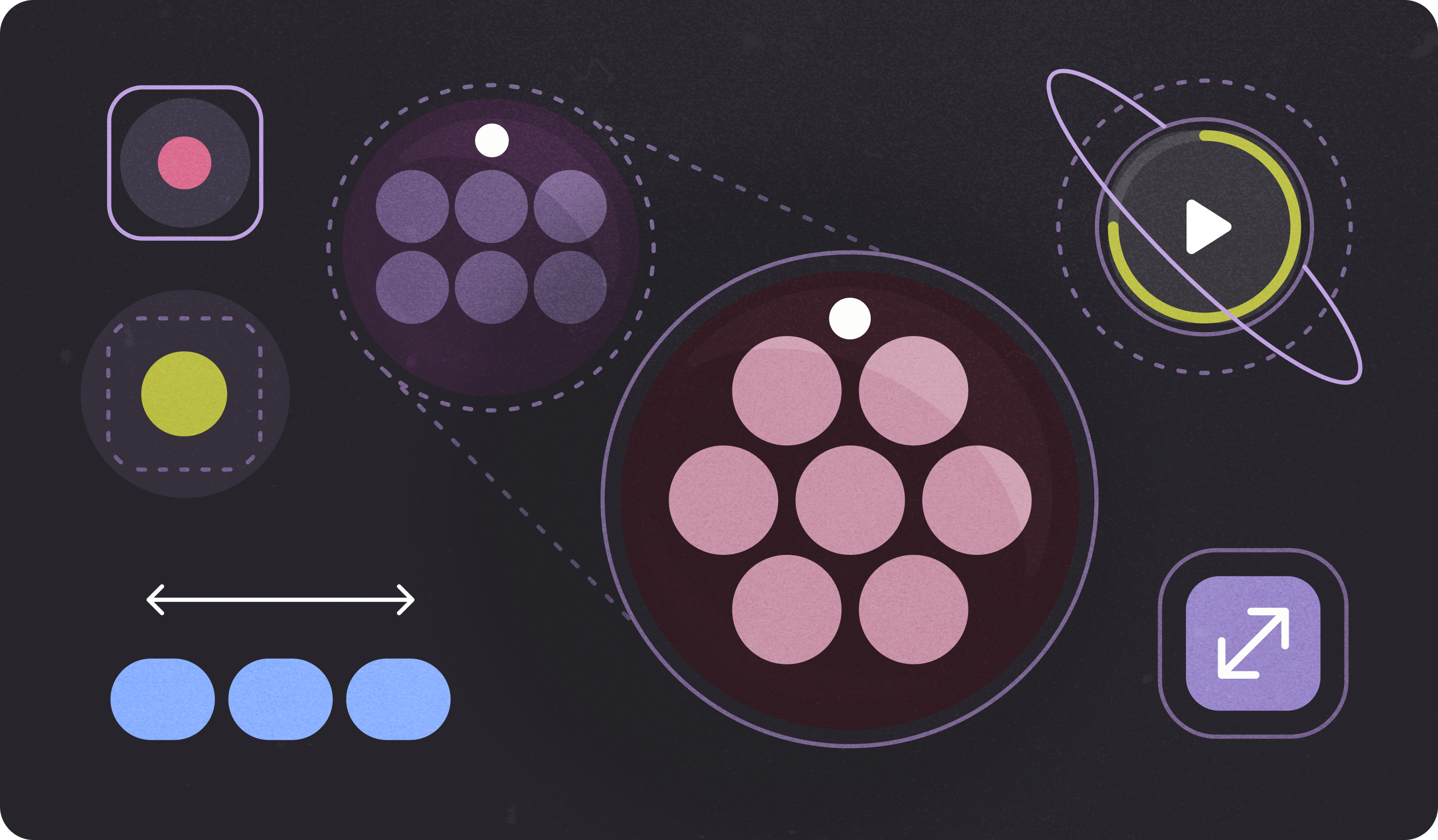
レイアウトの種類
円形画面のアダプティブ レイアウトを設計する場合、スクロール ビューとスクロール以外のビューには、UI 要素のスケーリングとバランスの取れたレイアウトとコンポジションの維持に関する独自の要件があります。
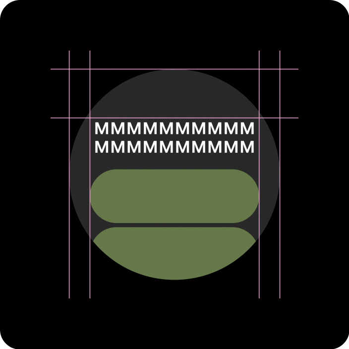
スクロール ビュー
クリッピングを回避し、要素を比例的にスケーリングするには、上部、下部、側面のすべての余白をパーセンテージで定義する必要があります。

スクロールしないビュー
すべての余白はパーセンテージで定義し、中央のメイン コンテンツが使用可能な領域全体に伸びるように垂直方向の制約を定義する必要があります。
アダプティブ レイアウトとデザイン手法で価値を付加する
円形画面のアダプティブ レイアウトを設計する場合、スクロール ビューとスクロール以外のビューには、UI 要素のスケーリングとバランスの取れたレイアウトとコンポジションの維持に関する独自の要件があります。
以下の画像は一般的な提案であり、例はあくまで参考情報です。各コンポーネントまたはサーフェス ページを表示して、コンテキストに応じた詳細なガイダンスを確認します。
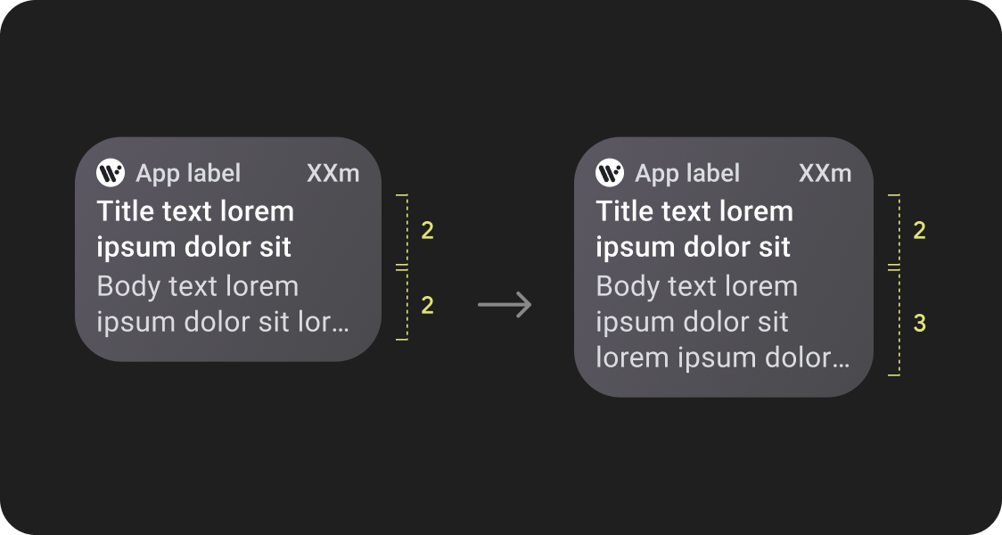
その他のコンテンツを簡単に確認
レスポンシブ レイアウトでは、より多くのチップ、カード、テキスト行、ボタンを 1 つの画面に収めることができます。
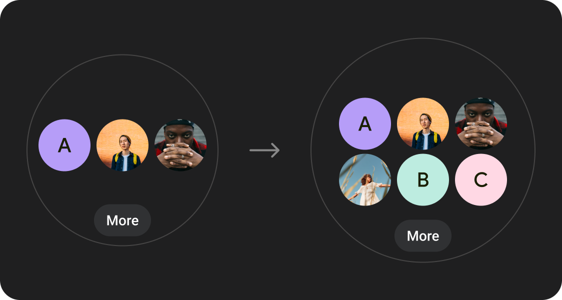
表示されるコンテンツ要素が増える
定義された画面サイズのブレークポイントで適用される新しいレイアウトを使用して、可能な場合は新しいコンテンツを導入し、画面サイズの大きいデバイスでユーザーに追加の価値を提供します。

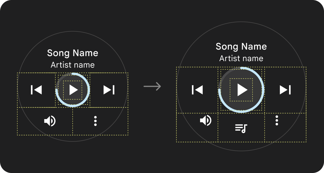
スナップショットの改善
余分な画面スペースを使用して、より大きなコンテナ、大きなテキスト、太いリング、より詳細なデータ可視化を実現し、ユーザーが簡単に確認できるようにします。
ユーザビリティの向上
余分な画面スペースを使用して、タップ ターゲットを大きくし、視覚的な階層を高め、コンテンツ アイテムの間にスペースを追加することで、インターフェースの操作をより簡単に、快適にします。

最適化されたコンポジション
更新されたコンポーネントとテンプレートを使用して、すべての画面サイズで UI の外観を改善します。
アプリの品質
品質ガイドラインは 3 つのレベルに分かれています。3 つの階層すべてでガイドラインを満たすことで、ユーザーに最適なエクスペリエンスを提供します。

確立された正規レイアウトを利用する
確立された標準レイアウトを使用すると、さまざまなデバイスサイズに UI をスムーズに適応させることができます。
正規レイアウトは、すべての画面サイズで質の高いエクスペリエンスを提供するために慎重に開発されています。
