Warning: Google Play Instant will no longer be available. Starting December 2025, Instant Apps cannot be published through Google Play, and all Google Play services Instant APIs will no longer work. Users will no longer be served Instant Apps by Play using any mechanism.
We're making this change based on developer feedback and our continuous investments to improve the ecosystem since the introduction of Google Play Instant.
To continue optimizing for user growth, we encourage developers to refer users to their regular app or game, using deeplinks to redirect them to specific journeys or features when relevant.
Google Play Instant provides a new way for users to consume apps. These apps, called instant apps, are native Android apps, but they run without being installed on the device. Each instant app has a corresponding version that users can choose to install.
Because of the unique way that users interact with them, instant apps should observe some specific user experience practices. This guide presents guidelines for how to create a positive user experience in an instant app.
We strongly recommend that you use material design principles when you design your instant app. For more information about how to apply material design to an app, see Material Design for Android.
We've also provided additional guidelines specific to gaming apps. For more information, see the UX best practices for games on Google Play Instant.
Provide a meaningful landing screen for your app
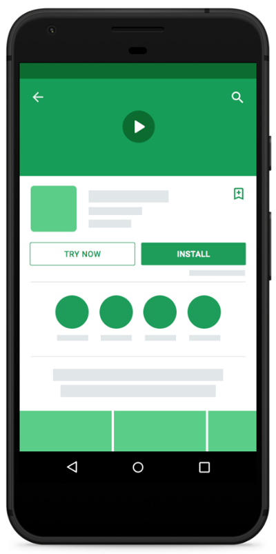
In order for your app or game to have a Try Now button on the Play Store, or to appear in the Android launcher, it needs a default main activity.
Users who enter your app from the Try Now button or from the launcher don't have the context of a deep link or specific content they're trying to access. Therefore, you should provide a place for them to browse and discover your app's functionality.
It's also worth making sure that your app's name is prominently displayed on the screen. Because users sometimes click on a link to your app without much context, they might not know what your app's name is.
Identify fallback destinations for your links
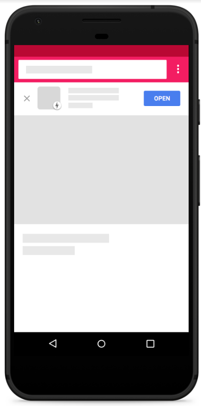
Links to apps and games on Google Play Instant open immediately when possible. Otherwise, these links fall back to opening in a browser.
By Linking to Google Play, you can change the fallback scenario to go to the Play Store instead. This strategy can be useful if you want to direct users to download your app if they cannot open the app right away and you don't want them to use your app on the web.
As an alternative strategy, you can use banners on your website to open your app directly instead of having to send users to the Play Store first. This strategy is shown in Figure 2.
Allow users to complete their task
When advertising a feature to users in your instant app, ensure that users can use the feature without having to install the app.
Avoid asking users to install the app so that they can accomplish what they want to do. The main click-through action of a page in the app should never trigger an installation prompt.

Ask users to sign in at the appropriate time
Provide as much functionality as possible without requiring users to sign in or register for a service associated with your app.
Wait until users try to use a feature that requires authentication before you prompt them to sign in. Users perceive sign in prompts as less intrusive if they immediately see the benefit for signing in.
For example, consider a photo sharing app that requires users to log in when launched. To improve the user experience, the app now provides features users can use without logging in, such as browsing the most popular publicly-shared photos and editing the photos on their devices. When the user wants to share their photos with friends, the app prompts them to sign in.

Preserve user state after app installation
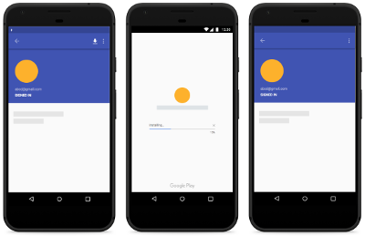
When users install the app, make sure that you transfer their stored app state to the app using cookies or local storage. Users should be able to pick up where they left off in your app, as depicted in Figure 5.
Don't create any additional splash screens
The instant app launch experience incorporates app branding, app title, and app launcher icon. Don't create additional splash screens of your own, as those seem redundant to users.

Up arrows vs. system back
The Up button navigates upward in the app's navigation stack until the user reaches the app's home screen. The Back button navigates in reverse chronological order through the history of recently viewed screens.
While the Up button ensures the user remains in your app, the Back button may take the users back through recent screens outside of your app. In other words, Pressing the Up button shouldn't ever exit the app.
For more information about how to design navigation with the Back and Up buttons, see Designing Back and Up navigation.

Don't branch your UI
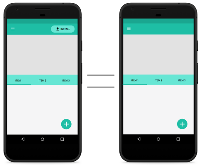
The UI of your instant app should be identical to the UI of an installed version. Don't change your design and UI in the instant app.
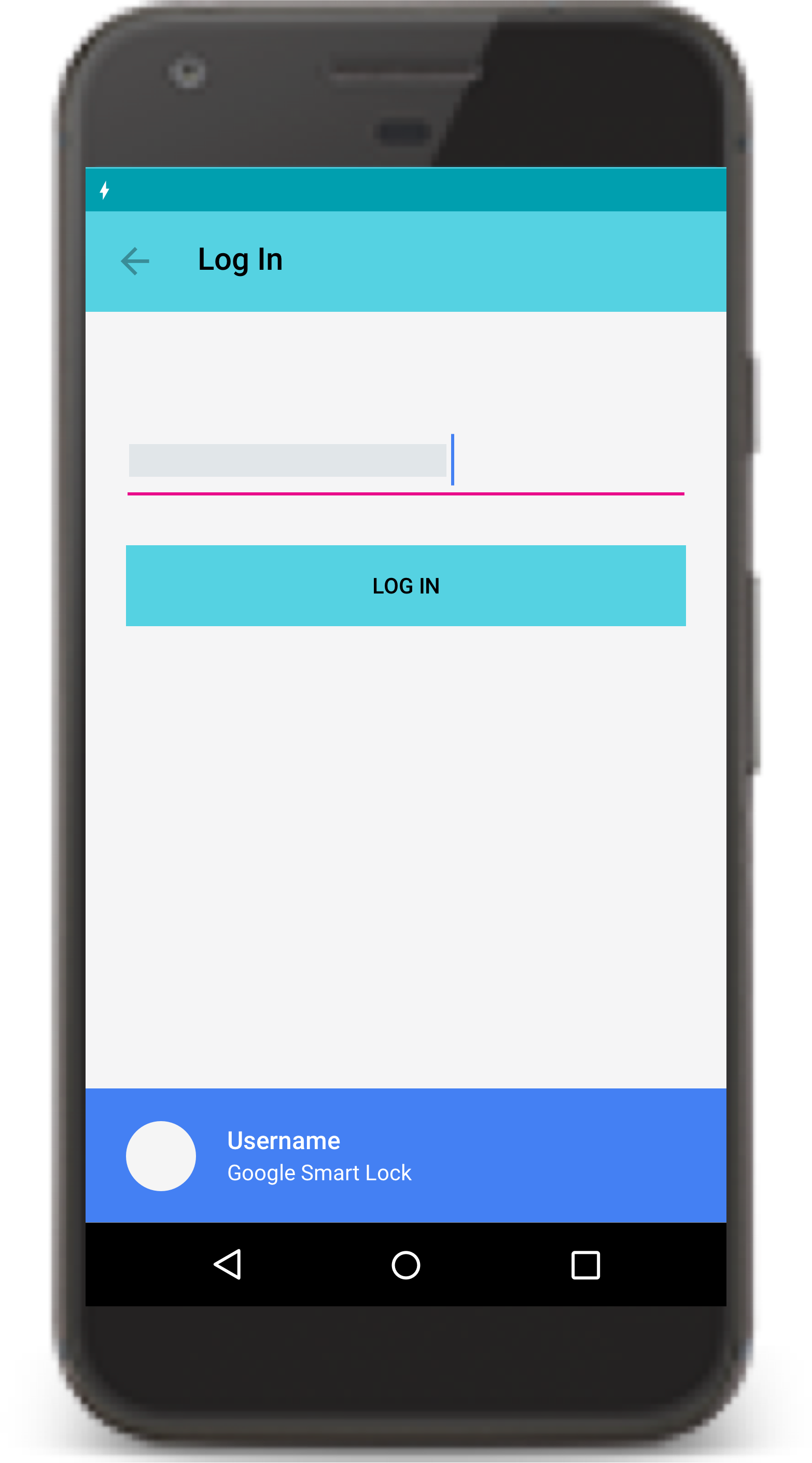
Use Smart Lock for Passwords on Android for identity
Smart Lock for Passwords on Android is a password manager across Chrome and Android. Smart Lock also automatically signs users in on subsequent visits. To makes authentication easier for users, provide support for Google Smart Lock in your instant app.
Provide explicit installation prompts
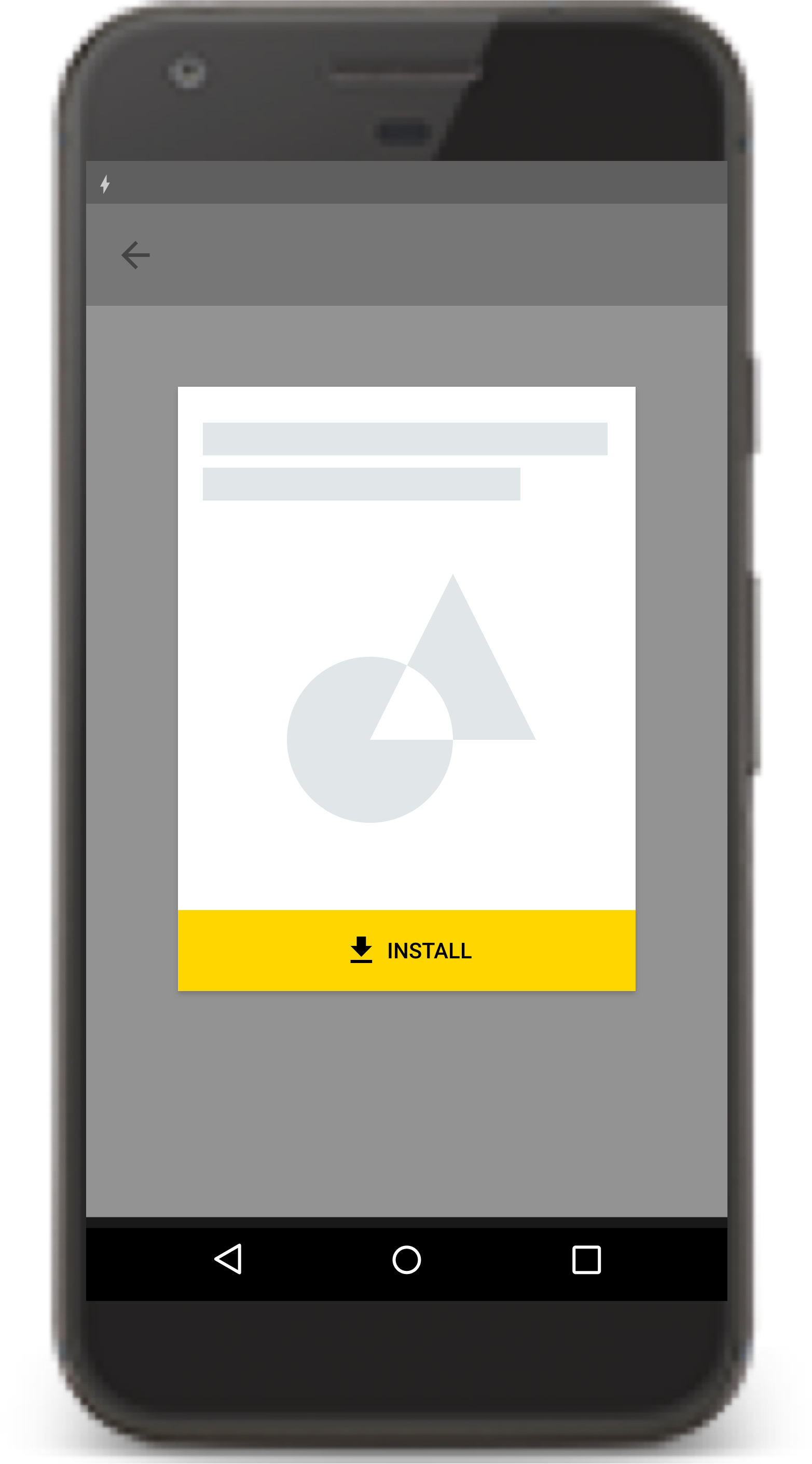
Use install buttons strategically by making them part of your app's user interface. Use the Material Design "get app" icon and the label INSTALL for the installation button.
Don't use any other labels like "Get the app," "Install the full app," or "Upgrade." Never use a banner or other ad-like technique for presenting an installation prompt to users.

Provide at most 2-3 implicit installation prompts
Implicit installation prompts are links in the instant app that don't do anything other than launch an installation prompt. These implicit installation prompts might occur where you have functionality in the installed version of your app that the instant version doesn't have.
Don't have more than 2-3 implicit installation prompts in your app.
When using an implicit installation prompt, make sure to provide context and information about the feature that triggered it. Give users a reason why they might want to install the app.
Remove non-functional sections of your app
When converting your app to an instant app, you may have portions of your instant app's UI that link to other feature modules of your app. Remove any such sections from the instant app.

Take the friction out of payments
If purchases in your instant app aren't supported by Google Play Billing and you don't have the user's payment information on file, you can use another payment API, such as the Google Pay API. The Google Pay API allows you to offer purely offline payments, like cash on delivery, and to store gift cards in your instant app.

Link out to third-party offerings
Links to third-party offerings and content can open in a Chrome custom tab
or browser. They can be rendered using a
WebView when the requested resources
are provided through HTTPS protocol.
Your own offerings should not link out to the browser but rather stay within the
instant app, using a WebView if
necessary. All network traffic from inside the instant app must use HTTPS
protocol.
Within the instant app, you should clearly define what functionality your app provides and what functionality is provided from an external source.
Provide a way to share instant app URLs
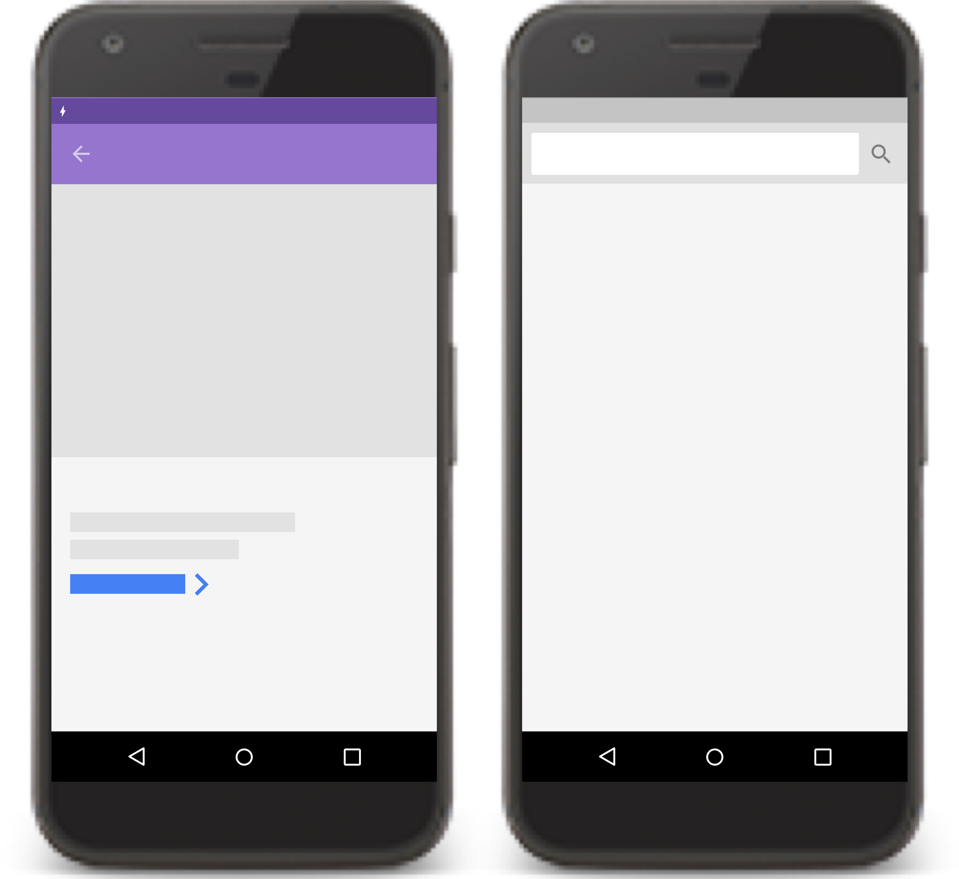
Since instant apps don't provide an address bar for users to copy the URL, provide a "share" action within your app that allows users to share your instant app's URL.

Additional resources
For more information about creating high-quality instant experiences, consult the following resources.
