

If your app contains multiple destinations for users to traverse, we recommend employing layout and navigation pairings that are commonly used by other apps. Because many users already possess the mental models for these pairings, your app will be more intuitive for them.
Layout and navigation pairings
প্যারেন্ট লেআউট ভিউ এবং প্রাইমারি নেভিগেশন ডেস্টিনেশনের জন্য প্রাইমারি নেভিগেশন প্যাটার্ন হিসেবে নেভিগেশন বার এবং মোডাল নেভিগেশন ড্রয়ার ব্যবহার করা হয়।

The navigation bar can hold three to five navigation destinations across the same hierarchy level. This component translates to the navigation rail for large screens.
Although the navigation drawer can hold more than five navigation destinations, the pattern isn't as ideal as the navigation bar. This is because users must reach for the top bar on compact sizes.

ম্যাটেরিয়াল ৩ ট্যাব এবং বটম অ্যাপ বার হলো সেকেন্ডারি নেভিগেশন প্যাটার্ন, যা আপনি প্রাইমারি নেভিগেশনের পরিপূরক হিসেবে অথবা চাইল্ড ভিউতে প্রদর্শন করতে ব্যবহার করতে পারেন।
এখানে, ট্যাবগুলো একই স্তরের বিষয়বস্তুকে একত্রিত করার জন্য একটি দ্বিতীয় নেভিগেশন স্তর হিসেবে কাজ করে।
Layout actions
Provide controls to enable users to accomplish actions. Common patterns include top bar actions, floating action button (FAB), and menus.
For actions of the highest importance, a FAB provides a large and prominent button for the user. Provide only one action at a time at this level. A FAB can appear in multiple sizes and an expanded form, which includes a label. Use Scaffold to pin a FAB, to ensure it's always visible even when scrolling.

A floating action button (FAB) that lets users add plants to the plant gallery
You can place secondary actions within the top bar or, if it's grouped near related content, within the page.

যেসব অতিরিক্ত কাজের তাৎক্ষণিক বা ঘন ঘন প্রয়োজন হয় না, সেগুলোকে একটি ওভারফ্লো মেনুতে যোগ করুন।
Adaptive navigation
Use the right layout for the window size class. Avoid using the same bottom navigation bar across sizes.
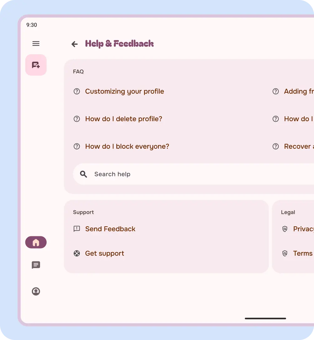
করুন
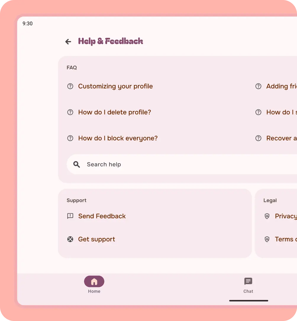
না
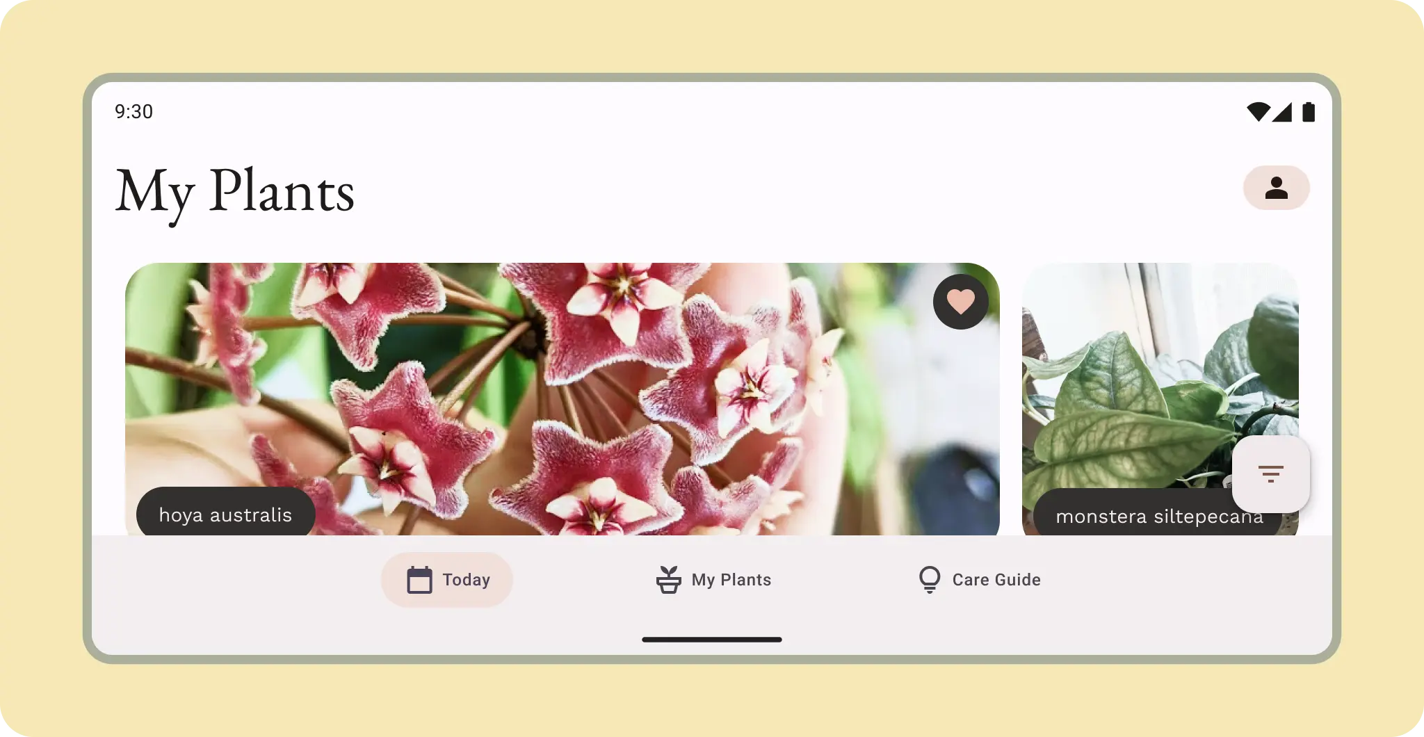 মাঝারি আকারের ব্যবহারকারীরা নেভ রেল বা হরাইজন্টাল নেভিগেশন আইটেম ব্যবহার করতে পারেন।
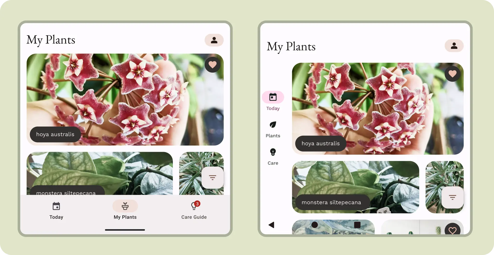 Although compact, a navigation rail might be more ergonomic on a cover screen. Larger covers could take advantage of either navigation orientation. Consider how the user might interact with the content.