
您的应用应能在各种尺寸的 Wear OS 设备上顺畅运行,在有额外空间时充分利用这些空间,同时在较小的屏幕上也能呈现精美外观。本指南提供了有关如何实现这种用户体验的建议。
如需详细了解自适应布局的设计原则,请参阅设计指南。
使用 Material 3 构建自适应布局
布局应具有基于百分比的边距。由于 Compose 默认使用绝对值,因此请使用 Horologist 库中的rememberResponsiveColumnPadding 来计算边衬区,并将其传递给 ScreenScaffold 的 contentPadding 形参和 TransformingLazyColumn 的 contentPadding 形参。
以下代码段使用 TransformingLazyColumn 组件创建在各种 Wear OS 屏幕尺寸上看起来都很棒的内容:
val columnState = rememberTransformingLazyColumnState() val contentPadding = rememberResponsiveColumnPadding( first = ColumnItemType.ListHeader, last = ColumnItemType.Button, ) val transformationSpec = rememberTransformationSpec() ScreenScaffold( scrollState = columnState, contentPadding = contentPadding ) { contentPadding -> TransformingLazyColumn( state = columnState, contentPadding = contentPadding ) { item { ListHeader( modifier = Modifier.fillMaxWidth().transformedHeight(this, transformationSpec), transformation = SurfaceTransformation(transformationSpec) ) { Text(text = "Header") } } // ... other items item { Button( modifier = Modifier.fillMaxWidth().transformedHeight(this, transformationSpec), transformation = SurfaceTransformation(transformationSpec), onClick = { /* ... */ }, icon = { Icon( imageVector = Icons.Default.Build, contentDescription = "build", ) }, ) { Text( text = "Build", maxLines = 1, overflow = TextOverflow.Ellipsis, ) } } } }
此示例还演示了 ScreenScaffold 和 AppScaffold。
这些坐标在应用和各个界面(导航路线)之间进行协调,以确保正确的滚动行为和 TimeText 定位。
对于顶部和底部内边距,另请注意以下事项:
- 第一个和最后一个
ItemType的规范,用于确定正确的边衬区。 - 对列表中的第一个项目使用
ListHeader,因为Text标题不应有内边距。
如需查看完整规格,请参阅 Figma 设计套件。如需了解更多详情和示例,请参阅:
- Horologist 库 - 提供有助于为 Wear OS 构建优化且差异化应用的辅助程序。
- ComposeStarter 示例 - 一个展示本指南中概述的原则的示例。
- JetCaster 示例 - 一个更复杂的示例,展示了如何使用 Horologist 库构建可适应不同屏幕尺寸的应用。
在应用中使用滚动布局
在实现屏幕时,请使用滚动布局(如本页前面所示)作为默认选择。这样一来,无论用户设置了何种显示偏好设置或 Wear OS 设备屏幕尺寸如何,都可以访问您应用的组件。
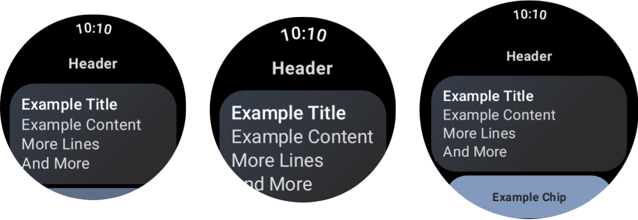
不同设备尺寸和字体缩放的效果。
对话框
对话框还应可滚动,除非有非常充分的理由不这样做。
AlertDialog 组件具有自适应能力,如果内容超出视口高度,则默认可滚动。
自定义界面可能需要非滚动布局
某些屏幕可能仍然适合非滚动布局。例如,媒体应用中的主播放器界面和健身应用中的锻炼界面。
在这些情况下,请查看 Figma 设计套件中提供的规范指南,并使用正确的边距实现可根据屏幕尺寸做出响应的设计。
通过断点提供差异化体验
借助更大的显示屏,您可以引入更多内容和功能。如需实现这种差异化的体验,请使用屏幕尺寸断点,在屏幕尺寸超过 225 dp 时显示不同的布局:
const val LARGE_DISPLAY_BREAKPOINT = 225 @Composable fun isLargeDisplay() = LocalConfiguration.current.screenWidthDp >= LARGE_DISPLAY_BREAKPOINT // ... // ... use in your Composables: if (isLargeDisplay()) { // Show additional content. } else { // Show content only for smaller displays. } // ...
设计指南中展示了更多此类机会。
使用预览功能测试屏幕尺寸和字体大小的组合
Compose 预览有助于您针对各种 Wear OS 屏幕尺寸进行开发。同时使用设备和字体缩放预览定义,可查看以下内容:
- 屏幕在尺寸极端情况下的外观,例如,最大字号搭配最小屏幕。
- 差异化体验在不同断点处的行为。
确保您为应用中的所有屏幕使用 WearPreviewDevices 和 WearPreviewFontScales 实现预览。
@WearPreviewDevices @WearPreviewFontScales @Composable fun ComposeListPreview() { ComposeList() }
屏幕截图测试
除了预览测试之外,屏幕截图测试还允许您针对一系列现有硬件尺寸进行测试。如果您可能无法立即使用这些设备,并且问题可能不会在其他屏幕尺寸上出现,那么此功能就特别有用。
屏幕截图测试还有助于您识别代码库中特定位置的回归。
我们的示例使用 Roborazzi 进行屏幕截图测试:
@RunWith(ParameterizedRobolectricTestRunner::class) class ComposeListScreenTest( override val device: WearDevice ) : WearScreenshotTest() { override val tolerance = 0.02f @Test fun myScreenTest() = runTest { AppScaffold { ComposeList() } } companion object { @JvmStatic @ParameterizedRobolectricTestRunner.Parameters fun devices() = WearDevice.entries } }
请注意以下几点重要事项:
WearDevice.entries包含最热门的 Wear OS 设备的定义,以便在具有代表性的屏幕尺寸范围内运行测试。
生成黄金映像
如需为屏幕生成图片,请在终端中运行以下命令:
./gradlew recordRoborazziDebug
验证图片
如需针对现有映像验证更改,请在终端中运行以下命令:
./gradlew verifyRoborazziDebug
如需查看屏幕截图测试的完整示例,请参阅 ComposeStarter 示例。