本页介绍了表盘设计器的更高级使用场景,包括如何添加对子表盘、复杂功能和颜色主题的支持。如需详细了解如何开始使用,请参阅基础知识指南。
小表盘
您可以创建在表盘的某个子部分内旋转的模拟时针,就像真实腕表上的子表盘一样。
为此,请完成以下步骤:
创建一个空框架,覆盖您在设计中放置子表盘的区域:
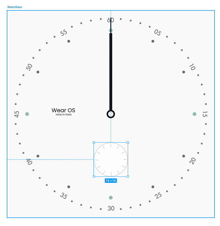
图 1:覆盖子表盘插槽的空框架 在此框架内设计秒针:
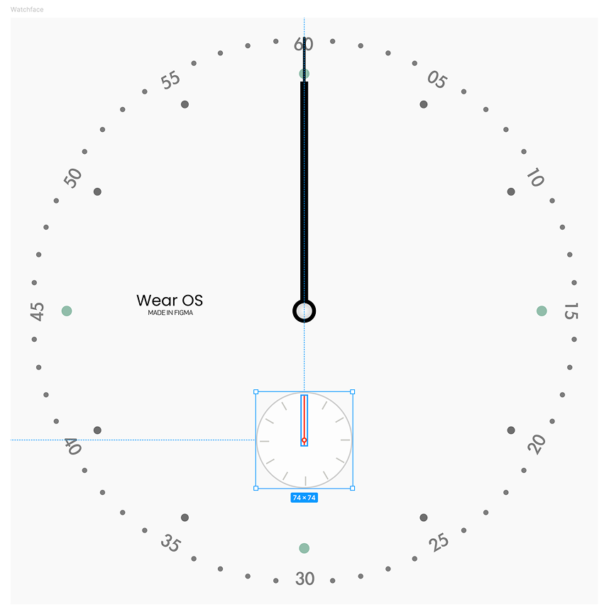
图 2:位于容器框架中的秒针设计 选择包含秒针的子表盘框架。然后,在 Watch Face Designer 中,将 Rotate around 设置为“Layer center”(图层中心):
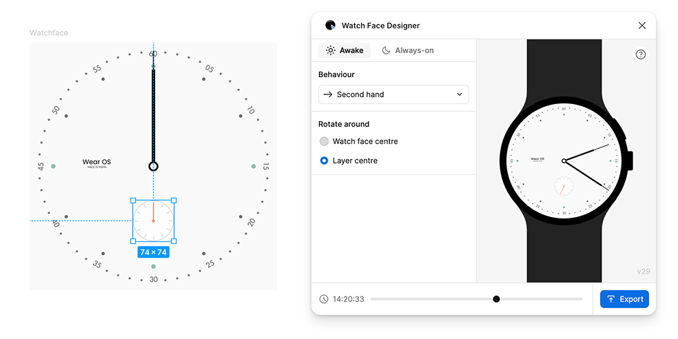
图 3:选择包含框架(左侧)后,选择秒针旋转行为(右侧)
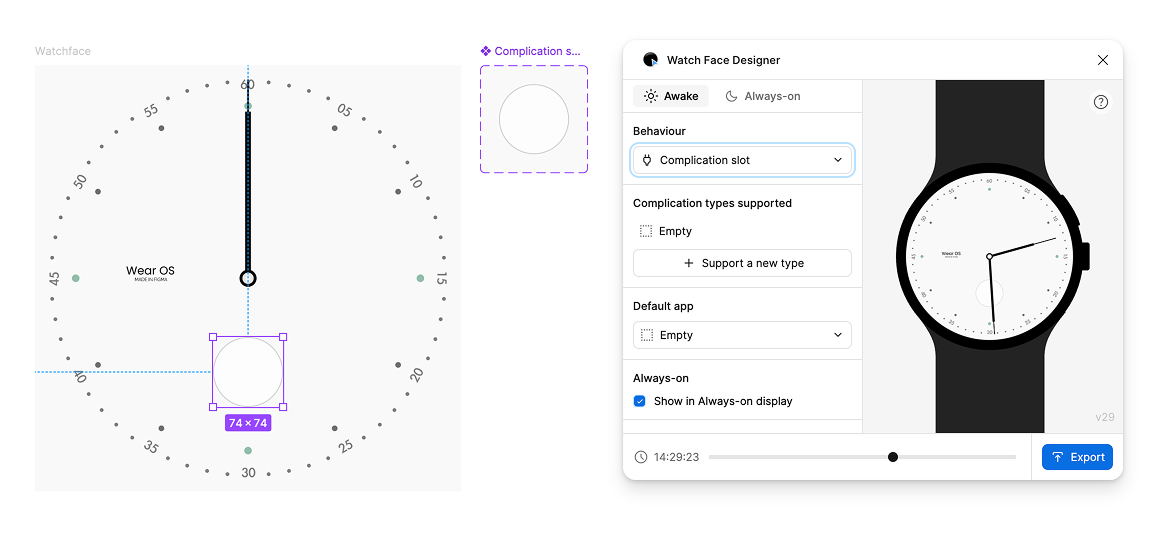
复杂功能
如需添加复杂功能插槽,请向表盘添加框架。 在此框架内,设计复杂功能槽在为空时的外观。这构成了其他类型复杂功能(例如图标和文字)的基本设计。
信息复杂化有很多不同的类型。表盘主题会为每种类型提供模板,而用户手表上的应用会自行决定使用哪个模板以及提供哪些数据。用户选择将哪个应用放入哪个复杂功能位置。
选择包含复杂功能位置设计元素的帧。然后,在表盘设计器中,将行为更改为“复杂功能插槽”。此流程会创建一个组件,其中包含一个变体(一个空设计)。
应用复杂功能显示槽类型
由于包含仅支持“空”类型的复杂功能插槽并不是很有用,因此添加另一种类型。在“表盘设计器”窗口中,按 + 支持新类型,然后选择“简短文本”。短文本是大多数应用支持的一种复杂功能类型,可显示两个小标签以及一个图标。
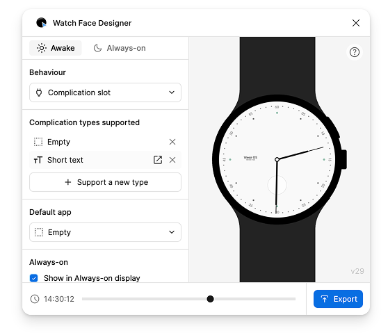
此步骤会创建另一个变体,用于表示相应复杂功能类型的设计。选择“简短文本”行即可跳转到该行。
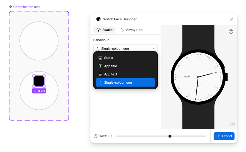
在编辑复杂功能模板中的图层时,系统会显示“行为”选项。 此选项与表盘上的选项类似,但在这里,您可以选择特定于您正在修改的复杂功能类型的行为。
在此示例中,短文本功能块中的图层可以是应用的标题、文本或单色图标。单色表示图标会继承您在 Figma 中为其设置的颜色。
在表盘上绘制一个矩形,用于放置应用的图标,然后前往 Watch Face Designer 窗口,并将行为设置为“单色图标”:
接下来,创建两个文字图层。这些层表示另外两个“短文本”位置:一个用于标题,一个用于文本:
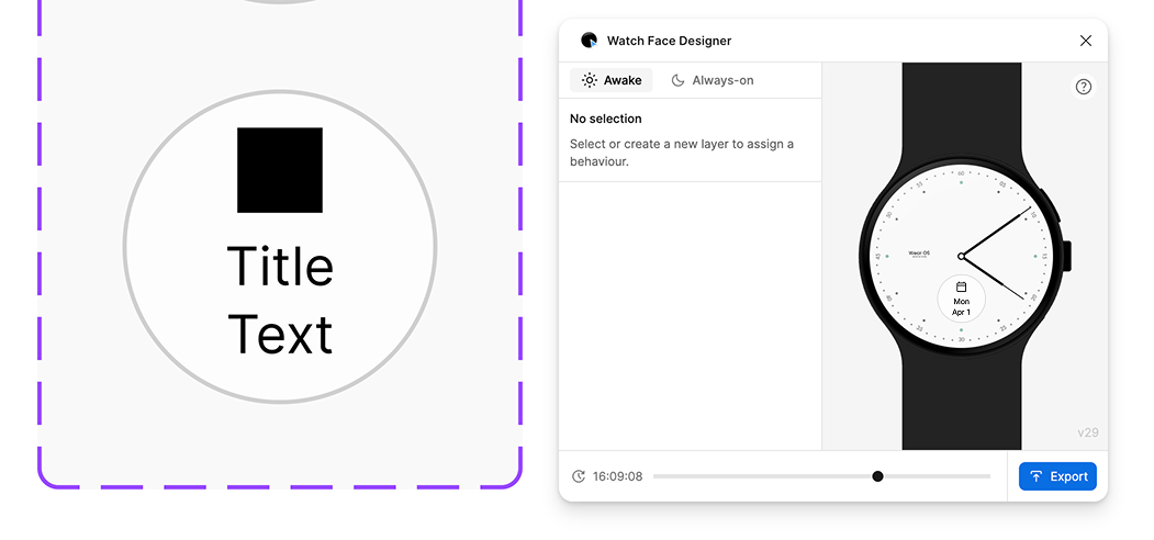
预览会显示复杂功能是如何组合在一起的。此示例展示了如果将日历应用分配给此插槽,复杂功能可能会呈现的外观。
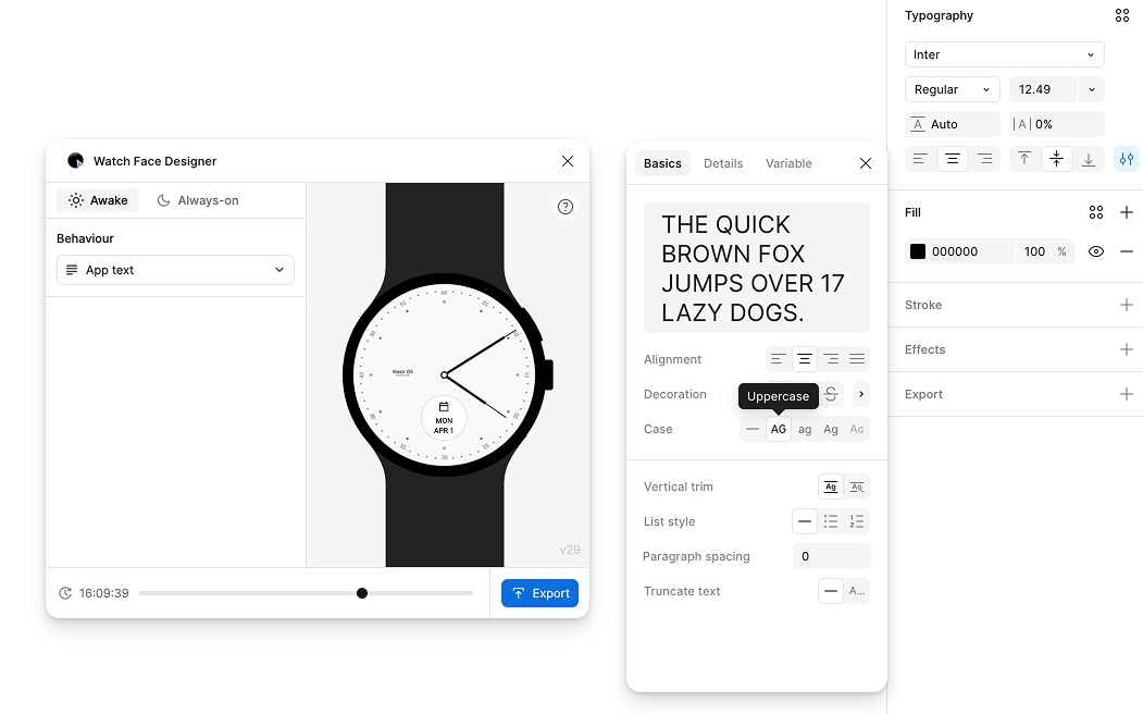
如需以全大写字符显示文本(如下图所示),请使用 Figma 的排版菜单中的文字格式功能。
请注意,与数字时间不同,复杂功能文本没有任意字体导出功能。复杂功能始终使用 Wear OS 设备的系统字体绘制,该字体可能会有所不同,但通常为 Roboto。
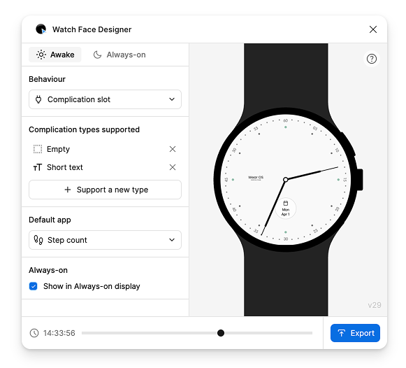
如需添加对其他类型复杂功能的支持,或自定义相关设置(例如默认应用或当手表处于微光模式时是否显示该插槽),请选择表盘中的复杂功能插槽:
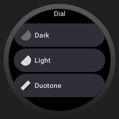
颜色主题
您可以在表盘主题中添加多个颜色主题选项。然后,用户可以使用手表上的表盘选择器选择所需的主题。
表盘设计器支持使用 Figma 样式设置颜色主题。
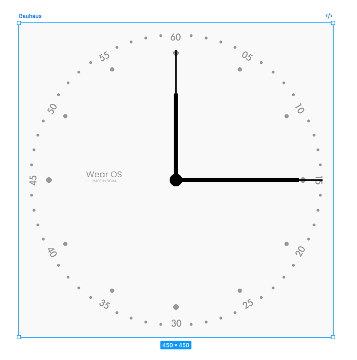
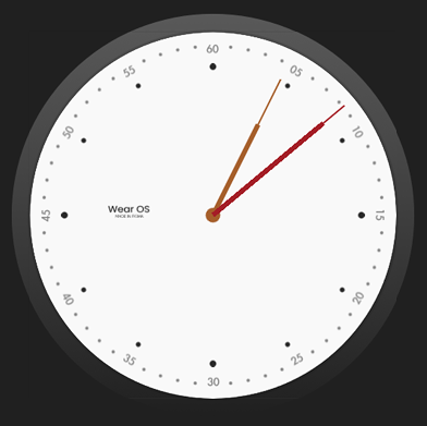
假设您有以下表盘,并希望让用户自定义表针和表盘的颜色:
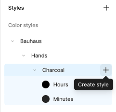
创建第一个样式
如需创建可在手表上自定义的颜色样式,请创建新样式:
- 取消选择画布上的所有内容。
- 在右侧边栏中,选择样式旁边的 + 按钮。
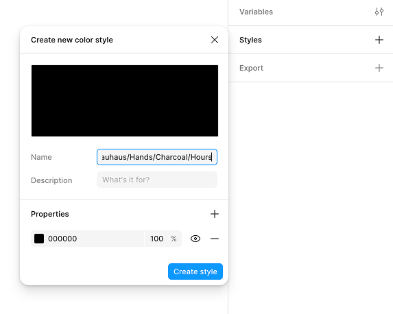
您必须以特定方式为其命名:
Watch Face Name/Element Family Name/Descriptive Color Name/Specific Element Name
在本例中,示例表盘主题的名称为 Bauhaus,因此颜色从该名称开始,后跟 Hands,这是用户可以自定义的元素。然后,指定一个描述性颜色名称(例如 Charcoal),并指明哪个特定元素(时针)的颜色应发生变化。
综合以上所有因素,最终名称为:Bauhaus/Hands/Charcoal/Hours:
按照类似流程为分针创建自定义颜色主题:
最后,将这些颜色分配给表盘上显示的实际指针:
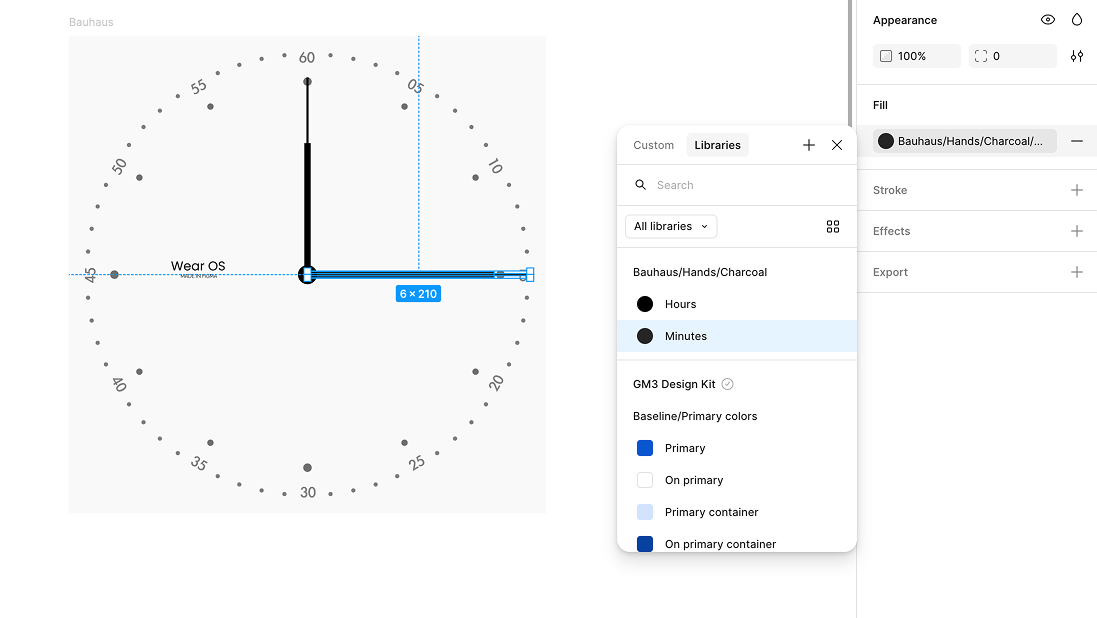
Bauhaus/Hands/Charcoal/Minutes 主题添加其他样式
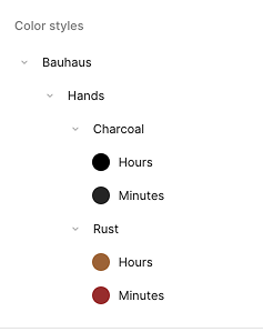
通过更改样式的 Theme Name 部分来创建新样式。以下示例添加了一个名为 Rust (Bauhaus/Hands/Rust/Hours) 的新样式:
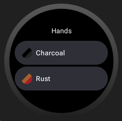
然后,用户可以在设备上切换“炭黑”和“锈红”颜色主题,表盘的时针和分针会相应地重新着色:
应用于其他元素
按照类似的步骤,使表盘的其他元素可设置主题。这些主题可以混搭,您可以使用任意数量的颜色样式来创建复杂的可互换主题:
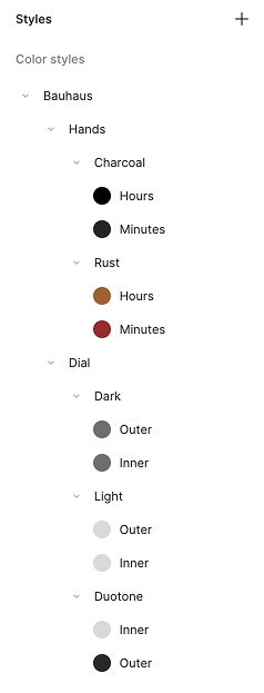
借助上述样式集,您为表针提供了两种选项(Rust 和 Charcoal),为表盘提供了三种选项(Light、Dark 和 Duotone):