
本指南介绍了如何创建表盘、添加基于时间的元素,以及如何支持用户选择的照片(包括多张照片图库)。如需了解其他功能,请参阅高级指南。
创建表盘
如需创建表盘,请在 Figma 中绘制一个框架,然后按如下方式进行配置:
将其大小设置为 450 个单位宽、450 个单位高:
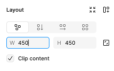
图 1:Figma 的框架布局面板,显示 450x450 的表盘 其他尺寸也可以,但建议使用 450x450 尺寸的图片作为 Wear OS 表盘,并且必须使用此尺寸的图片才能导出到 Watch Face Studio。
如需制作省电的表盘,请将框架的填充颜色设置为黑色:
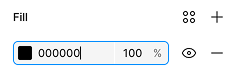
图 2:显示黑色填充颜色的框架填充面板 将框架的名称设置为您希望表盘主题的名称。此内容会显示在用户的手表上。
创建并配置框架后,打开表盘设计器插件,然后选择您刚刚创建的框架。该表盘的实时预览会显示在表盘设计器窗口中。
向表盘添加元素
向表盘添加一些元素,以便用户查看时间。
模拟时间
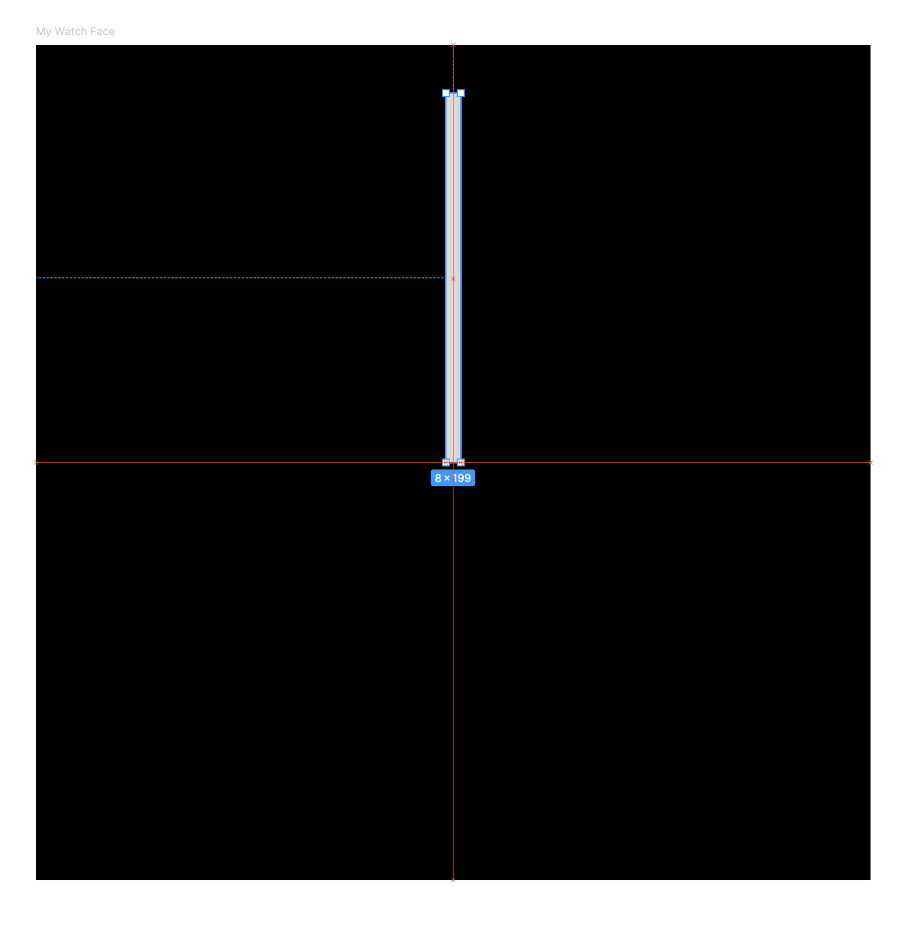
绘制一个矩形,作为手表上的秒针。
验证在显示新分钟的开头时,矩形是否水平居中,并且其底部边缘是否位于表盘的中心,就像真正的时针一样。默认情况下,Figma 会启用贴靠到几何形状,该功能会显示红色参考线,帮助您对齐此矩形:
接下来,告知 Watch Face Designer 此图层不仅用于装饰。 选择您在上一步中绘制的矩形,然后前往 Watch Face Designer 窗口,将行为从“静态”更改为“秒针”。
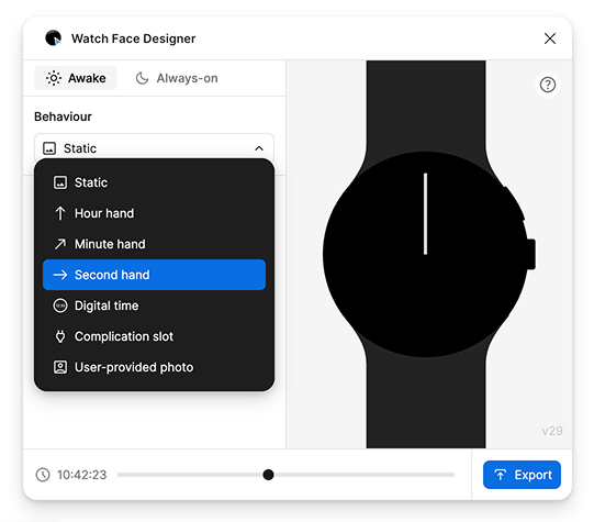
请注意,指针如何开始每秒移动一次,模拟时钟滴答声。 您可以根据需要调整其旋转方式,还可以创建分针和时针,方法与创建此指针类似。
如需有关子表盘的建议,请参阅高级使用指南。
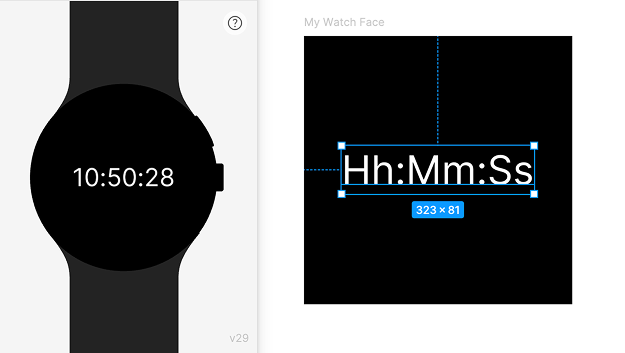
数字时间
我们还可以使用数字格式显示时间。为此,请在 Figma 中创建文本图层。目前,请输入 Hh:Mm:Ss 作为图层的文本内容。
在表盘设计器窗口中,将文字的行为从“静态”更改为“数字时间”。预览显示了在真实设备上的效果:
如需了解可使用的字符集,请按照表盘设计器窗口侧边栏中显示的模板指南操作。例如,a 表示当前时间是“上午”还是“下午”,您可以将其与“小时格式”搭配使用来显示 12 小时制时间。
您可以选择 Figma 中的任何字体(包括 Wear OS 中没有的字体),系统会自动导出该字体并将其捆绑到表盘中。请注意,每种字体都有自己的再分发许可条款。
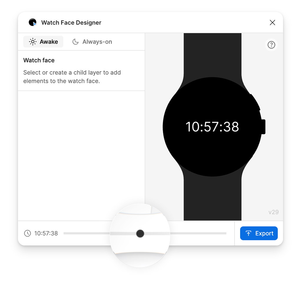
预览不同时间
如需查看表盘在不同时段的效果,您可以拖动表盘设计器窗口底部的滑块,调整预览显示的时间:
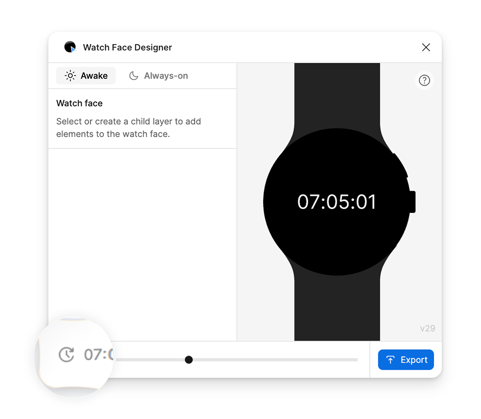
预览完不同时间后,您可以选择左下角的重置按钮,将时间重置为当前时间:
包括用户提供的照片
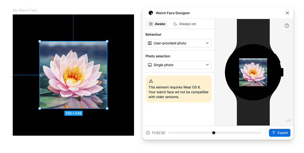
表盘可以包含自定义照片插槽。这样一来,用户就可以添加自己喜欢的照片作为背景,同时仍能显示时间和您在设计中添加的任何其他元素。
如需支持自定义照片,请向表盘添加一个层,并将其 Behavior 设置为“User-provided photo”。在此示例中,我们使用一朵花的示例照片作为此图层的默认图片。 在用户分配自己的照片之前,或者在用户选择不使用自己的照片时,系统会使用此图片作为后备图片。
支持多选照片
您的表盘主题可以支持多选照片。在 Watch Face Designer 中,这称为图库:
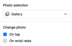
当照片选择设置为“图库”时,用户可以为该位置选择多张照片,手表会在不同时间点轮播这些照片,具体取决于您在“更改照片”下选择的内容:
- 选择“点按时”后,当用户点按您的图层时,照片会发生变化。
- 如果选择“抬腕时”,则每当用户抬起手腕时,系统都会更改一次。目前,无法使用表盘设计器调整此设置。详细了解如何使用
changeAfterEvery属性,通过表盘格式提供更高级的支持。
了解详情
如需在实体设备上预览表盘,请参阅导出指南。
如需了解更多选项和功能,请参阅高级使用指南。