
如需开始在应用中提供功能块,请在应用的 build.gradle 文件中添加以下依赖项。
Groovy
dependencies {
    // Use to implement support for wear tiles
    implementation "androidx.wear.tiles:tiles:1.6.0"

    // Use to utilize standard components and layouts in your tiles
    implementation "androidx.wear.protolayout:protolayout:1.4.0"

    // Use to utilize components and layouts with Material Design in your tiles
    implementation "androidx.wear.protolayout:protolayout-material:1.4.0"

    // Use to include dynamic expressions in your tiles
    implementation "androidx.wear.protolayout:protolayout-expression:1.4.0"

    // Use to preview wear tiles in your own app
    debugImplementation "androidx.wear.tiles:tiles-renderer:1.6.0"

    // Use to fetch tiles from a tile provider in your tests
    testImplementation "androidx.wear.tiles:tiles-testing:1.6.0"
}
Kotlin
dependencies {
    // Use to implement support for wear tiles
    implementation("androidx.wear.tiles:tiles:1.6.0")

    // Use to utilize standard components and layouts in your tiles
    implementation("androidx.wear.protolayout:protolayout:1.4.0")

    // Use to utilize components and layouts with Material Design in your tiles
    implementation("androidx.wear.protolayout:protolayout-material:1.4.0")

    // Use to include dynamic expressions in your tiles
    implementation("androidx.wear.protolayout:protolayout-expression:1.4.0")

    // Use to preview wear tiles in your own app
    debugImplementation("androidx.wear.tiles:tiles-renderer:1.6.0")

    // Use to fetch tiles from a tile provider in your tests
    testImplementation("androidx.wear.tiles:tiles-testing:1.6.0")
}
主要概念
卡片的构建方式与 Android 应用不同,并且使用不同的概念:
- 布局模板:定义显示屏上视觉元素的整体排列方式。这是通过
primaryLayout()函数实现的。 - 布局元素:表示单个图形元素(例如按钮或卡片),或使用列、buttonGroup 或类似元素分组在一起的多个此类元素。这些变量嵌入在布局模板中。
- 资源:
ResourceBuilders.Resources对象包含一个键值对映射,其中包含渲染布局所需的 Android 资源(图片),以及一个版本。 - 时间轴:
TimelineBuilders.Timeline对象是布局对象的一个或多个实例的列表。您可以提供各种机制和表达式来指示渲染器何时应从一个布局对象切换到另一个布局对象,例如在特定时间停止显示某个布局。 - 状态:一种
StateBuilders.State类型的数据结构,在功能块和应用之间传递,以使这两个组件能够相互通信。例如,如果点按了功能块上的某个按钮,则状态会保存该按钮的 ID。您还可以使用映射来交换数据类型。 - 功能块:表示功能块的
TileBuilders.Tile对象,包含时间轴、资源版本 ID、新鲜度间隔和状态。 - Protolayout:此术语出现在各种功能块相关类的名称中,指的是 Wear OS Protolayout 库,这是一个在各种 Wear OS 界面中使用的图形库。
创建功能块
如需在应用中提供功能块,请实现 TileService 类型的服务,并在清单中注册该服务。这样一来,系统会在调用 onTileRequest() 期间请求必要的图块,并在调用 onTileResourcesRequest() 期间请求必要的资源。
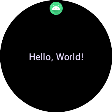
class MyTileService : TileService() { override fun onTileRequest(requestParams: RequestBuilders.TileRequest) = Futures.immediateFuture( Tile.Builder() .setResourcesVersion(RESOURCES_VERSION) .setTileTimeline( Timeline.fromLayoutElement( materialScope(this, requestParams.deviceConfiguration) { primaryLayout( mainSlot = { text("Hello, World!".layoutString, typography = BODY_LARGE) } ) } ) ) .build() ) override fun onTileResourcesRequest(requestParams: ResourcesRequest) = Futures.immediateFuture(Resources.Builder().setVersion(RESOURCES_VERSION).build()) }
接下来,在 AndroidManifest.xml 文件的 <application> 标记内添加服务。
<service android:name=".snippets.m3.tile.MyTileService" android:label="@string/tile_label" android:description="@string/tile_description" android:icon="@mipmap/ic_launcher" android:exported="true" android:permission="com.google.android.wearable.permission.BIND_TILE_PROVIDER"> <intent-filter> <action android:name="androidx.wear.tiles.action.BIND_TILE_PROVIDER" /> </intent-filter> <meta-data android:name="androidx.wear.tiles.PREVIEW" android:resource="@drawable/tile_preview" /> </service>
权限和 intent 过滤器会将此服务注册为功能块提供程序。
当用户在手机或手表上配置功能块时,系统会向用户显示图标、标签、说明和预览资源。请注意,预览资源支持所有 Android 的标准资源限定符,因此可以根据屏幕尺寸和设备语言等因素来调整预览效果。如需了解其他建议,请参阅预览版核对清单。
部署应用,然后将卡片添加到卡片轮播界面(还有一种更方便开发者预览卡片的方式,但目前只需手动操作)。
如需查看完整示例,请参阅 GitHub 上的代码示例或 Codelab。
为功能块创建界面
Material 3 Expressive 界面元素采用结构化方法创建,该方法由 Kotlin 的类型安全构建器模式提供支持。
布局
如需有关创建有效且自适应的功能块布局的设计原则的指导,请参阅功能块的常见布局。
如需创建布局,请执行以下操作:
启动 Material Design 范围:调用
materialScope()函数,提供所需的context和deviceConfiguration。您可以添加可选参数,例如allowDynamicTheme和defaultColorScheme。allowDynamicTheme默认为true,defaultColorScheme表示在动态颜色不可用时(例如用户已关闭该功能时、设备不支持该功能时或allowDynamicTheme为false时)使用的ColorScheme。在范围内构建界面:给定 Tile 布局的所有界面组件都必须在单个顶级 materialScope() 调用的 lambda 中定义。这些组件函数(例如
primaryLayout()和textEdgeButton())是MaterialScope的扩展函数,仅在对此接收器范围调用时可用。materialScope( context = context, deviceConfiguration = requestParams.deviceConfiguration, // requestParams is passed to onTileRequest defaultColorScheme = myFallbackColorScheme ) { // inside the MaterialScope, you can call functions like primaryLayout() primaryLayout( titleSlot = { text(text = "Title".layoutString) }, mainSlot = { text(text = "Main Content".layoutString) }, bottomSlot = { textEdgeButton( labelContent = { text("Action".layoutString) }, onClick = clickable() ) } ) }
槽数
在 M3 中,功能块布局采用了一种受 Compose 启发的做法,利用了三个不同的槽。从上到下依次为:
titleSlot,通常用于主要标题或标题。- 核心内容的
mainSlot。 bottomSlot,通常用于操作或补充信息。这也是边缘按钮的显示位置。
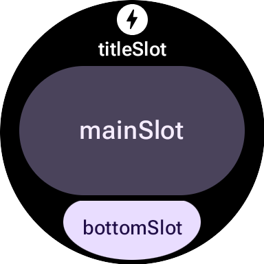
每个 slot 的内容如下:
titleSlot(可选):通常是由text()生成的几个字。mainSlot(必需):整理成行、列和按钮组等结构的组件。这些组件还可以相互递归嵌入;例如,列可以包含行。bottomSlot(可选):通常填充边缘贴靠按钮或文本标签。
由于图块无法滚动,因此没有用于分页、滚动或处理长内容列表的组件。请注意,当字体大小增加或文本因翻译而变长时,内容应保持可见。
界面组件
protolayout-material3 库提供了大量根据 Material 3 Expressive 规范和界面建议设计的组件。
按钮
按钮主要以行动为导向。用于触发特定操作。每个按钮的内容(例如图标或短文本)用于标识相应操作。
- textButton():具有单个槽位的按钮,用于放置(简短的)文本内容
- iconButton():具有单个槽位来表示图标的按钮
- avatarButton():药丸状的头像按钮,最多可提供三个插槽来放置内容,这些内容表示垂直堆叠的标签和辅助标签,以及旁边的图片(头像)
- imageButton():可点击的图片按钮,不提供额外的 slot,只有图片(例如
backgroundImage作为背景) - compactButton():紧凑型按钮,最多可提供两个槽位来接收水平堆叠的内容,表示一个图标和旁边的文本
- button():药丸形状的按钮,最多可提供三个插槽来放置内容,这些内容表示垂直堆叠的标签和辅助标签,以及旁边的图标
边键
边缘按钮是一种特殊的全宽度按钮,固定在手表圆形屏幕的底部,表示从当前功能块屏幕执行的最重要操作。
- iconEdgeButton():边沿按钮,提供单个槽位来接收图标或类似圆形的小内容
- textEdgeButton():边缘按钮,提供单个槽位来接收文本或长度和宽度相似的内容
卡片
卡片主要以信息为导向。它们会显示相关结构化数据的集合。虽然您可以创建互动式卡片,但它们通常会显示信息摘要,用户可以点按这些摘要来查看更多详细信息或执行相关操作。
- titleCard():提供 1 到 3 个插槽(通常基于文本)的片头字幕
- appCard():提供最多 5 个位置的应用卡片,通常基于文本
- textDataCard():提供最多三个垂直堆叠的插槽(通常基于文本或数字)的数据卡片
- iconDataCard():提供最多三个垂直堆叠的插槽(通常基于文本或数字)的数据卡,带有图标
- graphicDataCard():提供图形数据槽(例如进度指示器)和最多两个垂直堆叠的槽(通常用于文本说明)的图形数据卡片
进度指示器
- circularProgressIndicator():使用径向元素指示目标达成进度
- segmentedCircularProgressIndicator():使用具有不同阶段的径向元素指示目标完成进度
分组布局元素
- buttonGroup():一种组件布局,可将其子项按水平序列放置
- primaryLayout():全屏布局,表示建议的 M3 布局样式,该样式具有自适应性,可处理元素放置,并应用建议的边距和内边距
应用主题
在 Material 3 Expressive 中,颜色系统由 29 个标准颜色角色定义,分为六个组:主色、副色、第三色、错误色、表面色和轮廓色。
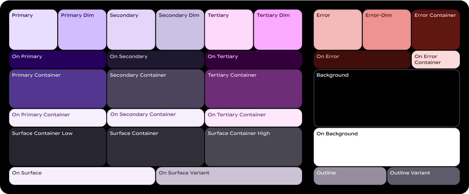
ColorScheme 会将这 29 个角色中的每一个都映射到相应的颜色,并且由于它是 MaterialScope 的一部分,组件必须在其中创建,因此它们会自动从方案中获取颜色。这种方法可让所有界面元素自动遵循 Material Design 标准。
如需让用户在您定义的配色方案(例如反映品牌颜色的配色方案)和系统提供的配色方案(从用户当前的表盘派生或由用户选择)之间进行选择,请按如下方式初始化 MaterialScope:
val myColorScheme = ColorScheme( primary = Color.rgb(0, 0, 255).argb, // Blue onPrimary = Color.rgb(255, 255, 255).argb, // White // 27 more ) materialScope( context = context, deviceConfiguration = requestParams.deviceConfiguration, defaultColorScheme = myColorScheme ) { // If the user selects "no theme" in settings, myColorScheme is used. // Otherwise, the system-provided theme is used. }
如果您选择此选项,请提供单色功能块图标,以便系统正确着色,确保在任何主题下都能获得最佳可见性。
如需强制使您的功能块以您提供的配色方案显示,请将 allowDynamicTheme 设置为 false,以停用对动态主题的支持:
materialScope( context = context, deviceConfiguration = requestParams.deviceConfiguration, allowDynamicTheme = false, defaultColorScheme = myColorScheme ) { // myColorScheme is *always* used. }
颜色
每个单独的组件都使用 ColorScheme 定义的 29 种颜色角色中的一部分。例如,按钮最多使用四种颜色,这些颜色默认取自有效 ColorScheme 的“primary”组:
ButtonColors 组件令牌 |
ColorScheme 角色 |
|---|---|
| containerColor | 主要 |
| iconColor | onPrimary |
| labelColor | onPrimary |
| secondaryLabelColor | onPrimary(不透明度为 0.8) |
如需详细了解如何为 Wear OS 设计应用颜色,请参阅颜色设计指南。
您可能需要针对特定界面元素偏离默认颜色令牌。例如,您可能希望某个 textEdgeButton 使用“次要”或“第三”组中的颜色,而不是“主要”组中的颜色,以便突出显示并提供更好的对比度。
您可以通过多种方式自定义组件颜色:
使用辅助函数来表示预定义颜色。使用
filledTonalButtonColors()等辅助函数来应用 Material 3 Expressive 的标准按钮样式。这些函数会创建预配置的ButtonColors实例,这些实例会将填充、基调或轮廓等常见样式映射到MaterialScope中有效ColorScheme的相应角色。这样,您就可以应用一致的样式,而无需为常见的按钮类型手动定义每种颜色。textEdgeButton( colors = filledButtonColors(), // default /* OR colors = filledTonalButtonColors() */ /* OR colors = filledVariantButtonColors() */ // ... other parameters )
对于卡,请使用等效的
filledCardColors()系列函数。如果您只需要更改一两个令牌,还可以使用辅助函数的
copy()方法修改其返回的ButtonColors对象:textEdgeButton( colors = filledButtonColors() .copy( containerColor = colorScheme.tertiary, labelColor = colorScheme.onTertiary ), // ... other parameters )
明确提供替换颜色角色。创建您自己的
ButtonColors对象,并将其传递给组件。对于卡,请使用等效的CardColors对象。textEdgeButton( colors = ButtonColors( // the materialScope makes colorScheme available containerColor = colorScheme.secondary, iconColor = colorScheme.secondaryDim, labelColor = colorScheme.onSecondary, secondaryLabelColor = colorScheme.onSecondary ), // ... other parameters )
指定固定颜色(请谨慎使用)。虽然通常建议按语义角色(例如
colorScheme.primary)指定颜色,但您也可以直接提供颜色值。此方法应谨慎使用,因为它可能会导致与整体主题风格不一致,尤其是在主题风格动态变化的情况下。textEdgeButton( colors = filledButtonColors().copy( containerColor = android.graphics.Color.RED.argb, // Using named colors labelColor = 0xFFFFFF00.toInt().argb // Using a hex code for yellow ), // ... other parameters )
排版
如需详细了解如何在设计中有效使用排版,请参阅排版设计指南。
为了在整个 Wear OS 平台上实现视觉一致性并优化性能,功能块上的所有文字均使用系统提供的字体进行渲染。也就是说,图块不支持自定义字体。在 Wear OS 6 及更高版本中,这是 OEM 专用字体。在大多数情况下,它将是可变字体,可提供更具表现力的体验和更精细的控制。
如需创建文字样式,您通常会使用 text() 方法并结合排版常量。借助此组件,您可以利用 Material 3 Expressive 中的预定义排版角色,这有助于您的功能块遵循既定的排版最佳实践,以实现可读性和层次结构。
该库提供了一组 18 个语义排版常量,例如 BODY_MEDIUM。这些常量还会影响除大小以外的字体轴。
text( text = "Hello, World!".layoutString, typography = BODY_MEDIUM, )
如需更多控制手段,您可以提供其他设置。在 Wear OS 6 及更高版本中,可能会使用可变字体,您可以沿斜体、粗细、宽度和圆度轴修改该字体。您可以使用 settings 参数控制这些轴:
text( text = "Hello, World".layoutString, italic = true, // Use elements defined in androidx.wear.protolayout.LayoutElementBuilders.FontSetting settings = listOf( weight(500), width(100F), roundness(100) ), )
最后,如果您需要控制大小或字间距(不推荐),请使用 basicText() 而不是 text(),并使用 fontStyle() 为 fontStyle 属性构建值。
形状和边距
您可以使用几乎所有组件的 shape 属性来更改其边角半径。值来自 MaterialScope 属性 shapes:
textButton( height = expand(), width = expand(), shape = shapes.medium, // OR another value like shapes.full colors = filledVariantButtonColors(), labelContent = { text("Hello, World!".layoutString) }, )
更改组件的形状后,如果您认为显示屏边缘周围的留白过多或过少,请使用 primaryLayout() 的 margin 参数调整边距:
primaryLayout( mainSlot = { textButton( shape = shapes.small, /* ... */ ) }, // margin constants defined in androidx.wear.protolayout.material3.PrimaryLayoutMargins margins = MAX_PRIMARY_LAYOUT_MARGIN, )
弧形
支持以下 Arc 容器子元素:
ArcLine:沿着弧形渲染一条曲线。ArcText:沿着弧形渲染曲线文本。ArcAdapter:沿着弧形渲染基本布局元素,在弧线的切线方向上进行绘制。
如需了解详情,请参阅每种元素类型的参考文档。
修饰符
对于每种可用的布局元素,您都可以选择对其应用修饰符。这些修饰符有以下用途:
- 更改布局的视觉外观。例如,为布局元素添加背景、边框或内边距。
- 添加有关布局的元数据。例如,为布局元素添加 semantics 修饰符,以便与屏幕阅读器结合使用。
- 添加功能。例如,为布局元素添加 clickable 修饰符,使用户可与功能块互动。如需了解详情,请参阅与功能块互动。
例如,我们可以自定义 Image 的默认外观和元数据,如以下代码示例所示:
private fun myImage(): LayoutElement = Image.Builder() .setWidth(dp(24f)) .setHeight(dp(24f)) .setResourceId("image_id") .setModifiers( Modifiers.Builder() .setBackground(Background.Builder().setColor(argb(0xFFFF0000.toInt())).build()) .setPadding(ModifiersBuilders.Padding.Builder().setStart(dp(12f)).build()) .setSemantics(Semantics.Builder().setContentDescription("Image description").build()) .build() ) .build()
Spannable
Spannable 是一种特殊的容器,其元素布局方式与文本类似。如果您想仅针对一大段文本中的一个子字符串应用不同样式,使用 Text 元素是不可能实现的,此时 Spannable 就非常有用。
Spannable 容器中填充的是 Span 子元素。不允许填充其他子元素或嵌套的 Spannable 实例。
Span 子元素有两种类型:
例如,您可以将“Hello world”功能块中的“world”设为斜体,并在两个单词之间插入图片,如以下代码示例所示:
private fun mySpannable(): LayoutElement = LayoutElementBuilders.Spannable.Builder() .addSpan(SpanText.Builder().setText("Hello ").build()) .addSpan(SpanImage.Builder().setWidth(dp(24f)).setHeight(dp(24f)).setResourceId("image_id").build()) .addSpan( SpanText.Builder() .setText("world") .setFontStyle(FontStyle.Builder().setItalic(true).build()) .build() ) .build()
使用资源
功能块无法访问应用的任何资源。这意味着您无法将 Android 图片 ID 传递给 Image 布局元素并指望应用能够对其进行解析。您需要替换 onTileResourcesRequest() 方法并手动提供所有资源。
在 onTileResourcesRequest() 方法中,您可以通过以下两种方式提供图片:
- 使用
setAndroidResourceByResId()提供可绘制资源。 - 使用
setInlineResource()以ByteArray形式提供动态图片。
override fun onTileResourcesRequest( requestParams: ResourcesRequest ) = Futures.immediateFuture( Resources.Builder() .setVersion("1") .addIdToImageMapping( "image_from_resource", ResourceBuilders.ImageResource.Builder() .setAndroidResourceByResId( ResourceBuilders.AndroidImageResourceByResId.Builder() .setResourceId(R.drawable.ic_walk) .build() ).build() ) .addIdToImageMapping( "image_inline", ResourceBuilders.ImageResource.Builder() .setInlineResource( ResourceBuilders.InlineImageResource.Builder() .setData(imageAsByteArray) .setWidthPx(48) .setHeightPx(48) .setFormat(ResourceBuilders.IMAGE_FORMAT_RGB_565) .build() ).build() ).build() )
功能块预览图片核对清单
系统会在功能块轮播界面编辑器中显示 Android 应用清单中引用的功能块预览图片,以便添加新功能块。此编辑器会同时显示在 Wear OS 设备上和手机上的手表配套应用中。
为帮助用户充分利用此预览版图片,请验证有关您的功能块的以下详细信息:
- 反映了最新设计。预览应准确反映图块的最新设计。
- 使用推荐的维度。为了提供尽可能最佳的显示质量和良好的用户体验,预览图片的尺寸应为 400 像素 x 400 像素。
- 使用静态色彩主题。使用功能块的静态色彩主题,而不是动态色彩主题。
- 包含应用图标。确认应用的图标显示在预览图片的顶部。
- 显示已加载/已登录状态。预览应显示完全正常运行的“已加载”或“已登录”状态,避免显示任何空白或占位内容。
- 利用资源解析规则进行自定义(可选)。 不妨考虑使用 Android 的资源解析规则来提供与设备的显示大小、语言或语言区域设置相匹配的预览。如果您的功能块在不同设备上的外观有所不同,此功能就特别有用。