
Wear Material 3 生动配色系统采用三个强调色层(主色、辅色、第三色)用于关键组件,并采用两个中性 Surface 层。每个角色都提供一系列具有一致对比度的值,从而实现富有表现力且易于访问的颜色组合,以便在任何主题中提供统一的体验。
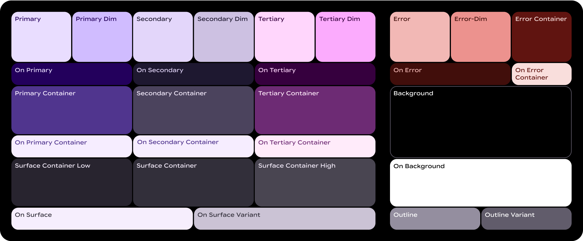
什么是颜色角色?
颜色角色就像按数字涂色画布上的“数字”。它们是界面元素与颜色之间的连接组织。
- 颜色角色已映射到 Material 组件:无论您使用的是静态基准方案还是动态颜色,都将使用这些颜色角色。如果您的产品包含自定义组件,则需要将这些组件正确映射到这组颜色角色。
- 颜色角色支持无障碍功能:颜色系统基于更符合无障碍设计标准的颜色配对构建。这些颜色对可提供至少 3:1 的色彩对比度。
- 颜色角色已令牌化:角色通过令牌在设计和代码中实现。设计令牌表示可重复使用的小设计决策,是设计体系外观样式的一部分。
基本术语
以下是您会在颜色角色的名称中看到的一些关键术语:
- Surface:用于屏幕的背景和大面积低强调区域的角色。
- Primary、Secondary、Tertiary:用于强调或弱化前景元素的强调色角色。
- 容器:用作按钮等前景元素的填充色的角色。不应将其用于文字或图标。
- On:以该词开头的角色表示文本或图标的颜色位于配对的父颜色之上。例如,“on primary”用于与主填充色形成对比的文字和图标。
- 变体:以该字词结尾的角色是其非变体配对的低强调替代方案。例如,轮廓变体是轮廓颜色的一种强调度较低的版本。
主要角色
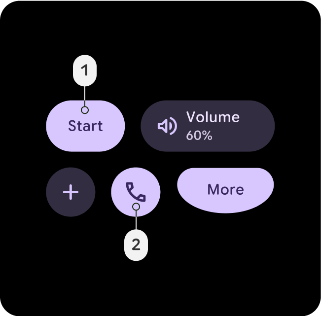
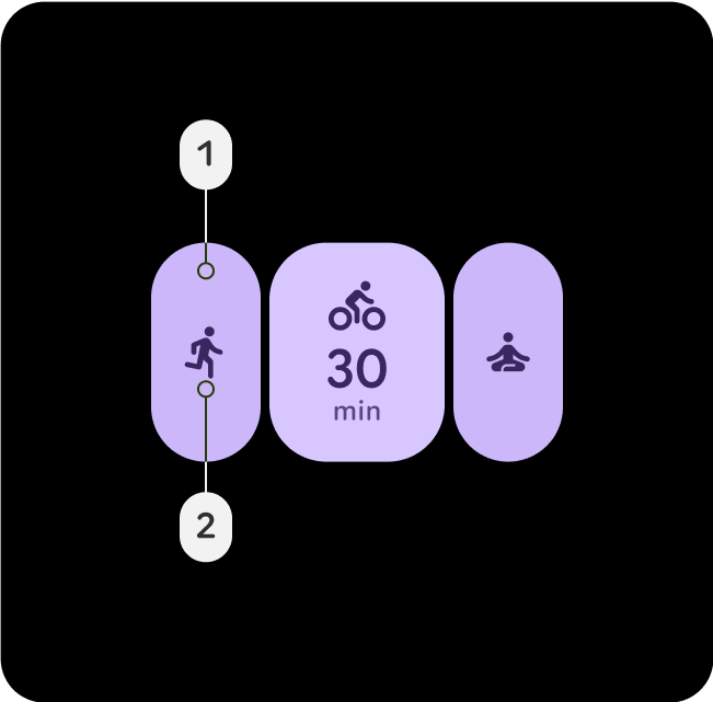
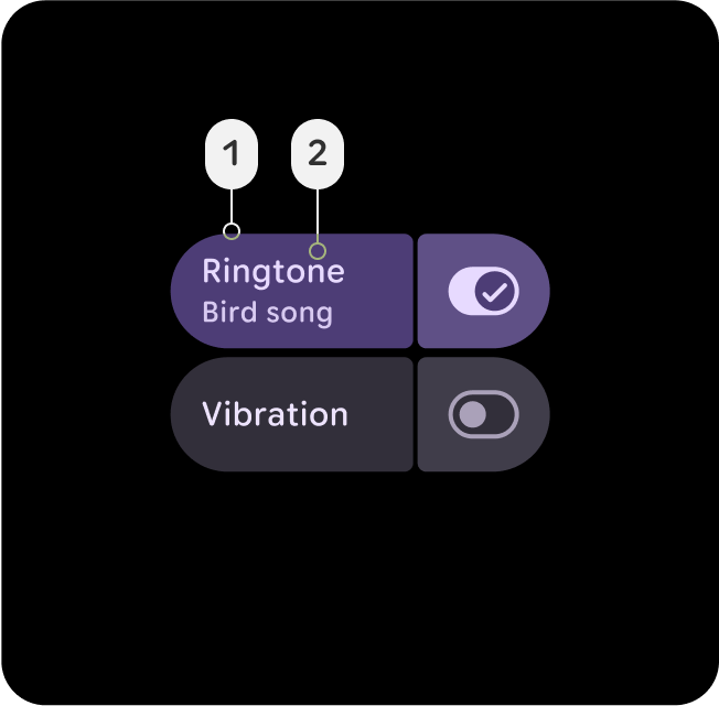
主要角色用于整个界面的关键组件,例如边缘贴靠按钮、显眼的按钮、活动状态以及色调按钮样式上的图标。

主要
- 主要
- On-Primary
对于界面中最重要的操作(例如主要按钮或号召性用语),请使用“主要”角色。此颜色应醒目且易于识别,以便引导用户进行关键互动。
Primary-Dim
- 主-调暗
- On-Primary
暗淡角色通常用于需要与主要操作在视觉上有所区别,但不需要用户立即注意或互动的元素。
Primary-Container
- Primary-Container
- On-Primary-Container
将主容器应用于卡片或模态框等背景元素,以突出显示部分内容或所选状态。这有助于吸引用户注意界面中的重要内容或正在进行的活动。
次要角色
辅助角色用于整个界面中不如主要角色重要但仍需突出的关键组件。主色调和次色调可同时用于布局中,以实现差异化和突出重点。

辅助
- 次要
- On-Secondary
在界面元素密集的区域(例如辅助按钮或补充操作)中使用 Secondary 角色来支持操作。它可在复杂布局中保持可见性,而不会遮盖主要元素。
次要-暗淡
- 次要-调暗
- 次要
Secondary-Dim 角色可为密集区域中的被动元素提供柔和的对比度。它与辅助色相得益彰,同时增添了细微的深度,使界面保持简洁,并帮助用户进行导航。
辅助容器
- 辅助容器
- On-Secondary-Container
应用 Secondary-Container 以在密集布局中整理次要元素。它可创建结构和分隔,确保次要内容可区分但不会占据主导地位。
三级角色
第三色角色用于对比强调,以平衡主色和辅色,或者引起用户对某个元素(例如输入字段)的高度关注。三级角色还可以帮助指示内容何时发生变化或应突出显示,例如达到目标时。

Tertiary
- 第三
- On-Tertiary
第三色用于吸引用户注意关键元素。三级角色特别适合需要突出的组件,例如徽章、贴纸或特殊操作元素。
三级变暗
- 第三-暗淡
- 第三
对于与次要操作相关但不要求立即关注的按钮或操作,请使用“次要暗淡”角色。
三级容器
- Tertiary-Container
- On-Tertiary-Container
将三级容器应用于用于对三级相关内容(例如徽章或贴纸的集合)进行分组的背景。它在强调三级元素的同时,保持了界面的平衡和结构。
语义角色
红色用于表示严重问题,例如错误、删除和与紧急情况相关的任何内容。它旨在立即引起对问题或警告的注意,确保用户能够快速确定需要采取纠正措施的方面。 错误红色调应与背景保持足够的对比度,以符合无障碍标准,确保其清晰可见,并与其他状态颜色(如警告或成功消息)区分开来。
错误
- 错误
- On-Error
一种语义化的红色,但略带主题色调,表示移除、删除、关闭或关闭操作,例如“滑动以显示”。添加为容器替代方案,与错误变暗颜色相比,其警报程度和紧急程度略低。
Error-Dim
- 错误-调暗
- On-Error
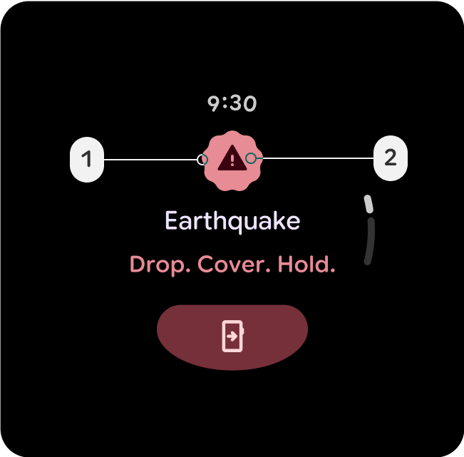
一种语义化的红色,但略带主题色调,表示高优先级错误或紧急操作,例如安全提醒、失败的对话框叠加层或停止按钮。
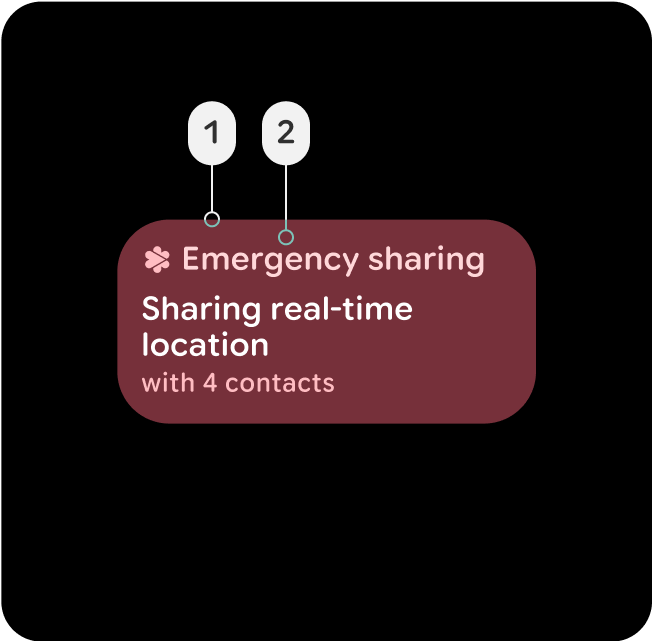
Error-Container
- Error-Container
- On-Error-Container
不太显眼的容器颜色,用于使用错误状态的组件。还可以表示一种活跃的错误状态,这种状态的互动性不如填充状态,例如活跃的紧急情况分享按钮或卡片,或者失败的叠加层对话框。
surface 容器和高度
界面容器对于定义界面中的深度和高度至关重要,可通过颜色提供结构和层次结构,帮助根据组件的重要性和互动性来区分组件。
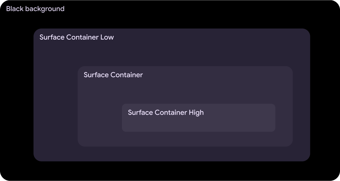
Surface-Container-Low
- Surface-Container-Low
- On-Surface
- On-Surface-Variant
非常适合需要位于 Surface-Container 下方的展开容器,例如通知中的展开卡片。也可用于非互动式卡片,其中内容仍受益于包含。
Surface-Container
- Surface-Container
- On-Surface
- On-Surface-Variant
大多数元素的默认容器颜色。它提供中性、适中的高程,因此适合用于一般界面组件。
Surface-Container-High
- Surface-Container-High
- On-Surface
- On-Surface-Variant
非常适合需要位于 Surface-Container 之上或与之组合的高强调组件。此颜色有助于突出显示界面中的关键区域,并建立层次结构。