
Material 3 富有表现力的颜色框架使用动态配色主题,基于映射到 HCT(色相、色度和色调)颜色系统的两个种子颜色。
基本术语
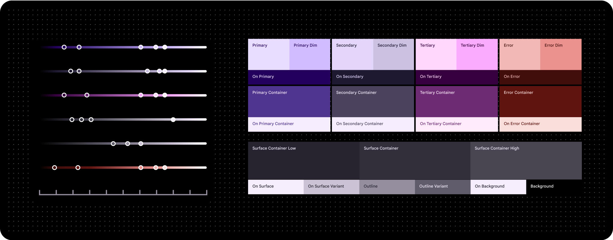
- 颜色角色
- 与按数字绘制画布上的“数字”一样,颜色角色会分配给特定的界面元素。它们的名称包括“primary”“on primary”和“primary container”等。浅色主题和深色主题使用相同的颜色角色。查看所有颜色角色
- HCT
- HCT 代表色相、色度和色调。
使用色调、色度和色相 (HCT) 定义颜色
HCT 颜色生成器根据一个种子颜色创建一组调色板,以创建三维颜色模型,该模型根据颜色(色相)、色度(饱和度)和色调(亮度)来定义颜色
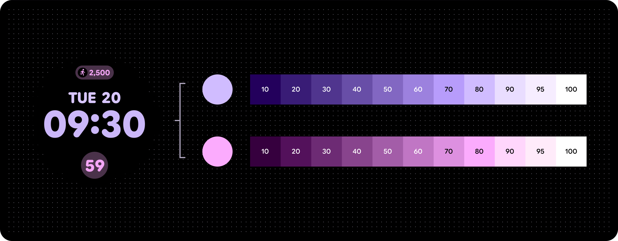
强调色有三种主要颜色:主色、辅色和第三色。中性色调(例如带有主色调的各种灰色)因其单色特性,非常适合用作富媒体内容的容器颜色。
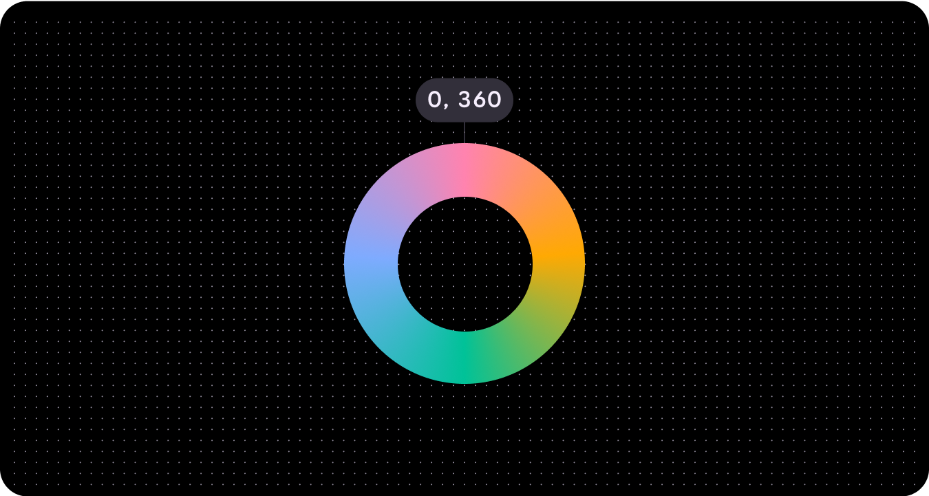
色相
色相是指对颜色的感知,例如红色、橙色、黄色、绿色、蓝色和紫色。色相由一个介于 0 到 360 之间的数字量化,并且是一个循环光谱(值 0 和 360 具有相同的色相)。
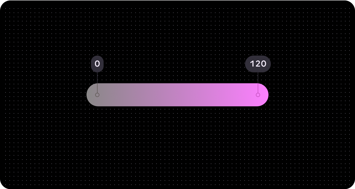
浓艳
色相是指颜色的鲜艳程度或中性程度(灰色、黑色或白色)。色度用一个数值来量化,范围介于 0(完全灰色、黑色或白色)到无穷大(最鲜艳)之间,但 HCT 中的色度值上限约为 120。
由于生物学和屏幕渲染限制,不同的色相和色调将具有不同的最大色度值。
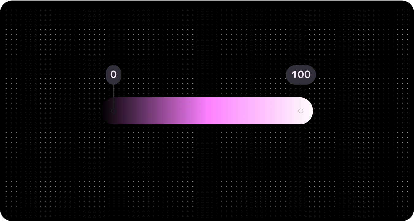
语气
色调是指颜色的明暗程度。色调有时也称为亮度。色调通过一个数字进行量化,该数字介于 0(纯黑色,无亮度)到 100(纯白色,完全亮度)之间。
色调对于视觉无障碍至关重要,因为它决定了对比度。色调差异越大,对比度就越高,而色调差异越小,对比度就越低。
动态配色(颜色主题)
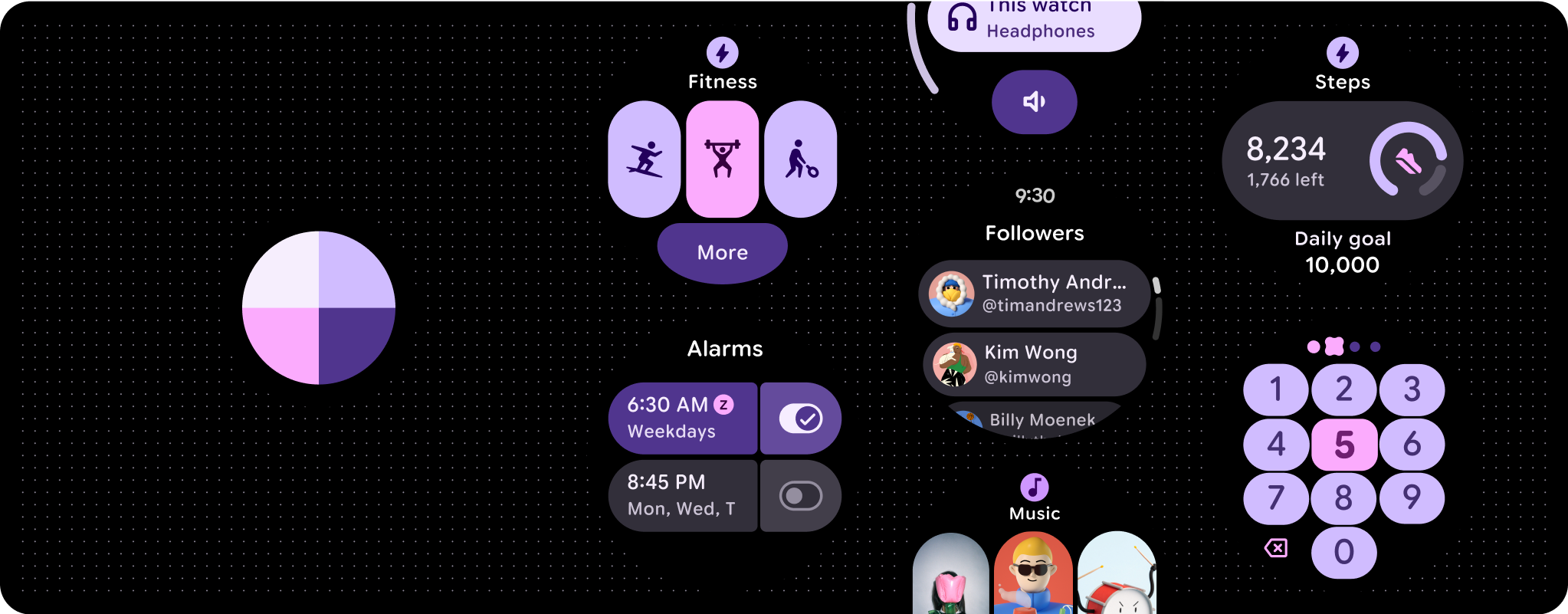
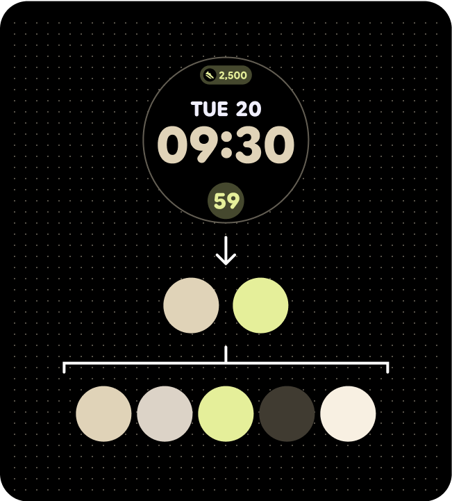
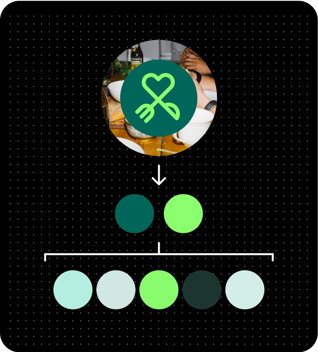
Wear OS 实现了符合 Web 内容无障碍指南 (WCAG)-AAA 的主题设置系统,该系统源自两个指定的种子颜色。具体而言,这些种子颜色是主调色板和第三色调板的基础。系统会使用这两种初始颜色生成一个包含主色、辅色、第三色和 Surface 调色板的全面调色板。随后,系统会将此生成的主题应用于 Wear OS 组件、系统界面元素、功能块和应用。
根据您的偏好,您可以使用特定的种子颜色或品牌颜色来派生动态配色。
根据种子颜色
动态配色功能会根据特定的种子颜色自动创建易于使用的配色方案。
由于界面最终可能会使用任意数量的不同来源颜色,因此最好先使用基准配色方案进行设计,以确保将正确的颜色角色映射到产品中的正确组件。使用 Material Theme Builder 查看您的界面模拟在各种来源颜色的呈现效果,并根据需要调整设置。
调色板(基于表盘种子颜色)
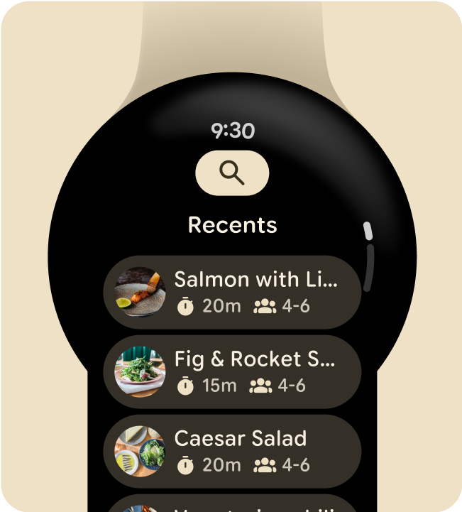
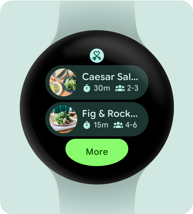
应用于功能块的颜色主题
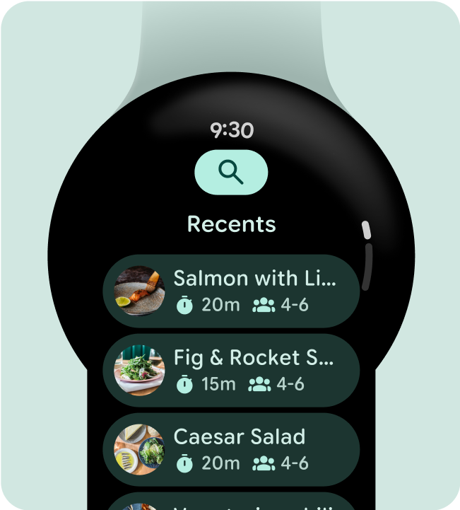
应用于应用屏幕的颜色主题
来自品牌颜色
与 Material 3 Expressive 处理颜色角色的方式类似,Wear OS 通过动态且易于访问的颜色表达方式将颜色应用于个性化体验。Wear OS 仅使用深色主题,因为穿戴式设备界面是基于黑色背景构建的。作为一个在触摸设备上运行的平台,Wear OS 的调色板也更有限,因为它不需要那么多的悬停和聚焦状态。使用专为 Wear OS 打造的颜色主题构建工具,围绕您的品牌构建自定义主题,并生成支持 Material Design 令牌且可与系统界面组件无缝协作的完整参考调色板和分配的颜色角色。
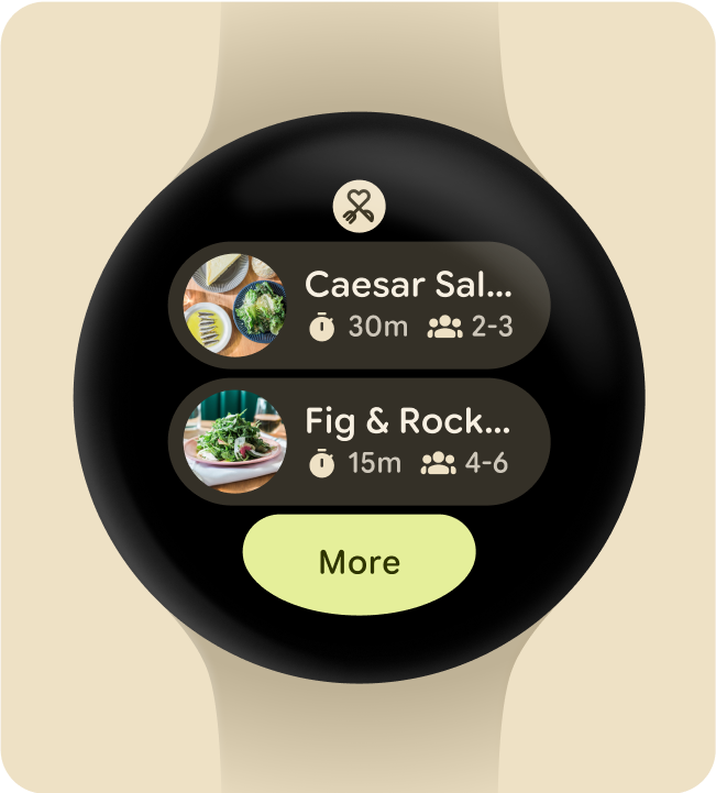
调色板(基于海报图片种子颜色)
应用于功能块的颜色主题
应用于应用屏幕的颜色主题