


Material Design provides components and layouts for XR. Using the Material 3 library, adaptive layouts, and the XR Compose Material 3 library, you can build spatial UI behaviors into your Compose app.
Add the XR Compose Material 3 library to your app's dependencies to use
Material 3 for XR components, or place standard Material 3 components
directly inside Jetpack Compose for XR containers such as Orbiter,
SpatialDialog, and SpatialPanel.
Use Material 3 for XR components
The androidx.xr.compose.material3 library provides Material 3 for XR
components for common spatial UI patterns—including navigation rails and bars,
top app bars, floating toolbars, dialogs, list-detail layouts, and a toggle
button to switch between Home Space and Full Space. The spatialized Spatial*
composables in this library are experimental and require opting in with
@OptIn(ExperimentalMaterial3XrApi::class).
Check LocalSpatialCapabilities.current.isSpatialUiEnabled to render
Material 3 for XR components when spatial UI is enabled and standard Material 3
components when spatial UI isn't enabled. For more information, see Check for
spatial capabilities.
Navigation rail
Use SpatialNavigationRail or SpatialWideNavigationRail to display
a Material 3 navigation rail in a start-aligned Orbiter when spatial UI
is enabled. For more information, see the Material Design
guidelines.

Non-spatialized navigation rail

Spatialized (XR-adapted) navigation rail
Navigation bar
Use SpatialNavigationBar or SpatialShortNavigationBar to display
a Material 3 navigation bar in a bottom-aligned Orbiter when spatial UI
is enabled. For more information, see the Material Design
guidelines.

Non-spatialized navigation bar

Spatialized (XR-adapted) navigation bar
Dialogs
Use SpatialBasicAlertDialog to display a basic alert dialog inside a
SpatialDialog with spatial elevation, or wrap standard Material 3 dialog
content directly in SpatialDialog.
For more information, see Dialogs and the adaptive design guidelines.
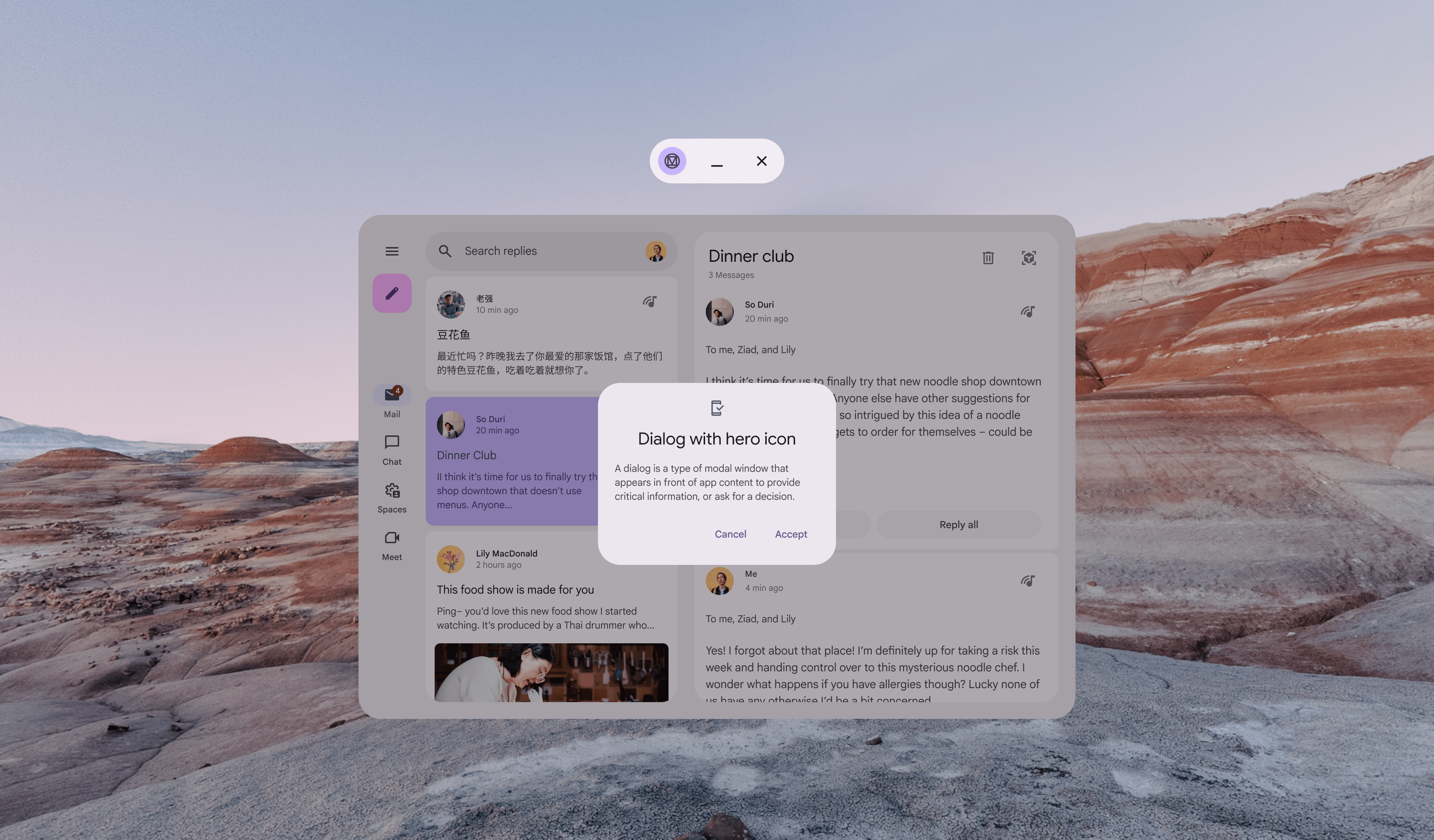
Non-spatialized dialog
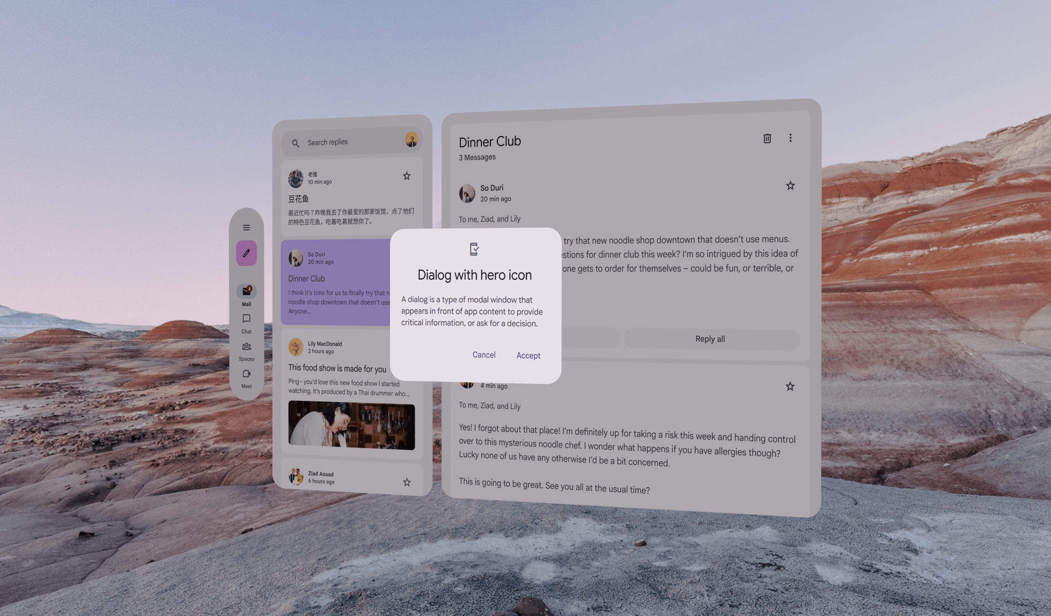
Spatialized (XR-adapted) dialog
Top app bars
Use SpatialTopAppBar or SpatialTwoRowsTopAppBar to display a
Material 3 top app bar inside a top-aligned Orbiter when spatial UI is
enabled.
For more information, see Top app bars and the adaptive design guidelines.
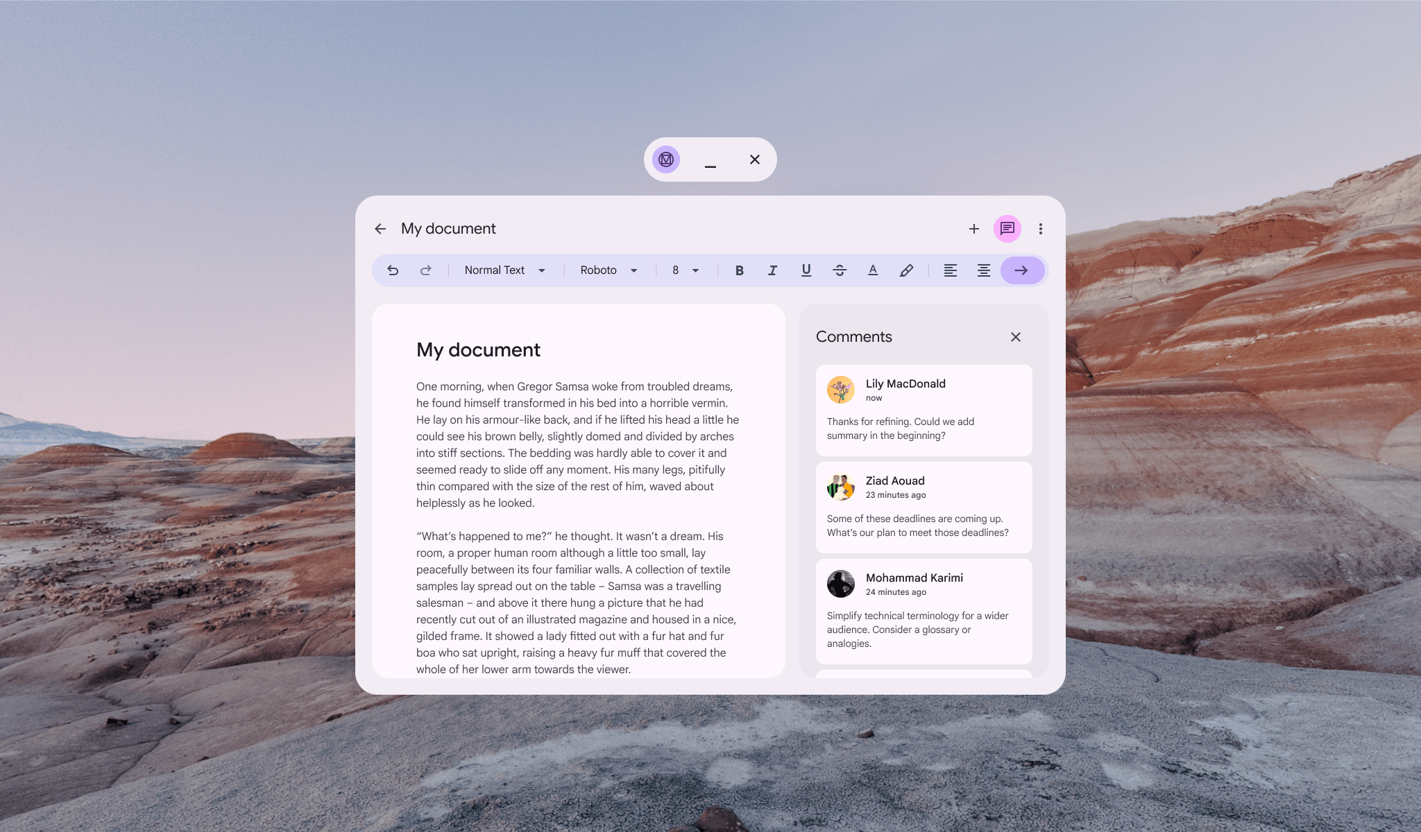
Non-spatialized top app bar
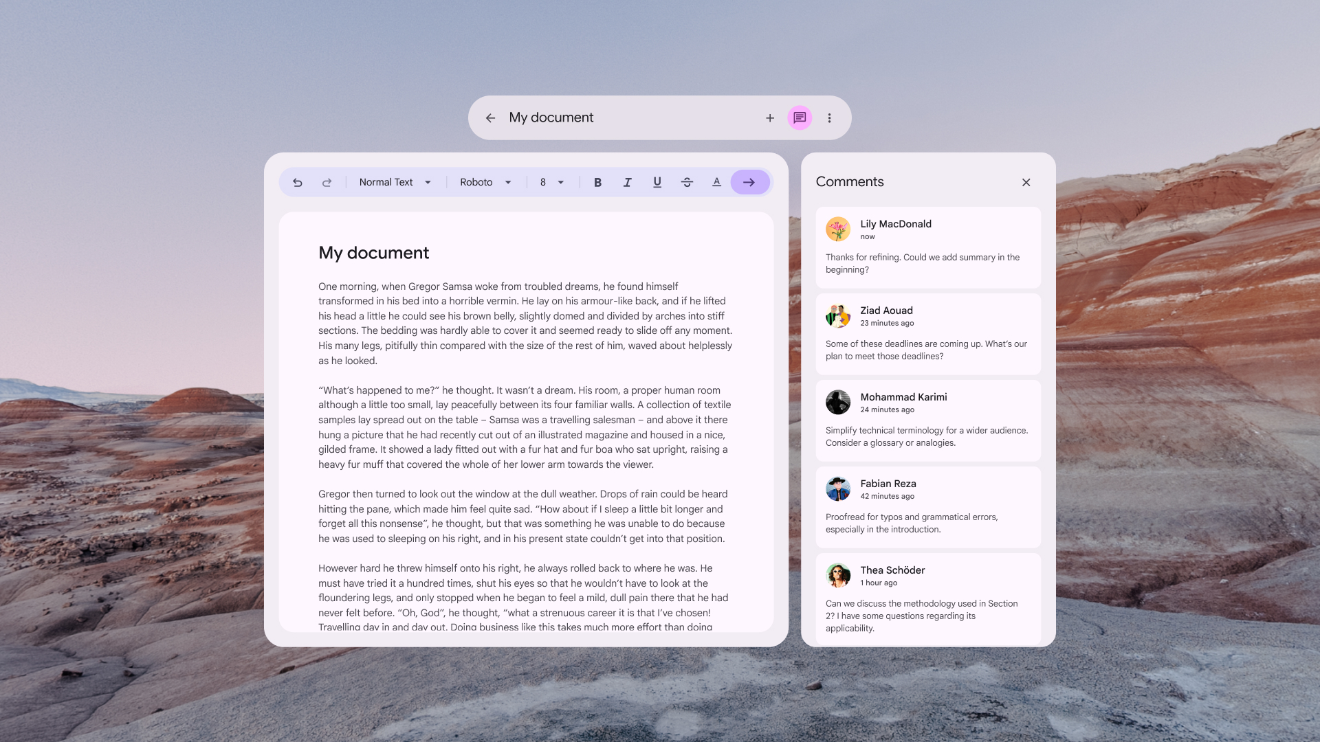
Spatialized (XR-adapted) top app bar
List-detail layout for XR
Use SpatialListDetailPaneScaffold when spatial UI is enabled to display
a Material 3 adaptive list-detail layout where each pane is placed inside
its own SpatialPanel. When spatial UI isn't enabled, use
ListDetailPaneScaffold. For more information, see List-detail
layout and the adaptive design guidelines.

Non-spatialized ListDetailPaneScaffold

Spatialized (XR-adapted) ListDetailPaneScaffold
Support pane layout for XR
When spatial UI is enabled, place your main pane and supporting pane into
separate SpatialPanel containers inside a SpatialRow within a
Subspace. When spatial UI isn't enabled, use
SupportingPaneScaffold. For more information, see Supporting pane
and the adaptive design guidelines.

Non-spatialized SupportingPaneScaffold

Spatialized (XR-adapted) SupportingPaneScaffold
Start designing with the Material 3 Design Kit for Figma

Download the Material 3 Design Kit to get started
See also
- Develop UI with Jetpack Compose for XR
- Transition from Home Space to Full Space
- Spatial UI design guidelines