สร้างรูปแบบสีที่เข้าถึงได้ง่ายขึ้นและเหมาะกับคุณโดยเฉพาะ ซึ่งสื่อถึงลําดับชั้น สถานะ และแบรนด์ของผลิตภัณฑ์ เมื่อออกแบบอุปกรณ์ที่สวมใส่ได้ สีมีบทบาทสําคัญในการปรับปรุงความชัดเจนในการอ่าน ความสามารถในการใช้งาน ความน่าสนใจของภาพ และการแสดงออก โดยเฉพาะบนหน้าจอขนาดเล็ก
หลักการต่อไปนี้อธิบายวิธีใช้สีในธีมต่างๆ
สร้างจากสีดํา
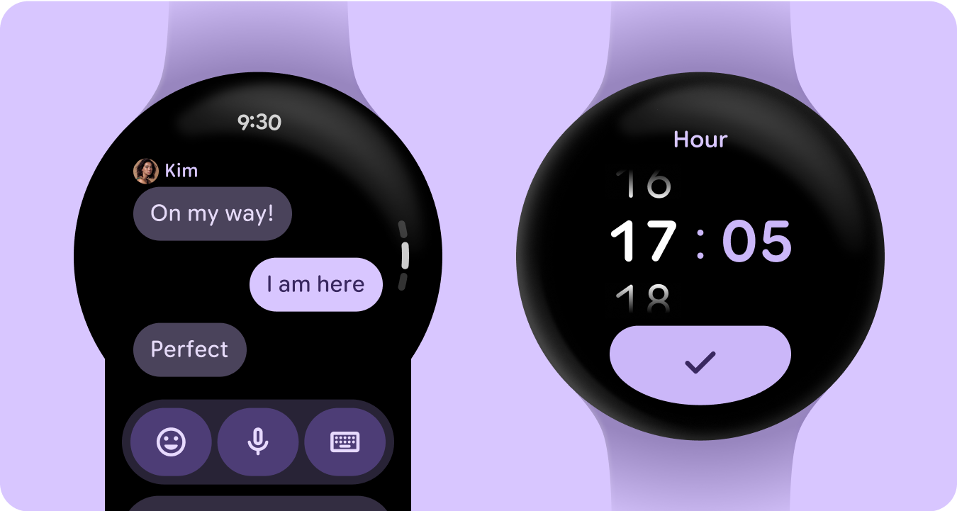
นาฬิกาออกแบบให้มีพื้นหลังสีดําแทนพื้นหลังที่มีสีของอุปกรณ์โทรศัพท์ แม้ว่าธีมมืดจะมีไว้สำหรับสภาพแวดล้อมที่มีแสงน้อยและธีมสว่างมีไว้สำหรับกลางวัน แต่ UI ของนาฬิกาต้องทำงานได้อย่างราบรื่นทั้งกลางวันและกลางคืน ดังนั้นโทเค็นสีสำหรับนาฬิกาจึงต้องปรับให้เหมาะกับนาฬิกาโดยเฉพาะ
บทบาทสีใหม่
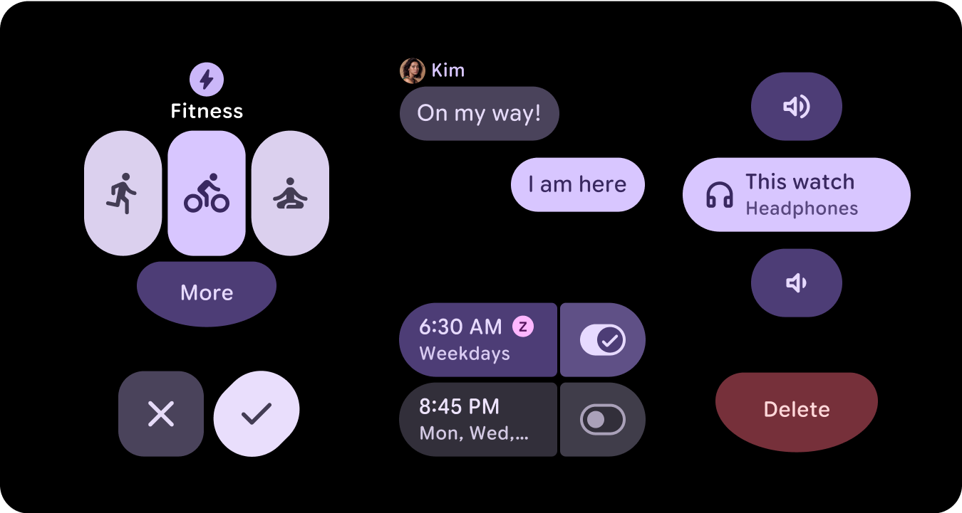
ระบบสีของ Material 3 ยังคงโครงสร้างของสีアクセント 3 สีและสีพื้นกลาง 2 สี แต่เพิ่มสีคอนเทนเนอร์ภายในบทบาทของสีアクセント บทบาทใหม่เหล่านี้ช่วยให้สื่อความหมายได้มากขึ้นโดยไม่รบกวนลําดับชั้นภาพ โดยพื้นฐานแล้วคือให้สีพื้นผิวที่หลากหลายขึ้นด้วยการเพิ่มสี บทบาทของคอนเทนเนอร์มีประโยชน์อย่างยิ่งในการไฮไลต์สถานะ เช่น ปุ่มเปิด/ปิด หรือเพื่อจัดสไตล์เสริมเมื่อใช้องค์ประกอบหลักแล้ว
ความหมายเชิงความหมาย
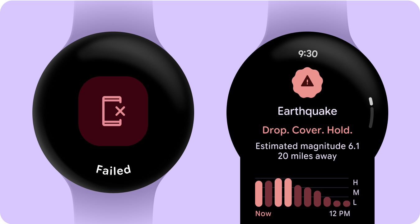
ใน UI ของนาฬิกา สีต้องสื่อความหมายอย่างชัดเจนและเข้าใจง่าย เช่น สีแดงแสดงข้อผิดพลาดและสีเขียวแสดงความสําเร็จ ซึ่งช่วยให้ผู้ใช้เข้าใจการดําเนินการหรือสถานะได้อย่างรวดเร็วโดยไม่ต้องมีคำอธิบายเพิ่มเติม การใช้สีตามความหมายนี้จะช่วยให้ผู้ใช้ไปยังส่วนต่างๆ ของ UI และดำเนินการได้อย่างมั่นใจ
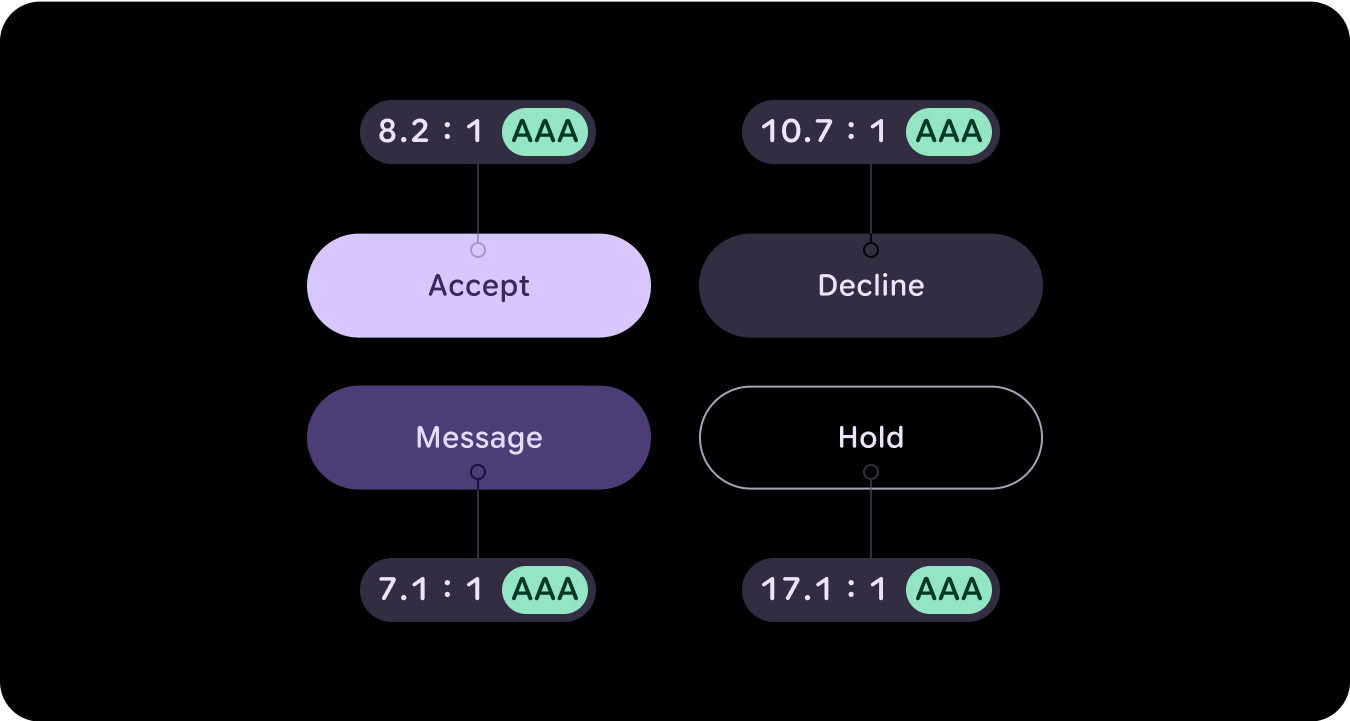
การช่วยเหลือพิเศษด้วยสี (การปฏิบัติตามข้อกำหนดด้านคอนทราสต์)
ใน UI ของนาฬิกา สีต้องสื่อความหมายอย่างชัดเจนและเข้าใจง่าย เช่น สีแดงแสดงข้อผิดพลาดและสีเขียวแสดงความสําเร็จ ซึ่งช่วยให้ผู้ใช้เข้าใจการดําเนินการหรือสถานะได้อย่างรวดเร็วโดยไม่ต้องมีคำอธิบายเพิ่มเติม การใช้สีตามความหมายนี้จะช่วยให้ผู้ใช้ไปยังส่วนต่างๆ ของ UI และดำเนินการได้อย่างมั่นใจ
มีอะไรใหม่
ระบบการออกแบบภาพและวิธีที่เรายกระดับการแสดงออกผ่านการอัปเดตไลบรารีการออกแบบพื้นฐาน คอมโพเนนต์ และไทล์ต่างๆ ได้รับการอัปเดตครั้งใหญ่
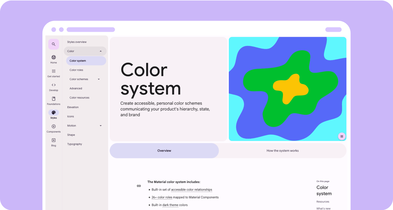
ระบบสีที่สื่อความหมายของ Material 3 มีฟีเจอร์ต่อไปนี้
- ชุดความสัมพันธ์ของสีที่เข้าถึงได้ในตัว
- บทบาทสีมากกว่า 28 รายการที่แมปกับคอมโพเนนต์ Material
- สีธีมมืดในตัวสำหรับสร้างจากสีดํา
- ค่าสีที่ปิดใช้ที่ปรับปรุงแล้ว
- สีข้อผิดพลาดเพิ่มเติม
- สีฐานคงที่ที่มีการกำหนดสีเริ่มต้นให้กับบทบาทสีแต่ละบทบาท
- ฟีเจอร์สีแบบไดนามิก ซึ่งรวมถึงระบบ/หน้าปัด และธีมสีที่อิงตามรูปภาพ
แหล่งข้อมูล
ดูข้อมูลเพิ่มเติมได้จากแหล่งข้อมูลต่อไปนี้
หลักเกณฑ์สีของ Material Design
ดูข้อมูลเกี่ยวกับแนวทางปฏิบัติแนะนำล่าสุดสำหรับรูปแบบสีโดยใช้ Material 3 แบบ Expressive