มุมมองที่ไม่เลื่อนจะเน้นข้อมูลที่ดูได้อย่างรวดเร็วและมอบมูลค่าแก่ผู้ใช้โดยมีการโต้ตอบน้อยมากหรือไม่มีเลย ด้วยเหตุนี้ การสร้างลักษณะการทำงานที่ตอบสนองในเลย์เอาต์เหล่านี้จึงอาจเป็นเรื่องยาก
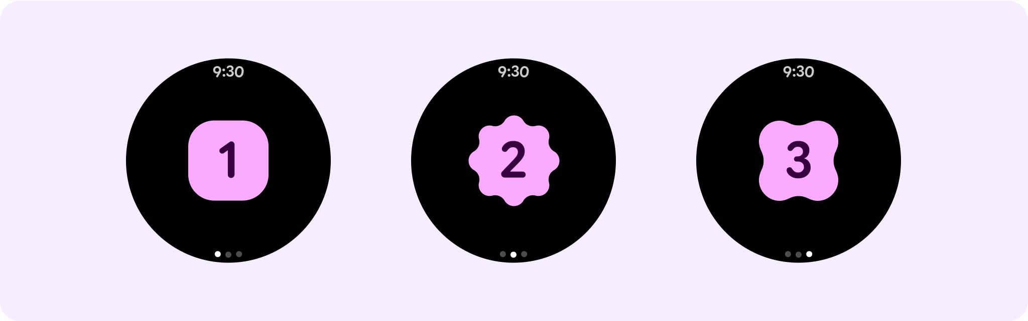
คอมโพเนนต์เลย์เอาต์แบบไม่เลื่อนที่กำหนดไว้ล่วงหน้า
Dialog
กล่องโต้ตอบคือการซ้อนทับชั่วคราวที่ครอบครองทั้งหน้าจอ โดยช่วยให้ผู้ใช้ ดำเนินการอย่างใดอย่างหนึ่งได้
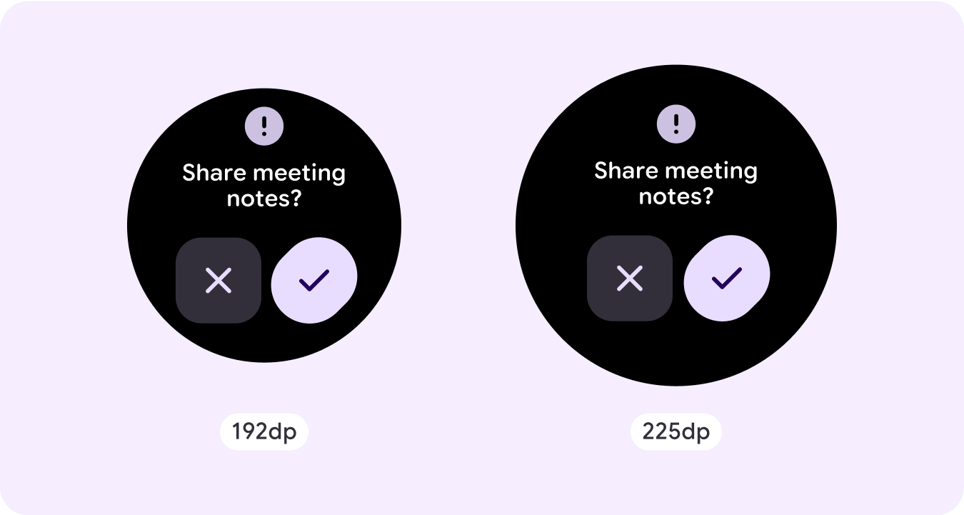
- กล่องโต้ตอบจะดึงดูดความสนใจของคุณเพื่อยืนยันว่าเนื้อหาได้รับการแก้ไขแล้ว
- กล่องโต้ตอบควรสื่อสารข้อมูลโดยตรงและมุ่งเน้นที่การ ทำงานให้เสร็จ
- กล่องโต้ตอบควรปรากฏขึ้นเพื่อตอบสนองต่องานหรือการกระทำของผู้ใช้ พร้อมข้อมูลที่เกี่ยวข้อง หรือข้อมูลตามบริบท
การซ้อนทับการยืนยัน
ภาพซ้อนทับยืนยันจะแสดงข้อความยืนยันแก่ผู้ใช้ในช่วงเวลาสั้นๆ ใช้คอมโพเนนต์นี้เพื่อดึงดูดความสนใจของผู้ใช้หลังจากที่ดำเนินการแล้ว
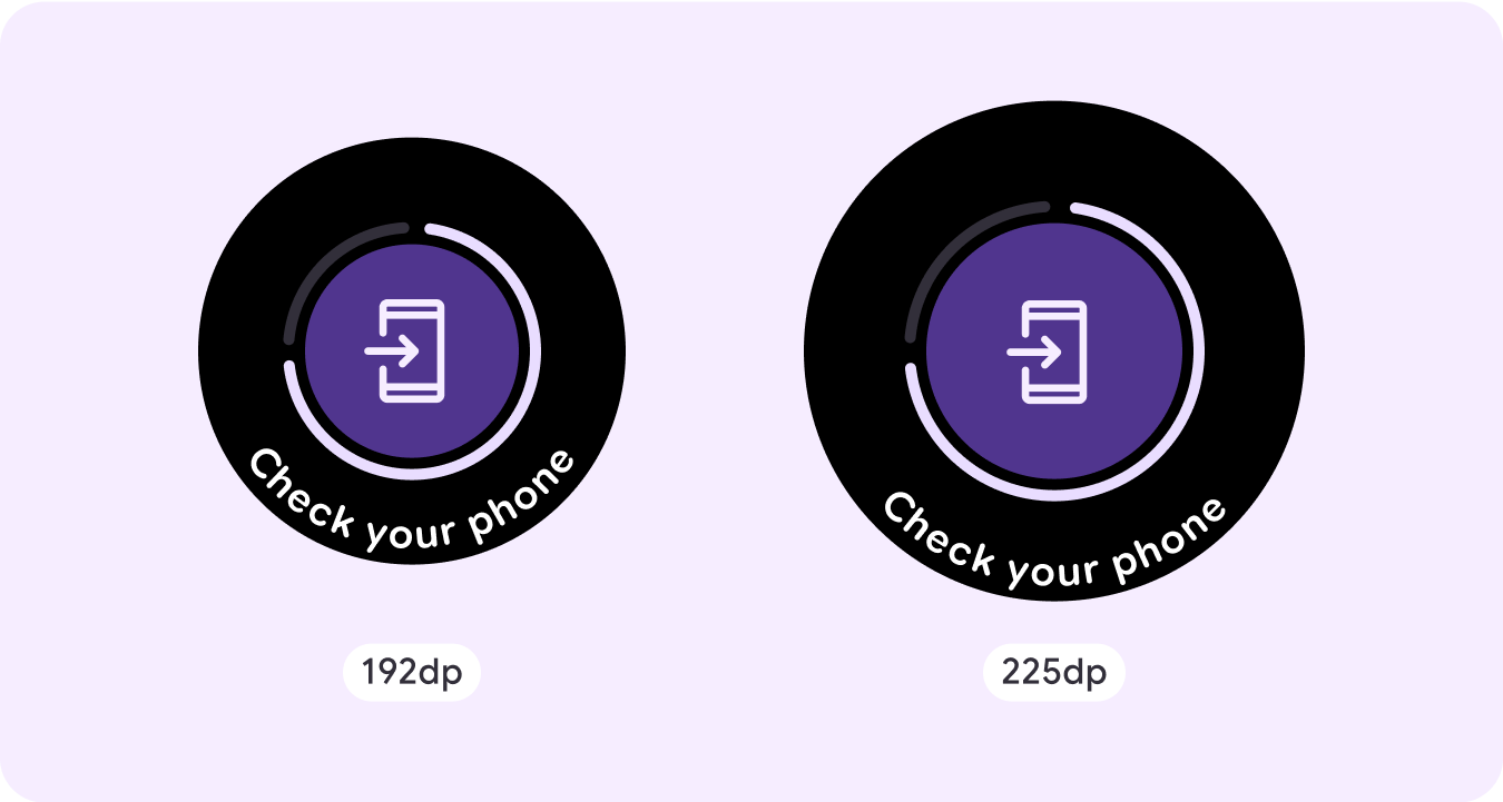
เปิดในโทรศัพท์
ระบบจะทริกเกอร์การซ้อนทับ "เปิดในโทรศัพท์" เมื่อผู้ใช้เลือกที่จะดำเนินการ เส้นทางต่อในโทรศัพท์ โดยการซ้อนทับจะมีตัวบ่งชี้ความคืบหน้าและจะแจ้งให้ผู้ใช้ทราบเมื่อ ต้องตรวจสอบโทรศัพท์
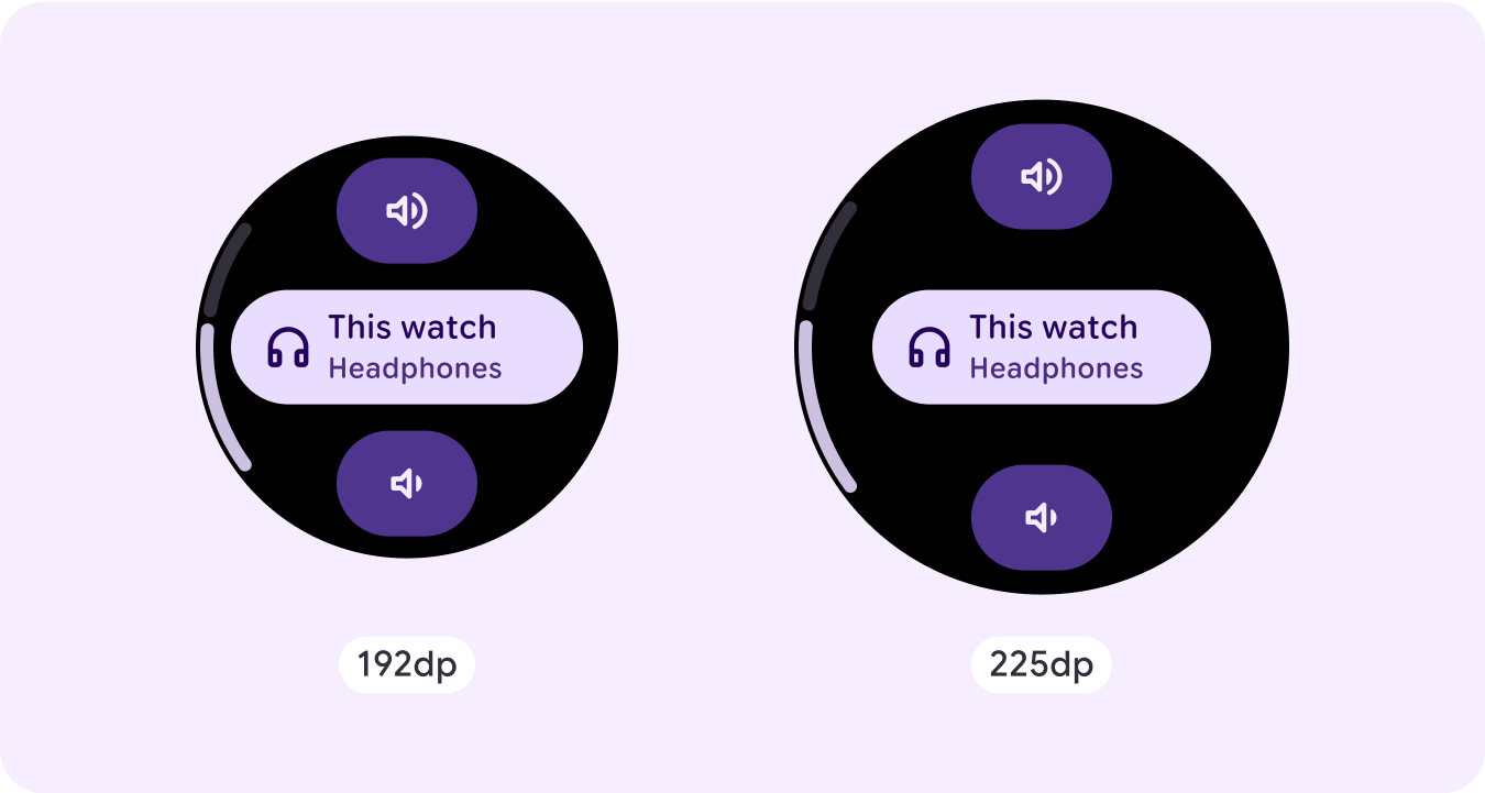
Stepper
Stepper มอบประสบการณ์การควบคุมแบบเต็มหน้าจอที่ช่วยให้ผู้ใช้เลือกจากช่วงค่าได้ โดยสามารถควบคุมการโต้ตอบได้โดยใช้ ปุ่มหรือเม็ดมะยม และระดับที่เฉพาะเจาะจงจะแสดงโดยใช้ ตัวบ่งชี้ระดับโค้ง
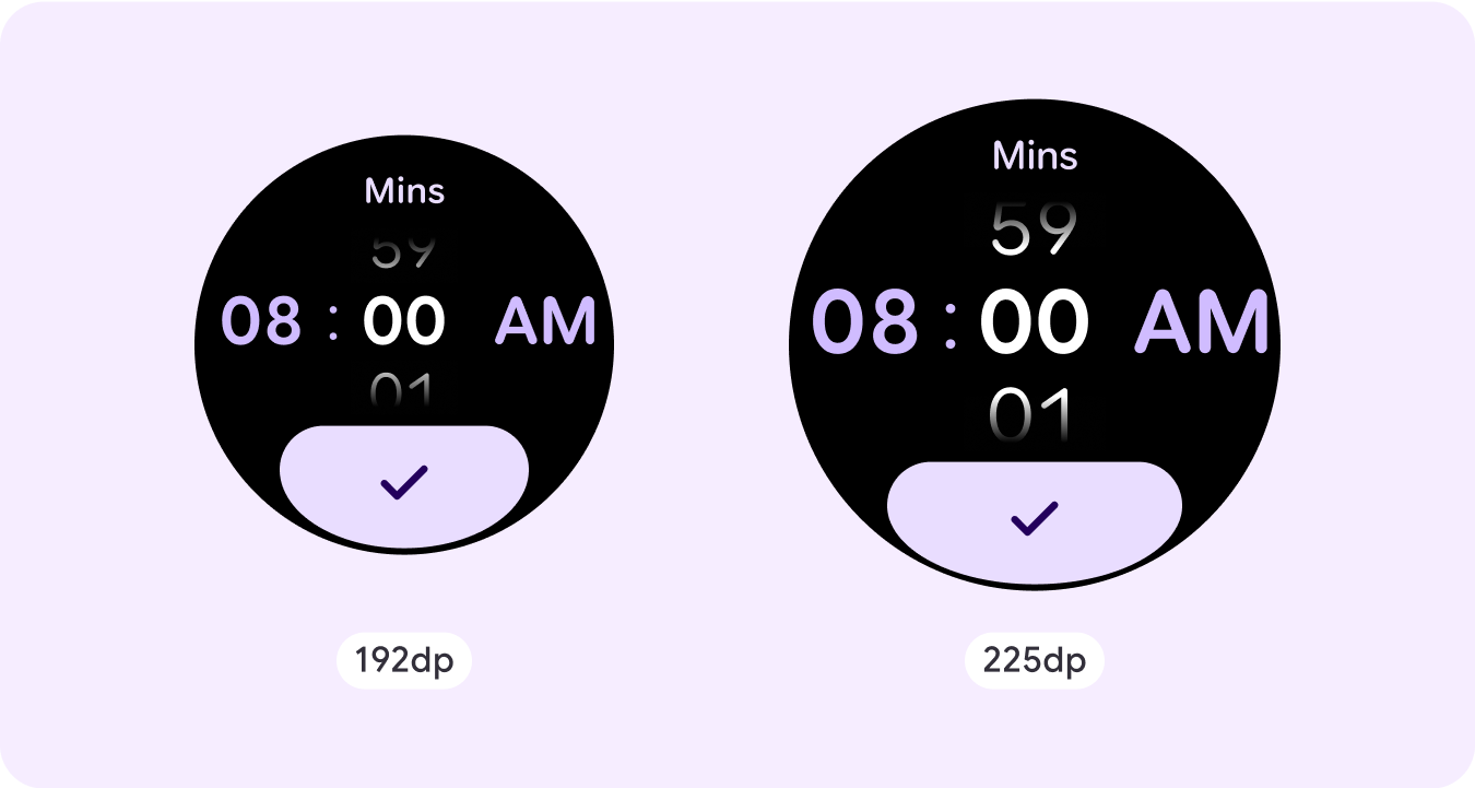
เครื่องมือเลือกเวลา
ตัวเลือกช่วยให้ผู้ใช้เลือกจากรายการจำนวนจำกัดในส่วนที่เลื่อนได้ เครื่องมือเลือกเวลามีได้สูงสุด 3 คอลัมน์ ขึ้นอยู่กับว่ามีวินาที หรือไม่ หรือเป็นนาฬิกาแบบ 12 หรือ 24 ชั่วโมง ผู้ใช้จะโต้ตอบกับแต่ละคอลัมน์ทีละรายการ โดยเลือกโดยปล่อยให้ตัวเลขอยู่ในโฟกัส ก่อนที่จะดำเนินการต่อ
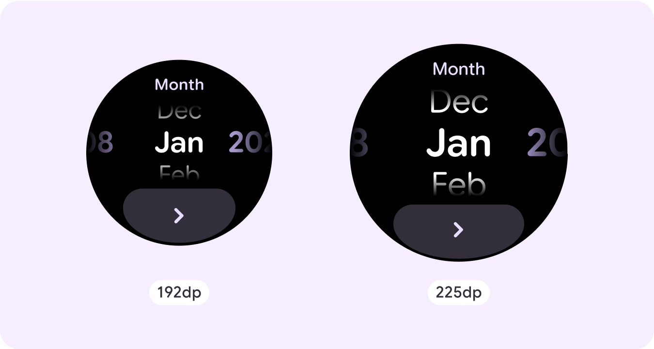
เครื่องมือเลือกวันที่
ตัวเลือกช่วยให้ผู้ใช้เลือกจากรายการจำนวนจำกัดในส่วนที่เลื่อนได้ เครื่องมือเลือกวันที่มีคอลัมน์ได้สูงสุด 3 คอลัมน์ ซึ่งมีลำดับที่สลับกันได้ ระหว่างวันที่ เวลา และปี ทั้งนี้ขึ้นอยู่กับกรณีการใช้งาน เครื่องมือเลือกวันที่ต้องใช้สตริงเนื้อหาที่ยาวกว่า ดังนั้นจึงมีเพียงคอลัมน์เดียวที่แสดง ในแต่ละครั้ง ซึ่งจะช่วยให้ทราบว่ามีอะไรอยู่ทางซ้ายหรือขวา ผู้ใช้จะโต้ตอบ กับแต่ละคอลัมน์ทีละรายการ โดยเลือกรายการที่ต้องการด้วยการปล่อยให้ตัวเลขอยู่ใน โฟกัสก่อนที่จะดำเนินการต่อ
ตัวอย่างเลย์เอาต์แบบไม่เลื่อนที่กำหนดเอง
หน้าจอแอปที่ไม่เลื่อนไม่ได้จำกัดเฉพาะคอมโพเนนต์ที่ตั้งค่าไว้ คุณสามารถรวม ชุดค่าผสมขององค์ประกอบต่างๆ เพื่อสร้างเลย์เอาต์ที่ต้องการได้
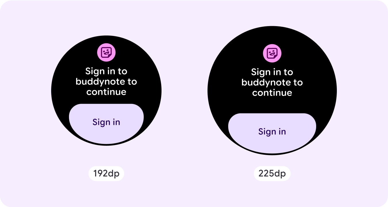
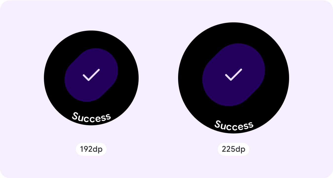
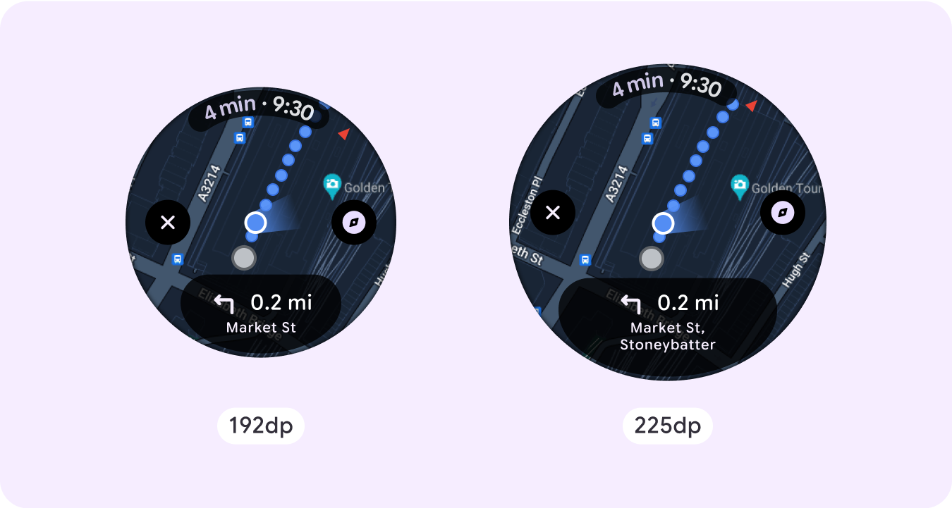
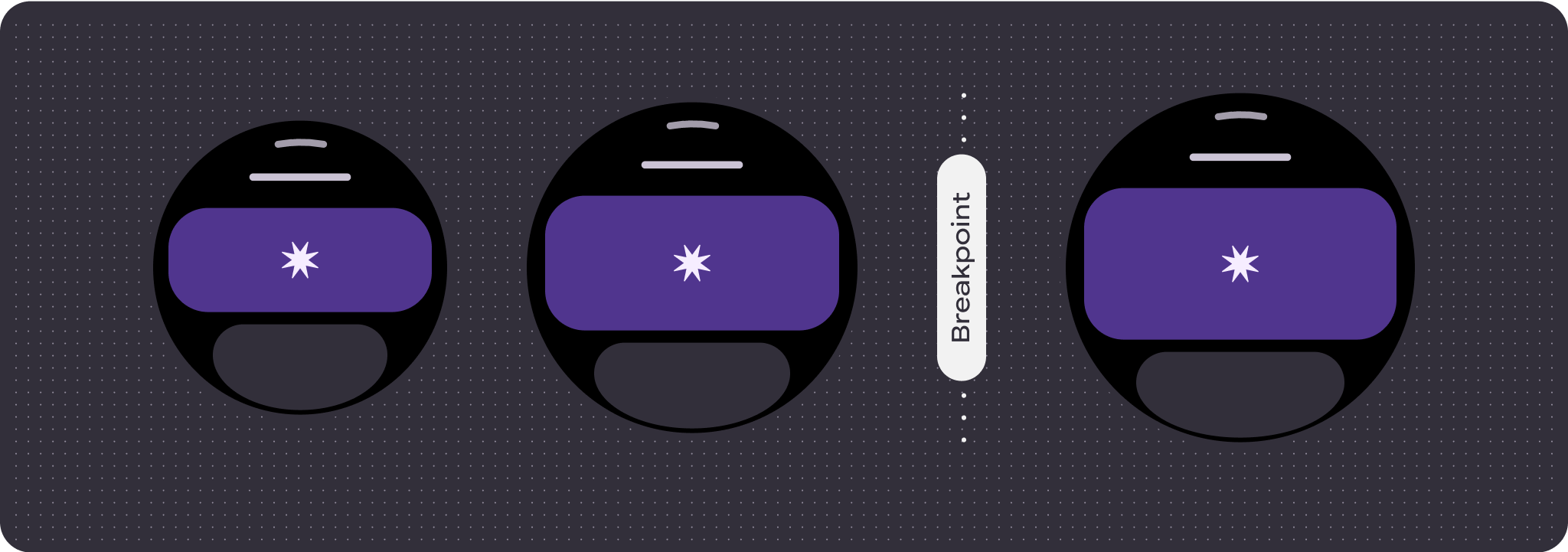
คุณควรคำนึงถึงพื้นที่จำกัดในหน้าจอที่ไม่เลื่อน และการใช้ระยะขอบและการเว้นวรรคแบบยืดหยุ่น (เปอร์เซ็นต์) เพื่อใช้พื้นที่หน้าจอที่มีอยู่ นอกจากนี้ คุณยังอาจพิจารณาใช้เบรกพอยต์ที่ 225dp เพื่อแสดงเนื้อหาเพิ่มเติมหรือทำให้เนื้อหาที่มีอยู่ดูง่ายขึ้นเมื่ออยู่บนหน้าจอขนาดใหญ่
แผนที่
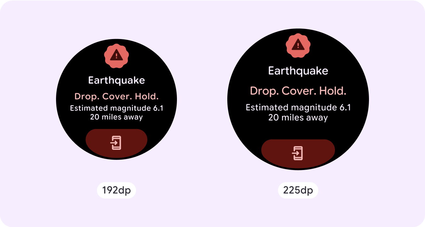
การซ้อนทับฉุกเฉิน
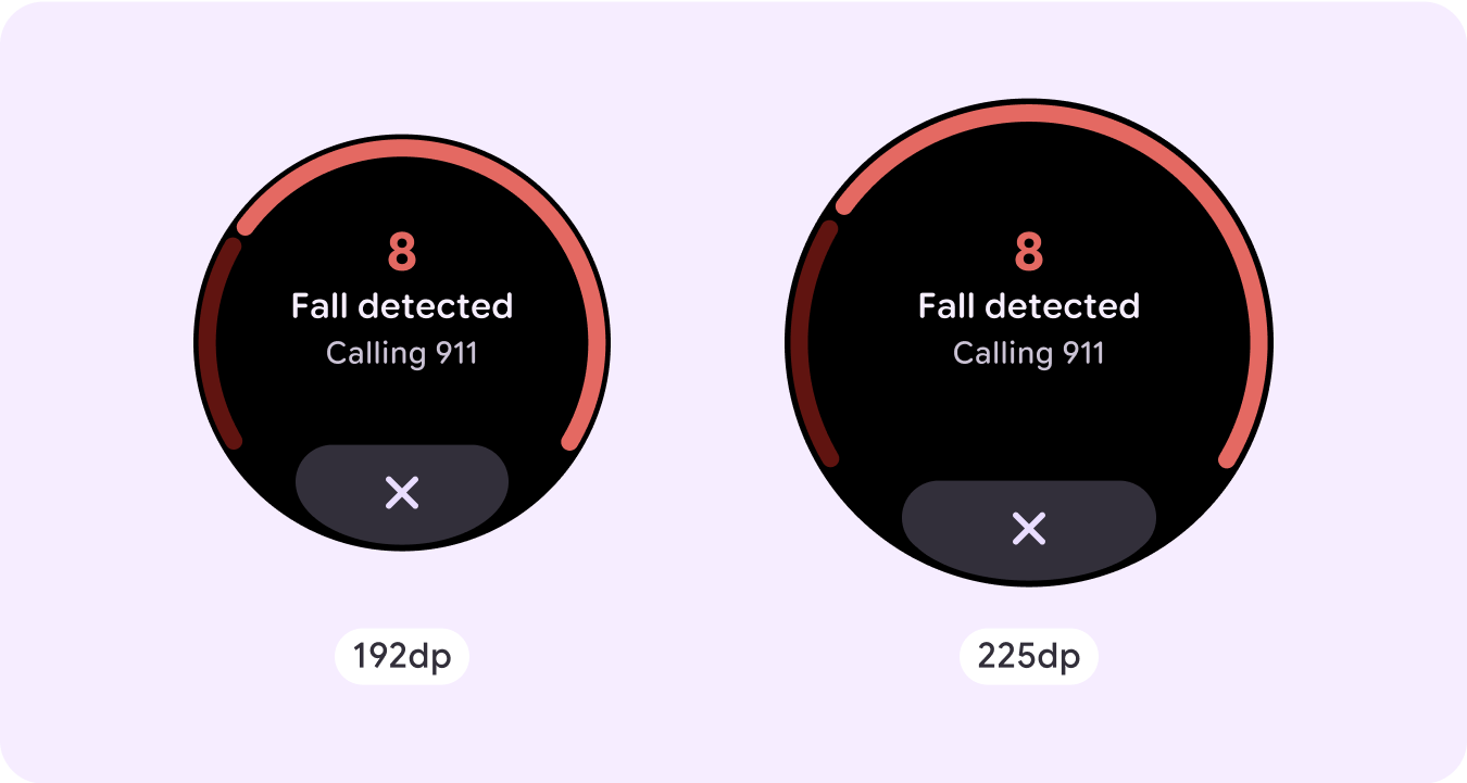
การแจ้งเตือนเหตุฉุกเฉิน
พฤติกรรมที่ตอบสนองและปรับเปลี่ยนได้
คอมโพเนนต์ทั้งหมดในไลบรารี Compose จะปรับให้เข้ากับขนาดหน้าจอที่กว้างขึ้นโดยอัตโนมัติ และจะมีความกว้างและความสูงเพิ่มขึ้น สำหรับมุมมองเหล่านี้โดยเฉพาะ การใช้ เบรกพอยต์จะมอบประสบการณ์ที่สมบูรณ์และมีคุณค่าอย่างยิ่งแก่ผู้ใช้ทุกคน
สำหรับปุ่ม การ์ด และขอบของ UI หลายรายการ ให้ขยายและเติมพื้นที่ สำหรับขนาดหน้าจอต่างๆ เพื่อใช้ประโยชน์จากพื้นที่ว่างใน UI และสร้างเลย์เอาต์ที่สมดุล
ใช้รายการตรวจสอบต่อไปนี้เพื่อยืนยันว่าได้กําหนดพารามิเตอร์ที่ตอบสนองอย่างเหมาะสมแล้ว
- สร้างเลย์เอาต์ที่ยืดหยุ่นซึ่งดูสมเหตุสมผลในหน้าจอทุกขนาด
- ใช้ระยะขอบด้านบน ด้านล่าง และด้านข้างที่แนะนำ
- กำหนดขอบในค่าเปอร์เซ็นต์ในตำแหน่งที่เนื้อหาอาจถูกตัดออก
- ใช้ข้อจํากัดของเลย์เอาต์เพื่อให้องค์ประกอบใช้พื้นที่ภายในหน้าจอได้อย่างดีที่สุดและรักษาความสมดุลในอุปกรณ์ขนาดต่างๆ
- รองรับข้อความตามเวลาหากมีการใช้ แต่ต้องไม่ทับซ้อนกับส่วนบนของหน้า
- ลองใช้ปุ่มที่ชิดขอบเพื่อใช้พื้นที่จำกัดให้ได้มากขึ้น
- ลองใช้เบรกพอยต์ที่ 225dp เพื่อแสดงเนื้อหาเพิ่มเติมหรือ ทำให้เนื้อหาที่มีอยู่ดูง่ายขึ้นเมื่ออยู่บนหน้าจอขนาดใหญ่
เส้นทางหน้าเว็บหลายหน้าแบบไม่เลื่อนโดยใช้การแบ่งหน้า
ในกรณีที่ประสบการณ์การใช้งานต้องใช้เนื้อหาเพิ่มเติมแต่ต้องการคงเลย์เอาต์แบบไม่เลื่อน ให้พิจารณาเลย์เอาต์แบบหลายหน้าที่มีการแบ่งหน้าในแนวตั้งหรือแนวนอน