با مجموعهها، منظم بمانید
ذخیره و طبقهبندی محتوا براساس اولویتهای شما.
نماهای بدون پیمایش بر اطلاعات قابل مشاهده تمرکز می کنند و با تعامل کم یا بدون تعامل، ارزشی را به کاربران ارائه می دهند. به همین دلیل، ایجاد رفتار پاسخگو در این طرحبندیها میتواند چالش برانگیز باشد.
اجزای طرح بندی غیر پیمایشی را از پیش تنظیم کنید
گفتگو
دیالوگ یک پوشش گذرا است که کل صفحه را اشغال می کند. این به کاربران امکان می دهد یک عمل واحد را انجام دهند.
به نکات زیر توجه کنید:
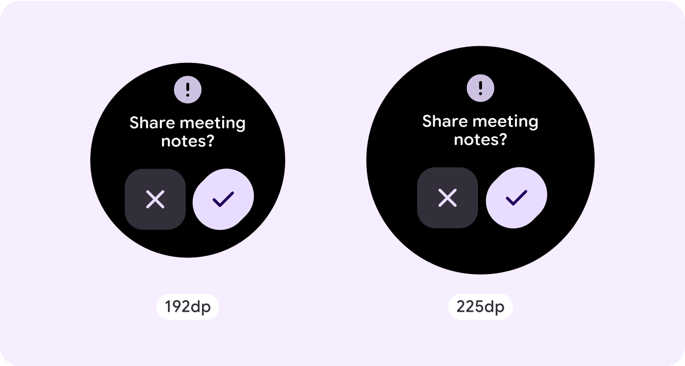
دیالوگها توجه شما را متمرکز میکنند تا تأیید کنند که محتوای آنها نشان داده شده است.
دیالوگ ها باید در انتقال اطلاعات مستقیم و اختصاص داده شده به تکمیل یک کار باشد.
دیالوگ ها باید در پاسخ به یک کار یا اقدام کاربر با اطلاعات مرتبط یا متنی ظاهر شوند.
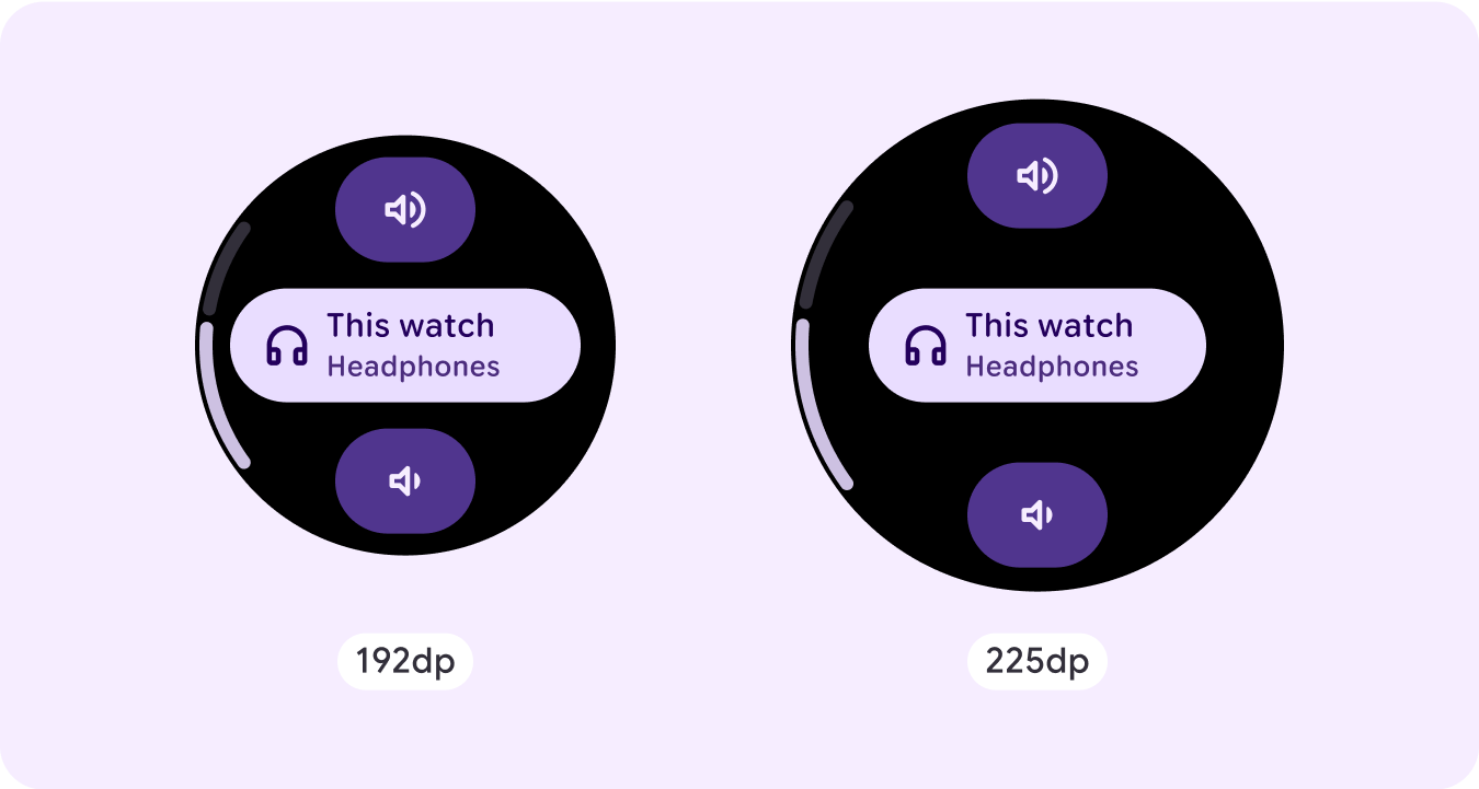
پوشش تایید
پوشش تایید یک پیام تایید را برای مدت کوتاهی به کاربر نمایش می دهد. از این مؤلفه برای جلب توجه کاربر پس از اجرای یک عمل استفاده کنید.
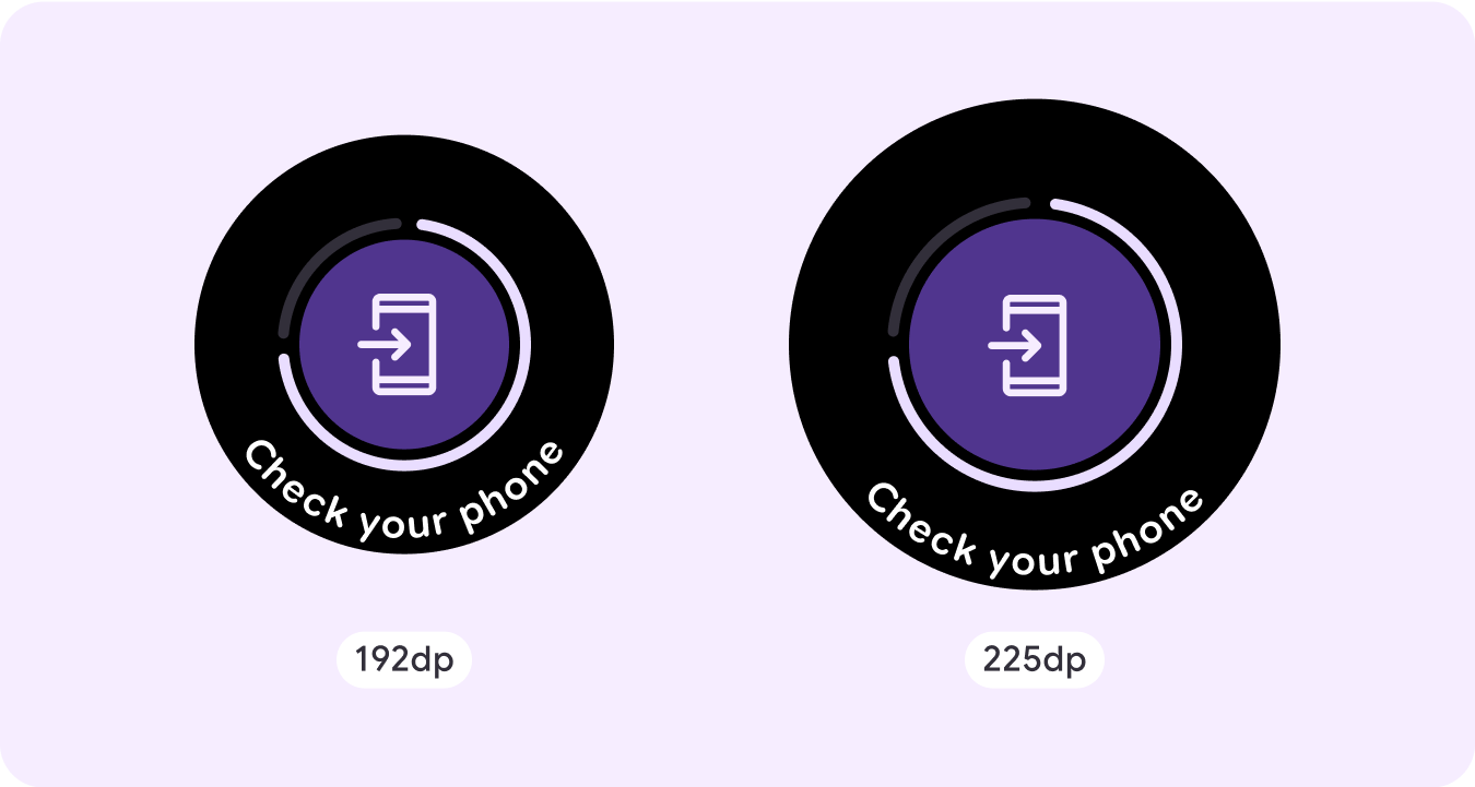
روی گوشی باز کنید
پوشش باز روی تلفن زمانی فعال می شود که کاربر تصمیم می گیرد به سفر خود در تلفن ادامه دهد. روکش دارای نشانگر پیشرفت است و به کاربر می گوید چه زمانی گوشی خود را چک کند.
استپر
استپرها یک تجربه کنترل تمام صفحه را ارائه می دهند که به کاربران امکان می دهد از طیف وسیعی از مقادیر انتخاب کنند. آنها می توانند تعامل را با استفاده از دکمه ها یا تاج کنترل کنند و سطح خاص با استفاده از یک نشانگر سطح منحنی نشان داده می شود.
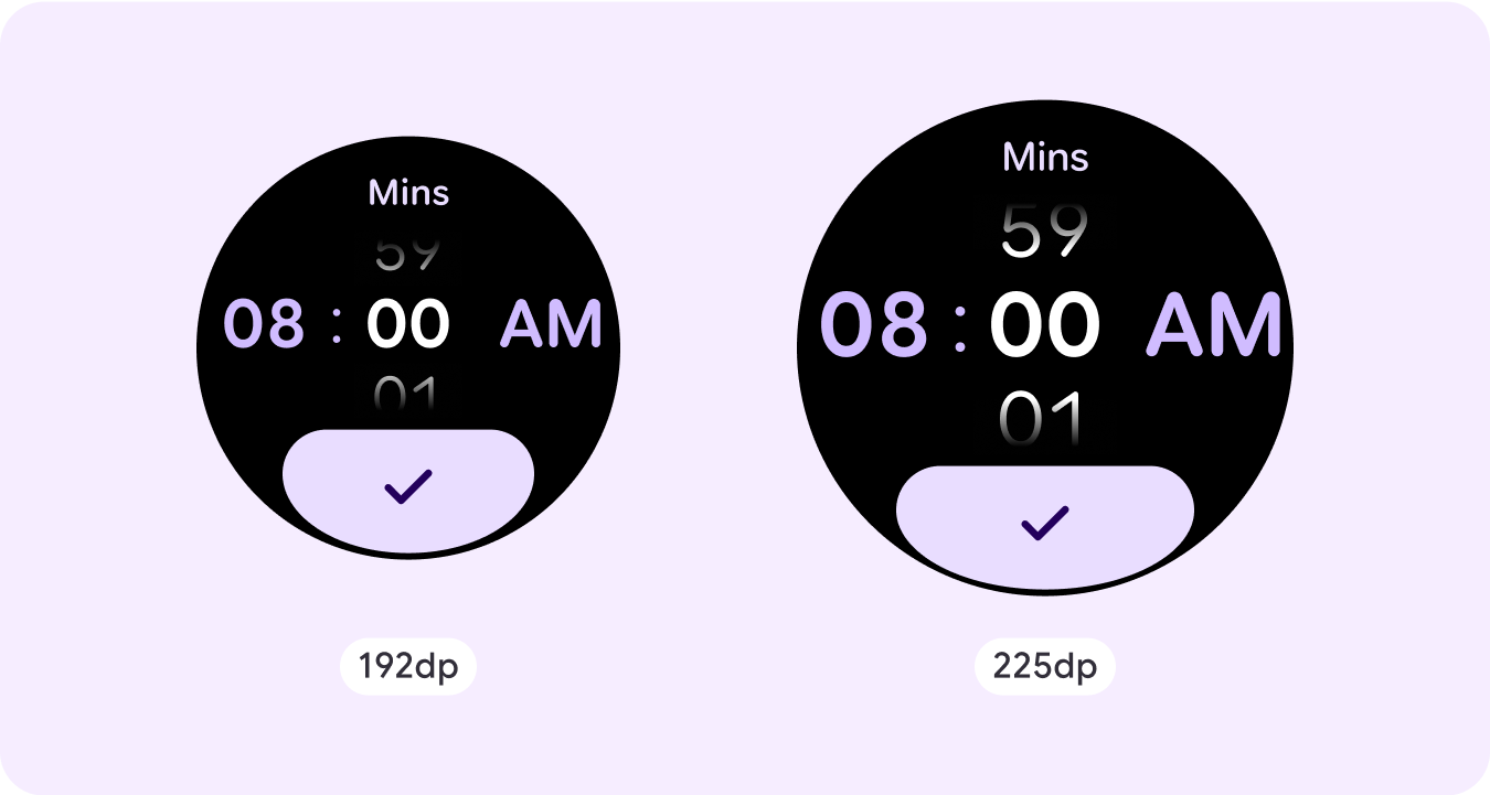
انتخابگر زمان
انتخابکنندهها به کاربران اجازه میدهند از بین تعداد محدودی از موارد در بخشهای قابل پیمایش انتخاب کنند. انتخابگر زمان تا سه ستون دارد، بسته به اینکه آیا ثانیه در دسترس است یا اینکه ساعت ۱۲ ساعته یا ۲۴ ساعته است. کاربران در یک زمان با هر ستون تعامل دارند و قبل از ادامه، با قرار دادن شماره در فوکوس، انتخاب خود را انجام می دهند.
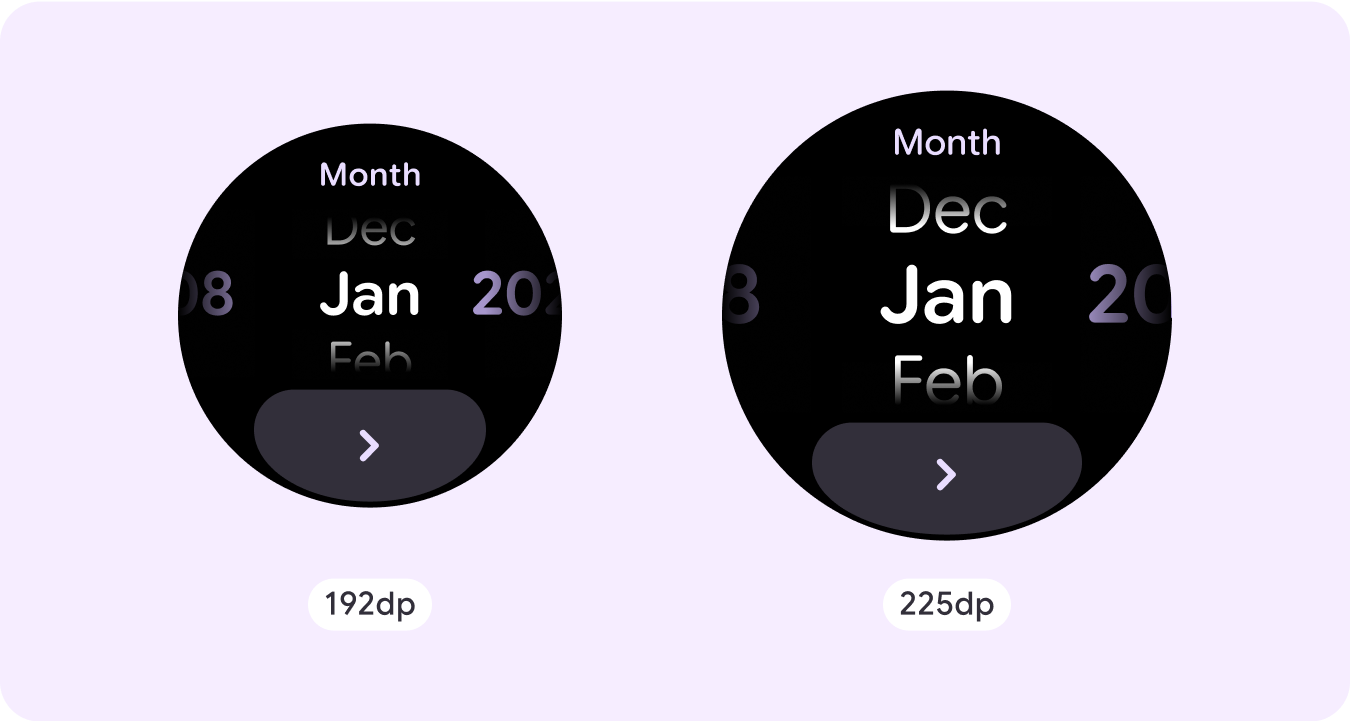
انتخابگر تاریخ
انتخابکنندهها به کاربران اجازه میدهند از بین تعداد محدودی از موارد در بخشهای قابل پیمایش انتخاب کنند. Date Picker دارای حداکثر سه ستون است که بسته به مورد استفاده، ترتیبی بین تاریخ، زمان و سال قابل تعویض دارند. انتخابکنندههای تاریخ به رشتههای طولانیتری از محتوا نیاز دارند، بنابراین هر بار فقط یک ستون در معرض دید قرار میگیرد و اشارهای به آنچه در سمت چپ یا راست است میدهد. کاربران در یک زمان با هر ستون تعامل می کنند و قبل از ادامه، شماره را در کانون توجه قرار می دهند.
نمونههای طرحبندی غیر پیمایشی سفارشی
صفحه نمایش برنامه های غیرپیمایشی به اجزای مجموعه محدود نمی شود. می توانید ترکیبی از عناصر را برای ایجاد طرح مورد نظر خود ترکیب کنید.
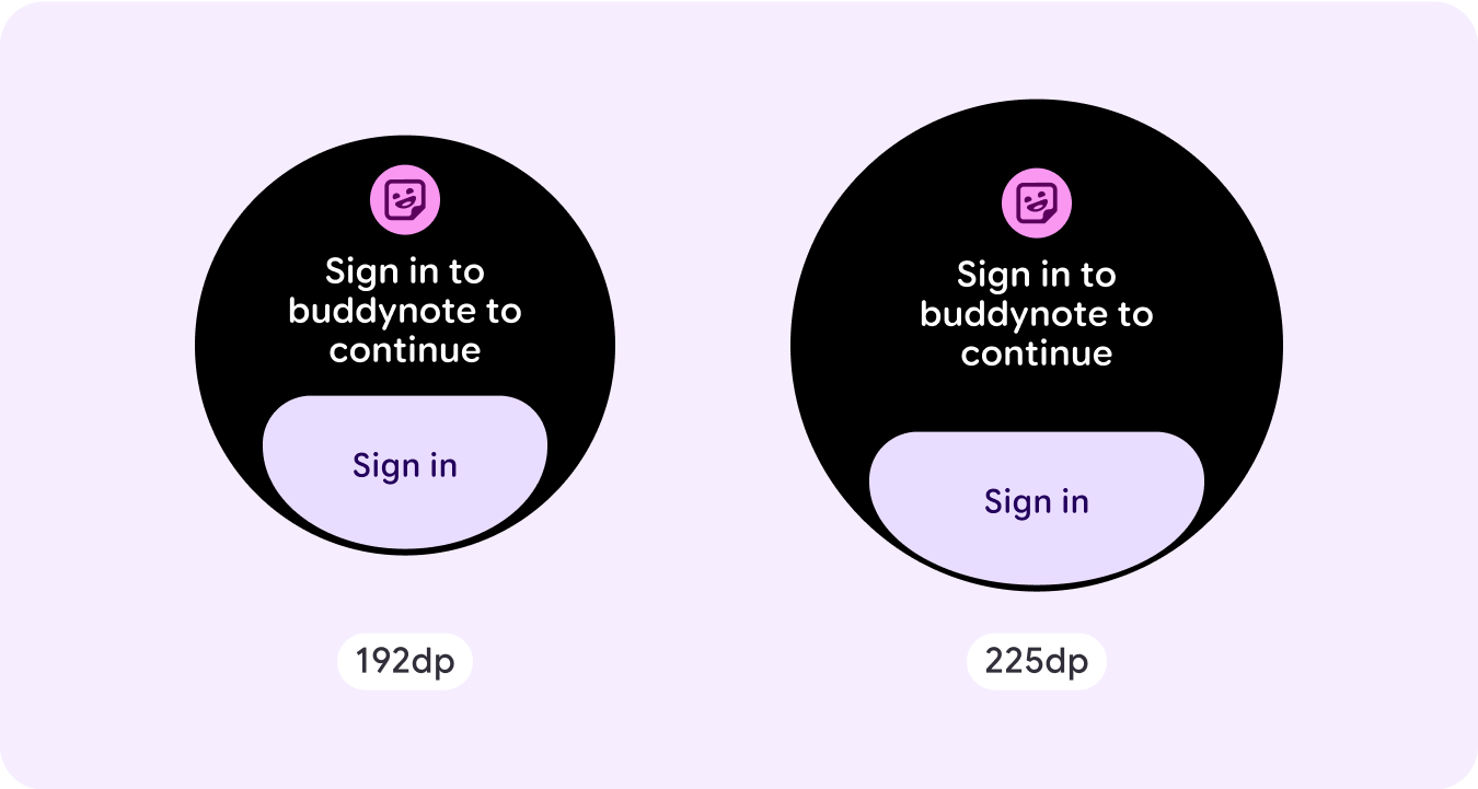
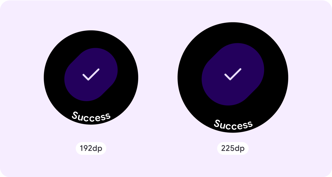
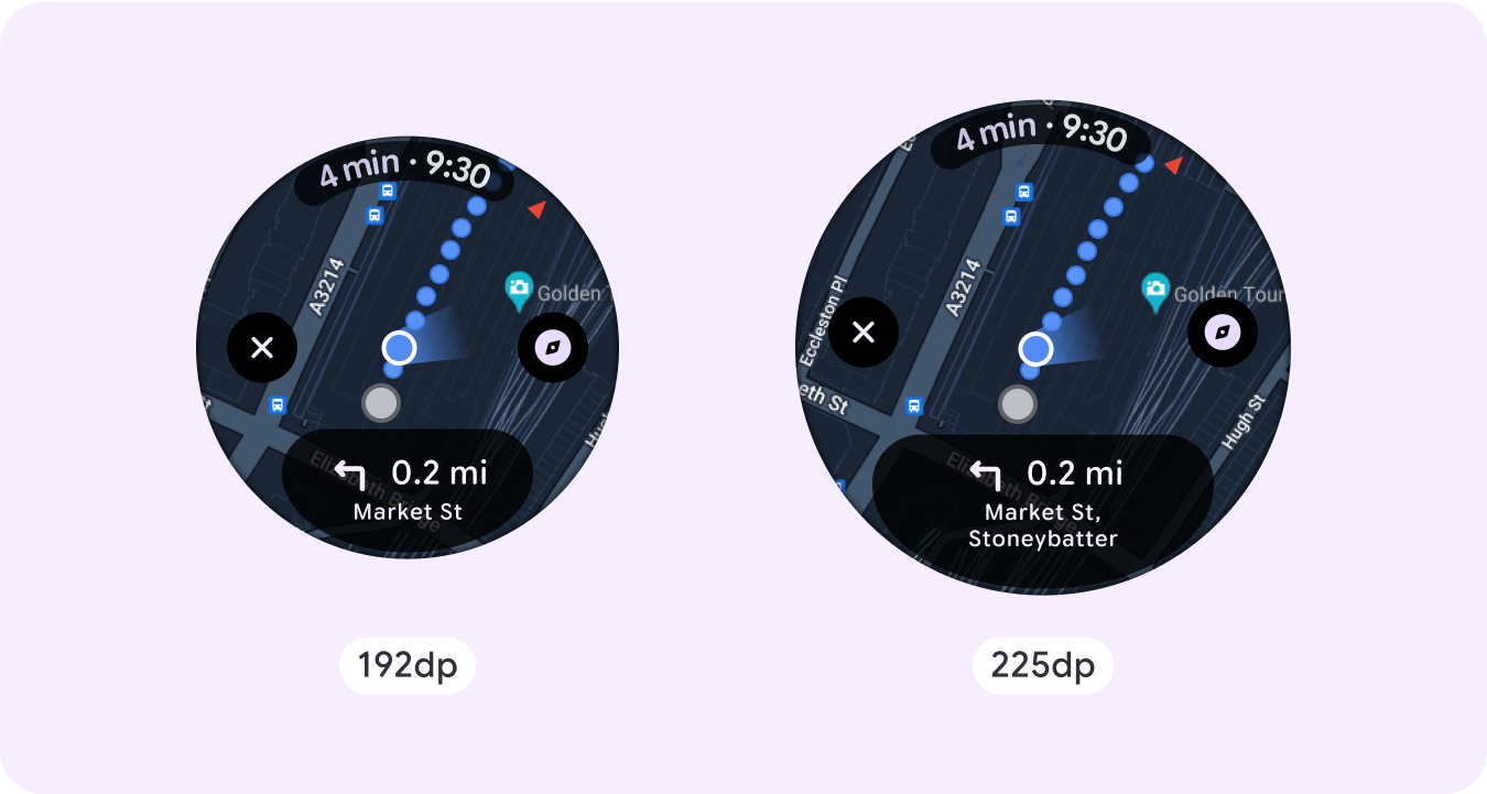
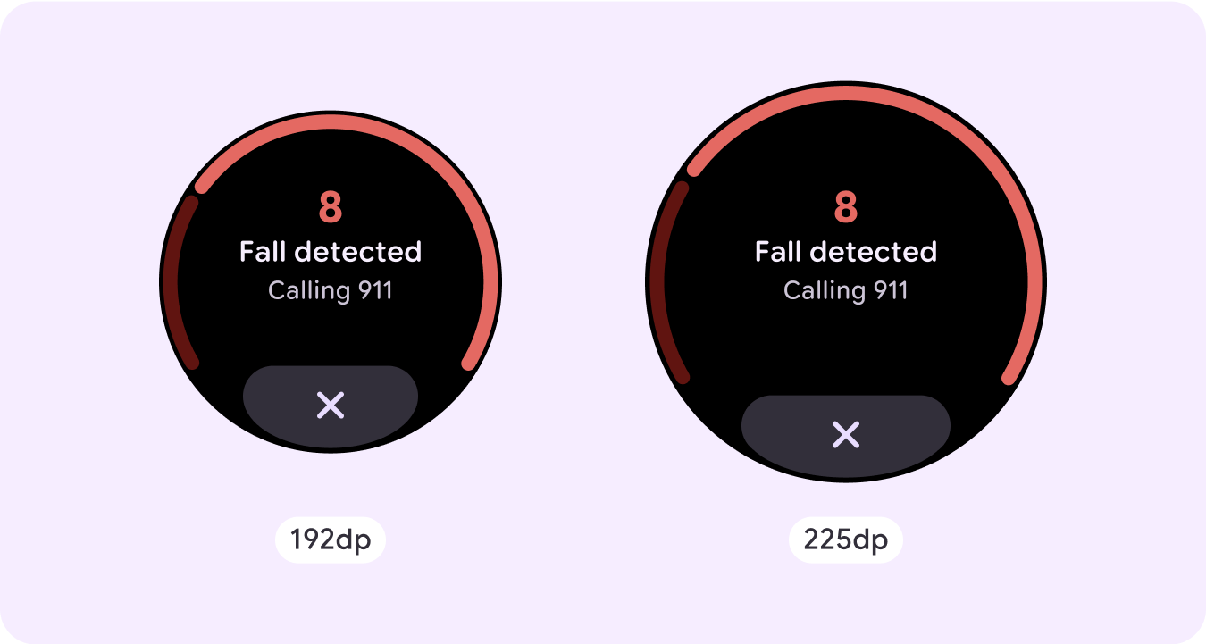
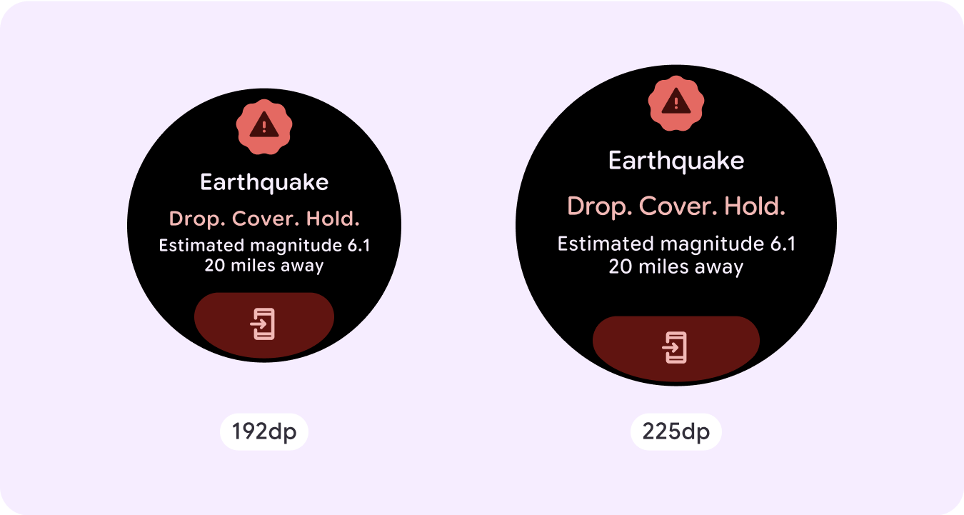
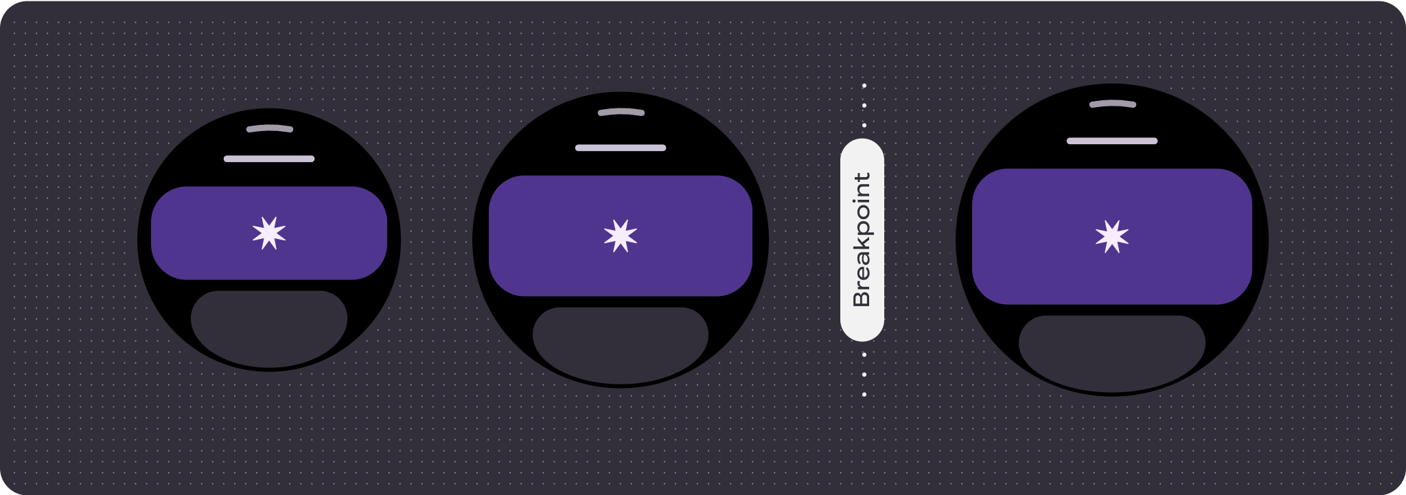
برای استفاده از فضای صفحه نمایش در دسترس، باید به فضای محدود روی صفحه غیر پیمایشی و استفاده از حاشیههای پاسخگو (درصد) و بالشتک توجه داشته باشید. همچنین میتوانید برای معرفی محتوای اضافی یا نمایش بیشتر محتوای موجود در اندازههای صفحه نمایش بزرگتر، یک نقطه شکست در 225dp اعمال کنید.
نقشه ها
پوشش اضطراری
هشدار اضطراری
رفتار پاسخگو و سازگار
همه مؤلفههای موجود در کتابخانه Compose بهطور خودکار با اندازه گستردهتر صفحه سازگار میشوند و عرض و ارتفاع را افزایش میدهند. به طور خاص برای این دیدگاه ها، استفاده از نقاط شکست می تواند تجربه غنی و ارزشمندی را برای همه کاربران ارائه دهد.
برای بسیاری از دکمهها، کارتها و حاشیههای رابط کاربری خود، فضا را برای اندازههای مختلف صفحه پر کنید تا از فضای موجود در رابط کاربری استفاده کنید و همچنین یک چیدمان متعادل ایجاد کنید.
از چک لیست زیر برای بررسی اینکه پارامترهای پاسخگو به درستی تعریف شده اند استفاده کنید:
طرح بندی های انعطاف پذیری ایجاد کنید که در همه اندازه های صفحه نمایش معقول به نظر می رسند.
حاشیه های بالا، پایین و کناری توصیه شده را اعمال کنید.
حاشیه ها را در مقادیر درصد در مکان هایی که ممکن است محتوا بریده شود، تعریف کنید.
از محدودیت های چیدمان استفاده کنید تا عناصر به بهترین شکل ممکن از فضای داخل صفحه استفاده کنند و تعادل را در اندازه های مختلف دستگاه حفظ کنند.
در صورت استفاده ، متن زمان را در نظر بگیرید، اما قسمت بالای صفحه را با هم تداخل ندهید.
برای استفاده بیشتر از فضای محدود، از دکمه های در آغوش گرفتن لبه استفاده کنید.
استفاده از نقطه شکست در 225dp را در نظر بگیرید تا محتوای اضافی را معرفی کنید یا محتوای موجود را در اندازههای صفحه بزرگتر قابل مشاهدهتر کنید.
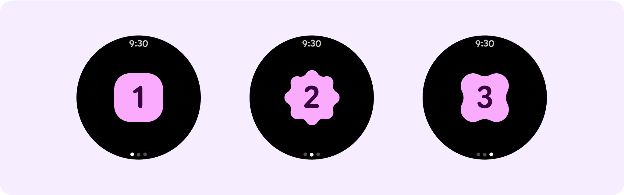
سفرهای متعدد صفحه بدون پیمایش با استفاده از صفحه بندی
در سناریوهایی که یک تجربه به محتوای بیشتری نیاز دارد اما میخواهد یک طرحبندی بدون پیمایش را حفظ کند، طرحبندی چند صفحهای را با صفحهبندی عمودی یا افقی در نظر بگیرید.
محتوا و نمونه کدها در این صفحه مشمول پروانههای توصیفشده در پروانه محتوا هستند. جاوا و OpenJDK علامتهای تجاری یا علامتهای تجاری ثبتشده Oracle و/یا وابستههای آن هستند.
تاریخ آخرین بهروزرسانی 2025-08-25 بهوقت ساعت هماهنگ جهانی.
[null,null,["تاریخ آخرین بهروزرسانی 2025-08-25 بهوقت ساعت هماهنگ جهانی."],[],[],null,["# Non-scrolling app layouts\n\nNon-scrolling views focus on glanceable information and offer users value with\nlittle or no interaction. Because of that, it can be challenging to build\nresponsive behavior into these layouts.\n\nPreset non-scrolling layout components\n--------------------------------------\n\n### Dialog\n\nA dialog is a transient overlay that occupies the whole screen. It lets users\nperform a single action. \n\n\u003cbr /\u003e\n\n\nConsider the following points:\n\n\u003cbr /\u003e\n\n- Dialogs focus your attention to verify their content is addressed.\n- Dialogs should be direct in communicating information and dedicated to completing a task.\n- Dialogs should appear in response to a user task or an action, with relevant or contextual information. \n\n\u003cbr /\u003e\n\n### Confirmation overlay\n\nThe confirmation overlay displays a confirmation message to the user for a short\nperiod. Use this component to capture the user's attention after an action has\nbeen executed.\n\n\u003cbr /\u003e\n\n### Open on phone\n\nThe open on phone overlay is triggered when the user chooses to continue their\njourney on a phone. The overlay has a progress indicator and tells the user when\nto check their phone.\n\n\u003cbr /\u003e\n\n### Stepper\n\nSteppers provide a full-screen control experience that let users make a\nselection from a range of values. They can control the interaction using the\nbuttons or crown, and the specific level is shown using a curved level\nindicator.\n\n\u003cbr /\u003e\n\n### Time picker\n\nPickers let users choose among a finite number of items in scrollable sections.\nThe **Time Picker** has up to three columns, depending on whether seconds are\navailable or if the clock is a 12-hour or 24-hour clock. Users interact with\neach column at a time, making your selection by leaving the number in focus\nbefore continuing.\n\n\u003cbr /\u003e\n\n### Date picker\n\nPickers let users choose among a finite number of items in scrollable sections.\nThe **Date Picker** has up to three columns, which have an interchangeable order\nbetween date, time, and year, depending on the use case.\n**Date Pickers** require longer strings of content, so only one column is in\nview at a time, giving a hint of what's to the left or right. Users interact\nwith each column at a time, making their selection by leaving the number in\nfocus before continuing.\n\n\u003cbr /\u003e\n\nCustom non-scrolling layout examples\n------------------------------------\n\nNon-scrolling app screens are not limited to the set components. You can combine\na combination of elements to create the layout you want.\n\nYou should be mindful of the limited space on a non-scrolling screen and the use\nof responsive (percentage) margins and padding to use the available screen\nspace. You can also consider applying a breakpoint at 225dp to introduce\nadditional content or make existing content more glanceable when on bigger\nscreen sizes. \n\n### Maps\n\n\u003cbr /\u003e\n\n### Emergency overlay\n\n\u003cbr /\u003e\n\n### Emergency alert\n\n\u003cbr /\u003e\n\nResponsive and adaptive behavior\n--------------------------------\n\nAll components in the Compose library automatically adapt to the wider screen\nsize and gain width and height. For these views in particular, utilizing\nbreakpoints can deliver a particularly rich and valuable experience for all\nusers.\n\nFor many of your UI's buttons, cards, and margins, stretch and fill the space\nfor different screen sizes to take advantage of the available space on the UI\nand also make for a well-balanced layout.\n\nUse the following checklist to verify that responsive parameters are properly\ndefined:\n\n- Create flexible layouts that look reasonable on all screen sizes.\n- Apply the recommended top, bottom, and side margins.\n- Define margins in percentage values in places where content might otherwise be clipped.\n- Utilize layout constraints so that elements make the best possible use of the space within the screen and maintain balance across different device sizes.\n- Accommodate **Time Text** if used, but don't overlap the top section of the page.\n- Consider using edge-hugging buttons to utilize more of the limited space.\n- Consider applying a breakpoint at 225dp to introduce additional content or make existing content more glanceable when on bigger screen sizes.\n\n| **Caution:** A display size shouldn't display less information than ones that are smaller than it. This is especially relevant for custom behaviors added at the breakpoint. A common example of this is when components or text sizes are increased past the breakpoint and end up showing less on the larger screens. Screens should show more value, not less, with increasing size.\n\nMultiple non-scrolling page journeys using pagination\n-----------------------------------------------------\n\nIn scenarios where an experience requires more content but wants to retain a\nnon-scrolling layout, consider a multi-page layout with either vertical or\nhorizontal pagination."]]