Wear OS makes it easy for users to engage with apps optimized for a watch. Ensure that content is displayed on the appropriate surface.
App surfaces on Wear OS are designed with jobs in mind. For example, if you have a single unit of information that users are likely to want to glance at multiple times a day, consider providing a complication. If your content is high-value and highly contextual, consider a notification instead.
Another useful way to design app content intuitively on Wear OS is to consider the priority of information across surfaces, elevating the most valuable content to Wear OS’s glanceable surfaces.
Display the highest-priority content in complications and notifications, and then use the larger space on tiles and your app to display more content appropriately.
The following sections cover each of these surfaces in more detail.
App
An app is a focused view that can serve a complex or less-common task or a cluster of tasks. An app is immersive, and it's similar to a mobile app's main user interface (UI), though there are some differences.
Other surfaces (tiles, complications, and notifications) can link into an app to let users carry out more complex tasks.
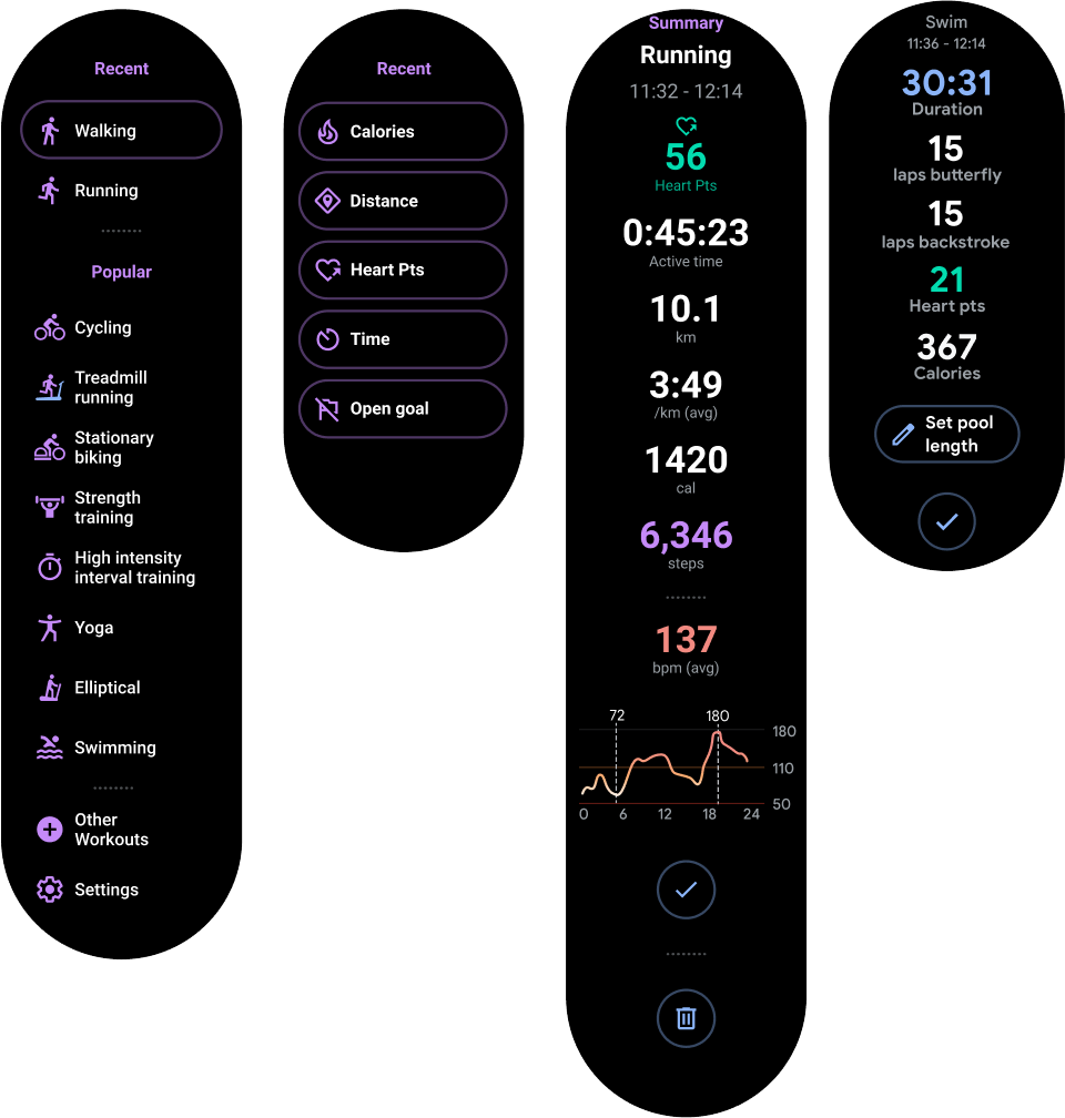
Figure 1. You can use an app to start a workout, browse a playlist, send a message, or review workout data.
Tiles
Tiles provide quick, predictable access to information and actions to solve user needs.
While apps can be immersive, tiles are fast-loading and focus on the user's immediate needs. If users want more information, they can tap tiles to open an app on the watch.
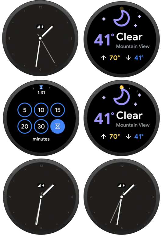
Figure 2. Use tiles to track the user’s daily activity progress, quick-start a workout, start a recently played song, or send a message to a favorite contact.
Notifications
A notification provides glanceable, time-sensitive information and actions for the user. Notifications on Wear OS are similar to mobile notifications.
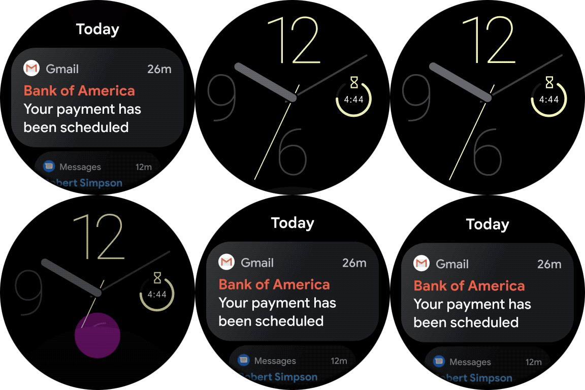
Figure 4. Use a notification to show a new message or email, track a workout after the user has left the app, or show information on the current song playing.
App launcher entries
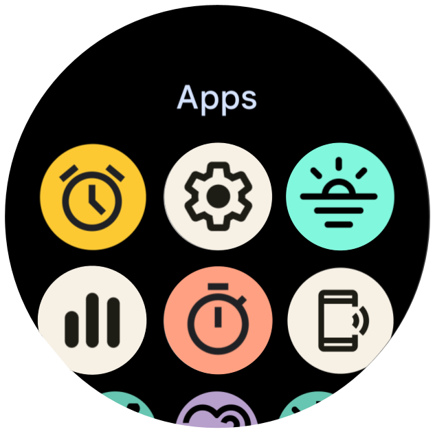
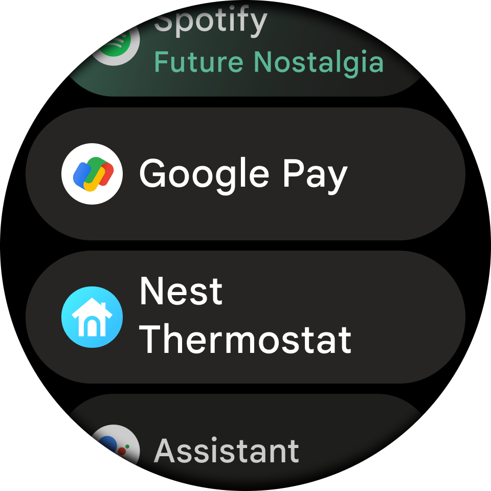
App launcher entries help users start and return to experiences on their watch. Tapping a shortcut launches an app.
Devices support at least one of the following app launcher experiences:
- Grid view: The icons appear next to each other both vertically and horizontally, as shown in figure 5. Available on all devices that run Wear OS 5 and higher, and on some devices that run previous versions of Wear OS.
- List view: The icons appear next to each other vertically, as shown in figure 6. Available on almost all devices that run Wear OS, and on all devices that don't support the grid view.
If a device supports both types of views, switch between the two using system settings.
Watch faces
Watch faces are dynamic, digital canvases where users can express their style. Most apps don't need to create a custom watch face. However, if creating a watch face makes sense for your app, Wear OS lets you customize the surface as much as you want.
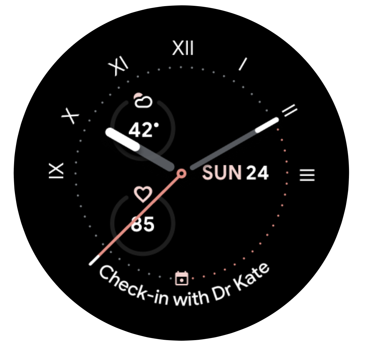
Figure 7. Use a custom watch face to show a customized analog timepiece or a customized digital timepiece that displays complications.
Complications
A complication is a single, often-repeated action or a highly glanceable unit of information on the watch face. As with tiles, users can tap complications to open an app on the watch for a deeper experience.
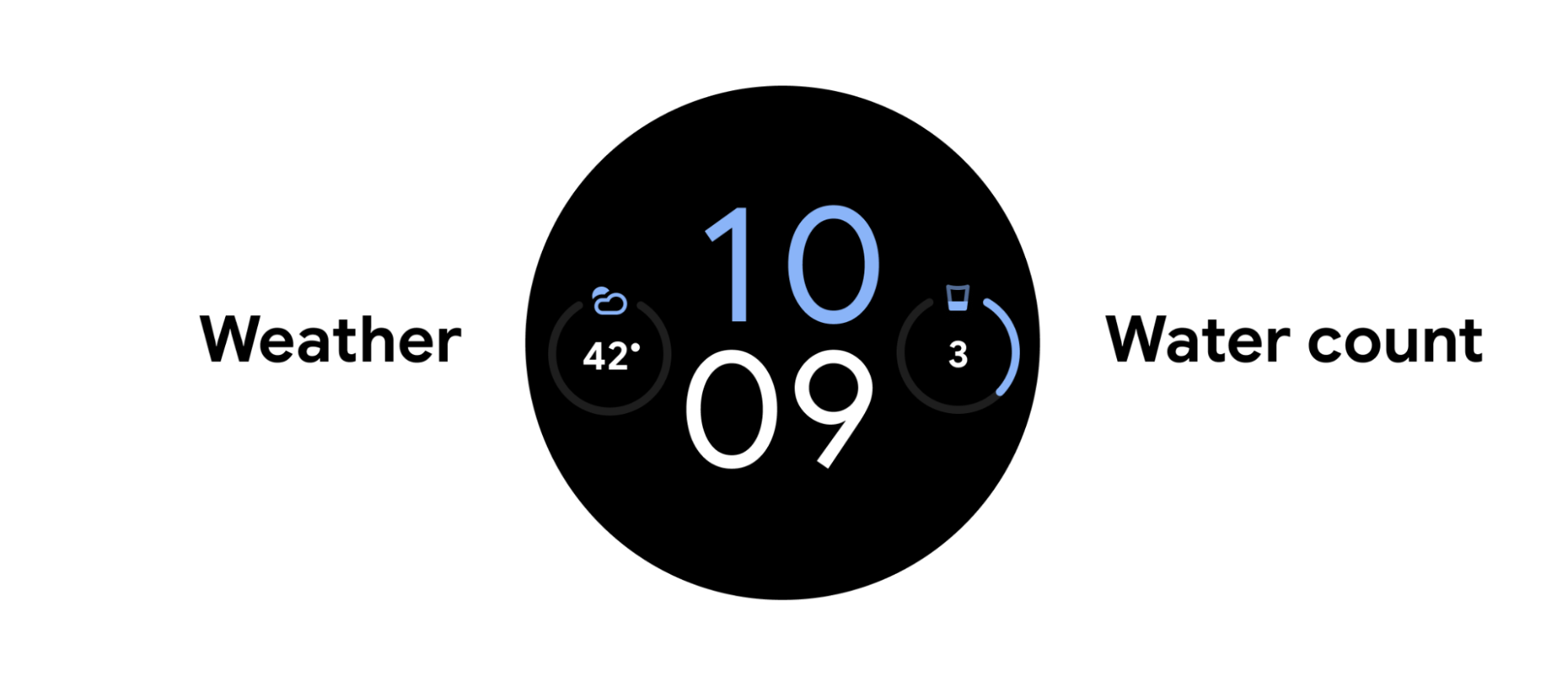
Figure 3. Use complications to track the date, the user's water intake or steps, or the current weather.
