تركّز طرق العرض غير القابلة للتمرير على المعلومات التي يمكن الاطّلاع عليها بسرعة، وتوفّر للمستخدمين قيمة من خلال تفاعل بسيط أو بدون أي تفاعل. لهذا السبب، قد يكون من الصعب إنشاء سلوك متجاوب في هذه التنسيقات.
مكوّنات التنسيق الثابتة غير القابلة للتمرير
مربّع حوار
مربّع الحوار هو تراكب مؤقت يشغل الشاشة بأكملها. ويتيح للمستخدمين تنفيذ إجراء واحد.
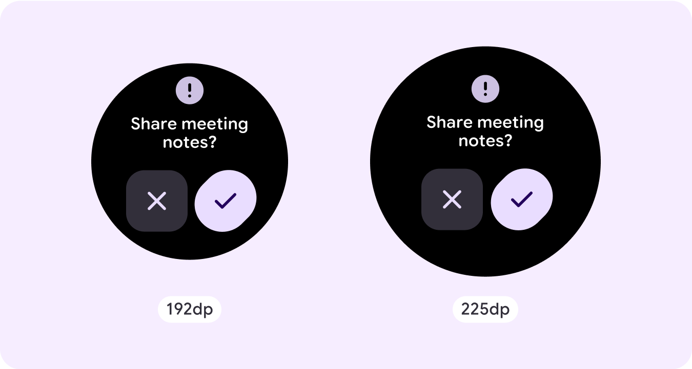
- تساعدك مربّعات الحوار في التركيز على التحقّق من معالجة محتواها.
- يجب أن تكون مربّعات الحوار مباشرة في نقل المعلومات ومخصّصة لإكمال مهمة.
- يجب أن تظهر مربّعات الحوار استجابةً لمهمة أو إجراء يتخذه المستخدم، مع عرض معلومات ذات صلة أو معلومات سياقية.
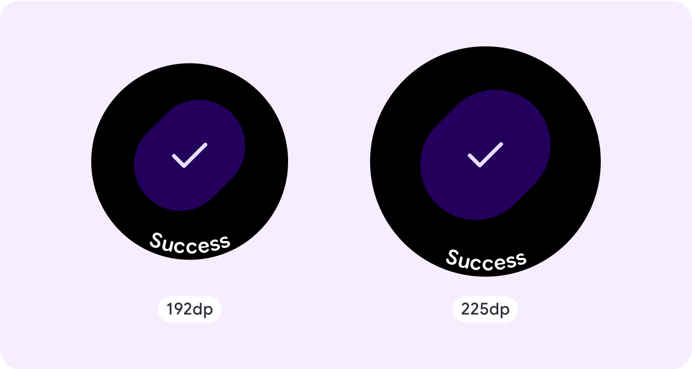
تراكب التأكيد
تعرض طبقة التأكيد رسالة تأكيد للمستخدم لفترة قصيرة. استخدِم هذا المكوّن لجذب انتباه المستخدم بعد تنفيذ إجراء.
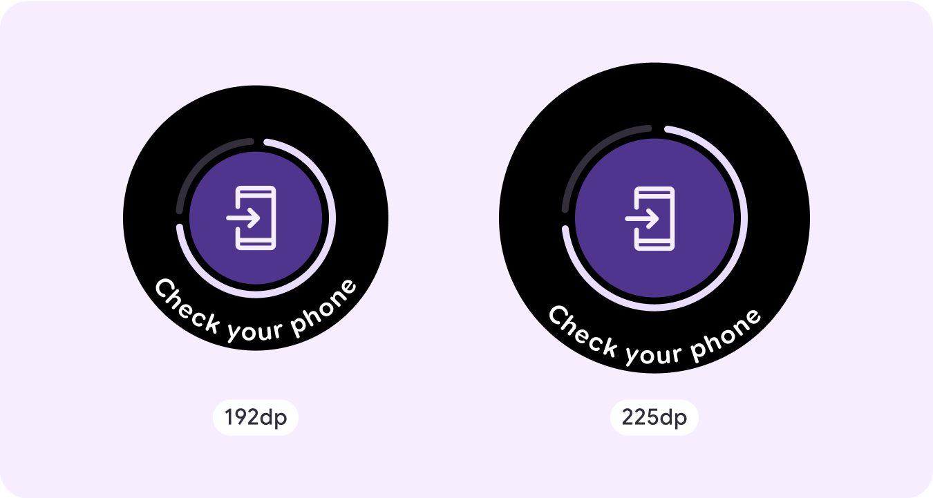
فتح على الهاتف
يتم تشغيل التراكب "فتح على الهاتف" عندما يختار المستخدم مواصلة رحلته على الهاتف. يتضمّن التراكب مؤشرًا للتقدّم ويُعلم المستخدم بموعد التحقّق من هاتفه.
Stepper
توفّر أدوات التحكّم في الخطوات تجربة تحكّم بملء الشاشة تتيح للمستخدمين إجراء اختيار من نطاق من القيم. ويمكنهم التحكّم في التفاعل باستخدام الأزرار أو التاج، ويتم عرض المستوى المحدّد باستخدام مؤشر مستوى منحني.
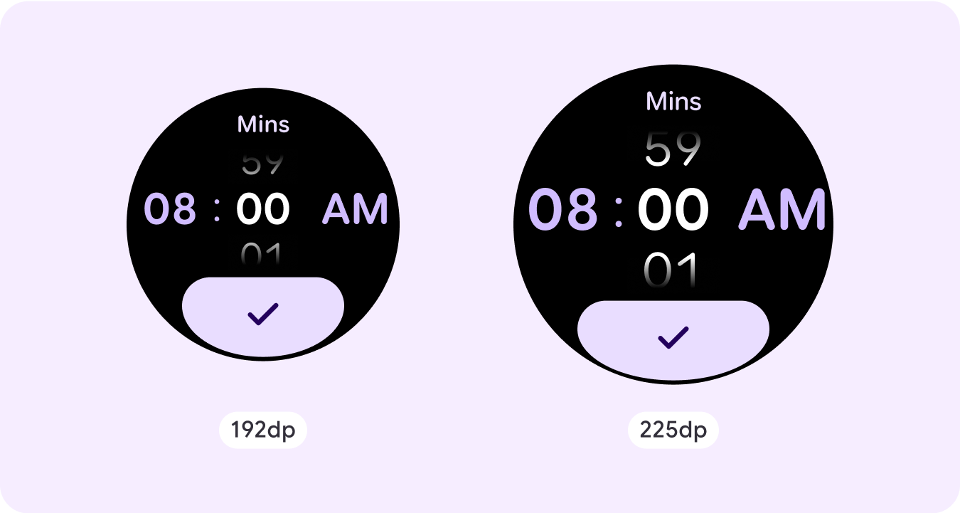
منتقى الوقت
تتيح أدوات الاختيار للمستخدمين الاختيار من بين عدد محدود من العناصر في أقسام قابلة للتمرير. يحتوي أداة اختيار الوقت على ثلاثة أعمدة كحد أقصى، وذلك حسب ما إذا كانت الثواني متاحة أو إذا كان تنسيق الوقت 12 ساعة أو 24 ساعة. يتفاعل المستخدمون مع كل عمود على حدة، ويتم الاختيار من خلال ترك الرقم في التركيز قبل المتابعة.
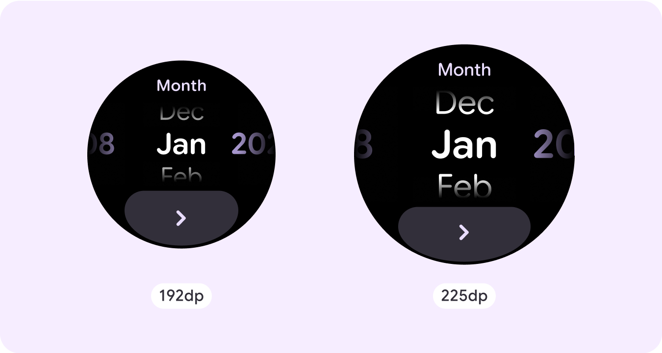
منتقى التاريخ
تتيح أدوات الاختيار للمستخدمين الاختيار من بين عدد محدود من العناصر في أقسام قابلة للتمرير. يحتوي منتقي التاريخ على ما يصل إلى ثلاثة أعمدة، ويمكن تبديل ترتيبها بين التاريخ والوقت والسنة، وذلك حسب حالة الاستخدام. تتطلّب أدوات اختيار التاريخ سلاسل أطول من المحتوى، لذا لا يظهر سوى عمود واحد في كل مرة، ما يقدّم تلميحًا بشأن ما يقع على اليمين أو اليسار. يتفاعل المستخدمون مع كل عمود على حدة، ويختارون الرقم المطلوب من خلال إبقائه في التركيز قبل المتابعة.
أمثلة على التنسيقات المخصّصة غير القابلة للتمرير
لا تقتصر شاشات التطبيقات غير القابلة للتمرير على المكوّنات المحدّدة. يمكنك الجمع بين مجموعة من العناصر لإنشاء التنسيق الذي تريده.
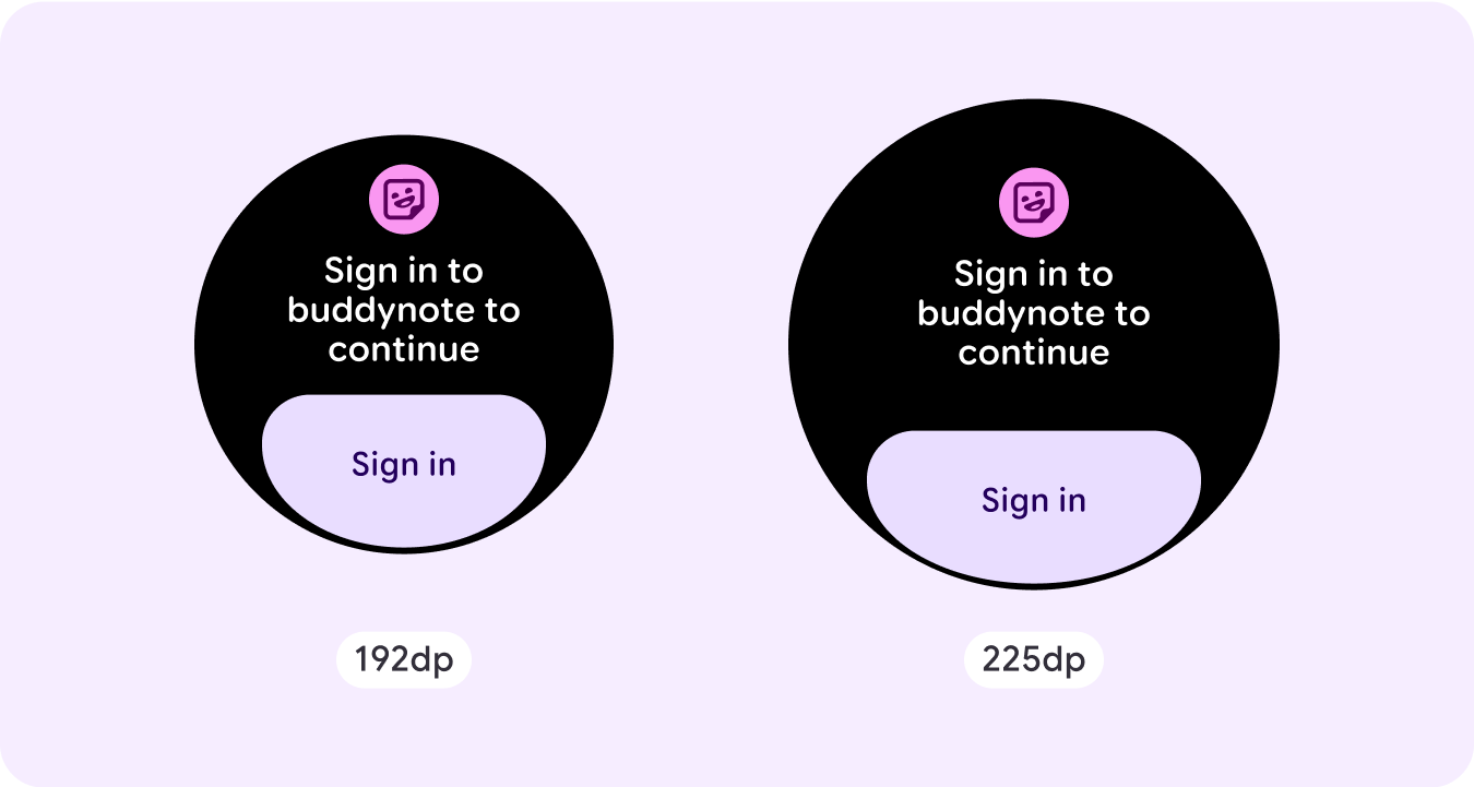
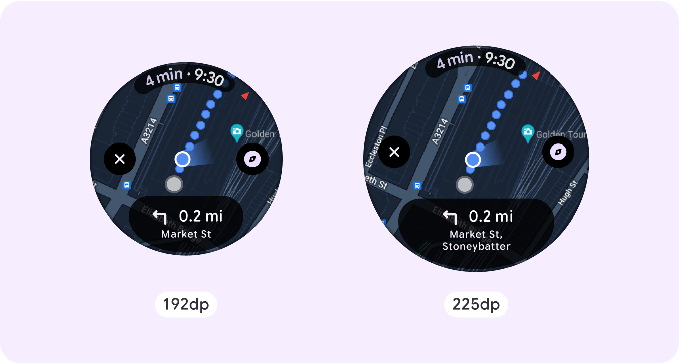
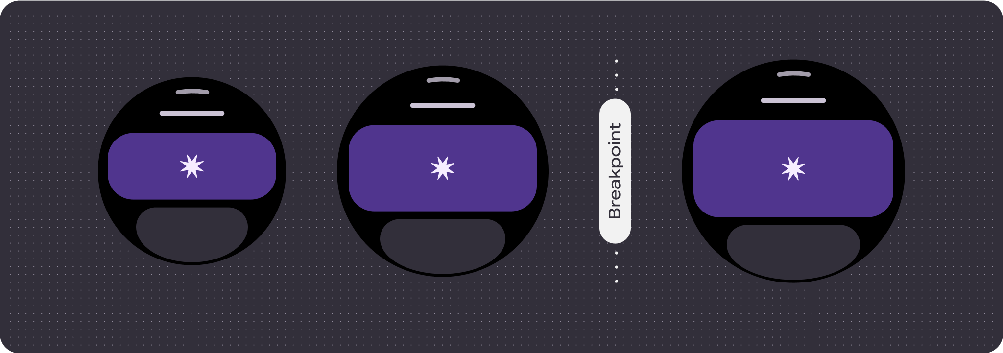
يجب الانتباه إلى المساحة المحدودة على الشاشة غير القابلة للتمرير واستخدام الهوامش والحشو المتجاوبَين (النسبة المئوية) للاستفادة من مساحة الشاشة المتاحة. يمكنك أيضًا التفكير في تطبيق نقطة توقّف عند 225 وحدة بكسل مستقلة عن الكثافة لعرض محتوى إضافي أو جعل المحتوى الحالي أسهل في التصفّح على أحجام الشاشات الأكبر.
Maps
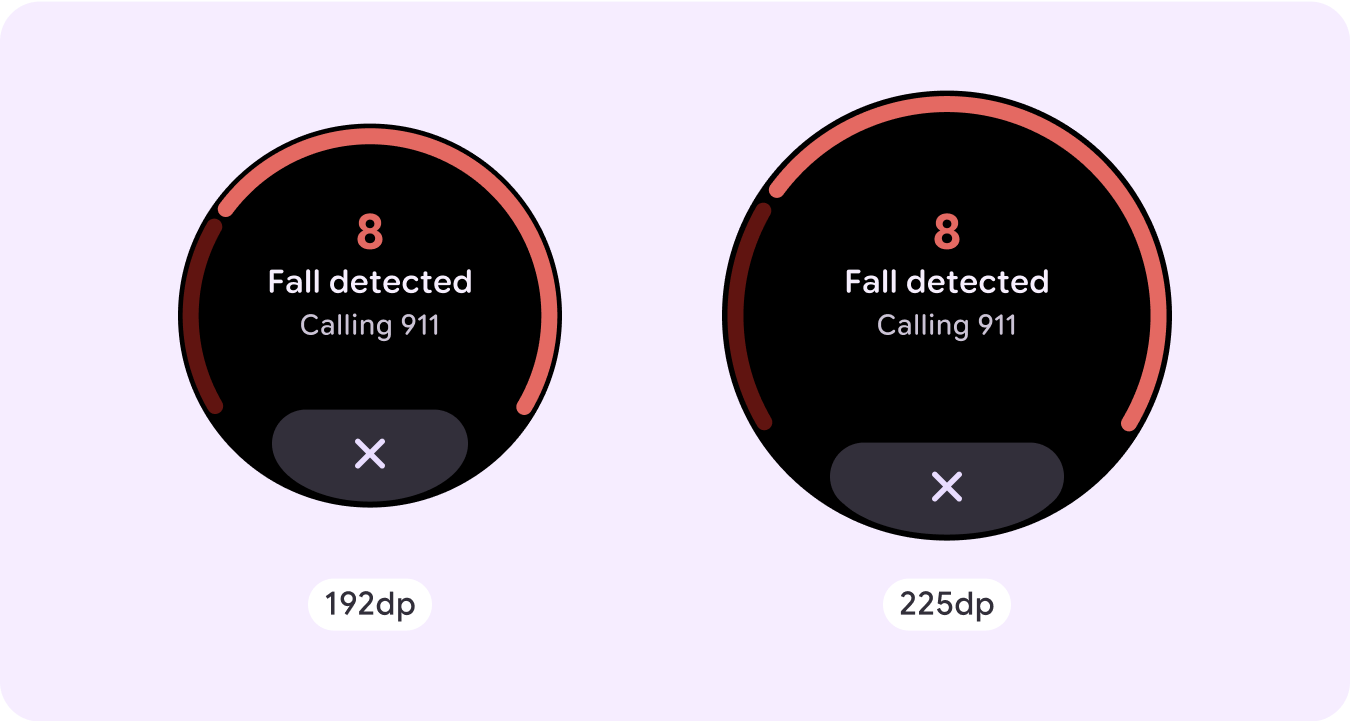
تراكب الطوارئ
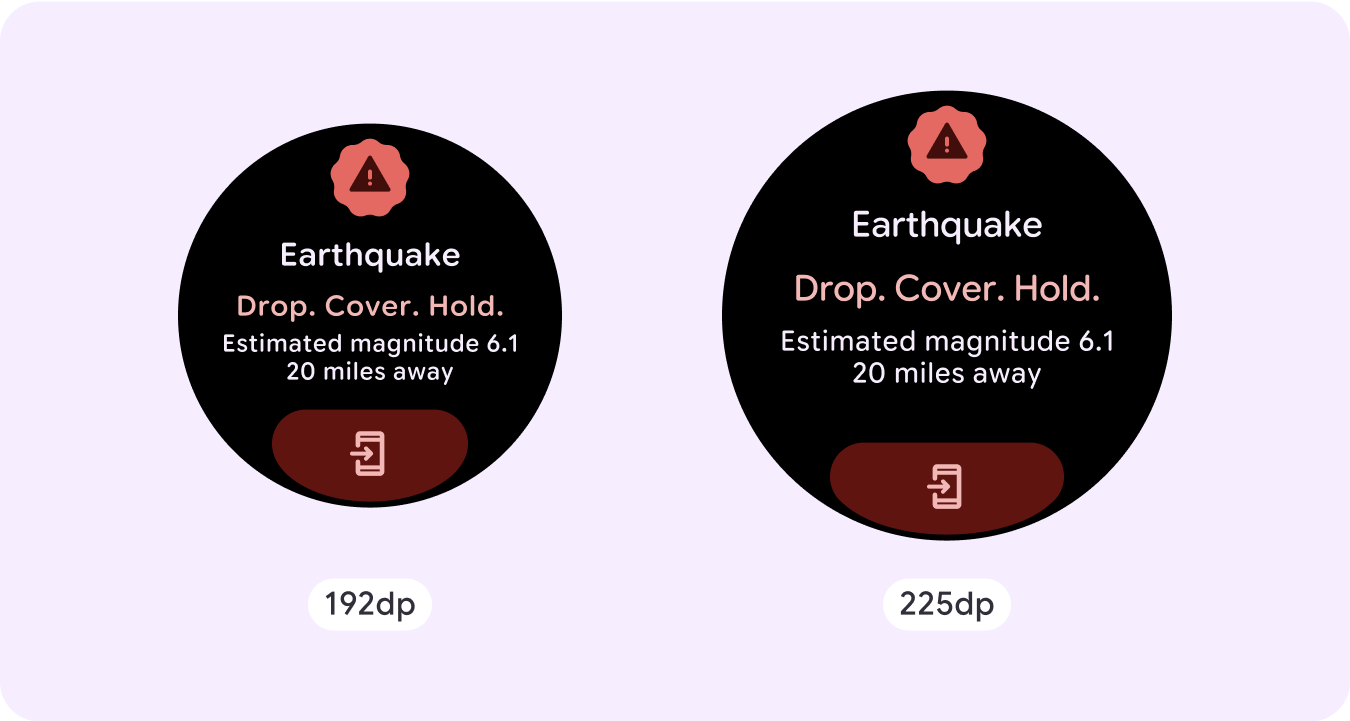
تنبيه طوارئ
السلوك المتجاوب والتكيّفي
تتكيّف جميع المكوّنات في مكتبة Compose تلقائيًا مع حجم الشاشة الأكبر، وتزداد مساحتها عرضًا وارتفاعًا. بالنسبة إلى طرق العرض هذه تحديدًا، يمكن أن يؤدي استخدام نقاط التوقف إلى توفير تجربة غنية ومفيدة لجميع المستخدمين.
بالنسبة إلى العديد من الأزرار والبطاقات والهوامش في واجهة المستخدم، يمكنك توسيعها وملء المساحة المتاحة بأحجام شاشات مختلفة للاستفادة من المساحة المتاحة على واجهة المستخدم، بالإضافة إلى إنشاء تخطيط متوازن.
استخدِم قائمة التحقّق التالية للتأكّد من تحديد المَعلمات المتجاوبة بشكل صحيح:
- إنشاء تخطيطات مرنة تبدو مناسبة على جميع أحجام الشاشات
- طبِّق الهوامش المقترَحة في الأعلى والأسفل والجانبَين.
- حدِّد الهوامش كقيم نسبية في الأماكن التي قد يتم فيها اقتصاص المحتوى.
- استخدِم قيود التنسيق لكي تستفيد العناصر إلى أقصى حد ممكن من المساحة المتاحة على الشاشة وتحافظ على التوازن بين أحجام الأجهزة المختلفة.
- يجب توفير مساحة للنص الزمني إذا تم استخدامه، ولكن بدون التداخل مع القسم العلوي من الصفحة.
- ننصحك باستخدام أزرار على الحواف للاستفادة من المساحة المحدودة بشكل أكبر.
- ننصحك بتطبيق نقطة توقّف عند 225 وحدة بكسل مستقلة عن الكثافة لعرض محتوى إضافي أو تسهيل إلقاء نظرة سريعة على المحتوى الحالي عند استخدام أحجام شاشات أكبر.
رحلات صفحات متعدّدة لا تتضمّن تمريرًا باستخدام تقسيم الصفحات
في الحالات التي تتطلّب فيها التجربة المزيد من المحتوى ولكن مع الحفاظ على تخطيط لا يتضمّن التمرير، ننصحك باستخدام تخطيط متعدّد الصفحات مع تقسيم إلى صفحات عمودية أو أفقية.