
รูปแบบเลย์เอาต์ของการเขียนช่วยให้คุณใช้ AlignmentLine เพื่อสร้างแบบกำหนดเองได้
จัดตำแหน่งเส้นที่เลย์เอาต์ระดับบนสุดสามารถใช้เพื่อจัดตำแหน่งและวาง
ตัวอย่างเช่น
Row
สามารถใช้บรรทัดการจัดข้อความที่กำหนดเองของบุตรหลานเพื่อจัดแนวข้อความ
เมื่อเลย์เอาต์มีค่าสำหรับ AlignmentLine ที่เจาะจง องค์ประกอบ
ผู้ปกครองจะอ่านค่านี้ได้หลังจากวัดผล โดยใช้ Placeable.get
โอเปอเรเตอร์
อินสแตนซ์ Placeable
ผู้ปกครองจะกำหนดตำแหน่งของบุตรหลานตามตำแหน่งของ AlignmentLine ได้
คอมโพสิชันบางอย่างใน Compose มีเส้นจัดตำแหน่งอยู่แล้ว ตัวอย่างเช่น คอมโพสิเบิล BasicText จะแสดงเส้นจัดตำแหน่ง FirstBaseline และ LastBaseline
ในตัวอย่างด้านล่าง LayoutModifier ที่กำหนดเองชื่อว่า
firstBaselineToTop อ่านเครื่องหมาย FirstBaseline เพื่อเพิ่มระยะห่างจากขอบใน Text
โดยเริ่มต้นจากเกณฑ์พื้นฐานแรก
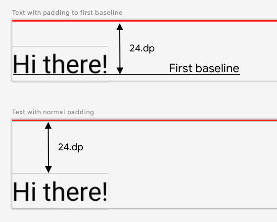
รูปที่ 1 แสดงความแตกต่างระหว่างการเพิ่มระยะห่างจากขอบปกติลงในองค์ประกอบ และการใส่ระยะห่างจากขอบกับเส้นฐานขององค์ประกอบข้อความ
fun Modifier.firstBaselineToTop( firstBaselineToTop: Dp, ) = layout { measurable, constraints -> // Measure the composable val placeable = measurable.measure(constraints) // Check the composable has a first baseline check(placeable[FirstBaseline] != AlignmentLine.Unspecified) val firstBaseline = placeable[FirstBaseline] // Height of the composable with padding - first baseline val placeableY = firstBaselineToTop.roundToPx() - firstBaseline val height = placeable.height + placeableY layout(placeable.width, height) { // Where the composable gets placed placeable.placeRelative(0, placeableY) } } @Preview @Composable private fun TextWithPaddingToBaseline() { MaterialTheme { Text("Hi there!", Modifier.firstBaselineToTop(32.dp)) } }
หากต้องการอ่าน FirstBaseline ในตัวอย่าง
ระบบจะใช้ placeable [FirstBaseline] ในช่วงการวัด
สร้างเส้นการจัดตำแหน่งที่กำหนดเอง
เมื่อสร้างคอมโพสิเบิล Layout ที่กำหนดเองหรือคอมโพสิเบิล LayoutModifier ที่กำหนดเอง คุณสามารถระบุเส้นการจัดตำแหน่งที่กำหนดเองเพื่อให้คอมโพสิเบิลหลักอื่นๆ ใช้เส้นดังกล่าวเพื่อจัดตำแหน่งและวางคอมโพสิเบิลย่อยตามลำดับได้
ตัวอย่างต่อไปนี้แสดงคอมโพสิเบิล BarChart ที่กําหนดเองซึ่งแสดงเส้นการจัดแนว 2 เส้น ได้แก่ MaxChartValue และ MinChartValue เพื่อให้คอมโพสิเบิลอื่นๆ ปรับแนวตามค่าข้อมูลสูงสุดและต่ำสุดของแผนภูมิได้ องค์ประกอบข้อความ 2 รายการ ได้แก่ Max และ Min ได้รับการจัดแนวให้อยู่ตรงกลางของเส้นการจัดแนวที่กำหนดเอง
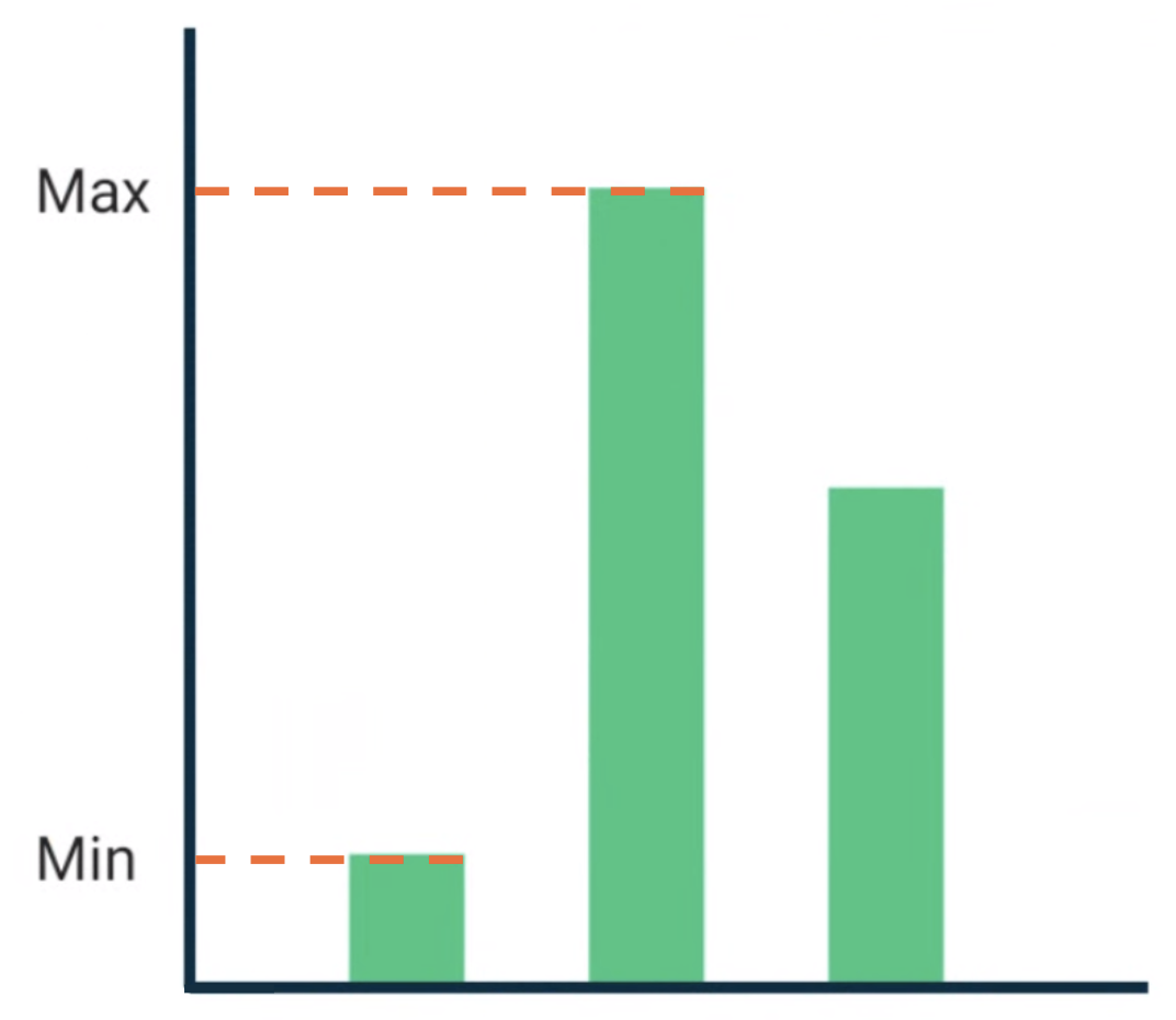
รูปที่ 2 BarChart คอมโพสิเบิลกับข้อความที่สอดคล้องกับค่าข้อมูลสูงสุดและต่ำสุด
บรรทัดการจัดข้อความที่กำหนดเองจะได้รับการกำหนดเป็นตัวแปรระดับบนสุดในโปรเจ็กต์ของคุณ
/** * AlignmentLine defined by the maximum data value in a [BarChart] */ private val MaxChartValue = HorizontalAlignmentLine(merger = { old, new -> min(old, new) }) /** * AlignmentLine defined by the minimum data value in a [BarChart] */ private val MinChartValue = HorizontalAlignmentLine(merger = { old, new -> max(old, new) })
เส้นการจัดตำแหน่งที่กำหนดเองเพื่อสร้างตัวอย่างของเราเป็นประเภท HorizontalAlignmentLine เนื่องจากใช้เพื่อจัดตำแหน่งองค์ประกอบย่อยในแนวตั้ง ระบบจะส่งผ่านนโยบายการผสานเป็นพารามิเตอร์ในกรณีที่เลย์เอาต์หลายรายการระบุค่าสำหรับเส้นการจัดตำแหน่งเหล่านี้ เนื่องจากพิกัดระบบเลย์เอาต์ของ Compose และพิกัด Canvas แสดงถึง [0, 0] มุมซ้ายบนและแกน x และ y จะบวกลง ดังนั้นค่า MaxChartValue จะน้อยกว่า MinChartValue เสมอ ดังนั้น นโยบายการผสานคือ min สำหรับเกณฑ์พื้นฐานค่าข้อมูลแผนภูมิสูงสุด และ max สำหรับเกณฑ์พื้นฐานค่าข้อมูลแผนภูมิต่ำสุด
เมื่อสร้าง Layout หรือ LayoutModifier ที่กำหนดเอง ให้ระบุบรรทัดการจัดตำแหน่งที่กำหนดเองในเมธอด MeasureScope.layout ซึ่งใช้พารามิเตอร์ alignmentLines: Map<AlignmentLine, Int>
@Composable private fun BarChart( dataPoints: List<Int>, modifier: Modifier = Modifier, ) { val maxValue: Float = remember(dataPoints) { dataPoints.maxOrNull()!! * 1.2f } BoxWithConstraints(modifier = modifier) { val density = LocalDensity.current with(density) { // ... // Calculate baselines val maxYBaseline = // ... val minYBaseline = // ... Layout( content = {}, modifier = Modifier.drawBehind { // ... } ) { _, constraints -> with(constraints) { layout( width = if (hasBoundedWidth) maxWidth else minWidth, height = if (hasBoundedHeight) maxHeight else minHeight, // Custom AlignmentLines are set here. These are propagated // to direct and indirect parent composables. alignmentLines = mapOf( MinChartValue to minYBaseline.roundToInt(), MaxChartValue to maxYBaseline.roundToInt() ) ) {} } } } } }
คอมโพสิชันหลักและรองของคอมโพสิชันนี้สามารถใช้การจัดตำแหน่งบรรทัดได้ Composable ต่อไปนี้จะสร้างรูปแบบที่กำหนดเองที่ใช้เป็น
พารามิเตอร์ 2 Text ช่องและจุดข้อมูล และจัดข้อความทั้ง 2 รายการให้อยู่ในแนวเดียวกับ
ค่าสูงสุดและต่ำสุดของข้อมูลแผนภูมิ ตัวอย่างของคอมโพเนนต์นี้คือสิ่งที่แสดงในรูปที่ 2
@Composable private fun BarChartMinMax( dataPoints: List<Int>, maxText: @Composable () -> Unit, minText: @Composable () -> Unit, modifier: Modifier = Modifier, ) { Layout( content = { maxText() minText() // Set a fixed size to make the example easier to follow BarChart(dataPoints, Modifier.size(200.dp)) }, modifier = modifier ) { measurables, constraints -> check(measurables.size == 3) val placeables = measurables.map { it.measure(constraints.copy(minWidth = 0, minHeight = 0)) } val maxTextPlaceable = placeables[0] val minTextPlaceable = placeables[1] val barChartPlaceable = placeables[2] // Obtain the alignment lines from BarChart to position the Text val minValueBaseline = barChartPlaceable[MinChartValue] val maxValueBaseline = barChartPlaceable[MaxChartValue] layout(constraints.maxWidth, constraints.maxHeight) { maxTextPlaceable.placeRelative( x = 0, y = maxValueBaseline - (maxTextPlaceable.height / 2) ) minTextPlaceable.placeRelative( x = 0, y = minValueBaseline - (minTextPlaceable.height / 2) ) barChartPlaceable.placeRelative( x = max(maxTextPlaceable.width, minTextPlaceable.width) + 20, y = 0 ) } } } @Preview @Composable private fun ChartDataPreview() { MaterialTheme { BarChartMinMax( dataPoints = listOf(4, 24, 15), maxText = { Text("Max") }, minText = { Text("Min") }, modifier = Modifier.padding(24.dp) ) } }
แนะนำสำหรับคุณ
- หมายเหตุ: ข้อความลิงก์จะแสดงเมื่อ JavaScript ปิดอยู่
- กราฟิกในการเขียน
- เลย์เอาต์ที่กำหนดเอง {:#custom-layouts }
- การวัดภายในในเลย์เอาต์ของการเขียน