스크롤하지 않는 뷰는 한눈에 볼 수 있는 정보에 초점을 맞추고 상호작용이 거의 또는 전혀 없이 사용자에게 가치를 제공합니다. 따라서 이러한 레이아웃에 반응형 동작을 빌드하기 어려울 수 있습니다.
스크롤되지 않는 레이아웃 구성요소 사전 설정
대화상자
대화상자는 전체 화면을 차지하는 일시적인 오버레이입니다. 사용자가 단일 작업을 실행할 수 있습니다.
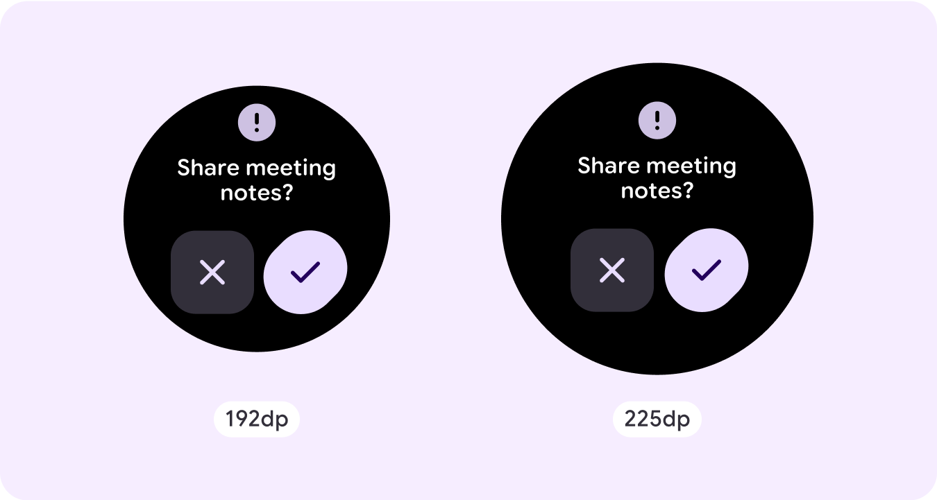
- 대화상자는 콘텐츠가 처리되었는지 확인하도록 주의를 집중시킵니다.
- 대화상자는 정보를 직접 전달하고 작업을 완료하는 데 전념해야 합니다.
- 대화상자는 사용자 작업 또는 동작에 응답하여 관련 정보나 문맥 정보와 함께 표시되어야 합니다.
확인 오버레이
확인 오버레이는 짧은 시간 동안 사용자에게 확인 메시지를 표시합니다. 이 구성요소를 사용하면 작업이 실행된 후 사용자의 관심을 끌 수 있습니다.
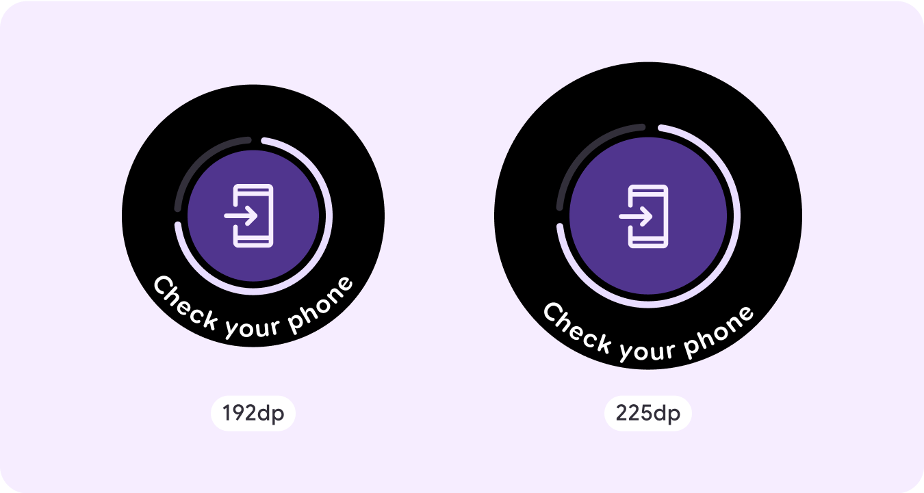
휴대전화에서 열기
사용자가 휴대전화에서 여정을 계속하기로 선택하면 휴대전화에서 열기 오버레이가 트리거됩니다. 오버레이에는 진행률 표시기가 있으며 사용자에게 휴대전화를 확인해야 하는 시점을 알려줍니다.
스테퍼
스테퍼는 사용자가 값 범위에서 선택할 수 있는 전체 화면 제어 환경을 제공합니다. 버튼이나 용두를 사용하여 상호작용을 제어할 수 있으며, 특정 수준은 곡선 수준 표시기를 사용하여 표시됩니다.
시간 선택기
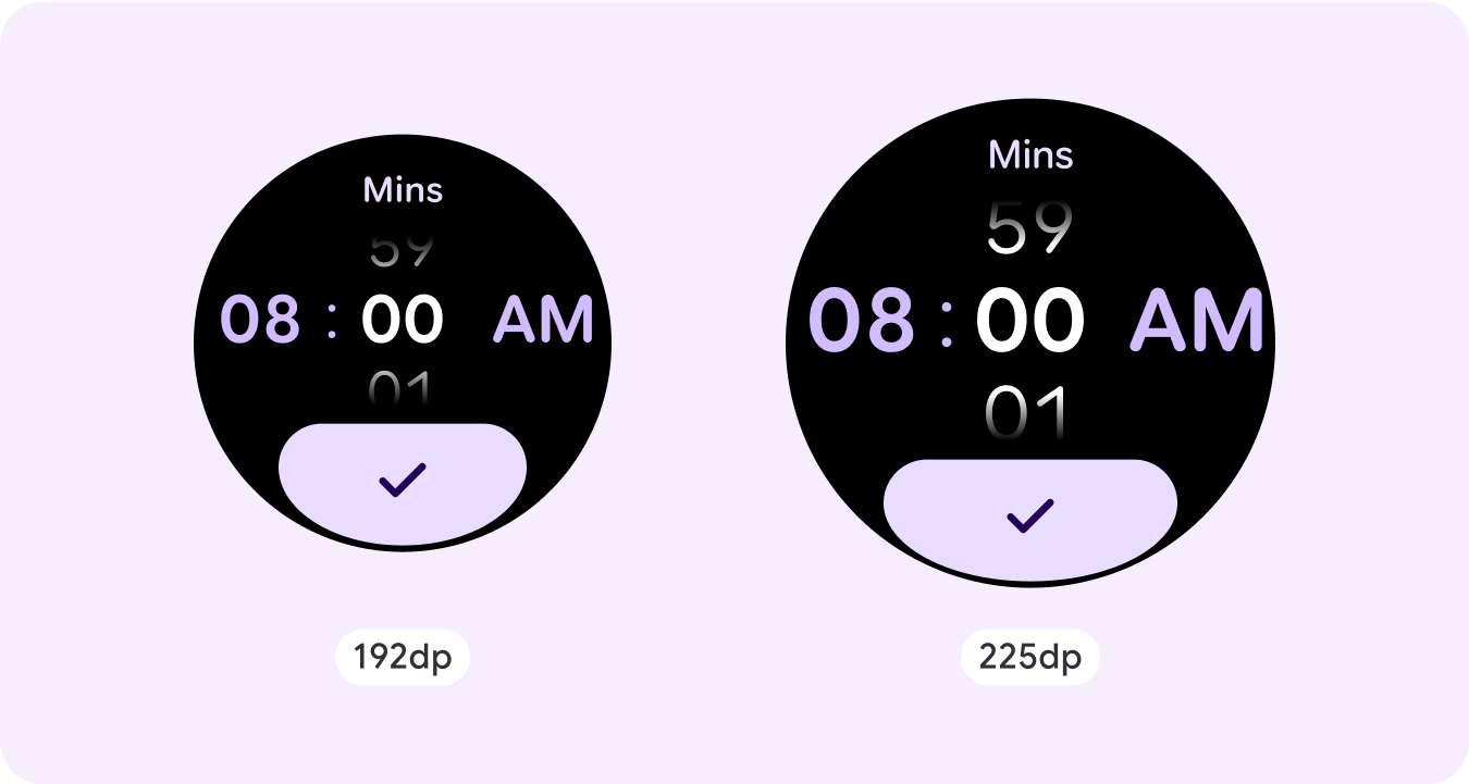
선택 도구를 사용하면 사용자가 스크롤 가능한 섹션에서 제한된 수의 항목 중에서 선택할 수 있습니다. 시간 선택기는 초가 사용 가능한지 또는 시계가 12시간제인지 24시간제인지에 따라 최대 3개의 열이 있습니다. 사용자는 한 번에 하나의 열과 상호작용하며, 계속하기 전에 숫자를 포커스 상태로 유지하여 선택합니다.
날짜 선택 도구
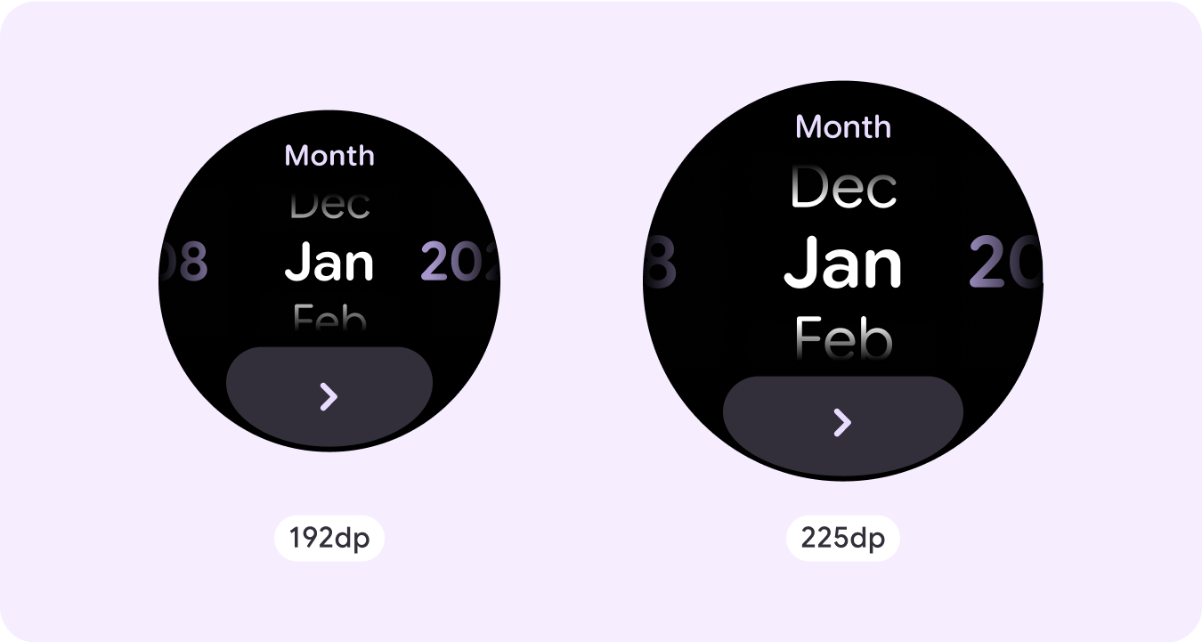
선택 도구를 사용하면 사용자가 스크롤 가능한 섹션에서 제한된 수의 항목 중에서 선택할 수 있습니다. 날짜 선택 도구에는 최대 3개의 열이 있으며, 사용 사례에 따라 날짜, 시간, 연도 간에 순서를 바꿀 수 있습니다. 날짜 선택기에는 더 긴 콘텐츠 문자열이 필요하므로 한 번에 하나의 열만 표시되어 왼쪽이나 오른쪽에 무엇이 있는지 힌트를 제공합니다. 사용자는 한 번에 하나의 열과 상호작용하며, 계속하기 전에 포커스가 있는 숫자를 남겨 선택합니다.
맞춤 비스크롤 레이아웃 예시
스크롤하지 않는 앱 화면은 설정된 구성요소로 제한되지 않습니다. 요소 조합을 결합하여 원하는 레이아웃을 만들 수 있습니다.
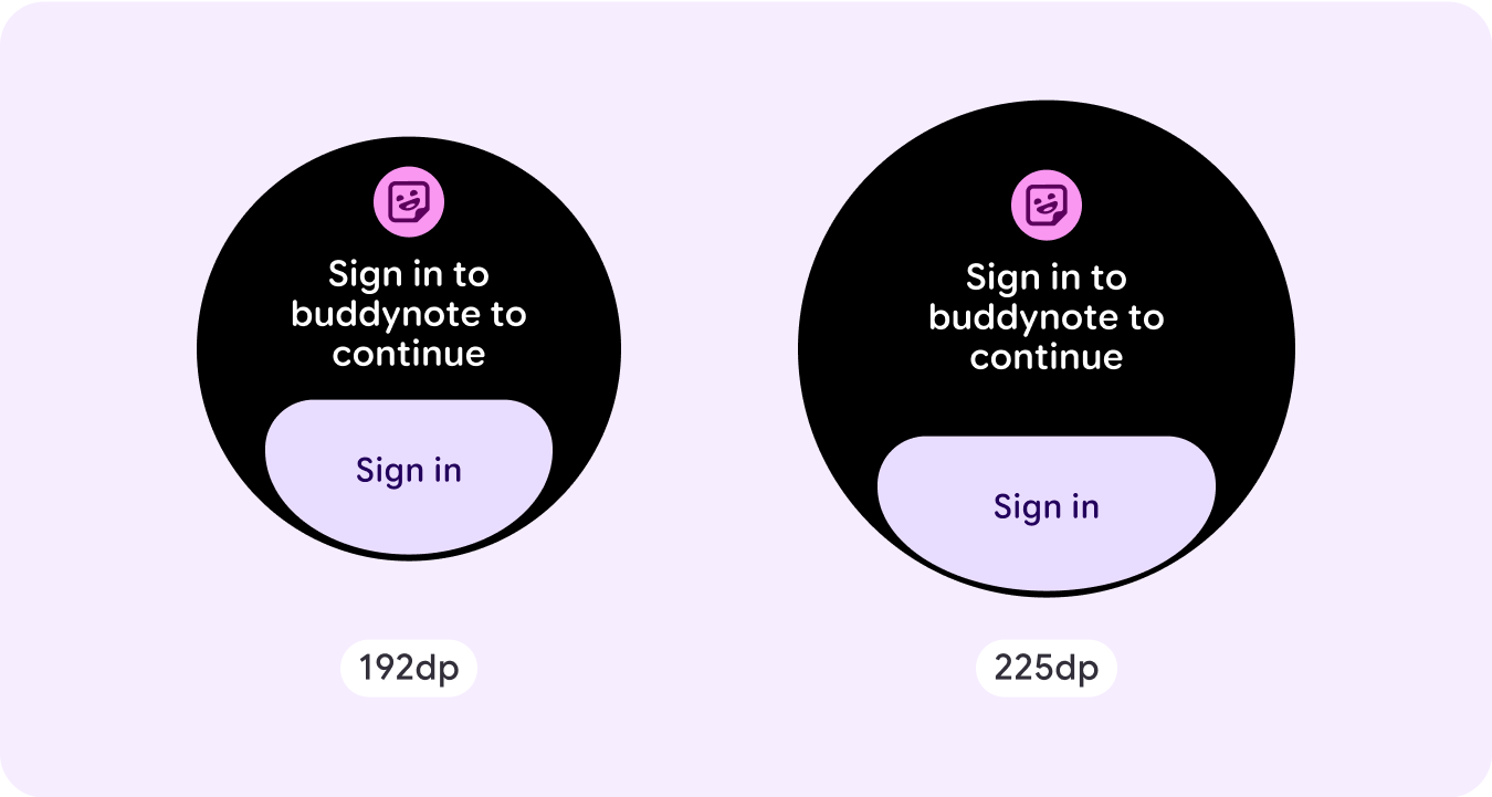
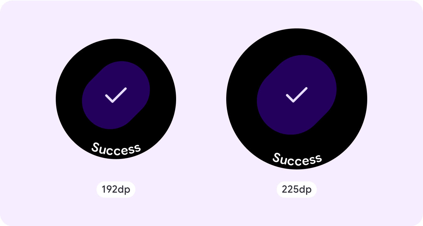
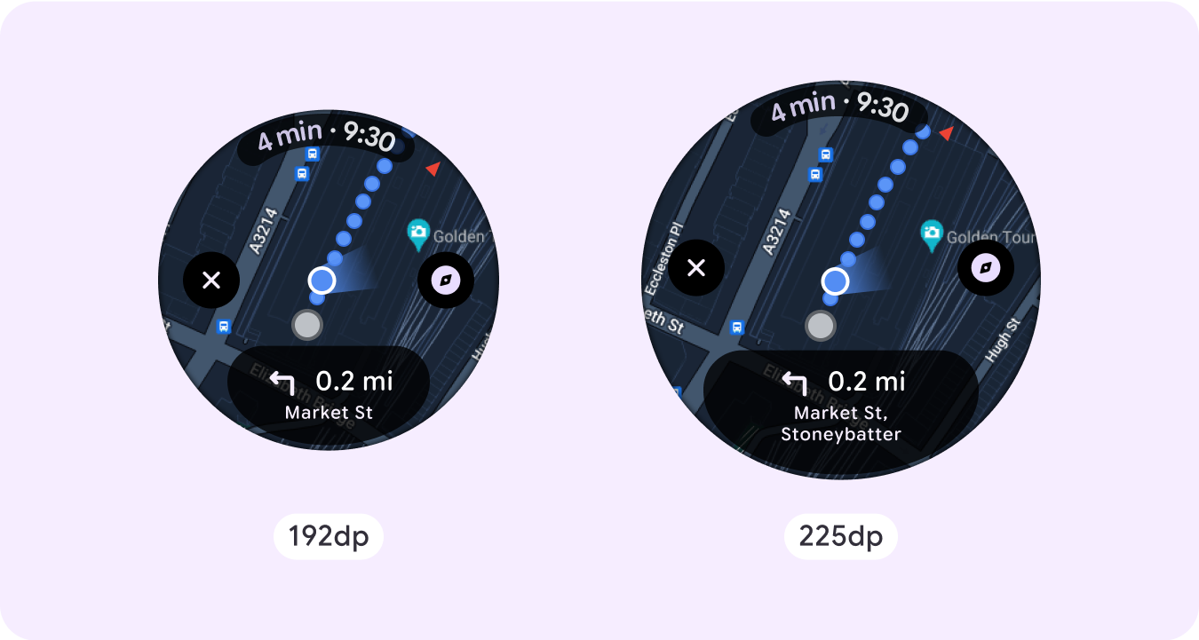
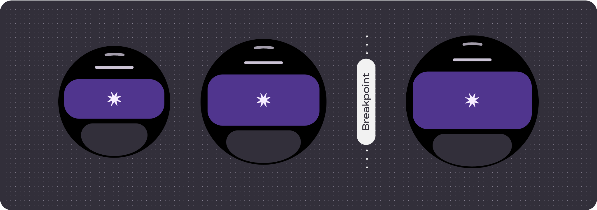
스크롤하지 않는 화면의 제한된 공간과 사용 가능한 화면 공간을 사용하기 위한 반응형 (백분율) 여백 및 패딩 사용에 유의해야 합니다. 더 큰 화면 크기에서 추가 콘텐츠를 도입하거나 기존 콘텐츠를 더 쉽게 살펴볼 수 있도록 225dp에서 중단점을 적용하는 것도 고려해 볼 수 있습니다.
지도
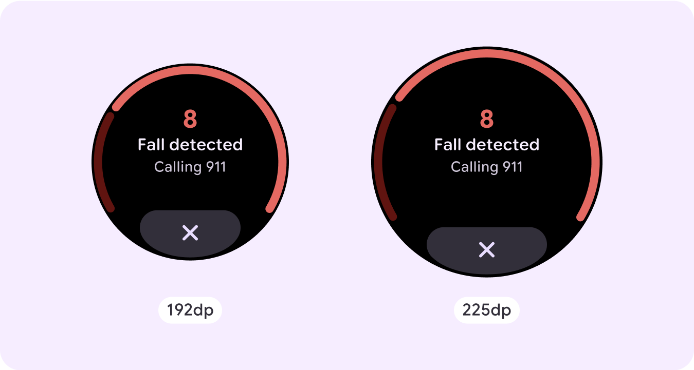
긴급 오버레이
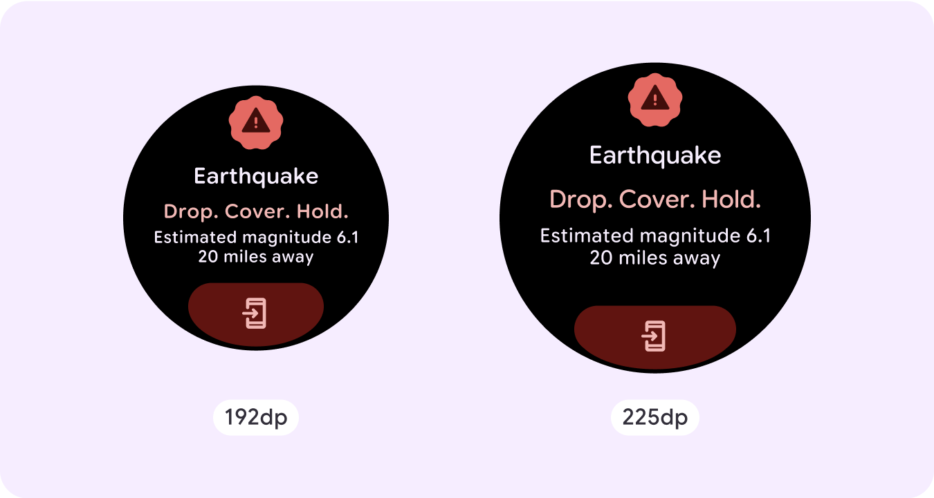
긴급 재난 문자
반응형 및 적응형 동작
Compose 라이브러리의 모든 구성요소는 더 넓은 화면 크기에 자동으로 적응하고 너비와 높이가 증가합니다. 특히 이러한 뷰의 경우 중단점을 활용하면 모든 사용자에게 특히 풍부하고 가치 있는 경험을 제공할 수 있습니다.
UI의 많은 버튼, 카드, 여백의 경우 다양한 화면 크기에 맞게 공간을 늘리고 채워 UI에서 사용 가능한 공간을 활용하고 균형 잡힌 레이아웃을 만드세요.
다음 체크리스트를 사용하여 반응형 매개변수가 올바르게 정의되었는지 확인합니다.
- 모든 화면 크기에서 적절하게 보이는 유연한 레이아웃을 만듭니다.
- 권장되는 상단, 하단, 측면 여백을 적용합니다.
- 콘텐츠가 잘릴 수 있는 위치에 여백을 백분율 값으로 정의합니다.
- 요소가 화면 내 공간을 최대한 활용하고 다양한 기기 크기에서 균형을 유지하도록 레이아웃 제약 조건을 활용합니다.
- 사용되는 경우 시간 텍스트를 수용하되 페이지 상단 섹션과 겹치지 않도록 합니다.
- 제한된 공간을 최대한 활용하려면 가장자리에 붙는 버튼을 사용하는 것이 좋습니다.
- 더 큰 화면 크기에서 추가 콘텐츠를 도입하거나 기존 콘텐츠를 더 쉽게 살펴볼 수 있도록 225dp에서 중단점을 적용하는 것이 좋습니다.
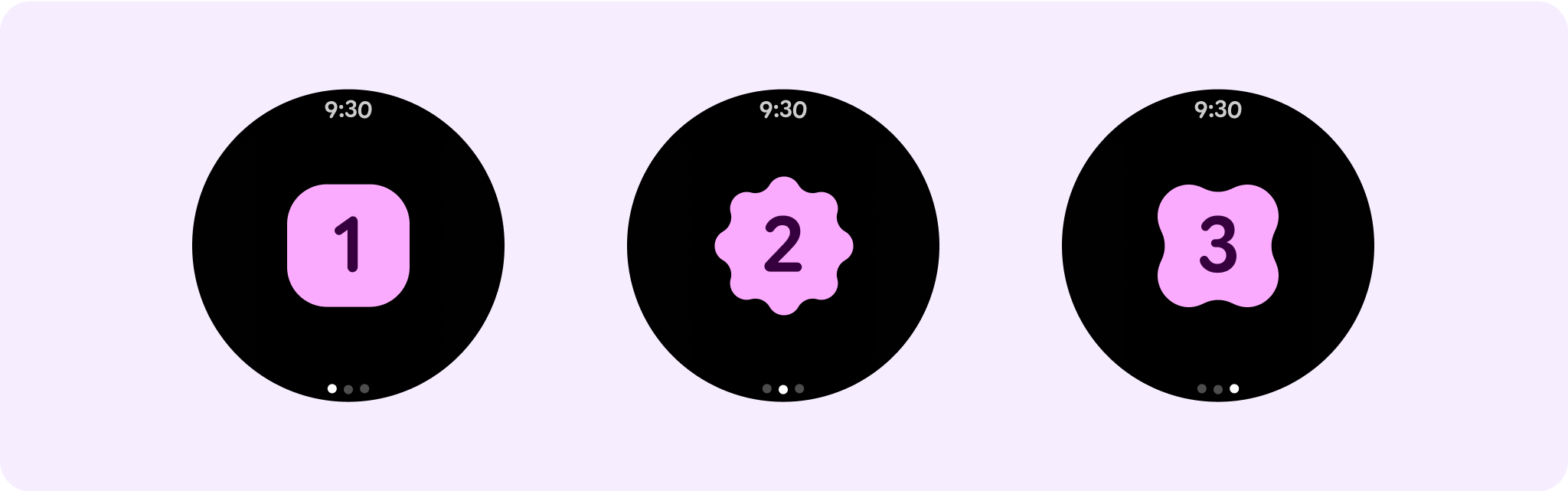
페이지로 나누기를 사용하는 여러 개의 스크롤하지 않는 페이지 여정
환경에 더 많은 콘텐츠가 필요하지만 스크롤하지 않는 레이아웃을 유지하려는 경우 세로 또는 가로 페이지로 나누는 다중 페이지 레이아웃을 고려하세요.