

진행률 표시기는 프로세스 길이 또는 지정되지 않은 대기 시간을 원형으로 표시합니다.

진행률 표시기를 사용하여 완료된 작업의 비율을 표시합니다. 진행률을 표시하기 위해 표시기는 시계 방향으로 원형 트랙을 따라 애니메이션으로 표시됩니다.
재생 버튼과 같은 구성요소에 진행률 표시기를 적용할 수 있습니다.
분석
진행률 표시기를 사용하여 완료된 작업의 비율을 표시합니다. 진행률을 표시하기 위해 표시기는 시계 방향으로 원형 트랙을 따라 애니메이션으로 표시됩니다.
재생 버튼과 같은 구성요소에 진행률 표시기를 적용할 수 있습니다.
디자인 권장사항

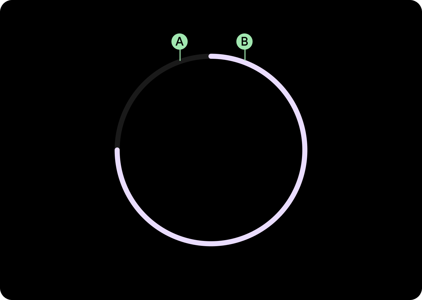
간격이 있는 진행 상태 표시기
시간 등의 중요한 정보를 위한 공간을 확보할 수 있도록 간격이 있는 진행 상태 표시기를 만드세요. 간격을 만들려면 진행률 표시기의 startAngle 및 endAngle을 변경합니다.

작은 진행 상태 표시기
시간 등의 중요한 정보를 위한 공간을 확보할 수 있도록 간격이 있는 진행 상태 표시기를 만드세요. 진행률 표시기의 시작 및 종료 각도를 변경하여 간격을 만듭니다.

확실하지 않은 진행 상태 표시기
설정된 시간이 없는 상황에서 진행 상태 표시기를 사용할 때는 진행률 표시기를 애니메이션 값과 함께 사용하세요. 스피너라고도 합니다. 스피너는 체감 대기 시간을 늘릴 수 있으므로 드물게 사용합니다.
사용

적응형 레이아웃

반응형 동작
진행률 표시기의 원주는 화면/요소 (버튼의 경우) 너비와 높이를 비례적으로 채우며, 획 너비는 모든 중단점에서 동일하게 유지됩니다.
전체 화면의 간격은 51°로 유지되지만 스위프는 화면 크기에 따라 dp 단위로 증가합니다.
고리 너비와 시작 및 종료 지점을 맞춤설정할 수 있습니다.
