
공유 요소 전환은 콘텐츠가 일관된 컴포저블 간에 원활하게 전환하는 방법입니다. 탐색에 자주 사용되며 사용자가 화면 간에 탐색할 때 다양한 화면을 시각적으로 연결할 수 있습니다.
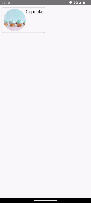
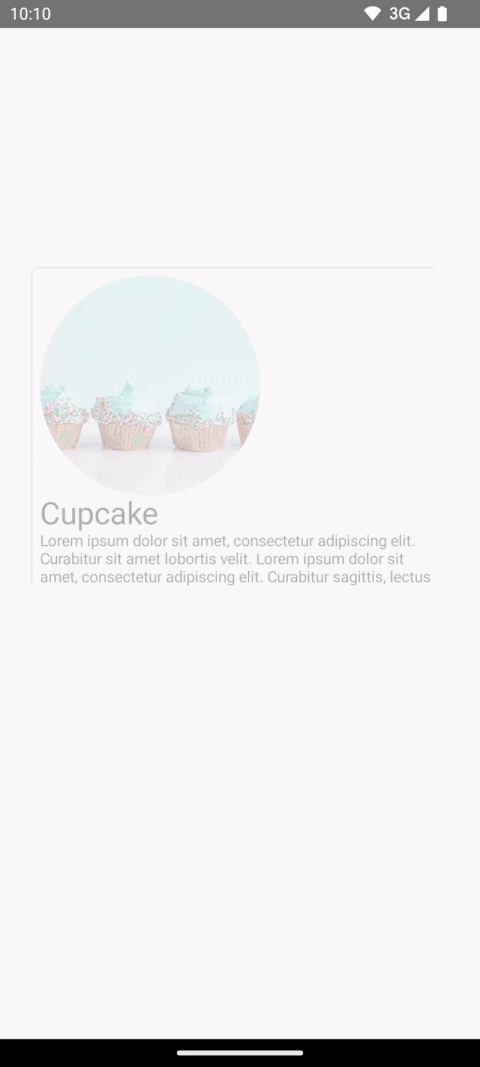
예를 들어 다음 동영상에서 스낵의 이미지와 제목이 목록 페이지에서 세부정보 페이지로 공유되는 것을 확인할 수 있습니다.
Compose에는 공유 요소를 만드는 데 도움이 되는 몇 가지 상위 수준 API가 있습니다.
SharedTransitionLayout: 공유 요소 전환을 구현하는 데 필요한 가장 바깥쪽 레이아웃입니다.SharedTransitionScope를 제공합니다. 공유 요소 수정자를 사용하려면 컴포저블이SharedTransitionScope에 있어야 합니다.Modifier.sharedElement(): 다른 컴포저블과 일치해야 하는 컴포저블을SharedTransitionScope에 플래그를 지정하는 수정자입니다.Modifier.sharedBounds(): 전환이 발생해야 하는 위치의 컨테이너 경계로 이 컴포저블의 경계를 사용해야 함을SharedTransitionScope에 플래그를 지정하는 수정자입니다.sharedElement()와 달리sharedBounds()는 시각적으로 다른 콘텐츠를 위해 설계되었습니다.
Compose에서 공유 요소를 만들 때 중요한 개념은 오버레이 및 클리핑과 함께 작동하는 방식입니다. 이 중요한 주제에 관해 자세히 알아보려면 클리핑 및 오버레이 섹션을 참고하세요.
기본 사용법
이 섹션에서는 더 작은 '목록' 항목에서 더 큰 세부정보 항목으로 전환하는 다음 전환을 빌드합니다.
Modifier.sharedElement()를 사용하는 가장 좋은 방법은
AnimatedContent와 함께 사용하는 것입니다. 이렇게 하면 컴포저블 간의 전환이 자동으로 관리됩니다.AnimatedVisibilityNavHost
시작점은 공유 요소를 추가하기 전에 MainContent 및 DetailsContent 컴포저블이 있는 기존 기본 AnimatedContent입니다.
AnimatedContent를 시작합니다.공유 요소가 두 레이아웃 간에 애니메이션을 표시하도록 하려면
AnimatedContent컴포저블을SharedTransitionLayout으로 둘러쌉니다.SharedTransitionLayout및AnimatedContent의 범위가MainContent및DetailsContent에 전달됩니다.var showDetails by remember { mutableStateOf(false) } SharedTransitionLayout { AnimatedContent( showDetails, label = "basic_transition" ) { targetState -> if (!targetState) { MainContent( onShowDetails = { showDetails = true }, animatedVisibilityScope = this@AnimatedContent, sharedTransitionScope = this@SharedTransitionLayout ) } else { DetailsContent( onBack = { showDetails = false }, animatedVisibilityScope = this@AnimatedContent, sharedTransitionScope = this@SharedTransitionLayout ) } } }
일치하는 두 컴포저블의 컴포저블 수정자 체인에
Modifier.sharedElement()를 추가합니다.SharedContentState객체를 만들고rememberSharedContentState()로 기억합니다.SharedContentState객체는 공유되는 요소를 결정하는 고유 키를 저장합니다. 콘텐츠를 식별하는 고유 키를 제공하고 기억할 항목에rememberSharedContentState()를 사용합니다.AnimatedContentScope가 애니메이션을 조정하는 데 사용되는 수정자에 전달됩니다.@Composable private fun MainContent( onShowDetails: () -> Unit, modifier: Modifier = Modifier, sharedTransitionScope: SharedTransitionScope, animatedVisibilityScope: AnimatedVisibilityScope ) { Row( // ... ) { with(sharedTransitionScope) { Image( painter = painterResource(id = R.drawable.cupcake), contentDescription = "Cupcake", modifier = Modifier .sharedElement( rememberSharedContentState(key = "image"), animatedVisibilityScope = animatedVisibilityScope ) .size(100.dp) .clip(CircleShape), contentScale = ContentScale.Crop ) // ... } } } @Composable private fun DetailsContent( modifier: Modifier = Modifier, onBack: () -> Unit, sharedTransitionScope: SharedTransitionScope, animatedVisibilityScope: AnimatedVisibilityScope ) { Column( // ... ) { with(sharedTransitionScope) { Image( painter = painterResource(id = R.drawable.cupcake), contentDescription = "Cupcake", modifier = Modifier .sharedElement( rememberSharedContentState(key = "image"), animatedVisibilityScope = animatedVisibilityScope ) .size(200.dp) .clip(CircleShape), contentScale = ContentScale.Crop ) // ... } } }
공유 요소 일치가 발생했는지에 관한 정보를 가져오려면 rememberSharedContentState()를 변수로 추출하고 isMatchFound를 쿼리합니다.
이렇게 하면 다음과 같은 자동 애니메이션이 생성됩니다.
전체 컨테이너의 배경 색상과 크기는 여전히 기본 AnimatedContent 설정을 사용합니다.
공유 경계와 공유 요소
Modifier.sharedBounds() 는 Modifier.sharedElement()와 비슷합니다.
그러나 수정자는 다음과 같은 방식으로 다릅니다.
sharedBounds()는 시각적으로 다르지만 상태 간에 동일한 영역을 공유해야 하는 콘텐츠를 위한 반면sharedElement()는 콘텐츠가 동일해야 합니다.sharedBounds()를 사용하면 두 상태 간의 전환 중에 화면에 들어가고 나가는 콘텐츠가 표시되는 반면sharedElement()를 사용하면 변환 경계에서 타겟 콘텐츠만 렌더링됩니다.Modifier.sharedBounds()에는AnimatedContent가 작동하는 방식과 마찬가지로 콘텐츠가 전환되는 방식을 지정하는enter및exit매개변수가 있습니다.sharedBounds()의 가장 일반적인 사용 사례는 컨테이너 변환 패턴인 반면sharedElement()의 사용 사례는 히어로 전환입니다.Text컴포저블을 사용할 때는 기울임꼴과 굵게 또는 색상 변경 간의 전환과 같은 글꼴 변경을 지원하는sharedBounds()가 선호됩니다.
이전 예에서 두 가지 다른 시나리오의 Row 및 Column에 Modifier.sharedBounds()를 추가하면 두 경계를 공유하고 전환 애니메이션을 실행하여 서로 간에 확장할 수 있습니다.
@Composable private fun MainContent( onShowDetails: () -> Unit, modifier: Modifier = Modifier, sharedTransitionScope: SharedTransitionScope, animatedVisibilityScope: AnimatedVisibilityScope ) { with(sharedTransitionScope) { Row( modifier = Modifier .padding(8.dp) .sharedBounds( rememberSharedContentState(key = "bounds"), animatedVisibilityScope = animatedVisibilityScope, enter = fadeIn(), exit = fadeOut(), resizeMode = SharedTransitionScope.ResizeMode.scaleToBounds() ) // ... ) { // ... } } } @Composable private fun DetailsContent( modifier: Modifier = Modifier, onBack: () -> Unit, sharedTransitionScope: SharedTransitionScope, animatedVisibilityScope: AnimatedVisibilityScope ) { with(sharedTransitionScope) { Column( modifier = Modifier .padding(top = 200.dp, start = 16.dp, end = 16.dp) .sharedBounds( rememberSharedContentState(key = "bounds"), animatedVisibilityScope = animatedVisibilityScope, enter = fadeIn(), exit = fadeOut(), resizeMode = SharedTransitionScope.ResizeMode.scaleToBounds() ) // ... ) { // ... } } }
범위 이해하기
Modifier.sharedElement()를 사용하려면 컴포저블이 SharedTransitionScope에 있어야 합니다. SharedTransitionLayout 컴포저블은 SharedTransitionScope를 제공합니다. 공유하려는 요소가 포함된 UI 계층 구조의 동일한 최상위 지점에 배치해야 합니다.
일반적으로 컴포저블도 AnimatedVisibilityScope 내에 배치해야 합니다. 이는 일반적으로 컴포저블 간에 전환하는 데 AnimatedContent
를 사용하거나 AnimatedVisibility를 직접 사용하는 경우 또는 공개 상태를 수동으로 관리하지 않는 한
NavHost 컴포저블 함수를 사용하여 제공됩니다. 여러 범위를 사용하려면 필요한 범위를
CompositionLocal에 저장하거나 Kotlin에서 컨텍스트 수신자를 사용하거나 범위를 함수에 매개변수로 전달합니다.
추적할 범위가 여러 개 있거나 깊게 중첩된 계층 구조가 있는 시나리오에서는 CompositionLocals를 사용합니다. CompositionLocal을 사용하면 저장하고 사용할 정확한 범위를 선택할 수 있습니다. 반면에 컨텍스트 수신자를 사용하면 계층 구조의 다른 레이아웃이 제공된 범위를 실수로 재정의할 수 있습니다.
예를 들어 중첩된 AnimatedContent가 여러 개 있는 경우 범위가 재정의될 수 있습니다.
val LocalNavAnimatedVisibilityScope = compositionLocalOf<AnimatedVisibilityScope?> { null } val LocalSharedTransitionScope = compositionLocalOf<SharedTransitionScope?> { null } @Composable private fun SharedElementScope_CompositionLocal() { // An example of how to use composition locals to pass around the shared transition scope, far down your UI tree. // ... SharedTransitionLayout { CompositionLocalProvider( LocalSharedTransitionScope provides this ) { // This could also be your top-level NavHost as this provides an AnimatedContentScope AnimatedContent(state, label = "Top level AnimatedContent") { targetState -> CompositionLocalProvider(LocalNavAnimatedVisibilityScope provides this) { // Now we can access the scopes in any nested composables as follows: val sharedTransitionScope = LocalSharedTransitionScope.current ?: throw IllegalStateException("No SharedElementScope found") val animatedVisibilityScope = LocalNavAnimatedVisibilityScope.current ?: throw IllegalStateException("No AnimatedVisibility found") } // ... } } } }
또는 계층 구조가 깊게 중첩되지 않은 경우 범위를 매개변수로 전달할 수 있습니다.
@Composable fun MainContent( animatedVisibilityScope: AnimatedVisibilityScope, sharedTransitionScope: SharedTransitionScope ) { } @Composable fun Details( animatedVisibilityScope: AnimatedVisibilityScope, sharedTransitionScope: SharedTransitionScope ) { }
AnimatedVisibility가 있는 공유 요소
이전 예에서는 AnimatedContent로 공유 요소를 사용하는 방법을 보여주었지만 공유 요소는 AnimatedVisibility와도 작동합니다.
예를 들어 이 지연 그리드 예에서 각 요소는 AnimatedVisibility로 래핑됩니다. 항목을 클릭하면 콘텐츠가 UI에서 대화상자 같은 구성요소로 끌어오는 시각적 효과를 냅니다.
var selectedSnack by remember { mutableStateOf<Snack?>(null) } SharedTransitionLayout(modifier = Modifier.fillMaxSize()) { LazyColumn( // ... ) { items(listSnacks) { snack -> AnimatedVisibility( visible = snack != selectedSnack, enter = fadeIn() + scaleIn(), exit = fadeOut() + scaleOut(), modifier = Modifier.animateItem() ) { Box( modifier = Modifier .sharedBounds( sharedContentState = rememberSharedContentState(key = "${snack.name}-bounds"), // Using the scope provided by AnimatedVisibility animatedVisibilityScope = this, clipInOverlayDuringTransition = OverlayClip(shapeForSharedElement) ) .background(Color.White, shapeForSharedElement) .clip(shapeForSharedElement) ) { SnackContents( snack = snack, modifier = Modifier.sharedElement( sharedContentState = rememberSharedContentState(key = snack.name), animatedVisibilityScope = this@AnimatedVisibility ), onClick = { selectedSnack = snack } ) } } } } // Contains matching AnimatedContent with sharedBounds modifiers. SnackEditDetails( snack = selectedSnack, onConfirmClick = { selectedSnack = null } ) }
AnimatedVisibility가 있는 공유 요소.수정자 순서 지정
Modifier.sharedElement() 및 Modifier.sharedBounds()를 사용하면 나머지 Compose와 마찬가지로 수정자 체인의 order of your
modifier chain matters,
순서가 중요합니다. 크기에 영향을 미치는 수정자를 잘못 배치하면 공유 요소 일치 중에 예기치 않은 시각적 점프가 발생할 수 있습니다.
예를 들어 두 공유 요소의 다른 위치에 패딩 수정자를 배치하면 애니메이션에 시각적 차이가 있습니다.
var selectFirst by remember { mutableStateOf(true) } val key = remember { Any() } SharedTransitionLayout( Modifier .fillMaxSize() .padding(10.dp) .clickable { selectFirst = !selectFirst } ) { AnimatedContent(targetState = selectFirst, label = "AnimatedContent") { targetState -> if (targetState) { Box( Modifier .padding(12.dp) .sharedBounds( rememberSharedContentState(key = key), animatedVisibilityScope = this@AnimatedContent ) .border(2.dp, Color.Red) ) { Text( "Hello", fontSize = 20.sp ) } } else { Box( Modifier .offset(180.dp, 180.dp) .sharedBounds( rememberSharedContentState( key = key, ), animatedVisibilityScope = this@AnimatedContent ) .border(2.dp, Color.Red) // This padding is placed after sharedBounds, but it doesn't match the // other shared elements modifier order, resulting in visual jumps .padding(12.dp) ) { Text( "Hello", fontSize = 36.sp ) } } } }
일치하는 경계 |
일치하지 않는 경계: 공유 요소 애니메이션이 잘못된 경계로 크기를 조정해야 하므로 약간 벗어난 것처럼 보입니다. |
|---|---|
공유 요소 수정자 앞에 사용되는 수정자는 공유 요소 수정자에 제약 조건을 제공하며, 이는 초기 및 타겟 경계를 파생하는 데 사용되고 이후에는 경계 애니메이션을 파생하는 데 사용됩니다.
공유 요소 수정자 후에 사용되는 수정자는 이전의 제약 조건을 사용하여 하위 요소의 타겟 크기를 측정하고 계산합니다. 공유 요소 수정자는 하위 요소를 초기 크기에서 타겟 크기로 점진적으로 변환하는 일련의 애니메이션 제약 조건을 만듭니다.
애니메이션에 resizeMode = ScaleToBounds()를 사용하거나 컴포저블에 Modifier.skipToLookaheadSize()를 사용하는 경우는 예외입니다. 이 경우 Compose는 타겟 제약 조건을 사용하여 하위 요소를 배치하고 레이아웃 크기 자체를 변경하는 대신 배율을 사용하여 애니메이션을 실행합니다.
고유 키
복잡한 공유 요소를 사용할 때는 문자열이 일치하기 쉽지 않으므로 문자열이 아닌 키를 만드는 것이 좋습니다. 일치가 발생하려면 각 키가 고유해야 합니다. 예를 들어 Jetsnack에는 다음과 같은 공유 요소가 있습니다.
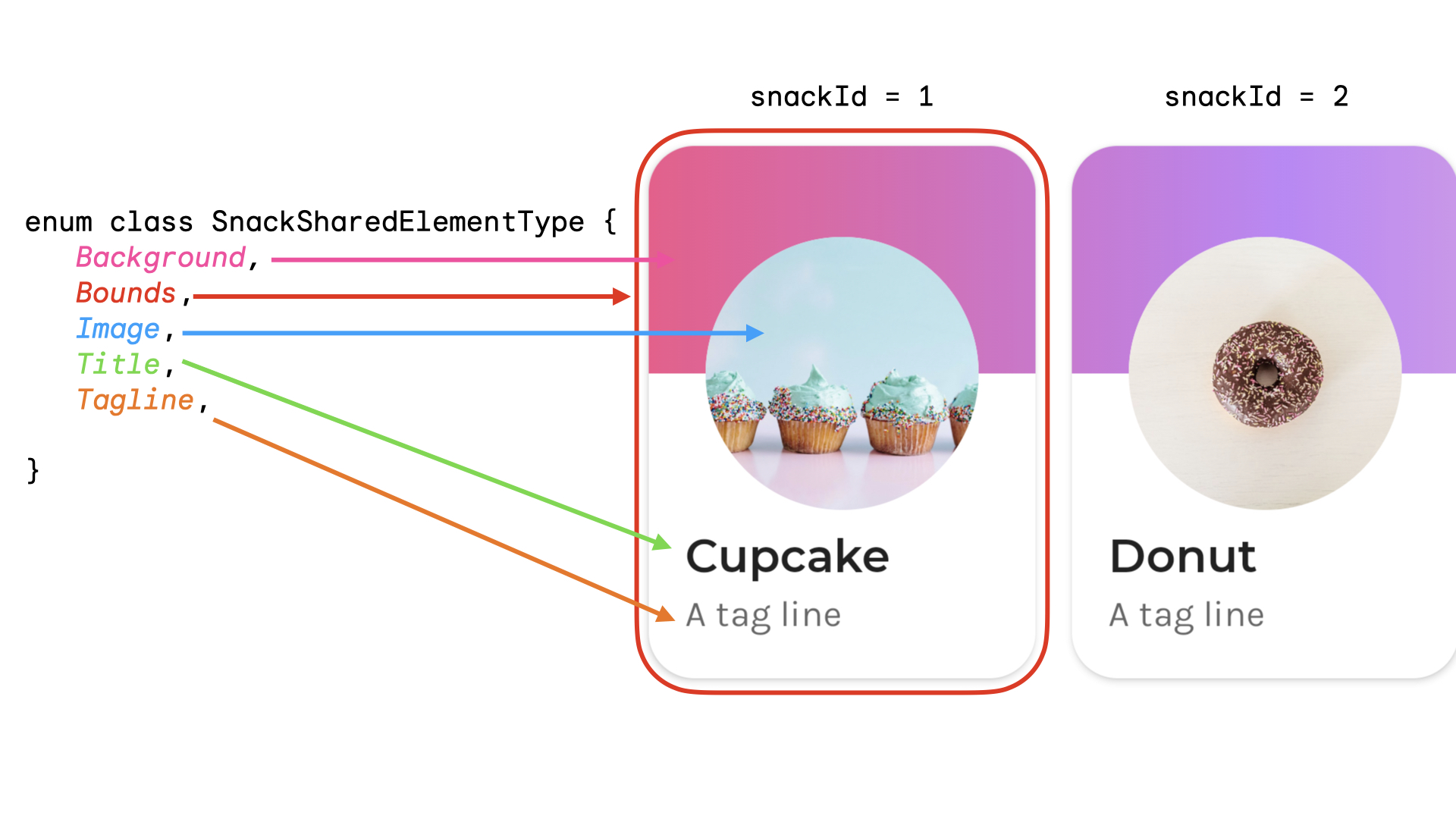
공유 요소 유형을 나타내는 enum을 만들 수 있습니다. 이 예에서 전체 스낵 카드는 홈 화면의 여러 다른 위치(예: '인기' 및 '추천' 섹션)에도 표시될 수 있습니다. snackId, origin('인기'/'추천') 및 공유할 공유 요소의 type이 있는 키를 만들 수 있습니다.
data class SnackSharedElementKey( val snackId: Long, val origin: String, val type: SnackSharedElementType ) enum class SnackSharedElementType { Bounds, Image, Title, Tagline, Background } @Composable fun SharedElementUniqueKey() { // ... Box( modifier = Modifier .sharedElement( rememberSharedContentState( key = SnackSharedElementKey( snackId = 1, origin = "latest", type = SnackSharedElementType.Image ) ), animatedVisibilityScope = this@AnimatedVisibility ) ) // ... }
데이터 클래스는 hashCode() 및 isEquals()를 구현하므로 키에 권장됩니다.
공유 요소의 공개 상태를 수동으로 관리
AnimatedVisibility 또는 AnimatedContent를 사용하지 않는 경우 공유 요소 공개 상태를 직접 관리할 수 있습니다. Modifier.sharedElementWithCallerManagedVisibility()를 사용하고 항목이 표시되어야 하는지 여부를 결정하는 자체 조건을 제공합니다.
var selectFirst by remember { mutableStateOf(true) } val key = remember { Any() } SharedTransitionLayout( Modifier .fillMaxSize() .padding(10.dp) .clickable { selectFirst = !selectFirst } ) { Box( Modifier .sharedElementWithCallerManagedVisibility( rememberSharedContentState(key = key), !selectFirst ) .background(Color.Red) .size(100.dp) ) { Text(if (!selectFirst) "false" else "true", color = Color.White) } Box( Modifier .offset(180.dp, 180.dp) .sharedElementWithCallerManagedVisibility( rememberSharedContentState( key = key, ), selectFirst ) .alpha(0.5f) .background(Color.Blue) .size(180.dp) ) { Text(if (selectFirst) "false" else "true", color = Color.White) } }
현재 제한사항
이러한 API에는 몇 가지 제한사항이 있습니다. 특히 다음 항목에 주의해야 합니다.
- 뷰와 Compose 간의 상호 운용성은 지원되지 않습니다. 여기에는
Dialog또는ModalBottomSheet와 같이AndroidView를 래핑하는 컴포저블이 포함됩니다. - 다음에는 자동 애니메이션 지원이 없습니다.
- 공유 이미지 컴포저블:
ContentScale은 기본적으로 애니메이션 처리되지 않습니다. 설정된 종료ContentScale로 스냅됩니다.
- 모양 클리핑 - 모양 간의 자동 애니메이션에 관한 기본 제공 지원은 없습니다. 예를 들어 항목이 전환될 때 정사각형에서 원으로 애니메이션 처리합니다.
- 지원되지 않는 경우
sharedElement()대신Modifier.sharedBounds()를 사용하고 항목에Modifier.animateEnterExit()를 추가합니다.
- 공유 이미지 컴포저블: