
ব্যবহারকারীর ইন্টারফেস উপাদানগুলি ব্যবহারকারীর ইন্টারঅ্যাকশনের প্রতিক্রিয়ার মাধ্যমে ডিভাইস ব্যবহারকারীকে প্রতিক্রিয়া জানায়। প্রতিটি উপাদানের ইন্টারঅ্যাকশনের প্রতিক্রিয়া জানার নিজস্ব পদ্ধতি রয়েছে, যা ব্যবহারকারীকে তাদের ইন্টারঅ্যাকশনগুলি কী করছে তা জানতে সাহায্য করে। উদাহরণস্বরূপ, যদি কোনও ব্যবহারকারী কোনও ডিভাইসের টাচস্ক্রিনের একটি বোতাম স্পর্শ করে, তবে বোতামটি কোনওভাবে পরিবর্তিত হতে পারে, সম্ভবত একটি হাইলাইট রঙ যুক্ত করে। এই পরিবর্তনটি ব্যবহারকারীকে জানাবে যে তারা বোতামটি স্পর্শ করেছে। যদি ব্যবহারকারী এটি করতে না চান, তবে তারা বোতামটি ছেড়ে দেওয়ার আগে তাদের আঙুলটি টেনে সরিয়ে নিতে জানবে - অন্যথায়, বোতামটি সক্রিয় হবে।
কম্পোজ জেসচার ডকুমেন্টেশনে কম্পোজ কম্পোনেন্টগুলি কীভাবে নিম্ন-স্তরের পয়েন্টার ইভেন্ট পরিচালনা করে, যেমন পয়েন্টার মুভ এবং ক্লিক, তা আলোচনা করা হয়েছে। বাক্সের বাইরে, কম্পোজ সেই নিম্ন-স্তরের ইভেন্টগুলিকে উচ্চ-স্তরের ইন্টারঅ্যাকশনে সারাংশ করে - উদাহরণস্বরূপ, পয়েন্টার ইভেন্টগুলির একটি সিরিজ একটি বোতাম টিপে এবং ছেড়ে দেওয়ার জন্য যোগ করতে পারে। উচ্চ-স্তরের বিমূর্ততাগুলি বোঝা আপনাকে ব্যবহারকারীর সাথে আপনার UI কীভাবে প্রতিক্রিয়া জানায় তা কাস্টমাইজ করতে সহায়তা করতে পারে। উদাহরণস্বরূপ, আপনি ব্যবহারকারীর সাথে ইন্টারঅ্যাক্ট করার সময় কোনও উপাদানের চেহারা কীভাবে পরিবর্তিত হয় তা কাস্টমাইজ করতে চাইতে পারেন, অথবা আপনি কেবল সেই ব্যবহারকারীর ক্রিয়াকলাপগুলির একটি লগ বজায় রাখতে চাইতে পারেন। এই ডকুমেন্টটি আপনাকে স্ট্যান্ডার্ড UI উপাদানগুলি পরিবর্তন করতে বা আপনার নিজস্ব ডিজাইন করার জন্য প্রয়োজনীয় তথ্য দেয়।
মিথস্ক্রিয়া
অনেক ক্ষেত্রে, আপনার কম্পোজ কম্পোনেন্ট ব্যবহারকারীর মিথস্ক্রিয়া কীভাবে ব্যাখ্যা করছে তা জানার প্রয়োজন হয় না। উদাহরণস্বরূপ, ব্যবহারকারী বোতামটি ক্লিক করেছেন কিনা তা নির্ধারণ করার জন্য Button Modifier.clickable এর উপর নির্ভর করে। আপনি যদি আপনার অ্যাপে একটি সাধারণ বোতাম যোগ করেন, তাহলে আপনি বোতামটির onClick কোড সংজ্ঞায়িত করতে পারেন এবং Modifier.clickable উপযুক্ত হলে সেই কোডটি চালায়। এর অর্থ হল ব্যবহারকারী স্ক্রিনটি ট্যাপ করেছেন কিনা বা কীবোর্ড দিয়ে বোতামটি নির্বাচন করেছেন কিনা তা আপনার জানার প্রয়োজন নেই; Modifier.clickable ব্যবহারকারী একটি ক্লিক করেছেন কিনা তা নির্ধারণ করে এবং আপনার onClick কোডটি চালিয়ে প্রতিক্রিয়া জানায়।
তবে, যদি আপনি ব্যবহারকারীর আচরণের প্রতি আপনার UI উপাদানের প্রতিক্রিয়া কাস্টমাইজ করতে চান, তাহলে আপনার গোপনে কী ঘটছে তা আরও জানতে হবে। এই বিভাগটি আপনাকে সেই তথ্যের কিছু অংশ দেবে।
যখন একজন ব্যবহারকারী একটি UI উপাদানের সাথে ইন্টারঅ্যাক্ট করেন, তখন সিস্টেমটি বেশ কয়েকটি Interaction ইভেন্ট তৈরি করে তাদের আচরণ উপস্থাপন করে। উদাহরণস্বরূপ, যদি একজন ব্যবহারকারী একটি বোতাম স্পর্শ করেন, তাহলে বোতামটি PressInteraction.Press তৈরি করে। যদি ব্যবহারকারী বোতামের ভিতরে তাদের আঙুল তুলেন, তাহলে এটি একটি PressInteraction.Release তৈরি করে, যা বোতামটিকে জানায় যে ক্লিক শেষ হয়েছে। অন্যদিকে, যদি ব্যবহারকারী বোতামের বাইরে তাদের আঙুল টেনে নিয়ে যান, তারপর তাদের আঙুল তুলেন, তাহলে বোতামটি PressInteraction.Cancel তৈরি করে, যা বোঝায় যে বোতামটি টিপে দেওয়া বাতিল করা হয়েছে, সম্পূর্ণ হয়নি।
এই মিথস্ক্রিয়াগুলি মতামতহীন । অর্থাৎ, এই নিম্ন-স্তরের মিথস্ক্রিয়া ইভেন্টগুলি ব্যবহারকারীর ক্রিয়াগুলির অর্থ বা তাদের ক্রম ব্যাখ্যা করার উদ্দেশ্যে নয়। তারা ব্যবহারকারীর কোন ক্রিয়াগুলি অন্যান্য ক্রিয়াগুলির চেয়ে অগ্রাধিকার নিতে পারে তাও ব্যাখ্যা করে না।
এই ইন্টারঅ্যাকশনগুলি সাধারণত জোড়ায় জোড়ায় আসে, একটি শুরু এবং একটি শেষ সহ। দ্বিতীয় ইন্টারঅ্যাকশনটিতে প্রথমটির একটি রেফারেন্স থাকে। উদাহরণস্বরূপ, যদি কোনও ব্যবহারকারী একটি বোতাম স্পর্শ করে আঙুল তোলেন, তাহলে স্পর্শটি একটি PressInteraction.Press ইন্টারঅ্যাকশন তৈরি করে এবং রিলিজটি একটি PressInteraction.Release তৈরি করে; Release একটি press বৈশিষ্ট্য রয়েছে যা প্রাথমিক PressInteraction.Press সনাক্ত করে।
আপনি একটি নির্দিষ্ট উপাদানের InteractionSource পর্যবেক্ষণ করে এর ইন্টারঅ্যাকশনগুলি দেখতে পারেন। InteractionSource কোটলিন ফ্লোগুলির উপরে তৈরি করা হয়েছে, তাই আপনি অন্য কোনও প্রবাহের সাথে যেভাবে কাজ করবেন সেভাবেই এটি থেকে ইন্টারঅ্যাকশনগুলি সংগ্রহ করতে পারেন। এই নকশা সিদ্ধান্ত সম্পর্কে আরও তথ্যের জন্য, Illuminating Interactions ব্লগ পোস্টটি দেখুন।
ইন্টার্যাকশনের অবস্থা
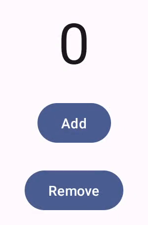
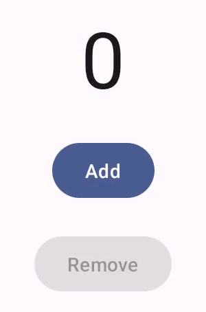
আপনি নিজেও ইন্টারঅ্যাকশন ট্র্যাক করে আপনার কম্পোনেন্টের বিল্ট-ইন কার্যকারিতা বাড়াতে চাইতে পারেন। উদাহরণস্বরূপ, আপনি হয়তো এমন একটি বোতাম চান যাতে চাপ দিলে রঙ পরিবর্তন হয়। ইন্টারঅ্যাকশন ট্র্যাক করার সবচেয়ে সহজ উপায় হল উপযুক্ত ইন্টারঅ্যাকশন অবস্থা পর্যবেক্ষণ করা। InteractionSource বিভিন্ন পদ্ধতি প্রদান করে যা বিভিন্ন ইন্টারঅ্যাকশন স্ট্যাটাসকে অবস্থা হিসেবে প্রকাশ করে। উদাহরণস্বরূপ, যদি আপনি দেখতে চান যে একটি নির্দিষ্ট বোতাম টিপেছে কিনা, তাহলে আপনি এর InteractionSource.collectIsPressedAsState() পদ্ধতিটি কল করতে পারেন:
val interactionSource = remember { MutableInteractionSource() } val isPressed by interactionSource.collectIsPressedAsState() Button( onClick = { /* do something */ }, interactionSource = interactionSource ) { Text(if (isPressed) "Pressed!" else "Not pressed") }
collectIsPressedAsState() ছাড়াও, Compose collectIsFocusedAsState() , collectIsDraggedAsState() এবং collectIsHoveredAsState() প্রদান করে। এই পদ্ধতিগুলি আসলে নিম্ন-স্তরের InteractionSource API-এর উপরে নির্মিত সুবিধাজনক পদ্ধতি। কিছু ক্ষেত্রে, আপনি সরাসরি ঐ নিম্ন-স্তরের ফাংশনগুলি ব্যবহার করতে চাইতে পারেন।
উদাহরণস্বরূপ, ধরুন আপনার জানা দরকার যে কোনও বোতাম টিপানো হচ্ছে কিনা এবং এটি টেনে আনা হচ্ছে কিনা । আপনি যদি collectIsPressedAsState() এবং collectIsDraggedAsState() উভয়ই ব্যবহার করেন, তাহলে Compose অনেক ডুপ্লিকেট কাজ করে এবং আপনি সঠিক ক্রমে সমস্ত ইন্টারঅ্যাকশন পাবেন এমন কোনও গ্যারান্টি নেই। এই ধরণের পরিস্থিতিতে, আপনি সরাসরি InteractionSource এর সাথে কাজ করতে চাইতে পারেন। InteractionSource সাথে নিজেই ইন্টারঅ্যাকশন ট্র্যাক করার বিষয়ে আরও তথ্যের জন্য, Work with InteractionSource দেখুন।
নিম্নলিখিত বিভাগে বর্ণনা করা হয়েছে কিভাবে যথাক্রমে InteractionSource এবং MutableInteractionSource এর সাথে ইন্টারঅ্যাকশন গ্রহণ এবং নির্গমন করতে হয়।
গ্রহণ এবং নির্গমন Interaction
InteractionSource Interactions একটি পঠনযোগ্য স্ট্রিম উপস্থাপন করে — একটি Interaction একটি InteractionSource থেকে নির্গত করা সম্ভব নয়। Interaction নির্গত করার জন্য, আপনাকে একটি MutableInteractionSource ব্যবহার করতে হবে, যা InteractionSource থেকে প্রসারিত।
সংশোধক এবং উপাদানগুলি Interactions গ্রহণ, নির্গত, অথবা গ্রহণ এবং নির্গত করতে পারে। নিম্নলিখিত বিভাগগুলি সংশোধক এবং উপাদান উভয় থেকে মিথস্ক্রিয়া কীভাবে গ্রহণ এবং নির্গত করতে হয় তা বর্ণনা করে।
কনজিউমিং মডিফায়ার উদাহরণ
ফোকাসড স্টেটের জন্য সীমানা আঁকে এমন একটি মডিফায়ারের জন্য, আপনাকে কেবল Interactions পর্যবেক্ষণ করতে হবে, যাতে আপনি একটি InteractionSource গ্রহণ করতে পারেন:
fun Modifier.focusBorder(interactionSource: InteractionSource): Modifier { // ... }
ফাংশন স্বাক্ষর থেকে এটা স্পষ্ট যে এই সংশোধকটি একটি ভোক্তা - এটি Interaction গুলি ব্যবহার করতে পারে, কিন্তু নির্গত করতে পারে না।
সংশোধক তৈরির উদাহরণ
Modifier.hoverable মতো হোভার ইভেন্ট পরিচালনা করে এমন একটি মডিফায়ারের জন্য, আপনাকে Interactions নির্গত করতে হবে এবং পরিবর্তে একটি MutableInteractionSource প্যারামিটার হিসেবে গ্রহণ করতে হবে:
fun Modifier.hover(interactionSource: MutableInteractionSource, enabled: Boolean): Modifier { // ... }
এই মডিফায়ারটি একটি প্রযোজক — এটি প্রদত্ত MutableInteractionSource ব্যবহার করে HoverInteractions নির্গত করতে পারে যখন এটি হোভার করা হয় বা আনহোভার করা হয়।
এমন উপাদান তৈরি করুন যা গ্রহণ করে এবং উৎপাদন করে
ম্যাটেরিয়াল Button মতো উচ্চ-স্তরের উপাদানগুলি উৎপাদক এবং ভোক্তা উভয়েরই ভূমিকা পালন করে। তারা ইনপুট এবং ফোকাস ইভেন্টগুলি পরিচালনা করে এবং এই ইভেন্টগুলির প্রতিক্রিয়ায় তাদের চেহারাও পরিবর্তন করে, যেমন একটি লহর দেখানো বা তাদের উচ্চতা অ্যানিমেট করা। ফলস্বরূপ, তারা সরাসরি MutableInteractionSource কে একটি প্যারামিটার হিসাবে প্রকাশ করে, যাতে আপনি আপনার নিজস্ব মনে রাখা উদাহরণ প্রদান করতে পারেন:
@Composable fun Button( onClick: () -> Unit, modifier: Modifier = Modifier, enabled: Boolean = true, // exposes MutableInteractionSource as a parameter interactionSource: MutableInteractionSource? = null, elevation: ButtonElevation? = ButtonDefaults.elevatedButtonElevation(), shape: Shape = MaterialTheme.shapes.small, border: BorderStroke? = null, colors: ButtonColors = ButtonDefaults.buttonColors(), contentPadding: PaddingValues = ButtonDefaults.ContentPadding, content: @Composable RowScope.() -> Unit ) { /* content() */ }
এর ফলে কম্পোনেন্ট থেকে MutableInteractionSource বের করা সম্ভব হবে এবং কম্পোনেন্ট দ্বারা উৎপাদিত সমস্ত Interaction পর্যবেক্ষণ করা যাবে। আপনি এটি ব্যবহার করে কম্পোনেন্টের উপস্থিতি নিয়ন্ত্রণ করতে পারেন, অথবা আপনার UI-তে অন্য যেকোনো কম্পোনেন্ট নিয়ন্ত্রণ করতে পারেন।
যদি আপনি নিজের ইন্টারেক্টিভ হাই লেভেল কম্পোনেন্ট তৈরি করেন, তাহলে আমরা আপনাকে এইভাবে প্যারামিটার হিসেবে MutableInteractionSource ব্যবহার করার পরামর্শ দিচ্ছি । স্টেট হোস্টিং এর সেরা অনুশীলনগুলি অনুসরণ করার পাশাপাশি, এটি একটি কম্পোনেন্টের ভিজ্যুয়াল অবস্থা পড়া এবং নিয়ন্ত্রণ করা সহজ করে তোলে ঠিক যেমন অন্য যেকোনো ধরণের স্টেট (যেমন এনাবেলড স্টেট) পড়া এবং নিয়ন্ত্রণ করা যায়।
কম্পোজ একটি স্তরযুক্ত স্থাপত্য পদ্ধতি অনুসরণ করে, তাই উচ্চ-স্তরের উপাদান উপাদানগুলি ভিত্তিগত বিল্ডিং ব্লকের উপরে তৈরি করা হয় যা রিপল এবং অন্যান্য ভিজ্যুয়াল এফেক্ট নিয়ন্ত্রণ করার জন্য প্রয়োজনীয় Interaction তৈরি করে। ফাউন্ডেশন লাইব্রেরিটি উচ্চ-স্তরের ইন্টারঅ্যাকশন মডিফায়ার যেমন Modifier.hoverable , Modifier.focusable এবং Modifier.draggable প্রদান করে।
হোভার ইভেন্টগুলিতে সাড়া দেয় এমন একটি কম্পোনেন্ট তৈরি করতে, আপনি কেবল Modifier.hoverable ব্যবহার করতে পারেন এবং একটি MutableInteractionSource প্যারামিটার হিসাবে পাস করতে পারেন। যখনই কম্পোনেন্টটি হোভার করা হয়, তখন এটি HoverInteraction s নির্গত করে এবং আপনি কম্পোনেন্টটি কীভাবে প্রদর্শিত হয় তা পরিবর্তন করতে এটি ব্যবহার করতে পারেন।
// This InteractionSource will emit hover interactions val interactionSource = remember { MutableInteractionSource() } Box( Modifier .size(100.dp) .hoverable(interactionSource = interactionSource), contentAlignment = Alignment.Center ) { Text("Hello!") }
এই কম্পোনেন্টটিকে ফোকাসযোগ্য করার জন্য, আপনি Modifier.focusable যোগ করতে পারেন এবং একই MutableInteractionSource প্যারামিটার হিসেবে পাস করতে পারেন। এখন, HoverInteraction.Enter/Exit এবং FocusInteraction.Focus/Unfocus উভয়ই একই MutableInteractionSource এর মাধ্যমে নির্গত হয়, এবং আপনি একই জায়গায় উভয় ধরণের ইন্টারঅ্যাকশনের জন্য চেহারা কাস্টমাইজ করতে পারেন:
// This InteractionSource will emit hover and focus interactions val interactionSource = remember { MutableInteractionSource() } Box( Modifier .size(100.dp) .hoverable(interactionSource = interactionSource) .focusable(interactionSource = interactionSource), contentAlignment = Alignment.Center ) { Text("Hello!") }
Modifier.clickable হল hoverable এবং focusable তুলনায় আরও উচ্চ স্তরের অ্যাবস্ট্রাকশন - একটি কম্পোনেন্ট ক্লিকযোগ্য হতে হলে, এটি অন্তর্নিহিতভাবে hoverable হয় এবং যে কম্পোনেন্টগুলিতে ক্লিক করা যায় সেগুলিও ফোকাসযোগ্য হতে হবে। আপনি Modifier.clickable ব্যবহার করে এমন একটি কম্পোনেন্ট তৈরি করতে পারেন যা নিম্ন স্তরের API গুলিকে একত্রিত না করেই hover, focus এবং press ইন্টারঅ্যাকশন পরিচালনা করে। আপনি যদি আপনার কম্পোনেন্টটিকে ক্লিকযোগ্য করতে চান, তাহলে আপনি hoverable এবং focusable clickable দিয়ে প্রতিস্থাপন করতে পারেন:
// This InteractionSource will emit hover, focus, and press interactions val interactionSource = remember { MutableInteractionSource() } Box( Modifier .size(100.dp) .clickable( onClick = {}, interactionSource = interactionSource, // Also show a ripple effect indication = ripple() ), contentAlignment = Alignment.Center ) { Text("Hello!") }
InteractionSource নিয়ে কাজ করুন
যদি আপনার কোন কম্পোনেন্টের সাথে ইন্টারঅ্যাকশন সম্পর্কে নিম্ন-স্তরের তথ্যের প্রয়োজন হয়, তাহলে আপনি সেই কম্পোনেন্টের InteractionSource এর জন্য স্ট্যান্ডার্ড ফ্লো API ব্যবহার করতে পারেন। উদাহরণস্বরূপ, ধরুন আপনি প্রেসের একটি তালিকা বজায় রাখতে চান এবং InteractionSource এর জন্য ইন্টারঅ্যাকশন টেনে আনতে চান। এই কোডটি অর্ধেক কাজ করে, নতুন প্রেসগুলি আসার সাথে সাথে তালিকায় যুক্ত করে:
val interactionSource = remember { MutableInteractionSource() } val interactions = remember { mutableStateListOf<Interaction>() } LaunchedEffect(interactionSource) { interactionSource.interactions.collect { interaction -> when (interaction) { is PressInteraction.Press -> { interactions.add(interaction) } is DragInteraction.Start -> { interactions.add(interaction) } } } }
কিন্তু নতুন ইন্টারঅ্যাকশন যোগ করার পাশাপাশি, ইন্টারঅ্যাকশনগুলি শেষ হয়ে গেলে (উদাহরণস্বরূপ, যখন ব্যবহারকারী কম্পোনেন্ট থেকে তাদের আঙুল তুলে নেয়) আপনাকে সেগুলিও সরিয়ে ফেলতে হবে। এটি করা সহজ, কারণ শেষ ইন্টারঅ্যাকশনগুলি সর্বদা সংশ্লিষ্ট শুরু ইন্টারঅ্যাকশনের একটি রেফারেন্স বহন করে। এই কোডটি দেখায় যে আপনি কীভাবে শেষ হয়ে যাওয়া ইন্টারঅ্যাকশনগুলি সরিয়ে ফেলবেন:
val interactionSource = remember { MutableInteractionSource() } val interactions = remember { mutableStateListOf<Interaction>() } LaunchedEffect(interactionSource) { interactionSource.interactions.collect { interaction -> when (interaction) { is PressInteraction.Press -> { interactions.add(interaction) } is PressInteraction.Release -> { interactions.remove(interaction.press) } is PressInteraction.Cancel -> { interactions.remove(interaction.press) } is DragInteraction.Start -> { interactions.add(interaction) } is DragInteraction.Stop -> { interactions.remove(interaction.start) } is DragInteraction.Cancel -> { interactions.remove(interaction.start) } } } }
এখন, যদি আপনি জানতে চান যে কম্পোনেন্টটি বর্তমানে চাপা বা টেনে আনা হচ্ছে কিনা, তাহলে আপনাকে যা করতে হবে তা হল interactions খালি আছে কিনা তা পরীক্ষা করা:
val isPressedOrDragged = interactions.isNotEmpty()
যদি আপনি জানতে চান যে সাম্প্রতিকতম ইন্টারঅ্যাকশনটি কী ছিল, তাহলে তালিকার শেষ আইটেমটি দেখুন। উদাহরণস্বরূপ, কম্পোজ রিপল বাস্তবায়ন এইভাবে সাম্প্রতিকতম ইন্টারঅ্যাকশনের জন্য উপযুক্ত স্টেট ওভারলে নির্ধারণ করে:
val lastInteraction = when (interactions.lastOrNull()) { is DragInteraction.Start -> "Dragged" is PressInteraction.Press -> "Pressed" else -> "No state" }
যেহেতু সমস্ত Interaction একই কাঠামো অনুসরণ করে, বিভিন্ন ধরণের ব্যবহারকারীর ইন্টারঅ্যাকশনের সাথে কাজ করার সময় কোডে খুব বেশি পার্থক্য থাকে না — সামগ্রিক প্যাটার্ন একই।
মনে রাখবেন যে এই বিভাগের পূর্ববর্তী উদাহরণগুলি State ব্যবহার করে মিথস্ক্রিয়া Flow উপস্থাপন করে — এটি আপডেট করা মানগুলি পর্যবেক্ষণ করা সহজ করে তোলে, কারণ state মান পড়ার ফলে স্বয়ংক্রিয়ভাবে পুনর্গঠন ঘটবে। তবে, রচনাটি ফ্রেমের আগে ব্যাচ করা হয়। এর অর্থ হল যদি অবস্থা পরিবর্তন হয় এবং তারপরে একই ফ্রেমের মধ্যে ফিরে আসে, তাহলে অবস্থা পর্যবেক্ষণকারী উপাদানগুলি পরিবর্তনটি দেখতে পাবে না।
এটি ইন্টারঅ্যাকশনের জন্য গুরুত্বপূর্ণ, কারণ ইন্টারঅ্যাকশনগুলি নিয়মিতভাবে একই ফ্রেমের মধ্যে শুরু এবং শেষ হতে পারে। উদাহরণস্বরূপ, পূর্ববর্তী উদাহরণটি ব্যবহার করে Button :
val interactionSource = remember { MutableInteractionSource() } val isPressed by interactionSource.collectIsPressedAsState() Button(onClick = { /* do something */ }, interactionSource = interactionSource) { Text(if (isPressed) "Pressed!" else "Not pressed") }
যদি একটি প্রেস একই ফ্রেমের মধ্যে শুরু হয় এবং শেষ হয়, তাহলে টেক্সটটি কখনই "চাপা হয়েছে!" হিসেবে প্রদর্শিত হবে না। বেশিরভাগ ক্ষেত্রে, এটি কোনও সমস্যা নয় — এত অল্প সময়ের জন্য ভিজ্যুয়াল এফেক্ট দেখানোর ফলে ঝিকিমিকি হবে এবং ব্যবহারকারীর কাছে খুব একটা লক্ষণীয় হবে না। কিছু ক্ষেত্রে, যেমন একটি রিপল এফেক্ট বা অনুরূপ অ্যানিমেশন দেখানোর ক্ষেত্রে, আপনি বোতামটি আর চাপা না থাকলে অবিলম্বে বন্ধ করার পরিবর্তে কমপক্ষে একটি ন্যূনতম সময়ের জন্য প্রভাবটি দেখাতে চাইতে পারেন। এটি করার জন্য, আপনি কোনও অবস্থায় লেখার পরিবর্তে, কালেক্ট ল্যাম্বডার ভেতর থেকে সরাসরি অ্যানিমেশন শুরু এবং বন্ধ করতে পারেন। অ্যানিমেটেড বর্ডার সহ একটি উন্নত Indication তৈরি করুন বিভাগে এই প্যাটার্নের একটি উদাহরণ রয়েছে।
উদাহরণ: কাস্টম ইন্টারঅ্যাকশন হ্যান্ডলিং সহ কম্পোনেন্ট তৈরি করুন
ইনপুটের কাস্টম রেসপন্স ব্যবহার করে কীভাবে কম্পোনেন্ট তৈরি করবেন তা দেখতে, এখানে একটি পরিবর্তিত বোতামের উদাহরণ দেওয়া হল। এই ক্ষেত্রে, ধরুন আপনি এমন একটি বোতাম চান যা তার চেহারা পরিবর্তন করে চাপের প্রতিক্রিয়া জানাবে:
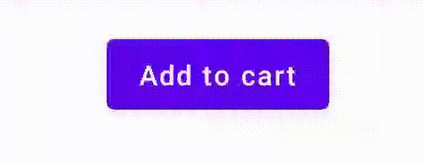
এটি করার জন্য, Button এর উপর ভিত্তি করে একটি কাস্টম কম্পোজেবল তৈরি করুন এবং আইকনটি আঁকতে একটি অতিরিক্ত icon প্যারামিটার ব্যবহার করুন (এই ক্ষেত্রে, একটি শপিং কার্ট)। ব্যবহারকারী বোতামের উপর ঘোরাফেরা করছে কিনা তা ট্র্যাক করার জন্য আপনি collectIsPressedAsState() কল করুন; যখন তারা থাকে, তখন আপনি আইকনটি যুক্ত করুন। কোডটি দেখতে কেমন হবে তা এখানে:
@Composable fun PressIconButton( onClick: () -> Unit, icon: @Composable () -> Unit, text: @Composable () -> Unit, modifier: Modifier = Modifier, interactionSource: MutableInteractionSource? = null ) { val isPressed = interactionSource?.collectIsPressedAsState()?.value ?: false Button( onClick = onClick, modifier = modifier, interactionSource = interactionSource ) { AnimatedVisibility(visible = isPressed) { if (isPressed) { Row { icon() Spacer(Modifier.size(ButtonDefaults.IconSpacing)) } } } text() } }
আর নতুন কম্পোজেবলটি ব্যবহার করতে কেমন দেখাচ্ছে তা এখানে দেওয়া হল:
PressIconButton( onClick = {}, icon = { Icon(Icons.Filled.ShoppingCart, contentDescription = null) }, text = { Text("Add to cart") } )
যেহেতু এই নতুন PressIconButton বিদ্যমান Material Button এর উপরে তৈরি, এটি ব্যবহারকারীর মিথস্ক্রিয়ায় স্বাভাবিক সকল উপায়ে প্রতিক্রিয়া দেখায়। ব্যবহারকারী যখন বোতামটি টিপে, তখন এটির অস্বচ্ছতা সামান্য পরিবর্তিত হয়, ঠিক একটি সাধারণ Material Button মতো।
Indication ব্যবহার করে একটি পুনঃব্যবহারযোগ্য কাস্টম ইফেক্ট তৈরি করুন এবং প্রয়োগ করুন
পূর্ববর্তী বিভাগগুলিতে, আপনি শিখেছেন কিভাবে বিভিন্ন Interaction প্রতিক্রিয়ায় একটি উপাদানের অংশ পরিবর্তন করতে হয়, যেমন চাপলে একটি আইকন দেখানো। এই একই পদ্ধতিটি একটি উপাদানে প্রদত্ত প্যারামিটারের মান পরিবর্তন করার জন্য, অথবা একটি উপাদানের ভিতরে প্রদর্শিত বিষয়বস্তু পরিবর্তন করার জন্য ব্যবহার করা যেতে পারে, তবে এটি শুধুমাত্র প্রতি-উপাদানের ভিত্তিতে প্রযোজ্য। প্রায়শই, একটি অ্যাপ্লিকেশন বা ডিজাইন সিস্টেমে স্টেটফুল ভিজ্যুয়াল এফেক্টের জন্য একটি জেনেরিক সিস্টেম থাকবে - একটি প্রভাব যা সমস্ত উপাদানে ধারাবাহিকভাবে প্রয়োগ করা উচিত।
আপনি যদি এই ধরণের ডিজাইন সিস্টেম তৈরি করেন, তাহলে নিম্নলিখিত কারণে একটি উপাদান কাস্টমাইজ করা এবং অন্যান্য উপাদানের জন্য এই কাস্টমাইজেশনটি পুনরায় ব্যবহার করা কঠিন হতে পারে:
- ডিজাইন সিস্টেমের প্রতিটি উপাদানের জন্য একই বয়লারপ্লেট প্রয়োজন।
- নতুন তৈরি উপাদান এবং কাস্টম ক্লিকযোগ্য উপাদানগুলিতে এই প্রভাবটি প্রয়োগ করতে ভুলে যাওয়া সহজ।
- কাস্টম ইফেক্টটিকে অন্যান্য ইফেক্টের সাথে একত্রিত করা কঠিন হতে পারে।
এই সমস্যাগুলি এড়াতে এবং আপনার সিস্টেম জুড়ে একটি কাস্টম উপাদান সহজেই স্কেল করতে, আপনি Indication ব্যবহার করতে পারেন। Indication একটি পুনর্ব্যবহারযোগ্য ভিজ্যুয়াল এফেক্ট উপস্থাপন করে যা একটি অ্যাপ্লিকেশন বা ডিজাইন সিস্টেমের বিভিন্ন উপাদান জুড়ে প্রয়োগ করা যেতে পারে। Indication দুটি ভাগে বিভক্ত:
IndicationNodeFactory: একটি ফ্যাক্টরি যাModifier.Nodeইন্সট্যান্স তৈরি করে যা একটি কম্পোনেন্টের জন্য ভিজ্যুয়াল এফেক্ট রেন্ডার করে। সহজ বাস্তবায়নের জন্য যা বিভিন্ন কম্পোনেন্টে পরিবর্তিত হয় না, এটি একটি সিঙ্গেলটন (অবজেক্ট) হতে পারে এবং সমগ্র অ্যাপ্লিকেশন জুড়ে পুনরায় ব্যবহার করা যেতে পারে।এই ইনস্ট্যান্সগুলি স্টেটফুল বা স্টেটলেস হতে পারে। যেহেতু এগুলি প্রতিটি উপাদানের জন্য তৈরি করা হয়, তাই এগুলি একটি নির্দিষ্ট উপাদানের ভিতরে কীভাবে প্রদর্শিত হয় বা আচরণ করে তা পরিবর্তন করার জন্য একটি
CompositionLocalথেকে মানগুলি পুনরুদ্ধার করতে পারে, যেমনটি অন্য যেকোনোModifier.Nodeক্ষেত্রে হয়।Modifier.indication: একটি সংশোধক যা একটি উপাদানের জন্যIndicationআঁকতে পারে।Modifier.clickableএবং অন্যান্য উচ্চ স্তরের ইন্টারঅ্যাকশন সংশোধকগুলি সরাসরি একটি ইঙ্গিত প্যারামিটার গ্রহণ করে, তাই তারা কেবলInteractions নির্গত করে না, বরং তাদের নির্গতInteractions এর জন্য ভিজ্যুয়াল এফেক্টও আঁকতে পারে। তাই, সহজ ক্ষেত্রে, আপনিModifier.indicationব্যবহার না করেইModifier.clickableব্যবহার করতে পারেন।
প্রভাবকে একটি Indication দিয়ে প্রতিস্থাপন করুন
এই বিভাগে বর্ণনা করা হয়েছে যে কীভাবে একটি নির্দিষ্ট বোতামে প্রয়োগ করা ম্যানুয়াল স্কেল প্রভাবকে এমন একটি ইঙ্গিত সমতুল্য দিয়ে প্রতিস্থাপন করা যায় যা একাধিক উপাদান জুড়ে পুনরায় ব্যবহার করা যেতে পারে।
নিচের কোডটি একটি বোতাম তৈরি করে যা টিপলে নিচের দিকে স্কেল করে:
val interactionSource = remember { MutableInteractionSource() } val isPressed by interactionSource.collectIsPressedAsState() val scale by animateFloatAsState(targetValue = if (isPressed) 0.9f else 1f, label = "scale") Button( modifier = Modifier.scale(scale), onClick = { }, interactionSource = interactionSource ) { Text(if (isPressed) "Pressed!" else "Not pressed") }
উপরের স্নিপেটের স্কেল ইফেক্টকে Indication এ রূপান্তর করতে, এই পদক্ষেপগুলি অনুসরণ করুন:
স্কেল ইফেক্ট প্রয়োগের জন্য দায়ী
Modifier.Nodeতৈরি করুন । সংযুক্ত করা হলে, নোডটি পূর্ববর্তী উদাহরণগুলির মতো ইন্টারঅ্যাকশন উৎস পর্যবেক্ষণ করে। এখানে একমাত্র পার্থক্য হল এটি আগত ইন্টারঅ্যাকশনগুলিকে স্টেটে রূপান্তর করার পরিবর্তে সরাসরি অ্যানিমেশন চালু করে।নোডটিকে
DrawModifierNodeবাস্তবায়ন করতে হবে যাতে এটিContentDrawScope#draw()কে ওভাররাইড করতে পারে এবং Compose-এ অন্য যেকোনো গ্রাফিক্স API-এর মতো একই অঙ্কন কমান্ড ব্যবহার করে একটি স্কেল প্রভাব রেন্ডার করতে পারে।ContentDrawScopeরিসিভার থেকেdrawContent()কল করলেIndicationপ্রয়োগ করা উচিত এমন প্রকৃত উপাদানটি আঁকবে, তাই আপনাকে কেবল একটি স্কেল রূপান্তরের মধ্যে এই ফাংশনটি কল করতে হবে। নিশ্চিত করুন যে আপনারIndicationবাস্তবায়নগুলি সর্বদা কোনও সময়েdrawContent()কল করে; অন্যথায়, আপনি যে উপাদানটিতেIndicationপ্রয়োগ করছেন তা আঁকবে না।private class ScaleNode(private val interactionSource: InteractionSource) : Modifier.Node(), DrawModifierNode { var currentPressPosition: Offset = Offset.Zero val animatedScalePercent = Animatable(1f) private suspend fun animateToPressed(pressPosition: Offset) { currentPressPosition = pressPosition animatedScalePercent.animateTo(0.9f, spring()) } private suspend fun animateToResting() { animatedScalePercent.animateTo(1f, spring()) } override fun onAttach() { coroutineScope.launch { interactionSource.interactions.collectLatest { interaction -> when (interaction) { is PressInteraction.Press -> animateToPressed(interaction.pressPosition) is PressInteraction.Release -> animateToResting() is PressInteraction.Cancel -> animateToResting() } } } } override fun ContentDrawScope.draw() { scale( scale = animatedScalePercent.value, pivot = currentPressPosition ) { this@draw.drawContent() } } }
IndicationNodeFactoryতৈরি করুন । এর একমাত্র দায়িত্ব হল প্রদত্ত ইন্টারঅ্যাকশন উৎসের জন্য একটি নতুন নোড ইনস্ট্যান্স তৈরি করা। যেহেতু ইঙ্গিতটি কনফিগার করার জন্য কোনও প্যারামিটার নেই, তাই কারখানাটি একটি অবজেক্ট হতে পারে:object ScaleIndication : IndicationNodeFactory { override fun create(interactionSource: InteractionSource): DelegatableNode { return ScaleNode(interactionSource) } override fun equals(other: Any?): Boolean = other === ScaleIndication override fun hashCode() = 100 }
Modifier.clickableঅভ্যন্তরীণভাবেModifier.indicationব্যবহার করে, তাইScaleIndicationদিয়ে একটি ক্লিকযোগ্য উপাদান তৈরি করতে, আপনাকে যা করতে হবে তা হলclickableপ্যারামিটার হিসাবেIndicationপ্রদান করা :Box( modifier = Modifier .size(100.dp) .clickable( onClick = {}, indication = ScaleIndication, interactionSource = null ) .background(Color.Blue), contentAlignment = Alignment.Center ) { Text("Hello!", color = Color.White) }
এটি একটি কাস্টম
Indicationব্যবহার করে উচ্চ স্তরের, পুনঃব্যবহারযোগ্য উপাদান তৈরি করা সহজ করে তোলে — একটি বোতাম দেখতে এরকম হতে পারে:@Composable fun ScaleButton( onClick: () -> Unit, modifier: Modifier = Modifier, enabled: Boolean = true, interactionSource: MutableInteractionSource? = null, shape: Shape = CircleShape, content: @Composable RowScope.() -> Unit ) { Row( modifier = modifier .defaultMinSize(minWidth = 76.dp, minHeight = 48.dp) .clickable( enabled = enabled, indication = ScaleIndication, interactionSource = interactionSource, onClick = onClick ) .border(width = 2.dp, color = Color.Blue, shape = shape) .padding(horizontal = 16.dp, vertical = 8.dp), horizontalArrangement = Arrangement.Center, verticalAlignment = Alignment.CenterVertically, content = content ) }
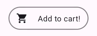
তারপর আপনি নিম্নলিখিত উপায়ে বোতামটি ব্যবহার করতে পারেন:
ScaleButton(onClick = {}) { Icon(Icons.Filled.ShoppingCart, "") Spacer(Modifier.padding(10.dp)) Text(text = "Add to cart!") }
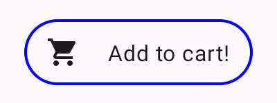
Indication দিয়ে তৈরি একটি বোতাম। অ্যানিমেটেড বর্ডার সহ একটি উন্নত Indication তৈরি করুন
Indication কেবল রূপান্তর প্রভাবের মধ্যেই সীমাবদ্ধ নয়, যেমন একটি উপাদান স্কেল করা। যেহেতু IndicationNodeFactory একটি Modifier.Node প্রদান করে, আপনি অন্যান্য অঙ্কন API-এর মতো সামগ্রীর উপরে বা নীচে যেকোনো ধরণের প্রভাব আঁকতে পারেন। উদাহরণস্বরূপ, আপনি উপাদানটির চারপাশে একটি অ্যানিমেটেড বর্ডার আঁকতে পারেন এবং যখন এটি চাপা হয় তখন উপাদানটির উপরে একটি ওভারলে আঁকতে পারেন:
Indication দিয়ে আঁকা একটি অ্যানিমেটেড বর্ডার এফেক্ট। এখানে Indication বাস্তবায়ন পূর্ববর্তী উদাহরণের মতোই - এটি কেবল কিছু প্যারামিটার সহ একটি নোড তৈরি করে। যেহেতু অ্যানিমেটেড বর্ডারটি Indication জন্য ব্যবহৃত উপাদানের আকৃতি এবং সীমানার উপর নির্ভর করে, তাই Indication বাস্তবায়নের জন্য প্যারামিটার হিসাবে আকৃতি এবং সীমানার প্রস্থও প্রদান করা প্রয়োজন:
data class NeonIndication(private val shape: Shape, private val borderWidth: Dp) : IndicationNodeFactory { override fun create(interactionSource: InteractionSource): DelegatableNode { return NeonNode( shape, // Double the border size for a stronger press effect borderWidth * 2, interactionSource ) } }
Modifier.Node বাস্তবায়ন ধারণাগতভাবে একই, এমনকি যদি অঙ্কন কোডটি আরও জটিল হয়। আগের মতোই, এটি সংযুক্ত হলে InteractionSource পর্যবেক্ষণ করে, অ্যানিমেশন চালু করে এবং কন্টেন্টের উপরে প্রভাব আঁকতে DrawModifierNode প্রয়োগ করে:
private class NeonNode( private val shape: Shape, private val borderWidth: Dp, private val interactionSource: InteractionSource ) : Modifier.Node(), DrawModifierNode { var currentPressPosition: Offset = Offset.Zero val animatedProgress = Animatable(0f) val animatedPressAlpha = Animatable(1f) var pressedAnimation: Job? = null var restingAnimation: Job? = null private suspend fun animateToPressed(pressPosition: Offset) { // Finish any existing animations, in case of a new press while we are still showing // an animation for a previous one restingAnimation?.cancel() pressedAnimation?.cancel() pressedAnimation = coroutineScope.launch { currentPressPosition = pressPosition animatedPressAlpha.snapTo(1f) animatedProgress.snapTo(0f) animatedProgress.animateTo(1f, tween(450)) } } private fun animateToResting() { restingAnimation = coroutineScope.launch { // Wait for the existing press animation to finish if it is still ongoing pressedAnimation?.join() animatedPressAlpha.animateTo(0f, tween(250)) animatedProgress.snapTo(0f) } } override fun onAttach() { coroutineScope.launch { interactionSource.interactions.collect { interaction -> when (interaction) { is PressInteraction.Press -> animateToPressed(interaction.pressPosition) is PressInteraction.Release -> animateToResting() is PressInteraction.Cancel -> animateToResting() } } } } override fun ContentDrawScope.draw() { val (startPosition, endPosition) = calculateGradientStartAndEndFromPressPosition( currentPressPosition, size ) val brush = animateBrush( startPosition = startPosition, endPosition = endPosition, progress = animatedProgress.value ) val alpha = animatedPressAlpha.value drawContent() val outline = shape.createOutline(size, layoutDirection, this) // Draw overlay on top of content drawOutline( outline = outline, brush = brush, alpha = alpha * 0.1f ) // Draw border on top of overlay drawOutline( outline = outline, brush = brush, alpha = alpha, style = Stroke(width = borderWidth.toPx()) ) } /** * Calculates a gradient start / end where start is the point on the bounding rectangle of * size [size] that intercepts with the line drawn from the center to [pressPosition], * and end is the intercept on the opposite end of that line. */ private fun calculateGradientStartAndEndFromPressPosition( pressPosition: Offset, size: Size ): Pair<Offset, Offset> { // Convert to offset from the center val offset = pressPosition - size.center // y = mx + c, c is 0, so just test for x and y to see where the intercept is val gradient = offset.y / offset.x // We are starting from the center, so halve the width and height - convert the sign // to match the offset val width = (size.width / 2f) * sign(offset.x) val height = (size.height / 2f) * sign(offset.y) val x = height / gradient val y = gradient * width // Figure out which intercept lies within bounds val intercept = if (abs(y) <= abs(height)) { Offset(width, y) } else { Offset(x, height) } // Convert back to offsets from 0,0 val start = intercept + size.center val end = Offset(size.width - start.x, size.height - start.y) return start to end } private fun animateBrush( startPosition: Offset, endPosition: Offset, progress: Float ): Brush { if (progress == 0f) return TransparentBrush // This is *expensive* - we are doing a lot of allocations on each animation frame. To // recreate a similar effect in a performant way, it would be better to create one large // gradient and translate it on each frame, instead of creating a whole new gradient // and shader. The current approach will be janky! val colorStops = buildList { when { progress < 1 / 6f -> { val adjustedProgress = progress * 6f add(0f to Blue) add(adjustedProgress to Color.Transparent) } progress < 2 / 6f -> { val adjustedProgress = (progress - 1 / 6f) * 6f add(0f to Purple) add(adjustedProgress * MaxBlueStop to Blue) add(adjustedProgress to Blue) add(1f to Color.Transparent) } progress < 3 / 6f -> { val adjustedProgress = (progress - 2 / 6f) * 6f add(0f to Pink) add(adjustedProgress * MaxPurpleStop to Purple) add(MaxBlueStop to Blue) add(1f to Blue) } progress < 4 / 6f -> { val adjustedProgress = (progress - 3 / 6f) * 6f add(0f to Orange) add(adjustedProgress * MaxPinkStop to Pink) add(MaxPurpleStop to Purple) add(MaxBlueStop to Blue) add(1f to Blue) } progress < 5 / 6f -> { val adjustedProgress = (progress - 4 / 6f) * 6f add(0f to Yellow) add(adjustedProgress * MaxOrangeStop to Orange) add(MaxPinkStop to Pink) add(MaxPurpleStop to Purple) add(MaxBlueStop to Blue) add(1f to Blue) } else -> { val adjustedProgress = (progress - 5 / 6f) * 6f add(0f to Yellow) add(adjustedProgress * MaxYellowStop to Yellow) add(MaxOrangeStop to Orange) add(MaxPinkStop to Pink) add(MaxPurpleStop to Purple) add(MaxBlueStop to Blue) add(1f to Blue) } } } return linearGradient( colorStops = colorStops.toTypedArray(), start = startPosition, end = endPosition ) } companion object { val TransparentBrush = SolidColor(Color.Transparent) val Blue = Color(0xFF30C0D8) val Purple = Color(0xFF7848A8) val Pink = Color(0xFFF03078) val Orange = Color(0xFFF07800) val Yellow = Color(0xFFF0D800) const val MaxYellowStop = 0.16f const val MaxOrangeStop = 0.33f const val MaxPinkStop = 0.5f const val MaxPurpleStop = 0.67f const val MaxBlueStop = 0.83f } }
এখানে মূল পার্থক্য হল, animateToResting() ফাংশনের সাথে অ্যানিমেশনের জন্য এখন একটি ন্যূনতম সময়কাল রয়েছে, তাই প্রেস অবিলম্বে ছেড়ে দেওয়া হলেও, প্রেস অ্যানিমেশনটি চলতে থাকবে। animateToPressed এর শুরুতে একাধিক দ্রুত প্রেসের জন্যও হ্যান্ডলিং রয়েছে — যদি একটি বিদ্যমান প্রেস বা বিশ্রাম অ্যানিমেশনের সময় একটি প্রেস ঘটে, তাহলে পূর্ববর্তী অ্যানিমেশনটি বাতিল হয়ে যায় এবং প্রেস অ্যানিমেশনটি শুরু থেকেই শুরু হয়। একাধিক সমবর্তী প্রভাব সমর্থন করার জন্য (যেমন রিপলগুলির ক্ষেত্রে, যেখানে একটি নতুন রিপল অ্যানিমেশন অন্যান্য রিপলের উপরে আঁকবে), আপনি বিদ্যমান অ্যানিমেশনগুলি বাতিল করে নতুন শুরু করার পরিবর্তে একটি তালিকায় অ্যানিমেশনগুলি ট্র্যাক করতে পারেন।
আপনার জন্য প্রস্তাবিত
- দ্রষ্টব্য: জাভাস্ক্রিপ্ট বন্ধ থাকলে লিঙ্ক টেক্সট প্রদর্শিত হয়।
- অঙ্গভঙ্গি বুঝুন
- জেটপ্যাক কম্পোজের জন্য কোটলিন
- উপাদান উপাদান এবং বিন্যাস